
Google Looker Studio is a reporting and dashboard-building tool that organises data from different sources in one place. It lets you analyse KPI, trends, campaigns, conversions and data quality without the tedious process of assembling reports in a spreadsheet. It previously operated under the name Google Data Studio, but the way it works still follows the same principle: you connect a source, choose fields and build views for analysis. The key thing is that a good report should support decision-making, not just display lots of numbers. In practice, the outcome is more often determined by the quality of the sources, the correct definitions of metrics and a well-thought-out structure than by the dashboard’s appearance alone. This guide takes you step by step through Looker Studio so that the report is useful, clear and reliable.
What Google Looker Studio is and how it works
Google Looker Studio is a reporting tool that combines data from multiple systems and presents it as interactive dashboards. You can connect GA4, Google Ads, Search Console, Google Sheets, BigQuery or a CSV file, and then use that basis to build charts, tables, scorecards and filters. The user does not work on raw data here, but on a reporting layer that pulls fields from sources and displays them in a clear format.
The basis of work is two types of fields: dimensions and metrics. A dimension describes a record’s characteristic, for example the date, channel, campaign, device or country. A metric measures a result, for example users, sessions, cost, revenue or the number of conversions. If you confuse a dimension with a metric or choose the wrong level of detail, the report may look correct, but the conclusions can be misleading.
A report in Looker Studio works as an analytical layer on top of the data source. This means that the available fields, how they are aggregated, the report’s performance and data freshness depend on the connector and the source itself. Not every source provides the same set of fields and not every source refreshes data at the same pace, so the same dashboard may behave differently when connected to different systems.
In practice, a report consists of several elements, each answering different questions. Scorecards show KPI, time series help capture the trend, tables provide detail, and filters and date ranges let you narrow the analysis to a campaign, segment or period. It is worth designing a dashboard around specific business questions, for example “where do leads come from?” or “which campaigns have the highest cost per conversion?”, rather than around data presentation alone.
One of Looker Studio’s strengths is calculated fields. These make it possible to define your own metrics, such as CTR, CPA, percentage share, margin or custom channel groupings. This solution can be very helpful, but it requires vigilance, because a badly prepared formula or an incorrect aggregation can distort the result more than an error on the chart itself.
- 01Connects dataIntegrates sources from multiple systems
- 02Interactive reportsCreates visual dashboards
- 03Reporting layerWorks on prepared fields
- 04Dimensions and metricsDistinguishes characteristics and measures. Dimension (characteristic): Date, Channel, Device. Metric (result): Users, Cost, Conversions.
A key tool for combining, visualising and analysing data without working on raw sources, based on dimensions and metrics.
How to connect data sources in Looker Studio
Data sources in Looker Studio are connected by adding a connector, authorising access and specifying the exact account, file or service. In a new report, you choose to add data, select the source, log in to the correct account and confirm permissions. Once the connection is set up, Looker Studio displays a list of fields, their types and how they can be used in the report.
At the start, it is worth being precise about what question the report is meant to answer, because this directly affects the choice of sources. When you analyse traffic and conversions, GA4 is usually enough. If you want to compare campaign cost with results, you additionally need Google Ads or another cost source. For first-party data, Google Sheets, CSV or BigQuery often work well.
- GA4: traffic, users, events, conversions.
- Google Ads: cost, clicks, campaigns, ad groups.
- Search Console: queries, clicks, impressions, positions.
- Google Sheets or CSV: goals, budgets, manual classifications, supporting data.
- BigQuery: large datasets, custom models and more advanced analysis.
Connecting a source is only the first step, because it is worth checking the quality of the fields straight away. Check the data type, date format, currency, time zone, campaign naming and record completeness. A very common problem does not come from Looker Studio, but from the source: incorrect UTM tagging, incomplete events, blank campaigns or inconsistent naming can ruin a report right from the start.
It is also worth remembering the limitations of connectors and permissions. One source can provide data almost in real time, while another only after a delay or after partial processing. A user may have access to the report, but not to the data source, which blocks preview or editing. That is why, after connecting the data, it makes sense to immediately decide who should see the report and what level of access they should receive.
If you need a single view from several systems, you can use data blending, that is, combining sources within the report. This only makes sense when there is a common key, for example date, campaign, account or product ID. Blends can be helpful, but they increase the risk of duplication and incorrect aggregation, so it is best to use them only when one source genuinely is not enough.
After connecting the source, it is worth carrying out a short validation test. Set out a few basic metrics against the source system, check the totals for a selected day or campaign, and make sure that no empty values appear. This simple step will quickly show whether the report is built on solid data before you start creating charts and making decisions.
Building reports: key metrics and dimensions
Building a report starts with choosing the metrics and dimensions that genuinely answer specific business questions. A metric shows the result, while a dimension defines where, when or for whom that result occurred. When you pair the wrong metric with the wrong dimension, the report may be technically correct, but in practice it tells you very little. For that reason, at the start it is worth deciding what decisions are meant to follow from the dashboard.
The simplest layout is as follows: KPI at the top, trends in the middle, details at the bottom. Scorecards with key figures usually go at the top, for example users, conversions, cost, revenue or ROAS. In the middle section, it is good to show a time series so that the direction of change is immediately clear. At the bottom, tables work well, broken down by channel, campaign, device or landing page.
Metrics and dimensions need to be chosen in pairs, because a number on its own rarely explains anything. The number of conversions says little if you do not know which source they came from. Campaign cost is also hard to assess without data on clicks, sessions or revenue. In practice, it is good to start with a few tried-and-tested combinations:
- users + source / medium
- sessions + date
- conversions + campaign
- revenue + product or category
- cost + advertising platform
- conversion rate + device
Data aggregation matters a great deal. Sum, average, unique count and percentage share are different ways of calculating data, and they cannot be used interchangeably. If you insert an average where a sum is needed, the result will start to mislead. Most errors in Looker Studio come not from the chart, but from incorrect field aggregation.
Calculated fields are useful when standard metrics are not enough to assess performance. They make it possible to calculate CTR, CPA, percentage share, margin or build your own channel grouping. This is a sensible approach, but each such field is worth verifying on a small slice of data and comparing it with a manual calculation. Only when the formula matches does it make sense to use it across the whole report.
A good report should not try to show everything at once. Senior management usually expects a few KPIs, a comparison with the previous period and a clear answer as to whether performance is moving in the right direction. The operations team needs more detail: campaigns, ads, devices, locations and landing pages. One dashboard for everyone usually ends up meaning that nobody gets exactly what they need.
- 01Define decisionsBusiness goal of the dashboard
- 02Metric vs. dimensionResult vs. context (where/when)
- 03Avoid pitfallsTechnically correct, useless
- 04Simple layoutKPI (Top) > Trends (Middle) > Details (Bottom)
The key is to match metrics and dimensions to specific business questions so that the report is useful.
Filtering data and managing analysis quality
Filtering data and managing analysis quality involves deliberately narrowing the view and checking whether the numbers really mean what they should. A filter lets you cut out noise, but it can also accidentally hide an important part of the data. That is why you need to be sure whether it works at chart, page or report level. That difference can change the result of an analysis more than many users assume.
The most common filters are date, campaign, channel, device or country. This makes it possible to compare period with period efficiently, separate paid traffic from organic traffic and understand what causes KPI fluctuations. A filter only makes sense if it helps answer a specific question, not if you add it “just in case”. Too many controls slow the report down and cloud the picture.
The date range requires particular attention because data from different sources does not always refresh at the same pace. GA4, Google Ads, Search Console, spreadsheets and external connectors may have different delays. In practice, this means that the same day in the report may only be partially populated or may still be “open”. If you are analysing results in real time, it is worth adding a note to the report that the last hours or days may be incomplete.
Good analysis starts with solid source data. Incorrect campaign tagging, empty source names, inconsistent currencies, missing events and different conversion definitions can ruin the result regardless of how polished the dashboard is. In practice, it pays to regularly check a few elements:
- whether the dates are complete and have no gaps
- whether campaign names are consistent
- whether cost, revenue and conversions have the same definitions across all sources
- whether empty values appear in key dimensions
- whether the total in Looker Studio matches the source
When comparing data between tools, you need to stick to KPI definitions. The same metric label does not always mean the same calculation method. User, session, conversion or revenue may be calculated differently depending on the system and configuration. Before you treat a discrepancy as an error, check the metric definition and the level of aggregation.
If you use blends, quality control becomes even more important. Combining sources by date, campaign or another key is sometimes necessary, but it is easy to end up with duplicates or distorted totals. Most often the problem lies not in Looker Studio itself, but in the fact that the data are being joined at the wrong level of detail. That is why after every blend you should compare the result with the source data and make sure the numbers are not artificially inflated.
In day-to-day work, unusual spikes are worth treating with caution. A sharp drop in conversions, zero campaign cost or a flood of empty campaigns often signals a measurement issue rather than a real change in user behaviour. First verify tagging, the data source, permissions and refresh recency. Only then draw business conclusions.
Practical tips for effective reporting
Effective reporting in Looker Studio comes down to building a dashboard that answers specific questions straight away and does not force the audience to guess what the data means. Each element of the report should serve one purpose: show the result, the trend or the reason for the change. If a chart does not add anything or lead to a decision, it usually only obscures the picture. A good dashboard shortens interpretation time, rather than just showing lots of numbers.
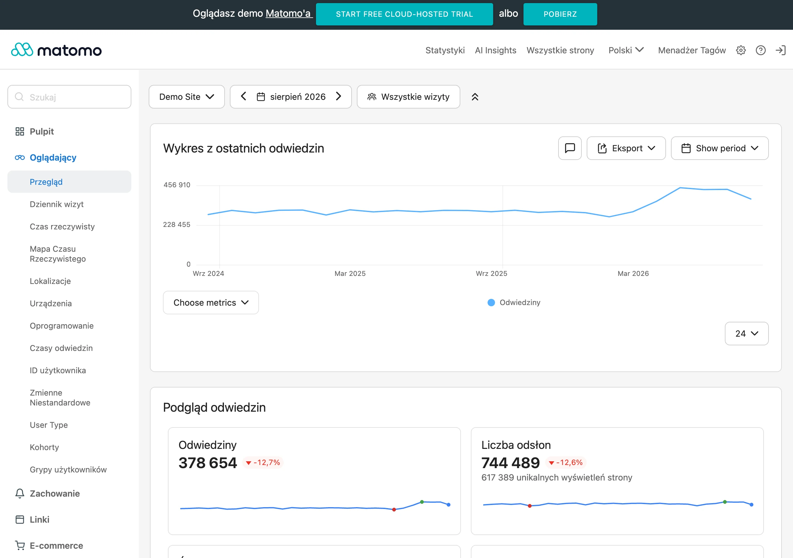
It is best to design a report in layers. At the top there should be KPIs with a comparison to the previous period, below them trends, and only then details of campaigns, channels or pages. This layout works well both for management and for the operational team, because the result is visible first and only then its sources.
In practice, it is worth keeping the number of metrics on a single view under control. When sessions, users, conversions, cost and revenue all appear on one chart at the same time, the whole thing becomes hard to read and easy to misinterpret. It is better to show fewer indicators, but place them in the right context of dimensions and time.
Every calculated field should be checked on a simple example. This applies especially to CTR, CPA, ROAS, percentage shares and custom channel classifications. If a formula gives the correct result only on one chart, but not on another, the source of the problem is most often aggregation or the level of data granularity.
The report should also communicate limitations clearly. If the data refresh with a delay, come from several systems or do not cover all campaigns, the user should see this straight away. A short note about the scope and quality of the data is often more important than another chart.
Finally, make sure it is usable. Consistent field names, uniform currencies, clear date filters and a logical order of sections all genuinely speed up analysis. The best report is one that a new user can understand without extra explanation.
Most common errors and limitations in data analysis
The most common errors in data analysis in Looker Studio are inconsistent KPI definitions, incorrect aggregation, overly hasty source blending and ignoring the quality of the input data. The report itself is rarely the root of the problem. Most often it merely exposes errors that earlier appeared in the source, tagging or data model.
A very common mistake is comparing metrics with the same name but calculated in different ways. A user, session, conversion or revenue can mean something different in GA4, Google Ads, a CRM or a sales spreadsheet. Before comparing figures across tools, check the metric definition, not just its label.
The second typical problem is incorrect aggregation. An average, sum, unique count and percentage do not behave the same after adding a dimension, applying a filter or creating a blend. That is why the same metric can look correct in a scorecard, yet in a table broken down by campaign produce misleading results.
Many mistakes appear when combining data from different sources. If you match ad cost, GA4 traffic and CRM sales using an imprecise key, it is easy to end up with duplicates or “cut off” records. A data blend only makes sense when you have a common key, a consistent aggregation level and missing values under control.
Another limitation of Looker Studio is performance. Too many charts, complex calculated fields and several blends on one page can slow down the report and sometimes make data refreshes harder. In practice, splitting the analysis into 2-3 logical views works more often than building one heavy dashboard “for everything”.
You should also not assume that a report always shows data up to the last minute. Freshness depends on the connector, the refresh schedule and the source itself. A sudden drop to zero does not always mean a business problem — sometimes it is a data delay, a tracking error or a lack of permissions.
Finally, it is worth keeping access limitations and interpretation risks in mind. A user may see a different data scope from the report owner if the source has different permissions or runs in owner data mode. That is why before publishing you need to verify not only the dashboard design, but also what the audience will actually see.
How to monitor and optimise reports in Looker Studio
Monitoring and optimising reports in Looker Studio comes down to regularly checking whether the dashboard presents up-to-date, correct data and performs smoothly for the user. A report is not “done” once and for all, because data sources, KPI definitions, campaign scope and audience needs change. Without control over these changes, even a well-designed dashboard starts to mislead. The key is to continuously keep three elements in check: data quality, report performance and usefulness for the audience.
The first area to monitor is data freshness. It is worth checking what delay a given connector has, when sources refresh and whether the report is not yet showing partially processed data. This is particularly important for day-to-day comparisons, campaign costs and conversions imported from other systems. If the data is delayed, state that clearly in the report instead of leaving the user with the wrong interpretation.
The second area is data quality. In practice, it is worth periodically flagging empty campaigns, sudden zeros, unusual spikes, duplicates and changes in record counts after connecting sources. Such signals more often indicate a problem with tagging, tracking or the join key than a real change in business performance. A good practice is to compare key totals with source data after every major change to the report or source.
The third area is performance. When a report takes too long to load, the user puts it aside or starts making decisions based on data that has not finished loading properly. The most common causes are too many charts, expensive calculated fields, too many blends and overly detailed tables crammed onto one page. The simplest way to speed up a dashboard is to remove elements that do not lead to decisions, and split one heavy report into several lighter views.
It is best to start optimising with the pages that audiences actually use. Some users need only the KPI, the trend and the comparison with the previous period, while campaign details are checked only occasionally, preferably on a separate tab. As a result, the main view works more smoothly and is easier to digest. An operational dashboard does not have to show everything at once; it should show what is needed to make a specific decision.
Order in the data model itself is just as important. Field names should be unambiguous, units consistent, and metric definitions described so that they do not have to be inferred from context. If the report contains custom calculated fields, it is worth checking from time to time whether they still fit the current business logic and whether they do not duplicate metrics available in the source. It is precisely these “left behind” fields, unused or poorly named, that over time more often complicate a report than the data itself.
After every change to the data source, you should carry out a brief report validation. Usually, it is enough to review a few control charts, metric totals, filter behaviour, date range and compare the results with the original system. This is especially important after changing the campaign structure, migrating to a new source, updating events or editing a blend. Do not assume that the report still calculates correctly just because it still opens.
Monitoring is not only about the data itself, but also about the actual use of the report. If audiences regularly ask about the same issues, skip part of the sections or massively export data to a spreadsheet, that is a sign that the dashboard does not support the way they work. In such a situation, it is worth simplifying the layout, changing the order of sections, adding more useful filters or removing elements that merely take up space.
The best approach is to treat the report as an operational tool that requires cyclical reviews. From time to time, it is good to check which charts are actually needed, whether the KPI still make sense and whether the dashboard still supports the decisions it was built for. Only then does Looker Studio remain practical in day-to-day analysis, instead of turning into a collection of outdated visualisations.
FAQ
Frequently asked questions
How does Google Looker Studio work and what is it for?
It is a tool for creating reports and dashboards that combines data from multiple systems in one place. It lets you analyse KPIs, trends, campaigns and conversions in a clear format.
What data sources can be connected in Looker Studio?
You can connect, among others, GA4, Google Ads, Search Console, Google Sheets, BigQuery and a CSV file. The choice of source depends on what question the report is meant to answer.
What are the differences between a dimension and a metric in Looker Studio?
A dimension describes a record attribute, for example the date, channel, campaign or country. A metric shows the result, for example users, cost, revenue or the number of conversions.
Can you combine data from several sources in Looker Studio?
Yes, this is what data blending is for, meaning combining sources in a report. This only makes sense when there is a common key, for example date, campaign or product ID.
What filters are most often used in Looker Studio reports?
The most commonly used filters are date, campaign, channel, device or country. A filter should help answer a specific question, rather than being added just in case.
What mistakes most often ruin analysis in Looker Studio?
The most common problems are inconsistent KPI definitions, incorrect aggregation, overhasty source blending and poor input data quality. Often it is the source or tagging, rather than the report itself, that leads to incorrect conclusions.