
A landing page can lift a campaign’s performance. And that is not a cliché. But it only happens when the page is tailored to a specific goal, traffic source and user intent. A modern look on its own will not deliver conversions. What matters is whether, after clicking the ad, the user immediately understands the offer, trusts it and sees one simple next step. The most common mistake is judging the ad before checking whether the page after the click gives the user a clear reason to act at all. A well-designed landing page structures the message, cuts distractions and makes it easier to measure results. As a result, you can quickly see whether the problem lies in the campaign, the offer, the page or the analytics itself.
How a landing page supports a campaign step by step
A landing page supports a campaign when it guides the user from the click to a single, measurable conversion. At the same time, it ruthlessly shows where effectiveness leaks out along the way. First, you define what counts as success for the page: submitting a form, calling, signing up, buying or registering. Then you check where the user comes from and what confirmation they expect immediately after arriving. Without that, even a properly designed page can be misaligned with the traffic you are sending to it.
- First, define one main campaign goal and the page’s success condition. When different goals clash on one page, users are more likely not to choose any of them.
- Next, break down the user’s entry point: the ad, keyword, email or sponsored link. This lets you establish the intent they arrive with and what they want to confirm straight after clicking.
- Then align the page message with the campaign promise. The headline, subheading, value section, trust arguments and CTA must speak about the same problem and the same offer.
- The next step is to design the conversion path. Simplify the form, remove unnecessary decisions and structure the sections so the user first gets the key information and only then is asked to act.
- On the technical side, set up the mobile version, loading speed, UTM parameters, conversion events, advertising pixels and integrations with your CRM or email tool. Without this, the campaign may generate results that cannot be attributed properly.
- After launch, measure not only visits, but also CTA clicks, scroll depth, form errors, drop-offs and lead quality. On that basis, test variations of headlines, section layouts, form length and versions for different traffic segments.
If the ad says one thing and the landing page shows something else, the campaign loses effectiveness even with well-targeted traffic. The problem is that, in practice, most losses come precisely from this mismatch. The user clicks on a specific promise, and after arriving gets an overly generic page, a few conflicting messages or an ask for contact too early. What happens then. Most often they back out, because trust drops, not necessarily the quality of the traffic itself.
Once the page is live, it is not only the number of visits that matters. More important are CTA clicks, form submissions, bounce rate, mobile behaviour and the quality of contacts passed to sales. Good results start not with more traffic, but with removing the places where the user loses the page’s meaning or trust in the offer.
This usually leads to straightforward, practical decisions. If the traffic is relevant but conversion is weak, you fix the page: the opening section, CTA, value arguments, form or trust elements. And when the page looks fine but the leads are poor or the traffic drops off quickly, the problem sits higher up, not lower down: in the campaign, audience groups, keywords, creative or the offer itself.
What a landing page is in practice
A landing page is a dedicated entry page built around one campaign goal. It is not meant to guide people through the whole website, but to take over attention after the click and direct it to one next step. That step may be a form, a call, a purchase, a registration, a demo or downloading a resource. In practice, a landing page is not “a nice-looking page”, but an operational tool for turning traffic into measurable action.
Its role starts precisely the moment someone arrives from an ad, email or sponsored link. The user wants to check straight away whether they have landed where the message promised. That is why an effective landing page stays consistent with the ad: the same problem, similar language, the same offer and a clear CTA. It works best when it does not force the user to look for the page’s meaning or guess the next step.
A landing page does not replace media campaigns. But, crucially, it does determine how much of the budget turns into results. It reduces traffic waste because it filters out irrelevant visitors more quickly and guides genuinely interested users more confidently. This makes it easier to compare the performance of traffic sources, ads and audience segments, provided that tracking of clicks, forms and other events is set up correctly.
The biggest mistake is treating it like a shortened version of the home page. A home page usually has many jobs, many paths and plenty of distractions, whereas a landing page should have one dominant function. When a campaign draws on several traffic sources, you often need separate page variants or at least separate sections, because a user from search, social media and email responds to a different level of detail and different arguments.
The current context of execution and evaluation
The current context of execution and evaluation is that a landing page is judged today by traffic quality and measurement accuracy, not by the number of visits alone. The sheer number of sessions says very little if users arrive by chance, do not understand the offer or send poor leads. The question is not “how many people came in”, but “did the right people do the right action”.
In practice, several layers matter at once. Traffic source, user intent, conversion rate, contact quality and what people do on the page all make up one picture that cannot be read from a single chart. It sometimes happens that a landing page “delivers” forms, yet the leads still are not suitable for sales. And then the page may not be to blame at all, but rather the ad promise, audience selection or an offer spread too thin across too many directions.
Hard analytics on the browser and server side carries increasing weight. An ad pixel alone usually is not enough if you want to understand what is actually happening between entry and conversion. The question is: at which point does the user drop off. That is why it makes sense to measure CTA clicks, form submissions, field errors, form abandonment, phone number clicks, scroll depth and micro-conversions, because only then can you see where the path breaks.
In paid campaigns, results are most often decided by the alignment between the ad and the page. If the ad promises a specific benefit and the landing page headline says something else, the user loses confidence and goes back to the search results or simply closes the tab. Ad-page consistency is not a creative detail, but a condition for effectiveness.
Technology also affects the evaluation. Loading speed, clarity on mobile, privacy consent and limiting distractions can do more than another paragraph of copy. A mobile user will not keep looking for a form hidden under a heavy visual section or wait for a page that “grinds away” for several seconds. If the mobile version is poor, the campaign is paying for traffic the page cannot handle.
With traffic from several channels, one version of the page often does not deliver. Someone from the search engine usually expects specifics and quick confirmation of intent, while a social media user more often needs a short explanation of the value and a greater dose of trust before clicking anything. Is it really possible to tie this together with one “universal” narrative. When traffic sources differ in intent, separate landing page variants are more practical than one universal version.
What to analyse, optimise and deliver
Without a goal there is no optimisation. To sensibly analyse, optimise and deliver a landing page, you first define the campaign goal, traffic source and way of measuring results, because otherwise you are drifting between the copy, the form, the offer and the campaign itself. The starting point is simple: one main conversion, one dominant CTA and a clear definition of success that can be counted.
In basic analysis, the first things to stand out are those that are ruthless in their simplicity. Ad-page match, visibility of the offer after entry, form length, trust signals, speed and mobile performance say more than extra “improvements” by eye. It is also crucial whether the user immediately understands who the offer is for, what they get and what they should do next. If the answer requires scrolling, guessing or comparing several paths, conversion usually drops.
Optimisation usually starts with the first screen. That is where the headline, subheading, button copy and the form itself are decided. In practice, these also matter greatly: section order, the way the price or terms are presented, FAQ and the microcopy next to form fields. Most value is usually gained by refining the elements closest to the decision, rather than cosmetic tweaks in the lower sections of the page.
The scope of work is dictated by the type of campaign. In lead generation, the key factors are: form quality, sensible contact qualification and CRM integration, because without that leads turn into noise. In e-commerce, consistency between the offer and the ad, clear terms and a smooth move to purchase often win out, while in B2B there is also a need for stronger argumentation and handling a longer decision-making process. The question is: at what stage should the user make the decision.
In practical implementation, you usually need to deliver specifics:
- a map of the campaign goal and the conversion path,
- a landing page structure matched to the traffic source,
- copy consistent with the ad promise,
- a design for the sections, CTA and form,
- configuration of analytics, events and UTM tags,
- integration with a CRM, mailing system or booking system,
- a list of test hypotheses and a post-launch optimisation plan.
The key implementation decisions revolve around one dilemma. Build one page for the whole campaign, or separate variants for segments. You also need to decide whether the form should be short and deliver more leads, or longer and qualify them better, at the cost of volume. This is not a “better-worse” choice, but a classic antithesis: volume instead of quality or quality instead of volume.
Mistakes keep coming back like a boomerang. Sending traffic to the homepage, several goals on one page, an overly generic message, a lack of credibility proof, a weak mobile version and incomplete conversion tracking. The problem is that then it is impossible to tell whether the campaign is not working or whether there is simply no fair way to assess it. A landing page truly supports a campaign only when it is treated as an operational tool: built for a specific intent, with full tracking and regular data-driven optimisation.
The most common mistakes and how to avoid them
The most common missteps are fairly predictable. Sending traffic to an overly generic page, combining multiple goals on one landing page, a message that does not match the ad and a lack of proper tracking. This setup reduces effectiveness even when the campaign brings in the right users, because the energy of the click simply dissipates. After clicking, the user wants to see confirmation of the ad promise, not to play detective and search for the right offer. If the ad says a specific benefit, the page headline must confirm that benefit immediately.
It is also a mistake to leave too many exit routes on the page. A top menu, several different buttons, links to other services and too much copy distract attention and blur the campaign goal, even if the whole thing looks “nice”. A single main action and a section layout that leads to it step by step work better instead. The landing page is not there to “show everything”, but to help complete one specific action.
The most common blunder is the form. Either it goes on forever, or it is so sparse that it explains nothing. Too many fields reduce the number of submissions, but too few fields produce low-quality leads that sales will not be able to use later anyway. The key is matching the number of questions to the value of the offer and the stage of the funnel, rather than to the team’s aesthetic preferences. And when the service is complex, part of the qualification can be moved to the next stage of contact instead of blocking conversion at the point of entry.
Results can evaporate for two basic reasons: a lack of trust and a poor mobile version. Within a few seconds, the user needs to see who is making the offer, why it is worth trusting, and what exactly will happen after submitting the form or clicking the CTA. Add to that loading speed, clear buttons and fields that do not drive people mad on a phone. On mobile devices, every extra point of friction costs more than on desktop. The question is: why complicate something that is meant to work straight away.
There is also a mistake that can invalidate the whole discussion about content and design. That is poor measurement. Without events for CTA clicks, form submissions, field errors, phone calls and traffic sources, it is impossible to distinguish a page problem from a campaign problem. Then optimisation is not optimisation, but groping in the dark. If you do not know where the conversion came from and where the user drops off, the landing page does not support the campaign operationally, only superficially.
Practical decisions when creating a landing page
First decisions, then embellishments. Practical decisions when creating a landing page revolve around what single goal it should have, who it is aimed at and whether it should serve one traffic segment or several. These are more important choices than the colour scheme, animations or the length of the copy itself. You need to clearly establish which conversion actually means campaign success: a form, a phone call, a sign-up, a purchase or booking a call. The most important decision is not about the page design, but about the conversion architecture.
The second issue is the scale of variants. Should you build one landing page for the whole campaign, or separate versions for different sources and audiences. If users arrive from different ads, with a different intent and at different stages of the decision process, one “universal” version usually turns out to be too generic, and in practice bland. Someone from search more often needs quick confirmation that the answer to a specific need is here, while a social media user more often needs a shorter introduction and a stronger value argument. Instead of one message for everyone — it is better to have separate versions or at least separate sections for segments, because that gives you real control over the message.
The third area is friction. And the length of the journey. You need to decide whether to send people straight to the form, or first explain the offer, show the benefits, price, terms and trust elements. For simple, low-cost or well-known offers, a short journey can work well. But beware: for more expensive services, B2B or offers that need explaining, a page that first builds understanding and removes objections is better than hoping for a miracle in one click.
In practice, one thing often has to be decided: whether to show the price straight away. It depends on the strength of the offer and on whether the price without context will cut interest before the user has even seen the value. When the price is straightforward and competitive, hiding it becomes simple friction. Instead of helping, it gets in the way. When the offer requires tailoring or differs in scope, it is better first to clarify what the user gets and what the cost really depends on.
The last group of decisions concerns implementation. And this is where the difficulties begin. Which events to measure, what to integrate the form with and how to plan optimisation after launch. Already at the design stage, you need to know whether the lead will go into the CRM, who will handle it, how its quality will be assessed and which hypotheses will be put on the table first. This means the landing page does not end with publication, but works as a tool for a real improvement in campaign results. A well-designed landing page is built for data and decisions after launch, not only for the moment it goes live.
Practical effect and key success metrics
A landing page has one practical effect: it turns campaign traffic into measurable action. And this is not theory, because as a side effect it also shows exactly where the campaign is losing effectiveness. A well-prepared page does not “beautify” the advert, but increases the chance that the user will take one specific step. If a landing page works well, it improves not only the number of conversions, but also the quality of data for further decisions. Only then can you finally distinguish a traffic problem from a problem with the offer, the page copy or the form.
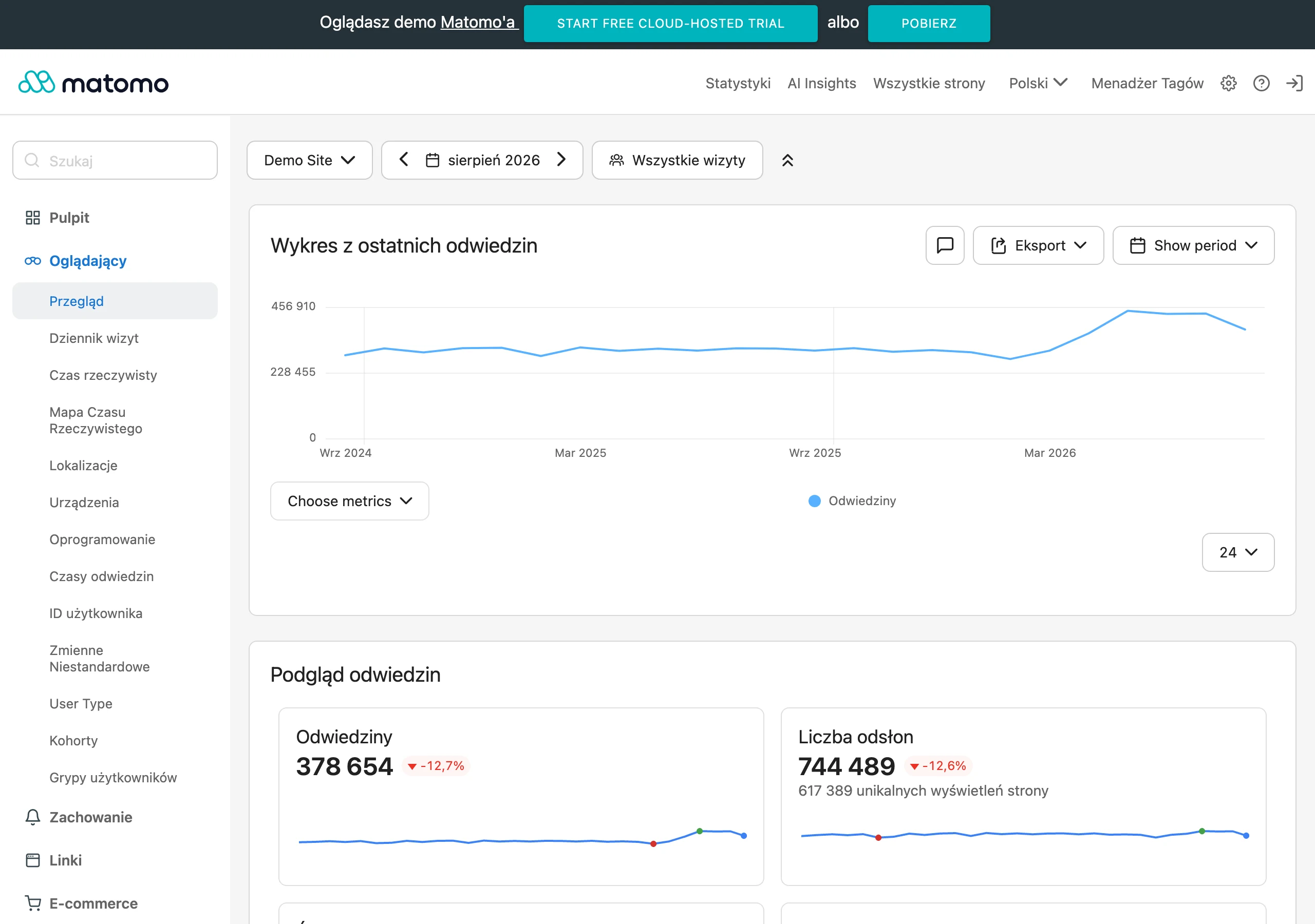
The most important success metrics depend on the campaign goal, but the start should always be the same: one main conversion. Everything else is an add-on. In practice, you most often measure the conversion rate, the number and cost of leads acquired, CTA clicks, form submissions, phone calls, bookings or purchases. The raw number of visits says very little if you do not know how many users took the right action and from which source they came.
Supporting metrics are equally important. They explain why the result is what it is. It is worth monitoring page scroll depth, form abandonment, field errors, differences between devices, loading speed and user behaviour in the first sections. And if many people click the advert, but few move further on the page, the question is: what is not working at the start. Most often, the culprit is a mismatch in the message or a weak first screen.
In lead generation campaigns, it is not only the number of contacts that matters. What matters is their quality from the sales side. It may turn out that a shorter form generates more enquiries, but worse lead fit, while a longer form reduces volume yet improves sales effectiveness. And this is where the whole truth about optimisation comes out: not for the report, but for the business. A good landing page supports the campaign when it delivers a result that is useful for the business, not just a nice report with a high number of form submissions.
Measuring success cannot end with the ad. It should connect the data from the campaign, the page and what happens later in lead management or sales. If the ad CTR looks good, but the page conversion is poor, it is usually the headline, the offer itself or the CTA that needs improving. And when conversion is high, but the leads are still weak, the question is: is the campaign promise not too broad? In that case, it makes sense to refine the message, add qualification in the form or simply change the audience. The best success metric is one that allows you to make a specific optimisation decision, rather than just say that “the result is kind of there”.
FAQ
Frequently asked questions
How does a landing page support a campaign step by step?
It guides the user from the click to one measurable conversion and shows where effectiveness drops along the way. First, the page goal is set, then the message, conversion path and measurement are adapted.
Is a modern landing page design enough to increase conversion?
No, design alone does not deliver conversions. What matters most is a clear message, trust and a simple next step after the click.
Why must the advert and the landing page say the same thing?
Because when the advert’s promise does not match the page, the user loses confidence and is more likely to return to the search results or close the tab. Ad-page consistency is a condition for campaign effectiveness.
When is it worth creating separate landing page variants for different traffic sources?
When traffic comes from channels with different intent, for example from search, social media and email marketing. In that case one universal version usually does not deliver, and separate variants are more practical.
What should be measured on a landing page beyond the number of visits?
It is worth tracking CTA clicks, form submissions, field errors, drop-offs, scroll depth and lead quality. Only this set shows where users are dropping out and what needs improving.
What are the most common landing page mistakes that reduce campaign effectiveness?
Most often it is an overly generic page, several goals on one page, a lack of alignment with the advert and poor measurement. Another issue can be a lack of trust, an overloaded form and a non-working mobile version.