

Lead volume rarely drops because of one spectacular mistake. More often, the culprits are small obstacles on the site that add up to an effective brake. A user will not leave their details if they do not understand the offer, do not trust the company, or run into a technical snag or an overly demanding form. And this is where the uncomfortable truth appears: a higher number of visits to the site does not have to translate into a better sales result. If the site creates friction at the click, reading or form-filling stage, the budget for acquiring traffic starts to go to waste. In practice, it is not just the design that matters, but the entire user journey: from the traffic source to the lead being recorded in the CRM. In this article, we will go through the elements that most often reduce the number of contacts and enquiries.
What are the elements of a site that reduce the number of leads
Elements of a site that reduce the number of leads are the specific parts of a website and conversion process that add resistance for the user before they carry out an action. It sounds technical, but it works in a very down-to-earth way. It can be an unclear heading, a weak value proposition, an invisible CTA, a form that is too long, no contact details, no trust signals, or technical problems. Each of these points undermines one of the three conditions for effective lead generation: understanding the offer, trusting the company and easily completing the action.
In practice, the problem is not assessed at the level of a single subpage. You look at the entire user flow, from the first click to whether the data actually lands in the system. What matters is where someone came from, what they saw on the landing page, whether they scrolled, clicked the CTA, started the form, submitted it, and whether the record was saved in the CRM. Even a well-designed sales section will not help if the form freezes, does not save data, or the user does not know what will happen after submission.
The most common groups of problems revolve around a few areas: matching the message to the search intent, interface usability, form quality, the credibility of the offer, technical performance and measurement accuracy. But be careful, because a drop in leads can be only apparent. Sometimes users are still submitting forms, but conversions are not being measured correctly because of analytics, tags or an incorrect CRM integration.
A typical example looks like this. An advert promises a quick quote, and the page after the click serves up a general company description and a long form with many fields. The user does not see continuity between the promise and the next step, so they simply give up. An element reduces leads when it slows the decision, raises doubt or creates unnecessary effort.
The business significance is simple, though it is often ignored. A company may increase traffic from SEO or ads and still stand still in terms of results. The loss then happens on the site, not at the traffic acquisition stage. So the question is: where exactly does the user drop off and what is stopping them?
The current context and its impact on lead generation
Today, leads are not lost because of one catastrophe, but because of context. The growing share of mobile traffic, the increasing importance of page speed, measurement issues and higher expectations regarding the credibility of the offer combine into a mix that ruthlessly exposes weak points. The problem is that these weak points rarely look like a “big mistake”. Instead, we get a series of small frictions at once. And when they pile up in one place, the form or contact page stops working as well as it should.
Mobile rules the traffic. And in practice that means a huge amount of loss comes directly from mobile UX. Buttons that are too small, sections that are hard to scan, banners covering the content, finicky dropdown fields or an awkward keyboard in the form can cut enquiries faster than anyone notices. In many websites, it is not the overall quality of the site, but the poor mobile experience that is the main cause of lost leads.
The second context is measurement. Consent systems, cookie blocking and tracking restrictions mean analytics increasingly shows a slice rather than the full picture. If a company bases decisions on one tool, it is easy to draw a false conclusion: “there are fewer leads”, when in reality some simply disappear from the reports. Or vice versa, you cannot see the moment when users drop off. That is why it is better to combine data from several sources: forms, CRM, tags and events triggered correctly only after consent has been obtained.
Then there is the technical weight of websites. Sometimes a site looks lightweight, but underneath it is carrying a large JavaScript stack. External widgets, chats, maps, pop-ups and A/B tests like to worsen speed and interface stability. The user does not investigate the cause, they just experience the effect. The page takes too long to load, the button responds with a delay, the form field jumps and the layout suddenly shifts.
The way offers are assessed has also changed. People compare companies faster and mercilessly spot the lack of specifics: who the service is for, what problem it solves, what the contact process looks like and what will happen after leaving their details. The question is whether the site answers that immediately or expects the user to infer it. If the site does not answer these questions straight away, the user often does not move on to the form, even if everything is technically working correctly.
Consistency between the traffic source and the landing page also matters. When an advert, a search result or a campaign link promises a specific service, problem or benefit, the destination page has to pick up that context and deliver on it. Otherwise, bounce rate rises. And leads are not only fewer, but also of lower quality.
How to identify and remove elements that reduce leads
Elements that reduce leads are identified by looking at the entire user journey, not just whether the site “looks nice”. You need to trace where the traffic enters from, what the user sees on the landing page, whether they click the CTA, whether they start the form, whether they submit it and whether the lead actually lands in the CRM. The most common mistake is assessing the effectiveness of a site solely by the number of sessions or one report in GA4. That is not enough, because the bottleneck can sit in the form, consent, JS errors or the measurement itself, rather than in the content or design.
The first step is mapping the lead acquisition journey. It sounds technical, but it is about simple things: you identify the key entry pages, the main CTAs, the contact points, the types of forms and the end point, namely the contact being saved in the system. Only then does it become clear where the user drops off and whether the loss happens before the click, during the form, or only after submission.
The second step is measurement control. You check whether not only submitted forms are being tracked, but also button clicks, form starts, validation errors, phone and email clicks, and visits to the thank-you page. If measurement is incomplete, you can end up fixing the wrong area and wasting time as a result. The problem is that data from analytics, the form tool and CRM can drift apart, because cookies and consent limitations leave gaps in reports along the way.
The next stage is quantitative and qualitative analysis, together, not separately. The numbers will show which pages have high traffic and weak progression to the next step, while session recordings, click maps and manual tests will explain why this is happening. This quickly exposes situations where the user cannot see the CTA, tries to click an inactive element, abandons the form after an error, or simply waits too long for the page to load.
Next, you take a close look at the messaging and the form itself. Assessing the above-the-fold section, headline, benefits section, FAQ, trust elements and information about further contact answers one question: does the user understand the offer and know what will happen after submitting their details. In parallel, you check the “mechanics” of the form, meaning the number of fields, order, required data, error messages and autocomplete. Add to that mobile performance and whether the form has a sensible fallback if a technical issue appears.
At the end, there is the technical audit and prioritisation. This includes: loading speed, layout stability, JavaScript errors, plugin conflicts, form performance across different browsers and devices, and whether key pages are accessible and properly indexed. First, critical issues are removed: a broken form, no tracking, very slow loading, poor mobile UX and a mismatch between the message and the traffic source. Only then does it make sense to move on to A/B tests and small visual tweaks, rather than polishing over cracks in the wall.
Removing problems does not end with implementing changes. You compare the number of form starts, submissions, calls, lead quality and the share of mobile devices before and after implementation. A rise in the number of leads without confirmation of quality in CRM does not yet mean the process has improved.
What to improve first to increase the number of leads
First, you improve what blocks understanding of the offer, trust or easy action. These three areas usually determine whether the user leaves their details or closes the tab and disappears. So the key is not to “pretty up” the page, but to remove friction on the main conversion path, where the decision is made in a matter of seconds.
- above-the-fold section: a clear headline, a specific value proposition and a visible CTA,
- form: only essential fields, simple validation and clear error messages,
- mobile UX: readability, speed, no elements covering the CTA and convenient field completion,
- trust elements at the point of decision: reviews, company details, contact process, FAQ,
- consistency between the ad or search result and the landing page content.
The above-the-fold section has to do the job in a few seconds. It needs to say clearly who the offer is for, what problem it solves and what the next step is. When the headline is “about everything” and the specific benefit is hidden lower down, the user often drops off before they even see the form. The CTA should name the real action, for example “Book a consultation” or “Request a quote”, not a generic “Send”.
It pays to trim the form down to what is actually needed at this stage of contact. Every additional field is another barrier and another excuse to stop, especially on a phone. The biggest performance killers are: unclear consent checkboxes, awkward dropdowns, aggressive CAPTCHA and validation that screams “error” but does not explain exactly what needs fixing.
Mobile can turn lead numbers upside down. And downwards.
Just a few details are enough: whether the buttons are within thumb reach, whether the keyboard opens the right type of field, whether sticky banners do not cover the content, and whether sending the form does not turn into jumping between errors and scrolling back and forth. If the page works properly on desktop but frustrates on mobile, the real effectiveness of the campaign and SEO drops regardless of traffic quality.
The second quick area for improvement is trust right next to the decision point. The user wants to know who they are contacting, what the next process looks like and what will happen after clicking “send”. Concrete details work: genuine reviews, a clearly described scope of cooperation, real company details, a short list of next steps and information on whether the reply will come by email or by phone.
Finally, it is time for a tidy-up. Instead of adding more “improvements”, you need to cut distractions and adapt the page to the traffic source. An overly complex menu, a popup triggered immediately, carousels and heavy add-ons pull attention away from the main action and often slow the page down. If the ad or search result promises a specific service, that same context must be visible straight away on the landing page. Otherwise bounce rates rise and the number of valuable contacts falls.
The most common mistakes and obstacles in the lead generation process
Most often, the message, CTA and form lose out. Then trust issues come into play, followed by technical factors doing their work in the background. The user does not leave their contact details when they do not understand the offer, do not see the point of the next step or do not believe what they see on the screen. In practice, a drop in leads is rarely caused by one big problem; more often it is the result of several small points of friction along the same path.
The first obstacle is often a mismatch between the traffic source and the page content. The problem is that the user arrives with a specific promise from an ad or a search result, but the landing page gives them a generic slogan. And then they lose the thread. The effect is simple: bounce rates rise and the number of people who actually make it to the form falls.
The second common mistake is poor guidance towards the action. The CTA can get lost in the layout, be too generic or sit too low, leaving the user unsure what to do next. The button should clearly say what will happen after clicking, because even brief uncertainty lowers the number of people moving on to contact. This is not about aesthetics, but about a decision made in seconds.
Many leads are lost on the form. This is not just a question of the number of fields, but also their order, unclear error messages, awkward consents, inconvenient dropdown lists and poor autofill handling on mobile. On mobile, even a minor inconvenience can stop a user who was already ready to submit their details. Who is going to wrestle with a form on a small screen when one moment of hesitation is enough.
A separate group of obstacles is a lack of credibility at the moment of decision. When a form does not include real company details, a clear description of the contact process or information about what will happen after the enquiry is sent, some people simply drop off. A user is more likely to leave their details when they know who will receive them, why and what happens next. Instead of having to guess, they should get concrete information.
Finally, there are technical issues that are often invisible to the marketing team. A form may look fine and still fail to save data, fail to send leads to the CRM, or not work on some devices and browsers. And then the whole narrative about a “good layout” loses to the reality of the backend. On top of that, slow loading, heavy widgets, pop-up popups and an unstable page layout effectively reduce the number of started and completed enquiries.
The importance of analysis and measurement in optimising the conversion path
Analysis and measurement are crucial, because without them it is impossible to determine whether leads are being blocked by the message, the interface, the form or a technical error. The number of visits alone or final submissions says too little, because it does not show where people drop off. Good optimisation starts where you can see the specific stage of decline, not just the overall campaign result. The data will tell you clearly, if you collect it in the right places.
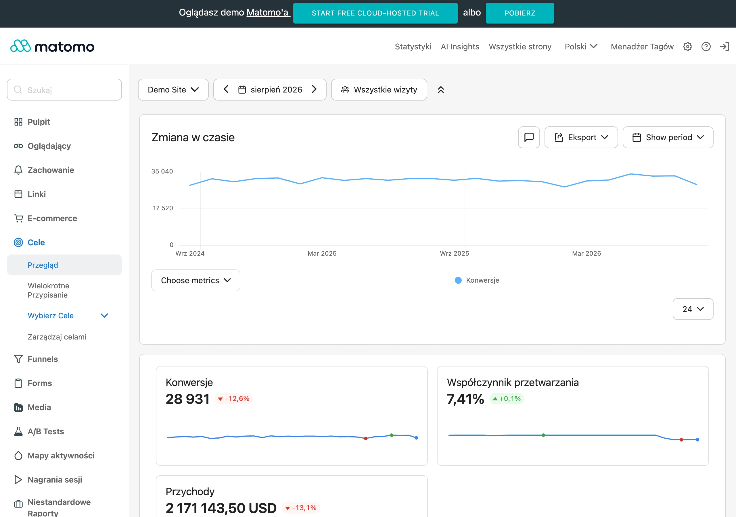
The biggest mistake is measuring only the final lead. When you cannot see CTA clicks, form starts, validation errors, phone number clicks or visits to the thank-you page, it is hard to identify the real problem. Then the team is guessing instead of making decisions based on the user journey. And guessing in marketing costs money, usually more than it seems.
- entries to key landing pages,
- clicks on the main CTAs,
- form start,
- field errors and failed submissions,
- successful form submission,
- phone and email clicks,
- lead saved in the CRM.
Measurement should bring together several data sources at once. That is the foundation. Cookie limitations, consents and tracking itself mean that a single report in an analytics tool rarely shows the full picture. Look at it another way: only by combining data from analytics, the form system, tags, error logs and the CRM can you see whether the problem lies with traffic, the page itself or the contact capture process.
Segmentation of results matters a great deal. Without it, it is easy to fall into complacency. A page may look “good” in an averaged report, yet lose leads mainly on mobile, from paid campaigns or on one specific service subpage. Analysis without a breakdown by device, traffic source and landing pages often hides the most important problems. The question is whether we are looking at the real funnel, or only its smoothed average.
In the end, it is not just the number of leads that matters, but also their quality. And that is not a cliché. A higher number of forms does not always mean a better result if sales receives random or incomplete enquiries that nobody can then work with sensibly. That is why it is worth confirming the effectiveness of changes in the CRM and checking which pages and forms deliver “sales-ready” contacts, not just statistical ones.
Prioritising and implementing changes to optimise leads
Prioritising changes means first removing what is genuinely blocking form submission, contact or accurate conversion measurement. Fix it first, polish it later. There is no point starting with cosmetics if the form does not save data, the CTA is hard to see on mobile, or the landing page does not deliver on the ad promise. The biggest implementation mistake is improving the appearance before fixing the places where the user is actually dropping off. It is crucial that the order of work comes from data, not from the team’s opinions.
In practice, problems are best divided according to two criteria: impact on leads and ease of implementation. This works because it structures the discussion and cuts out “soft” priorities. Critical errors and changes that improve the result without rebuilding the whole site take top priority. Only afterwards is it time for secondary elements, such as refining the section layout, expanding the content or testing communication variants.
- First: broken form, no thank-you page or CRM save, incorrect measurement, mobile issues, very slow loading.
- Then: weak above-the-fold area, unclear CTA, form that is too long, lack of a trust section close to the decision point.
- Finally: tests of headline variants, section order, content length, additional conversion-supporting elements.
Changes should be implemented in stages so it is clear what really improved the result. Otherwise, chaos sets in. If the team changes the headline, form, CTA and page layout all at once, it then becomes difficult to fairly assess which element helped and which was just noise. Smaller, controlled rollouts are better than a large one-off redesign without a benchmark. But note: this is especially important for sites with lower traffic, where there is simply less data for comparison.
After every change, you need to check not only the number of submitted forms, but also the quality of the leads. The raw volume of enquiries proves nothing if random, incomplete or simply non-target contacts are getting into the CRM. And then the question arises: are we growing, or just inflating the figures. Performance assessment should combine data from analytics, forms and CRM, because only then can you see the full effect of the implementation. In practice, it is best to compare the number of forms started with the number of submissions, check validation errors, the share of mobile devices and what happens next, that is, the fate of the leads in sales.
Good prioritisation ends with a backlog of tasks, not a loose list of ideas. Specificity is key. Every change should include a problem description, the expected impact, implementation difficulty, the task owner and the method for measuring the outcome after publication, because otherwise it is easy to slip into a “we’re improving it because we can” mode. If you cannot clearly say what you are improving, why, and how you will recognise the effect, such a change usually should not have a high priority. This makes lead optimisation a managed process, not a lottery, and instead of a series of random tweaks we get a sequence of decisions that can be defended with data.
FAQ
Frequently asked questions
Which page elements most often reduce lead generation?
The most common issues are: an unclear heading, a weak value proposition, an invisible CTA, a form that is too long, missing contact details, lack of trust signals and technical issues. Each of these increases resistance to leaving details.
Does more traffic on a site always mean more leads?
No, because the number of visits alone does not guarantee a sales result. If a site creates friction at the click, reading or form-filling stage, the budget for traffic can be wasted.
Why can a form reduce the number of enquiries?
Too many fields, difficult consent boxes, awkward dropdowns, poor autofill and unclear error messages can stop a user. On a phone, even a small inconvenience can interrupt submission.
How does a lack of trust on a site affect leads?
When there are no real company details next to the form, no explanation of the contact process and no information about what happens after submission, some people give up. A user is more willing to leave their details when they know who will receive them and what happens next.
Can mobile issues reduce the number of leads?
Yes, because in the article it is precisely poor mobile experience that is pointed to as a common cause of lead loss. Small buttons, banners covering content, difficult fields and an awkward keyboard get in the way, among other things.
How can you check where users drop out of the lead process?
You need to trace the whole journey: traffic source, landing page, CTA click, form start, submission and entry in the CRM. Only then can you see whether the problem is before the form, during it, or after submission.