
High website traffic does not yet mean that users are ready to send an enquiry. In practice, the problem rarely lies in the number of visits itself, but in what happens between the first click and the decision to get in touch. Some people arrive out of pure curiosity, others at the stage of comparing offers, and still others with a very specific need. And each of these situations calls for different language, different proof, and a shorter or longer contact path. Most often, you lose enquiries not because of a lack of visits, but because of a mismatch in intent, content, trust, the form, or conversion tracking. That is why it is better to start the diagnosis not with “how to increase traffic”, but with “why the right user does not move on to contact”. This article shows where the problem usually begins and how to assess it in practice.
What the problem is and where it arises
It is a situation that is easy to describe, though painful in its effects. The site generates visits, but the user does not take the contact step: they do not submit a form, call, click on email, or move on to booking. For a business, this is a clear signal that traffic is not turning into a real sales opportunity. The number of sessions on its own says very little if there is no visible move to the next stage along the way.
Most often, the problem arises at the intersection of five areas: traffic quality, offer alignment with intent, trust, site usability, and measurement accuracy. It only takes one element to fall short, and the user visits the site and sees no reason to get in touch. What is stopping them. Content that does not answer their question, a form that is a chore to complete, or a lack of signals that there is a credible business behind the site. This matters, because even a good offer will not work when it reaches the wrong traffic or is presented in an unclear way.
In practice, you first need to separate the lack of enquiries from the lack of proper tracking. Some companies have a working form, but cannot see conversions in GA4, GTM, CRM, or the advertising system. And then the problem is not only poor site performance, but also a false picture of the situation, which pushes the team towards bad decisions. The data says it clearly: if you do not measure, you do not know what you are really fixing.
What matters are the specific elements of the journey, not general impressions. Traffic source, landing page, entry intent, CTA, form, micro-conversions, UX friction, trust elements, device and load time. The user judges the site in an instant and usually does not give it many chances. If they do not find an answer to their question or run into technical friction, they simply leave.
The stage of the buying decision also has a very strong impact on the result. A person in the research phase wants explanations and comparisons, while someone ready to act is looking for price, lead time, an example of work, or a simple way to get in touch. The same number of visits can deliver completely different results if the traffic comes from different stages of the funnel. So the question is not “how do we drive more visits”, but “what is blocking contact from those who are already on the site”. Instead of pumping up traffic — remove the obstacles that cut the right users off from contact.
Current operational context
Today’s context is simple. A large share of website traffic is informational rather than transactional, and this is visible both in SEO and in paid campaigns. The latter often “catch” users at an earlier stage of decision-making, before they are even ready to ask anything. The result is predictable: visits increase, but meaningful enquiries do not necessarily follow.
On top of that comes the dominance of mobile traffic. It is on a phone that problems with the form, overlapping elements, slow loading, a poorly visible CTA, or tiresome scrolling show up most quickly. If the site performs only average on mobile, that is often where you lose the most enquiries, even when the desktop experience looks fine.
Users assess credibility within a few seconds. And then, without sentiment, they look for evidence: specifics, case studies, reviews, a clear working process and visible contact details. When these are missing, uncertainty grows and the willingness to get in touch falls. The problem is that it does not have to be a poor service, just a lack of signals that say clearly: “this makes sense, carry on”.
In many companies, the picture is further blurred by incomplete analytics. It is often the case that a button click is measured, but the click is not distinguished from an actual form submission, so the stats start living their own life. There is also often no tracking of phone, email, calendar, chat, or lead saved in the CRM. And without that, it is difficult to reliably pinpoint where contacts are really “evaporating”.
That is why analysis of traffic source alone usually does not deliver the answer. Only connecting data from GA4, Google Search Console, heatmaps, session recordings, form analytics, CRM and call tracking creates a sensible picture. Most mistakes come from assessing site performance on the basis of one tool or one metric.
The alignment between the entry promise and what the user sees after landing on the site also has a strong impact on the result. If an ad or search result suggests a quick quote, but the landing page serves a general company description, there is a clash and a rapid drop-off. But beware, more and more often the problem is also too much content with no clear decision. The user reads a lot, yet still does not know who the service is for, what exactly it includes, and what the next step should be.
What diagnosis and optimisation look like in practice
Diagnosis starts where the user stops moving towards contact. First, you need to establish whether the problem is a real lack of enquiries, or simply a lack of proper measurement. Without proper tracking of the form, phone, email and other contact paths, you can draw the wrong conclusions right from the start.
That is why the first stage is checking analytics in GA4, GTM, CRM and advertising systems. The question is: what are we actually measuring, and what only seems to be measured. You need to distinguish a button click from a real form submission, a phone number click from an actual call, and a lead saved in the CRM from a mere visit to the site. If this stage is done badly, all further optimisation is based on guesswork, and guesswork rarely sells.
The next step is to analyse the quality of traffic, not just its volume. Channels, campaigns, queries, devices, locations and landing pages are compared to check which visits have genuine business value. Traffic from informational keywords, broad campaigns or poorly matched ads can rack up sessions, but it does not deliver contacts, because the user is simply not ready to make a decision yet.
Next, you check whether the intent behind the visit matches what the user sees on the page. If someone is looking for a quote, a deadline, the scope of a service or examples of work, but lands on a general company description, they will usually bounce and go no further. The most common problem is not “we have too little content”, but “the user did not get the information they expected at that moment”. The question is: what do you promise in the ad or search result, and what do you deliver after the click.
Then comes the analysis of behaviour on the site. In practice, you use GA4 data, heatmaps, session recordings and form analytics to pinpoint points of friction: quick exits, no scroll to the CTA, dead clicks, form abandonment, going back and repeatedly correcting fields. This answers not only why conversion is low, but also why the user does not complete the action.
The offer itself and the messaging are assessed separately. The site should clearly say who the service is for, what problem it solves, what the process looks like, what the quote includes and what happens after the enquiry is sent. When these elements are blurred, the user puts off getting in touch, because they do not want to risk a conversation without basic information. It is not a lack of willingness, but a lack of certainty.
The UX layer and the technical side also have a major impact, especially on mobile. You check the visibility of the CTA, content hierarchy, number of form steps, checkbox behaviour, loading speed, JavaScript errors and whether the phone number or email are easy to find. On mobile devices, even a minor obstacle can reduce the number of enquiries more than weaker content. And that is not a cliché, but everyday reality in the data.
In the end, you do not do everything at once, but choose the changes with the biggest impact and fastest value. Sometimes it is enough to clarify the hero section, shorten the form and add stronger trust elements, and sometimes you need to rebuild the landing page or adjust traffic sources. A well-run diagnosis ends with something concrete: a list of critical errors, implementation priorities, improved measurement and a way to check whether the growth concerns real leads, not just clicks.
What to do to increase the number of enquiries
The number of enquiries is increased by removing the barriers that stop the right user from getting in touch. First, you need to confirm that you are measuring real conversions, and only then start changing the content, form or campaigns. If you do not separate a CTA click from an actual form submission, you may end up optimising what only appears to be a good result. The key question is simple: what are you really counting, and what just looks good in the report.
Start by breaking the problem down into parts. Check brand and non-brand traffic separately, desktop and mobile, new and returning sessions, paid and organic traffic, and specific service pages. That way you will more quickly identify whether the issue affects the whole site, one channel, a specific group of queries, or perhaps only the mobile version.
Then match the landing page to the intent behind the visit. A user searching for pricing wants to see what the quote looks like, a user searching for examples of work expects case studies, and someone ready to talk needs simple contact details. The problem is that when the promise of the ad or search result does not match the page content, bounce rate rises and the number of enquiries falls.
Now simplify the decision to get in touch. The site should have one main CTA in key places, a clear message about what happens after the form is submitted, and visible alternatives such as phone, email, calendar or messenger. The user should not have to guess what the next step is or whether anyone will reply at all.
Shorten the form to the data that is really needed at the first stage. The more fields, consents, unusual validation and minor obstacles there are, the more abandonment you get, especially on a phone. A longer form only makes sense when it deliberately filters lead quality and genuinely supports the sales process, not when it collects data “just in case”.
At the same time, sort out the mobile and technical issues. Too-small fields, awkward selects, intrusive pop-ups, slow loading, poorly functioning sticky elements and invisible CTAs can take away conversion more than a missing extra content section. But note: if most of your traffic comes from mobile, that is where you should test every change first.
Trust is built at decision points, not in the footer. What works well are concrete case studies, reviews, company details, a short description of the process, the expected response time and an FAQ about working together. It is not about adding lots of decorative elements, but about removing the doubts that stop the user just before getting in touch.
When the content is extensive, add elements that help close the decision. The user should quickly understand who the service is for, when it is worth getting in touch and what types of matters you handle. A page can educate, of course, but it cannot trap the person in reading mode only. The question is: are you making the choice easier, or just adding more paragraphs.
Finally, look not only at the number of forms, but also at the quality of leads. More enquiries do not always mean a better result if they come from outside the location, outside the offer or from people who are not ready to buy. The fact is that changes need to be implemented iteratively, segments compared and checked to see whether conversion growth translates into real sales opportunities.
The most common reasons for no enquiries
Most often, silence in the inbox does not come from “lack of demand”, but from a mismatch: traffic, offer, trust, form, mobile version or the measurement itself. One click does not yet make a customer ready to get in touch. Often they are at the research stage, comparing options, checking price ranges or looking only for indicative information. If the traffic source attracts people with low purchase intent, even a good site will not generate many valuable leads.
The second classic issue is the mismatch between what was promised in the ad or search result and what the user sees after clicking through. Someone clicking a quote-related query expects specifics about costs, scope or pricing method, not a general company description. When they get a polished puff piece instead of an answer, their motivation disappears within seconds. The problem is that such subpages say a lot, but they do not say the most important thing: who the service is for and what exactly they should do next.
A major problem is also the communication of the offer, or rather the lack of it. A user does not send an enquiry when they do not understand what they are buying, what the working process looks like, when they will get a response and whether the company handles their case at all. The lack of a contact decision often does not stem from a lack of interest, but from a lack of certainty. The more complex or expensive the service is, the more strongly this mechanism works, from a slight hesitation to a firm “I’ll come back later”.
A separate group of reasons are trust barriers. Without case studies, reviews, company details, photos, collaboration rules or a simple explanation of what will happen after the form is submitted, the user simply puts off contact until later. Do they suspect fraud. Usually not. It is enough that they do not see enough signals of credibility to take the next step instead of risking their time and data.
Very often, the form itself or the whole contact path is to blame. Too many fields, broken validation, awkward select fields, mandatory consent checkboxes in the wrong place, no submission confirmation, or a form that works worse on mobile than on desktop all effectively reduce the number of enquiries. This is not cosmetic fluff, but a real bottleneck on the path to conversion. On a phone, even a minor technical problem can cut off a large share of contacts.
You also must not ignore the speed and usability of the site. When the CTA is hidden, the content is overloaded, a popup covers the screen and the page loads too slowly, the user drops off just before the decision moment. The question is: why educate if you do not provide a bridge to action. A common mistake is overloading the page with educational content without a clear transition to the next step. The user learns a lot, but is not given a simple reason to write now instead of “some time”.
Finally, there are measurement errors. Sometimes enquiries do come in, they are just not properly attributed in GA4, GTM, CRM or the advertising system. The effect can be costly: the company optimises the wrong channel, the wrong subpage and the wrong form that actually delivers results. Before you conclude that the site does not convert, check whether the real contacts are visible in the data at all.
What decisions matter most
The most important decisions are about what you really want to optimise: more forms, better leads or a higher share of the right traffic. This is not a detail, because these goals do not always go hand in hand. A shorter form usually boosts the number of submissions, but can reduce quality. A longer form cuts volume, but more often delivers enquiries that are better matched to the offer.
The first important decision concerns segmenting the problem. One metric for the whole site can be like a thermometer pressed against a window. Traffic from SEO, ads, brand and mobile devices behaves differently, so lumping everything together blurs the picture. The question is whether you are analysing specific landing pages, channels and user types separately. Good decisions start with separating where the problem really lies, instead of improving everything at once.
The second decision is matching the message to the entry intent. Context matters. If a user comes looking for a quick consultation, simple contact and a short path to a conversation win. If they are looking for case studies or want proof of competence, they need to see evidence first, and only then the form. In practice, this means one thing: the page layout, heading, CTA and trust sections should be aligned with what the user expects at that stage.
The third decision is choosing one main contact path. And here, the problem is often not a lack of buttons, but a lack of hierarchy. A form, phone, email, chat and calendar can all work in parallel, but the user should immediately see which route is the primary one. What should they do first if they have twenty seconds. The simpler the choice and the more predictable the next step, the greater the chance of contact.
It also matters a great deal what you show before the first CTA. This is the moment when you either build meaning or just take up space. In many sectors, concrete details work better than an expanded company description, even if the description sounds elegant. The scope of the service, who the offer is for, the approximate process, response time and one strong reason to trust you usually achieve more than a long introduction. Especially on mobile, where the user scans the screen and makes decisions faster.
Another important decision concerns implementation priorities. Not everything has to be fixed at once, because that is a straightforward way to go round in circles. If the form is broken, the CTA is invisible on mobile, or leads are not being measured, those problems have a greater impact than cosmetic changes to the copy. First the foundations, then the decoration. First you remove contact-critical errors, then you test communication and layout improvements.
Finally, it matters how you evaluate the effect of the changes. Button clicks alone or the number of started forms can look excellent while meaning nothing for the business. The data makes one thing clear: you need to check whether the number of real enquiries has increased and whether they make business sense. Only then do you know that the site improvement has not merely boosted user activity, but has actually translated into a better result.
What is worth measuring and verifying in practice
In practice, you count more than just visits. What matters is the whole chain: from the traffic source all the way to the real lead in the CRM, because only there does marketing end and sales begin. First check where the user comes from, which subpage they land on and whether they perform any contact action. The key is to distinguish empty signals from real conversions: a click on a CTA is not the same as a correctly submitted form. Without this, it is easy to declare success, even though in the background only traffic and theatrical interactions are spinning around.
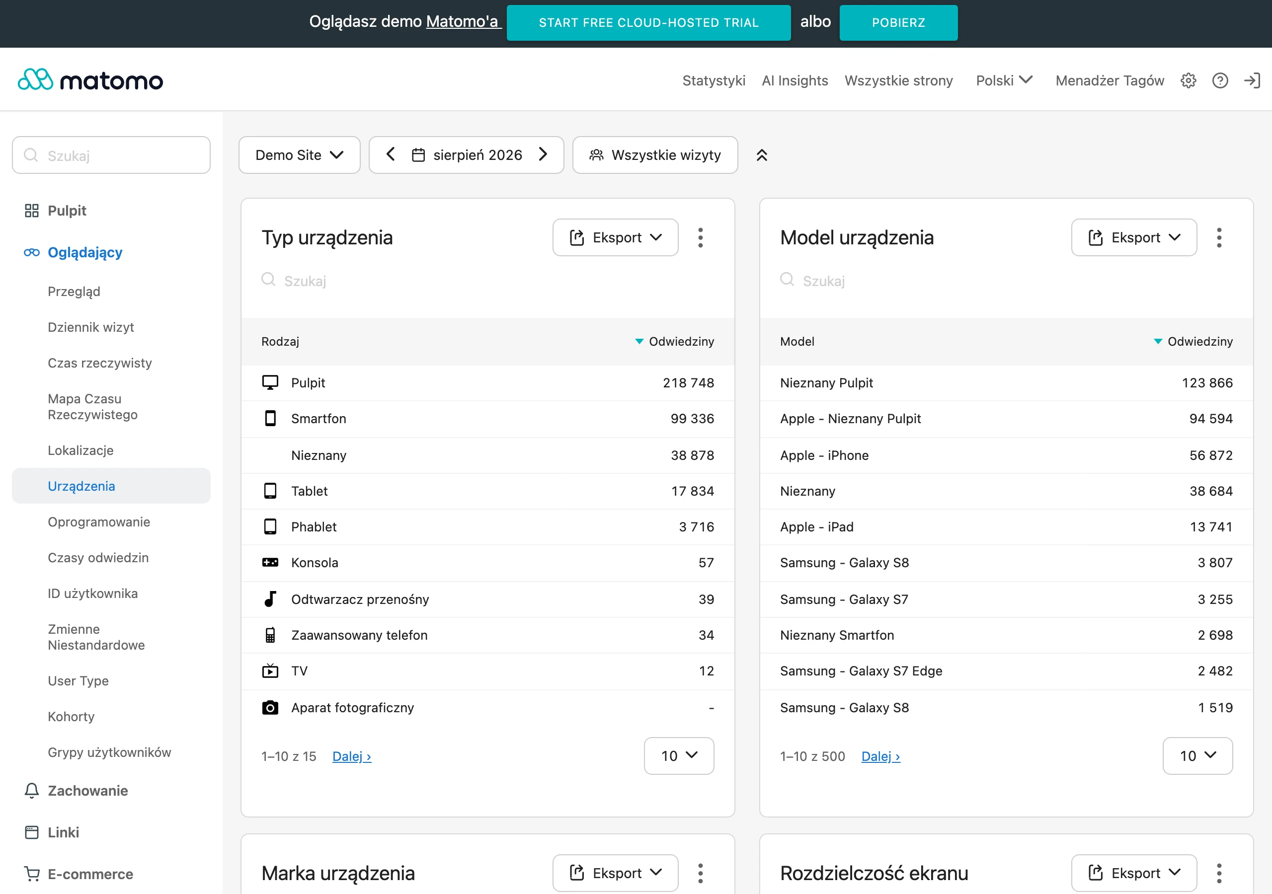
Measure each contact path separately. Form submissions, clicking the phone number, clicking the e-mail address, going to the calendar, chat or messenger. For the form, break it down even further: starting to fill it in, field error and final submission. If the system shows lots of clicks but few confirmed leads, the problem usually lies in the form, the integration or the quality of traffic. The question is: what exactly is failing. That needs to be confirmed with data, not guessed.
The average can blur the picture. Compare results in segments, because the result “for the whole site” often hides a specific hole in the funnel. Analyse mobile and desktop separately, paid and organic traffic, new and returning sessions, service pages and specific campaigns. The simplest question says the most: which segment has traffic, but no contact. Then it becomes clearer faster whether the issue affects one landing page, a specific advert or only the mobile version.
Do not look only at the finish line. Verify user behaviour on the site, because the final result can be a delayed signal of a problem. Check whether users reach the offer and CTA sections, where they stop scrolling, which elements they click without effect and at which point they abandon the form. Here, GA4, heatmaps, session recordings and form analytics complement each other well. If users repeatedly correct the phone field, go back or never reach the submit button, you have a tangible obstacle to remove, not an “impression” from the report.
Technical issues can also quietly cut off enquiries. Check the technical aspects, because they often reduce the number of contacts without a single obvious error visible to the naked eye. Check the loading time of key pages, how the form works on different devices, the visibility of the CTA above the fold, the correctness of validation and error messages. It is worth regularly testing every contact path manually on a phone and desktop, making trial submissions as a normal user would. A correct tracking code alone does not guarantee that the contact actually reaches the inbox or CRM.
Leads themselves can also be misleading. Look at their quality, because an increase in the number of forms does not have to mean better business performance, only more clutter in the inbox. Mark in the CRM which enquiries match the offer, location and budget, and which are rejected straight away. This way you will see whether the problem is low conversion on the site, or rather poor traffic match. Good analysis ends not with the number of leads, but with an answer as to which sources and pages deliver valuable enquiries.
At the final stage, compare data between systems. Discrepancies happen more often than anyone likes to admit. GA4 can show clicks, the CRM fewer leads, and the sales team yet another number of conversations if some contacts come in by phone or entirely outside the form. The problem is that everyone looks at their own slice and declares “the truth”. That is why you should regularly compare data from analytics, call tracking, the e-mail inbox and the CRM, instead of trusting a single report. Only then does it become black and white whether the problem sits on the site, in the traffic source, or simply in the measurement itself.
FAQ
Frequently asked questions
How do you check why users land on a site but do not send enquiries?
First, you need to distinguish between a lack of enquiries and a lack of their correct measurement in GA4, GTM, CRM and ad platforms. Then it is worth analysing the entry intent, traffic quality, on-site behaviour and friction points in the form and CTA.
Does high traffic on a site mean more customer enquiries?
No, because the number of visits alone says little about readiness to get in touch. If the traffic has low purchase intent or the site does not respond to the user’s need, there may be few enquiries despite a large number of sessions.
Why does a user click through to a site but not go on to contact you?
Most often, they are held back by a mismatch between the content and their intent, a lack of trust or a contact journey that is too difficult. The problem may also be caused by a form that is tiring to use, or by an unclear CTA.
Which site elements most often block an enquiry being sent?
Most often, these are a poorly matched offer, a lack of credibility signals, a long form, weak CTAs and technical issues on mobile. Load time, intrusive elements and awkward form fields also matter.
Can the form be the reason there are no enquiries from the website?
Yes, especially if it has too many fields, the validation works badly, or it is awkward on a phone. Another problem can be the lack of a clear confirmation of what will happen after the submission is sent.
When do traffic from ads or SEO not produce valuable leads?
When the user arrives at the research stage, not at the point of being ready to get in touch, or when the ad promises something different from what the landing page shows. Then visits rise, but enquiries do not increase at a similar rate.