
Checkout determines whether the cost of acquiring traffic turns into revenue or into an abandoned basket. Even good traffic from SEO and ads will not pay off if the user encounters friction at the final stage of purchase. In practice, the biggest losses arise when the customer is ready to buy, but is met with unclear costs, extra obligations, or uncertainty. This section focuses on two fundamentals: the impact of checkout on store performance and why hidden costs so often stop a purchase.
How checkout affects conversion and ROI in an online store
Checkout affects conversion and ROI directly, because this is where the user finally pays or abandons the purchase. The purchase process itself is not an SEO ranking factor, but it has a very strong impact on the return from organic and paid traffic. If a store attracts users effectively but loses them before payment, the acquisition cost remains, yet revenue does not grow.
In practice, this means that a weak checkout lowers the value of the entire marketing effort, even when campaigns and product pages work well. The problem is then not the number of visits, but the final steps of the funnel. Every unnecessary point of friction at the finish line reduces the Conversion Rate, and therefore worsens budget efficiency and sales profitability.
The importance of checkout also goes beyond a single transaction, because it affects the customer experience and their willingness to buy again. A process that is fast, predictable and secure builds a better first impression after the purchase decision. When the end of the order frustrates the customer, the store loses not only the current sale, but often also the customer’s future value.
The most damaging barriers are the ones that appear suddenly and are hard to ignore. This group includes hidden costs, forced account creation, overly long forms, poor UX on mobile, limited payment methods and technical errors. The closer the problem appears to payment, the more expensive every lost session becomes.
Unclear or hidden costs as a barrier to order completion
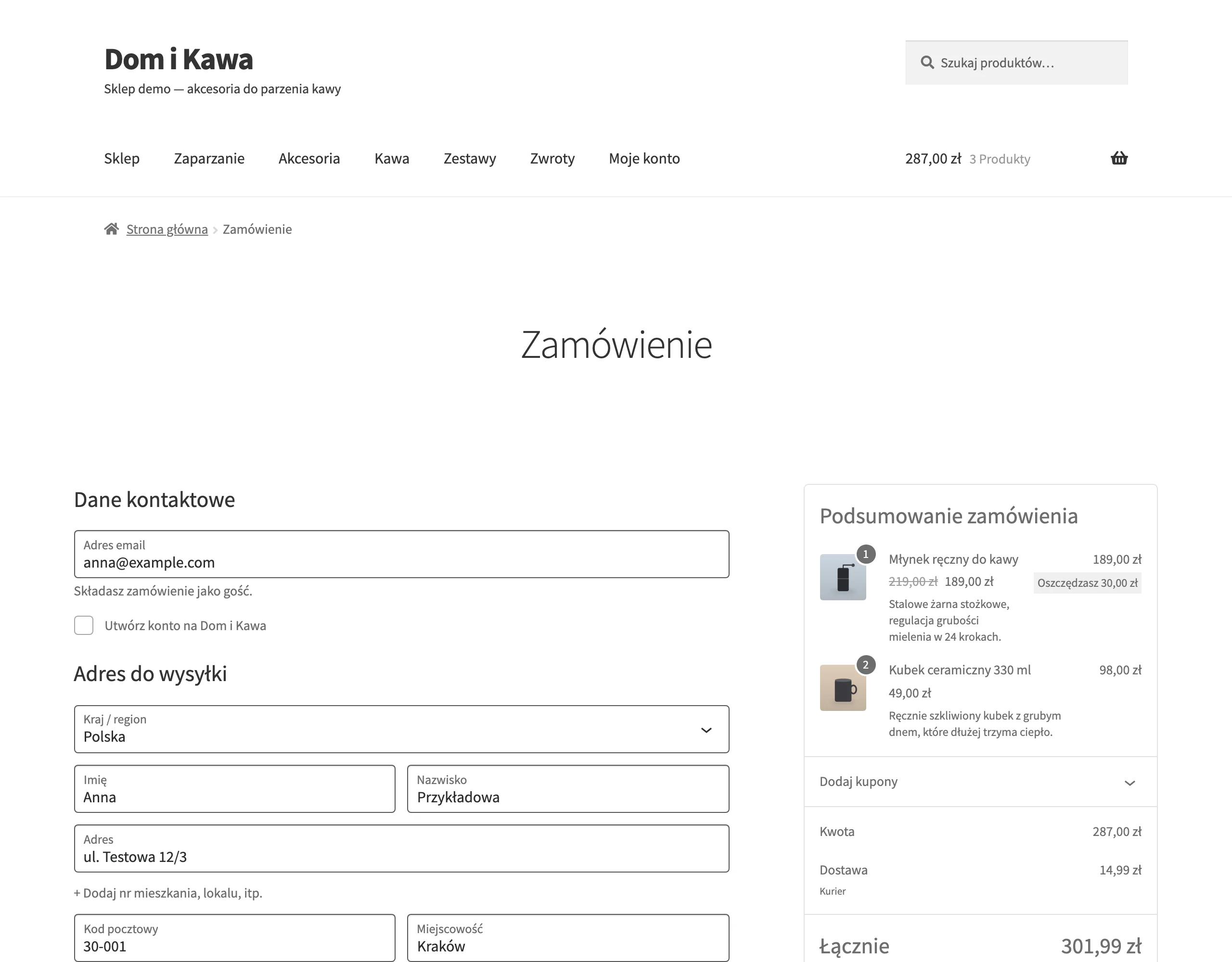
Unclear or hidden costs hinder order completion because they change the expected price just before payment. A user who has already accepted the product price suddenly sees an additional delivery cost, an unclear surcharge or no information about the total amount. This undermines trust and often triggers a simple reaction: abandoning the purchase.
This barrier is particularly dangerous because it appears at the moment of highest purchase intent. According to research by Baymard Institute, it is the most common cause of basket abandonment. For the store, this means lost sales even though the user has already completed most of the journey and was close to paying.
Most often, the problem results from a few specific communication gaps:
- surprise surcharges visible only in checkout,
- unclear delivery cost before going to the basket,
- no delivery date or too vague a description,
- no information about the free delivery threshold.
From the user’s perspective, it is not only about the amount of the cost, but also about predictability. A customer may accept paid delivery if they know about it in advance and understand the terms. If they only find out about it at the very end, they perceive it as a change of the rules mid-purchase.
The most sensible decision is to communicate the full terms even before checkout, on the product page, in the basket and on information pages. The cost and delivery time, available options and the free delivery threshold need to be shown clearly. This way, checkout does not become a place of unpleasant surprise, but the formal closing of the decision.
If a store suspects this problem, it should check at which step users most often leave and what they see just before abandoning. A large drop-off after showing delivery costs usually does not require guesswork, only clearer communication and a better order of information. This is one of those barriers that can often be reduced faster than rebuilding the entire purchase process.
The importance of guest checkout and avoiding forced account creation
The guest checkout option increases the chance of completing an order because it removes the obligation to register before payment. When a customer has to create an account, an additional task unrelated to the purchase appears. At this stage the user wants to complete the transaction quickly, not make a new decision about a password, login and consents. Every such requirement increases the risk of basket abandonment.
In practice, the best option is a clear choice: guest checkout or logging in for people who already have an account. The guest path should be fully functional, without hidden restrictions and without a worse experience. If the store wants to build an account base, the safest approach is to suggest creating an account after the order has been paid for. Registration after the transaction uses the data entered in checkout and does not add friction before payment.
A common mistake is hiding the option to buy without registration behind a small link or suggesting that an account is required for delivery. This creates uncertainty and can look like an attempt to force consent. Better are simple messages that explain the difference between logging in and buying without an account, and confirm that the order can also be tracked as a guest.
Performance and UX on mobile devices as a key checkout element
Performance and UX on mobile devices determine checkout, because on a small screen every mistake costs more. If subsequent steps load slowly, the interface jumps around or buttons respond with a delay, the user loses control of the process. On a phone, patience is lower, and abandoning the purchase takes one tap. That is why mobile issues reduce conversion faster than similar inconveniences on desktop.

In practice, you need to keep an eye on three areas: step loading time, visual stability and ease of interaction. Layout shifts, or CLS, cause accidental clicks and make the user’s focus wander. Poor interaction responsiveness, or INP, delays the response after a click and creates the impression that the system is not working. Just as important are appropriately sized fields, spacing between buttons and the correct keyboard type for a phone number or postcode.
Most losses appear when mobile combines performance problems with form errors. The user enters data on an awkward keyboard, wrestles with validation and waits to move on to the next step. If checkout on a phone is not fast and predictable, even a good offer and properly chosen payment methods will not close the sale. That is why improving mobile checkout usually starts with removing delays, screen jumps and elements that are hard to tap with a thumb.
What trust and security signals are essential in the purchasing process
Clear company details, secure connection HTTPS, readable return policies, payment information and credible reviews are essential. When these signals are missing, the user has no certainty about who they are handing their data and money to. In checkout, this uncertainty has the strongest effect, because the decision is already about payment. The effect is simple: hesitation increases and order completion drops.
These messages should appear exactly where the customer feels risk. Next to the payment form, it is worth showing transaction security, and next to delivery costs, the return, tracking and contact terms. Precise button labels and short explanatory messages about what will happen after the next step also work well. A common mistake is hiding the details in the footer or replacing them with icons alone, without explanation.
The role of analytics and problem diagnosis in optimising the checkout process
Analytics and diagnosis are the basis of checkout optimisation, because they show where and why users drop off. Without data, it is easy to improve visible things and miss the real sales blocker. A fall in conversion alone does not say whether the problem is costs, the form, mobile or an outage. Only measurement allows you to distinguish the symptom from the cause.
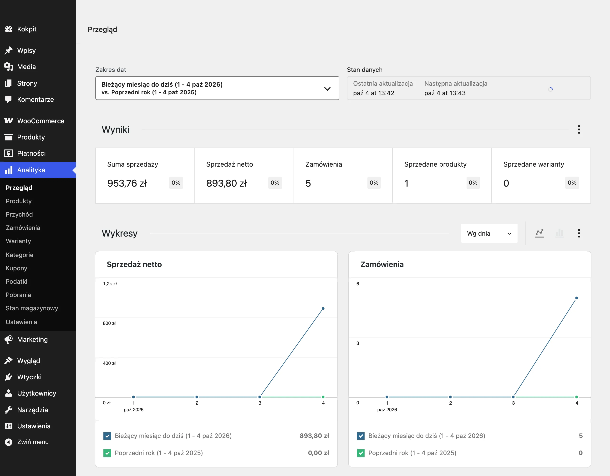
For quantitative data, it is best to start with the funnel in GA4 and the share of exits at each checkout step. If one screen has a clearly higher drop-off, that is where friction is being created. It is worth comparing mobile and desktop results, because the same stage can break differently. Where there are technical issues, you also need to catch timeouts, payment gateway errors and cases of cart loss.
Qualitative data explain exactly what is happening on the screen and why the customer gives up. Session recordings, heatmaps, usability tests and short surveys show the moment of hesitation or frustration. The best decisions come when the numbers point to the location of the problem and observation shows its mechanism. This makes it easier to distinguish bad validation from an unclear message or lack of trust.
Prioritising corrective actions to improve checkout performance
Prioritising corrective actions needs to be based on data about the impact of the problem, confidence in the diagnosis and ease of implementation. In practice, this means assessing tasks in a similar way to ICE or RICE models, rather than choosing changes based on the team’s opinion. First, you need to know which checkout step is losing the most users and whether the cause is confirmed in qualitative data. Only then can you sensibly set the order of work.
First, remove barriers that block payment or destroy the cart, because they stop sales immediately. This group includes timeouts, payment gateway integration errors, redirect loops, non-working discount codes and cart contents being lost after refresh. These faults do not reduce convenience; they interrupt the transaction. That is why they should always come before aesthetic tweaks and bigger interface overhauls.
Once outages have been fixed, it is worth implementing quick improvements at stages with high drop-off and a low cost of change. These are most often clearer delivery costs, a more visible guest checkout, simpler field validation and improvements to key mobile elements. These changes often reduce friction without rebuilding the whole checkout. A sensible order is first the issues with the broadest reach, and only then local improvements affecting a smaller share of users.
The platform’s technical debt has to be taken into account straight away, because it raises the cost and risk even of simple fixes. If the architecture makes deployments difficult, it is worth breaking some changes into smaller stages, while at the same time planning work at the source of the problem. Otherwise, the team will keep firefighting symptoms instead of improving the stability and speed of the purchase process. Well-set priorities protect the budget and make it possible to improve checkout where the business impact is most real.
FAQ
Frequently asked questions
How does checkout affect conversion and return on investment in an online store?
Checkout determines whether the user ultimately pays or gives up. A poor process reduces the return from organic and paid traffic, even if campaigns and product pages are performing well.
Why do hidden costs so often cause basket abandonment?
Because they change the expected price just before payment and undermine trust. The user often abandons the purchase when they only see an extra charge, delivery cost or a lack of full price information at checkout.
Does buying as a guest really increase the chance of order completion?
Yes, because it removes the need to create an account before payment. The customer can buy faster, without an extra task unrelated to the purchase itself.
Which mobile issues damage checkout the most?
Slow loading, layout shifts, delayed responses from elements and awkward forms hurt the most. On mobile, each such error ends in basket abandonment faster than on desktop.
Which trust signals should be visible in the purchase process?
It is worth showing clear company details, HTTPS, returns policies, payment information and credible reviews. The lack of these elements increases uncertainty and reduces the willingness to complete the purchase.
When is it worth starting to improve checkout in an online store?
First, when the data shows a clear drop-off at a specific step or technical errors. The priority should be issues blocking payment, and only then smaller usability improvements.