
lack of a clear value proposition (UVP) and its impact on conversion
A lack of a clear value proposition (UVP) lowers conversion because within 3–5 seconds the user does not understand “why you” and starts comparing price only. When the UVP is not clear, the customer has no reason to go further or add the product to the basket, even if the offer itself is attractive. The UVP should be visible above the fold, i.e. on the first screen without scrolling. Example messages focused on a real benefit include “Dispatch today by 14:00, 30 days to return, Makita parts in stock”.
The UVP works when it directly communicates an operational advantage (dispatch time, returns, availability), rather than relying on generic slogans. The sooner a customer sees conditions that reduce purchase risk, the less often they “run” to a comparison site. In practice, this means that promises such as “dispatch today” or “30 days to return” should be just as easy to spot as the price. If you sell an assortment where availability or compatibility matters, emphasising “in stock” and concrete details in the first view can decide the purchase.
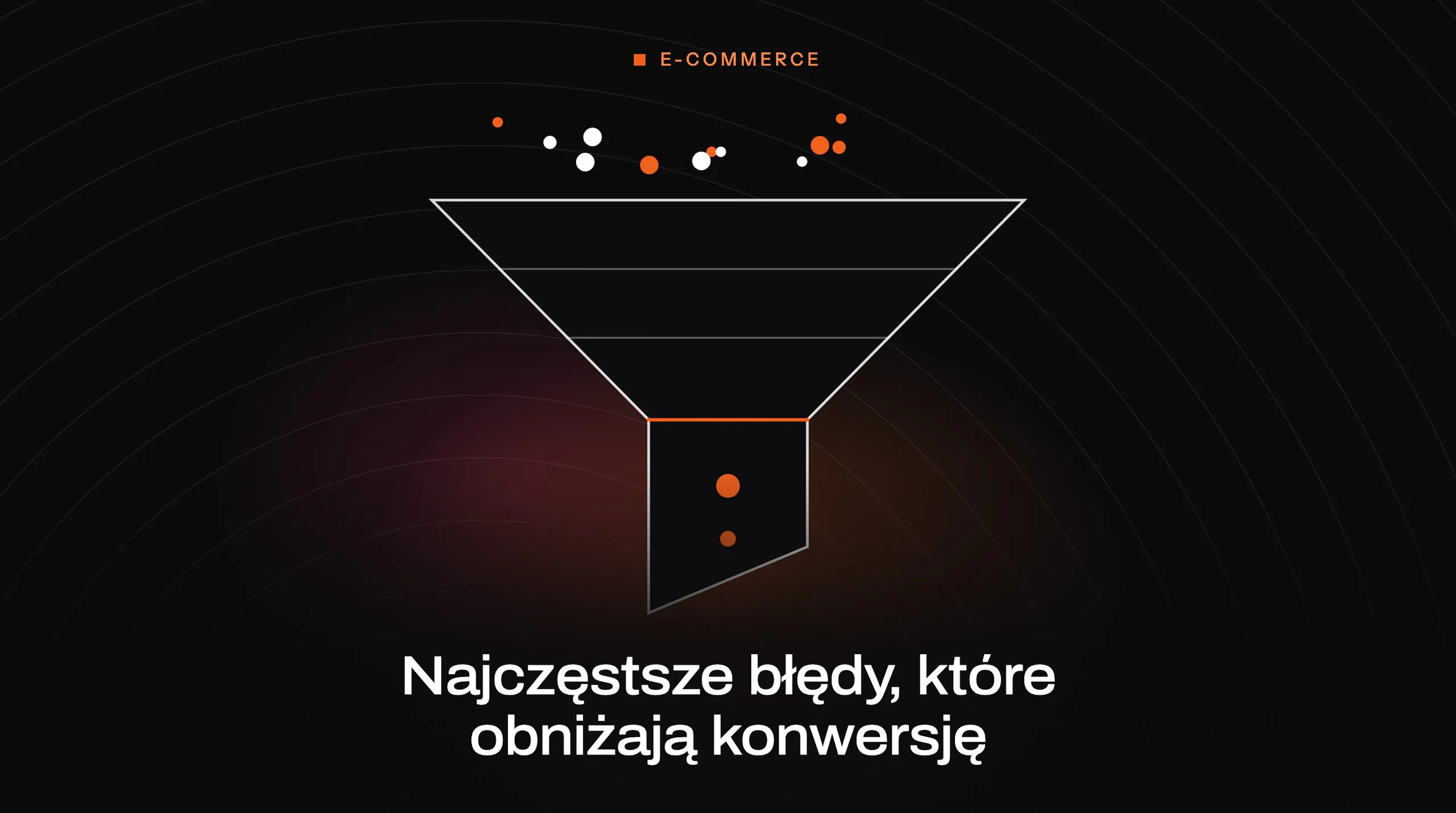
- 01Unclear UVPNo answer to “why you”
- 02Price comparisonThe customer only looks for cheaper options
- 03Lower conversionNo purchase and an exit
An operational advantage (e.g. fast dispatch, returns) must be visible above the fold to reduce purchase risk.
pricing strategies and the importance of margin optimisation
Pricing strategy affects sales and financial performance, because prices set incorrectly against the market and costs can generate orders at a loss or reduce conversion after later price rises. Undercutting prices without calculating CAC, delivery costs and returns is a common trap in online stores. A sensible starting point is to set a minimum margin and only then optimise price thresholds and promotions. It is also worth taking into account in both pricing and communication how delivery costs are perceived relative to the product price.
Set a minimum margin and test free delivery thresholds (e.g. 199 zł vs 249 zł) based on AOV and parcel cost, rather than “guessing” pricing. It is equally important that the customer does not only learn about additional charges at the final stage. An unclear delivery and returns policy and shipping costs revealed only in the basket increase the number of abandonments. The situation is especially damaging when delivery is disproportionately expensive (e.g. 24,99 zł for a product costing 39 zł), because then the purchase may be seen as “not worth it”. It helps to communicate delivery and return conditions already on the product page and to offer cheaper options such as Paczkomaty InPost.
Constant promotions such as “-20% all the time” weaken sales because they train customers to wait for a discount and pay less “later”. As a result, paid campaigns may bring in traffic that would have completed the purchase anyway over time, just more cheaply, at the expense of your margin. Instead of permanent markdowns, it is better to implement limited promotional windows, bundling (e.g. “set +10%”) and coupons only for the first order. Such a tactic supports profitability and reduces the risk of getting drawn into a price war.
Key UX elements in e-commerce that affect sales
Sales in e-commerce are most often blocked by UX that makes it difficult to find products quickly and make a decision. When the menu is too complex (e.g. 12 levels) or uses industry terms that are incomprehensible to a layperson, the user will not “guess” and will simply leave the store. In practice, it is worth limiting the main categories to 6–9 and testing naming against real customer queries (e.g. from chat or GA4 Site Search). Filters and sorting are equally important, because without them the customer will not narrow down the choice and drops off after several dozen seconds.
- Menu: clear category logic and a maximum of 6–9 main sections.
- Filters: including by size, compatibility, availability and price, as well as options such as “available immediately” and “shipping today”.
- Sorting: by default “most popular”, not “newest”.
- Search: typo and synonym handling plus autocomplete (e.g. Algolia, Doofinder, Elasticsearch) with reporting of no-result queries.
- Listing: consistent product tiles (price, availability, rating, key parameter and clear CTA).
- CTA: visible, high-contrast and as fixed as possible on mobile (sticky bar), with delivery information next to it.
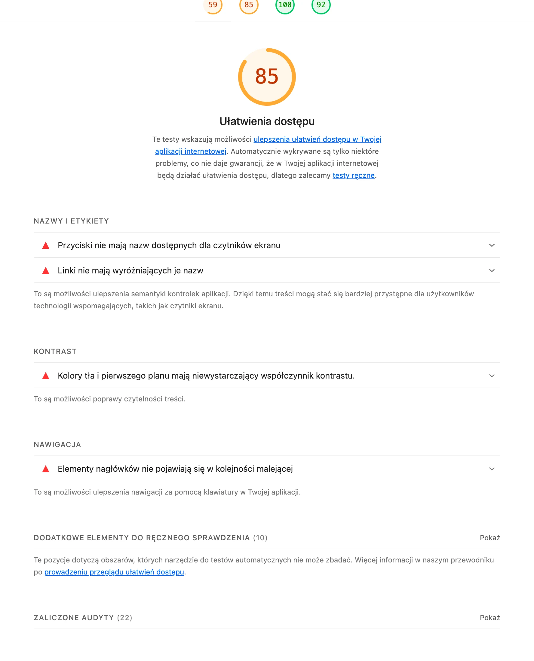
Conversion is also clearly reduced by poor mobile fit, because the user will not zoom in on tables or try to tap tiny checkboxes. Use large form fields, a one-column layout and test key views in Lighthouse/Chrome DevTools on 360×800 devices. Pop-ups and banners covering the content can immediately interrupt product browsing, so limit them to one per session and set the trigger after 30–45 seconds with a clear close button. Adding elements that support the decision (a comparison tool for up to 4 products, “favourites”, “recently viewed”, basket saving and “goes with” recommendations) shortens the path to purchase without adding pressure.
- 01Simplified navigationA maximum of 6–9 main categories.
- 02Intuitive namingClear to a layperson, not industry jargon.
- 03Effective filters and sortingThey make it easier to narrow down the choice quickly.
- 04Full mobile optimisationLarge fields, single-column layout.
Investing in clear, intuitive UX and a mobile version significantly increases conversion and prevents store abandonment.
The role of well-designed product pages and their impact on purchase decisions
A well-prepared product page genuinely increases the chance of purchase when it immediately clears up doubts about appearance, specifications and fulfilment conditions. Poor images (one shot on a white background, low quality, no context) do not answer the questions “how big is it?” and “what does it look like in use?”, leaving the customer with no point of reference. A sensible minimum is 5–8 photos, including close-ups of details and one shot showing scale (e.g. on a hand) or in a setting. The description and presentation should make it easier to compare models and use cases, rather than repeating the same manufacturer text that also appears at competitors.
Purchase decisions are often also hampered by a lack of specifics about availability and shipping, because a generic “Available” does not explain whether the parcel will go out tomorrow or only in two weeks’ time. It is worth providing clear messages such as “Shipping today (order by 14:00)”, “Delivery 1–2 days” and the number of items when stock is low. Hidden costs (e.g. cash on delivery, gift wrapping, “handling fee”) only revealed in the basket lead to abandonment, so the full set of options and surcharges (e.g. “cash on delivery +6.99 zł”) should be visible already on the product page. A clear specification and FAQ help when the customer is looking for specific information (e.g. dimensions, compatibility, composition), not marketing generalities.
Conversion is directly affected by the credibility of the product page, especially in the area of reviews and properly prepared variants. The lack of opinions acts as a risk signal, so it is worth actively collecting reviews via TrustMate, Opineo or Judge.me, marking “verified purchase” and displaying the average score and number of reviews. Variants (colour/size) should not be split into separate products without a shared page — it is better to use selectors, show differences in price and availability per variant and add hints such as “runs small”. When a product needs clarification, supplementary materials come in handy: a short 20–60 s video, a PDF manual, as well as certificates (CE, approvals) and warranty information gathered in one place.
The most common problems in the checkout process and how to eliminate them
The most common problems in checkout result from friction that slows down the purchase and increases the number of abandonments in the final stretch. Requiring an account to be created before payment can cut sales short, because the customer wants to buy “here and now”, so it is worth enabling guest checkout and suggesting registration only after the transaction (e.g. “set a password to track your delivery”). Equally often, an overly long form with additional fields gets in the way, generating mistakes and discouraging users. Leave only the data necessary for delivery and invoicing, and validate it in real time (e.g. postcode, NIP).
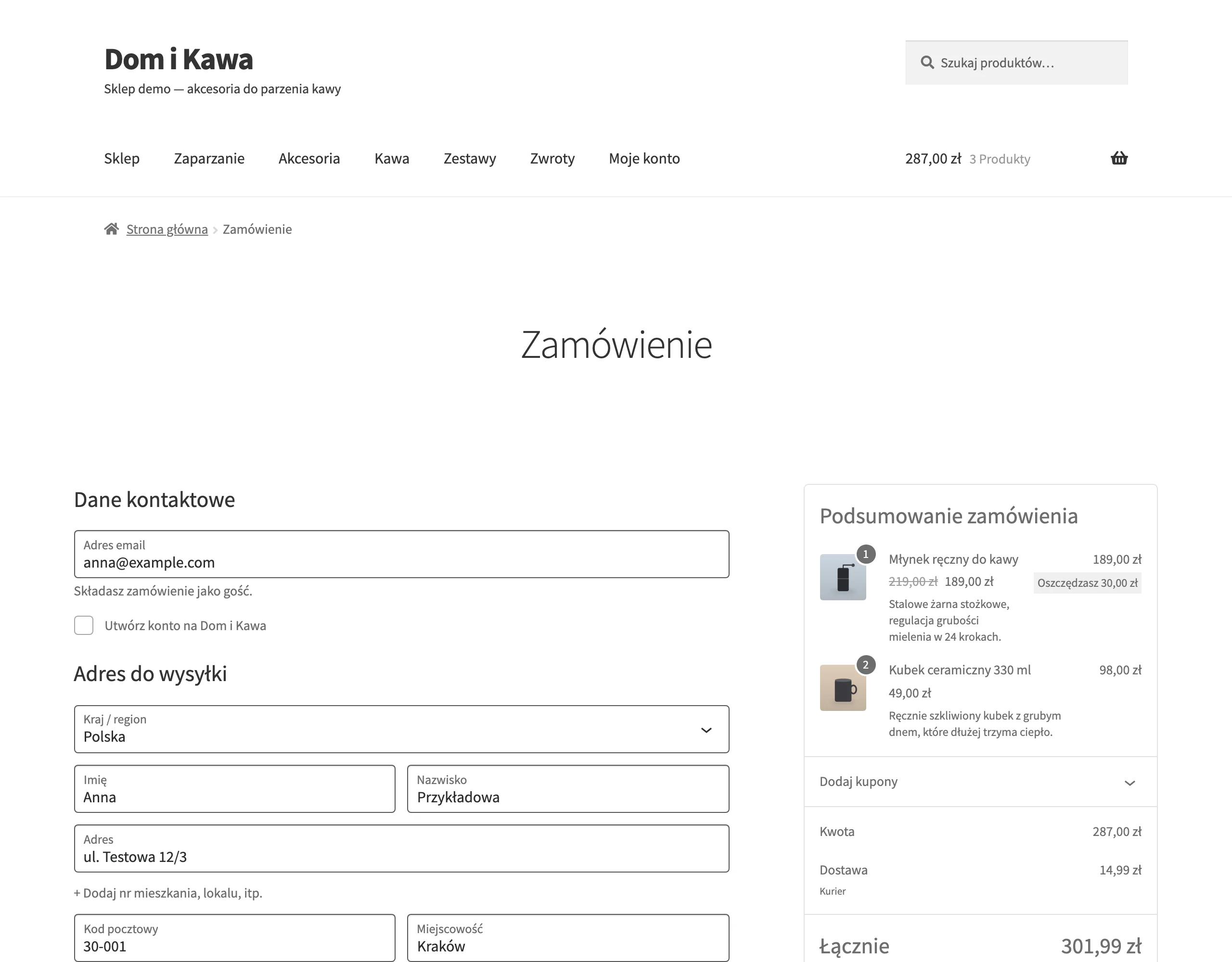
Checkout also stops working commercially when delivery and payment methods are hidden until the very end, because the user wants to check earlier whether Paczkomat and BLIK are available. It is worth showing the available options already at an earlier stage of the purchase journey and automatically sorting them by popularity (e.g. BLIK, Przelewy24/PayU, card, Apple Pay/Google Pay). The sooner the customer sees their preferred delivery and payment method, the lower the risk that they will abandon the form halfway through. If the store offers only a traditional bank transfer, it loses mobile and impulse users, which is why BLIK and gateways such as Przelewy24, PayU or Tpay are standard.
Sales can also be blocked by technical errors in checkout, such as timeouts or incorrect post-payment statuses, which increase the number of complaints and reduce the willingness to return. Monitor incidents in Sentry/Datadog, test return scenarios from the payment gateway and send automatic e-mail/SMS confirmations so that the customer is not left without information. Equally important is a clear summary and quick cart editing. Changing the quantity, variant or removing a product should work without having to go back steps. Add a clear cost breakdown (products, delivery, discount, total) and information on fulfilment time for each item.
Conversions are also reduced by poorly working discount codes, because a coupon field without clear rules easily generates frustration when it “doesn’t work”. Show the coupon conditions (minimum basket value, exclusions) and error messages in plain language, and where possible consider automatic promotion application instead of codes. For higher-value baskets (500–5000 zł), the lack of instalments or deferred payment can be critical, because the customer compares the monthly amount rather than the total price. In such a situation, it is worth adding PayPo, Twisto or instalments via PayU/Przelewy24 and communicating this option on the product page (e.g. “from just 79 zł/month”).
- 01Account creation requiredAllow guest checkout
- 02Too long a formLeave only the necessary details
- 03Hidden payment and delivery optionsShow options at the start
Simplifying the purchase path and eliminating friction increase conversion, ensuring a smooth customer flow.
Building customer trust through transparency and legal compliance
Customer trust is built on transparent company information, clear shopping rules and consistent messages that reduce the sense of risk. When the user cannot see the tax identification number, address and phone number, they are more likely to assume fraud and not complete the order, which is why the details should be in the footer and on the “Contact” page together with opening hours and a response-time statement (e.g. “we reply within 2 h”). Visible company details and real contact are one of the quickest ways to reduce payment anxiety. Credibility is also strengthened by social proof signals: Google ratings, Trusted Shops or Allegro (if relevant), as well as communication of the number of completed orders (e.g. “over 120,000 shipments”).
Legal transparency works best when the terms and conditions and returns policy are written clearly and make it easy to find answers to the most common questions. Customers want to know, among other things, how much time they have to return an item, who covers the shipping cost and whether a used product can be returned, so it is worth placing a short, simple summary of the rules on the product page and in the basket (e.g. “30 days to return, return via Paczkomat”), while making the full documents available as an expansion. In many sectors, information about warranty and complaints is equally important, namely who the guarantor is: the manufacturer or the seller, how long the process takes and how to submit a claim. A “Warranty and complaints” section works well, with the steps described, a response time (e.g. 14 days) and the possibility to submit a claim online.
Trust can vanish in a few seconds because of security gaps, which is why the store should work without browser warnings and with correctly implemented HTTPS. It is worth checking whether the SSL certificate is valid and correctly configured, and whether payments are handled by a trusted gateway with 3D Secure for cards, because this directly affects the readiness to complete payment. It is equally important to avoid manipulative practices (dark patterns), such as a countdown saying “2 minutes left” without justification or hiding marketing consents under a checkbox. Instead, it is better to use honest messages: actual stock levels, a real shipping deadline and clear opt-in consents.
GDPR compliance supports sales when marketing consents are not forced and remain separate from the purchasing process. If checkboxes are pre-ticked by default or consent is a condition of purchase, the risk of complaints rises and conversion falls due to a lack of transparency, so use separate consents and do not mix them with marketing. When selling internationally, trust is also weakened by the lack of specifics regarding delivery costs and times as well as potential import charges. Provide the rates, countries, estimated time (e.g. DE 2–3 days DHL) and information about any customs/VAT costs, so that the customer does not fear “surprises” after placing the order.
Effective use of data and analytics to optimise conversion
Effective use of data and analytics to optimise conversion means that you measure every key stage of the purchase journey and see at which point sales are actually “leaking” away. Without correctly configured events in GA4, such as add_to_cart, begin_checkout, purchase and payment errors, it is difficult to assess whether the problem lies in the offer, UX or the checkout itself. The foundation is implementing e-commerce in GA4, debugging in DebugView and comparing funnels by device and traffic source. Only then can you reliably assess which changes genuinely improve conversion and which merely “look nice”.
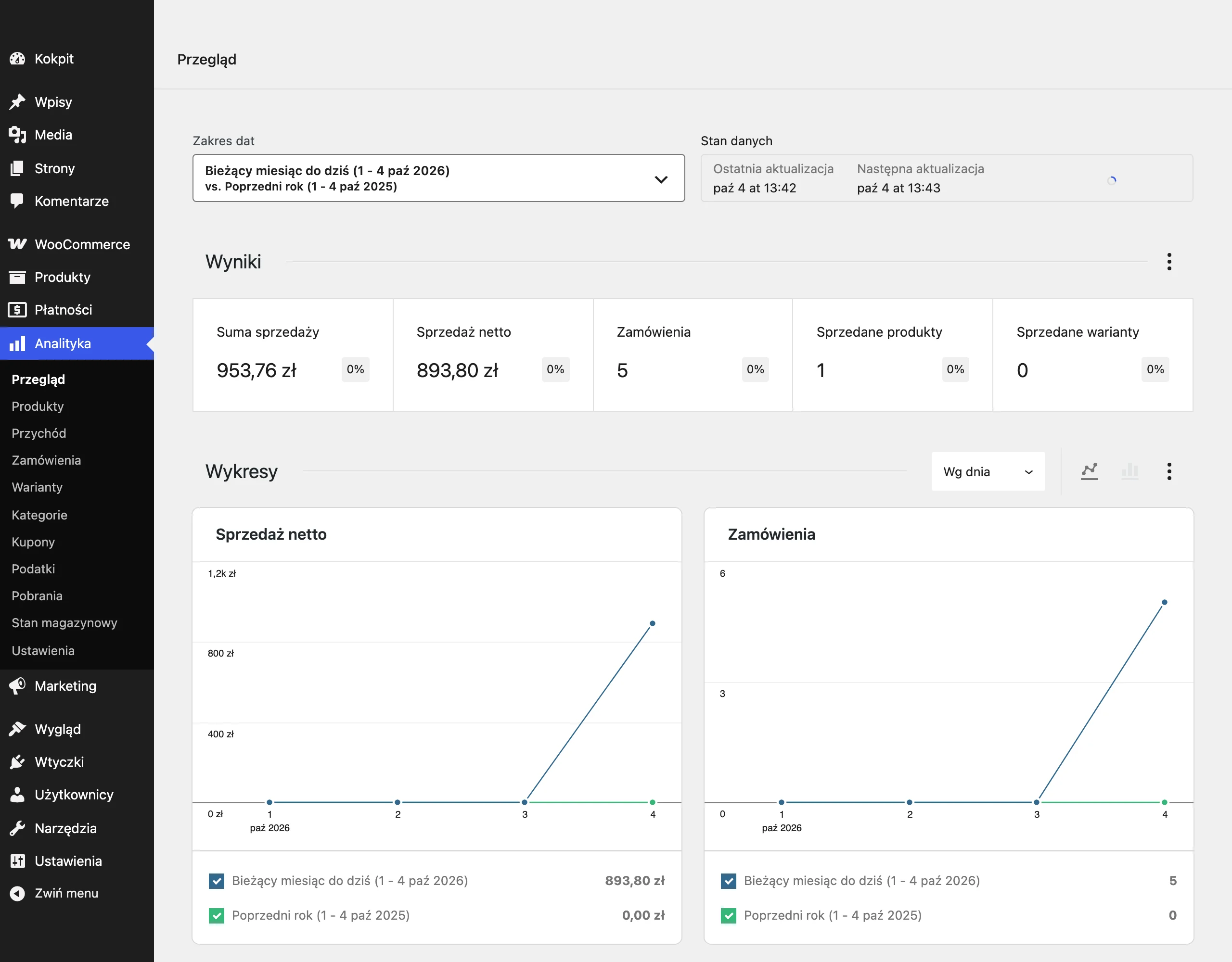
Conversion rate optimisation runs more smoothly when you analyse basket abandonment together with its causes, rather than looking only at the metric itself. Gather reasons using a short exit-intent survey (e.g. in Hotjar) and verify at which stage of the checkout conversion clearly drops off, so you do not have to guess whether the obstacle is delivery, payment or the form. Insight into real behaviour is provided by heatmaps and session recordings in Hotjar, Microsoft Clarity or FullStory, because they often reveal friction such as confusing filters or hidden CTAs. Such data makes it easier to prioritise fixes where the return will be greatest.
- Measure the full funnel in GA4: add_to_cart, begin_checkout, purchase and payment errors.
- Verify implementation and events in GA4 DebugView to rule out measurement gaps.
- Analyse basket abandonment with an exit-intent survey (e.g. Hotjar) and identify the critical drop-off stage.
- Use heatmaps and session recordings (Hotjar, Microsoft Clarity, FullStory) to see where users get “stuck”.
- Segment the results (mobile vs desktop, new vs returning), because average conversion can hide significant issues.
- Check data quality (e.g. duplicate transactions, missing currency) and verify consistency with the payment/ERP system.
Insights from the data translate into sales growth only when they are tested consistently and implemented on an ongoing basis. Instead of “gut feeling” decisions, test changes in VWO, Optimizely or Convert (e.g. sticky CTA on mobile, the order of payment methods, the free delivery threshold), because even a small UI tweak can improve or worsen results. Set a fixed optimisation rhythm: funnel analysis every week, 1–2 tests every month, and every quarter an SEO audit/UX review and a review of ad feeds. At the same time, it is worth tying operational KPIs to sales (response time of support, on-time delivery, return rate, cancellations, NPS/CSAT), because “post-purchase” problems rebound as a drop in conversion and LTV.
Using SEO and content marketing to increase organic sales
Using SEO and content marketing increases organic sales when the category structure and content are matched to user intent at the pre-purchase stage. Cannibalisation (when several subpages compete for the same keyword) limits visibility because Google does not have a clear signal about which page to show. The solution is to build a category tree, assign unique intent to each page and use internal linking to the “main” category. Such organisation supports more stable organic traffic on subpages that actually sell.
Sales from SEO are also limited by duplicate content in product descriptions and filters, because it generates thousands of similar URLs and disperses authority. If filter combinations get indexed or descriptions are copied, the risk of wasting crawl budget and losing rankings increases. Use canonicals, set noindex for filter pages and prepare unique descriptions for key categories and bestsellers. This helps keep the index tidy and directs visibility to the most important pages.
CTR and the quality of traffic from search results improve when you implement structured data and strengthen internal linking to products and categories. Implement Schema.org markup (Product, Offer, AggregateRating) in JSON-LD and validate it in Google Rich Results Test and in Search Console, so you do not lose rich snippets (price, availability, stars). At the same time, refine the link architecture. Sections such as “related”, “frequently bought together” and links from guides to specific products and categories help new products gain rankings, even if the descriptions are already polished. The content should answer questions such as “how to choose”, “what size”, “model comparison” and direct users to products in stock through clear CTAs.
The SEO effect gains further strength when you keep technical basics and snippet quality under control, instead of leaving them to automation. Deleting products without redirects ends in 404 errors and the loss of traffic and links, so use 301 redirects to substitutes or categories, and for discontinued products keep a page with alternatives and the option to sign up for a notification. Meta title and description are worth writing with the keyword and a clear benefit (instead of “Category – Shop”), and headings on pages should be unique. If you have a showroom or click and collect, add a local page, Google Business Profile and information about opening hours and parking to capture “right now” queries.
FAQ
Frequently asked questions
How does a lack of a clear value proposition affect e-commerce sales?
If a customer does not understand within a few seconds why they should buy from you, they start comparing only the price and often leave the store. The UVP should be visible above the fold and immediately show a real benefit, such as delivery time, returns or availability.
Can underpricing reduce the profitability of an online store?
Yes, if you do not factor in CAC, delivery and returns, you may be selling at a loss despite a high number of orders. That is why you first need to establish the minimum margin and only then test prices and promotions.
Why do hidden delivery costs increase cart abandonment?
Because the customer wants to know the full purchase cost earlier, not only at the end of the process. If delivery is too expensive or fees appear in the basket, the purchase often seems not worth it.
Which UX mistakes most often block sales in an online store?
The biggest problems are overly complex menus, unclear category names, no filters and a poor search function. Other issues include poor mobile fit and intrusive pop-ups covering the content.
What should a good product page include to increase conversion?
It should include several photos, specific information about availability, delivery, variants and extra costs, plus a clear description. Reviews, FAQ, specifications and supporting materials are also important if the product requires them.
Which checkout elements most often cause purchase abandonment?
Mandatory account creation, too long a form, hidden payment methods and a lack of popular options such as BLIK or Paczkomaty usually hurt the most. Technical issues, incorrect post-payment statuses and unclear discount codes also reduce conversion.