

A category page can genuinely help with purchase decisions. The condition is simple: it organises the offer according to how the user actually chooses a product, not according to how the store menu is laid out. For many people, this is exactly where the decision is made whether to narrow the selection, compare variants, or click through to a specific model. A well-designed category shortens the path to a decision because on the first screen it shows the differences between options and guides the user through the key selection criteria. If the user has to open several product tabs to understand the basic differences, the category page is not doing its job. And that matters not only for convenience. It is also SEO, conversion and the quality of traffic from campaigns, in other words money spent sensibly or wasted in vain. In practice, the most depends on the logic of the filters, the quality of product data and whether the content supports the choice rather than merely “describing the category”.
What a category page that supports purchase decisions is
This is not a standard listing. A category page that supports purchase decisions works as an intermediary layer between the product list and the product page and helps the user choose the right variant. It is not only about displaying all items from a given group. The key is to organise the offer around intent and the real selection criteria that matter at the point of purchase.

In practice, such a page answers specific questions. How do the available options differ, which variant suits a given use case, which parameters are really important and for whom a given type of product makes sense. The category name alone will not solve that. What is needed is short explanations of the purchase goal, clear divisions, filters based on actual attributes and sorting that does not muddle things up but organises them.
The core of this page is fairly predictable. It usually consists of a clear category title, well-described filters, logical subcategories, comparison elements and supporting content. These may be short sections such as “how to choose”, “for whom”, “key differences” or links to buying guides. The best category pages do not try to say everything, only quickly eliminate unsuitable options and show what is worth comparing.
It all comes down to the data. The effectiveness of such a category depends mainly on the quality of product data, because that is what feeds the filters and comparisons. If the attributes are incomplete, inconsistent or named differently across systems, the whole “logic” starts to fall apart and the user loses trust. Without organised data, it is impossible to build a category that genuinely helps the user choose, because they are given chaos instead of guidance.
From an implementation point of view, this is not solely a job for a copywriter or UX designer. Such a category requires several layers to be connected at once: information architecture, filter logic, sorting rules, content that supports choice, internal linking, product data and interaction analytics. Only together do they form a page that not only captures traffic, but also leads to a purchase decision instead of ending with helpless scrolling.
Current trends and user expectations
The trends are clear. Users want help choosing already on the category page, without having to click through to successive product pages. This is especially visible in categories where products look similar but differ in a few parameters that are crucial for the purchase. Today, a product list alone increasingly does not deliver, because the user wants to understand the differences in a minute and narrow the selection straight away.
This is most visible on mobile devices. A small screen does not forgive, so it forces simpler filters, shorter content blocks, a better order of information and fast page loading. On mobile, the categories that prioritise the most important decisions win, rather than trying to display everything at once.
The role of categories in SEO has also changed. For many generic and semi-specific queries, the category page is often the best landing page because it addresses the need for comparison and initial selection. The problem starts when the store indexes too many filter combinations, has weak internal linking or publishes generic texts that do not lead to a decision. The question is: does this category help the user choose, or does it just take up space in the index.
The quality and consistency of data across systems are becoming increasingly important. There is no room for halfway measures here. Variant names, technical parameters, prices, stock levels, bestseller labels or comparison data must match between the product feed, the CMS and the shop engine. If the user sees different information in the filter, on the listing and again on the product page, trust drops rapidly.
In practice, the quality of a category is increasingly determined not by the team’s opinion but by behavioural analytics signals. And that is not a cliché. You need to check which filters are actually used, where empty results appear, how often users return from product pages to the listing and whether they click the advisory sections at all. If users ignore the filters or often land on no results, the problem usually lies in the category logic rather than in the traffic itself.
How the purchase decision model works on category pages
The purchase decision model on a category page works simply. It turns the user’s questions into filters, sorting, comparisons and short supporting content. Instead of showing only a collection of products, the category is meant to lead to an answer: which variant fits, how the options differ and what can already be ruled out at this stage. That is why a good category is a decision layer between the listing and the product page, not decoration.
The first step is to identify what people really use to choose a product in a given category. Only then does the filter layout make sense. You take into account search intent, customer service queries, sales data, keywords from the internal search engine and the points at which users abandon their selection. If you do not know which 2-4 criteria really determine the purchase, filters usually become just a technical add-on.
Once the main criteria have been defined, the real work begins. They need to be assigned to specific elements of the page, otherwise they will remain just a nice note in the brief. Some criteria should work as filters, others as default sorting, and still others as a short section that explains the differences between variants. For example, compatibility, size or use case should often be visible straight away, not hidden only on the product card.
Then comes the time for category architecture. This is not a cosmetic issue, but a decision about where the user should actually land. Not every combination of filters deserves its own page, but some of them should get a separate URL if they match a separate intent and have a sufficient number of products. Separate filter pages make sense only when you can maintain a unique heading, sensible content and real value for the user. Otherwise, you are only creating empty expansion that helps nobody.
UX reduces the decision model to one thing. Priorities of information. The most important filters must be at hand, the number of results should update clearly, and the user must immediately understand what a given choice delivers. Whether clicking a filter changes the list, or only promises a change. In practice, short modules such as “how to choose”, “for whom” or “key differences” work well, inserted above the listing or between products, wherever the eye naturally goes anyway.
All of this rests on data. And that is not a cliché. If attributes are inconsistent, variant names differ between systems or there are no parameters for comparison, the category loses credibility faster than you can update the copy. Without organised data, you cannot filter, sort or compare products properly. And without fair comparison, everything else is just decoration.
At the end, the SEO and analytics layer comes into play. The key thing is to decide consciously which categories and filter combinations should be indexed, set canonical tags, breadcrumbs and internal linking, and make sure pagination or infinite scroll is handled properly. After that, you stop guessing and start checking. You measure filter usage, clicks through to product cards, returns to the listing, exits after no results, and the impact of the category on assisted conversion, because only these data clearly show whether the decision model works in practice.
Practical steps for implementing an effective category page
Implementing an effective category page starts with one question. What specific decision should the user make here. It may be narrowing the selection, choosing a budget, confirming compatibility or quickly comparing several product types. Without that decision, filters, content and default sorting start to live their own lives, and the user gets chaos instead of a signpost.
- Define the main choice scenario in the category and 2-4 key decision criteria.
- Check whether the product data actually allows those criteria to be shown and sensibly filtered.
- Arrange filters by value to the user, not by the order of fields in the system.
- Match the default sorting to the purchase intent instead of leaving it to chance.
- Add short supporting modules: differences between variants, use cases, typical selection mistakes.
- Implement event analytics for filters, sorting, no results and transitions to product cards.
First choose one decision that the user should make, and only then design the interface. It brings order to thinking. Suddenly you can see which filters genuinely help to narrow the choice and which ones only take up space and attention. In many shops, the problem is not a lack of options, but a terrible hierarchy and labels that sound like a service manual.
Filters must grow out of the customer’s language, not out of a table in the PIM. If a parameter matters but is written in engineering language, translate it into a simpler criterion or add a short explanation. This is especially important in technical categories. The user usually knows why they are buying, they just do not always know the manufacturers’ vocabulary.
Default sorting should support the buying scenario. Sometimes popularity or best-rated products win, at other times price, newness or use case. Default sorting should not result from the shop engine settings, but from the way the user makes a decision. Because what is the point of the system “liking” one setting if the customer is looking for something completely different.
You can also plan landing pages for selected filter combinations, but only where there is a separate intent behind them and a sensible number of products. This works for SEO and paid campaigns, as long as the page genuinely responds to a specific need and does not pretend that it does. Do not index all facets automatically, because it most often ends up in duplication, poor page quality and internal linking issues.
An effective category must cope with edge cases. No results after filtering should suggest what to change, an overly broad list should prompt further narrowing, and where data is missing you need to state honestly where the comparison breaks down. The user cannot end up at a dead end just because the system does not have complete attributes. They should not have to guess.
In the end, what matters is the maintenance process, not a one-off implementation. Products change, variants are added, stock rotates, attribute names evolve and customer questions change, so the category logic has to keep up as well. Measure not only sales, but also filter usage, zero-result states and returns to the listing, because these most often show where the purchase decision gets stuck. The data clearly shows whether a filter helps or merely looks “professional”.
Challenges and risks related to optimising category pages
The biggest risks in category page optimisation are prosaic, and that is exactly why they hurt. It is data quality, broken filtering logic, SEO conflicts and user overload. In practice, most problems do not come from the listing’s appearance itself, but from the fact that the shop does not have organised attributes and consistent variant names. If one product has the parameter “capacity”, another “volume”, and a third has none at all, the filter stops being reliable. Without organised product data, you cannot filter, sort or compare properly.
The second risk is building filters around the system structure, rather than around how the customer makes a decision. The user does not want to click through a dozen technical parameters they do not understand, but to narrow the choice quickly to sensible options. There should therefore be fewer filters, but they need to answer real purchase questions: use case, compatibility, budget or level of expertise. Too many filters usually do not help; they only slow down the choice and increase the number of abandonments.
On the SEO side, the most common problem is uncontrolled indexing of pages filtered by parameters. When every combination of filters gets its own URL, it is very easy to end up with duplicate content, diluted link equity and the indexing of pages that do not deliver business value. The solution is not to block everything, but to choose only those combinations that have their own intent, sensible demand and a sufficient number of products. Then it is possible to prepare a unique heading, title, copy and internal linking for them.
The risk also concerns UX itself, especially on mobile. A complex category with long descriptions, a large number of badges, heavy modules and a fragmented filter layout quickly becomes simply inconvenient. The user should immediately see where to narrow the choice, how many products meet the criteria and how the key variants differ. On a phone, prioritisation of content wins, not quantity.
You also need to keep an eye on edge cases, because they are what most often undermine the decision-making process. No results after filtering, incomplete product data, the unavailability of bestsellers or default sorting based on random rules can stop the user despite a good offer. What is someone supposed to do then, when they land on an empty listing. The category should suggest the next step: loosening the filters, moving to a similar subcategory, changing the sorting or choosing an alternative product variant. No results must not be a dead end.
A separate challenge is maintaining the results after implementation. A category page does not work well once and for all, because the offer changes, new variants are added, and some attributes simply become outdated. If there is no collaboration process between SEO, UX, e-commerce, content and the person responsible for the product feed, the category loses coherence over time. In practice, the greatest damage is done by small inconsistencies that build up over months.
How to measure performance and optimise the purchase process
The effectiveness of the page category is measured by whether it helps users move faster from entry to the right choice, not just by the sale at the end of the journey. Conversion on its own is often too broad a metric, because it does not show where the user got stuck. The key is checking whether the category genuinely narrows the choice, makes comparison easier and leads to the right product pages. A good category shortens the route to the decision, even if the purchase is completed later.
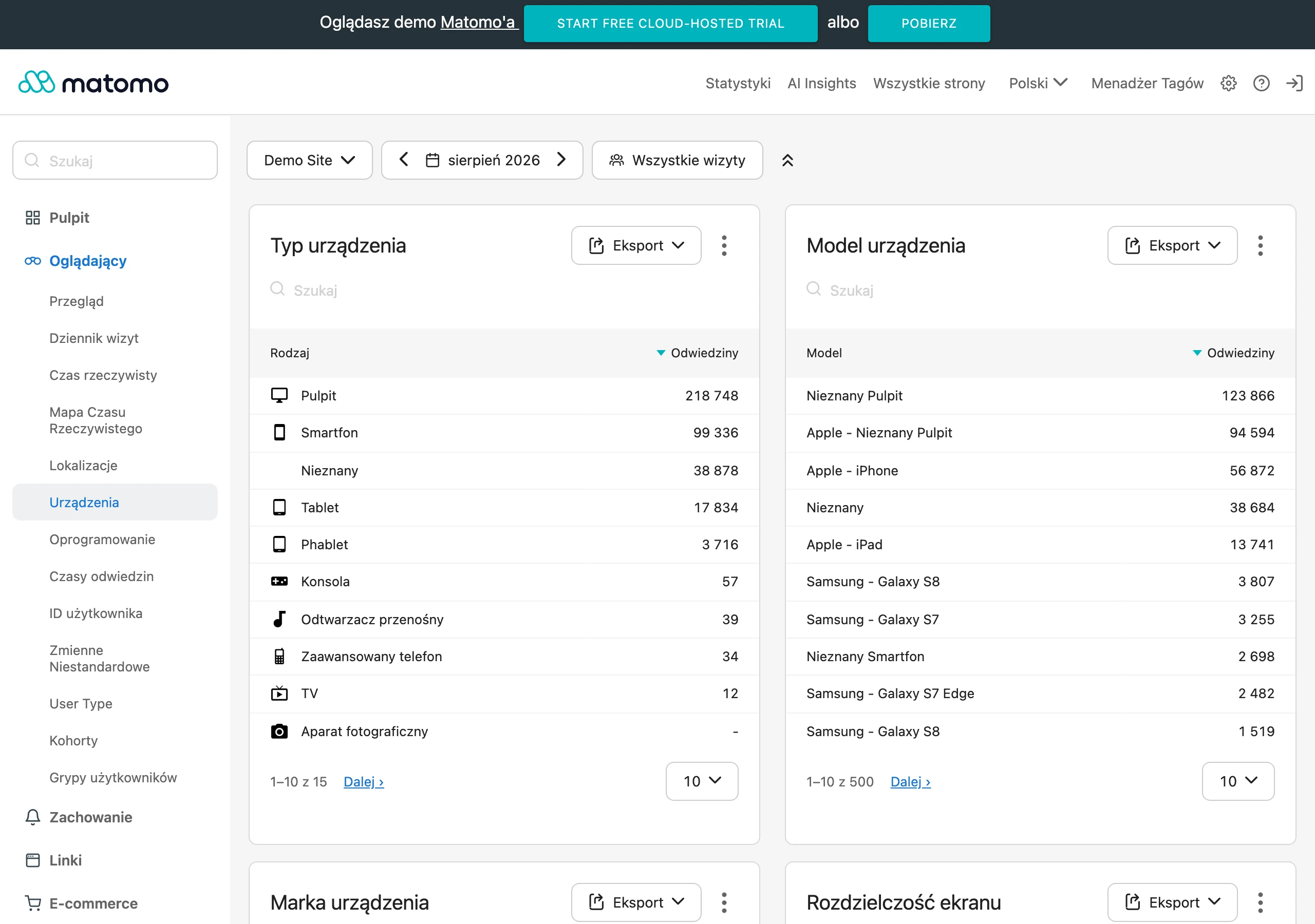
The most telling metrics are the behaviour metrics within the category itself. They reveal whether the choice process is clear or whether it feels more like wandering through a labyrinth. In practice, it is worth monitoring regularly:
- filter usage and the order in which filters are applied,
- the frequency of zero results after filtering,
- CTR from category pages to product pages,
- interactions with sorting,
- returns from the product page to the listing,
- exits from the category without further action,
- the share of categories in assisted conversions,
- organic visibility for category and subcategory queries.
These data should be read in the context of a specific category, not averaged across the whole shop. In one section, frequent filter clicking is natural, while in another a quick move to a few best-matching products wins. The question is whether you are comparing similar behaviours or mixing them all into one bucket. That is why it makes sense to break the analysis down by device, traffic source, new versus returning users and category type. The same layout can work well on desktop and clearly worse on mobile.
Start optimisation where the user loses confidence in their choice. If many people open products but then return to the listing, it usually means one thing: the category does not clearly communicate the differences between variants, so the customer looks for “the right” information only on the product page. If no results appear often, the problem is that the filters are too strict, in the wrong order or the attributes are poorly mapped. If organic traffic is coming in, but clicks through to products are weak, the category copy and layout are probably misaligned with the entry intent.
Iteration works best. Instead of rebuilding everything at once, you change one element, measure the effect, and only then touch the next layers. First you improve the logic of the filters or the default sorting, then you check the impact on behaviour, and only later do you work on the content or the layout of advisory blocks. That way you know what actually delivered the result and what was just painting the walls. It is not worth rebuilding an entire category without measurement, because then it is hard to distinguish improvement from coincidence.
In the end, you still need to connect analytics with operational decisions. If users often filter by a parameter that many products have not filled in, that is not a UX issue, but a lack of data in the feed. If a particular combination of filters generates good traffic and sales, it may deserve its own landing page. The data clearly shows that effective category optimisation does not end at the interface, but also includes data, technical SEO and the day-to-day maintenance of the offer.
FAQ
Frequently asked questions
How can a category page help with a buying decision?
It helps when it turns user questions into filters, sorting, comparisons and short supporting content. This enables the user to narrow down the choice more quickly and see which variant makes sense.
Is a product list alone enough for a user to choose a product?
No, because a list alone often does not show the key differences between options. If several product tabs have to be opened to understand the basic parameters, the category is not doing its job.
What elements should a category page have to support product choice?
It should have a clear title, well-described filters, logical subcategories, comparison elements and short “how to choose” or “for whom” content. Links to buying guides and clear sorting are also important.
Why is product data quality so important on a category page?
Because data powers filters, comparisons and sorting. If attributes are inconsistent or incomplete, the user gets confusion instead of clear guidance.
How do you decide which filters should be included in a category?
First, you need to check which criteria people really use to choose a product: search intent, questions to support, sales data and internal search terms. Usually only the 2–4 most important criteria matter.
When is it worth creating separate pages for filter combinations?
Only when a given combination corresponds to a separate intent and has a sensible number of products. Such a page must have a unique heading, content and real value for the user.