
Buying guides sell when they lead the user from doubt to choice, rather than just serving up general information. In practice, they are a bridge between informational traffic and a shop’s or service site’s offer, that is, the place where curiosity has a chance to turn into a decision. A well-prepared guide organises the selection criteria, explains the differences between variants and shortens the time needed to make a decision. The greatest value comes from a guide that does not stop at education, but clearly directs users to the right category, filter or product. This does not happen by itself. It requires tying content together with the site architecture, UX, SEO and analytics so the reader does not get stuck halfway through. This article is precisely about how to do that in practice and without wasting traffic.
What are buying guides and how do they affect sales?
Buying guides are content that help the user choose the right product when they know their problem, but do not yet know which variant will be best. This is not a typical blog post or category description, because it does not end with talking about the topic. Their job is to lead the audience through the selection criteria and bring them to a specific purchase decision.
In sales, they act as an intermediary layer between looking for information and landing on a product page. Users often enter not the model name, but questions such as “what equipment for a small flat”, “what to look for when choosing” or “how do the variants differ”. A good guide captures that traffic, organises the topic and sends people on to the right category, filtering or specific offer. This means the site does not lose the user at the hesitation stage, when the decision is still not closed. That is the moment when it is easiest to lose them, because they already have intent, but lack certainty.
The impact on sales does not come from the mere fact of publishing a text. The key is whether the guide contains mechanisms that support choice: a clear indication of use cases, a comparison of key parameters, a description of differences between quality levels and logical transitions to products. If the reader understands what they need and can immediately see where to find it in the offer, the chance of the next step in the buying journey increases, instead of a return to the search results.
In practice, a guide can reduce abandonment caused by uncertainty. Many users do not give up because they do not want to buy, but because they do not know which variant to choose and are afraid of making a mistake. A guide reduces this problem only when, instead of general descriptions, it answers real dilemmas. When it is worth paying extra, which parameters matter, which are secondary, and for whom a given type of product makes sense.
From the site’s perspective, such content also supports SEO and internal linking. It attracts visits from problem-based and comparative keywords, and then strengthens sales pages through sensible, contextual links rather than random referrals. The most common mistake is that the guide educates, but does not lead to the offer, so it generates traffic without any real impact on the sales result. And that is not a detail, but the difference between text that works for sales and text that simply “exists”.
What questions should effective buying guides answer?
A good buying guide should catch the moment of hesitation. That is when specific questions appear: what to choose, how to match the product to the use case, how the variants differ and when paying extra makes sense. This is not knowledge to be ticked off. It is a set of doubts after which the user already wants to move on to comparison, filtering or simply buy.
The strongest guides work on informational and transactional intent. And that is not a cliché. The content should explain the topic only as much as is needed to close the decision, rather than building a lecture from scratch. If someone is looking for an answer just before buying, they do not need broad theory, but a practical distinction: which type of product fits their situation, which parameters are the minimum, and what compromises the cheaper and more expensive choice bring.
- Which product will work in a specific use case, conditions or at a given level of usage intensity?
- Which parameters should you really look at when choosing, and which of them have the biggest impact on the result?
- How do the available variants, series, classes or models differ, and what do those differences mean in everyday practice?
- When does paying extra for a higher variant make sense, and when will the cheaper option be fully sufficient?
- What mistakes should you avoid when buying so you do not end up with a product that does not match your needs?
The context of use is just as important here as the product itself. The problem is that the user often does not ask “which model is the best”, but “which model for a small office”, “for a beginner”, “for everyday use” or “for working in more demanding conditions”. The better the guide connects the parameters with a real usage scenario, the faster the reader sees that it is exactly about their case.
An effective guide must also demystify technical jargon. In many industries, the problem is not a lack of products, but a lack of understandable descriptions, and the terminology for parameters can sound like a cipher. When the content throws around specialist terms without simple explanations, the user will not make a confident decision. So the key is not only “what it is”, but above all “what it changes in everyday use”.
Let us not skip questions about selection mistakes either. These are what most often block a purchase: a too-weak variant, an overcomplicated model, unnecessary extra spend, a mismatch with the conditions, or a mistaken comparison of parameters. A good guide pre-empts such mistakes and leads the reader along a simple decision path, instead of leaving them with a list of features. If, after reading, the user still does not know which type of product to choose, the guide has not fulfilled its sales function.
In practice, the content is best built around questions from search, Search Console, the shop’s internal search, conversations with salespeople and recurring themes in customer service. The data makes it clear: that is where you can see what users are really up against before buying. Such material is usually more effective than a guide written solely for broad, high-volume phrases. Instead of chasing numbers, it is better to close the decision.
What are the key stages of creating a buying guide?
A buying guide is not written “off the top of one’s head”. It is a sequence of several stages: analysing user intent, selecting topics with sales potential, linking the content to the offer, designing the decision logic, implementing elements that support the decision, and finally measuring and making improvements. The process starts not with the keyboard, but with checking which questions are actually asked just before purchase. This is about phrases along the lines of “how to choose”, “which model for”, “what to look out for” or “what the variants differ in”. If a topic does not lead to a specific category, filter or product, it will usually not be real sales support.
The second stage is more ruthless. Only topics that make business sense are chosen, rather than ones that merely “sound nice” in SEO. The highest priority usually goes to categories where the choice is difficult, the margin is good, seasonality is high or the sales team keeps answering the same questions over and over. The key is combining data from Search Console, the internal search, customer questions and the product range structure. This lets you distinguish a popular topic from one that genuinely helps close the decision.
Then comes the time to map the guide to specific landing pages. Each piece should have its transition points set from the outset: a category, subcategory, filter page, landing page, configurator or selected product cards. A guide without planned transitions to the offer often generates traffic, but it does not help the user take the next step. And that is precisely why linking and product modules are planned already at the brief stage, instead of trying to fix things only at publication.
Now the most important part: the decision structure. The best-performing layout is based on practical questions, not an encyclopaedia of parameters. For whom does a given type of product make sense, in what conditions will it work, which parameters are really important and when is it justified to pay extra for a higher-end variant. But beware: this is also where you need to name the most common choice errors, because they block purchase more often than a lack of technical knowledge.
Then the content stops being a description and starts working as a sales tool. This is where variant comparisons, simple recommendations such as “if you need X, choose Y”, product boxes, parameter glossaries and FAQ sections come in. The best guides do not describe every possibility; they narrow down the choice and make the decision easier. Instead of adding more and more options, they organise them, especially in categories where the user gets lost in the excess.
Finally, there are two stages that surprisingly often fall out of the plan: publication with full measurement and iteration based on the data. You measure not only visits, but also clicks on products, transitions to categories, scrolling to the decision section and the guide’s share in conversion paths. Only with that data can you see whether the problem is the topic, the content layout, weak CTA or poor matching of links to the offer. Facts cannot be talked away: a well-performing guide usually emerges after one or two updates, not on the day of publication.
How to optimise buying guides for SEO and UX?
Buying guides are tuned for SEO and UX at the same time. Otherwise it does not hold together. It is about matching the content to intent, a clear decision structure, strong linking to the offer and convenient use of the material on mobile. SEO has to bring in the right traffic here, and UX decides whether the user will take the next step from that traffic. One without the other simply gives a weaker result. The text may shine in Google, but if it does not lead the user smoothly to a choice, it will not lift sales.
From an SEO perspective, the key is to target informational-commercial queries, not just broad guide-style phrases. The title, headings and paragraphs should answer concrete pre-purchase questions and speak the customer’s language, not only the terminology from the feed. And that is where the real work starts, not the cosmetic polish. The topic’s semantics matter: differences between variants, use cases, parameters, typical problems and the context of use. This boosts visibility, but above all it aligns better with user expectations.
Internal linking makes a difference. A big one. The guide should lead to categories, subcategories, filtered listings and product cards exactly where the user naturally looks for the next step. The most common mistake is that the link to the offer appears only at the end, instead of next to the specific point in the decision process. If you are discussing different needs, why not give each of them its own clear path forward.
UX starts with scanning. And ends with sequencing. On a phone, a guide must be easy to skim quickly, without long blocks of text and without tables that cannot be read without zooming in. Short paragraphs, clearly highlighted conclusions, logical headings and recommendation modules placed right next to the decision sections all work well. The user should understand within a few seconds where the answer to their problem is and what they can click next. If they do not see that, they leave.
In practice, you also optimise the elements that genuinely support the choice. Comparisons should end with a clear conclusion, the CTA must say what the user will see after clicking, and parameter names are worth translating into plain language rather than leaving them as a code. If the guide compares several product types, it is a good idea to show not only the differences, but also the situations in which a given variant simply does not make sense. This shortens the path, limits wandering and reduces the risk of making the wrong choice.
Effectiveness of optimisation is checked on data, not instinct. The facts are as follows: organic visibility, visits to the guide, clicks through to the offer, engagement in key sections and the guide’s role in assisted conversions are analysed. Search Console will show which questions the content is visible for, and GA4 will help assess whether users move from the guide to categories and products. If a guide has good traffic but weak clicks through to the offer, the problem usually lies in the decision structure, internal linking or overly generic content. And that is a diagnosis, not a theory.
What to analyse and what data to collect when implementing buying guides?
Implementing buying guides does not start with writing. It starts with recognising user intent, mapping out the offer structure and checking where people really click when they want to move to sales pages. First, check what questions are asked before purchase and at what stage of the decision they appear. In practice, the most telling data comes from Search Console, search suggestions, search results for guide-related keywords, the internal search and the questions reaching sales and customer support teams. From these sources, you can see clearly whether someone is just trying to understand the topic, comparing variants, or already targeting a specific category.
The second area is the offer. And here there is no mercy, because a guide has to lead to real buying paths, not theoretical considerations. You need to scrutinise categories, subcategories, filters, parameter names, the quality of product data and whether content can be logically tied to the product range. If a product has disorganised parameters or the filters do not match how the user thinks about choice, the guide will educate, but it will not lead to purchase.
The next layer is what the user does after entering the guide. Traffic alone is not enough, because sales do not happen in pageview statistics, but in clicks through to the offer. So measure not only visits and organic visibility, but also scrolling, CTA clicks, clicks through to categories, interactions with comparison tables and product boxes. Traffic without clicks through to the offer is a weak sales signal, even if the text itself has good views.
When measuring, it is crucial to connect content and sales data in GA4 and Search Console. Then you look at user paths, landing pages after the guide, assisted conversions, differences between devices and topics that deliver valuable sessions, not just a “nice” chart. The best guide is not the one that gets the most visits, but the one that most often shortens the route from question to the right category or product.
Before publication, define a minimum measurement plan for each piece of content. It should include the target pages the guide is meant to lead to, the main CTAs, the events to implement and the way to assess traffic quality, instead of leaving it “for later”. If you do not know from the outset what click-through is meant to count as success, later it is hard to distinguish a sales-supporting guide from an ordinary informational article.
What are the most common mistakes made when creating buying guides?
The most common mistake is a guide “about everything”. It explains the topic, but does not help with the decision, because it answers “what is it” instead of “what to choose and why”. If, after reading, the user still does not know which type of product will be right for them, the guide is not fulfilling its sales function.
Equally often, the connection with the offer fails. The article talks about choosing, but does not lead to a specific category, filter, configurator or product cards that match the needs described, so all the work ends with knowledge. As a result, the user has to start the search again, and that is a straightforward route to abandoning the journey.
The second frequent mistake is overloading the content with parameters without explaining what they actually mean in practice. A bare set of numbers, technology names and technical features does little for someone who is not immersed in the market and has no point of reference. Comparison only works when it shows the practical meaning of the differences: when paying extra makes sense, for whom a given variant will be too weak, and in what conditions the higher model really offers an advantage.
Many guides also lose out at the execution level. On mobile, tables can be unreadable, key takeaways get lost in long blocks of text, and the CTA appears too late or is simply too hard to see. And then even good content becomes useless, because the user cannot quickly scan the sections and move to the next step.
A separate category of mistakes is copying the manufacturer’s descriptions or writing content detached from the real product range. Such materials sound correct, sometimes even “professional”, but they do not answer real customer questions and do not support filtering by features that actually exist in the store. Instead of marketing fluff, simple language, clear selection criteria and recommendations matched to what can genuinely be bought work better.
Finally, measurement and updating often fail. The guide is published, then the topic disappears from the radar and nobody checks which sections are being read, which links are being clicked and whether traffic is actually going through to the offer. Lack of data on clicks through and assisted conversions is one of the main reasons companies have content but do not know whether that content is actually selling.
How to measure the effectiveness of buying guides in practice?
The effectiveness of buying guides is measured by combining data on visibility, user behaviour, clicks through to the offer and impact on sales. The number of pageviews alone says little, because a guide may generate traffic while at the same time not helping with product choice. The most important thing is whether the content shortens the route from question to category, filters or product card. That is why measurement should cover both the stage of entering from search and the further steps taken on the site, where decisions begin.
At the outset, it is worth checking whether the guide is attracting the right traffic at all. In practice, you analyse organic visibility, clicks, CTR and queries in Search Console, especially informational-transactional ones such as “how to choose”, “which model for”, “what to pay attention to” or “how does it differ”. If a guide is getting visits mainly from very broad keywords, rather than questions close to a purchase decision, its sales potential is usually limited.
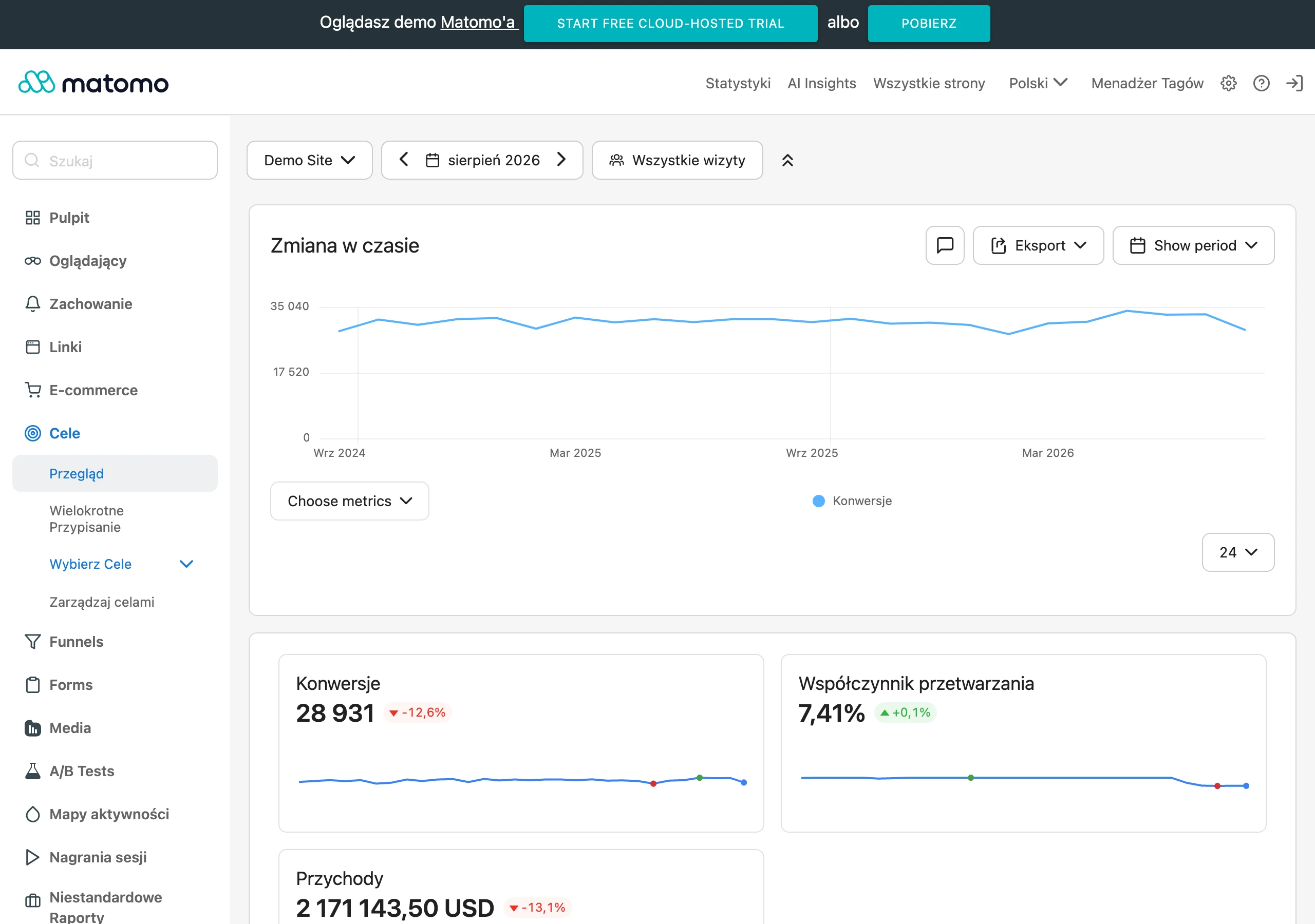
The next level is user behaviour on the page itself. In GA4, it is better to look at engaged sessions, scroll depth to key sections, clicks on the table of contents, interactions with the comparison table and transitions to product modules. For a sales-oriented guide, what matters more than a long time on page is whether the user moves on to the offer. Because a long reading time can be misleading. It may indicate genuine interest, but equally it may mean wandering around and difficulty finding the answer.
The most useful metrics are those showing transitions between the guide and transactional pages. You need to measure clicks to categories, subcategories, product pages, internal rankings and filter pages, and then check which of those transitions trigger further activity. Path analysis works brilliantly: the user landed on the guide, clicked a category, used filters, opened a product and only then bought or sent an enquiry. It is precisely such sequences that show the real value of the guide, not the mere fact that it was read. The question is whether the content pushes the user towards a decision, or merely holds their attention.
The impact on sales is best assessed through assisted conversions, rather than solely through the last-click model. This is an important difference. In practice, a guide often does not close the transaction immediately; instead, it reduces uncertainty and prepares the user for a later purchase. That is why in GA4 it is worth analysing multi-step paths, comparing sessions with and without a guide, and checking whether users who have interacted with such content return to categories or products more often. If you look only at sales attributed to the last click, you usually underestimate the role of guides.
For these data to make sense, measurement must be set up properly. Most often, you implement events for clicks on CTAs, product boxes, category links, FAQ expansions, transitions to the decision-making section and interactions with variant comparisons. But beware, the devil is in the detail. It is also good practice to label the modules embedded in the guide so it is clear whether the user clicked a general text link, a recommended product or the “who is this variant for” section.
Interpreting the results should take into account the guide topic and product type. Content for simple purchases, where the transition to the offer happens quickly, is assessed differently from material for more expensive or more technical products, where the user needs more time and more touchpoints. The key is comparing like with like, not everything with everything. That is why it is best to compare guides against one another within the same category, season and similar search intent.
In the end, iteration always wins. In other words, regularly improving what works, based on data. If a guide attracts visits but poorly “pushes” traffic towards the offer, you usually need to refine the recommendations, simplify the selection criteria or connect the content more strongly to categories and specific products. And when users click but drop off at later stages, the culprit is no longer the guide, but the category itself, the filters or the product pages. Effective measurement therefore does not end with a report; it only starts there and leads to real changes in the content and the buying journey.
FAQ
Frequently asked questions
How can a buying guide support sales in an online store?
It works when it takes the user through the selection criteria and directs them to the right offer. Information alone is not enough if there is no clear path to the category or product.
Should a buying guide end with a link to a product or category?
Yes, because it has the most value when it does not stop at education, but leads to a specific place in the offer. Without that, it may generate traffic, but it does not help close the purchase decision.
What questions should an effective buying guide answer?
It should explain what to choose, how to match the product to the use case, how the variants differ and when paying extra makes sense. Questions about selection mistakes are important too, so the user does not buy an ill-fitting product.
When does a buying guide have the strongest impact on the user’s decision?
It works most strongly at the moment of hesitation, when the user knows the problem but still does not know which variant to choose. Then comparisons and simple recommendations can shorten the route to purchase.
How should buying guides be optimised for SEO and UX?
The content needs to match informational-transational intent, and you need a clear structure and sensible linking to the offer. On mobile, short paragraphs, clear headings and modules that make it easy to move on quickly matter.
What data is worth analysing when implementing buying guides?
It is worth checking Search Console, the internal search, customer questions, as well as clicks on CTAs and visits to categories or products. Traffic alone is not enough, because the key thing is the paths that lead to the offer.