
Content for customers before the purchasing decision are materials that help choose a solution before the user sends a form, calls or buys. This is the stage of hesitation. The customer already knows they have a problem, but is still not sure which option to choose and what to avoid so as not to get themselves into trouble. In practice, it is not about “nice articles”, but about copy that answers specific questions, organises the decision criteria and reduces the risk of making a mistake. Good pre-purchase content does not push for a sale, it removes the uncertainty that blocks the decision. And it works. That is why such materials influence not only traffic from SEO, but also lead quality, the length of the sales process and the number of questions that the sales rep has to handle. If they are well designed, they lead the user smoothly from research to the next sensible step.
What pre-purchase content is and its role in the buying process
Pre-purchase content is for those who are comparing options and checking whether a given solution actually fits their situation. This is not the moment for generic slogans. Most often, this involves buying guides, “how to choose” pages, variant comparisons, decision-making FAQs, checklists, use-case descriptions, and explanations of costs, limitations and implementation conditions. Such a user usually no longer needs a definition of the product. They need specifics: how the options differ, how long it takes, how much it costs, what the entry conditions are and where the risk lies.
Their role in the buying process comes down to one thing: removing decision barriers. Sometimes it is a lack of knowledge, sometimes unclear differences between offers, and sometimes concerns about fit, implementation time, service quality or total costs. If the content does not answer the customer’s real objections, it does not support the decision, even if it has good traffic and high rankings. The question is whether we are speaking to the customer or to the algorithm. That is why pre-purchase materials should say not only “what we offer”, but also “who it makes sense for”, “when it does not make sense” and “under what conditions it works well”.
In practice, such content is part of a broader content design and SEO process. First, you need to understand the stage of the customer journey, their questions, their decision criteria and the language they use to describe the problem. Only then do you choose the format of the material and connect it with the on-site experience, internal linking, CTA and analytics. This is not cosmetic work, it is structure. As a result, the article or page does not end with education, but genuinely leads to a comparison of plans, contact, a calculation or a consultation.
A well-designed set of such materials works like an advisory layer between initial interest and the sale. It does not sell by force, it prepares the user for a conversation with a sales rep or for making a purchase on their own, because it organises the information needed to assess the offer. This is especially important where the choice does not depend on a single price, but on fit, limitations and the consequences of implementation. And that is when the effect becomes visible: the customer moves forward more consciously, and the company gets fewer random enquiries and more conversations about specific needs.
The current practical context and challenges in content creation
That is what the pre-purchase stage looks like today. The user compares solutions in parallel in several places and wants answers delivered quickly, simply and without going round in circles. They search in Google, read reviews, browse manufacturers’ websites, land on marketplaces, ask questions in AI tools, check FAQs and documentation. That is exactly why simply being present on a blog has stopped being a ticket to attention. The content must be scannable, unambiguous and arranged so that the answer sits right on the surface.
The biggest snag appears elsewhere. Many decisions do not start with queries like “buy” or “pricing”, but with questions such as “how to choose”, “is it worth it”, “for whom”, “alternative”, “pros and cons”, “what to pay attention to” or “how long implementation takes”. If a company publishes only strictly sales-oriented content, it misses the moment when the customer is still building their criteria. The question is: who takes the initiative then. It is precisely at this stage that the decision is most often made about which brands will make it into the final comparison at all.
Increasingly, data from your own backyard also matters. Not just inspiration from search results, but hard signals from form enquiries, sales conversations, chat, support or demos. They usually reveal the real blockers better than keyword research alone. They show clearly whether customers are worried about costs, integrations, implementation time, technical requirements or a mismatch with their industry. It is from these sources that sections are created which genuinely shorten the path to a decision.
There is one more thing that is easy to forget. The alignment between the content and the experience after landing on the site. If an article helps to choose a solution, the user should immediately be able to move on to a comparison of options, pricing, requirements, a demo, a consultation or technical questions. The problem is that often the content educates, but does not suggest a logical next step. Then even a good piece holds attention, but does not translate into real progress in the buying process.
The second typical problem is writing “softly” and avoiding uncomfortable topics. A customer before making a decision wants to know not only the advantages, but also the limitations, implementation conditions and situations in which the solution will not be the best choice. And this is not a cliché: such honesty does not weaken the content, it boosts its usefulness and credibility. Instead of a marketing dodge — specifics, even if they are a bit awkward. The less of a marketing dodge there is, the greater the chance that the user will treat the material as real help in making a decision.
How pre-purchase content preparation works in practice
It is not magic, just a process. Preparing pre-purchase content means moving from diagnosing the goal and customers’ questions to publishing, measuring and regularly improving the material. First, you determine what the content is actually supposed to do: attract better traffic, shorten sales conversations, increase the number of meaningful enquiries or help the user move on to pricing, a demo or contact. The key point is that everything that follows depends on that decision: the format, the level of detail and the type of call to action. Not more words, but a better next step.
First, you need to gather data on how the customer actually makes a decision. The most useful input comes from form submissions, sales calls, chat, support, demo notes and the on-site search. This is usually a better source of topics than a simple keyword list, because it reveals the real decision blockers rather than just search popularity.
Next comes intent mapping and breaking topics down by stage of the decision. Some pieces answer “what should I choose”, others “how much does it cost”, and still others “does this make sense in my situation”. Put all of that into one article and the user gets chaos instead of help.
Now for content architecture. Some questions are better handled by a “how to choose” guide, others by a comparison page, a decision-focused FAQ, an implementation description or material about limitations and entry requirements. Good architecture does not end with publishing the text; it connects the content with the next step: comparing options, calculating costs, contacting sales, booking a demo or checking the pricing.
The brief also needs to be specific. And this is not a minor detail. In practice, it should cover user intent, mandatory questions, objections to address, expert sources, internal links, the CTA plan and how results will be measured. That way the writer does not churn out a generic category text, but a piece that leads towards a decision.
Content production should be based on knowledge from within the organisation, not solely on online research. The key is to gather from experts the implementation conditions, limitations, common customer mistakes, differences between variants and situations in which the solution will not be a good choice. Content only becomes credible when it shows not just the benefits, but also the conditions for fit and misfit.
When the text is ready, it is time for SEO and UX. Nothing flashy, but with discipline. The point is clear headings, unambiguous answers, comparison sections, sensible linking, mobile usability and visible paths to the next step. The problem is that users increasingly scan the page or land on a single fragment of an answer, so the information has to be easy to spot quickly.
At the end, you are left with measurement and iteration. The data is clear: it is not enough to track visits from search; you also need to look at clicks on CTAs, visits to pricing, contact or demo pages, FAQ expansions or use of the calculator. If content drives traffic but does not help users move to the next stage, then from a business perspective it is not doing its job.
Strategies for creating content that supports the purchase decision
Strategies for creating content that supports the purchase decision are about building materials around questions, selection criteria and objections, rather than around the offer itself. At this stage, the user usually does not need another product description, but a tool to assess whether a given solution fits their situation. So the question is not “what are we selling”, but “how do we help them choose”. That is why the content should organise the decision, instead of A. B, meaning instead of simply increasing brand exposure.
The most effective strategy starts with real choice scenarios. Instead of producing a general text about a service, it is better to prepare material for a specific case: a small budget, a short implementation deadline, a need for integration, technical limitations, several decision-makers or a risk of making the wrong choice. This works because the user gets a faster answer to the simple question “is this for me”, and that is exactly what moves them forward.
The second rule is equally firm: separate the functions of the content. One piece is meant to educate, another to compare, another to remove objections, and yet another to qualify the lead before the conversation. When one page tries to explain the basics, sell, compare and close the deal at the same time, it usually loses precision and reduces effectiveness.
In practice, the content that works best is the kind that lets the user assess the decision against specific points. No fluff and no marketing embellishments:
- selection criteria and differences between variants,
- costs, limitations and implementation conditions,
- risks and common mistakes when choosing,
- requirements on the client side,
- fit for the industry, scale or operating model.
That structure is useful because it answers the questions that will come up anyway before contact or during a sales conversation. The problem is that if the page does not answer them, the user will do it themselves and look for the answers elsewhere.
Honesty in information is also important. Good content before the decision shows not only the advantages of the solution, but also the moments when another option, postponing implementation or changing the scope of needs makes more sense. This does not weaken sales; in practice it usually improves the quality of enquiries and cuts off conversations with people who were never a good fit anyway.
The strategy should also include matching the CTA to the user’s readiness. At the comparison stage, softer transitions work better: checking options, seeing the requirements, downloading a checklist, asking a question or booking a consultation. Why push “buy now” if the customer is still organising their choice and putting the arguments together in their head.
For more complex services, it pays to build separate resources for different roles in the buying process. The technical person checks integrations and requirements, the finance person looks at cost and risk, and the decision-maker wants to know which choice model will be safest. One general piece of content rarely meets all of these needs at once.
The most common mistake is hiding difficult topics: prices, limitations, implementation time or the client’s responsibilities. The second mistake can be even more subtle, because it looks “professional”: writing only for what appears in search results, without checking with your own sales and customer service teams. If the material does not answer the questions that really arise before the decision, it will look fine, but it will not help with the choice.
The most common mistakes and limitations when creating content
The most common mistake is very simple. The material looks marketing-wise correct, but it does not help the user make a decision, because it leaves them with the same set of doubts. This is especially visible in texts full of vague statements, without specific selection conditions, costs, limitations and implementation requirements. Such content can generate visits, but it does not reduce uncertainty. If after reading, the user still does not know whether the solution fits their situation, the content is not doing its job.
A common problem is also mixing funnel stages within one piece of content. First, a how-to article educates, and then it suddenly veers into aggressive selling or describes the offer without answering the key comparison questions. The question is: why put the reader through that kind of slalom. As a result, they do not get a logical path: from understanding the problem to evaluating the options and taking the next step. It is better when each piece of content has one main role and one suitably chosen CTA.
A major mistake is basing the content solely on what the search engine suggests. SERP suggests topics, but it does not show all the objections that keep coming back like a boomerang in sales conversations, on chat or in support, and these are what block the decision. The best decision-stage content is created by combining SEO and the questions asked by real customers. Without that, it is easy to write a text that answers popular queries, but not the actual buying blockers. And that is not a cliché.
Limitations are sometimes completely practical too. Not every piece of information can be published publicly, because some of it depends on individual pricing, legal requirements, contracts, technical configuration or the client’s industry-specific context. But note: that is not an excuse for vagueness. In such a situation, you need to clearly state what the answer depends on rather than sweeping it under the carpet. That builds trust more than apparent completeness.
In many companies, the problem is not the lack of ideas itself. The problem is that there is no access to experts and the process owner, namely the people who know the constraints and the consequences of the choice. Without consulting someone technical, implementation-oriented or sales-oriented, content can easily oversimplify the topic or omit details that later come back in the form of disappointment. This is especially risky for services with a longer buying cycle, where several roles assess the decision at the same time. Content before a purchase decision must be specific enough for someone comparing options, but still clear for someone without specialist knowledge.
I would also watch out for structural issues. Duplicate topics, keyword cannibalisation, weak internal linking between materials and a lack of transition to the next stage can quietly eat away at the results of even a good article. The fact is: even a great article loses value if it does not lead on to comparing variants, pricing, a consultation or technical questions. Is the user supposed to guess on their own where to find the next needed element. Content that does not connect with the rest of the decision path works in isolation and usually delivers a worse business outcome.
Methods for measuring the effectiveness of content before a purchase decision
Measuring the effectiveness of content before a purchase decision is not about counting views. It is about whether the user takes the next decision-making steps, not just “spins” traffic on the site. Organic traffic alone or rankings in the results are not enough, because they do not show whether the text actually helped in choosing a solution. What matters are signals of moving forward: visiting the pricing page, clicking a plan comparison, using a calculator, opening a form, contact, booking a demo or downloading a checklist. The best measurement combines visibility with behaviour and query quality.
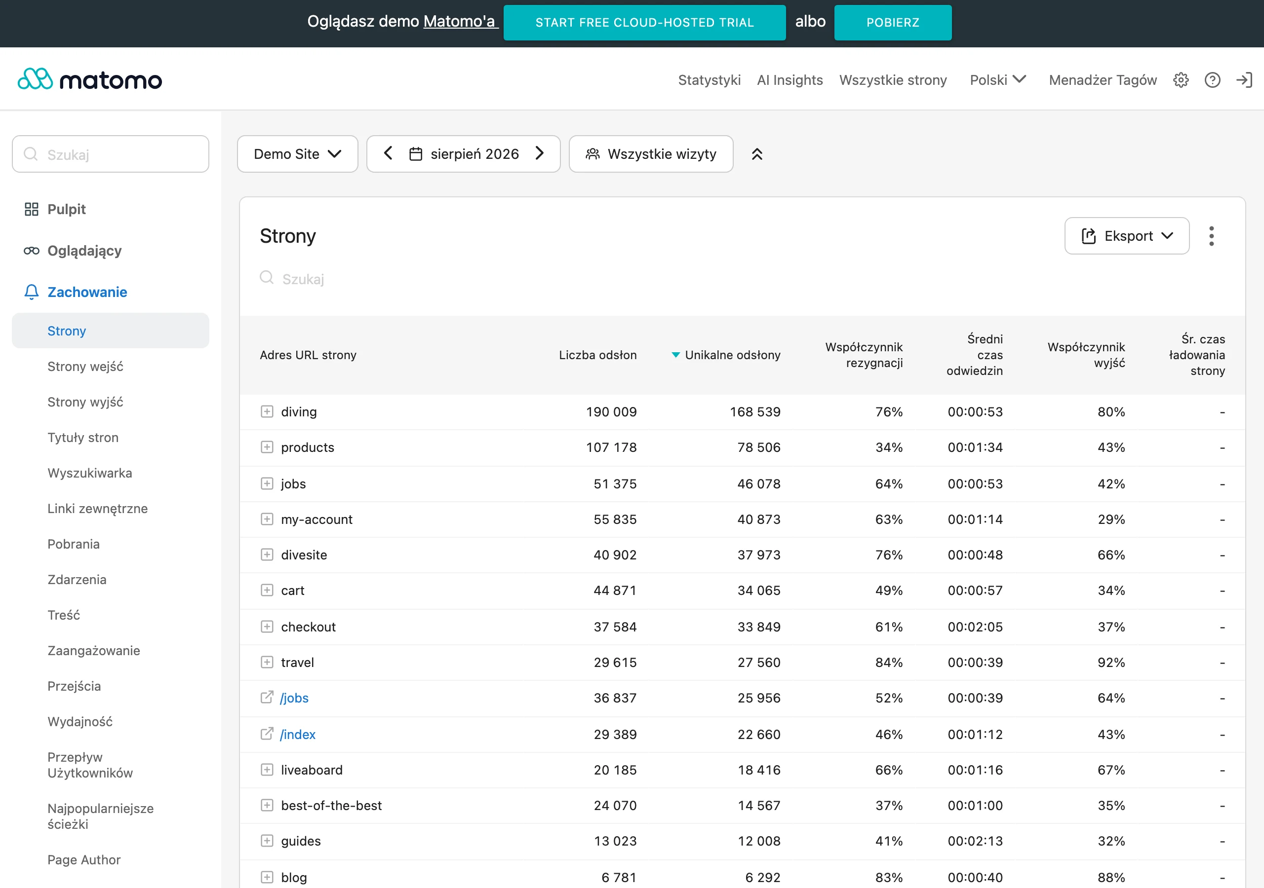
In practice, it is a good idea to split metrics into micro- and macro-conversions. Micro-conversions are small actions that reveal progress in the decision: expanding the FAQ, clicking into the comparison section, going to the implementation page or interacting with the “who this solution is for” module. Macro-conversions are the heavier hitters: contact, lead, booking a consultation or starting a purchase. This split works like a roadmap, because it lets you assess whether the content not only attracts, but also prepares the user for a conversation or transaction.
There is one more catch. You need to measure quality, not just the number of conversions. If an article generates a lot of forms, but most of them concern mismatched cases, then the content is probably promising too broadly or qualifying the audience poorly. That is why it is better to tie analytics to the CRM and check which materials lead to meaningful conversations, a shorter sales process or fewer repetitive questions. Good decision-stage content does not have to generate the most leads, but it should generate better-matched leads.
Page anatomy also helps: in which sections users lose interest and leave. If exits increase at the fragment about requirements, pricing or implementation, that is not always an alarm. Sometimes the user got the answer and moved on via a different path, and sometimes that is exactly where a real barrier appears that cuts off the decision. The problem is that the numbers alone will not tell you which scenario is true. That is why quantitative data needs to be combined with session recordings, click maps, questions from chat and feedback from sales.
Effectiveness can also be read from how the queries change with which users land on the site or come back to it. If after publication the share of visits on queries such as “how to choose”, “for whom”, “cost”, “advantages and disadvantages” grows, and at the same time the переход to offer pages increases, that is usually a sign that the content handles the comparison stage well. The key is whether the text moves the user from curiosity to specifics instead of leaving them with generalities. It is also worth observing whether new materials reduce the number of the same questions that come back like a boomerang in conversations with salespeople. That is one of the most practical indicators of real usefulness.
In the end, what matters is regular iteration. Decision-stage content becomes outdated very quickly because implementation conditions, the offer, customer expectations and the language of the questions themselves all change. Measurement should therefore lead to decisions, not nice-looking charts. Should you add a missing section, replace the CTA, simplify the comparison, clarify the limitations, or perhaps split one piece into several separate assets. Content before the purchase decision works when, after analysing the data, you can effortlessly identify what to improve and what real impact that change brought.
FAQ
Frequently asked questions
What content helps a customer before a purchase decision?
The best-performing formats are “how to choose” guides, option comparisons, decision-stage FAQs, checklists and descriptions of use cases, costs, limitations and implementation conditions. They should organise the selection criteria and remove doubts.
Why should pre-purchase content not be purely sales-led?
Because at this stage the customer is usually still comparing options and looking for answers about fit, risk and costs. Straight selling without addressing objections does not help with the decision.
Is it worth showing the limitations of a solution in pre-decision content?
Yes, because honesty increases the usefulness and credibility of the material. The customer wants to know not only what works well, but also when the given solution will not be the best choice.
What questions do users most often type at the selection stage?
They most often look for answers such as: “how to choose”, “is it worth it”, “for whom”, “alternative”, “pros and cons”, “what to pay attention to” or “how long does implementation take”. These are exactly the questions that help build decision-stage content.
When does pre-purchase content really help sales?
When it leads the user to the next sensible step, for example to a variant comparison, pricing, a demo, a consultation or contact. Education alone without that transition may hold attention, but it will not speed up the decision.
What is the biggest mistake when creating content for customers before a decision?
The biggest mistake is writing in vague terms and avoiding difficult topics such as prices, limitations, implementation time or requirements. The second common problem is relying solely on SEO, without validating questions from sales calls, chat and support.