
These are the pieces of content that close the decision. They work when the user is no longer hunting for general information, but checking whether it is worth sending a form, making a call or booking a conversation. In practice, they remove the blockers that most often stop contact: the scope of the service, pricing model, start conditions, delivery time, limitations and next steps. They are especially important where the service is complex, requires qualification or cannot be bought with a single click. Their main job is not to persuade with slogans, but to reduce the risk of the contact decision. A well-prepared service page, sales FAQ or a refined form section can shorten the path from interest to enquiry. Poorly prepared content does the opposite: it adds hesitation, multiplies uncertainty or attracts low-quality leads.
What are content for ready-to-contact customers?
Content for ready-to-contact customers is material written for people who are one step away from sending an enquiry, making a call or arranging a conversation. Most often it takes the form of service pages, local subpages, sales FAQs, descriptions of the working process, information about pricing and scope of service, project qualification rules, contact pages and content around the form. The aim is simple: to lead to meaningful contact, not to build general awareness of the topic.
At this stage, the user usually already knows their problem and is comparing the available options. They do not need a broad introduction, only specifics: whether the company handles their case, what is required at the start and what cooperation looks like after the enquiry. That is why this content should answer decision-making questions, not expand on marketing promises.
The best material of this type shows how the service fits the client’s specific situation. It does not talk about “comprehensiveness”, only explains what is included in the scope of work, what the service does not cover, what the entry requirements are, who is involved on both sides and what happens after the form is submitted. This is critical especially in services where implementation requires data, approval, integration or involvement from several people. The more complex the process, the higher the cost of things left unsaid.
In practice, their role comes down to reducing risk. The client wants to know whether contact makes sense now, whether they need to prepare anything beforehand, whether their budget and need fit a realistic working model and what the first stage after the enquiry looks like. The question is: is there order on the other side, or chaos. One of the most effective things is to show clearly when contact makes sense and when it is better to choose another solution. This does not put off good leads; it improves the quality of enquiries.
It is also worth remembering one thing. Content for ready-to-contact customers must sit close to sales and operations, because this is where marketing fantasy meets reality fastest. If the service description does not match how the team actually works, the user will feel it immediately after the conversation or after the response to the form. Effective content at this stage cannot be detached from the lead handling process, pricing model and real delivery constraints.
The current context and importance of content for ready-to-contact customers
Today, this content carries more weight than it may seem. More and more often the user lands directly on a service or contact page and decides within a few seconds whether it is worth getting in touch. They do not have to go through the whole journey from educational article to offer. They may arrive from search, maps, ads, a recommendation or an AI tool and expect specifics straight away.
This changes the logic of page design. A service subpage cannot assume that someone already knows the company, understands the cooperation model and has gone through earlier materials. Every key page should explain the offer, qualification conditions and next step on its own. If that is missing, the user starts wandering around the site looking for answers and is much more likely to abandon contact.
Operational trust is also becoming more important, not just brand perception. What matters is whether the client can see a real process, a clear scope, the implementation method, the requirements on their side, as well as data security, integrations and contact availability. These are hard signals. In practice, they are what decide whether the form will be submitted.
From an SEO and UX perspective, such content serves high-intent queries, for example those related to price, quotation, consultation, implementation, offer, audit, contact or service location. But note, this is not “SEO versus sales”, but both at once. The content must answer a specific question and at the same time not make conversion harder. The user should quickly find the answer and just as quickly move to action.
The biggest problem appears when content, UX and the lead process drift apart in the details. The page may promise a quick response, but if the form is too long, the CTA remains vague and after submitting the enquiry it is not clear what happens next, performance drops. The question is: why build trust if the ending is frustrating. At the bottom of the funnel, even good content will not save a weak contact process.
How does the process of creating content for ready-to-contact customers work?
This process starts with the user’s real sales questions. Only then are they translated into pages, sections and CTAs that make the contact decision easier. Not from slogans about quality or experience, but from checking what the client needs in order to judge whether a conversation makes sense. The fact is that at this stage, the data from practice matters: questions from forms, sales calls, chat, emails and CRM. If the content does not answer the objections that really appear in sales, even good traffic will not translate into valuable enquiries.
The first step is analysing contact intent. You need to establish from which queries and subpages people ready to take action are coming, for example from phrases such as “quotation”, “consultation”, “support”, “implementation”, “contact” or “service + city”. In parallel, it is worth checking which questions recur just before the form is submitted and which of them actually determine whether the lead will be qualified.
The second step is modelling the user’s decision. In practice, this means simply mapping out what the client wants to know before making contact: whether their case is handled, what the scope of the service is, what they need to prepare, how the start looks, who is involved on both sides and what the limitations are. Good BOFU content does not talk about the offer in general terms, but helps the user assess fit and the cost of entering the process.
The third step is to design the content architecture. One page will almost never carry the topic if the service is complex or has several entry scenarios, because the user then wanders between questions. That is why separate roles are usually assigned to: the service page, the cooperation process page, sales FAQ, form copy, the local landing page, pricing model or the “who this is for and who it is not for” section.
The fourth step is to prepare operational content, that is, what the user wants to know before clicking the CTA. There is no room for vagueness here. It should include specifics: what the cooperation covers, what it does not cover, when it is worth getting in touch, when it is better to choose another solution, what materials are needed to get started and what happens after the enquiry is submitted. It is precisely the sections on limitations, entry requirements and the implementation process that most often reduce decision risk.
The fifth step concerns UX and conversion. The CTA must match the user’s level of readiness, because “Get in touch” can be too vague and leaves the person wondering: what next. When project evaluation data is needed, “Request a quote”, “Send a brief” or “Book a consultation” works better, and the form should immediately suggest what information will speed up the response.
The final stage is validation and refinements. After implementation, it is worth measuring not only the number of leads, but also their quality, form completions, drop-offs, the effectiveness of individual CTAs and the questions that still keep coming up in sales. If the same objection keeps appearing regularly after someone lands on the page, it means the content is not closing the decision and needs to be corrected.
Practical steps in creating content for clients ready to get in touch
To create effective content for people ready to get in touch, you need to base it on customer service and sales data, and then turn that into clear service pages, forms and CTAs. Speed of work is key: first you gather the source material, then you set out the qualification logic, and finally you refine the details that genuinely close conversion. In this work, usefulness matters, not text volume.
The best source of insight is real conversations with clients. Call transcripts, email messages, questions from forms, reasons for won and lost opportunities, and sales notes quickly show where the user hesitates and what information they are missing. And that is not a cliché. It means you do not have to guess which sections to add to the page.
Without qualification, the page is firing blindly. The next step is to build the content according to qualification logic, so that the user immediately gets answers to a few practical questions: does this service fit their situation, what is the next step, what do they need to prepare and when does contact make sense. If the page does not help assess fit, it starts generating random enquiries or putting off good leads.
The CTA also has to match the weight of the decision. For simpler services, a contact form is enough, but for more complex ones a qualification form, a request for a brief, a quote enquiry or a consultation call works better. The key is that the copy around the CTA clearly says what happens next, who will respond and what information will genuinely speed up handling the enquiry.
The most common mistakes are surprisingly repetitive. The problem is that they usually stem from content being disconnected from the sales process, and then everyone is surprised by the quality of the leads.
- Overly generic service description, without showing scope, limitations and starting conditions.
- One form for all types of leads, even though they need different inputs.
- No information about what happens after the enquiry is submitted.
- Hidden contact details or a CTA that is not suited to the stage of the decision.
- Inconsistency between what the page promises and how the rest of the sales process works.
The scope of work has to reflect the realities of the offer. Content for simple local services is designed differently from content for implementations requiring discovery, data analysis, integrations or technical qualification. The number of customer segments, industry differences, pricing variants and whether the team has access to CRM data and is ready for regular updates also matter.
Finally, you need to organise the implementation elements so that the content can later be developed and measured. What is most often needed is: a map of intent and sales questions, the architecture of service and contact pages, qualification sections, sales FAQ, form microcopy, CTA scenarios and analytics requirements. These are not decorative extras, but the foundation for further optimisation of lead quality.
Optimising UX and conversion strategy for contact content
Less friction, more clarity. Optimising UX and conversion strategy for contact content is about removing friction between the moment of decision and the act of getting in touch, because at this stage the user does not need another layer of generic promises, only simple answers: does this service fit their situation, what should they do now and what can they expect next. The pages that convert best shorten the path from question to action, rather than trying once again to “sell” the brand.
The first area is matching the CTA to the user’s real readiness. If the decision requires input data, “Request a quote” or “Send a brief” will work better than the generic “Get in touch”. And if the user needs an initial assessment, the question is: why not give them a choice between a short qualification form and a consultation call.
The second area is the form and its entire surrounding context. The simpler, the better. The form is meant to collect only the information needed for a useful response, not everything that “might come in handy” at some point. Every additional field must have a practical justification, because at the contact stage too many questions often reduce the number and quality of enquiries at the same time.
Microcopy around the form and CTA also matters. It’s a small detail that does a lot of work. Short messages such as “We respond after an initial analysis of the enquiry”, “The more data you provide on the scope, the more accurate the response” or “If the project is still at the discovery stage, describe the objective rather than a full specification” take the pressure off the user without making rigid promises. And that’s the point, because the problem is that they often do not know whether their case is even eligible for a conversation.
The page layout should answer questions in decision order. First, service fit and scope. Then the process, input requirements, constraints, pricing model and only then contact. If the user has to search the whole page for information about the process, deadlines or start conditions, they often postpone the decision or send a poor enquiry.
Effectiveness is also boosted by consistency between the content and lead handling. Without that, everything falls apart. If the page invites users to a consultation, but after submitting the form they do not know what will happen next, unnecessary uncertainty appears. A good practice is to show the next step: enquiry review, clarification of information, a proposal for a call, or information that a given type of project is not supported.
The final element is measuring quality, not just the number of contacts. The data is clear. It is worth checking which CTAs generate valuable leads, on which sections users drop off, and which questions keep coming back later in sales. Contact content is effective when it increases the number of conversations that make business sense, not just the number of submitted forms.
Typical mistakes and how to avoid them when creating contact content
Typical mistakes in contact content come from a simple habit: companies describe their offer from their own perspective instead of answering the questions of a person ready to get in touch. The result can be misleading. The page looks correct, but it does not help with the decision, because it gives “nice” information rather than useful information. Most often, the problem is not a lack of content, but a lack of useful content at the final stage of the journey.
- Too generic messages instead of qualification. When the page only talks about quality, experience and a tailored approach, the user still does not know whether their case is supported. Let’s look at it differently: this is not about declarations, but about specifics. The solution is to show the scope, typical scenarios, limitations and situations in which contact does or does not make sense.
- One form for all lead types. In theory, that is convenient. In practice, it mixes things up. A client ready to implement needs different information from someone who is only comparing options. It is better to separate the journeys or at least clearly name the purpose of the form.
- No information about the process after submitting the enquiry. The user does not want to guess whether they will get a phone call, an e-mail, a meeting or simply silence. It is better to describe the next steps briefly, concretely and without ambiguity.
- Hiding the price or pricing model without explanation. You do not always need to publish a full price list, but you do need to say clearly what the cost depends on and what data you need for a quote. That cuts down on random enquiries and improves the quality of conversations.
- Inconsistency between the content and the real service. If the page promises a quick start, but implementation in practice takes a long time and requires many materials, trust evaporates in an instant. The content should match how the team really works, not how it would like to present itself.
Another major mistake is brushing under the carpet the objections that keep coming back in sales like a boomerang. If salespeople are constantly answering the same questions about deadlines, scope, responsibilities or technical requirements, then those answers should be on the page in black and white. Good contact content supports sales by removing recurring uncertainties before the first conversation.
Many companies confuse simplicity with a lack of information. Shortening the page will not help if decision-making elements disappear from it. And these are, after all, the start conditions, documents needed for a quote, or the implementation process. It is better to have short but concrete content than a “light” page that answers nothing important.
To avoid these mistakes, you need to regularly compare the page content with real sales conversations and form data. When unqualified leads, recurring questions or form abandonment appear, it is usually a sign that information is missing or the CTA is poorly matched. The best correction to contact content does not start with copywriting, but with analysing where and why the user hesitates before making contact.
Key success metrics and validation of contact content
The key success metrics for contact content are lead quality, contact conversions and the consistency between the page promise and the real sales process. The number of submitted forms alone is not enough, because it can rise alongside the number of casual enquiries rather than purchase intent. The most important thing is how many users, after landing on the page, move into a meaningful sales conversation or a quoting stage.
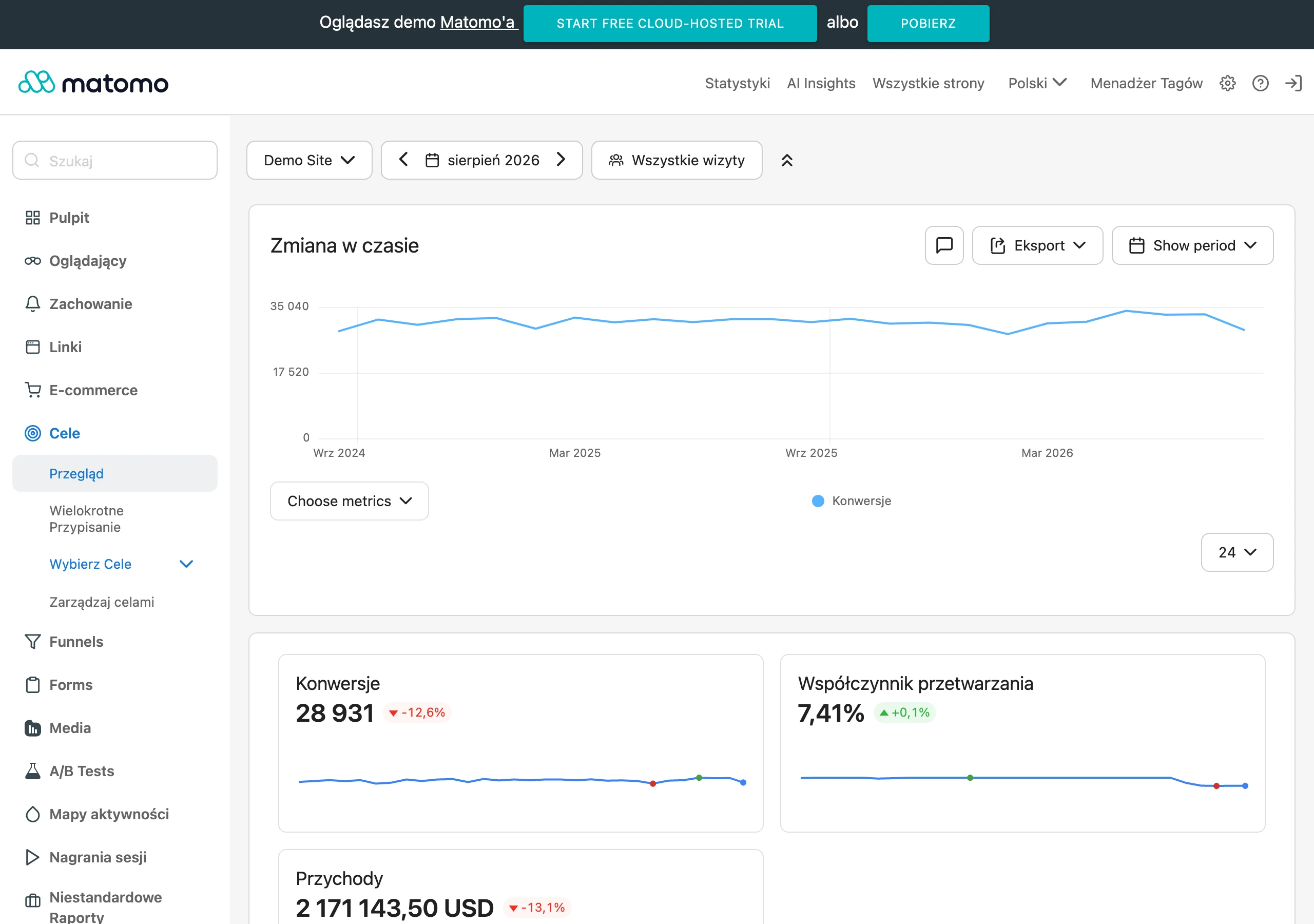
In practice, it pays to measure the entire chain of behaviours, not just the final click. This usually means analysing: page visit, CTA click, form start, form submission, contact from the team and lead qualification in the CRM. Only such a set clearly shows whether the content actually shortens the path to a conversation instead of complicating it.
Basic metrics are straightforward to capture. What matters is the click-through rate on the CTA, the proportion of forms started, the proportion of forms completed, drop-offs in specific fields and the share of sales-qualified leads. And that is where the filtering begins: check which landing pages, keywords and traffic sources deliver the highest-quality contacts, not just the largest volume. If a page generates a lot of contacts, but few of them meet the criteria for working together, the problem is often the content, not the traffic.
Validating contact content has to bring analytics and sales into contact. Analytics tools will show user behaviour, but they will not answer the question: was the lead genuinely valuable? Only CRM and feedback from salespeople reveal the quality of enquiries, recurring misunderstandings, missing information and the specific reasons for rejection. The most common mistake is assessing a page’s effectiveness solely on conversion rate without checking who is actually enquiring.
There is one more signal that cannot be ignored. These are the questions that keep coming back after the form is submitted or during the first call. If users regularly ask about the scope of the service, deadlines, required materials, the pricing method or whether their case is even handled, the content simply does not fully answer the key doubts. By contrast, a drop in the number of such questions usually means the page has taken over part of the sales work.
Implementation is not philosophy, just discipline. Tag clicks on all the main CTAs, measure transitions between sections and connect the form to the CRM so that the lead status can be assigned to a specific landing page. Without this, it is hard to distinguish a page that really converts well from one that simply attracts easy-to-win but low-quality enquiries. Good content for contact does not maximise the number of forms, but improves the ratio between an enquiry sent and a real sales opportunity.
Validation does not end on publication day. The best results come from regularly checking which sections are skipped, where the user drops out, which CTA works better for different types of service and which messages attract unqualified leads. Because why would a company need a queue of enquiries if half of them are wild guesses. Contact content is only effective when it helps the user make a decision and at the same time reduces the number of unnecessary contacts on the company side.
FAQ
Frequently asked questions
What content helps a user decide to contact a company?
Service pages, sales FAQs, descriptions of the collaboration process, pricing information and form sections work best. Their job is to answer decision-stage questions and show whether contact makes sense.
Is it worth showing service limitations before the form is submitted?
Yes, because limitations reduce the risk of a poor enquiry and help the user assess fit. This is particularly important for complex services or those requiring qualification.
Why should contact content be based on sales questions?
Because they show which objections really arise before contact. This allows the content to close them rather than guessing the user’s needs.
What information should be included on a service page to increase the number of enquiries?
It is worth clearly describing the scope of cooperation, what the service does not include, what the entry requirements are and what happens after the form is submitted. The user should quickly assess the fit and the next step.
Should the contact form be long and detailed?
No, the form should collect only the information needed to provide a sensible reply. Too many fields increase friction and can reduce the number and quality of submissions.
How should the effectiveness of content for contact-ready customers be measured?
Not only by the number of leads, but also by their quality, form abandonment, CTA performance and the questions that still come up in sales. If the same objection appears regularly, the content needs improving.