
The service page has to deliver enquiries. Not just “look nice” or talk about the company in generalities. In practice, a user lands on it directly from Google or an advert and, within seconds, decides whether they’ve reached the right offer. That is why this subpage has to quickly say: what you offer, who it helps and how to get in touch. The best service pages reduce customer uncertainty and make it easier to decide to send an enquiry. That requires tying three things into one whole: search visibility, a clear layout and content that answers real questions. Only then does traffic start turning into concrete contacts.
What a effective service page is
An effective service page is a dedicated subpage built around one service or one clear customer problem. It is not a shortened company profile or a general description of “what we do”. Its job is to lead the user from landing on the page to making an informed contact, step by step.
Such a page should answer five practical questions: exactly what do you offer, who is the service for, what problem do you solve, what does the collaboration look like and how can someone get in touch? Miss even one answer and the guessing starts. And when the user is guessing, they are more likely to leave than submit a form. The most enquiries are generated by pages where the scope of the service and the conditions for getting started are clear without having to ask follow-up questions. So the question is not “should you describe the service”, but whether you should describe it in a way that leaves no room for assumptions.
The effectiveness of such a subpage comes from combining SEO, UX and CRO. SEO brings the right-intent visitors to the page, UX lets them quickly understand the offer, and CRO removes friction before contact. In practice it looks simple, though not simplistic: a good heading, a clear service description, a process section, trust signals, FAQ, a clear CTA and a simple form. Not “more content”, but content that gets straight to the point.
The key elements of the page are not decorative. They are decision-making. The user wants to know what they will get, what you need from them at the start, what is included, what the service does not cover and what will happen after they send an enquiry (and when). The fewer ambiguities there are, the higher the chance of contact and the better the quality of the leads themselves. Instead of decoration — clarity, because that is what does the work.
How a service page works in practice
A service page works when it leads the user through successive decisions: recognising the offer, assessing fit, building trust and making contact. This is not a one-off description of a service written “for the website”, but a tool tailored to specific intentions and objections. A good subpage removes doubts exactly at the moment the user feels them. And that is precisely what distinguishes it from a nice but dead profile page.
The first stage is intent analysis. In practice, you take keywords from search, questions from clients, CRM data, form content and sales notes to check what people are really looking for and where they get stuck. Then you arrange it into a hierarchy: what must be high up on the page and what is better moved lower, into the FAQ or the process section. The data clearly shows whether the page answers questions or merely “talks about the service”.
The second stage is simple in theory, hard in execution: matching the message on the first screen. The user should immediately see the service name, the main outcome, a short description, who the offer is for, and one genuinely clear CTA. If the opening section does not answer the question “is this for me?” within a few seconds, the rest of the page usually does not get another chance to work.
The next step is to describe the offer in blocks that lead to a decision. Not with slogans, but with specifics. The sections that work best show the scope of work, typical problems, delivery stages, materials needed from the client, the cooperation model and the service limitations. The key point is that the user is not looking for another litany of “benefits”, but for a picture of the practicalities: what it looks like, how long it takes, what to expect and where the limits are.
Then the page has to do one more thing. Build trust and remove friction before contact. Appropriate proof helps with this: examples of work, reviews, testimonials, team experience, sectors served and a clear explanation of what the first contact looks like. The form itself should be short, collect only the necessary data and state plainly what the user will receive after sending the enquiry. Not “we will get in touch”, but what happens next and when.
The final stage is optimisation based on data. No mythology. Measure not only form submissions, but also CTA clicks, form starts, clicks on the phone number, page scrolling and lead quality in the CRM. Without linking analytics to a real sales outcome, it is hard to distinguish a page that generates lots of forms from a page that generates good enquiries.
What a page should contain to increase the number of enquiries
A page that is meant to genuinely increase the number of enquiries should quickly show exactly what you offer, who the service is for and how to get in touch. The top of the page matters, because that is where the user makes the initial decision: stay or leave. The H1 should clearly name the service, and the short description beneath it should clarify the outcome, scope and type of client. Next to it there must be one main CTA, for example “Request a quote” or “Book a consultation”. One, not three.
The second key block is matching the service to the user’s situation. In practice, you need to explain when such a service makes sense, what problems it solves and in which cases it will not be a good choice. It sounds like “giving away” the sale. But it is the opposite: it is a filter that improves the quality of enquiries. The fewer ambiguities there are at the page-reading stage, the fewer random contacts there are.
The scope section is also very important. The user should see what is included in the service, what the outcome of the work is, what you need from the client at the start and what the service does not cover. This is one of those elements that genuinely shortens the sales process, because some questions fall away even before the first conversation. A good page does not hide the boundaries of the offer; it shows them clearly. Instead of promising “everything” — it defines “what” and “what not”.
The process section is meant to guide the user step by step. It shows how the collaboration works from the first contact to delivery, without assumptions or ambiguity. So it is worth adding what happens after the form is submitted, who responds, in what mode, and what information the client will see in the first message (and when). It is a simple way to lower the barrier to contact, especially when the service is more expensive, more complex or requires real involvement from the client.
Without credibility signals, even the best-described service loses its impact. The strongest performers are case studies, client reviews, short descriptions of implementations, the team’s experience, the industries you work in, and concrete information about how you work. And these are not decorative extras. They are signals that the company understands the subject and can deliver on it, not just talk about it nicely. If you have certificates or work with specific tools, show them where they genuinely support the decision, instead of creating a separate “badge gallery”.
FAQ often closes the moment of hesitation. And it does so right before the form, that is, in the place where every point of uncertainty costs you a contact. It works well if it answers questions about cost, timelines, pricing model, required materials, availability, service variants and typical limitations. The question is: are the answers concrete enough to base a decision on them. In practice, simple, precise messages work better than general statements. If the client has to guess the basic terms of collaboration, they often simply leave the page.
At the end, you need a contact section that does not create obstacles. The form should collect only the data needed to start the conversation, and next to it it is worth providing a phone number, e-mail address or the option to book a call. It is also crucial to clearly state what information makes sense in the message and what the client can expect after sending an enquiry. Instead of “write to us” — concrete context and the next step. A form that is too long, unclear validation errors or a CTA without explanation regularly reduce the number of contacts.
The whole thing has to be tied to SEO and UX. That is the foundation, not an add-on at the end. The page title, meta description, headings and content should respond to real user queries, and the layout should make scanning on a phone easier (because that is how most people read today). Visibility in Google only helps once the page content turns a visit into a decision to get in touch. So link to related services, case studies and supporting pages, but be careful: do not distract the user at key moments.
Current practical context
Today, a service page has to be able to work on its own. Users often land on it directly from Google or an ad, without any “warm-up” on the homepage and without knowing your company. The assessment takes place within a few seconds, and then a decision is made: keep reading, compare the offer, or go back to the search results. That is why the first section and the clarity of the message matter more today than an expanded “about us” description and a company story told from A to Z.
Mobile traffic also matters a great deal. On a phone, the user does not read leisurely; they scan the screen, read fewer blocks of text and react faster to clutter, slow loading or an invisible CTA. In practice, it is simple maths: a simpler layout, shorter sections, good contrast and a form that can be filled in with a thumb without acrobatics. And if the page is “correct” only on desktop, some enquiries are quietly lost before anyone even reaches the actual content. How many such contacts disappear along the way.
SEO visibility alone is not enough. The problem is that user intent can be mixed: some people still want to understand the service, while others are already ready to ask about a deadline, a quote or the terms of collaboration. That is why an effective page does not choose between education and sales, but combines explanatory information with transactional elements, for example a form, phone number, consultation CTA or an FAQ section about costs and process. It is precisely this link between “I know what it is about” and “I can act now” that most often decides whether traffic has business value.
It is also becoming increasingly important to measure effectiveness at the level of specific behaviours, not just the number of visits. A session counter can look good while the enquiries inbox stays empty. In practice, it is worth measuring form submissions, phone number clicks, form starts, CTA clicks, clicks through to pricing, FAQ or call booking. This split quickly shows where the user drops off and whether the problem lies with the offer, the content, the page structure or the form itself. Without analytics it is easy to improve things that look good but do not increase the number of enquiries.
Tools that combine the traffic source with behaviour and the contact outcome are useful for this kind of work. GA4 and Google Tag Manager help measure conversions, Search Console shows queries and visibility, while Clarity or Hotjar let you see where users scroll, click and where they get lost. When you add a CRM or call tracking into the mix, you can assess not only the number of leads, but also their quality. Only then does it become clear, in black and white, which keywords, ads and page sections really deliver valuable enquiries.
SEO layer and its importance
The SEO layer determines whether the right user lands on the service page, that is, someone looking for exactly the kind of help you offer. It is not just about rankings, but about matching the content to intent. If someone types in a specific service and lands on a generic company description, they usually go back to the search results and choose a competitor. A good service page must answer both “what is this about?” and “can I get in touch about this straight away?”.
The most important elements are the page title, meta description, H1 and the first sections of content. They influence CTR in search results and whether the user immediately recognises the topic of the page. In practice, it is better to stick to service names, client problems and the typical clarifications that people actually search for, rather than creative slogans that sound great in a brainstorming session but not in the client’s head.
The content should revolve around real customer questions, not around the description of the offer itself. That makes all the difference. That is why the sections that work best are the ones that organise the topic in a human way: scope, process of cooperation, limitations, service variants and FAQ. Thanks to them, both the user and the search engine can more quickly grasp what the subpage is about and which queries it actually answers.
Internal linking is important too. Without it, a service page can become a dead end. It should lead to related case studies, similar services, pricing, FAQ or the contact page, but beware — without distracting the user or breaking their intent across ten tabs. SEO works best when traffic from search lands on a page that does not require further “searching for information” across the whole website.
In practice, it is worth measuring not only visibility, but also the quality of SEO traffic. Visits alone prove nothing. This is where data from Google Search Console, GA4 and CRM comes in handy: which queries generate visits, which subpages have a good CTR, where users drop off, and from which keywords leads come through, not just clicks. The key point is that such a picture allows you to improve not “traffic” as a statistic, but traffic that has a real chance of turning into contact.
The UX and technical layer
The UX and technical layer is responsible for one thing: whether the user quickly understands the offer and sends an enquiry without friction. Simply put. Even good content will not help if the page loads slowly, looks poor on mobile or makes contact difficult. Instead of fireworks — simplicity, clarity and no obstacles to taking the next step.
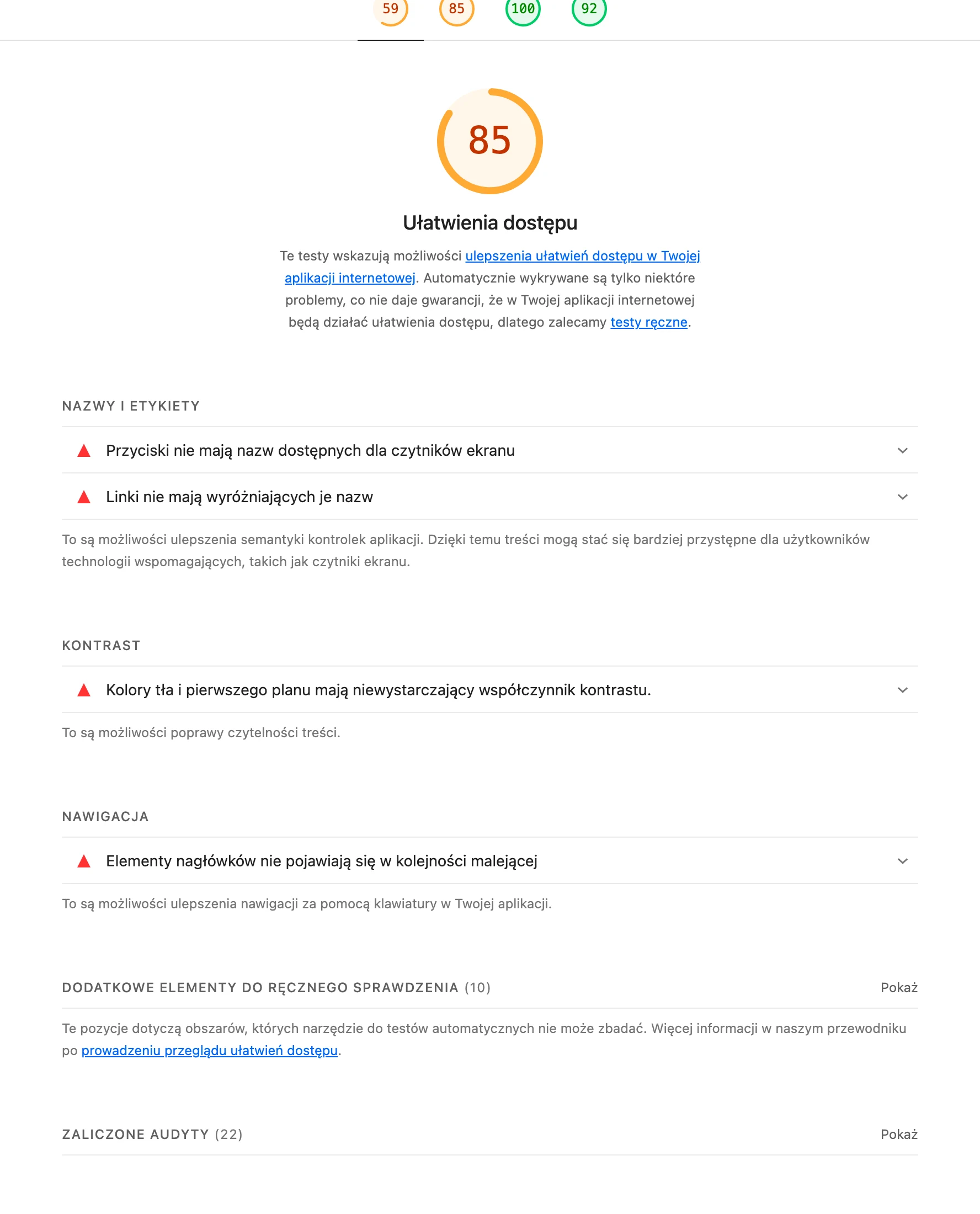
The first screen should be clear the moment someone lands on it. No guessing. The user should see the service name, a short explanation of the offer and a contact button without scrolling, without hunting for “what next”. On mobile, text size, contrast, spacing and visible CTAs matter especially, because decisions happen faster there, but frustration appears faster too.
The form matters a great deal. And this is often where the problems start. It should collect only the information needed to start the conversation, not to fully qualify the project at the outset. Every unnecessary field lowers the chance of sending an enquiry, especially on a phone. It also helps to have a clear message about what will happen after the form is submitted (when someone will reply, what information is worth providing at the start), because uncertainty costs conversions.
Technically, you need to take care of loading speed, correct form validation, button functionality, clickability of the phone number and the absence of errors that interrupt the contact path. That is the foundation. In practice, it is worth regularly checking the page in PageSpeed Insights, Lighthouse and manually on a few devices. A common problem does not stem from the page design, but from small faults — ones that, for weeks, block parts of the form or quietly worsen the mobile experience.
UX is judged by what users do, not by what the team thinks. Session recordings, heat maps, scroll depth and form abandonment ruthlessly show where people stop, what they do not understand and at what point they lose the urge to get in touch. The best UX fixes are often small, but spot-on: a more precise heading, a shorter form, a stronger CTA or moving key information higher up.
The most common mistakes in designing a service page
The most common sin is simple. The page does not help the user make a decision, it just leaves them with assumptions and a vague feeling that “there is something here”. Instead of explaining the service, who it is for and what to do next, it serves up generic slogans, a broad offer and random CTAs. Traffic may therefore appear, but it does not turn into enquiries. If the user does not understand the scope of the service and the next step after a few seconds, they usually do not return to the form.
A very common problem is an offer description that is too general. Phrases such as “comprehensive service”, “individual approach” or “highest quality” sound good, but they do not answer the one key question: what does the customer actually get? When there is no concrete scope, no stages, no starting requirements and no information on what the service does not include, the quality of enquiries drops and the number of conversations with poorly matched people grows.
The second mistake is more subtle. It is poor alignment of the message with user intent, i.e. talking “about everything” instead of “for whom and for what purpose”. The page often does not clearly communicate who the service is for, in what situation it makes sense and when it is better to choose a different solution. A person arriving from Google or an ad does not want to analyse the entire website to understand the offer. That is why the first screen must immediately confirm that this is the right service, and the CTA needs context, for example “Request a quote” or “Book a short consultation”, instead of the bare “Contact us”.
The next group of mistakes concerns trust and contact. Pages can hide the turnaround time, the cooperation model, the billing method or what happens after the form is submitted, while at the same time asking for too much data right from the start. A form that is too long, no alternative in the form of a phone call or a conversation, and no proof of credibility do their work: the user postpones the decision because the risk simply seems too high.
The last mistake can be invisible, but it is the most expensive to maintain. It is the lack of measuring the page’s effectiveness, because without data you do not know whether the problem is a low CTR from search results, a weak first screen, a form that gets abandoned or simply poor traffic quality. In practice, it is worth measuring not only submitted forms, but also CTA clicks, form starts, phone calls and lead quality in the CRM. Without this, optimisation is shooting in the dark rather than cutting to the point.
FAQ
Frequently asked questions
What should a service page look like to increase enquiries?
It needs to show straight away what you offer, who the service is for and how to get in touch. A clear layout, specific copy and one obvious CTA are also important.
What should appear on the first screen of a service page?
The service name, a short description of the outcome, who the offer is for and one clear CTA should be there. If this section does not quickly answer “is this for me?”, users will often leave.
Why is it worth describing the scope of the service and its limitations?
Because users want to know what is included in the service, what you need from them at the start and what the offer does not cover. This kind of description reduces guesswork and improves the quality of enquiries.
What elements build trust on a service page?
Case studies, customer reviews, testimonials, team experience and information about the industries you work in work best. These elements show that the company understands the topic and can deliver on it.
Does an FAQ on a service page really help generate enquiries?
Yes, because it closes doubts right before the form, where it is easy to lose the lead. It should answer questions about cost, lead times, pricing model, required materials and service limitations.
How can you measure whether a service page actually generates good enquiries?
It is not enough to count visits; you also need to track CTA clicks, form starts, form submissions and phone number clicks. It is also worth assessing lead quality in the CRM so you can distinguish traffic from real enquiries.