
Trust on a company website does not come from a single slogan, a nice design or the logo alone. It appears when a user gets answers in a few moments to simple questions: who is behind the company, what exactly it offers, on what terms it operates and whether contact will be safe. Today most people do this test in a few seconds, often first on a phone, and only then verify the information elsewhere. The key is that trust is built from specifics visible straight away, and lost through small oversights, mistakes and omissions. Look at it differently: a website is not a business card to admire, but a tool that should confirm credibility at every stage of the decision. In practice, this means working in parallel on content, usability, technical performance and information consistency.
What trust on a company website is and how to build it
Trust on a company website is the user’s instant assessment of whether the company is real, competent and safe to work with. It is not created by one “feature”, but by a set of signals that together show there is a specific organisation behind the site, with a clear offer and a working contact or purchase process.
Users usually do not analyse a website for long. First they want to understand what the company does, who it works for and what the next step should be. And if they do not see that immediately, uncertainty grows, and then even polished design does not carry the subject through. Visual appeal can support credibility, but it cannot replace clear information about the offer, terms and company details.
Trust grows where a website shows specifics. The company name, contact details, scope of services, stages of cooperation, real case studies, data processing rules and working forms. These are not decorations, but signposts. The user does not want to guess what they are buying or to whom they are sending a message, because at this point the question is: “does this definitely work”.
In practice, building trust starts with removing points of risk. The most common issues are vague claims without evidence, inconsistent messages, unclear CTAs, hidden information, broken forms and outdated details. If a website makes it difficult to complete a simple step, the user reads that as a sign of unprofessionalism. Not because they are being malicious, but because risk online counts faster than promises.
The most effective approach is to audit several areas at once: the company identity, the offer, credibility signals, UX, technical aspects and legal compliance. This makes it clear not only what looks weak, but also where exactly the user loses confidence and simply gives up. The data is clear: people most often drop off over small details, not big declarations. Only then does it make sense to decide whether the priority is improving the service page, the contact section, the form or the messages about the cooperation process.
Which elements affect a company website’s credibility
A company website’s credibility is affected above all by whether the user can immediately see who is behind the company, what exactly it offers and how they can safely take the next step. The strongest impact comes from elements that can be quickly verified and that remove uncertainty before contact or purchase. Not “more content”, but the right information presented directly. And that is not a cliché.
- clear company identity: name, address, phone number, e-mail, registration details, responsible people,
- a specific offer: who the service is for, what it includes, what it does not include, what cooperation looks like,
- credibility signals: contextual reviews, case studies, publications, certifications, partnerships,
- good usability: logical navigation, clear headings, visible CTAs, a simple form,
- technical reliability: HTTPS, fast loading, no errors, proper mobile performance,
- up-to-date and consistent information: the same details on the website, in the company profile and in other channels.
The first group is identity signals. The facts are these: when a company hides basic details or provides them only in one hard-to-find place, users start checking it outside the website. In local and B2B companies, consistency of the phone number, address, opening hours and service scope across all channels is crucial, because discrepancies immediately trigger a warning sign.
The second group concerns how the offer is presented. The service name alone usually does not carry the day, because users want to know what problem is being solved, what the process looks like, what they need to prepare on their side and when contact actually makes sense. The question is whether the website leads to a decision or only talks about the brand. A website is more credible when it helps people make a decision, rather than just describing the brand in vague slogans.
The third group is evidence. The problem is that reviews, references and case studies only work when they have context: the company name, industry, scope of cooperation, date or at least a short description of the result. An anonymous quote without details looks weak, as do customer logos alone without an explanation of what the company did for them and with what effect.
The fourth group is UX and content. It should be simple: the user should be able to find contact details without wandering around, understand the structure of the site and move on to the next step. Instead of A — convenience, they often get B — obstacles: aggressive popups, confusing buttons, overloaded sections, overly long forms and content that sounds “professional” but explains nothing. Look at it differently: if people have to guess, trust is already leaking away.
The fifth group is technology and security. No HTTPS, 404 errors, broken links, slow loading, layout shifts and mobile issues not only spoil the experience, but also undermine the sense of safety. But note the antithesis here: not “an extra plus”, but a condition for entry. Technical security is now the standard, so lacking it does more damage than its mere presence can help.
The sixth group is freshness. Outdated posts, old case studies without dates, expired promotions, inactive numbers and forms without a submission confirmation are a very strong risk signal. And that is not a cliché, because the user reads it very simply: if the basics on the website are not cared for, what will happen after cooperation begins. Who would want to enter into a relationship that already smells of neglect at the start.
How to carry out a trust audit on a website in practice
A trust audit on a website is a test simple in principle. It checks whether a user can, without getting lost, confirm who is behind the company, exactly what it offers, on what terms it operates and whether contact is actually safe. It is not about scoring the look and feel, but about identifying places where hesitation appears or the risk of abandonment grows. A good audit brings content, UX, technical factors and information consistency together as one. Most often the problem is not the absence of one element, but the sum of small signals that weaken credibility.
First, you need to define the purpose of the website. Only then does it make sense to assess what the user should do next, because otherwise you measure a lead-focused site differently from a local service business website, and differently again from an online store or a booking site. The question is: which information must be visible immediately, and which can appear in the next step, once basic trust has been established.
Then comes the user’s decision path. It is worth going through the site as a new visitor and checking whether, without guessing, you can find the service scope, contact details, working process, terms of operation and answers to common questions. If the user has to click through several subpages just to establish the basics, trust usually evaporates before contact is even made. And that works like a silent brake, not like a dramatic error on the screen.
Then it is time for the company identity and the offer itself. In practice, the visibility of the name, address, phone number, email, registration details, responsible people and the consistency of this information across the whole site is checked, because discrepancies in details hurt the most. At the same time, it is assessed whether the services are described specifically: who they are for, what they include, what they do not include, how pricing works and when a consultation is needed. Not a “nice description”, but a description that makes a decision possible.
The next area is proof of credibility. Reviews, case studies, client logos, publications or certificates only do the job if they can be placed in context, rather than treated as decoration. An anonymous quote without the scope of the cooperation has a weaker effect than a short but specific testimonial with an industry, date or project description. And if these “proofs” are repetitive and empty of content, the reader will interpret them exactly as they look.
At the same time, UX and technical factors need to be examined. The audit assesses the clarity of headings, the visibility of CTAs, the logic of navigation, the number of obstacles in the form, error messages and ease of use on mobile, because these determine whether someone will even get to contact. On the technical side, HTTPS, working forms, the absence of 404 errors, fast loading, a stable page layout and the absence of browser warnings matter. These are not “nice extras”, but trust hygiene.
A separate stage is compliance and privacy. The user should understand what happens to their data, why they are ticking consent and what will happen after submitting the form. Because if they do not understand that, why should they trust it. Unclear checkboxes, hidden terms or overly aggressive lead capture mechanisms are a strong signal of risk rather than a clever tactic.
At the end, you create a problem map and a list of priorities. First you fix what is critical to the decision, namely contact details, forms, basic company information and ambiguities in the offer, and only then do you polish the proof sections and expand the content. If the form does not work or the phone number is out of date, even the best reviews will not help much. The key is to remove risk step by step, not to “beautify” the surface.
Once the changes are implemented, you need to check whether they actually work. Not “by eye”, but with data. Session recordings, click maps, form testing, user journey analysis and manually going through the most important screens all help. The goal is not “a prettier site”, but the moment when the user gets confirmation of credibility faster and takes the next step without effort.
The most important trust signals for users
The most important trust signals are those that most quickly answer simple questions: who is behind the site, what the company does, how contact works and whether the decision is safe. Users rarely break that down into smaller parts. The judgement is made in a few moments, made up of specifics and the absence of friction. The problem is that “somewhere on the site” does not solve anything. What matters is what is visible straight away.
The first strong signal is clear company identification. The name, contact details, location, scope of activity and a real way to get in touch must be within easy reach, not hidden in the footer or privacy policy. If the user does not know who they are dealing with in the first few seconds, the rest of the content loses its impact. And that is not theory, but an instinct.
The second signal is a clear offer. Short and to the point. The user wants to quickly understand who the service is for, what problem it solves, how the cooperation works and what they can expect after getting in touch. Generalities such as “comprehensive solutions” sound professional, but note that they do not help assess whether the company actually fits the need.
Transparency of the process also has a very strong effect. A website builds more trust when it shows the stages of cooperation, the pricing method, required materials, the scope of responsibility and limitations. This is not a decorative extra, but an instruction manual for the relationship. Especially in B2B services, local businesses and everywhere else where the decision requires contact before purchase.
The next group of signals is evidence that can be verified. Reviews, case studies, expert publications, partnerships and certificates work when they do not look like decoration. The question is: what exactly was done and can it be checked. A client logo alone or an anonymous review has limited power, because it does not answer the core point.
Users also pick up technical and usability signals extremely quickly. A slow website, a shifting layout, unreadable mobile, dead links, a form error or misleading buttons lower trust immediately. Technical problems are perceived not as a minor issue, but as a sign of a lack of order and responsibility. Instead of “they probably have it under control”, the thought becomes “if they dropped the ball here, where else have they dropped the ball”.
In practice, the freshness and consistency of data are just as important. One inconsistency is enough. If the phone number on the site does not work, the contact hours are outdated, and the details differ from the company listing or social media profiles, the user starts looking for confirmation elsewhere. Often by then they do not come back, because trust does not like being tested twice.
A strong signal is also the absence of manipulation. A user is more likely to trust a site that states its terms clearly, does not hide costs in the small print, does not force contact before giving basic information and does not use artificial pressure. Too many pop-ups, misleading CTAs or unclear marketing consents have exactly the opposite effect to what the site owner would want.
In the end, what matters is the consistency of the overall picture. A professional website does not have to be extensive, but it does have to stay on message. The promise in the heading should match the service description, the form should match the contact purpose, and the content should match the company’s real way of working. Trust grows when every important screen confirms the same simple thing: this company is specific, predictable and accessible.
How to avoid typical mistakes and trust-related risks
Typical mistakes are avoided by removing everything that gets in the way of the user quickly confirming three things: who the company is, what it offers and how to take the next step safely. The key point is that it is usually not about one major slip-up, but several small risk signals at once. As a result, the user sees a site that looks fine, but does not give them confidence. If after a few seconds it is not possible to understand what the company does and how to contact it, trust drops very quickly.
A common mistake is replacing specifics with vague statements. Slogans such as “we create quality” or “we focus on professionalism” sound nice, but what do they actually mean if there is no service scope, target audience, cooperation process or operating terms alongside them. A website that showcases design instead of critical information produces a similar effect. And then it turns out that the address, phone number, pricing principles or responsibility for the content are hidden somewhere, if they are there at all.
Inconsistent data is a major risk. Users are increasingly comparing information from the website with the company’s Google Business Profile, social media profiles and registration data, because that is now a habit. A different phone number, outdated opening hours or an old address undermine credibility more than the absence of an additional sales section.
Trust is also weakened by manipulative patterns. Hidden costs, unclear marketing consents, misleading buttons, artificial counters and forcing contact without providing basic information are a straight road to suspicion. Can this temporarily increase the number of clicks. Probably. The trouble is that it usually ends in poorer lead quality and greater resistance to getting in touch.
In practice, a lot of damage is caused by technical and operational neglect. A dead form, no sending confirmation, 404 errors, slow loading, a shifting layout or an unreadable mobile version are perceived as a lack of professionalism, even if the offer is good. Security and technical reliability are now a standard expected by the user, not an extra advantage.
Risk also arises where the content is too general, out of date or simply duplicated. When the service description does not answer the client’s real questions, does not show limitations and does not explain what happens after the form is submitted, the user is left with uncertainty. And uncertainty does not sell. In service websites, it is crucial not to promise more than can be supported on the site with evidence, process or the team’s experience.
Practical steps to increase trust on a company website
Trust on a company website does not come from declarations, but from order. It is about structuring information, showing specifics and removing points of risk on the user’s most important paths. It is best to start where the decision to get in touch or buy is made. In practice, that means the home page, service subpages, contact, forms and elements that confirm credibility. First fix what blocks the decision, and only then refine the visual extras.
The home page has one job: to give orientation from the very first second. That is why it should immediately show three things: what the company does, who it works for and what the next step is. The heading should carry operational information, not just branding. Contact details or a clear CTA leading to contact, a quote or a booking must be visible alongside it.
On service pages, the marketing fog ends. You need to clarify the scope and terms of cooperation, because the user should quickly understand what problem the service solves, what it includes, what it does not include, what the process looks like and when an initial consultation is needed. And the question here is: after two minutes, does the client know what they are agreeing to. A clear offer builds trust more effectively than extensive declarations of quality.
Showing the cooperation process works best. A short description of the stages, required materials, pricing method, response times and delivery format simply reduces uncertainty before contact. This is especially important in B2B and specialist services, where the client wants to know not only “what”, but also “how” the company works. Instead of promises — a map of action.
Proof of credibility has to be concrete, otherwise it is just decoration. Testimonials are more convincing when they include the company name, industry, scope of cooperation or date, and case studies gain value when they show the starting point and the actions taken. Client logos alone or anonymous quotes have less power if it is not clear what exactly they refer to. The data says it plainly: context makes the difference.
Forms can also sabotage trust, even if at first glance they seem “neutral”. It is worth simplifying them and refining the post-submission message: the fewer unnecessary fields, the lower the risk of abandonment, but it is just as important to explain the purpose of the form and what will happen next. Who hands over data blindly. A short message such as “we respond within 1 working day” often gives the user more confidence than another block of sales text.
Finally, there are the technical and legal basics. HTTPS, working links, a proper mobile version, a clear privacy policy, sensible consent checkboxes and up-to-date contact details do not create a “wow” effect, but they act like safety brakes. It may sound unexciting, but the absence of any one of these elements can cut trust in a second. That is why it makes sense to revisit key subpages after every major change to the site and do a quick review before users do it for you.
How to measure and verify trust in a website in practice
Trust in a website isn’t captured by a single metric. It’s measured through a combination of user behaviour, the quality of key journeys and the monitoring of risk signals, rather than by staring at one number. The raw number of visits, time on site or a low bounce rate still don’t answer whether the user judged the company to be credible. In practice, you need to check whether the visitor quickly understands who the company is, what it offers and how to safely take the next step. The best measure of trust is whether the user moves on to contact, an enquiry, booking or purchase without hesitation.
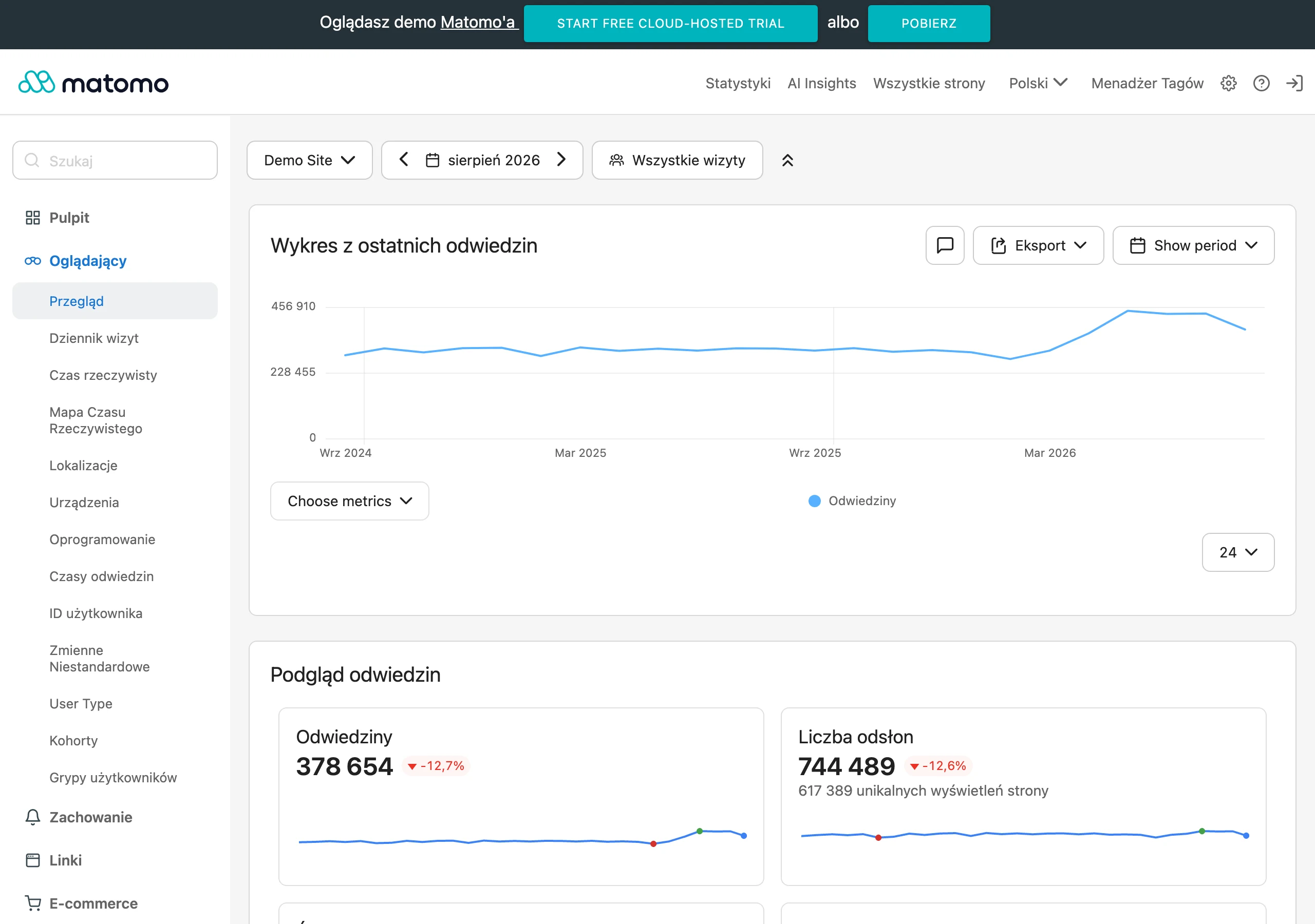
First you define the purpose of the website, and only then do you choose the specific signals for it. For a service website, these will be, for example, moves to the form, clicks on the phone number, enquiries sent, forms started and abandoned, and visits to the contact page from service subpages. For e-commerce, more important will be moves to the basket, checkout abandonment, payment errors and the places where the user returns to look again for information about the company, delivery or returns. The question is not “is traffic growing”, but “where does the decision break down”.
In quantitative data, it’s best to look for moments of hesitation. If users often visit the service page and then drop off en masse before the form or just after landing on contact, they usually lack confirmation of credibility or clarity of the offer. If the form is opened but rarely submitted, the problem may be the number of fields, an unclear purpose of the form, a lack of information about the next steps, or a simple technical fault. What tells you the most are not the overall stats, but the places where the user breaks off the decision.
The numbers themselves need to be seasoned with behavioural observation, otherwise you’re left with theory only. Click maps, session recordings and simple user tests show whether people are looking for contact details, scrolling through the page in search of pricing, returning to the menu or clicking elements that look active but do not work. And it’s precisely in such details that you can see a lack of confidence, not in charts “in the green”. If a user checks the footer, the “about the company” page and the privacy policy several times, it’s often a sign that they want to confirm whether the company is real and whether it’s worth leaving their details.
This is the simplest test. Check whether a new user can answer four questions after a dozen or so seconds: who is behind the website, what exactly the company does, who the offer is for and what will happen after sending the form or making contact. If they can’t, then trust issues begin, even if the design looks modern. Trust drops very quickly when the user has to fill in the basic information for themselves.
Trust also has a technical layer. The user sees errors and reads them as a message: lack of professionalism rather than a smooth process. That’s why you should regularly test forms, click-to-call phone numbers, email links, the mobile version, error messages, loading speed and basic security elements such as HTTPS or the absence of browser warnings. A dead form, an inactive map, a faulty redirect or a slowly loading contact page can destroy trust more effectively than poor content. And that’s brutally simple.
That’s not the end of it. In practice, you also need to measure the consistency of information beyond the website itself, because users like to compare the company name, address, phone number, opening hours and reviews with the Google Business Profile, social media profiles and registration data. What if the website shows a different number, an outdated address or empty social profiles. Then a strong risk signal appears. For local and B2B companies, data consistency across the digital ecosystem is one of the simplest credibility checks.
The most sensible way to assess trust is before changes and after implementing improvements. First you record the baseline: form performance, the number of contact clicks, technical errors, the quality of service pages and the main drop-off points. Then, after the changes, you compare whether users reach key information faster, abandon the journey less often and complete the desired action more frequently. Without such a comparison, all you have left is a feeling. Only then can you see whether real trust has improved, rather than just the appearance of the site.
In day-to-day work, it’s best to treat this as an ongoing control process rather than a one-off audit. After every major change to content, layout or forms, manually go through the most important journeys on desktop and mobile, check the consistency of data and review session recordings from new visits. It sounds mundane, but it works. This way, you quickly catch minor issues which, on their own, seem harmless, but together reduce the website’s credibility.
FAQ
Frequently asked questions
Which elements have the biggest impact on trust in a company website?
The strongest factors are: a clear company identity, a concrete offer, proof of credibility, good usability, technical reliability, and up-to-date, consistent data. The user wants to know straight away who is behind the site and whether they can safely take the next step.
Is a nice website design enough to build trust?
No, aesthetics can support credibility, but they cannot replace clear information about the offer, terms and company details. If the user does not see the specifics straight away, their uncertainty increases.
Why does the lack of contact details reduce a website’s credibility?
Because then the user does not know who they are dealing with or where they can safely get in touch. When basic details are hidden or incomplete, they start verifying the company outside the website.
Which proof of credibility works best on a company website?
Reviews, case studies, publications, certificates and partnerships work well, but only when they have context. Anonymous quotes or client logos alone are much weaker than specific examples with an explanation of the result.
Do technical errors on a website really affect trust?
Yes, no HTTPS, slow loading, 404 errors, broken forms and mobile issues undermine the sense of security. The user reads this as a sign of poor organisation and a lack of professionalism.
How do you run a trust audit on a company website?
You need to check whether the user can understand, without getting lost, who is behind the company, what it offers, on what terms it operates and whether contact is safe. It is worth assessing the content, UX, technical setup and consistency of information across the whole site.