

The category description in e-commerce is neither decorative fluff nor “text for Google”, but a part of the page that is meant to close the sale and structure the choice. In short, it has to perform. A well-written description tells the user what they will actually find in a given category, how the main product types differ and where it makes sense to start the purchasing decision. At the same time, it does a second job: it helps the search engine understand the page topic and its links with subcategories and specific products. The best category descriptions are built from the store’s real offer and user needs, not from a mere list of keywords. In practice, it is not only the content that matters, but also its placement on the page, length, structure and relationship with filters, the listing and internal linking. These are the decisions that most often determine whether the description delivers business results or just takes up screen space.
What are category descriptions in e-commerce and how do they work in practice
Category descriptions in e-commerce are pieces of content placed on the product listing page that simultaneously support customer choice, organic visibility and navigation around the store. This is not text written “next to” the store, but an integral part of the category page. Such a description should explain who the product group is for, what the key differences between variants are and which parameters are worth paying attention to before the user opens a specific product card.

In practice, a category description plays in the same team as the rest of the page elements, rather than going solo. It has to stay aligned with the H1, product list, filters, breadcrumbs, links to subcategories, guide sections and meta data, otherwise information chaos appears. If the content promises brands, features or uses that are not in the offer, it starts to do harm instead of helping. The user gets lost more quickly, and the search engine receives an inconsistent signal about the page content, so the risk of weaker visibility and poorer conversion rises.
A well-designed description usually performs three roles at once. First, it organises the category topic for the search engine, meaning it clarifies what the listing is about and which subtopics matter most within it. Second, it makes it easier for the user to narrow down their choice, because it explains the differences between product types and suggests sensible decision criteria. Third, it directs traffic onwards: to subcategories, filters or products that matter from a sales perspective, instead of leaving the user with random clicking.
The implementation format matters too, not just the text itself. Sometimes a short block above the listing will work, while at other times it is better to expand below the products or split the content into modules that do not compete with the offer for attention. On mobile, the most valuable thing is short, concrete value visible without pushing the product list down. Longer explanations can be moved lower or hidden in a collapsible section, provided this does not make the page harder to use or break the buying journey.
The most common mistake is simple in mechanism. All categories are treated as if they came from one template, although “a category with a simple choice” and one with a broad assortment are two different worlds. Where the decision is based on one main parameter, the description should guide quickly and clearly, rather than rambling in the background. By contrast, with many variants and use cases you need text that organises the choice instead of pretending to be an encyclopaedia. That is why an effective description does not start with writing, but with deciding what job it has to do on that specific page.
Current challenges and conditions for creating category descriptions
Today, precision matters. The user and the search engine expect content that is short, relevant and embedded in the store’s logic, rather than a loose paragraph “about everything”. In search results for categories, intent often gets mixed: some people want to go straight to the product listing, while others need a short hint so they do not buy blind. And that is where the tension starts, because the description can be neither an empty shell nor a wall of text at the top of the page. It has to answer the basic purchasing questions immediately and not put barriers between the user and the offer.
Keywords alone no longer do the job. If the content does not address the real topics that matter to the customer, even the most “polished” words will do little in practice. The key is alignment with search intent, sensible expansion of subtopics and consistency with what the user sees in filters and on product cards. A category description should speak the language of the purchasing decision, not the language of stuffing in synonyms. In practice, that means fewer empty definitions and more specifics: differences between types, uses, limitations and selection criteria that can genuinely be translated into a click on a filter.
Duplication in e-commerce can kill visibility. Stores often run on similar descriptions for many categories, copy manufacturer content without reflection or create several URLs that compete for the same queries. Most often, the relationship between main categories, subcategories and filtered pages suffers, because topics start to overlap. When there is no clear division, keyword cannibalisation appears, and then even solid text works at half capacity. The question is: why build competition within your own store.
Information architecture is unforgiving. If the category tree is unclear, the filters do not lead to a sensible choice, and the names of subcategories sometimes sound technical and sometimes “marketingy”, the text alone will not fix it. The description can support navigation, clarify differences and organise the decision, but it will not replace a logical store structure. Content works best when it is part of a well-organised category, rather than an attempt to mask UX and indexing problems.
More and more often the problem is also automatically generated content without real editorial oversight. Speeding up production in itself is not the issue; the problem is that the text does not stem from the product range, does not distinguish between categories and sounds identical across dozens of subpages. Such content can be linguistically correct, yet still weak in terms of usefulness and semantics, because it does not answer the questions that are actually behind the choice. In e-commerce, this usually means more noise than help, and noise does not sell. Worse still, it blurs the signals the store is trying to send to the search engine.
An important condition for creating descriptions is a mobile-first approach and hard business data. Without numbers, people get lost. You need to know which product groups are priority, where the margin is higher, what is seasonal, and which categories have stable stock availability throughout the year. It is precisely this information that determines what to highlight in the content, where to link, and how often to refresh the description. Without such context, it is easy to put together text that is linguistically correct but simply empty from a sales perspective.
Steps for creating effective category descriptions
An effective category description starts with analysing intent, the offer and the store structure, not with churning out paragraphs. First, the fundamentals. To begin with, you need to check how the category is built: what URL it has, its H1, filters, subcategories, number of products and whether the user really has something to choose from. Without that, you end up with content that sounds “correct” but does not fit the page and does not help either SEO or sales.
The next step is to establish what the user actually expects when they enter this category. There is no room for guesswork here. You need to separate strictly transactional queries from informational ones and check which pages appear in the search results: plain listings, guides or a mixed layout. It is precisely search intent that determines whether the description should mainly organise the choice, explain differences between products, or direct users to subcategories.
Next, you design the content layout on the page. First, usefulness. Above the listing, a short block is usually enough to explain the scope of the category and suggest the 1–2 most important selection criteria. Lower down, you can expand into a guide section, FAQ or links to subcategories, but on mobile the most important value must be visible without pushing the products far down. Not the other way around.
Only after these decisions does the brief and the actual text come into being. A brief is not decorative; it is a map. It should cover the differences between product types, key parameters, assortment limitations, required internal links and words that must not be overused. The description itself must stem from the store’s real offer, because text promising brands, features or uses that are not in the product list quickly undermines the page’s credibility.
In the end, there is optimisation and implementation. And that is where the work starts, not finishes. You need to align the heading, meta data, link anchors and module order so that the content works in tandem with the listing, filters and subcategories. A well-prepared description does not end in the text editor, but after quality control and checking the results in indexing, CTR, clicks through to products and signs of keyword cannibalisation between similar URLs.
Practical tips for descriptions that support sales
A description supporting sales should help with choice, not just contain keywords. That is a fundamental difference. First, ask yourself why a given category exists: should the user quickly find the right product type, or rather understand the differences between variants? That decision determines the length of the text, its placement on the page and whether links to subcategories or a short selection guide will be more important.
Base the content on data from the offer, not on a universal template for the whole store. If users mainly choose by size, material, intended use or price range, those are the parameters that should be reflected in the description and work in tandem with the filters. The best category description names these criteria in the same way as customers do and as they are shown in the store. No translation into “marketing language” when the UI says something else.
Above the listing, leave only what genuinely shortens the path to a decision. Most often, a short clarification of what the category covers, an indication of the key differences and, if needed, a link to the most important subcategories is enough. Put the longer expansion lower down, because an overly long block before the products often does more harm than having no description at all. The user came to browse the offer, not to push through a wall of text.
Internal linking only makes sense when it genuinely simplifies navigation. In practice, it is best to lead to subcategories, important filters, buying guides and complementary categories, but without stuffing links into every paragraph. It is also crucial to separate the scope of content between the main category, subcategories and filtered pages so that several URLs do not compete for the same queries. This is not tidying for tidiness’ sake, but visibility and UX hygiene.
The description needs to be updated regularly, because the category lives alongside the offer. A change of season, a restructuring of the category tree, a new product group or a different sales priority should automatically trigger a content review. When the assortment changes quickly, it is better to use shorter modules that are easy to amend than long blocks that stop matching the listing after a few weeks. The text must keep pace with the shelf, not the other way around.
- Do not copy one scheme across all categories, because the complexity of choice and breadth of the offer are rarely the same. One category requires a comparison of parameters, another only a simple clarification.
- Do not create a description detached from filters, subcategories and real products, because the user will quickly notice the inconsistency. Instead of a “nice story”, there should be a map of the offer.
- Do not duplicate the same content between similar categories and filtered pages, because this increases the risk of duplication and cannibalisation. The effect can be banal in its consequences, with several URLs competing for the same traffic.
- Do not write the text solely for bots: an excess of synonyms, keyword repetition and vague generalities without shopping value usually do not help. In SEO, clarity wins, not artificial “inflation” of words.
- Before publishing, check whether the CMS allows content modules to be embedded safely and whether the description does not break the mobile layout. One badly inserted block can wreck the entire listing view.
The most common mistakes in creating category descriptions
The most common mistakes come from writing a description that has no connection with the real offer, the user’s intent and the structure of the category itself. Such text may sound linguistically correct, but it helps neither with choice nor with organic visibility. The problem is that the description is created “for the category”, rather than for a specific listing, filters and subcategories. If the content promises features, brands or uses that are not in the assortment, it weakens trust and harms the site’s usability. And you lose trust in e-commerce faster than you build it.
This is one of the most common sins. Failing to separate search intent means that in one category the user wants to buy straight away, while in another they first need a short explanation of the differences between product types. When those two goals end up in one chaotic block, the description does not support the decision and responds poorly to queries. The result is predictable: the content becomes too general for the customer and at the same time too vague for the search engine.
The second classic mistake is a wall of text above the product listing. On desktop it is still manageable, but on mobile it is easy to push products too far down and make it harder to browse the offer quickly. Above the listing there should be only what genuinely helps with the choice: the category range, 1–2 decision criteria and, if needed, links to key subcategories. It is better to move everything else lower down or show it in expandable modules, so as not to obscure what the user came here for.
I also often see one template copied across all categories. Convenient organisationally, yes, but usually harmful, because not every category needs the same length, depth and structure of content. A simple category with a small number of variants is described differently from a more extensive one, where the user compares parameters, uses and price segments. A good description does not have a fixed length; it only has a clearly defined function.
Duplication can still sink even a decent online store. And this is not only about copying descriptions between categories, but also about repeating the same topics on subcategories, filtered pages and product pages. The effect is simple: several URLs start competing for similar queries, and the search engine receives an unclear signal as to which page should matter most. This is the classic keyword cannibalisation problem, which more often results from poor topic allocation than from the wording of the text itself.
A separate set of mistakes concerns style. Overusing phrases, artificial synonyms, definitions with no commercial value and paragraphs full of platitudes look like content written solely “for SEO”. The question is: who is meant to benefit from this, the human or the algorithm. Such a description usually explains nothing and does not help narrow down the choice. If, after reading it, the user still does not know how the main variants differ and where to start with the selection, the description is not doing its job.
In practice, content being embedded in the store structure also fails just as often. Internal links then lead to random places, anchors sound unnatural, and the naming in the description does not match the names of filters, H1 or subcategories. For the user it is simply jarring, and for SEO it is a signal that the category topic is less well organised. Before publishing, it is better to check not only the text itself, but also how it fits with the whole category module.
The last, and by no means rare, mistake is failing to update after an offer changes. A category lives by its own rhythm: new product groups arrive, seasonality shifts the emphasis, variants disappear, and sales priorities move to where the margin and demand are at that moment. A text that “did the job” a year ago can now mislead or ignore the most important decision paths. A category description should be treated as an operational part of the store, not a one-off “content to be implemented”. And there is no room for sentiment here.
How to measure the effectiveness of category descriptions in e-commerce
The effectiveness of category descriptions in e-commerce is measured by their impact on visibility, user behaviour and clicks through to products, not just their position in the SERPs. Increases in the number of keywords or visits from Google may sound good on a slide, but they are not enough if users do not go further and do not use the category to choose the offer. The question is: what is the point of them coming if they do not click. That is why it is better to base the assessment on several groups of signals at once. A good description should improve traffic quality, not just its volume.
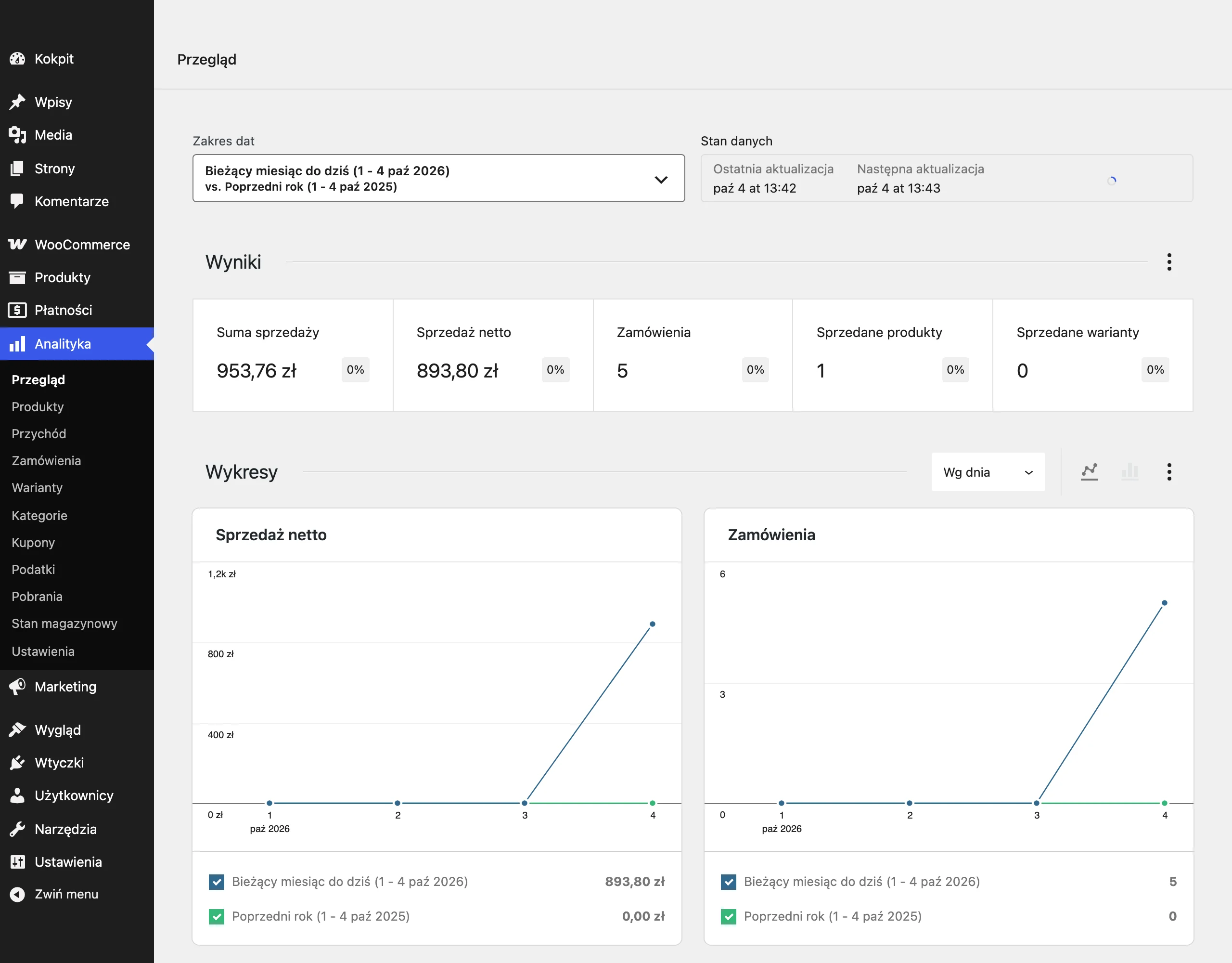
At SEO level, you need to keep a close eye on indexing of the category, visibility for queries within its scope and CTR from search results. If, after implementation, the description organises the topic of the page, you usually see broader query coverage and better alignment with user intent more quickly. But be careful: if impressions increase while clicks stay put, the culprit may not be the description, but the meta title, meta description or simply a mismatch between the content and what the user expects after clicking through. Then SEO “delivers reach”, but the page does not deliver on the promise.
At the level of user behaviour, what matters is clicks from the category to product pages, to subcategories and to key filters. That is a hard signal of whether the content genuinely helps with navigation and narrowing down the choice. If users scroll, click sensible paths and move on, the description is usually doing its job of supporting sales. And if they stop on the page but do not carry out any useful actions, session length alone says very little. Longer does not mean better.
At a business level, it is best to look at the metrics that the category co-creates, rather than attributing the whole result to the copy alone. This is mainly about the category’s share in purchase journeys, visits to products of high business importance, add-to-basket actions after entering from the category, and comparing results before and after implementation. Category copy rarely works in isolation, so it needs to be assessed together with the listing, filters, product availability and information architecture. It is a system of interconnected parts, not a separate project to tick off.
It is also very important to spot side effects. After changes, it is worth checking whether keyword cannibalisation has appeared between similar categories, whether filtered pages are taking traffic for the wrong queries, and whether the content has started competing with guides or product pages. It sounds technical, but the stakes are simple: one shift in emphasis can throw the whole navigation map off course. In practice, improving one category can reduce the clarity of the entire structure if the subject areas are not separated precisely.
Without context, measurement is just a number. That is why seasonal categories are read differently from stable ones, and narrow segments with a few products differently from broad listings with extensive subcategories. The question is what you are really comparing it against. The most sensible approach is to compare results with the equivalent period, take stock availability into account, and track changes across category groups, not just at the level of individual URLs. The best measurement is one that shows whether the copy has actually shortened the path from entering the category to making a sensible product choice.
FAQ
Frequently asked questions
How should a well-written category description work in e-commerce?
It should explain what the user will find in a given category, how the products differ and where to start the selection. At the same time, it should support organic visibility and navigation around the store.
Does a category description matter only for SEO?
No, because it should also close the sale and make the purchase decision easier. It is an integral part of the category page, not a text added next to the store.
Why should a category description not be written only for keywords?
Because keywords alone are not enough if the content does not answer the customer’s real questions and needs. An effective description should speak the language of the purchase decision, not stuffing synonyms.
When is it worth placing a short description above the product listing?
When it should quickly explain the scope of the category and provide 1–2 most important selection criteria. On mobile, it is especially important that it does not push the product listing too far down.
What damages category descriptions in e-commerce the most?
Most often, writing without any connection to the offer, user intent and category structure does the damage. Duplication, keyword cannibalisation and an overly long block of text above the products are also a problem.
How do you create a category description that supports sales?
First, you need to define user intent, the category structure and the store’s real offer. Only then is it worth building a short, concrete text with links to important subcategories and selection criteria.