

Trust in an online store can be improved without an expensive ground-up overhaul. And that is not a cliché. In practice, you rarely need to change the whole design; more often it is enough to cut out the places where the customer starts to hesitate or simply drops out of the process. Most often this means the product page, basket, checkout, returns policy, contact and post-order communication. The biggest problem usually lies not in aesthetics, but in missing information, unclear rules and inconsistent messages. These build or undermine the sense of security, and with it the store’s credibility. The fixes may be small, but they can genuinely change user behaviour at exactly the moments that determine sales.
What is trust building in e-commerce without a redesign?
This is not cosmetic work. Trust building in e-commerce without a redesign means increasing the store’s credibility through changes to the content, information layout and decision-making elements, without rebuilding the whole site. The goal is simple: not to refresh the appearance, but to reduce the risk perceived by the customer just before purchase. The question is what the user sees straight away, and what they cannot quickly find when they want to close the decision.
Such activities usually cover the homepage, category listings, product pages, basket, checkout, FAQ, delivery and returns policies, contact page and post-purchase messages. These are the points where you check whether the customer can easily find the full price, delivery time, return rules, available payment methods, company details and genuine reviews. If key information appears too late or is hidden, the store loses trust even when it looks modern. It works like grit in the gears: a small thing, yet it blocks the whole mechanism.
In practice, the content hierarchy and order of sections are changed most often. Then come the microcopy, button labels, visibility of important messages and the simplicity of forms, because that is where the user starts to struggle. Sometimes it is enough to move delivery information closer to the price, clarify the returns policy or show the contact details more clearly. Small moves, big effect. They work exactly where the customer makes a decision or abandons the basket.
The result is not a new visual design, but a set of specific improvements to be implemented by UX, marketing and development. And that is a good thing. This way of working is often faster and cheaper because it builds on the existing store and its data instead of starting from a blank page. The biggest impact usually comes from changes on pages with the highest purchase intent, not on the homepage. In other words, not where there is the most traffic, but where the money is at stake.
Current challenges and trends in user trust
Today, trust is won through details. Current challenges and trends in user trust are above all the growing importance of mobile, transparency and message consistency across the entire purchase journey. The customer wants to see quickly how much they will pay, when they will receive the product and how they can return it. If they have to search for this information across several screens, trust drops rapidly. And when trust drops, so does the willingness to complete the purchase.
On mobile, the problem is plain to see. Space is limited, and the user has less patience, so delivery, returns and payment information must sit close to the price and the buy button, not at the bottom of the page or in a separate tab. On a phone, the store that wins is the one that answers the key questions before the “add to basket” click.
The second major challenge is transparency, and the brutally honest kind at that. Hidden costs, unclear shipping times, vague return terms or a lack of contact details reduce credibility regardless of how nice everything looks. The customer does not judge the design itself, only whether the store behaves predictably and fairly. The question is simple: do I know what I am signing up for?
Simply flashing security badges around also works less and less often. Much more important is consistency between the advert, product page, basket, checkout and post-purchase messages, because that is where promises collide with reality. If the store promises fast shipping, that promise should be confirmed not only in the headline, but also in the policy, order summary and transactional communication.
Contextual use of reviews and social proof is also gaining in importance. Reviews work best when they refer to something specific: the product, delivery, service quality or the returns process, rather than hanging around as a generic block on the homepage. A customer trusts a review that answers their specific objection more than the general message “thousands of customers trust us”.
In practice, trust analysis increasingly combines two worlds at once: quantitative and qualitative data. Sales reports alone will not tell you why a user abandons the checkout or why they look for contact details before buying. You need to look in parallel at GA4, basket and form data, session recordings, heatmaps, questions to support and reasons for returns, because only then does the full picture emerge. Only such a combination shows which barriers are merely aesthetic and which genuinely block the purchase decision.
Practical stages of trust optimisation
This can be broken down into specific stages. A risk-point audit, data analysis, prioritisation of changes, implementation of fixes and measurement of results create a process that starts not with the graphics, but with checking where the user loses confidence and breaks off the purchase. The most information usually comes from the product page, basket and checkout, because that is where purchase intent is highest. If resources are limited, start with these three places, not with the homepage.
The first stage is reviewing the key screens and spotting gaps in information. You check whether the customer can see the full price, delivery time, availability, returns conditions, payment methods, company details and contact information, in other words everything that calms the mind before payment. The problem is that most often it is not about the store “looking weak”, but about the much more down-to-earth “I do not know what will happen after I click buy”.
The second stage is hard data analysis: quantitative and qualitative. You combine GA4, Search Console, session recordings, heatmaps, cart and checkout data, and questions coming into support, because only then does the full picture emerge. It is best to measure not only sales, but also behaviours that build or undermine trust: clicks on delivery and returns, form errors, drop-offs after costs are revealed, and use of contact options.
The next step is mapping trust gaps and prioritising them. It sounds technical, but it works simply: you assign each barrier to a specific place and a specific problem. This could be a lack of clear returns rules on the product page, showing delivery costs too late, or an unreadable error message in a form. This means the team does not get lost in slogans like “UX improvement”, but targets obstacles that can be implemented without rebuilding the entire store.
Implementation usually means small changes with a big impact. Instead of a major revolution, you move important information closer to the price and CTA button, refine microcopy, shorten the form, improve the presentation of payment methods and add contact details. Often this also includes refining the FAQ, product reviews and messages after adding to basket and after purchase. The greatest value comes from fixes that reduce uncertainty at the exact moment of decision, not generic claims about quality and security.
The final stage is validating the effect after implementation. The data tells you clearly: you check whether transitions from product page to basket have increased, whether checkout abandonment has fallen, and whether the number of questions about delivery, returns or payments has decreased. The key is comparing the same traffic scope and the same paths, rather than relying on the feeling that “it’s better”. A good practice is to prepare a simple change backlog, microcopy proposals and a measurement plan before launch, so that after implementation it is clear what actually worked.
Which interface elements influence customer trust?
The interface elements that mainly build customer trust are those that answer four simple questions: how much will I pay, when will I receive the order, can I return it easily, and how do I contact the store if a problem arises. The question is whether these answers are visible immediately or hidden behind several screens. This information must be easy to read without unnecessary searching, especially on mobile. When the customer has to look for it across several screens, the risk of abandonment increases even with a polished-looking store.
- final price, delivery cost and fulfilment time,
- product availability and clarity of variants,
- return and complaints terms shown at the point of purchase decision,
- payment methods and security messages,
- reviews embedded with a specific product,
- company details, contact and order support status.
The most important elements are the ones visible right next to the price and CTA. The customer should immediately see whether the product is available, when it will be dispatched and what the basic delivery costs are. The delivery cost and estimated delivery time should not appear only at the final checkout step, because then they feel like an unpleasant surprise.
How you present returns and complaints also has a strong influence on trust. A link to the policy in the footer usually does not close the subject, because the user wants a short answer right next to the product or in the basket. It is better to display a simple summary: how long the return period is, what the procedure looks like, and what needs to be done step by step. The full terms and conditions can comfortably stay behind a link.
Reviews matter. And a lot, but only when they are set in a specific context. A general block saying “our customers are satisfied” looks weak compared with reviews tied to a given product, delivery quality or ease of return. It is not about adding stars alone, but about showing content that answers the customer’s real objections.
Company details and contact also build credibility. Nothing flashy, but consistently. The entity name, address, e-mail, phone number, contact hours and order status information should be the same in the footer, checkout and transactional messages. If the store hides these details or presents them in several versions, the user reads that as a risk signal, not “minor chaos”.
Checkout is a separate category. There is no room for uncertainty here. The number of fields, validation quality, clarity of errors, sequence of steps and visibility of payment methods directly affect the sense of security. A good checkout does not force the customer to guess what they did wrong and what will happen after clicking finalise.
Ultimately, consistency across the whole experience matters. It keeps trust in check. If an advert promises fast shipping, the product page must confirm it, the checkout cannot contradict it, and the post-purchase e-mail should give the same timeframe. Trust drops not only because of missing information, but also because of small inconsistencies between screens and messages.
How do you measure the effectiveness of trust changes?
The effectiveness of trust changes shows up in user behaviour exactly where they previously had reason to hesitate. Sales alone are not enough, because conversion increases or decreases can result from seasonality, price, campaigns or traffic quality. That is why it is crucial to look at micro-interactions on the product page, in the basket and in checkout. The best measurement combines the business result with user behaviour before purchase and after purchase.
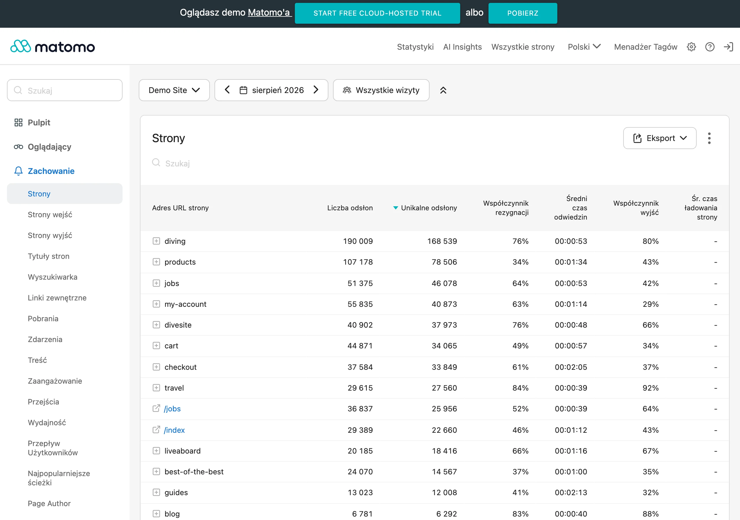
In practice, start with a simple “before” and “after” comparison after implementation. Check whether more people move from the product page to the basket after the change, fewer drop off after the delivery cost is shown, and whether the number of form errors in checkout falls. If the implementation concerned only one place, assess above all that stage rather than spreading the conclusions across the whole store.
The most useful metrics are those that show a reduction in objections, not just the final transaction. Data from GA4, events implemented via GTM, session recordings, heatmaps and support data work well here. If, after adding clear returns policies, users click “add to basket” more often and ask about returns less often, that is a real signal of improved trust.
- clicks from the product card to the basket,
- basket abandonment after finding out the delivery cost,
- checkout abandonment at a specific stage,
- clicks on sections: delivery, returns, payments, FAQ,
- form validation errors and the number of retry attempts,
- use of contact before purchase and the topics of those questions,
- reasons for complaints, returns and post-purchase support tickets.
Measurement must be segmented. Separate mobile and desktop, new and returning users, and in larger stores also the main product categories. And only then compare the results, because otherwise you are mixing different intentions in one pot. It is often on mobile that it turns out the delivery information sits too low or the form is simply exhausting.
You have enough traffic volume. Use an A/B test. If traffic is lower, do a before-and-after comparison, but mark the exact implementation date and do not assess the effect during periods of major campaign changes. The most common mistake in analysis is to attribute the result to one change too early, even though prices, promotions or traffic sources also changed at the same time. That is not a nuance, but the difference between conclusions and guessing.
Also measure operational alignment with the store’s promise. This is a hard test. If you communicate “shipping within 24 hours” or “easy returns”, check later whether customers are reporting delays, ambiguity and disappointment after purchase. Trust does not end at the “buy now” click, because a broken promise comes back faster than you think, as a return, complaint or negative review.
Most common mistakes and pitfalls in building trust
The most common pitfalls in building trust are repetitive. Hiding key information, inconsistent messages and trying to replace transparency with aesthetics alone. The user does not need to believe the store is perfect. They need to see the specifics: how much they will pay, when they will get the product, how they will pay and what they will do if something goes wrong.
A very common problem is revealing costs and terms too late. When the customer only sees an extra delivery charge, a long lead time or return restrictions in the basket or checkout, they read it as risk, not as “small print”. Transparency shown earlier usually works better than “saving” conversion with a discount at the end. Rather than putting out a fire, it is better not to start one.
The second pitfall is a lack of consistency between channels and screens. An advert promises fast delivery, the product card talks generally about shipping, and the terms and conditions add exceptions the customer has not seen before. The same applies to the mismatch between the product page, checkout and transactional emails. Such inconsistency reduces credibility even when the store itself looks modern.
Many stores also overestimate the importance of badges, icons and claims such as “100% secure shopping”. They can help, but as an addition, not the foundation. If there are no clear payment methods, company details, return policy and a smooth checkout alongside them, the embellishments do not build trust — they just start to look suspicious.
Another mistake is hiding or smoothing over reviews. Silence does not build trust. No reviews, only extremely positive comments or reviews without specifics can trigger more distrust than a few moderate ratings with a sensible description. It is better to show reviews tied to the product, variant, delivery quality or returns handling than to put up one general “our customers are satisfied” block.
- an overly general returns policy, without a short version on the product page,
- missing full company details or contact information hidden so that it has to be searched for,
- checkout forms with too many fields and errors that explain nothing,
- artificial urgency such as “1 item left”, when the message sounds unconvincing,
- unclear product availability and no real shipping date,
- image and copy quality too poor to assess the product.
Another trap can be focusing on the homepage instead of the points where the purchase decision is made. A nice, tidy homepage will not fix a product card that does not answer the customer’s questions, nor a checkout that loses the user along the way. The question is: where does the customer have doubts, and where do you leave them unanswered. If the budget is limited, first remove uncertainty from the product card, basket and checkout completion.
Finally, there is the organisational mistake. The most expensive one. The store communicates a promise it cannot operationally deliver, and then wonders why people do not come back. You can improve the copy and information layout, but if support replies after several days, returns are unclear and deliveries are delayed, trust breaks faster than you can refresh the page. In e-commerce, credibility is built not only by the interface, but by consistency between what the store promises and what it actually does.
FAQ
Frequently asked questions
How can you increase trust in an online store without a costly redesign?
Most often, changes to the copy, section order and visibility of key information are enough. The biggest gains come from improving the product page, basket, checkout, returns policy, contact details and post-order communication.
Why do customers stop trusting an online store despite a nice design?
Most often because of missing information, unclear rules and inconsistent messaging. Aesthetic design does not make up for hidden costs, delivery shown too late or a lack of contact details.
Which elements of a store have the biggest impact on customer trust?
The most important are the full price, delivery cost, fulfilment time, returns policy, payment methods, company details and contact information. Reviews placed next to the specific product and consistent post-purchase messaging also matter a great deal.
On mobile, should delivery and returns information be shown near the product?
Yes, because screen space is limited and users have less patience on a phone. Information about delivery, returns and payments should be close to the price and the buy button.
How can you measure whether changes in the store really increase trust?
You need to look at pre-purchase and post-purchase behaviour, not just sales. It’s worth checking transitions from the product page to the basket, checkout abandonment, form errors, clicks on returns and delivery, and questions to support.
Which changes are worth implementing first if resources are limited?
It’s best to start with the product page, basket and checkout, because purchase intent is highest there. These are the places where missing information that undermines the customer’s decision becomes visible fastest.