
The product page is the moment of truth. This is where the customer decides whether to buy straight away, compare the offer, or simply leave the store. That is why it should not be merely a collection of photos and specifications, but a sensibly structured decision-making page. Users rarely read it from start to finish. Instead, they scan the key sections and hunt for answers to specific questions. Conversion is often determined not by the product itself, but by whether the customer can see the price, availability, buying conditions and a reason to click “add to basket” within a few seconds. A good product page not only sells, but also reduces basket abandonment, relieves customer support of repetitive questions and lowers the number of unsuitable purchases. In practice, it is less about the number of sections and more about their order, clarity and fit with how people actually buy.
What is an effective product page in practice?
An effective product page works quickly. It explains what the product is, why it is worth buying, whether it suits a specific need and how to complete the transaction safely. It does not force the user to guess the basics. It provides answers when they are needed, not only after a few clicks or after scrolling through the whole page.
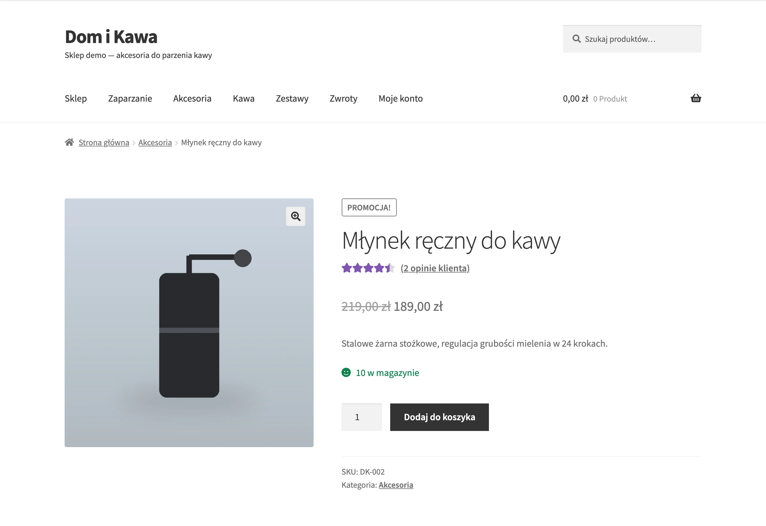
In practice, a product page is a decision-making system, not a single sales description. Users usually first check the name, image, price, availability, variant and purchase button, and only then look into details, reviews and delivery terms. Who has time to read everything in order. For a simple product, the page should shorten the path to the basket, and for a more expensive or technical one, it should above all reduce purchase risk.
The effectiveness of such a page is visible not only in sales results. A well-designed page can reduce abandonment, limit questions about basic issues and help avoid returns caused by incorrect expectations. One thing is key: the customer is not buying the description itself. They are buying confidence that they are choosing the right product on clear terms.
What elements should be included on a product page?
A product page should contain the information needed to make a decision, without sending the customer around the store to look for details. It is about combining sales, technical and trust-building elements in one clear layout. Above the fold, at least the following should be visible: the product name, price, main image, variant selection, availability, CTA and a short note on delivery and returns. And that is not a cliché. If this is missing, the rest of the content becomes an add-on rather than decision support.
- product name that clearly identifies the offer,
- current price and any price before discount,
- image gallery showing the product from several angles and in use,
- variants such as size, colour, capacity or configuration,
- availability and a real dispatch date,
- a clear purchase button,
- a short description of benefits and uses,
- technical specification or parameter table,
- information on delivery, payments and returns,
- customer reviews and answers to the most common questions.
These elements cannot just “be there”. They need to be sensibly arranged, because when a customer has to look for delivery costs, does not understand the differences between variants or cannot see availability, the risk of leaving the page rises almost automatically. Especially on mobile, a simple layout, large clickable elements and no information hidden too deeply win out.
The visual layer is equally important. Images are meant to replace physical contact with the product, so show details, scale, material and usage context, and for more complex products add a short video or animation of how it works. The description should complement the images and specification, not repeat the manufacturer’s dry data. Otherwise it becomes a catalogue, not a product page.
The page must not lack information that removes the burden of doubt from the customer. The customer wants to know whether the product fits their case, exactly what they will receive, what returns look like and when the parcel will arrive. Missing information about delivery, returns or compatibility often lowers conversion more than weaker copywriting. The problem is that these gaps only come to light at the very moment when the customer is already one step away from buying.
How do you optimise a product page for mobile devices?
You arrange a product page for mobile devices so that the purchase decision can be made on the first screen. At the start, the following should be visible: image, name, price, selected variant or the option to choose one, availability and the purchase button. If the customer has to scroll for a long time to see the price, delivery or CTA, conversion usually drops. On mobile, it is about shortening the path to the basket, not expanding the content above the fold.

The layout must be subordinated to thumb-based “screen scanning”. The “add to cart” button should be large, high-contrast and genuinely clickable with one hand, without finger gymnastics. A sticky CTA can help, but note: only when it does not cover the price, variants and important messages. Selecting size, colour or capacity should be simple and unambiguous, instead of small fields and labels you have to guess.
On mobile, clarity of costs and purchase conditions matters especially. The user should quickly see not only the product price, but also the dispatch date, delivery cost and return policy. Hiding this information in distant tabs or only in the cart often increases abandonment. For expensive products, add information about instalments, warranty or compatibility straight away, if that is a common objection.
The content should be layered. On a small screen, long blocks of text are more likely to get in the way than help, so first you show a short summary of benefits next to the CTA, further down an expanded explanation of use cases, and move specifications, instructions and FAQ into clear expandable sections. Such a layout lets you buy a simple product quickly, while still not blocking the decision for more technical offers.
Technical performance translates into sales. If a heavy product page on a phone starts lagging, every stage of the decision becomes longer and more frustrating. Instead of adding more layers of “features”, it is better to cut unnecessary scripts, compress images sensibly, load elements progressively and make sure that variant selection does not add delays. Mobile loading speed is not an add-on to UX, but part of the purchase process.
It pays to build optimisation on data, not gut feeling. The most telling metrics are clicks on the CTA, variant selection, form errors, scroll depth and interactions with sections such as delivery, returns or the size chart. And that raises a simple question: what does the user have to “dig out” before clicking “add to cart”. If they often open the FAQ before adding the product, that is a signal that you are showing key information too late or too unclearly.
What visual assets really increase conversion on a product page?
The visual assets that increase conversion are the ones that show the look, scale, details and way of using the product without needing to touch it in person. A nice photo is a pleasant start, but not the finish. If the customer still does not know what the product looks like from the side, what it is made of or whether it suits their use case, aesthetics will not save the decision. Good visual assets replace some of the questions the customer would normally ask the salesperson.
The gallery that works best is the one that leads the user from the general to the specific. The first photo should identify the product instantly, and the next ones should fill in the rest. Details, texture, scale and usage context should appear in a logical order, rather than in a random mix. For fashion products, interiors, electronics or accessories, it is often the photo sequence that decides whether the customer continues or goes back to the list.
- a main shot on a neutral background that clearly shows the product,
- close-ups of the material, finish and important details,
- a photo showing scale or dimensions in practice,
- shots in use that explain the application,
- a separate presentation of colour variants or the set.
Video works when it does not pretend to be an advert, but explains. It helps most with understanding how it works, assembly or the difference between variants, especially with technical, moving, foldable, configurable products or ones whose function is not visible in a photo. Pace and specificity are key. A short recording usually beats a long piece of content because it answers the question “how does it work?”, rather than building mood.
It is worth adding assets that make it easier to choose the right variant. When the user selects a size, colour, length, power or compatibility, the name of the option alone is simply not enough. Variant thumbnails, colour swatches, photos after changing the option and graphics showing the differences between versions genuinely make the decision easier. And the stakes can be high: a wrong choice ends in a return, extra questions for customer service and costs that could have been avoided.
Customer photos and reviews with photos can boost trust. But only when they are clear and integrated into the page where they actually help, not where they “look nice”. They will not replace the main gallery, because they are usually less structured and do not show all the product features. It is better to think of them as proof of use in real life, not as the main source of information about appearance.
The most common mistake. Visual appeal without informational value. Overloaded banners, stylised packshots without details, no variant photos and no scale make buying much harder, even if the page looks modern. The question is whether, after viewing the assets, the user knows more about the product or has only seen a nice picture. Visual assets should above all reduce uncertainty, because that is what most often blocks the click on “add to cart”.
What analytics data are key for monitoring the effectiveness of a product page?
The data that matter are the ones showing whether the user understands the offer, can choose the right variant and moves to the cart without friction. The number of page views alone says little if you cannot see what happens between landing on the page and clicking the CTA. In practice, you need to measure not only sales, but also the behaviours that lead to the decision or derail it. The most important thing is the combination of data on conversion with data on interactions and errors.
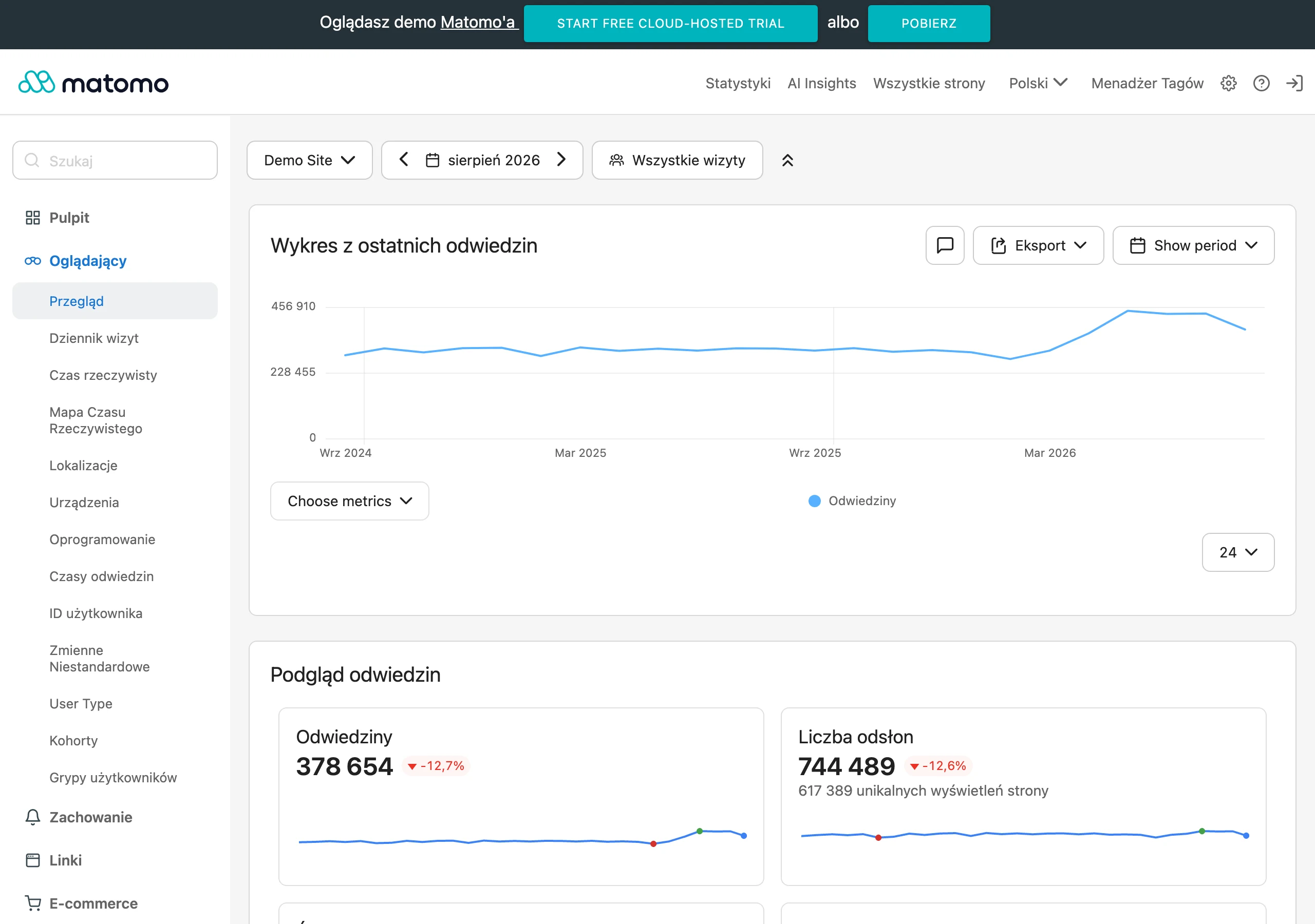
The most useful indicators for an individual product card are indirect ones. This means the add-to-basket rate, transitions to checkout, variant selection, interactions with the gallery, reading the FAQ section, clicks on delivery and returns information, and errors when choosing a size or option. And that is where real diagnosis begins. If users view the images and scroll the page but do not add the product to the basket, the problem is usually not traffic itself, but the content, price, trust, or the way the variants are presented.
- product page views and traffic source,
- clicks on “add to basket” and their share relative to views,
- variant selection and the moment of abandonment after selection,
- interactions with the gallery: changing images, zooming, video plays,
- scrolling to key sections such as specifications, reviews, delivery, returns,
- clicks on the size chart, compatibility selector, instructions or FAQ,
- form errors and validation messages,
- basket abandonment after entering from the product page.
These data need to be read by device, product category, variant and traffic source. Without that, everything gets blurred. The same page can perform well in SEO and poorly in paid campaigns, because a user from an ad more often expects a quick answer to the question “is this for me”. Analysis without segmentation easily leads to wrong conclusions, because it mixes traffic with different intent and quality.
Combine numbers with observation. It works. Session recordings, heatmaps, customer service questions, search terms in the internal search and reasons for returns can point to the source of the problem faster than the e-commerce report alone. When customers keep asking about dimensions, compatibility or what is included in the set, the signal is clear: the product card is not addressing the key objections early enough.
From an implementation point of view, keep things tidy. The best approach is to measure events in GA4 through Google Tag Manager and describe them using one shared structure for the entire store, instead of inventing definitions “for each product card” separately. That way, you can compare product cards against one another rather than digging through each one manually. Good product card analytics should lead to decisions about changes in content, layout and UX, not just politely report sales.
Typical mistakes and how to avoid them when creating a product card
Mistakes are usually mundane. And that is why they hurt. Most often it is about the lack of information needed to make a decision, too weak a presentation of the product, and hiding purchase conditions somewhere low down on the page. The user gives up not because the product card is “too short” or “too long”, but because they do not get an answer at the right moment. Price, availability, delivery, returns or product fit are unclear. Conversion falls because it is meant to fall. A product card most often loses out because of simple information gaps, not graphic details.
The classic mistake is copying the manufacturer’s description without adapting it to the store and the real questions customers ask. Such copy is often generic, stuffed with slogans and, in practice, does not answer the basics: who it is for, how the variants differ, and what the limitations are. Let’s look at it differently. It is better to prepare content in layers: a short benefits summary near the CTA, more specific use cases below, and further down the specifications, instructions and technical data.
The second sin is an unclear variant selection. It seems like a minor detail, yet it can kill sales. Names such as “Model A”, “Version 2” or “Colour 03” mean very little if there is no photo, sample, dimension or simple explanation of the difference. The more variants there are, the more important it becomes to show the differences directly, rather than leaving the customer with a bare list of options.
It is also harmful to show delivery, returns and availability information too late. The question is: why force the user to search for this data in the footer, terms and conditions, or only after entering the basket. If the full cost of purchase only becomes visible at the end of the journey, the store itself adds friction and increases the number of abandonments.
A separate category of problems is visual materials and UX. Poor images, no scale, no close-ups, outdated variant photos, heavy scripts and a button to buy that is too small can ruin even a decent offer. On mobile, you can see it clearly: overload from banners, pop-ups and sections that cover the most important interface elements.
You want to avoid these mistakes. So work with a fixed checklist for every product card, one that guides you step by step rather than just “ticking off” items. It should cover: complete purchase information, layout logic, objection-reducing content, technical data, trust elements and measurement of key interactions. And if that sounds like too much formality, the question is: how much is the lack of that routine costing you. The best product cards do not come from a one-off “nice design”, but from regular improvements based on data and customer questions.
FAQ
Frequently asked questions
What elements should a product page contain to increase conversion?
The page should immediately show: the name, price, image, variants, availability, purchase button, and concise information about delivery and returns. A benefits-led description, specifications, reviews and a questions section are also important if they help decision-making.
Why should a product page not be just a collection of photos and specifications?
Because users do not read it from start to finish; they scan the most important sections. If they do not find the answer quickly, they are more likely to abandon the page or basket.
How should you lay out a product page on mobile to shorten the path to basket?
On the first screen, the image, name, price, variant selection, availability and purchase button should be visible. The less scrolling is needed to see this information, the greater the chance of conversion.
What visual materials really help sales on a product page?
The best-performing assets are images showing the product from several angles, details, scale and real-world use. For more complex products, a short video or animation explaining how it works also helps.
Should delivery and returns information be visible straight away on the product page?
Yes, because their absence often lowers conversion more than a weaker description. The customer wants to know quickly when the parcel will arrive, how much delivery costs and what returns look like.
What analytics data is worth measuring on a product page?
It is worth tracking clicks on “add to basket”, variant selection, interactions with the gallery, views of delivery, returns and FAQ, and drop-offs after landing on the page. Page views alone are not enough, because they do not show where the user has a problem.