
On a product page, images do not serve a decorative role but a sales one. The customer looks at them to replace the lack of contact with the product and check whether the offer is safe to buy. It is not “nice pictures” that increase conversion, but those that quickly remove the most important doubts before clicking “add to basket”. That is why it is not only aesthetics that matter, but also the selection of shots, their sequence and whether they show the real product in a useful way.
How do product images influence purchasing decisions?
Product images influence purchasing decisions when they reduce the customer’s uncertainty before buying. The user wants to assess the appearance, quality and whether the product suits their need in a few seconds. If the image answers these questions straight away, the risk of purchase feels lower. If it does not, the tendency to leave the page or postpone the decision increases.
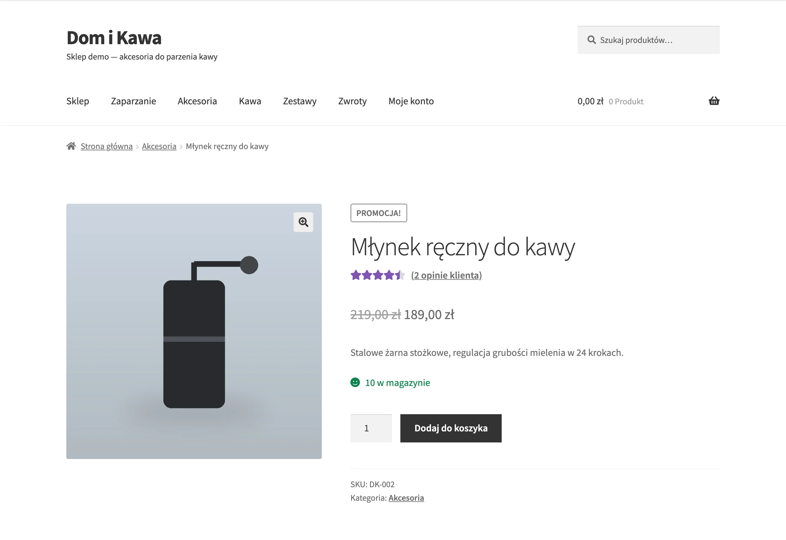
In practice, the customer looks for four things in images: appearance, scale, how to use the product and the differences between variants. The technical description alone is rarely enough, because it does not show proportions, texture or how the product works in a real context. An image can shorten the path to a decision, because part of the assessment happens instantly, without reading a long description. This is particularly important for products that are bought by sight or compared between variants.
Images that build trust through consistency with reality also have a strong impact on conversion. When the colour, texture and construction look believable, the customer more easily assumes they will receive exactly what they see. When the image is too polished or omits important elements, concern about disappointment after delivery appears. This not only lowers sales, but can also increase returns.
It also matters whether the images help compare variants and assess the product from every angle. The customer wants to know what really differs between the colour, size or version, rather than guess based on a single thumbnail. Good images reduce questions to customer service and lower the risk of choosing incorrectly. From the store’s perspective, this means more informed purchases, not just more clicks.
The most important types of product images for maximising conversion
The most important types of images are those that answer specific customer questions about appearance, scale, use and the product variant. There is no single universal set for every industry. For some products, execution details will be key; for others, the method of assembly or the real size. That is why it is worth building the gallery around customer questions, not a rigid template.
The foundation is packshots on a uniform background, ideally showing the front, back and side. Such shots organise the assessment of the product’s form and make it easier to compare offers. The customer sees the shape, proportions and construction elements without distractions. This is usually the best base for the main image and further gallery navigation.
Very often, the sales result is decided by contextual images and close-ups. Lifestyle shots show the product in use, so the customer understands more quickly where and how they can use it. Close-ups of texture, stitching, joints or finish answer the question about quality, which cannot be resolved by the description alone. If the customer is going to look for a specific detail anyway, it is better to show it straight away than to hope they will “work it out” from the rest of the gallery.
Images showing scale and a complete presentation of variants are also highly valuable. A product shown in a hand or next to a familiar object eliminates the common problem of misjudging size. In turn, each colour and size should have its own clear shots, because one thumbnail for multiple versions increases the risk of mistakes. This is especially important where visual differences are a genuine reason for purchase.
In some categories, 360° images and 3D models are very effective. They give the user greater control over viewing the product and better replace turning it in their hand. This type of presentation helps with items that need to be viewed from multiple angles to assess their construction. However, it is not compulsory for every offer, because it only makes sense when it genuinely removes significant customer uncertainty.
- Packshots answer the question: what does the product really look like.
- Contextual images answer the question: how does it work and where will it be used.
- Detail shots answer the question: what is the quality of workmanship.
- Scale shots answer the question: what is the real size and proportions.
- Variant shots answer the question: how do the product versions differ.
- 360° images and 3D models answer the question: what does the product look like from every angle.
The importance of authenticity and trust in product images
The authenticity of product images increases conversion when the customer sees exactly this product, this variant and these features that will end up in the parcel. The most important thing is an accurate representation of the colour, texture and proportions. If the image lightens the material or hides the thickness of an element, the user starts comparing the image with the description and loses confidence. In practice, any mismatch between the image and reality raises the risk of an abandoned basket or a return.
Trust grows when the gallery shows the product from every angle, including less flattering shots. The customer wants to see the back, fastenings, edges, connectors or finishing, because that is often where doubts hide. It is not worth retouching images so heavily that they remove features of the real product. This can improve aesthetics, but it weakens the consistency between the offer and delivery.
Misleading styling reduces credibility, especially when the image includes elements not covered by the sale. If the customer sees a set but is only buying one item from it, this needs to be shown clearly. Customer photos also help, because they show the product in everyday conditions and work as social proof. The best effect comes from combining your own sales images with UGC, not replacing one with the other.
UX optimisation of the photo gallery for a better user experience
Gallery UX improves the user experience when the most important image is visible immediately and allows a quick assessment of the product. The main shot should be placed high on the product page, without the need to scroll. This is especially important on mobile, where space is limited and the decision is made quickly. If the user first sees a banner, a long title and several text blocks, the gallery loses its selling power.
A good gallery makes it easy to view the product instead of fighting the interface. On a phone, natural gestures should work, above all swiping and pinch-to-zoom. On larger screens, a clear zoom is needed, because that replaces close-up inspection of the details. Thumbnails must be readable and always available, otherwise the user will not discover important shots.
Equally important is the gallery’s responsiveness after changing colour, size or another variant. If images load with a delay after clicking a variant, or the old thumbnails remain, the risk of choosing the wrong option increases. Consistent image ratios are essential, because they eliminate layout jumping and make it easier to compare successive shots. It is a technical detail that in practice has a strong impact on the sense of control over the purchase.
The role of product video in reducing purchase uncertainty
Product video reduces purchase uncertainty best when it shows the product in motion, at scale and in real use. The customer understands more quickly how the mechanism works, what assembly looks like and what to expect after unboxing. This is especially important for products that cannot be assessed in a single static frame. A good video shortens the path from interest to decision, because it answers the questions that usually block the purchase.
The greatest value comes from material that does not duplicate the photo gallery, but complements it. A 360-degree presentation in motion, a short usage guide or a demonstration of the product in a daily context work well. This way, the customer sees dynamics, scale and how to use it, not just the appearance itself. If the product requires assembly or has moving parts, video often removes key doubts before purchase.
Effective video needs to be light and easy to consume. The safest option is to start it without sound, with a simple option to turn it on, because many users browse the product page in public places. The format should be well compressed, for example MP4, so the material does not hold up page loading. In practice, one short, specific recording works better than a long film that slows the page and distracts attention.
Key performance indicators and their significance for conversion
Key performance indicators affect conversion when the gallery appears quickly and does not destabilise the page layout. The most important here are LCP and CLS. LCP shows when the user will see the main product image, and CLS says whether the interface shifts during loading. If these elements fail, the customer loses the pace of evaluating the offer within the first few seconds.
In practice, the most common problem concerns the main image. It should not be treated like any other image and loaded lazily together with the rest of the gallery. The first, key shot is usually worth loading with priority, and only the rest later. When the image responsible for the first impression loads too slowly, even a good gallery stops helping sales.
CLS is most strongly affected by the lack of fixed ratios and the lack of explicitly defined image dimensions. When successive images have different formats or the browser does not know their size, the layout shifts during loading. This is especially irritating on mobile devices and makes it harder to click the correct variant. A fixed gallery grid gives a calmer comparison of images and fewer accidental interactions.
Performance is also improved by the way files are delivered. Responsive images via srcset and sizes allow you to send a smaller file to a phone and a larger one to a big screen. In addition, it is worth using WebP or AVIF with a fallback, because they reduce file size without unnecessary loss of quality. The compromise is simple: images need to be clear enough for the purchase decision, but not heavier than necessary.
The number of images itself is not a problem if loading is planned well. The problem starts when all images and scripts launch at once or the main image is rendered by JavaScript. It is better to show the first image immediately and load the rest after interaction or scrolling. This setup supports both user convenience and sales performance.
The most common mistakes in product photos and how to avoid them
The most common mistakes in product photos are the ones that simultaneously increase customer uncertainty and worsen the performance of the product page. In practice, losses are caused less often by a lack of “nice” photos and more often by poor technical decisions and bad gallery logic. If a customer cannot quickly assess the variant, detail or scale, the photos stop supporting the purchase. If, on top of that, the gallery loads slowly or jumps around, the risk of leaving the page increases.
The most costly mistakes usually look unremarkable, which is why it is worth checking them point by point:
- Loading the main image as lazy load instead of prioritising it, which worsens the moment the most important image appears.
- Inconsistent image proportions and a lack of fixed dimensions, causing the gallery layout to shift while loading.
- Lack of shots of details, the back, finishing, or the places a customer will ask about before buying anyway.
- Showing multiple colour variants through a single poor-quality thumbnail, without separate photos for a specific variant.
- Hiding photos in tabs or sliders that require extra clicks, especially on mobile.
- Ignoring mobile performance, even though that is where the gallery most easily loses convenience and speed.
Avoiding these mistakes requires simple implementation rules. The first image should be visible straight away and loaded without delay, while the remaining photos should come later. All images in the gallery should have fixed proportions and explicitly defined dimensions so the interface does not change position. Each variant must have its own photos if colour or size genuinely changes the product’s appearance.
It is equally important to show what is usually omitted. The customer wants to see not only the best shot, but also the stitching, joints, texture, back and finishing. These photos are not always the most striking, but they often support the decision most strongly. They reduce queries to customer service and help lower the risk of returns.
The best approach is to treat the gallery as a sales element, not a decoration for the site. If, after changing the layout, the number of interactions with thumbnails rises, add-to-basket increases and returns fall, the direction is right. If the photos look better but the product page becomes slower or less readable, the change was misguided. That is precisely why mistakes in product photos need to be assessed not aesthetically, but commercially.
FAQ
Frequently asked questions
How do product photos affect a customer’s buying decision?
They reduce uncertainty because they let customers quickly assess the appearance, quality, scale and suitability of the product for their needs. If the image answers these questions straight away, the customer is less likely to leave the page.
Which product photos increase conversion the most?
Packshots, contextual photos, close-up details, scale shots, variant photos and — where it makes sense — 360° or 3D models work best. Each of these types answers a different customer question.
Are “pretty photos” enough to increase sales?
No, because what matters most is whether the photos remove doubts before purchase. Aesthetics help, but without showing the real product, details and proportions, they do not boost conversion as effectively.
Why is authenticity in product photos so important?
Because the customer wants to see exactly the product that will arrive in the parcel, in the same colour, texture and proportions. Over-editing or hiding product features reduces trust and can increase returns.
When is it worth adding product video instead of photos alone?
It is worth adding when the product needs to be seen in motion, at scale or in real use. Video is especially helpful for assembly, mechanisms and things that cannot be properly assessed in a single frame.
Which mistakes in the photo gallery hurt conversion the most?
The biggest problems are slow loading of the main image, inconsistent aspect ratios, hiding important shots and the lack of separate photos for variants. It is also a problem when the gallery is tucked away in hard-to-find places, especially on mobile.