
The product page more often closes the sale than the ad, listing or Google ranking itself. This is where the user checks within a few seconds whether they understand the offer, trust the store and are buying now, rather than putting it off for “later”. A drop in conversion is rarely the result of one major blunder. Usually it is a series of minor frictions that together create uncertainty and shopping friction. If the customer cannot quickly see the price, availability, variant, delivery and a clear call to action, conversion drops even when the product itself is attractive. And there is no magic here, just logic. In practice, you need to consider content, layout, mobile version, performance and the purchasing logic itself at the same time. The source of traffic is also crucial, because a user from paid ads, SEO or a comparison site arrives with a different “promise” in their head.
What are product page errors and how do they affect conversion
Product page errors are stumbles in the content, layout, technology or purchasing process that make it harder to assess the offer and add the product to the basket. And no, these are not only things that are literally “broken”, like a dead button. The problem is that the elements that hurt most are often those that are technically correct, but unclear, incomplete or badly prioritised. The reader may seem to have everything, but still has to guess.
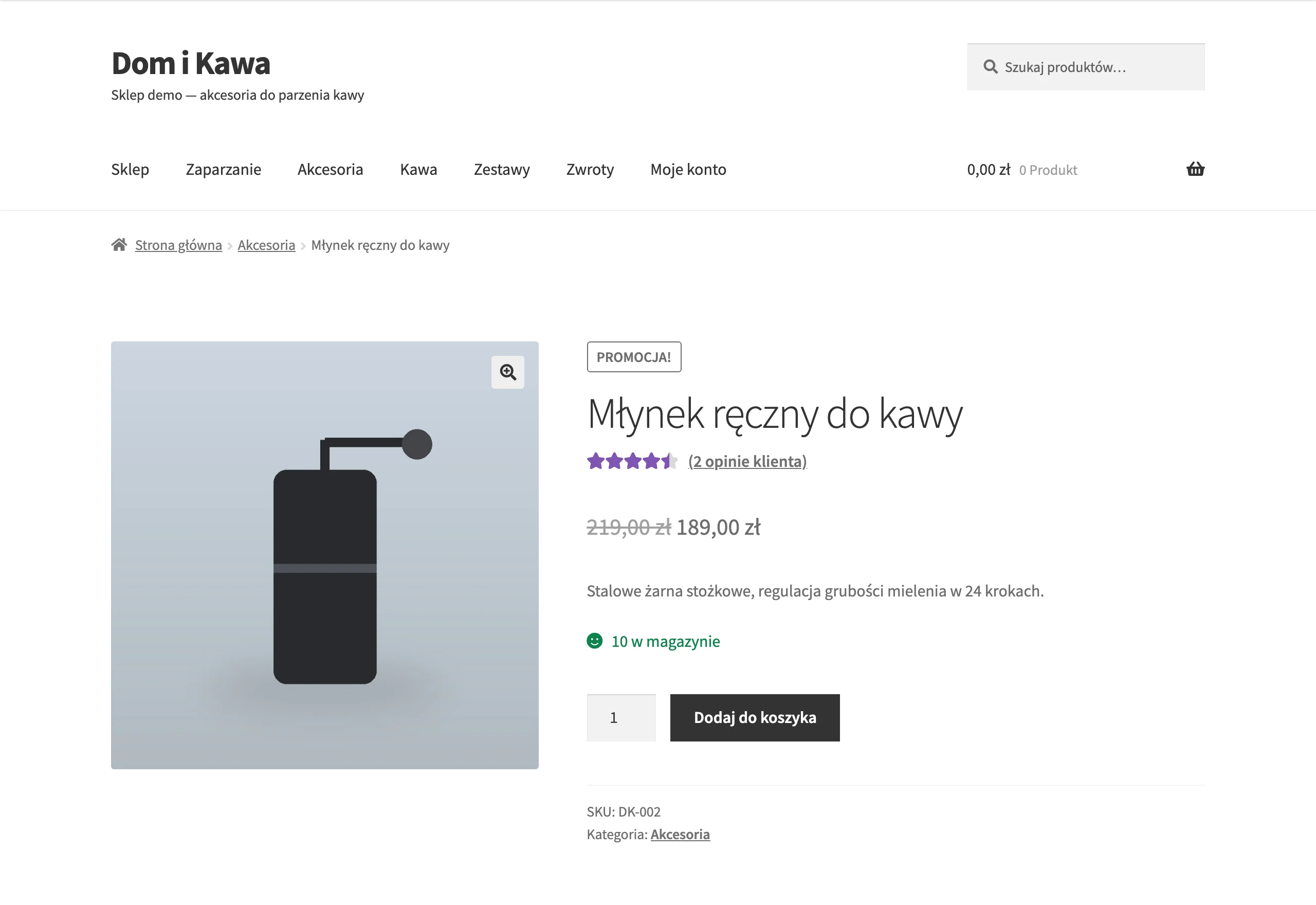
The most costly mistakes are in the places that decide the purchase in the first few seconds. This includes the product name, price, availability, variants, image gallery, delivery cost and time, description, reviews and CTA. That is where the quick “I’ll take it” or “I’ll come back later” happens. If the user has to search for basic information or guess the differences between variants, the risk of leaving the page without buying increases.
Conversion is also affected by hidden errors that the store owner often will not see without behaviour analysis. For example, resetting the selected size after changing the colour, delayed loading of a section, an unclear error message or no confirmation that the product has been added to the basket. These are small things, but they work like sand in the gears. They increase frustration and can interrupt the decision-making moment exactly when the user was already “for it”.
One more thing to remember. The same product card can work differently depending on the source of traffic. A user from an ad expects consistency with the promise in the message, while an SEO user more often expects a fuller description and answers to questions about the purchase. Analysing a product page without splitting it by device and traffic channel often leads to incorrect conclusions. Because what is the point of everything being “fine on average” if something is clashing in a key channel.
The most important product page elements that increase sales
The most important page elements for a product are the ones that answer simple questions immediately. What is it, how much does it cost, is it available, when will it arrive and what do I click next? The first screen should show the name, price, variants, availability, a short benefit, delivery information and a clear add-to-basket button. Instead of a maze — a simple path. That is the basic set that shortens the route to a decision.
We buy with our eyes. The user sees the product through a screen, not in their hand, so the image gallery can make the difference between “add to basket” and “I’ll come back later”. Images need to show details, scale, colour, how it is used and the product’s real appearance, not just pretty shots. In many sectors, size charts, contextual images and video also work brilliantly, because they simply remove uncertainty before the purchase.
Variants need to make sense. The user should immediately understand which options are available, how they differ and whether changing the variant affects the price, delivery time or images. The question is: how are they supposed to know that if the interface mixes up names, order and consistency in presentation. Unclear variants are one of the most common reasons for abandoning a product page, especially on mobile.
Trust sells. That is why the information that builds it should sit right next to the purchasing decision, not be hidden somewhere deep in the site. Reviews, number of ratings, return policy, payment methods, estimated delivery time and stock status work best next to the CTA or just below it. The problem is that when these elements end up in the footer or on separate subpages, the user is more likely to put the purchase off until later.
At the end of the day, convenience matters. Especially on a phone, where one wrong thumb movement can close the matter. The CTA button must be visible, the gallery must not choke page performance, and sticky elements should not cover the price or variant selection. Even a good offer sells poorly if the mobile product card is heavy, chaotic or requires too many steps before adding to the basket.
How data analysis affects product page optimisation
Data clearly shows where sales get stuck. Data analysis shows which product page elements are really blocking the purchase and which changes are worth implementing first, instead of polishing details that have no impact on conversion. Without this, it is easy to improve things that are visible but unimportant, while overlooking problems with the price, variants, CTA or delivery. In practice, it is worth checking at which stage users drop off: before adding to the basket, after choosing a variant or only when moving to checkout. The greatest value comes from analysing a specific product page, not averages for the whole store.
It starts with the numbers. The foundation is quantitative data from GA4 and e-commerce events, because they show the scale of the issue, not isolated cases. It is worth comparing add-to-cart rate, checkout progression, abandonment, and differences between devices, traffic channels and product groups. The same product can perform differently for traffic from paid campaigns, SEO, comparison sites and returning users, because each of these groups arrives with a different level of knowledge and a different purchase intent.
Numbers alone, however, stay silent on “why”. That is why they need to be set alongside behavioural observation, because only then can you see the mechanics of the problem, not just its effect. Heatmaps and session recordings show whether users see the add-to-cart button, try to zoom images, pause on the size guide or get lost when choosing a variant. If the data shows traffic but no interaction with key elements, the problem is usually not the product, but the way it is presented.
Technical analysis can also make a difference, especially on mobile. Slow gallery loading, layout shifts, broken sticky CTAs, JavaScript errors or resetting the variant after changing the colour can kill conversion, even though nothing alarming appears in the content itself. And that is precisely the trickiness of these issues. That is why, alongside sales analytics, it makes sense to inspect PageSpeed Insights, Lighthouse, the section loading logic and whether the events really fire as they should.
In the end, prioritisation still wins. First you remove the errors that block purchase or create strong friction, then you refine the trust-building elements, and only at the end do you tackle layout or copy details. The best results come from rolling out changes iteratively and measuring one specific hypothesis, rather than rebuilding the entire product page at once.
Role of trust and information in the purchase process
Trust and complete information determine whether a user buys now or postpones the decision until “some time”. On the product page, the customer wants to quickly check not only the price, but also availability, delivery time, return policy, variants, dimensions, composition, compatibility and payment method. If this data is missing or hidden too deep, uncertainty starts to creep in. And uncertainty, as in e-commerce, simply eats away at conversion.
The biggest mistake. Leaving the user with questions exactly at the point of decision. If someone does not know whether the product fits, when it will arrive or whether it can be returned easily, they will often not click the CTA even when the offer looks attractive. Information that reduces risk should be visible next to the purchase button or just below it, not only in the footer or on a separate page.
Reviews also build trust, but only when they genuinely help people choose. What matters is a clear rating, the number of reviews, substance in the content, customer photos and answers to recurring doubts, not just a widget with stars for the sake of appearances. In many industries, the user is looking for confirmation that the size is accurate, the colour looks like it does in the photo, the product works in practice, and the shop does not disappear after purchase when a problem arises.
Equally important is consistency of messaging between the advert, the listing and the product page. If the user clicked a promotion, a specific variant or a promise of fast delivery, they must see exactly the same thing once they land on the product page. A mismatch between the promise and the advert not only reduces sales, but also undermines the shop’s credibility.
Small quality signals also affect perceived credibility. Unclear error messages, no confirmation after adding to basket, hidden costs, unclear variants or aggressive pop-ups make the user approach the purchase with clear distance. This is not about one “magic” element. In e-commerce, trust is rarely built by a single element, but it is very often lost through small problems with the content, layout and logic of how the site works.
How to avoid mobile errors on the product page
Mobile errors are eliminated at the source. Simplify the first screen, speed up the page and reduce the path to adding a product to the basket to the absolute minimum. On a phone, the user has no patience to hunt for the price, delivery costs or the CTA button after several scrolls. When these elements are hidden, obscured or load with a delay, conversion usually drops faster than on desktop. On the mobile version, the most important information must be visible and legible straight away: name, price, availability, variant, delivery and CTA.
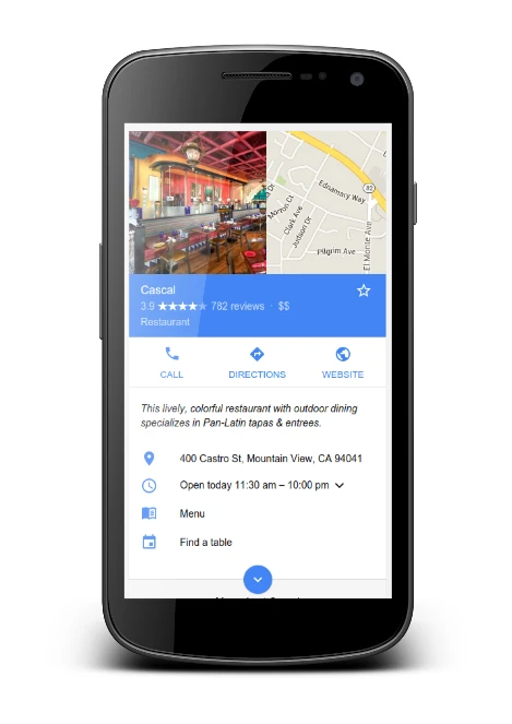
Most often the culprit is a layout carried over from desktop, as if the small screen did not exist. A heavy image gallery, a long promotional block above the product name, extensive sticky bars and pop-ups can push the actual offer beyond the first screen, which is where few people get to. Then it gets even worse. Too-small selection fields, poor contrast and buttons placed too close together end up with the user clicking something they did not mean to, and frustration beats the purchase.
Much also depends on the logic of variant selection. On a phone, the user should immediately see which sizes or colours are available, what changes after selection and whether this affects the price and delivery time. Clarity matters, not fireworks. If changing the variant resets the previous choice, scrolls the page to the top or fails to give clear confirmation, that is a real purchase barrier, not a minor detail.
Performance is a separate area. A mobile product page must load quickly and reliably, because delays with the gallery, reviews, mini basket or delivery section break up the decision-making process. And it works like dominoes. Delayed-loading elements can also be a problem, as they shift the page layout and trigger accidental clicks instead of guiding the user straight to the basket.
- check whether the CTA is visible without extensive scrolling and is not covered by sticky elements,
- make sure variant selection can be done with one thumb and without mistakes,
- see whether, after adding to the basket, the user gets a clear, unambiguous confirmation,
- compare speed and add-to-basket rate separately for iPhone, Android and the most important browsers,
- review mobile session recordings, because many issues do not show up in the numerical reports alone.
In practice, mobile issues are caught on specific interactions, not on the overall conversion rate. Measure CTA clicks, variant selection errors, gallery usage, size chart opens and time to add to basket, because only then can you see where people are really dropping off. The data makes it clear that the “overall” report can be a smokescreen. If mobile traffic is significant, desktop analysis is not enough, because mobile users drop off for different reasons than desktop users.
The importance of consistency between the ad and the product page
Consistency between the ad and the product page is a simple contract. After clicking, the user should see the same offer, the same promise and the same purchase conditions they expected in the ad. If the ad shows a specific variant, price, promotion or fast delivery, the product page must confirm this immediately, without clicking around and guessing. Every discrepancy adds uncertainty and reduces the chance of adding to basket. Inconsistency does not have to be major to cause harm — sometimes a different price, the absence of the pictured variant or an unclear promotion message is enough.
In practice, the problem often starts already at the creative or product feed stage. The ad shows the product in black, while the page opens on the default white variant. The ad promises a discount, but the promotion terms only come to light in the basket. The user does not read this as a “minor difference”, but as a warning sign that the offer may be less favourable than it looked.
Consistency does not end with price and image. The product name, availability, delivery cost, lead time, distinguishing feature and the wording of the message itself also matter. The key is to deliver on the promise without friction. If the ad targets the intent “fast shipping”, and on the page you have to open several sections just to find the lead time, then it is not X, but Y that makes the difference: not marketing, but delivering on that promise in the first few seconds.
- the same product and variant as in the ad,
- the same price or a clearly explained difference,
- the same promotion and the conditions for applying it,
- matching the main image with what the user clicked,
- a visible delivery message, if it was part of the ad message.
Such issues are best identified in data from specific campaigns, not in the average for the whole store. Compare the add-to-basket rate for individual ads, ad groups and creative types. Visits may be cheap, but so what if users go back to the listing, use internal search or leave the product page quickly. The fact is: it often means one thing, a problem with matching the page to the promise of the click.
The solution is often not only to change the content on the product page, but also to change how traffic is directed. Instead of one “universal” page for everything — different versions of the page for different messages, preselected variants or at least URL parameters setting the right colour, size or package. It is a small thing that can swing the result. The ad that converts best is the one that does not require the user to reorient themselves in the offer after landing on the page.
Iterative implementation of changes and performance measurement
Iterative implementation of changes means working in small steps. First you improve a fragment of the product page, then you measure what that specific change did to user behaviour. This approach allows you to distinguish a real improvement from a gremlin effect, which comes from seasonality, a promotion or a sudden change in traffic source. Instead of tearing apart the whole product page at once, it is better to start where the user stumbles: in places blocking the purchase or creating uncertainty. First remove friction in the purchase decision, only then test aesthetic elements and additional modules.
Prioritisation is usually ruthless. The first screen, variant selection, availability, delivery and CTA matter, because that is where purchase intent most often “escapes”. If the user cannot quickly choose a size, cannot see the delivery date, or nothing visibly happens after clicking the button, then does it really matter that you refine the gallery or the layout of the sections below. Further improvements then make limited sense. The biggest return usually comes from changes that shorten the path to adding the product to the basket and reduce the risk of mistakes.
Performance measurement must not end with one metric. The overall conversion rate is tempting in its simplicity, but on the product page the indirect signals are just as important, as they show whether the user better understands the offer and moves on more efficiently. Final sales are important, of course, but they are the finale, not a record of the whole match. That is why, before implementation, it is worth establishing the baseline and carefully recording exactly what was changed and when.
- clicks on the add to basket button,
- selection and change of variant,
- opening the size chart or delivery section,
- interactions with the gallery, reviews and FAQ,
- form errors or failed product add-to-basket attempts,
- proceeding to the basket and further movement to checkout.
Analyse the results by segment, not as an average. Separately for devices, separately for traffic channels, separately for product groups, because the same layout can work brilliantly for brand traffic from SEO, and fall apart for visits from paid campaigns. There, the user often expects immediate confirmation of the price, promotion or specific variant, rather than a walk around the site. The average for the whole store very often hides a problem that occurs only on mobile, only in one category, or only for products with multiple variants.
You have the right traffic. Then A/B tests for individual changes are the gold standard: the layout of delivery information, the way reviews are presented, the order of sections. When traffic is lower, comparing the period before and after implementation more often wins, but with seasonality, promotional activity and changes in campaigns taken into account. The problem is that many teams assess a change in a vacuum, as if context did not exist. The most common mistake is assessing the effectiveness of a change without controlling for context, and then it is easy to attribute an increase or decrease to the wrong cause.
A good implementation does not end with publishing the changes. It ends with a decision on what to do next with the data and conclusions. If the number of add-to-basket actions rises after a fix, but the move to checkout does not, that is a signal that the friction is already in the basket or in delivery costs. If users open the size chart more often, yet still abandon the product, check whether the chart is readable and whether information about fit is missing. The question is: what exactly is blocking movement by that one step. Iteration only makes sense when each change leads to the next conclusion, rather than to random “improvements” to the page.
FAQ
Frequently asked questions
Which product page mistakes lower conversion the most?
The most damaging are missing or unclear price, availability, variants, gallery, delivery cost, description, reviews and CTA. The problem is also small frictions that together create uncertainty and put people off buying.
Can a missing visible price and availability on a product page reduce sales?
Yes, because in the first few seconds the user wants to quickly check the basic information. If they have to look for it, the risk of leaving the page without buying increases.
Why do unclear product variants lower conversion?
Because the user cannot immediately see how the options differ and whether changing the variant affects the price, images or delivery date. Especially on mobile, such confusion often ends with the page being abandoned.
What elements should be visible above the fold on a product page?
It should show the product name, price, variants, availability, a short benefit, delivery information and a clear add-to-basket button. Such a layout shortens the route to the decision and reduces purchasing friction.
When do reviews and return information help sales on a product page?
Best when they are right next to the purchase button or directly beneath it. If they are hidden in the footer or on separate subpages, they more often put the decision off until later.
How does data analysis help find product page mistakes?
It shows at which stage users drop off, for example before adding to basket, after choosing a variant or when moving to checkout. Combining data from GA4, heatmaps and session recordings allows you to determine what is really blocking the purchase.