
A drop in conversion is rarely the result of one big mistake. Usually, it is caused by a chain of small obstacles that appear along the user’s path to the goal. It may be a poorly matched message, an overcomplicated form, an unreadable price, slow page loading or measurement errors. In practice, it is worth looking at the whole journey: from the ad or search result through to form submission, purchase, booking or contact. The biggest mistake is assessing conversion by the page’s appearance, rather than by the specific moments when users drop off. That is why the analysis should combine analytics data, behavioural observation and an assessment of the offer itself. Only then does it become clear what is really holding back performance.
What are mistakes that lower conversion?
Mistakes that lower conversion include all issues that make it harder for a user to move from landing on the page to completing the goal. They may concern the message, offer, CTA, form, checkout, trust, speed or the measurement itself. The effect is always similar: the user does not complete the action, even though they were interested at the start.
In practice, it is not just the page itself that should be analysed, but the entire conversion path. The user comes from an ad, email campaign, search results or a direct visit and immediately compares the promise of the source with what they see on the landing page. If the message at the entry point promises something different from the destination page, conversion drops very quickly, even when the page looks fine.
Most often, the problem does not come down to one element. A too-generic heading, several competing buttons, too many fields in a form and a lack of information about costs can together lower performance more than one serious failure. The devil is in the detail, which is why effective analysis looks not only for individual mistakes, but also for the combined effect of small frictions.
The key questions are very specific: does the user understand what they are getting, who the offer is for and what the next step should be. Do they see the price, conditions, lead time and trust signals at the right moment. If the answer to these questions is not clear on the first screen or just before the decision, the conversion rate usually suffers as a result.
Current challenges in conversion analysis
Current challenges in conversion analysis mainly stem from the growing share of mobile traffic, tracking limitations and increasingly high user expectations for simplicity and clarity in the process. Today, even a small inconvenience costs more than it used to, because the user abandons the page faster and more easily compares it with alternatives. This means that mistakes which used to be merely irritating now often genuinely block results.
Mobile traffic has raised the usability bar. On a small screen, a long form, a poorly visible button or an awkwardly placed pricing section become a much bigger obstacle than on desktop. What is merely inconvenient on a computer often completely stops conversion on a phone.
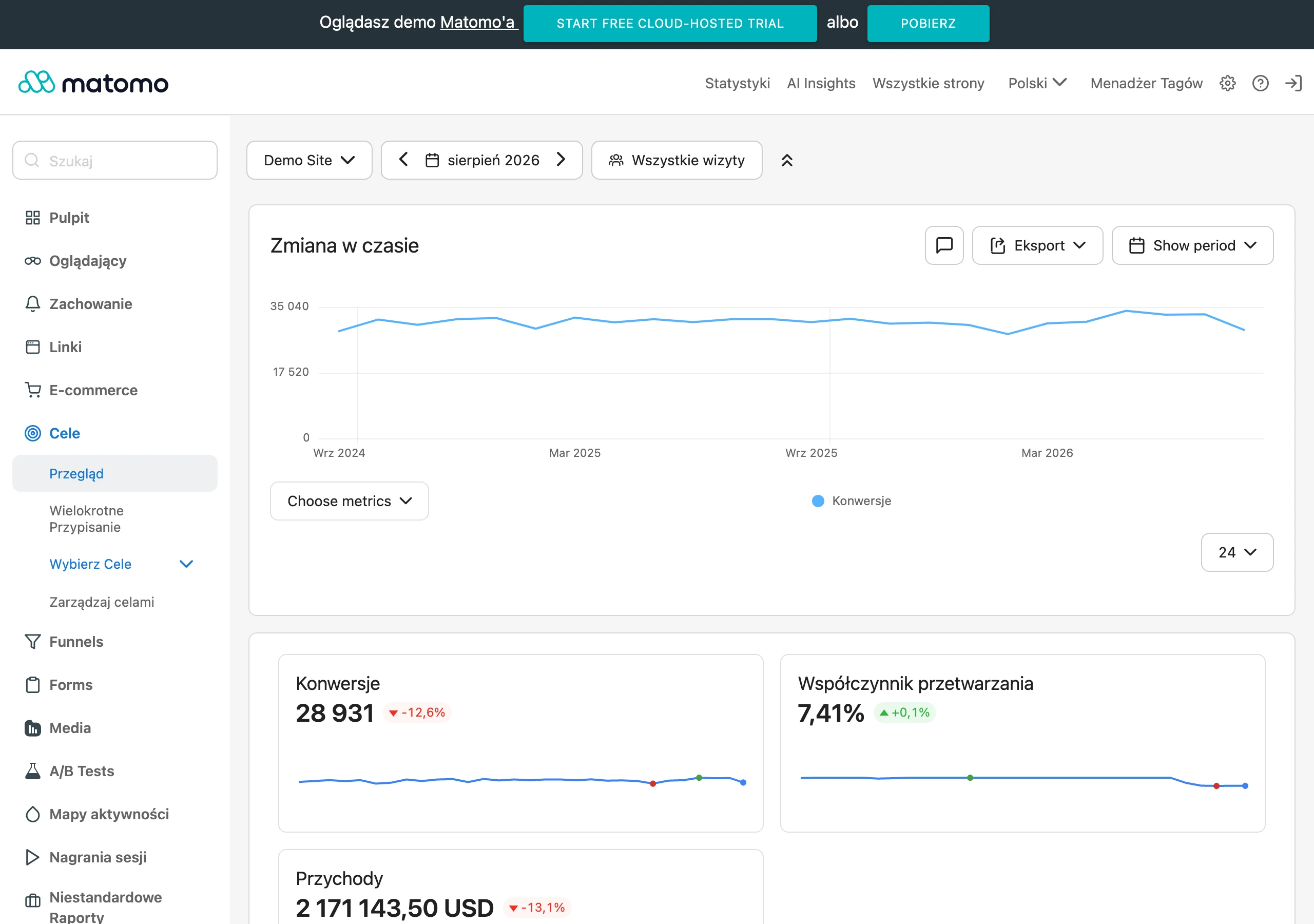
The second difficulty is measurement itself. Cookie consent, script blocking, browser limitations and discrepancies between devices mean that data can be incomplete or distorted. As a result, a company may conclude that the page is to blame, when in reality the tracking is failing and some conversions are not being recorded at all.
Users more often compare offers across tabs and devices, so a lack of consistency quickly works against you. If one price appears in the ad, another on the landing page and yet another in the basket, trust drops immediately. The same applies to delivery costs, lead times, promotions and return policies.
Security and the predictability of the entire process are also playing an increasingly important role. The user wants to know in advance how much they will pay, when they will receive the product, how they can return the order and whether payment is secure. Hidden fees and unclear terms are one of the most common reasons for abandonment, because they undermine convenience and trust at the same time.
How to analyse the conversion path effectively?
Effective analysis of the conversion path comes down to identifying the moment when the user loses motivation, trust or the real ability to complete the goal. At the outset, it is worth confirming what counts as a conversion in the given business model, where the traffic comes from and whether the measurement works flawlessly. If goals, events or forms are tracked incorrectly, it is very easy to draw the wrong conclusions. Before you start improving the page, make sure that analytics shows the real process flow.
The next stage is checking whether the user intent matches what they see immediately after landing on the page. Someone arriving from an ad, an email campaign or a search result should instantly get confirmation of the promise: the same problem, similar language and a clear next step. If the ad talks about a specific offer, but the landing page starts with a generic headline, conversion usually drops on the first screen. Much of the loss often comes not from a lack of traffic, but from a mismatch in messaging between the source of the visit and the page.
Next, you analyse the first screen and the decision architecture. Within a few seconds, the user should understand what is being offered, for whom, at what price and what they should do next. When several equal CTAs, lots of secondary links or obscured offer terms appear on the page, friction increases and some people put the decision off. In practice, it is worth going through this journey as a new user, ideally separately on mobile and desktop.
Finally, you need to look at the places where the user does the work: the form, basket, checkout, booking or contact step. What matters is the number of fields, the clarity of validation errors, the need to create an account, the visibility of final costs and ease of use on a small screen. Every extra field, click or unclear message increases the risk of abandoning the process. That is why analysing the overall conversion rate without looking at the funnel stages usually explains very little.
At the final stage, trust issues and the technical layer are assessed, and then action priorities are set. You need to verify whether contact details are easy to find, whether the return policy is clear, how payment security looks, the visibility of reviews and the predictability of the whole process. At the same time, it is worth identifying technical snags such as slow loading, layout shifts, broken buttons, integration errors or the lack of certain payment methods. It is best to implement changes where the most users drop off and where the improvement is relatively straightforward to introduce.
Most common practical mistakes and how to fix them
The most common mistakes are those that break the consistency of the journey, unnecessarily extend the process or undermine trust just before a decision is made. In practice, they rarely occur in isolation. Usually several small barriers overlap, and only their sum clearly lowers the result.
- A mismatch between the advert and the landing page message. Fix: align the headline, offer, price, scope of service and CTA so that the user immediately knows they are in the right place.
- Overly generic first screen. Fix: show specific value, the target audience and the next step without needing to scroll.
- Too many options and competing CTAs. Fix: reduce distractions and keep one main action for that stage.
- The form collects data that is not needed at this stage. Fix: reduce the number of fields, add hints and phrase error messages in simple, understandable language.
- The checkout requires registration or hides costs until the end. Fix: allow purchase without an account and show the full cost, delivery and conditions earlier, before finalising.
- Missing trust elements at the point of decision. Fix: add reviews, return policy, contact details and security information close to the form or the purchase button.
- A slow or unstable site, especially on mobile. Fix: improve performance, the loading order of resources and interface stability during scrolling and clicking.
- Assessing conversion only at site level. Fix: break down the data by traffic sources, campaigns, devices, new and returning users and funnel stages.
- Implementing changes without checking measurement. Fix: first confirm the goals, events, attribution and the correct functioning of forms, basket and payments in analytics.
It is also worth bearing in mind that not every low conversion rate is the site’s fault. Sometimes the problem comes from traffic quality, a poorly matched offer, pricing policy, seasonality or product or slot availability. That is why after implementation you should assess not only the increase in the number of conversions, but also lead quality, the number of cancellations and the real impact on sales.
The most common mistake in optimisation is improving what is visible instead of what is actually stopping the user. If the analysis shows a drop only on mobile, only in one campaign or only at the final checkout step, the cause should be looked for there. A good fix is specific, measurable and confirmed after implementation, not based solely on an aesthetic impression.
Prioritising changes to improve conversion
Prioritising changes to improve conversion comes down to choosing first those fixes that reduce the biggest user drop-off with as little risk and as reasonable an implementation cost as possible. There is no point starting with the button colour when the form on mobile does not work or delivery costs only appear at the very end. First, it is worth identifying the places where the most people drop off with high-intent traffic. That usually delivers a bigger effect than perfecting visible but secondary elements.
In practice, three things are assessed at the same time: the scale of the problem, its position in the funnel and how easy it is to fix. If a large share of users abandon the checkout at the account registration step, that has a higher priority than refining the FAQ section on the blog. The biggest potential lies in errors that appear close to the decision: in the form, basket, checkout and on the landing page for paid traffic.
It is also worth separating changes with a large impact from those that are convenient to implement but have little business significance. Reducing a form from ten fields to four often matters more than moving graphics around. Similarly, removing inconsistencies between an advert and the page usually works more strongly than purely cosmetic content tweaks. If the problem concerns only one traffic source or one device, the priority should be assessed in that specific segment, not across the whole site.
A sensible sequence of actions is simple: first fix technical and measurement errors, then trust barriers and friction in the process, and only later test the message and layout. If analytics does not measure the form correctly, you cannot reliably assess the result of any change. If you do not know whether the drop is due to a site issue, traffic quality or a tracking error, you are not prioritising optimisation, only guessing.
Do not implement several major changes at once if you want to understand what actually worked. Combining a new headline, a new form, a new CTA and a new layout in one release makes it harder to assess the result. It is better to improve the journey step by step, starting with the most obvious blockers. This speeds up learning and reduces the risk that you accidentally make something worse that was working before.
Optimisation and measuring results after implementing changes
Optimisation and measuring the results after implementing changes come down to checking whether the fix has actually reduced friction and improved the quality of results, rather than merely “shifting” the numbers in the report. A rise in the conversion rate alone means little if the basket value is falling at the same time or lead quality is deteriorating. After implementation, it is therefore worth looking more broadly than a single metric. Ultimately, the full business impact is what matters.
To begin with, make sure your analytics are correctly recording the new journey through the funnel. Verify CTA clicks, form starts, validation errors, transitions between checkout steps, form submissions and purchase confirmation. A very common mistake is declaring success simply because the event has stopped losing some users or has started counting duplicates.
Then compare results in segments, rather than only in aggregate. A change may increase conversion on desktop while at the same time reducing it on mobile phones. It may perform well for branded traffic, but poorly for paid campaigns. That is why it is worth reviewing traffic sources, devices, new and returning users, and the subsequent stages of the funnel, instead of basing the assessment solely on the final conversion number.
If you have sufficient traffic volume, an A/B test gives the cleanest read on the impact of a change. With lower traffic, comparing the periods before and after implementation is often more sensible, but only if campaign conditions, prices, product availability and seasonality are comparable. The result needs to be read in context: the same change implemented with different traffic, a different promotion or a different stock situation may produce a completely different effect.
After implementation, assess not only whether more people click or submit the form, but also whether the whole process has become more predictable. Fewer validation errors, a shorter time to purchase, a lower abandonment rate at a specific step and fewer returns to previous screens usually indicate that the friction has genuinely been removed. Often this is a more reliable signal than the mere jump in final conversion over the short term.
Finally, check the quality of the business outcome. A higher number of leads does not have to translate into better sales if the form has been simplified at the expense of lead relevance. In e-commerce, an increase in transactions is worth comparing with average order value, returns and payment abandonment. Good optimisation increases not only the number of conversions, but also the predictability of the process and the usefulness of traffic for the business.
FAQ
Frequently asked questions
What mistakes most often lower conversion on a website?
Most often these are a mismatched message, too generic a first screen, too many CTAs, a too long form, hidden costs and a lack of trust elements. Slow page loading and measurement errors are also very important.
Does a low conversion rate always mean there is a website problem?
No, because the cause may also be traffic quality, a poorly matched offer, pricing policy, seasonality or product availability. That is why it is worth checking not only the website, but also traffic sources and business conditions.
Why must the message in the ad and on the landing page be consistent?
The user immediately compares the promise from the ad with what they see after landing on the page. If these two elements do not match, conversion drops already on the first screen.
How do you check at which point users give up on conversion?
You need to analyse the entire journey: from the traffic source, through the first screen, the form or basket, all the way to the final step. Analytics data, behaviour observation and assessment of the offer itself help with this.
What gets in the way of conversion most on mobile?
On a phone, long forms, poorly visible buttons and badly arranged price sections are especially problematic. What is merely inconvenient on desktop can completely stop the decision on mobile.
What changes are worth implementing first to improve conversion?
First it is worth fixing technical errors and measurement, then trust barriers and friction in the process, and only then testing the message and layout. The priority should be the places where the most users drop off despite high intent.