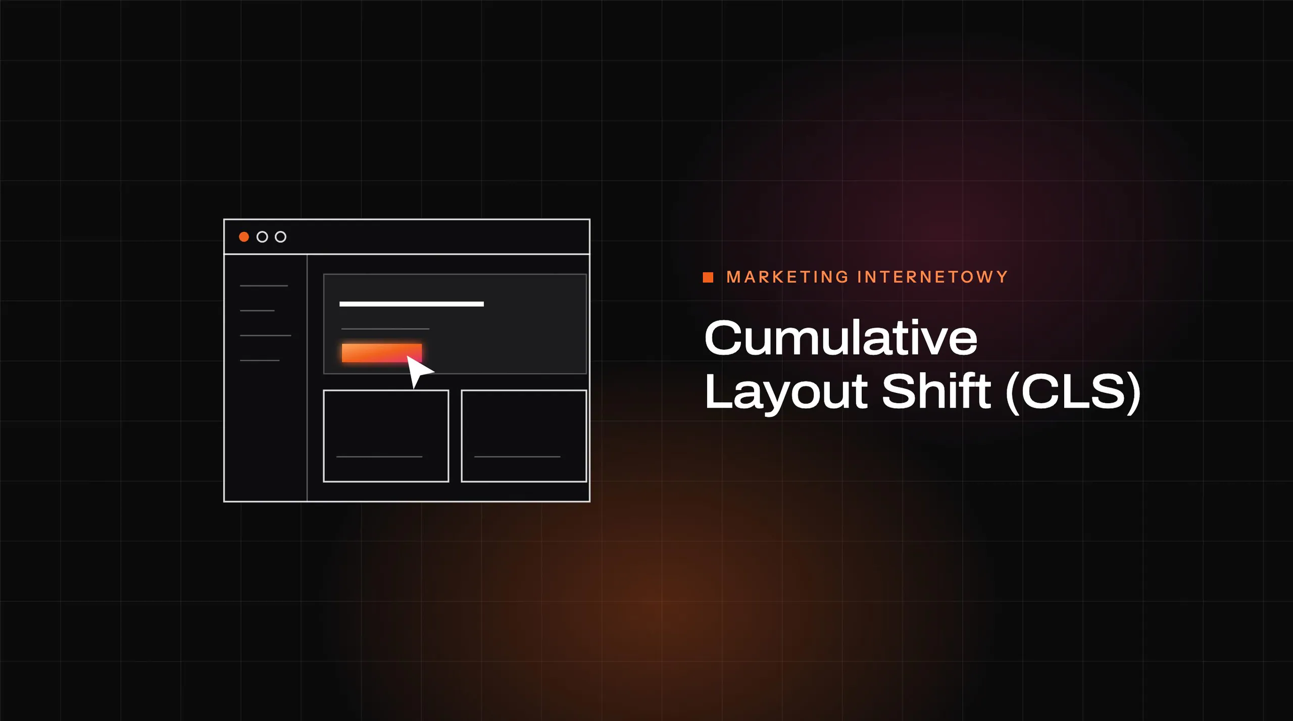

Does your website provide users with a smooth and stable browsing experience? Cumulative Layout Shift (CLS), a key metric in Core Web Vitals, measures the visual stability of a website by assessing how often sudden shifts in elements occur during loading. Exceeding acceptable values can frustrate visitors and lower your site’s ranking in Google. Find out what affects CLS and discover effective improvement techniques that will boost your website’s quality!
What is Cumulative Layout Shift (CLS)?
Cumulative Layout Shift (CLS) is a metric that assesses the visual stability of a website during loading. It measures the sum of unexpected shifts in elements on the page that may occur during user interaction. Such changes are often caused by dynamically loaded content, such as ads, images without precisely defined dimensions or elements added on the fly.
A high CLS score indicates frequent and sudden changes in the page layout, which can frustrate users and make navigation harder. For example, a sudden shift in a button can make it impossible to click. That is why optimising this metric is crucial to ensure a smooth and predictable experience.
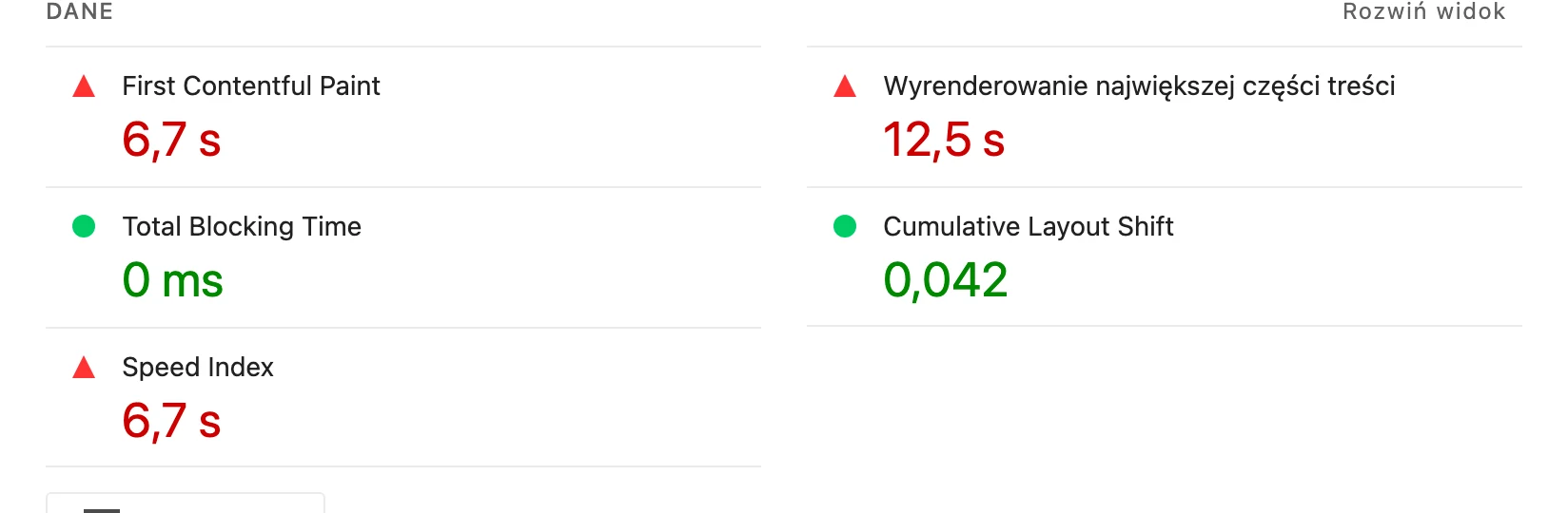
Within Core Web Vitals, CLS is one of the three main metrics alongside Largest Contentful Paint (LCP) and First Input Delay (FID). All of them affect how Google evaluates a website. A CLS value below 0.1 is considered good, while scores above 0.25 are considered poor and may negatively affect a site’s position in search results.
Visual stability has a direct impact on user satisfaction and conversion rate. Pages with a low CLS are perceived as more professional and easier to use, which translates into better business results.
- 01Visual stabilityAssesses unexpected shifts of elements on the page.
- 02Causes of changesDynamic loading, missing dimensions, ads.
- 03Impact on the userFrustration, difficult navigation, click errors.
Optimising CLS is key to a smooth, predictable user experience.
Definition of the CLS metric
Cumulative Layout Shift (CLS) is a metric that measures how often unexpected changes in a page’s layout occur during loading. Each such event is assessed based on two key factors: impact fraction (the portion of the visible area that changed) and distance fraction (the distance the element shifted). By summing these values for all events during a session, we get the final CLS score.
A high CLS indicates frequent and sudden visual changes that can frustrate users. For example, when a dynamically loaded image or ad shifts a button, the person browsing the page may accidentally click the wrong place. That is why optimising this metric is essential to ensure layout stability and improve user experience.
A CLS score below 0.1 is considered good. If, however, it exceeds 0.25, this means that urgent corrective action is needed. It is worth remembering that CLS is part of Core Web Vitals, which means it has a direct impact on how Google evaluates a page and on its position in search results.
The importance of CLS in the context of Core Web Vitals
Cumulative Layout Shift (CLS) is a key element of Core Web Vitals, having a direct impact on users’ experiences when browsing websites. Alongside Largest Contentful Paint (LCP) and First Input Delay (FID), CLS is one of the three main metrics evaluated by Google that determine a website’s position in search results.
A high level of CLS can frustrate visitors when page elements suddenly change position. This often happens with dynamically loaded ads or images without precisely defined dimensions, which leads to unexpected shifts. Such situations not only make navigation harder, but can also lower the conversion rate.
CLS optimisation matters both for user experience and for SEO. Pages with a low CLS are rated more favourably by Google’s algorithms, which translates into greater visibility in search results. A score below 0,1 is considered satisfactory, while a result above 0,25 requires urgent remedial action.
To improve CLS, it is worth applying page layout stabilisation techniques. For example, precisely defining image dimensions or reserving space for dynamic elements can have a significant impact on the score. This makes the page more predictable and user-friendly, which translates into greater satisfaction and better business results.
- 01Analytical toolsStability reports (e.g. PageSpeed)
- 02Impact Fraction (area)Part of the screen affected by the shift
- 03Distance Fraction (shift)Distance moved relative to the height
- 04Calculating the CLS scoreFormula: Impact Fraction × Distance Fraction
Key takeaway: The CLS score is the product of the area affected by the shift and the distance it moves, measured with dedicated tools.
What are the causes of cumulative layout shift?
Cumulative layout shift (CLS) often results from dynamic visual changes while the page is loading. The main culprits are dynamic elements, such as images, videos or fonts, which load asynchronously. Without precisely defined dimensions, they can cause sudden movement of content, affecting user comfort.
Another problem is ads without fixed dimensions. Because they load dynamically, they often take up more space than anticipated, leading to unforeseen changes in the page layout. Similar effects are caused by dynamically injected content, which can appear at any moment, e.g. after data is retrieved from an external source.
Image loading techniques are also important. Images without defined dimensions or delayed in loading can cause other elements on the page to shift. Even small changes can accumulate, resulting in a high CLS score.
To prevent these problems, it is worth defining dimensions precisely for all dynamic elements and using layout stabilisation techniques, such as reserving space or using the CSS ‘contain’ property. This makes it possible to significantly reduce unexpected shifts and improve the user experience.
Dynamic elements and their impact on a high CLS
Dynamic elements such as widgets, ad banners or content loaded on the fly are the main source of a high Cumulative Layout Shift (CLS) score. Because they often load asynchronously after the page has loaded, they can cause sudden shifts in the layout. Imagine a situation where an advert or widget appears without reserved space – other elements then have to change position. Such behaviour frustrates users, especially when they are trying to click a button or read text.
High CLS has a direct impact on user experience. Research shows that pages with this problem record a higher bounce rate – even by 15-20%. Unpredictable changes in the layout make navigation more difficult, which often prompts visitors to leave the website quickly.
To minimise the impact of dynamic elements on CLS, it is worth applying several proven techniques:
- precisely define dimensions for all dynamic components so that the browser can reserve the appropriate space before they load,
- use CSS properties such as `aspect-ratio` or `contain`, which help stabilise the page layout,
- delay loading some elements until the user interacts, e.g. while scrolling, to avoid unwanted shifts during the initial rendering of the page,
- use containers with fixed dimensions for adverts and avoid over-expanding their content.
Optimising dynamic elements is key to maintaining a low CLS and improving the user experience. Pages with a stable layout are not only more user-friendly, but are also rated more favourably by Google’s algorithms, which affects their visibility in search results.
- 01Reserve space for elementsReserve dynamic space
- 02Use CSS aspect-ratioMaintain image proportions
- 03Use lazy loadingDelay loading resources
Visual stability of the page is achieved through space planning and modern CSS techniques.
Ads without dimensions and dynamically injected content
Ads without fixed dimensions and dynamically injected content are among the main causes of a high Cumulative Layout Shift (CLS) score. The lack of precise sizes for these elements causes sudden shifts in the page layout, which negatively affects visual stability and frustrates users.
For example, when an advert loads dynamically without reserved space, it can push other elements, such as buttons or text, out of place. As a result, users may accidentally click the wrong areas or have trouble reading the content. Similar challenges arise when dynamically added content, e.g. pulled from external sources, appears on the page in an unpredictable way.
To limit the impact of adverts and dynamic content on CLS, it is worth applying a few simple solutions:
- precise specification of dimensions for adverts and other dynamic elements allows the browser to reserve the appropriate space before they load,
- space reservation using containers with fixed dimensions prevents sudden layout changes,
- using CSS properties such as aspect-ratio or contain helps stabilise the page layout.
Thanks to these measures, you can significantly improve the visual stability of the site and provide users with a smoother browsing experience.
Image loading techniques and their impact on visual stability
Image loading techniques play a crucial role in ensuring the visual stability of a website. One of the most common problems is the lack of precisely defined image dimensions, which results in unpredictable layout shifts while they are loading. When the browser does not know the exact size of an image before it loads, it cannot plan the available space properly, which leads to sudden changes in the page structure.
To prevent this, it is worth using the `width` and `height` attributes in HTML. Thanks to them, the browser can reserve the appropriate space for an image before it has fully loaded. Example:
“`html “`
An alternative solution is to use the CSS property `aspect-ratio`, which makes it possible to maintain an image’s proportions without needing to provide exact dimensions. This can be done as follows:
“`css img { aspect-ratio: 16 / 9; } “`
Another technique worth noting is lazy loading, which delays loading images until the user scrolls the page to their location. This solution not only reduces the load on the page during the initial render, but also minimises the risk of unwanted layout shifts.
Implementing these methods significantly improves the visual stability of the site, reduces the Cumulative Layout Shift (CLS) score and gives users a smoother experience.
How to measure and calculate the CLS score?
The CLS (Cumulative Layout Shift) score can be measured using analytics tools such as Google PageSpeed Insights or Google Search Console. They provide detailed reports on the visual stability of the site, taking into account key indicators such as impact fraction and distance fraction.
Impact fraction determines what part of the visible area of the page was affected by the shift. For example, if an image occupying 30% of the screen suddenly moves, this value will be 0.3.
By contrast, distance fraction measures the distance an element moves relative to the height of the screen. When a button moves by half the screen height, this value will be 0.5.
To calculate the CLS score for a given event, simply multiply these two values: CLS = impact fraction * distance fraction.
Example:
- impact fraction = 0,3,
- distance fraction = 0,5,
- CLS score for this event = 0,15.
The final CLS score for the entire user session is the sum of all such events. Analytics tools automatically collect this data and present it in clear reports. Regularly checking these values allows you to quickly detect page layout issues and make the appropriate fixes.
It is also worth using the developer tools available in browsers (e.g. Chrome DevTools). They make it possible to track shifts in real time while testing the site. This allows you to precisely identify the source of problems and optimise individual page elements.
Impact fraction and distance fraction
Impact fraction and distance fraction are two key metrics used to calculate the Cumulative Layout Shift (CLS) score. Together, they make it possible to assess how severe page layout shifts are while the page is loading.
- Impact fraction determines what proportion of the visible screen area was affected by the shift. For example, if an image taking up 40% of the screen suddenly moves, this value will be 0.4. The larger the area that changes, the higher this metric,
- Distance fraction, on the other hand, measures the distance the element has shifted relative to the screen height. If a button moves by one third of the screen height, this value will be 0.33. The value increases as elements on the page move further.
To calculate the CLS score for a given event, these two values are multiplied: CLS = impact fraction * distance fraction.
Example:
- impact fraction = 0.4,
- distance fraction = 0.33,
- CLS score for this event = 0.132.
The final CLS score for the entire user session is the sum of all such events. Analytics tools, such as Google PageSpeed Insights, automatically collect this data and present it in reports. This makes it easy to identify problematic elements on the page and implement the appropriate fixes.
It is worth remembering that even small changes can accumulate and lead to a high CLS score. That is why optimising these metrics is key to ensuring visual stability on the site and improving user experience.
Analytics tools for monitoring CLS
To monitor Cumulative Layout Shift (CLS), it is worth using various analytics tools that help identify issues related to layout shifts on the page. One of the most popular solutions is Google PageSpeed Insights. This tool provides detailed reports on site performance, including CLS values, and points out areas requiring optimisation. It allows you to quickly check whether the site meets the recommended Core Web Vitals standards.
Another useful solution is Google Search Console, which offers reports on user experience (Core Web Vitals). In this section, you will find information about pages with high CLS and suggestions for improving visual stability. Regular use of this tool allows you to monitor results continuously and respond quickly to any issues.
For more advanced analysis, it is worth using Chrome DevTools. This tool allows you to track layout shifts in real time while testing the site. Thanks to the Performance function, you can analyse exactly which elements are causing sudden layout changes and implement the appropriate fixes.
Another noteworthy solution is Lighthouse, available both as a Chrome extension and as part of Chrome DevTools. Lighthouse generates detailed reports on site performance, including CLS results, and suggests specific steps for optimisation.
It is also worth mentioning tools such as the Web Vitals Extension, which allow you to monitor Core Web Vitals metrics directly in the browser. This simple solution makes it possible to quickly check CLS results while browsing any page.
Regular use of these analytics tools allows you to keep visual stability on the site under control and respond quickly to any issues related to layout shifts. This helps provide users with a smoother experience and improve the site’s position in search results.
CLS optimisation techniques: how to reduce unexpected layout shifts?
To minimise unexpected layout shifts (CLS), it is worth applying several proven optimisation methods. One of the key steps is stabilising visual elements. This involves precisely defining dimensions for dynamic components such as images, ads or widgets. This allows the browser to reserve the appropriate space before they load, which prevents sudden changes in the page layout.
Another important element is defining image dimensions. The lack of precisely defined graphic sizes is one of the main causes of a high CLS. You can use the width and height attributes in HTML or the CSS property aspect-ratio to preserve the image proportions without specifying exact dimensions. Example:
“`html “` “`css img { aspect-ratio: 16 / 9; } “`
Space reservation is another effective technique. It involves creating containers with fixed dimensions for dynamic elements such as ads or content loaded on the fly. This way, the browser knows how much space to reserve, which minimises the risk of shifts.
It is also worth using the CSS property contain, which helps stabilise the page layout by limiting the impact of dynamic elements on the content surrounding them. Example:
“`css .reklama { contain: layout; } “`
Implementing lazy loading is another CLS optimisation technique. It delays loading images and other resources until the user scrolls the page to their location. This solution not only reduces the load on the page during the initial render, but also minimises the risk of unwanted layout shifts.
Thanks to these techniques, you can significantly improve the visual stability of the site, reduce the CLS score and provide users with a smoother browsing experience.
Stabilising visual elements
Stabilising visual elements is key to reducing the Cumulative Layout Shift (CLS) metric. To achieve this, it is worth precisely defining the dimensions of dynamic elements such as images, ads or widgets. This allows the browser to reserve the appropriate space before they load, which prevents unexpected changes to the page layout.
One of the simplest and most effective solutions is to use the `width` and `height` attributes in HTML for images. For example:
“`html “`
If you want to preserve an image’s proportions without specifying exact dimensions, you can use the CSS property `aspect-ratio`:
“`css img { aspect-ratio: 16 / 9; } “`
In the case of dynamic elements, such as ads or asynchronously loaded content, it is worth reserving space by creating containers with fixed dimensions. In addition, the CSS property `contain` can help stabilise the page layout by limiting the impact of dynamic elements on the content around them:
“`css .reklama { contain: layout; } “`
Another useful tool is the lazy loading technique. It delays loading images and other resources until the user scrolls to their location. This solution not only reduces the page load during the initial render, but also minimises the risk of unwanted layout shifts.
Thanks to these techniques, you can significantly improve your page’s visual stability. Reducing the CLS metric translates into a smoother user experience when browsing the site.
Defining image dimensions
Defining image dimensions plays a key role in minimising the Cumulative Layout Shift (CLS) metric. Inaccurate graphic sizes can lead to sudden shifts in the page layout as they load. When the browser does not know the exact dimensions before an image is loaded, it cannot reserve the appropriate space, resulting in unpredictable changes to the structure of the site.
To prevent these issues, it is worth using the `width` and `height` attributes in HTML. They allow the browser to reserve space for an image even before it is fully loaded. Example:
“`html “`
An alternative approach is to use the CSS property `aspect-ratio`, which makes it possible to preserve proportions without having to specify exact dimensions. This can be achieved as follows:
“`css img { aspect-ratio: 16 / 9; } “`
It is also worth paying attention to the lazy loading technique, which delays loading images until the user scrolls to their location. This solution not only reduces the page load during the initial render, but also minimises the risk of unwanted layout shifts.
Implementing these methods significantly affects the visual stability of the site, reducing the CLS metric and providing users with a smoother browsing experience.
Reserving space and using CSS ‘contain’
To minimise Cumulative Layout Shift (CLS), it is crucial to reserve space for asynchronously loaded elements. This allows the browser to prepare the appropriate space before loading dynamic content such as ads, images or widgets. This simple action prevents sudden layout shifts that often frustrate users and reduce the quality of their experience.
One of the most effective ways to stabilise the layout is to use the CSS property `contain`. It limits the impact of dynamic elements on the content around them. For example, if an ad or image loads asynchronously, applying contain: layout to the container prevents unexpected changes in the page layout. Here is what it looks like in practice:
“`css .reklama { contain: layout; } “`
The `contain` property works by isolating an element from the rest of the page, which minimises the risk of shifts in other components. It is particularly useful for dynamic content such as ads or social widgets.
It is also worth combining space reservation with precise dimension definitions for dynamic elements. This can be achieved by setting fixed container sizes or using the CSS property `aspect-ratio`, which allows proportions to be preserved without having to specify exact dimensions. Example:
“`css .reklama { width: 300px; height: 250px; contain: layout; } “`
Thanks to these techniques, you can significantly improve the visual stability of the site and reduce the CLS value. Reserving space and using CSS `contain` are proven methods of optimising the page layout, which translate into a better user experience and a higher assessment of the site by Google’s algorithms.
Implementing lazy loading
Lazy loading is an effective optimisation technique that helps reduce Cumulative Layout Shift (CLS). Its main idea is to delay loading images and other resources until the user scrolls towards them. This means the browser does not have to fetch all elements immediately, which reduces the load during the initial render and minimises the risk of sudden layout shifts.
To apply this method, simply add the loading=”lazy” attribute to the <img> or <iframe> tags. For example:
<img src=”obraz.jpg” loading=”lazy” alt=”Przykładowy obraz”>
In addition, it is worth ensuring precise image dimensions. This can be achieved using the width and height attributes or the CSS aspect-ratio property. This approach allows the browser to reserve the appropriate space before the content loads, preventing unexpected changes in the page layout.
This technique is particularly valuable on pages rich in graphics or multimedia. It not only improves visual stability, but also increases page performance by shortening the initial load time.
Despite its many benefits, lazy loading requires a sensible approach. Key elements visible “above the fold” (above the fold) should always be prioritised — they shape the user’s first impression. Avoid situations in which the user has to wait for important content to load in order to maintain a smooth experience.
What are the best practices and tools for optimising CLS?
Optimising Cumulative Layout Shift (CLS) plays a key role in ensuring a page’s visual stability. To avoid unexpected layout shifts, it is worth applying a few proven methods. One of the most effective is reserving space for dynamic elements, such as images, ads or widgets. This allows the browser to plan the space in advance, eliminating the risk of sudden changes in the page’s appearance.
It is also worth using modern CSS techniques. For example, the aspect-ratio property allows you to preserve image proportions without having to define dimensions precisely. Example:
img {
aspect-ratio: 16 / 9;
}
Another useful tool is lazy loading, which delays loading images and other resources until the user scrolls the page to their location. This solution not only reduces the load during the initial render, but also minimises the risk of unwanted shifts.
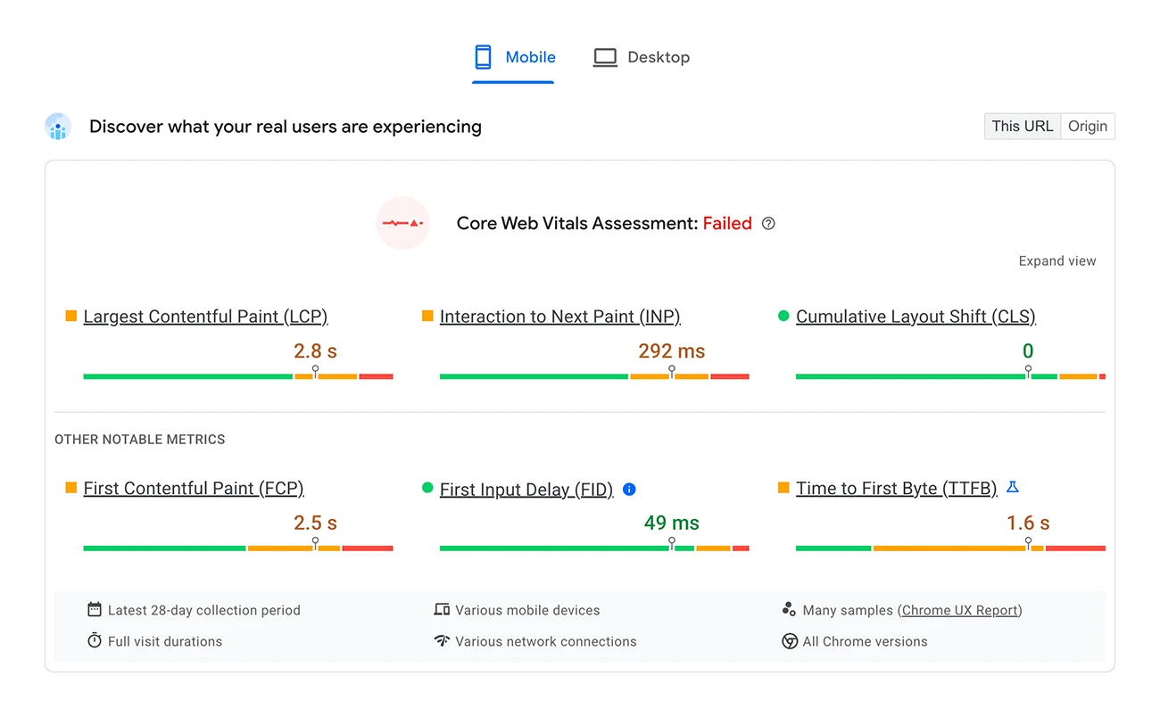
To track CLS, it is worth using tools such as Google PageSpeed Insights or Chrome DevTools. They provide detailed reports on a page’s visual stability and indicate areas requiring optimisation. Regular audits allow you to monitor CLS results on an ongoing basis and respond quickly to any issues.
You also cannot forget about technical SEO. It is important to define dimensions precisely for dynamic elements and to use the CSS contain property. This property helps stabilise the page layout by limiting the impact of dynamic elements on the content around them. Example:
.reklama {
contain: layout;
}
Implementing these practices significantly improves a page’s visual stability, reducing the CLS score and providing users with a smoother browsing experience.
Modern CSS solutions
Modern CSS techniques play a key role in minimising Cumulative Layout Shift (CLS), which directly affects user experience and how Google’s algorithms assess the page. With advanced styling methods, you can stabilise the site layout, avoiding unexpected shifts.
One of the most effective tools is the `aspect-ratio` property. It allows you to preserve the proportions of elements without having to define their dimensions manually. As a result, the browser reserves the appropriate space before the content loads, which significantly reduces the risk of sudden changes in the layout. Example:
“`css img { aspect-ratio: 16 / 9; } “`
Another important solution is the `contain` property, which limits the impact of dynamic elements on the content around them. This is particularly useful for ads or widgets, which often cause unexpected changes in the structure of the page. Example use:
“`css .reklama { contain: layout; } “`
It is also worth mentioning lazy loading, which delays loading images and other resources until the user scrolls the page to their location. This approach not only reduces the load during the initial render, but also minimises the risk of unwanted shifts.
Modern CSS frameworks such as Tailwind CSS or Bootstrap offer ready-made components and classes that make it easier to stabilise the page layout. Using them allows faster creation of responsive projects without having to manually adjust each element.
In addition, it is worth using analytical tools such as Google PageSpeed Insights or Chrome DevTools. They provide detailed reports on a page’s visual stability and indicate areas requiring optimisation. Regular audits allow you to monitor CLS results and respond quickly to any issues.
Implementing modern CSS solutions significantly improves a site’s visual stability, reducing the CLS score and providing users with a smoother experience when browsing the page.
Regular site audits and technical SEO
Regular site audits and technical SEO are crucial for maintaining a low Cumulative Layout Shift (CLS) score. They allow you to detect issues related to layout shifts, such as:
- dynamic elements,
- images without defined dimensions,
- asynchronously loaded adverts.
Implementing the right fixes stabilises the site layout, which translates into a better user experience.
Tools such as Google PageSpeed Insights and Chrome DevTools provide detailed reports on CLS, pointing to the specific page elements responsible for shifts. This makes it much easier to optimise them. Systematic monitoring of results allows for quick responses and maintaining visual stability.
As part of technical SEO, it is worth precisely defining the dimensions of dynamic elements, such as images or adverts. Using the `width` and `height` attributes in HTML or the `aspect-ratio` CSS property helps the browser reserve the appropriate space before the content loads, minimising the risk of sudden layout changes.
It is also worth using techniques such as lazy loading, which delay image loading until the user scrolls down the page. This solution not only reduces the load during the initial render, but also reduces the risk of unwanted shifts.
Regular audits and technical SEO activities are essential for the smooth operation of a site and improving its visibility in search results. They make it possible to effectively control CLS and ensure users enjoy a comfortable browsing experience.
Responsiveness and resource loading
The responsiveness of a website and effective resource management play a key role in keeping the Cumulative Layout Shift (CLS) score low. A lack of responsiveness can lead to unexpected element shifts when the screen size changes, which affects visual stability and frustrates users. That is why it is so important to design with a range of devices and resolutions in mind.
Optimising resource loading is another important aspect. Images, scripts and fonts should be loaded in a way that minimises disruption to the page layout. One solution is the lazy loading technique, which delays image loading until the user scrolls the page to their location. This not only reduces the load during the initial render, but also prevents sudden shifts that may put visitors off.
It is also worth precisely defining dimensions for dynamic elements. This allows the browser to reserve the appropriate space before they load, eliminating the risk of unexpected layout changes. CSS properties such as `aspect-ratio` and `contain` are helpful in maintaining stability and proportions without having to define dimensions manually.
The order in which resources load also matters – key elements visible “above the fold” should be prioritised. This ensures the user gets a smooth experience from the very first seconds of interacting with the site.
Responsiveness and resource-loading optimisation are the foundations of a site’s visual stability and CLS result. Implementing the right techniques not only improves user experience, but also positions the site higher in search results.
Strategies for monitoring and maintaining a low CLS in the future
Regular tracking of the CLS (Cumulative Layout Shift) score using analytics tools such as Google PageSpeed Insights, Chrome DevTools or Lighthouse is essential for maintaining a site’s visual stability. These tools provide detailed reports that help identify elements causing unwanted layout shifts. They make it possible to quickly diagnose issues and implement the necessary fixes.
For example, Google PageSpeed Insights points out specific shift-related events and provides *impact fraction* and *distance fraction* values, which makes precise optimisation much easier. Chrome DevTools, on the other hand, allows you to track these changes in real time while testing the site, which enables thorough analysis and error elimination.
It is also worth regularly reviewing the typical causes of high CLS and implementing preventive measures. If dynamic adverts cause sudden shifts, it is worth reserving space using containers with fixed dimensions or using the CSS property `contain`. For images, it is crucial to define their dimensions precisely using the `width` and `height` attributes or the `aspect-ratio` property.
Systematic CLS monitoring not only allows you to keep control of site stability on an ongoing basis, but also makes it possible to respond quickly to new challenges related to dynamic content or changes in the site structure. This helps ensure users enjoy a smooth browsing experience and maintain the site’s high ranking in search results.
Regular monitoring of CLS using analytics tools
Regular tracking of Cumulative Layout Shift (CLS) using analytics tools is essential to ensure a site’s visual stability. Tools such as Google PageSpeed Insights, Chrome DevTools or Lighthouse offer detailed reports that help identify elements causing unwanted layout shifts. They make it possible to quickly detect issues and implement the necessary fixes.
Google PageSpeed Insights precisely identifies shift-related events, providing impact fraction and distance fraction values, which makes optimisation much easier. Chrome DevTools, in turn, allows you to observe these changes in real time while testing the site, enabling thorough analysis and error elimination.
It is worth regularly analysing the typical causes of high CLS, such as:
- dynamic adverts,
- images without defined dimensions.
Implementing preventive measures is key. For example, if dynamic ads cause sudden shifts, it is worth reserving space by using containers with fixed dimensions or by using the CSS property contain. In the case of images, it is crucial to define their dimensions precisely using the width and height attributes or the aspect-ratio property.
Systematic monitoring of CLS makes it possible to keep track of site stability on an ongoing basis and quickly respond to new challenges related to dynamic content or changes in the site structure. This helps ensure users enjoy a smooth browsing experience and maintain a high ranking in search results.
Examples of CLS issues and how to solve them
Problems with Cumulative Layout Shift (CLS) often arise when dynamic elements such as images, ads or widgets are loaded asynchronously or added to the DOM without proper preparation. Such situations lead to sudden shifts in the page layout, which not only affect its visual stability, but also annoy users.
To avoid these problems, it is worth applying several practical solutions:
- Defining image dimensions – The lack of precise dimensions is one of the main causes of a high CLS. This can be addressed by using the width and height attributes in HTML or the CSS aspect-ratio property. This way, the browser will reserve the appropriate space before the image loads.
- Reserving space for dynamic content – For elements such as ads or widgets, it is worth creating containers with fixed dimensions. This allows the browser to reserve space in advance, minimising the risk of unexpected shifts.
- Optimising webfonts – Dynamically loaded fonts can cause text shifts while they are being loaded. To prevent this, it is worth using the font-display: swap technique or preloading key fonts.
- Using the CSS property contain – This feature helps limit the impact of dynamic elements on the content around them, which stabilises the page layout and prevents unwanted changes.
- Lazy loading images – Delaying the loading of graphics until the user scrolls the page reduces the load during the initial render and lowers the risk of shifts.
- Controlling ads – Ads without set dimensions are often a source of CLS issues. It is worth using containers with fixed sizes and the CSS property contain: layout to avoid sudden layout changes.
Implementing these methods makes it possible to significantly reduce the CLS score and improve the visual stability of the site. This allows users to enjoy a smoother and more pleasant browsing experience on the website.
FAQ
Frequently asked questions
How does Cumulative Layout Shift affect the user experience on a website?
High CLS means sudden shifts in elements, which make navigation harder and can lead to accidental clicks. Such a site is perceived as less predictable and less convenient to use.
Can high CLS lower a site’s ranking in Google?
Yes, because CLS is one of the Core Web Vitals metrics assessed by Google. Exceeding acceptable values can negatively affect a site’s visibility in search results.
Why do ads and dynamic content cause layout shifts?
Because they load dynamically and often do not have space reserved in advance. As a result, other elements have to change position, which increases CLS.
What techniques help to reduce CLS on a website?
The article points to specifying element dimensions precisely, reserving space for dynamic content, and using CSS properties such as aspect-ratio and contain. Delaying the loading of some elements until user interaction also helps.
How do you measure CLS in practice?
You can check it in Google PageSpeed Insights and Google Search Console. The calculations use impact fraction and distance fraction, and the session result is the sum of all shifts.
When is a CLS score considered good, and when is it bad?
A score below 0.1 is considered good. Values above 0.25 are poor and require urgent corrective action.