
Cart abandonment can be reduced. And that is not just a cliché. However, one email or a one-off promotion is rarely enough, because abandonment usually has a specific cause, not the customer “having a bad day”. In practice, you need to align three areas: analytics, a simple purchase process and communication that addresses real concerns. Some drop off because of costs, others because information is unclear, and others because of technical issues or a checkout that is too long. The best results come from removing the causes of abandonment in the cart and checkout itself, and only then launching recovery communication. So the question is not “should we send a reminder”, but what did the customer see and where did they get stuck. This article is about practice: what to check, what to implement and what to improve so you can distinguish a content issue from a technical or offer issue.
What does a cart abandonment reduction service involve?
This is not magic. It is diagnosis. A cart abandonment reduction service involves finding the points where the customer gives up on the purchase, and improving communication so it is easier to lead them to order completion. This is not only about sending reminders after someone leaves the store, because a reminder does not fix the barrier. First you need to establish exactly where the problem appears: in the cart, at delivery selection, during payment or already at the form stage.
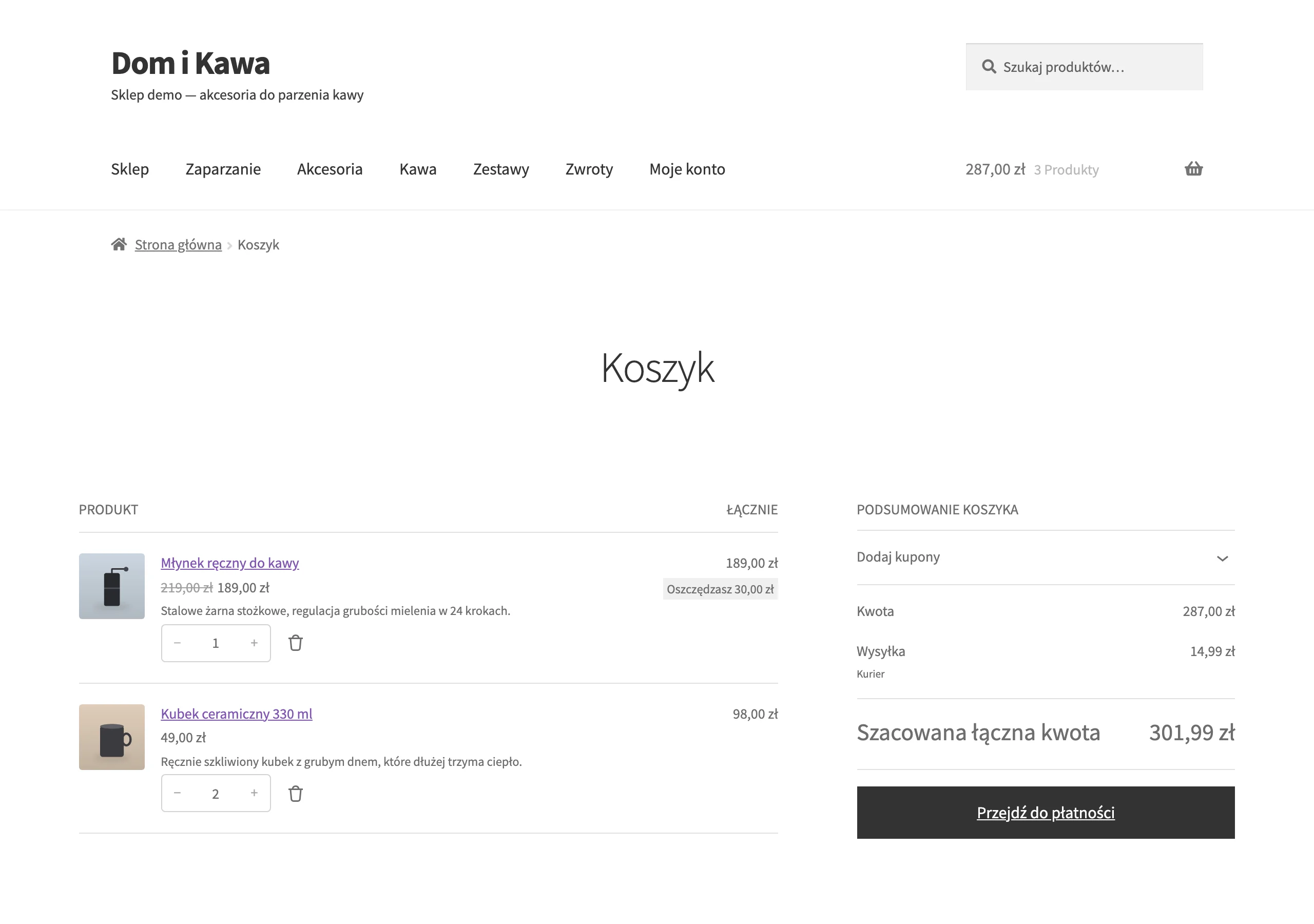
The scope of such a service includes onsite and offsite communication. Onsite is everything the user sees in the store: cart copy, checkout messages, information about delivery, payments, returns and form errors. Offsite starts only after leaving the site and includes actions such as email, SMS, web push or contact through an automation system, provided the user has given consent for it. The key is that these two worlds should not clash, but support the same goal.
The key is to match the message to the real reason for abandonment, not merely to the fact that the cart was abandoned. If the customer stopped after seeing the delivery cost, you need to explain the total cost and delivery conditions, not immediately offer a discount. Instead of sales pressure — clarity. If the problem was a payment error, helping them complete the order will matter more than a salesy tone in the message. Because what is the customer supposed to do with a voucher if they still cannot pay.
This kind of service combines several layers of work. First, event tracking and behaviour analysis are implemented, then users are segmented, messages are designed and automations are launched. Finally, it is verified whether the changes actually improve the journey from cart to checkout, from checkout to payment and from payment to purchase, rather than just “looking nice” in a mock-up. Without proper analytics, it is hard to distinguish a communication barrier from a simple technical error.
In practice, the main focus is the funnel cart – checkout – payment – confirmation. But note that the context matters just as much: traffic sources, devices, new and returning sessions, cart value, product type and selected delivery and payment methods. Marketing consents also matter, because they affect whether and how a reminder can be triggered after abandonment. The outcome of the work is not one “clever” message, but usually a set of hard deliverables: a map of abandonment points, a list of barriers, automation scenarios, a UX/UI changes backlog and a dashboard for monitoring results.
The current context of cart abandonment and its causes
Cart abandonment rarely has a single culprit. Usually it is several barriers at once, which overlap at the same moment and end the purchase before any persuasion has a chance to work. The user may accept the product price, yet still give up after seeing the delivery cost, a long fulfilment time and the need to create an account. The problem is that a single action, such as a discount or one recovery email, usually does not close the whole case.
Mobile is everything. And it is precisely on a phone that users are easiest to lose through an overly long form, unclear messages or final costs hidden in the last step. On a small screen, short copy, simple field labels, autofill and fast payments matter. If the customer has to look for information about delivery, returns or payment methods outside the checkout, the risk of abandonment rises sharply.
Tracking limitations and consent management have also entered the picture. A store will not always recognise a user after they leave the cart, nor will it be able to contact them through any channel, even if it very much wants to. This shifts the emphasis: the key is to make better use of communication within the purchase process itself, and to build recovery scenarios only where there is genuinely data and consent.
The biggest losses appear in places that can be predicted. These are the move from cart to checkout, the disclosure of full costs, the requirement to create an account, choosing delivery and payment, and form errors or a failed payment authorisation. Sounds familiar. These are the points that need to be measured separately, because each one requires a different response and a different message.
And one more thing: not every abandonment is a lost sale. Some people use the cart as a saved products list, compare offers or postpone the decision. As a result, it makes no sense to lump everyone together and run the same scenario. You communicate differently with someone who abandoned the purchase before checkout, and differently with someone who got stuck after a payment error.
The result is also affected by consistency of communication between the advert, product page, basket and checkout. If an advert promises free delivery, but additional conditions or surcharges appear at payment, trust drops immediately. The same happens when there is a mismatch in delivery time, product availability and returns policy. Instead of a pleasant promise — a cold shower at the final step, and that is a recipe for abandonment. The smaller the gap between the earlier promise and the final purchase, the lower the risk of abandonment.
How does the abandonment reduction process work in practice?
Reducing abandonment is a three-step job. First you catch the moment of abandonment, then you get to the cause, and finally you launch communication that genuinely helps close the sale. It all starts with analytics, because without it you are groping in the dark and you do not know whether the content, offer, form or the payment itself is to blame. You need to measure not only the purchase, but also entry into checkout, delivery selection, payment selection, form errors, failed authorisation and exit from the process. Without proper measurement, it is easy to treat the symptoms instead of removing the real barrier.
Then comes the time to pinpoint where the drop-off is greatest. And that is usually not at all surprising: drops are visible when moving from basket to checkout, after showing full costs, when account creation is required, or after a payment error. The key is to compare these moments by device, traffic source, product type, basket value and whether the user is new or returning. This breakdown works like a magnifying glass, because it quickly shows whether the problem affects everyone or only a specific segment.
Analytics alone will not solve it. That is why numerical data needs to be combined with behavioural observation: session recordings, path analysis, customer support tickets, chat questions and usability tests can fill in what a chart will not say outright. This lets you assign the problem to a specific screen and a specific message, rather than just to a general stage of the funnel. The problem is that “abandoned at checkout” sounds like a diagnosis, but it is only a label. This matters, because abandonment after choosing delivery requires a different response than abandonment after a failed payment.
Next you design scenarios for different types of abandonment. What works for an anonymous person on mobile is different from what works for a logged-in customer who returns to a high-value basket after a few hours. One recovery sequence for everyone usually lowers effectiveness, because it mixes different intentions and different problems. The question is: should the message only remind, or should it remove a specific obstacle. Some people need a gentle nudge, others need an explanation of delivery or return rules, and still others simply need a smooth return to the checkout they already started.
When implementing, simplicity matters. You simplify onsite communication and only then launch offsite communication, instead of bombarding the user with messages while traps are still lurking in the process itself. In the basket and checkout, you need to show the full cost, delivery date, available payment methods, return policy and clear error messages in advance. Off-site, you bring in e-mail reminders, SMS or web push, but only when the relevant data and consents are in place. The message content should answer what stopped the user, not just try to persuade them to buy again.
At the end come tests and continuous optimisation. You check the impact of changes on progression to the next step, purchase completion, error count and the quality of recovered traffic, because the “number of returns” alone can be misleading. It is worth testing not only the message subject or CTA button, but also the order of information, visibility of costs, number of fields and the logic of returning to the basket. And one more thing: a small form improvement can deliver more than the most polished automation. The best results come from improving the purchase process in parallel with recovery automation, rather than treating these areas separately.
What should you implement to effectively reduce basket abandonment?
First, sort out the basket and checkout. Only then do you add recovery automation, because without clear communication it is just a plaster over a crack. Before payment, the user should see the total cost, estimated delivery time, payment methods, return policy and an option to contact you if there is a problem. Hiding key conditions until the last step almost always increases the risk of abandonment. On mobile, this carries double weight, because few people leave the process to look for details elsewhere.
The devil is in the microcopy. And that is not a cliché. In form fields, show the required data format; for payment errors, provide possible next steps; and for delayed delivery, explain the real fulfilment time instead of sugar-coating the situation. A simple payment security signal also works, as does information on whether the purchase requires account creation. The less uncertainty at the critical moment, the greater the chance that the user will continue.
Recovery is not one-size-fits-all. The problem is that different types of abandonment require different responses and different channels. E-mail is suitable for a fuller explanation of purchase conditions, SMS for a short reminder in urgent situations, and web push for a quick return of a user who already knows the offer. If abandonment happened after a payment error, the message should help complete the transaction, not immediately offer a discount. If abandonment happened before checkout, it is better to remind the user about the products and purchase conditions than to push for a sale.
Technology also has a say here. Sometimes a louder one than copy. The system must correctly identify the user, pass on the current basket state, link them back to the right place and exclude people who have already bought. Even well-written communication will not work if, after clicking, the customer returns to an empty basket or receives a reminder after paying for the order. Before launch, look at it differently: data hygiene first, creativity second. Check the consistency of product data and order statuses between the store, analytics and the automation tool.
In practice, the best way is to follow this path:
- remove information barriers in the basket and checkout,
- improve error messages and form validation,
- simplify the process for mobile and reduce the number of steps,
- split abandonment into scenarios by stage and cause,
- launch automation only in channels covered by consent,
- test copy, timing and exclusion logic.
Discounts won’t fix a broken process. Aggressive pop-ups and too-frequent messages won’t either, even if they can temporarily boost part of the recovery. The bill comes later: trust falls, margins shrink, and the customer experience takes a knock that no coupon can cover. The key is therefore to use incentives sparingly and only when the data clearly shows that the user is genuinely being blocked by a price barrier, not by an unclear process or a technical issue.
In the end, what matters is monitoring a few operational metrics, not just the number of recovered baskets. The key is the transition from basket to checkout, checkout completion, form errors, failed payments, unsubscribes from communication and differences between devices. A good result is not just more transactions, but also less friction in the process and fewer unnecessary contacts to customer service. The facts are that only then can you see whether communication is really removing the barrier, or merely shifting the problem to a later stage.
What are the most common mistakes and risks in customer communication?
The most common mistake. Sending the same communication to every abandoned basket, without checking whether the user dropped off because of price, lack of information, a form error or a payment issue. This scenario usually lowers effectiveness, because instead of targeting the obstacle, it fires blindly. Abandonment before checkout is communicated differently from a situation after a failed payment authorisation. Good communication does not replace diagnosing the reason for abandonment.
A frequent problem is hiding key information until the last step. If delivery costs, fulfilment time, returns policy or available payment methods only appear at the finish line, communication starts to work like an “unpleasant surprise”, not as decision support. First you build expectations, then you undercut them, and at the most sensitive moment. This is especially damaging on mobile, where the user breaks off the process more quickly and returns less often to check the details.
The second risk is aggressiveness. Too many reminders, pushy pop-ups, fake countdown timers and offering a discount too quickly can lift short-term response, but in the longer term they weaken trust and train customers to wait for a price cut. Let’s look at it differently: the point is not to “push harder”, but to help close the decision. A discount should be an exceptional tool, not the primary way of recovering a basket.
Operational and legal mistakes account for a lot of the losses. Sending without valid consent, failing to exclude people who have already purchased, a broken link back to the basket, outdated product information or a message directing users to an empty checkout is a straightforward route to frustration. From the user’s perspective it looks like chaos, and from the company’s perspective, instead of improving results, it increases the number of support tickets.
A separate mistake is inconsistency between the earlier promise and the payment terms. If an ad suggests fast delivery, the product page shows availability, and then in checkout a longer delivery time or an extra cost suddenly appears, recovery communication will be of little credibility. The question is: how is the customer supposed to believe in “help” if they have just seen the rules change. First you need to align the message across the ad, product page, basket and checkout, and only then optimise reminders.
Another risk is misreading abandonment. Some users postpone the purchase for later, compare offers or treat the basket as a saved-products list. If you treat every such case as an urgent sales problem, it is easy to overdo contact frequency and weaken the effectiveness of the whole channel. This is not about more noise, but about better recognition of intent.
How do you monitor and measure the effects of the actions implemented?
You assess the effects of the actions implemented by looking at the whole journey from basket to purchase. Not just at the number of reminders sent. The key is where the user drops off, exactly what they saw along the way and whether, after the change, they genuinely take the next step more often. Without this perspective, it is hard to distinguish better UX from a temporary spike driven by the season, a promotion or a change in traffic source.
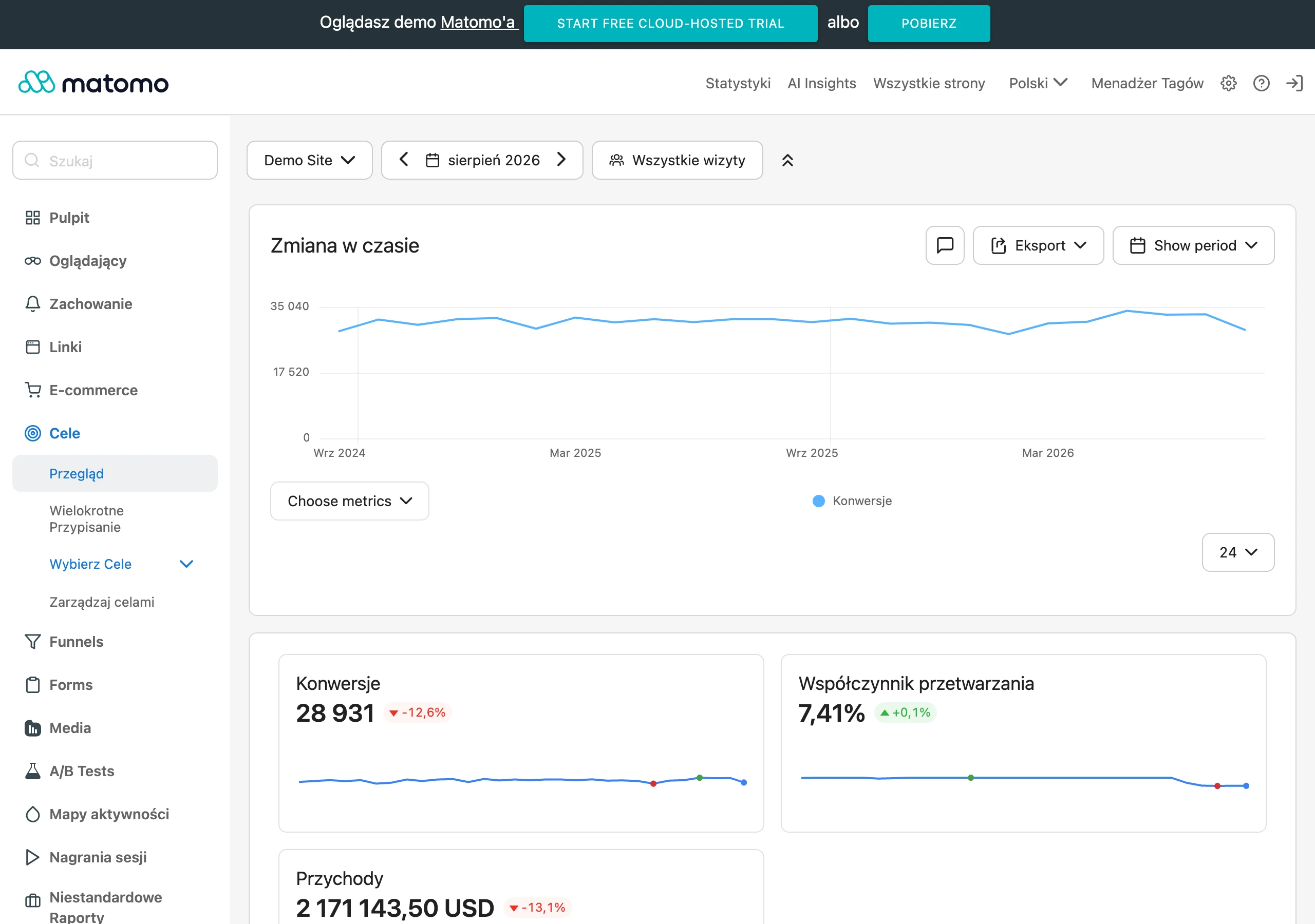
Without measurement there is no conversation. And certainly not about optimisation. The foundation is properly collected event tracking and sensible segmentation, because the “average” can lie more than no data at all. In practice, compare results by device, traffic source, new and returning users, basket value, product type and abandonment stage. The same messages can work well on desktop and fall apart on mobile, or help with simple purchases but get in the way of more expensive products that require thought.
The most useful metrics are simple. And ruthless towards illusions. They are the ones that show real progress in the funnel and the quality of communication:
- transition from basket to checkout,
- checkout completion,
- form error rate and the places where they occur,
- number of failed payments by payment method,
- recovered baskets and time to return to purchase,
- unsubscribes from communication and complaints about messages,
- returns on different devices,
- impact of changes on margin and customer service workload.
The basket recovery rate on its own is not enough. And that is not a cliché. Some users would have returned to the purchase anyway without any reminder, so compare results with the previous period, a control segment or an A/B test. If you measure only “recovery”, it is easy to overestimate the impact of automation and miss the true source of improvement.
In practice, the dashboard wins, not the report that ends up in a drawer. Ideally it should be simple and updated regularly, so you can see what is happening week by week and month by month. It should show trends, differences between segments and points of sudden change, for example a rise in payment errors after rolling out a new method. That way you will spot the lead more quickly: whether the problem lies in the message content, a technical change or the quality of traffic from the campaign.
Numbers alone will not tell the whole story. The problem is that they often only tell a convenient fragment. That is why you should combine hard metrics with qualitative data: session recordings, path analysis, support queries and the reasons for contact after an unsuccessful purchase. The best monitoring combines funnel metrics with observation of what the user is actually doing and where they get stuck.
In the end, it is the balance sheet that matters. Not just sales growth. If after implementation the number of orders rises, but at the same time cancellations, complaints, discount costs or the number of contacts to customer service also rise, the result can be weaker than first appears. The data makes it clear: monitoring should support business decisions, not generate pretty numbers for slides.
FAQ
Frequently asked questions
How to reduce cart abandonment with better communication?
First, you need to identify the point and reason for abandonment, then tailor the message to the specific barrier. A recovery message alone will not fix a problem in the basket, form or payment.
Does one recovery email suffice to win back an abandoned cart?
Usually not, because abandonment has a specific cause, not a single random reason. More effective is combining analytics, improving the purchase process and tailored communication.
What should be checked before sending a reminder about an abandoned cart?
You need to establish where the user stopped: in the basket, at delivery, payment or the form. Also important are data on the device, traffic source, basket value and marketing consent.
Why is communication in the basket and checkout more important than communication after abandonment?
Because the best results come from removing the reasons for abandonment within the purchase process itself. If the user sees full costs, delivery times and clear error messages, they are less likely to abandon the purchase in the first place.
What information should be visible in the basket and checkout?
The user should see the total cost, delivery date, payment methods, returns policy and clear error messages. Hiding this information until the last step increases the risk of abandonment.
When is it worth using email, SMS or web push after cart abandonment?
It depends on the stage of abandonment and the type of problem. Email is better for explaining the purchase conditions, SMS for a short reminder, and web push for quickly bringing the user back.