
The purchase funnel shows the user journey: from landing on the site all the way to completing an order. The problem begins when we see a drop in sales, but cannot identify the step at which people simply leave. This is not a topic only for e-commerce with huge traffic, because even a small website can lose money through one poorly performing stage. The most important thing is not that users drop out, but where exactly they drop out and what drives them to do so. Only then is it possible to separate an issue with the offer, traffic quality, the form, payment, or a plain technical error. In practice, a proper funnel analysis makes it possible to prioritise more quickly and improve the areas that genuinely block purchase.
What does analysis of purchase funnel drop-off mean?
Analysis of purchase funnel drop-off involves identifying the exact point at which the user breaks off the path to purchase, and determining what stopped them. So it is not about a general assessment of conversion, but about diagnosing specific stages: landing on the site, the product page, basket, checkout, payment and purchase confirmation. Such analysis answers two simple questions: where the user disappears and what happens just before they abandon the process.
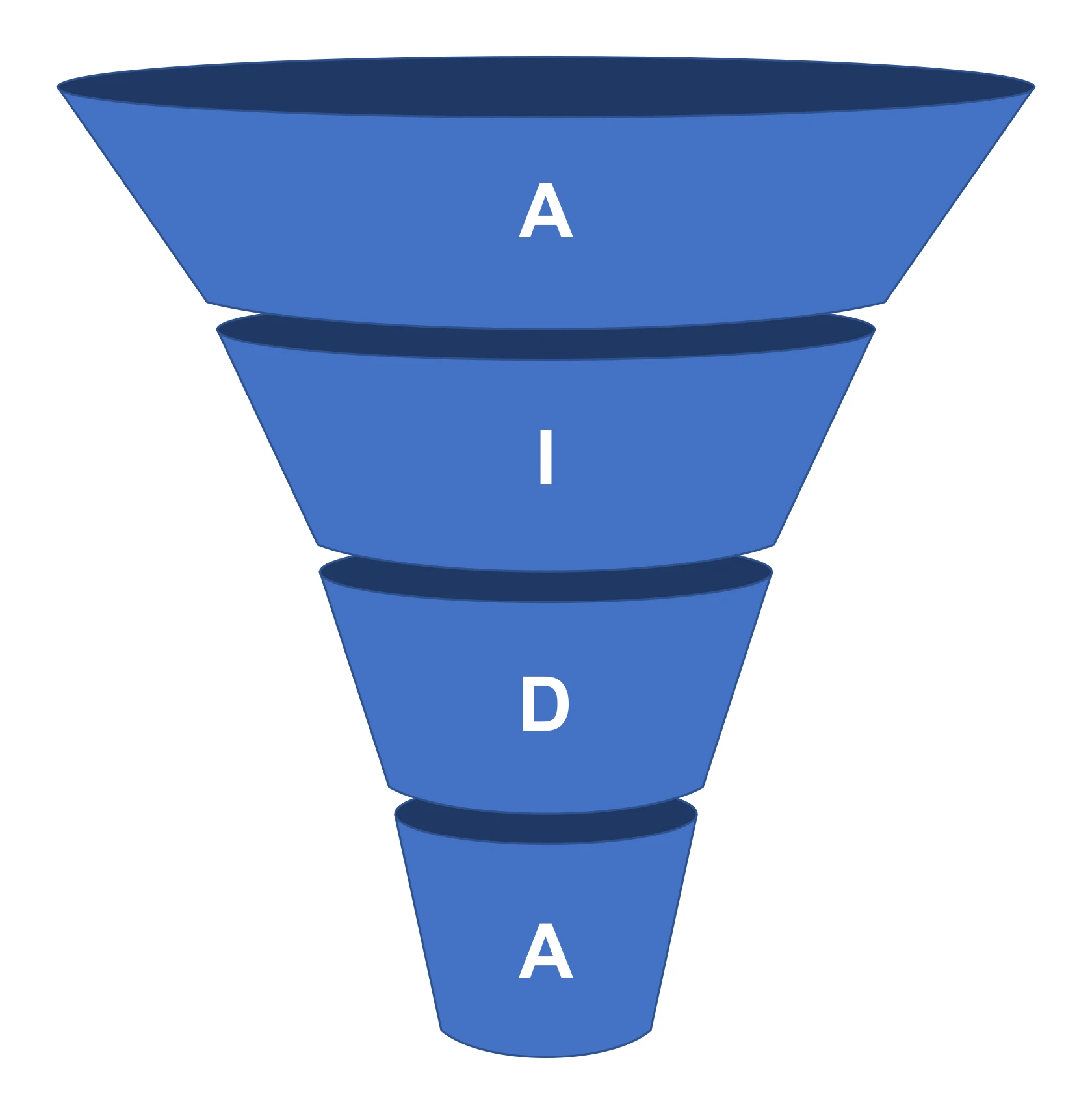
In practice, it is not only the drop in user numbers between steps that is analysed, but also the circumstances surrounding that drop. The cause may be a poor match between the ad and the landing page, an unclear offer, hidden costs, a too-long form, validation errors, slow loading, mobile issues or the lack of a preferred payment method. The same conversion drop can have a completely different source depending on the channel, device, user type and stage of the journey.
That is why funnel analytics rarely close the subject on their own. Quantitative data, such as visits, events, transitions and payment statuses, needs to be paired with qualitative data: session recordings, form analysis and error monitoring. A funnel report alone still does not tell us whether the user abandoned the process by their own decision or was stopped by a technical problem or friction in the process. So the question is not “how much”, but “why right here”.
Measurement quality matters too. If events are implemented badly, duplicated or do not cover part of the process, it is very easy to draw conclusions built on sand. Today, consent requirements, script blocking and purchases spread across devices are an additional complication, so it is worth confronting analytics data with backend logs, orders and transaction statuses. Look at it another way: without this comparison, the funnel is often more of a story than proof.
The outcome of good analysis should not be just a report with percentages. A useful result is a drop-off map: stage, user segment, observed problem, hypothesis, recommendation and a way of checking the effect after implementation. This format shortens the distance between diagnosis and fix, instead of leaving the team with yet another file for the archive.
What are the most important stages in the purchase funnel?
The classic purchase funnel has several fixed stops. It usually begins with landing on the site, then comes the product or service page, adding to basket, the basket itself, customer details or login, delivery, payment and finally purchase confirmation. It is a straightforward path that clearly shows whether the user is merely browsing the offer or actually moving towards closing the transaction. In uncomplicated e-commerce, this setup is entirely enough to identify most critical drop-off points.
- Landing on the site — this checks whether the traffic lands on the right landing page and whether what the user sees delivers on the promise made in the ad or search result.
- Product or service page — this is the decision stage. Price, availability, variants, benefits, images, specifications, as well as delivery and returns policies all matter.
- Adding to basket — this moment shows directly whether the offer and interface are clear enough to move from interest to concrete action.
- Basket — this is often where the first major drop-off appears, when the user sees the full costs, delivery conditions or promotion limitations.
- Customer details or login — mandatory registration, too many fields, unclear error messages and poor mobile usability can all be painful here.
- Delivery — the user compares the cost and lead time, checks the available options and whether the delivery method actually suits their expectations.
- Payment — a particularly sensitive stage. A technical error, the lack of a preferred method, a redirect issue or simple lack of trust is enough for the transaction to fall through.
- Purchase confirmation — the final step, which is meant to confirm that the payment and order have been recorded correctly and that the user has not got stuck along the way.
These stages always need to be tailored to the real process in a given business. In one shop the checkout will be single-page, in another it will be split across several screens, so too broad a grouping can hide the real source of the problem. Most incorrect conclusions come from combining several steps into one stage, because then it is not clear whether the drop-off is due to cost, the form, delivery or payment.
The weight of individual steps also changes depending on the traffic source and device. On mobile, forms, autofill, payment selection and cost visibility fail more often, because every extra click costs more than on desktop. By contrast, at the landing and product card stage, problems with traffic quality, intent mismatch and inconsistent communication between the ad and the page come to light more often.
For these stages to make analytical sense, each of them must be described clearly and measured without distortion. What matters is exactly what you count as the start of checkout, a successful payment or reaching the confirmation page. If stage measurement is inconsistent, the whole funnel only appears reliable on the surface.
What factors influence user drop-off in the purchase funnel?
User drop-off from the purchase funnel most often plays out on three fronts: matching traffic to the offer, the quality of the purchase journey and the absence of technical issues. It is not always a lack of intent to buy. More often it is a clash with a subpage that does not answer the intent, or with a process that effectively makes it harder to complete the transaction. And this is where it gets interesting, because an identical drop in conversion can have completely different roots in the ad campaign, on the product card and in checkout. The most common mistake is to treat the entire drop-off as one problem, instead of separating it by stage, segment and specific obstacle.
The first set of factors is traffic quality and communication consistency. Simple. If an ad promises a price, promotion or fast delivery, and once the user lands on the site this cannot be confirmed straight away, drop-off increases already at the start of the funnel. The problem is that in such cases the culprit is not the shop UX, but the mismatch between the ad message and the landing page.
The second area is clarity of the offer and trust. There is no magic here. Users are more likely to leave when they do not immediately see the final price, stock availability, delivery cost, fulfilment time, return policy or company details. If key information only appears in the basket or checkout, the drop-off is usually not caused by customer hesitation, but by the delayed disclosure of purchase conditions.
The third point is process friction in the basket and checkout. And it hurts most right before the finish line. A too-long form, mandatory registration, unclear field labels, validation errors, weak error messages and unclear action buttons can stop a user at the last moment. On mobile, small fields, an inconvenient keyboard, lack of autofill and problems moving on to payment come into play. Large mobile drop-off very often results from ergonomics, not from the price or the offer itself.
The fourth group is technical issues. No sentiment. Slow page loading, JavaScript errors, API problems, failed redirects to the payment provider, script conflicts and form outages cause forced, not intentional, abandonment. This distinction matters, because in the first case you improve the decision-making process, and in the second you remove a block that simply prevents the purchase.
Delivery and payment need to be looked at separately, because they are common critical points. And the question here is: does the customer get the full picture before clicking onward. The absence of a preferred payment method, showing delivery costs too late, an unclear delivery time or a problem with a discount code can reduce completion even when earlier stages work properly. If drop-off rises only after entering checkout, you usually need to check not the product card, but the final purchase conditions and the integration performance.
What data are key to analysing drop-off from the purchase funnel?
When analysing drop-off, specifics matter. Key data include transitions between funnel stages, user segments, process errors and the actual transaction outcome. Session and purchase counts alone are not enough, because they do not show where the user got stuck and why. To reach a sensible conclusion, you need to bring analytics, forms, payments and the order system together into one picture. First, you need to make sure the measurement is complete, because incorrectly implemented events give a false picture of drop-off.
- entries to key pages and transitions between stages, e.g. product, basket, checkout, payment, confirmation,
- events such as add to basket, checkout start, delivery selection, payment selection, discount code use,
- traffic source, campaign, landing page, device, browser, new or returning user,
- form errors, failed validations, abandoned fields, backtracking and resend attempts,
- payment statuses, declined transactions, interrupted redirects and data on actually created orders.
Segments do all the heavy lifting here. The most important thing is data that lets you compare stages within the same user groups, instead of mixing everything into one average. Drop-off from paid traffic looks different, from organic traffic it looks different again, and it is different still on mobile and desktop. If you look only at the averaged funnel, it is easy to miss that the problem affects one channel, one campaign or one payment method. And then the diagnosis is not so much wrong as simply blind.
The consistency between front end and back end is the truth test. An analytics tool may show a checkout started, but only the order system and payment statuses tell you whether the purchase actually went through. The problem is that today these two worlds often drift apart because of script blocking, consent restrictions and broken paths between devices. If the funnel report does not match the number of orders and payments, you need to verify backend logs rather than assume that analytics is right.
Numbers alone do not answer the question “why”. To understand the cause of drop-off, you also need qualitative and technical data, because only they show the mechanics of abandonment. Session recordings, click maps, form analysis, JavaScript error monitoring and API responses indicate whether the user gave up of their own accord or was blocked by the interface or a failure. These sources do not replace numeric analytics, but they shed light on it. Thanks to them, you know why the drop appeared exactly here, and not two steps earlier.
In the end, you always come back to definitions. If you have double-counted events, missing campaign parameters or inconsistent step names, segment comparison starts to lie, even though it looks “professional”. The data make it clear that without order in naming and parameters, the whole diagnosis is quicksand. Good drop-off analysis starts not with the dashboard, but with checking whether each funnel step has an unambiguous definition and reliable measurement.
What are the most common technical and UX problems affecting drop-off?
The most common technical and UX issues that ramp up drop-off are slow loading, form errors, unclear purchase paths, hidden costs and payment failures. These are small things that hurt. A user very often does not abandon a purchase because they are not interested, but because something pins them down at a specific step. In practice, the biggest losses are seen where extra effort is required, uncertainty appears or an error pops up that cannot simply be worked around.

Mobile issues are especially costly, because on a phone every unnecessary step weighs more than on desktop. Small fields. Buttons obscured. A keyboard that opens badly, no autocomplete and tedious cart editing quickly reduce progression to the next stages. If a form requires manual entry of lots of data, drop-off usually rises right at the start of checkout.
The second large group is technical errors that do not always show up in a standard analytics report. This includes JavaScript errors, failed API responses, issues with delivery or payment integrations, buttons that freeze and a failure to move properly to order confirmation. If a user clicked “pay”, but the transaction was not completed properly, you need to check it not only in analytics, but also in logs, payment statuses and the order panel. Otherwise you look at the graph while the money leaks out the side.
Another very common cause of drop-off is design missteps in the interface itself. These include unclear CTAs, forced registration, unclear field labels, a form that is too long, weak error messages and no clear information on what to do next. One thing is key. When a user makes a mistake and gets a generic message without the field being identified, they usually do not correct the form — they leave.
Information gaps and lack of trust also have a strong effect. This is no longer “UX”, but decision psychology. If delivery cost, a long fulfilment time or the lack of a preferred payment method only appears in the basket, the user reads this as a change in purchase conditions. Hidden costs and the surprise of the final price are one of the most common reasons for abandonments after adding to basket.
You also need to look separately at the product or service page, because part of the drop-off starts even before the basket. That is where the decision is made. When price, availability, variants, returns, delivery and the main benefit are not clearly visible, the user does not move on, even though they arrived with good intent. In such a situation the problem is not in checkout, but in the fact that the offer does not answer pre-purchase questions quickly enough.
What optimisation strategies can be applied in the purchase funnel?
The most effective purchase funnel optimisation strategies are based on three things: fixing measurement, removing the biggest friction at critical stages, and tailoring the path to the traffic source and device. It sounds technical, but the stakes are simple. It is not worth starting with cosmetic changes if you do not know at which point users are actually dropping off. First you need to establish the stage, segment and cause, and only then implement fixes.
It starts with getting the measurement in order. Every important step should have a properly measured event: product view, add to basket, checkout start, form errors, delivery selection, payment selection and transaction success. Without this, it is easy to confuse a UX problem with an analytics gap or to treat abandonment as “user behaviour”, even though the facts are that the integration failed.
The second strategy is to prioritise changes by impact and risk. In practice, the most convenient way is to split the backlog into several groups:
- critical errors blocking purchase,
- UX barriers that significantly reduce progression,
- information gaps on the product page and in the basket,
- traffic quality issues and mismatch between the message and the landing page.
This division keeps discipline. You do not mix outages with test hypotheses, instead of chasing everything at once. First you remove the things that genuinely break the purchase, then you simplify the path, and only at the end do you test variants.
The third strategy is to simplify checkout. Most often, what wins is shortening the form, reducing the number of required fields, enabling autocomplete, improving validation and removing forced account creation. If the customer has to stop and think about what a field means or why they cannot move on, the funnel will not be saved by a better banner or a stronger CTA.
The fourth strategy is simple, but ruthless. It is about showing earlier what affects the decision: the full price, delivery cost, fulfilment time, product availability, payment methods, return policy and basic information about purchase security. The later this data appears in the path, the greater the risk of drop-off at the end of the process.
The fifth strategy is separate optimisation for mobile. Here speed of loading, a clear screen hierarchy, large and visible buttons, good keyboard handling and simple movement between steps all matter. The problem is that in many shops the desktop version looks fine, while on a phone it creates much greater friction and that is what eats into conversion.
The sixth strategy is about aligning traffic with the offer. If a campaign promises a promotion, instalments, free delivery or a specific category, the user should see that immediately on arrival and further along the path. When the ad message and checkout say something else, the problem lies not only in the interface, but in the inconsistency of the entire acquisition process.
The final strategy is to validate the results after implementation. Compare the same stages and the same segments, and if the change concerns user behaviour, assess it in an experiment or in a controlled period comparison. Do not roll out many large changes at once without a way to assess which one actually improved progression through the funnel.
What are the best practices in measuring and verifying the purchase funnel?
The best practices for measuring and validating the purchase funnel are simple in theory and ruthless in practice. First, a consistent definition of the stages, then correctly implemented events, and finally confirming the data in several sources. The funnel should describe the real purchase journey, not a neat, generic model pulled from an analytics tool. For one shop, the critical point will be choosing a product variant; for another, logging in; and for yet another, moving on to an external payment. If the stages are defined incorrectly, the report will show drops in the wrong place and steer the team towards the wrong fixes.
The second practice is even more down to earth. Measure transitions between steps with events, not page views alone. Simply viewing the basket does not have to mean purchase intent, just as entering the checkout does not prove the process has actually started. In practice, it is worth separating: add to basket, checkout start, filling in details, delivery selection, payment selection, payment attempt, payment success and order confirmation. For each of these steps, it pays to pass through the session identifier, device, traffic source, basket value and delivery or payment variant.
The third principle sounds unexciting, but it saves results. Carry out a data quality audit before you even start analysing the numbers. Check whether events are duplicating, firing at the wrong moment and whether they have identical definitions across the organisation. Classic mistakes: counting checkout start after simply entering the page, even though the user has not clicked anything yet, or counting a purchase on the thank-you page without confirmation from the payment system. The most reliable funnel combines front-end data with back-end data: orders, payment statuses, error logs and API responses.
Funnel validation should also distinguish intentional abandonment from abandonment forced by a problem. A user may be undecided because they are comparing offers, but just as often they “drop out” because they got stuck on form validation, hit a payment error or received an unclear message. The transition percentages alone will not show this. That is why you should combine them with session recordings, form analysis, JavaScript monitoring and data on declined payments. A large drop after one step does not always mean a UX problem; sometimes it means an integration error or poor traffic quality from a specific channel.
Segmentation is not an add-on, but a condition for a meaningful diagnosis. The average for the whole funnel can cover up the real source of loss like a blanket. Check mobile and desktop separately, new and returning users, paid campaigns and organic traffic, as well as different delivery methods, payment methods and product groups. If the drop-off appears mainly on phones with one type of payment, the problem is not the whole checkout, but a specific part of the process. First look for where the problem is concentrated in a segment, and only then assess the whole funnel.
A good practice is to test the measurement regularly, and this is not a cliché. Do it both in a test environment and on live control sessions, because only then can you see what is really happening in the data. You need to manually go through the purchase journey on different devices and browsers. Check whether the events fire only once, whether the parameters are complete and whether the purchase completes identically in analytics and in the order system. Only then should you tackle edge cases: an invalid discount code, lack of product availability, a declined payment, going back to the basket and breaking off the process after redirection. Because where does measurement usually break down. Exactly where the standard report falls silent.
The last practice concerns validating changes after implementation. Simply observing sales growth is not enough, because the result can be a function of seasonality, a campaign or a simple change in traffic mix. The question is: did you improve the funnel, or did you just hit a better week. That is why you should compare the same stages, the same segments and the same user types, and if possible, use an A/B test or a controlled period comparison. The funnel is reliable only when the measurement, diagnosis and post-implementation result form one coherent picture.
FAQ
Frequently asked questions
How do you identify at which stage of the sales funnel users drop out?
You need to compare transitions between successive funnel steps and check where the biggest drop occurs. The number of sessions and purchases alone is not enough, because it does not show the point or the reason for abandonment.
Is a funnel report enough to understand a drop in sales?
No, because the report only shows the drop, not its source. It needs to be combined with session recordings, form analysis, payment statuses and backend logs.
Why do users drop out already at the entry page or product page?
Most often because of a mismatch between traffic and the offer, or inconsistent messaging between the ad and the landing page. The problem also appears when the price, availability, benefits or other key information are not immediately clear.
Which stages of the sales funnel are most sensitive to drop-off?
The most problematic are usually the basket, customer details or login, delivery and payment. This is where hidden costs, overly long forms, lack of a preferred payment method and technical errors tend to surface.
What data is needed for a good analysis of funnel drop-off?
You need data on transitions between stages, traffic source, device, form errors, payment statuses and actual orders created. It is also important to compare this data with the backend, because analytics may not show the full picture.
What technical and UX issues most often lead to purchase abandonment?
Most often these are slow loading, form errors, unclear CTAs, hidden costs and payment failures. On mobile, small fields, lack of autofill and awkward form handling also cause problems.