
A store can have enough traffic and still sell poorly if the problem lies in the offer, communication or checkout journey. In practice, this is most often visible when visits are stable but users do not move on through the successive funnel stages. This is not a situation where you should automatically buy more ads or increase the SEO budget. If a store attracts people but does not help them make a decision and complete the purchase smoothly, extra traffic usually only increases the loss. That is why you need to look not only at the number of sessions and revenue, but also at what happens between landing on the site and clicking “buy now”. In this section we will focus on how to distinguish a traffic problem from an offer or UX problem, and which signals in the data most often confirm it.
How to recognise that the store problem is not traffic, but the offer or UX
The store problem is not traffic when users land on the site, but do not see a strong enough reason to buy or encounter too much friction in the purchasing process. The simplest signal is a stable number of visits alongside a weak conversion rate or a large gap between interest and sales. This pattern often means that the source of the problem lies lower down the funnel. First you need to check where the user drops off, and only then decide whether there really is a traffic shortfall.
In practice, this is identified by the stages through the store journey. If users enter category pages but rarely click through to products, the problem usually concerns offer fit, images, pricing, naming or the listing itself. If they visit product pages but do not add to basket, it is more often the presentation of benefits, trust, variants, availability or purchase conditions that fails. If the basket works but checkout falls apart, the cause is often delivery costs, forms, payment methods or mobile UX.
It is also important to separate traffic quality from store quality. Not every poor sales result means a website-side problem, because sometimes the traffic is not aligned with the offer or the promise in the ad does not match the landing page. However, if different traffic sources perform similarly poorly and the problem repeats at the same stages, the likelihood grows that it is the store that is failing to close the sale. A good audit starts with the question of whether the user lands on the right page and whether they immediately understand why they should buy here.
It is not worth assessing the situation on the basis of a single figure, such as the overall conversion rate. You need to compare results by device, channel, product category and new versus returning users. It often turns out that desktop performs properly while mobile is blocking sales, or that one key category has good traffic but a weak product page. This is what distinguishes a systemic problem from a local error in the offer or interface.
Key signals pointing to offer and UX problems
The key signals are the data and user behaviours that show one thing: the store is losing sales after the user lands on the site, not before. This is most often visible in low progression between funnel stages. From category to product, from product to basket, from basket to checkout, or from checkout to completion. The more precisely you name the stage, the easier it is to distinguish an offer problem from a usability problem. The number of visits alone does not tell you whether the store helps people buy.
- Many category page views, but few clicks through to products — the offer is poorly presented, badly sorted or simply does not match the user’s intent.
- Traffic on product pages is high, but add-to-basket rates are low — the user does not get sufficiently clear information about price, benefits, availability, variants or delivery.
- The basket works, but checkout starts poorly — hidden costs, lack of trust or an unclear structure for the next step can be the barrier.
- Checkout is started, but completion is low — the problem usually lies in forms, payment methods, the need to create an account, technical errors or weak mobile UX.
- Users make heavy use of search and filters, but do not move on — this is often a sign of assortment gaps, poor naming or results that fail to deliver on the promise.
The second group of signals is behaviours that are not visible in the sales report itself. Here the embarrassingly “invisible” things come to light. Session recordings, heatmaps and scroll analysis show whether users fail to notice the CTA, get stuck when choosing a variant, return several times to the returns policy or try to click on inactive elements. These are practical clues, because they do not just say there is a problem, but also show exactly where friction is created. If the user has to guess the final price, delivery time or the difference between variants, conversion usually falls regardless of traffic levels.
The third signal is a gap between interest and purchase readiness. A store can have a lot of ad traffic and high engagement with product browsing, and still poor sales, because the offer does not provide a clear advantage or does not overcome basic objections. The point is that the issue is not that people did not come, but that after arriving they did not get a clear reason to buy right now and right here. How do we know this. It is often confirmed by customer service questions, returns, abandoned baskets and recurring doubts about delivery, quality or product fit.
Most is happening on mobile. An online store can look perfectly reasonable on desktop and yet still lose sales because of slow loading, poorly placed buttons, overlong forms and sections that are difficult to read on a small screen. This is the classic scenario: a company tells itself “we need more traffic”, when in practice it simply needs a better shopping experience. If the results differ sharply between desktop and mobile, start the diagnosis with UX, not by increasing the ad budget.
Stages of analysing and optimising the offer and user experience
This is not about yet another “optimisation”, but about finding the point at which sales are leaking away. Analysing and optimising the offer and user experience comes down to one thing: checking at which stage of the purchase journey the store loses customers and why. First you establish whether the problem affects the whole store, one category, a few products, or only a segment of traffic, for example from mobile or paid campaigns. The key point is that the same weak sales result can have completely different causes. It is not worth starting with a redesign of the store until you know exactly where the purchase intent disappears.

The first stage is checking the quality of traffic and whether the promise matches what the user sees after landing. If an advert or search result promises a specific benefit, but the landing page does not show it straight away, the user bounces before they have even had a chance to assess the offer. So you check the sources of visits, devices, new and returning sessions, and whether the person lands exactly where they expect to land.
The second stage is ruthless. You break the funnel down into specific transitions: from category to product, from product to basket, from basket to checkout, and from checkout to purchase. In practice, only then does it become black and white whether the listing is underperforming, the product page, or the final step itself. If users view products but do not add them to the basket, the problem usually lies in the presentation of the offer, trust or purchase conditions, rather than in the traffic itself.
The third stage concerns the offer itself. You assess whether the assortment matches user intent, whether the differences between variants are clear, whether the price is presented clearly and whether the product’s advantages are shown directly. The problem is often not that the product is weak, but that the store does not help people quickly understand who it is for, how it differs from others and why they should buy it here.
The fourth stage is UX and sales copy, that whole “small mechanics” layer that decides whether the purchase decision comes easily or is painful. You analyse the category layout, filters, sorting, image quality, the order of information on the product page, visibility of price, availability, delivery time, returns, reviews and the CTA button. On mobile, even a good offer loses if the most important information is hidden behind scrolling, expandable sections or interface elements that are too small.
The fifth stage is analysis of user behaviour and gathering qualitative signals. Numbers are ruthless. They show where people drop off, but they still do not tell you why they do it, so without digging into the details it is easy to confuse a symptom with the cause. The problem is that the answers usually lie in the detail: in session recordings, heatmaps, internal searches, customer service questions, abandoned baskets and form errors. That is exactly where the real purchase barriers are usually visible, not the ones “from the report”, but the ones from real life.
The final stage is assigning the problem to a specific layer and setting priorities for changes. Without that, you do activity, but you do not get results. Some fixes have high impact and low cost, for example refining the heading, showing delivery costs earlier, improving images or simplifying the form, and these are quick wins that are too good to delay. Others require more work, but do not always deliver a proportional return, so sequence matters. It is best to implement first the changes that can improve transitions between funnel stages without major technical redesign, and only then move on to larger projects.
What analytical tools to use to diagnose problems
For diagnosing problems, it is best to approach things with a mix of quantitative, qualitative and operational tools. One data source is almost never enough. GA4 will show paths, drop-offs and differences between devices, but it will not explain what the user actually saw and why they gave up along the way. And session recordings alone are helpful, but without hard data it is easy to fall into the trap of “evidence” from isolated behaviours. So the question is not “what should you use”, but “how do you combine it so you do not fool yourself”.
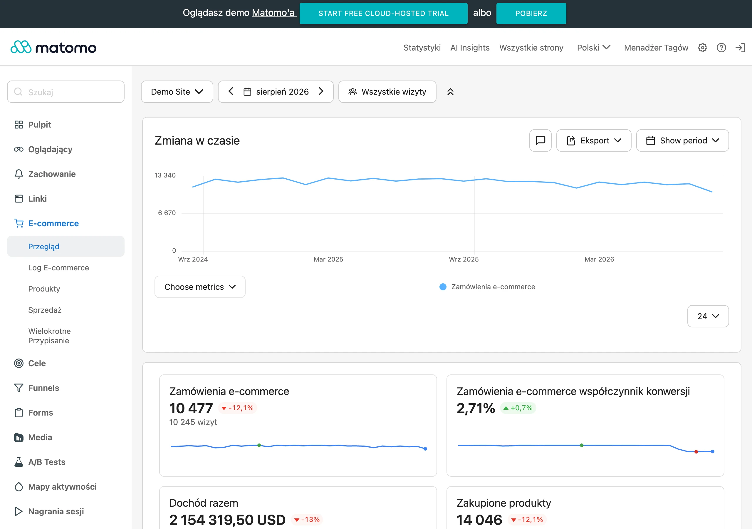
The foundation is e-commerce analytics: GA4, reports from the store platform and properly implemented events via tag manager. The key is to measure not only purchases, but also product clicks, add-to-basket actions, checkout starts, delivery and payment selections, form errors, and the use of filters or search. That way you can see whether the problem is the offer, the interface, or perhaps the logic of the whole process. If a store measures only sessions and transactions, in practice it does not know at which stage it is losing money.
Heatmaps, scroll maps and session recordings are extremely important tools. They give you evidence, not guesswork. They show whether users notice the CTA, whether they try to click non-clickable elements, where they go back and where they lose their bearings. This is especially useful when analysing product pages, the basket and mobile checkout, where small interface hiccups can completely derail the result.
Search data from the internal search, CRM and customer service also help diagnose the offer. This is where things emerge that you cannot see in the charts alone. If users frequently enter specific keywords but do not move on, it may point to stock gaps, poor category naming or weak matching of results. Questions about delivery time, returns, availability, sizes or product compatibility, in turn, show what information is missing on the site and where the shop is undermining sales itself.
Do not ignore data from campaigns and organic results either. Search Console, the ad platform and landing page reports let you check whether the shop attracts users with the right intent and whether the message from the ad or search results is consistent with what the user sees after landing. Instead of guessing, you compare the promise with the delivery. If the traffic is well matched and conversion is weak, the focus of the diagnosis shifts from acquisition to the offer and UX.
In more detailed analysis, technical reports and error logs are also a lifesaver. They show where the system is actually breaking down, not just where the number in the table is dropping. Monitor load speed, form issues, broken checkout elements, payment errors and situations where the user cannot choose a variant or delivery method. And this is where the crux lies. Some shops lose sales not because the customer changed their mind, but because the process did not allow them to calmly complete the purchase.
The most common mistakes when assessing shop problems
The most common sin is confusing the symptom with the cause. The second, equally popular one, is too quickly concluding that the shop simply needs more traffic. Low revenue with stable traffic does not yet tell you whether the problem is the offer, the product page, the basket, the checkout or a mismatch in traffic source. If you only analyse the number of sessions, revenue and the overall conversion rate, you can see the end result, but you cannot see where the loss occurred.
A very common mistake is looking at the shop only in aggregate. That kind of average for the whole e-commerce acts like fog, because it can hide a problem affecting only mobile, one category, a specific traffic source or several key products. The key is to break the diagnosis into layers. In practice, this should be split at least by device, channel, new and returning sessions, and funnel stages.
Another mistake. Assessing UX solely through the lens of appearance. Aesthetics matter, but note: sales are more often blocked by a lack of clear information about price, delivery, availability, returns, variants and product advantages. The user does not buy because the shop is “nice”, but because they quickly understand the offer and can complete the decision without friction. The question is whether your site explains this directly.
Many shops implement changes before checking where users are actually dropping off. That is tempting, because redesigning the homepage looks like “big traffic”, but the problem is that it often does not touch the bottleneck. Redesigning the homepage will not help if the problem is weak listings, unclear product pages or delivery costs revealed only in the basket. Similarly, cosmetic tweaks in the checkout will not increase sales if the user has not been given a sufficient reason to add the product to the basket earlier.
A separate category of mistakes is ignoring qualitative data. It does not replace numbers, but adds context to them. Session recordings, internal searches, customer service questions, return reasons and abandoned baskets often reveal the problem faster than quantitative reports alone. If customers regularly ask the same thing, it is usually not a customer problem, but missing information on the shop.
Finally, there is the operational mistake: no post-implementation measurement. Without checking the changes at the level of product clicks, add-to-basket actions, checkout starts and completed purchases, it is easy to attribute the effect to the wrong cause. And then the data only clearly says that something moved, but nobody knows why. The team learns the wrong lessons and repeats poor decisions.
Prioritising and implementing changes that improve conversion
Prioritising changes for conversion is a simple principle. First, implement the elements that genuinely block sales at a key point in the funnel, and that can be improved the fastest. It is not about a full redesign, but about coolly identifying where value is leaking and what can be corrected without adding risk. The best results usually come not from the biggest projects, but from precisely chosen fixes in decision-making points.
In practice, it is best to stick to this order:
- first remove technical and operational blockers that make purchase impossible, especially in the basket and checkout,
- then improve the elements influencing the decision on the product page: price, availability, delivery, returns, variants, CTA, images and sales copy,
- then work on listings, filters, sorting and search if users are not moving effectively to products,
- finally, plan larger structural changes such as redesigning categories, navigation logic, offer bundles or the assortment policy.
Such an order makes sense. A fix in the checkout will only work if the user actually gets there, and that is by no means obvious. Likewise, expanding the product page has limited value if customers cannot find the right products because of poor filters or unintuitive category naming. That is why every change should be assigned to a specific funnel stage and a specific metric, rather than ending up in one bucket under the heading “optimisation”.
Good implementation starts with a backlog of hypotheses scored by impact, complexity and technical dependencies. That is the starting point, not bureaucracy. Simple fixes, such as changing the order of information on the product page, clarifying the delivery message, simplifying the form or better showcasing reviews, can be introduced quickly and without a big production. More complex actions, for example rebuilding variants, category logic or pricing policy, require a separate scope and tests, because the cost of a mistake is simply greater.
It is also important not to throw everything in at once. If you change the listing, product pages, basket and checkout at the same time, how will you then separate what actually improved the result and what was just noise. A better rhythm is shorter rollouts with clear measurement than one big change without any way to draw conclusions.
When rolling out changes, you need to look at mobile and desktop separately. These are two different worlds, even if on paper the “functionality” is the same. On mobile, form convenience, CTA visibility, section length, loading speed and ease of choosing a variant, in other words friction at micro scale, more often make the difference. On desktop, product comparison, filtering and parameter analysis may play a bigger role, because the user has the space and time to dig deeper.
In the end, what matters is not only implementation, but closing the measurement loop. Without that, you are left with belief, not data-led work. For every change, it is worth defining a primary metric and supporting metrics, for example add-to-basket actions, checkout starts, filter usage, form errors or drop-offs at the delivery stage. If a change does not have an assigned goal and a way of measuring it, then it is not yet real optimisation, just a supposition.
How to measure the effects of changes introduced in an online store
The effects of changes in a store are measured simply. You compare specific metrics “before” and “after” implementation, exactly at the funnel stage the fix concerned. If you are tinkering with the product page, look first and foremost at clicks on variants, add-to-basket actions and moves to checkout, not straight away only at the overall store revenue. The most common mistake after implementation is judging the effect only by total sales, which also depend on seasonality, promotions, campaigns and product availability.
First you need a benchmark. Record the baseline of key metrics: category-to-product click-through rate, add-to-basket rate, checkout start, purchase completion, basket value, form errors and the share of mobile traffic. Without such a baseline, it is easy to mistake luck for success, or miss a real improvement at one specific stage.
The effect needs an address and a surname. A properly measured result can be attributed to the type of change, instead of being blurred into “overall improvement”. After improving the listing, check whether CTR to product pages and filter usage have increased. After changing the product page, assess price visibility, gallery interactions, variant selection, CTA clicks and add-to-basket actions. After simplifying checkout, what counts above all is a drop in abandonment between steps, fewer errors and a higher proportion of completed transactions.
Averaged data can lie. The problem is that the average often hides both the issue and the effect, so analyse results in segments. Compare mobile and desktop separately, new and returning sessions, traffic sources, categories and specific product groups. It happens that a change lifts conversion on phones, but does nothing on desktop, or only helps users from paid campaigns, who arrive with a different intent than organic traffic.
Credibility does not come from good intentions. Compare similar periods and keep the business context under control, otherwise you are measuring not a change, but the weather in the market. One week after implementation can be too short if traffic is low or prices, ad budgets, availability or promotions changed along the way. If you cannot run an A/B test, at least compare the same channel, the same category and a similar date range, instead of lining up random periods.
Numbers alone are not enough. That is why alongside quantitative data you should also collect qualitative signals: session recordings, heatmaps, questions to customer service, return data and internal searches. They are what will show whether users genuinely understand the offer more easily and move through the purchase process more smoothly. Sometimes an increase in add-to-basket actions looks great, but the number of questions about delivery or returns also rises, which means the problem has only been moved further along the path.
In the end, conversion is not the only thing that matters. The question is whether this change pays off, not whether it “looks nice” in the report. If a UX improvement increases the number of transactions but lowers the average basket value or increases the share of low-margin orders, the result needs to be read more broadly. Good optimisation is one that improves movement through the funnel without worsening profitability, order quality and the customer experience.
In practice, a simple model wins. Every implemented change gets its own goal, a set of metrics, a measurement window and a clear decision on what you do next. When the result is positive, you scale it to further categories or templates. And when there is no effect, you do not start fortune-telling from tea leaves, but go back to the data and check whether the problem lies in the offer, communication, technology, or simply in the match between traffic and the page.
FAQ
Frequently asked questions
How can you tell that the store’s problem is not traffic, but the offer or UX?
This is usually visible with a stable number of sessions and a weak conversion rate, or a large gap between interest and sales. You need to check at which stage of the funnel the user drops off.
Does a low conversion rate always mean a lack of traffic?
No, because the cause can also be the offer, communication or the checkout journey. If users land on the site but do not see a reason to buy, or run into friction, extra traffic will not help much.
Why do users enter category pages but not click through to products?
This usually means there is a problem with offer fit, images, prices, naming or the listing. The store is then not presenting the product in a way that matches the user’s intent.
What does it mean when traffic to product pages is high, but few people add to basket?
Most often the presentation of benefits, trust, variants, availability or purchase terms is falling short. The user is not getting sufficiently clear information to move on.
When does the problem lie in checkout, rather than in the product?
If the basket works, but completion rates are low, the source of the problem may be forms, payment methods, hidden costs, a requirement to create an account, or mobile UX. In that case, the barrier appears at the end of the process.
Which tools help identify where the store is losing sales?
GA4, reports from the ecommerce platform, heatmaps, session recordings, internal search data, and information from CRM and customer support all help. This lets you see both where drops happen and the specific causes of the problems.