
Increasing the average basket value is not about simply raising prices, but about making it clear to the customer what makes sense to add, compare or choose in a higher-tier option. In practice, it is about structuring the offer so that the decision to buy more is easy, logical and quick, rather than forced by an aggressive message. This game is played across many screens at once: product page, category listing, mini-basket, basket and checkout, not just one banner. Most often, it is not the shop with the greatest number of recommendations that wins, but the one that shows the right proposition at the right moment. Effectiveness rests on product data, business rules, mobile visibility and proper analytics measurement. When these elements are weak, even a good recommendation engine will not deliver the result.
What is average basket value optimisation?
Average basket value optimisation is a way of presenting the offer that increases the share of larger orders, multi-item purchases and more expensive variants. It is not about randomly adding products “anywhere”, but about designing specific placement points and display rules across the whole purchase journey. The customer should more quickly notice complementary products, bundles, benefit thresholds and the real sense of paying extra for a better option.
In practice, this is systematic work on the offer, not a one-off replacement of a section on the product page. It includes analysing user behaviour data, checking relationships between products, setting business priorities and implementing UX components. The aim is not to “sell more at any cost”, but to increase order value without harming the ease of purchase or margin. And here the question arises: does the shop help with the decision, or only get in the way of the purchase.
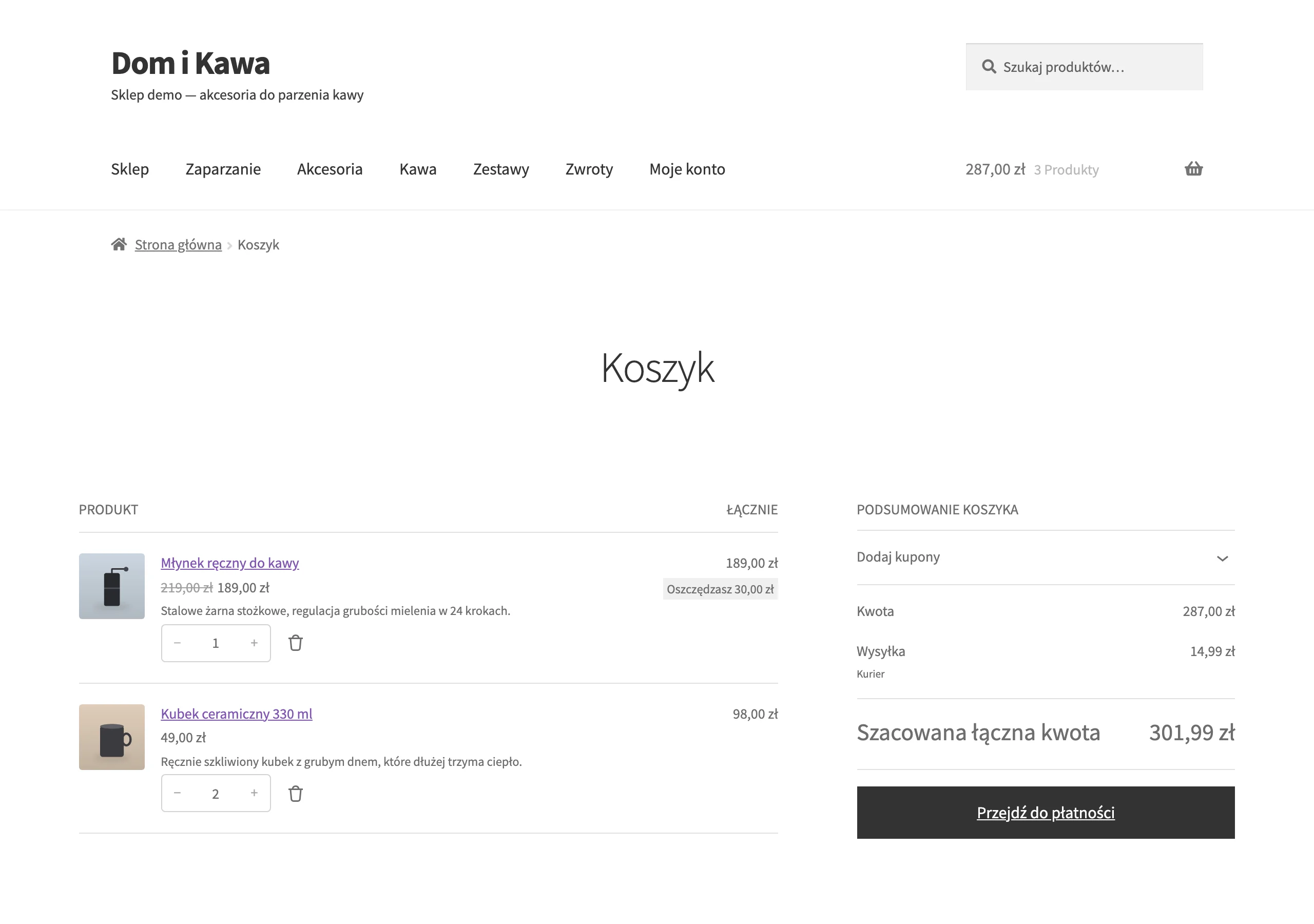
The most important touchpoints are the product page, category listing, store search, mini-basket, basket and checkout. Each of these places works to a different logic, because the context and user patience are different. In the category list, bundles and quick comparison of variants usually work better, while in the basket, add-ons with a low decision threshold and messages about the missing amount to unlock a benefit work better.
This approach also requires operational control. The recommended product must be available, compatible, profitable and relevant exactly at the stage of the journey where you show it. If the shop shows mismatched add-ons, launches an aggressive upsell too early or promotes poorly available SKUs, then instead of increasing AOV it increases friction and reduces the usability of the offer. Instead of making the decision easier, you get irritation.
What are the key elements of the offer that affect AOV?
The elements of the offer that have the strongest impact on AOV are those that help the customer buy more, choose a better variant or get a clear benefit after exceeding a certain basket value. Not every mechanism will work the same in every shop, so they need to be selected according to the product type, margin, purchase frequency and stage of decision-making. The key thing is not how many “tricks” you have, but whether they match the user’s real intent. The data speaks clearly: better fit beats quantity alone.
- Bundles and thematic packages — combine products that are naturally bought together and simplify the decision.
- Cross-sell — shows add-ons that sensibly complete the main purchase, such as accessories, consumables or protection.
- Upsell and premium variant — encourage a higher version by showing a concrete difference in value, rather than just the “better” label.
- Multipacks — work particularly well for repeatable products and everyday purchases.
- Free delivery, discount or freebie thresholds — close the basket, because the customer sees the missing amount and knows what to add to reach it.
- “Buy together” suggestions — shorten the path to buying complementary products, without juggling tabs and search.
A bundle works best when it genuinely saves time and structures the choice, rather than simply forcing several items together into a package. The customer should immediately see what is included in the set, how much the whole costs and what the difference is compared with buying separately. Hiding the total price or vague benefits quickly undermines trust.
Cross-sell is effective when it responds to a real need after the main product has been chosen. If someone is buying a technical device, it makes sense to show compatible add-ons that are needed straight after purchase. When the add-ons are random or there are too many of them, the user loses orientation and ignores the whole block.
Upsell requires a rock-solid justification for paying extra. The message “better variant” on its own simply does not deliver. You need to show a simple difference: larger capacity, better material, longer durability, an additional feature or a more cost-effective unit price. The best upsell does not pressure, but structures the comparison and lets the customer quickly assess whether the extra spend makes sense.
Benefit thresholds such as free delivery, a discount from a certain amount or a freebie work best just before completion. In the mini-basket and basket, the customer can already see the order value, so it is easier for them to calculate whether it is worth adding something extra. But note: the key is products with low purchase friction, meaning inexpensive, simple and low-risk.
Product data quality is also very important. To show a premium variant, a complementary product or a set correctly, the shop needs sensible attributes, names, images, regular and promotional prices, and up-to-date stock levels. Without organised data, even a good concept for presenting the offer quickly starts generating incorrect recommendations.
What factors affect the effectiveness of the offer presentation?
What determines the effectiveness of offer presentation is whether the customer gets the right proposal in the right place, at the right moment and without unnecessary effort. The idea of a cross-sell or bundle is not enough if it appears too late, too far down the page or in an unclear format. The best-performing mechanisms are those matched to the stage of decision-making: different ones on the category listing page, different ones on the product page, and yet others in the cart. The most common problem is not a lack of recommendations, but poor logic in how they are presented.
The device can make a difference. Especially mobile. On a small screen, additional offers must be short, clear and easy to click, because an overblown block simply starts to get in the way of adding the main product to the basket. If the add-ons section covers the price, variants or buy button, it can hurt not only AOV, but also the conversion itself.
The quality of product data is just as important. When variants are badly named, images do not show the differences, and compatibility attributes are incomplete, the customer gets lost and does not understand what they are paying extra for or what actually fits the main product. Good offer presentation starts with solid data, not with the visual layer.
Business rules that are not obvious at first glance also affect the result. Recommending a product with a low margin, poor availability or frequent returns may on paper increase basket value, but at the same time undermine the performance of the whole store. The key is for recommendations to take into account margin, stock levels, functional compatibility and a sensible order of product presentation.
Effectiveness also depends on measurement. You need to know not only whether someone bought more, but also whether they saw the widget at all, clicked a recommendation, switched to a higher-priced variant and added a product from a specific place on the site. Without proper tagging in GA4 and GTM, it is easy to confuse the effect of offer presentation with the impact of promotions, seasonality or traffic source.
The final important factor is the sales model itself. Offer building works differently for impulse purchases, where quick add-ons and free delivery thresholds are effective, and differently for planned baskets, where the customer compares variants and weighs up the value of the bundle. Offer presentation works best when it responds to the real way people buy in a given category.
How does the process of increasing basket value work in practice?
The process of increasing basket value is a journey from data and behaviour analysis to specific presentation rules, implementations and tests. No more designing a new widget just for the sake of design. Instead, you check where the store is currently missing an opportunity for a larger order, and where it is merely going round in circles. You need to see which categories have a low share of multi-item baskets, where customers choose cheaper variants and at what point they stop adding products.
The first stage is data diagnosis. In practice, you analyse AOV by channel, device, category, traffic source and user type, and then compare it with behaviour on the site. First you need to establish where the problem is and where the potential is, because without that it is easy to implement fixes in places that have no impact on the result.
The second stage is analysing the offer and the relationships between products. It sounds technical, but the stakes are simple: to understand what people actually add to the basket. You check which products are naturally bought together, which variants have real upsell potential and which bundles give the customer a concrete benefit, rather than just a “nice” discount. It is also crucial to quickly identify exclusions, meaning items that are incompatible, unavailable or simply not profitable to promote.
The third stage is mapping the placement of offers. And this is where the battle for attention starts. On the category listing page, simple messages about multi-packs and quick variant comparison usually work well, on the product page compatible add-ons and premium versions perform better, and in the cart small items with low purchase friction. Not every mechanism works in every place, which is why the touchpoint with the user has to be matched to the type of decision.
The next stage is designing the rules and components. Without that, things descend into chaos. Concrete scenarios are created then, for example showing the amount missing for free delivery, a “buy together” section, a comparison of the basic and extended versions, or a block with bundle savings. The problem is that components can drift apart in the details, so good versions are short, show one clear benefit, price, availability and one main action, without overloading the user with options.
Then comes the technical implementation and measurement. This is the moment of truth. You need to place the components in the right locations, connect the rules in the CMS, promotion engine or front-end layer, and correctly tag the analytics events, because without that “it works” means exactly as much as nothing. In practice, you measure block visibility, clicks, add-to-basket actions, moves between variants and the final impact on order value.
In the end, the process does not stop at publishing the changes, but moves on to testing and maintenance. And this is not a cliché. You compare layouts, message copy, the number of suggested products and benefit thresholds, and you assess the result not only through AOV growth, but also through conversion, margin, returns and discount usage. The best solution is not the one that increases the basket itself, but the one that improves the store’s result without damaging the shopping experience.
What are the best practices in designing offer components?
Best practice means designing components that show a clear benefit, fit the stage of purchase and do not get in the way of buying the main product. It should be clear, not flashy. The customer should immediately understand what extra they are getting, how much more they are paying and why this proposal makes sense at this particular moment in the purchase journey. A good AOV component does not distract from the purchase decision, it simplifies it.
On the product page, complementary offers and variant comparisons work best, because the user is then focused on one product. In the basket, low-risk add-ons such as accessories, top-ups or a message about the amount missing to gain a benefit usually perform better. The question is: why repeat the same block everywhere, when the decision context changes with every step. If you show it in exactly the same form in every place, it will quickly turn into noise rather than real decision support.
One component, one main action. And only as much information as is really needed to make a decision, because too many buttons, variants and messages kill clarity, especially on mobile. If the customer has to guess what the options differ in, the component is not working towards basket value.
- a clear proposition name, without vague phrases like “recommended for you”
- a concrete benefit: savings, a more complete set, convenience, or simply a better variant
- a clear price and the difference versus buying individually
- information on compatibility, size, capacity or intended use
- availability status and a simple add button
In bundles and multipacks, the whole matters. The user must immediately see the full cost and the logic of the package, i.e. whether they are buying more cheaply, more conveniently, or simply more completely. Hiding the price of the whole set or showing only a percentage “saving” without context often reduces trust.
Design components for the small screen first. That is exactly where usability is easiest to derail: the block must load quickly, not obscure key elements and fit the most important information without splitting it into several expandable sections. And how do you know whether the problem is the offer or the presentation? Attach measurement of visibility, clicks and add-to-cart actions, because without that you are navigating blindly.
What are the most common mistakes and limitations when optimising AOV?
Two classics keep coming back like a boomerang: the wrong products at the wrong moment and judging the result solely by basket value growth. If recommendations are incompatible, unavailable or simply too expensive relative to the main purchase, the customer is more likely to ignore them than use them. Higher AOV only makes sense if it does not damage conversion, margin and the shopping experience.
The second sin is overly aggressive upselling. When the store tries to sell a more expensive variant before the user even understands the base offer, friction rises and the page becomes less clear. The same happens when the product page is overloaded with several blocks at once: cross-sell, bundle, threshold discount, pop-up and promotion counter can all weaken the decision rather than strengthen it.
The next group of mistakes concerns data and business logic. The recommendation engine will not solve the problem if products have incomplete attributes, incorrect links or out-of-date stock levels. Automation without exclusion rules often promotes goods with low margin, low availability or simply products that do not fit the basket.
The limitations are often primarily operational, not just marketing-related. The outcome is shaped by platform capabilities, the availability of the development team, integration with PIM or ERP, pricing policy and the scale of changes in the catalogue. The more SKUs and the more frequent the offer rotations, the greater the importance of clean data and a simple, enforceable model for managing rules.
In practice, it is easiest to stumble over a few specific limitations:
- no distinction between logic on mobile and desktop
- underestimating the impact of promotions on margin and on voucher usage
- no measurement of component visibility and add-to-cart actions coming from widgets
- changes rolled out too slowly because of dependence on one system or supplier
- no cyclical updating of sets, thresholds and exclusions
The most costly mistake is implementing an AOV mechanism without a test plan and without a clear success criterion. It sounds sensible, and yet it can turn the conclusions upside down, because growth in average order value may result from fewer low-value baskets rather than from better presentation of the offer. The question is: what exactly is growing? That is why the result must be read together with conversion, the share of multi-item orders, margin and user behaviour at each stage of the journey.
Which tools and methods are most useful in analysis and implementation?
What matters are tools for measurement, user behaviour analysis, testing and managing product data and offer rules. In practice, the basic set is GA4, GTM, an A/B testing tool, heatmaps and session recordings, and on the operational side also PIM, CMS or a merchandising module, plus a promotion engine. Choosing the tools alone will not solve anything if there is no plan: what to measure and what decisions should follow from it. First you need to build correct measurement, and only then change the presentation of the offer.
To analyse the impact of offer presentation, GA4 with well-designed e-commerce events works best. Measure not only purchase and revenue. Add to that widget visibility, clicks on recommendations, add-to-cart actions from cross-sell blocks, variant changes and moves to checkout, because only this full set shows where the basket is really being “made”. This makes it clear whether a given component is genuinely helping to lift basket value or merely inflating clicks without affecting the order. GTM speeds up tag implementation, but it will not fix poorly defined event logic, so first map out a measurement plan for each exposure point.
To understand why the user skips additional propositions, you need heatmaps and session recordings. They tell you directly whether the “buy together” section is visible at all, whether the message about the threshold benefit gets lost on mobile and whether the block with add-ons is undermining the main purchase action. This is particularly important for mobile traffic. There, even a good AOV mechanism can fail simply because it is too low on the page, loads too late or takes up too much space. Such tools will not replace quantitative analytics, but they are excellent at pinpointing the source of the problem.
Implementation decisions like hard tests. A/B tests or sequential tests work best, because they show what actually makes a difference and what only looks good in a presentation. Test the component layout, benefit copy, number of suggested products, the way savings are shown and the timing of exposure, but always with control of the impact on conversion and margin. Growth in average basket value without checking conversion, returns and discount usage can give a misleading picture of performance. One thing is key. Good tests compare one specific change at a time, instead of throwing a new design, new recommendations and new promotion thresholds into one experimental bundle.
Product data is the foundation, not an add-on. On this side, the key things are PIM, feed management and structured attributes in the e-commerce platform, because without them even the best front end will be just a pretty façade. If a product does not have properly described compatibility, variant, availability or relationships with other SKUs, recommendations become random regardless of the quality of the interface. Implementing AOV rules usually also requires a CMS or merchandising module to manage promotional blocks and a promotion engine for free delivery thresholds, freebies and bundles. Most problems do not result from a lack of ideas, but from inconsistent data and a lack of control over display logic. The question is whether you even know what you are showing and why.
The best results come from simple, consistent work. Combining data diagnosis, a map of display points, an implementation backlog and cyclical optimisation keeps the topic under control and stops you getting stuck in “never-ending fixes”. Start with a few areas with the greatest potential, for example the product page, mini basket and basket, and only then expand the scope to further sections. Instead of tackling everything at once — precise cuts. This approach reduces chaos and lets you see faster which mechanisms really work in a given store model. In practice, it is not the most extensive stack of tools that wins, but a well-organised process from measurement, through rules, to testing and fixes.
FAQ
Frequently asked questions
How can you increase average basket value without raising prices?
You need to make it easier for the customer to choose a larger purchase, a better variant or complementary products. The key is to show a sensible proposition at the right point in the purchase journey.
What has the biggest impact on basket value in an online store?
Bundles, cross-sell, upsell, multipacks and benefit thresholds, such as free delivery or a free gift, work most strongly. However, their effectiveness depends on how well these mechanisms match user intent.
When is the best time to show add-ons and basket suggestions?
On category pages, faster comparisons and multipacks work well; on product pages, complementary add-ons and premium variants; and in the basket, low-decision-threshold products. Each placement requires a different display logic.
Why is product data important for increasing AOV?
Without good data, the store may show unsuitable, incompatible or unavailable products. In that case, recommendations stop helping and instead increase friction and reduce the usefulness of the offer.
How does upsell work so it really increases basket value?
Upsell should clearly show the difference between the basic and the more expensive version, for example capacity, durability, features or unit price. A message saying the variant is better usually is not enough.
What mistakes most often undermine average basket value optimisation?
The most common problems are the wrong products shown at the wrong time and an overly aggressive upsell. It is also a mistake to assess the effect only through AOV growth, without checking the impact on conversion, margin and the shopping experience.