
A seasonal landing page in e-commerce is a page tailored to a specific spike in demand, not to general traffic to the store. And that makes a difference. It is neither a standard category nor just a banner with a promotion, but a place meant to take over traffic from ads, email campaigns, social media and search, and then lead the user to the right offer as quickly as possible. In practice, what often decides the result of a campaign is not the ad budget itself, but whether the landing page is aligned with the offer, fast and easy to use on mobile. That is why such a page cannot exist alongside the store as a separate entity. It has to be tied to real prices, stock levels, delivery and returns policies, because effectiveness starts precisely with that consistency.
What is a seasonal landing page in e-commerce?
A seasonal landing page in e-commerce is a dedicated campaign page prepared for a specific season, sales occasion or buying intent. No fluff. It may relate, for example, to Christmas, sales, summer, back to school, gifts or the garden, and each time it taps into a different set of emotions and needs. Such a page has one main goal: to focus traffic and make the purchasing decision easier without wandering around the whole store.
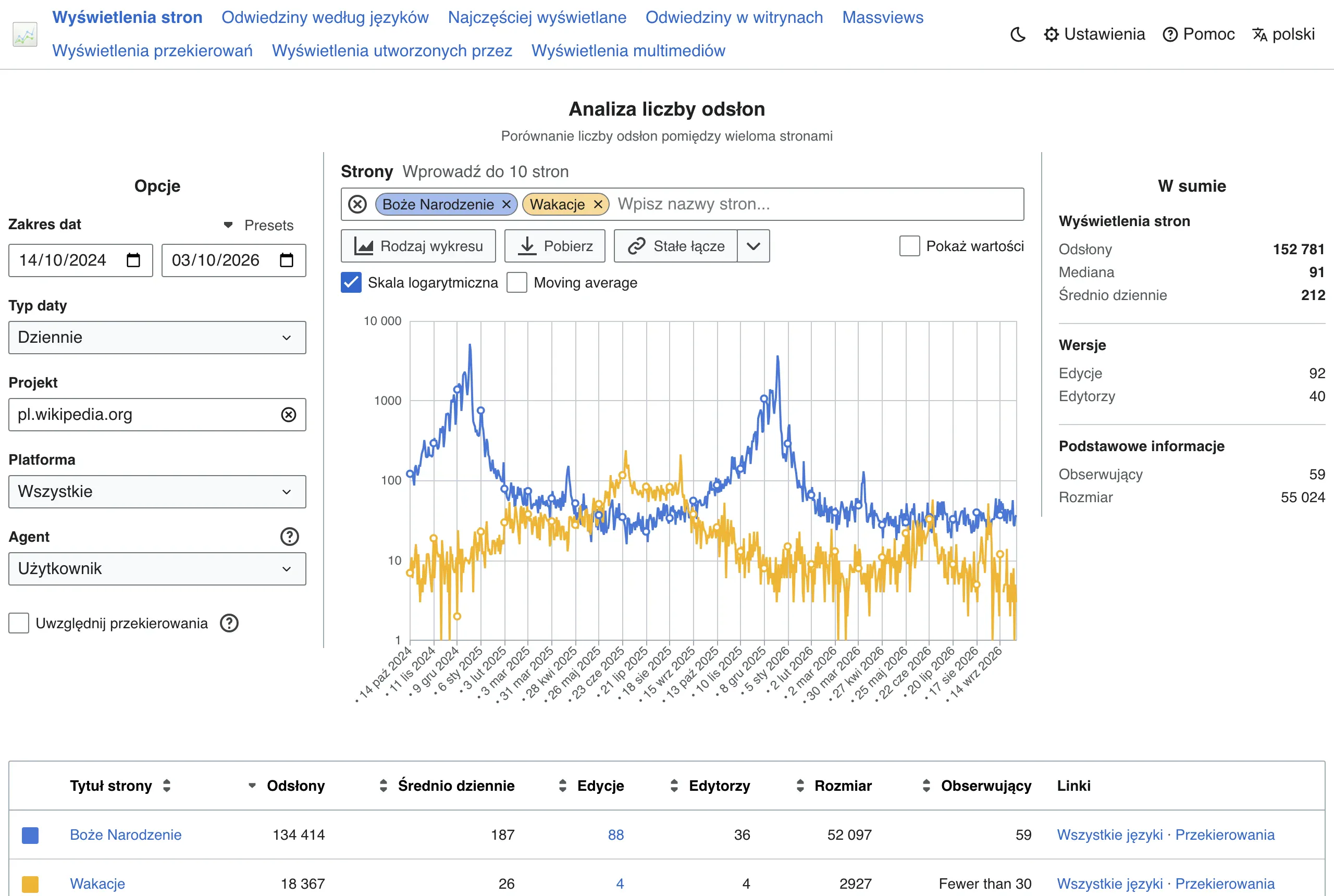
The main difference compared with a standard category is that a landing page is built for a campaign, not for the catalogue structure itself. Instead of “everything for everyone”, you get a content layout designed for a specific entry context: a more prominently featured offer, better matched products and messages tailored to the traffic source. The user should immediately see what is on offer, who it is prepared for and why it is worth buying right now. The question is whether the page says that in the first few seconds, or only after a few scrolls.
Such a landing page does not operate in a vacuum. It has to be consistent with the product feed, prices, promotions, availability, discount codes, and delivery and returns terms, otherwise it becomes an empty promise. If the ad promises a discount but the page shows different rules or unavailable products, campaign effectiveness drops quickly, and trust even faster.
In practice, a seasonal landing page serves several traffic channels at once. That is not a luxury, it is standard. It should work well for visits from performance ads, newsletters, social media, brand queries and organic traffic for seasonal keywords, because users do not arrive from one “ideal” source. If a given occasion returns every year, it is better to treat such a URL as a developing asset rather than building everything from scratch with every campaign.
What are the key elements of an effective landing page?
The key elements of an effective landing page are quite specific: a clear first screen, a well-chosen range of products, simple navigation, visible CTAs, trust elements, fast page performance and correct data measurement. It sounds like a checklist, but these are real conversion levers. Each of these elements affects whether the user moves on to a product or returns to the search results or the ad, and the difference often comes down to details. An effective landing page does not need to be elaborate, but it does need to be organised and specific.
- The first screen with a clear value proposition, information about the promotion and quick access to the offer.
- Entry blocks or audience segmentation, for example by budget, use case, gift recipient or delivery date.
- Product modules with genuinely available products, sensible sorting and alternatives in case of stock shortages.
- Clear CTAs, simple filters and a short path to the product page, especially on mobile.
- Sections that build trust: delivery, returns, promotion terms, payments, reviews and other hard arguments for purchase.
- FAQ and content that closes the decision when the user needs a comparison, a clarification of the rules or guidance on choosing.
- Loading speed and a stable layout, because heavy graphics and too many scripts can drag campaign results down more than weaker copy.
The start matters most. Usually, what drives the result is the first screen, product selection and consistency of the message with the ad, not the “nice” additions at the end of the page. If someone clicks an ad for gifts up to 200 zł, they should not land on a general page with a chaotic listing. Consistency between the entry source and the landing page is one of the quickest ways to improve conversion without increasing the budget.
Mobile does not forgive. On a phone, a clear heading, quick access to segments, convenient scrolling and no elements that hide the offer at the crucial moment all matter. Filters, promotional labels and buttons must be utterly simple, because the user decides faster and has less patience than on desktop. The question is: can the offer be seen straight away on a small screen, or only after battling with the interface.
Seasonality likes change. An effective landing page should be ready for adjustments during the campaign, because prices, stock levels and products that are actually driving sales rotate during the season. That is why a good campaign page does not end with deployment — it must allow quick swapping of modules, messages and the order of the offer.
In the end, analytics always comes back into play. Without it, it is hard to assess fairly what really works and what just looks good in a presentation. Measure not only sales, but also clicks through to product pages, clicks on segments, use of filters and user behaviour on the first screen. The data clearly shows whether the problem is the offer, the page layout, the traffic source or the technical quality of the landing.
How do you plan and implement a landing page for a seasonal campaign?
You start with the goal. A landing page for a seasonal campaign is planned from the business goal, traffic sources and the specific offer, and implemented as a page integrated with the product catalogue, promotions and analytics. At the outset, you decide whether the page is primarily meant to sell, direct users to product pages, capture SEO traffic, or combine several tasks at once. That decision determines the layout, the scope of content and how the result is measured. The most common mistake appears right here: one page tries to do everything and, as a result, does nothing well.
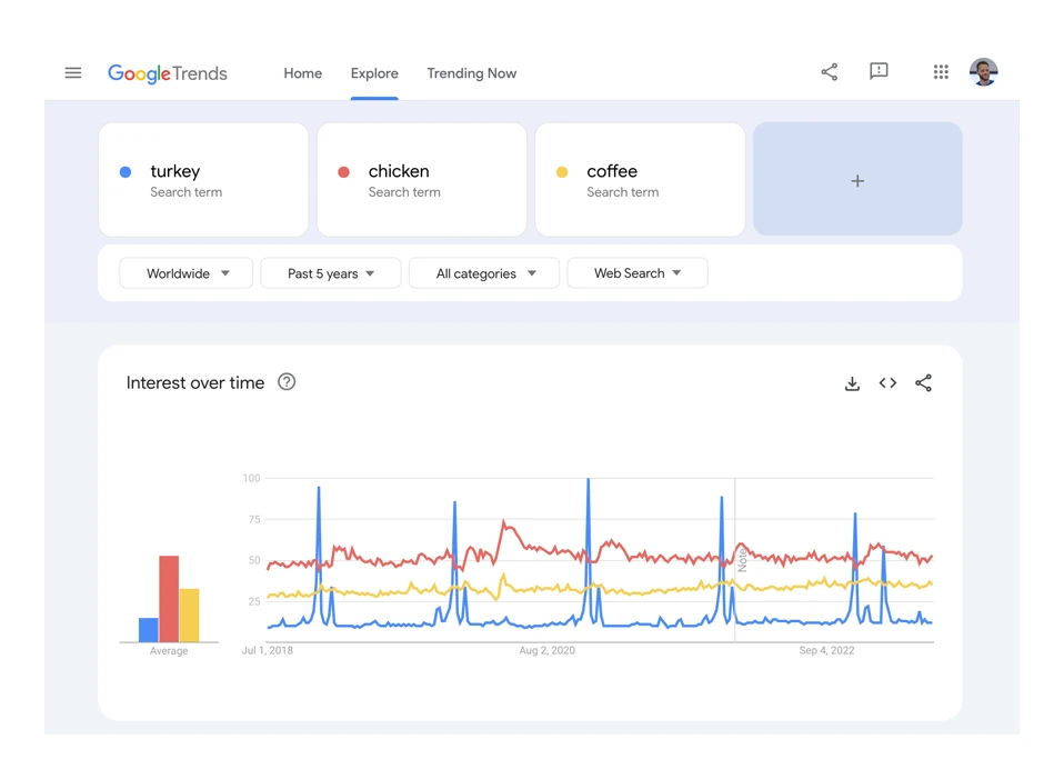
Then the input data comes in. In practice, previous campaigns, query seasonality, bestsellers, margins, returns, product availability and logistical constraints are checked, because they define the real room for manoeuvre. That makes it clear what to promote heavily, what to show as an alternative and what not to promise in the ad when stock levels are unstable.
The site architecture is built around user intent, not the convenience of the shop’s internal structure. When a customer is hunting for a gift, it is easier to guide them through segments such as recipient, budget, delivery date or use case, rather than through technical category names. On the first screen, the user should immediately see what they are buying, on what terms and why they should go deeper.
The assortment selection has to take into account product turnover during the season. Rules for replacing unavailable products, hiding empty modules and connecting alternatives in a similar price range are not “a nice extra” but a condition for it to work. The problem is that in paid campaigns a single click on an unavailable product can quickly cut the effectiveness of the whole page.
At the implementation stage, the landing page needs to be connected to the real product feed, prices, delivery, discount codes and return conditions. The visual layer alone will not deliver results if the message on the page does not match the basket or the ad. Consistency between the ad, the landing page and the checkout usually matters more than yet another banner variant.
Before publishing, you need technical and analytical tests. In short: mobile first. Then everything else. Check loading speed, filter functionality, empty states, links, price accuracy, event tagging and compliance with the consent policy, because these are the areas where conversion most often breaks down. In measurement, do not limit yourself to transactions; add CTA clicks, product clicks, filter use and abandonment after the first screen, because these signals show earlier what is not working.
Once the campaign has started, the landing page cannot be left to run unattended. During the season, the hero section, section order, products, price messages and trust blocks are regularly swapped out, based on what is actually coming from traffic channels. The key is to optimise first the elements with the biggest impact: the first screen, product selection, CTA and delivery message.
What are the best SEO practices for seasonal pages?
The best SEO practices for seasonal pages come down to three decisions: the right URL, deliberate indexing and a content plan that makes sense beyond the campaign peak. If the season returns every year, it is usually better to develop one stable URL rather than build a new page from scratch for each edition. That makes it easier to maintain link history, visibility and performance data, which in SEO is currency.
The most important decision is whether the landing page should be indexed. A recurring page, based on repeated purchase intent, should grow as an SEO asset, not as a one-off decoration. By contrast, a one-off page, short and based solely on ad traffic, often requires a different approach, for example limiting indexing or later redirecting it once the campaign is over. It is not worth leaving an empty or outdated page in the index after the season, because over time it starts to harm traffic quality.
On-page SEO for such a landing page should be specific. The title, H1 heading and body copy should clearly indicate the season, type of offer and user intent, rather than repeating generic sales slogans. It also helps to have a layer that assists the choice: short segment descriptions, delivery information, FAQ and logical internal linking to subcategories or product pages.
The content is matched to the traffic source and the stage of decision-making. A user from a performance campaign wants to see the offer quickly, while organic traffic more often needs context, comparison or answers to questions before they click “buy”. And the problem here is that one template will not handle both situations equally well. That is why a seasonal SEO landing page is increasingly often a hybrid page: not just a product listing, but also real help in making a choice.
Internal linking makes a difference. A seasonal landing page should be linked from navigation, categories, how-to articles, the homepage or onsite blocks when the season is actually running. This shortens the path for both robots and people, and at the same time boosts the page’s importance in the store structure. One thing is key: don’t hide the page in the corner when it is meant to work.
From a technical SEO perspective, seasonal pages come down to speed and stability. Core Web Vitals, image size, limiting heavy scripts, lazy loading and the absence of layout shifts all have a real impact on search traffic, especially on mobile. The data speaks clearly: every second of delay costs visibility and user patience. If a landing page loads slowly, it loses in SEO, ads and conversion at the same time.
After the season, it is better to update the page than to abandon it. You can replace messages, hide an outdated promotion, keep evergreen content and prepare the base for the next edition. Instead of building from scratch every year — amplify what already has history and signals. The best SEO results come from seasonal pages treated as a developing asset, not a one-off project for a short sales spike.
What should you pay attention to when optimising a landing page?
When optimising a landing page, the elements that really push the user towards the product and purchase matter most. In a seasonal campaign, the first screen, the offer layout, product selection and page speed usually do the most work. The question is: why polish paragraphs at the bottom if the user bounces two seconds after entering. Not X, but Y: instead of cosmetic tweaks to later sections — fix what blocks the decision at the start. First improve what the user sees and understands within the first few seconds.
The first screen must immediately confirm that the user is in the right place. The heading, promotion, offer range and CTA should be consistent with the ad, newsletter or post on social media, with no silent change in the promise. If the opening message promises a discount, fast delivery or gifts within a certain budget, the landing page should show that without scrolling. And that is not a cliché, but a simple consistency check.
The way products are presented can determine the result. In season, it is not the biggest selection that wins, but a well-ordered display: bestsellers, products with good availability, a sensible entry price and clear alternatives when items are out of stock. Order first, expansion of the listing later, because chaos does not sell. It is worth regularly reshuffling the module order based on campaign data instead of keeping one version throughout the whole promotional period.
On mobile, simplicity matters. Instead of adding more gimmicks, you need to cut back to the bone: filters should be clear, buttons large, and sections short and easy to scan. Overly heavy graphics, unnecessary scripts and an unstable layout quickly reduce effectiveness, especially with paid traffic.
Optimisation makes sense when it is based on intermediate data, not just final sales. In practice, check clicks through to product cards, filter usage, clicks on segments, bounces after the first screen and differences between traffic sources, because that is usually where the funnel breaks. If a campaign has plenty of visits but few product views, the problem is usually not price, but the page layout or a mismatched opening message.
You also need to think about the page’s operational resilience. In a seasonal campaign, the offer rotates quickly, so the landing page should allow the hero, product modules, delivery sections and price messages to be swapped quickly without involving a full deployment. A well-designed landing page does not fall apart the moment part of the promoted products goes out of stock.
What are the typical mistakes and how do you avoid them?
Typical mistakes on a seasonal landing page are painfully repetitive: inconsistent messaging, an overly general structure, poor handling of stock shortages, page overload and incomplete measurement. The problem is that most of them do not stem from design, but from a lack of decisions before the campaign starts. The shorter the season, the more each such mistake costs.
A common problem is a disconnect between the ad and the landing page. The user clicks on a specific promise and lands on a general page with a banner and a long list of random products. The question is: why promise precision if you end up giving chaos. To avoid this, keep the heading, promotion, discount codes, delivery dates and offer range aligned at every point in the journey.
The second mistake is trying to serve everyone with one chaotic page. If you mix gifts for children, premium electronics, a cheap sale and a last-minute offer on one landing page without a clear split, the user has to work out the page’s logic for themselves. It is better to separate traffic with entry blocks, audience segmentation or subpages than to build one overloaded landing page.
Very often, the offer logic also fails. Out-of-stock products are still promoted, prices do not match the feed, and after clicking the user ends up on an empty product card or a variant without a promotion. Cosmetic tweaks will not fix that, only order: a landing page tied to the current catalogue, fallback rules for shortages and tests before publishing and during the campaign.
A separate category of mistakes concerns the technical side. Too many trackers, pop-ups, countdowns and heavy banners slow the page down and make shopping on mobile harder, precisely where traffic is often the most expensive. In practice, keep only the elements that genuinely support the purchase decision or measurement, and limit or load the rest sparingly.
Poor performance measurement can also be dangerous. If you do not track CTA clicks, product views, filter usage and add-to-cart actions by traffic source, you are still groping in the dark, because you do not know whether the problem lies in the campaign or on the page. Without proper tracking, optimisation turns into guessing.
At the finish, many people forget what to do with the page after the season. A one-off landing page is left with an outdated offer, damages the experience and sometimes still collects traffic from the index or old ads. Then someone wonders why the user lands on a dead campaign end. If the page is meant to come back every year, it is better to keep a fixed URL and simply update the content. If it is not going to return, plan a sensible redirect or a “post-campaign” version straight away instead of leaving an empty shell.
How to monitor and measure campaign success on a landing page?
Campaign success on a landing page is measured by a combination of three things: sales performance, user behaviour and the quality of traffic from specific sources. The sheer number of sessions means little if you cannot see whether users are moving on to products, adding them to basket and completing the purchase. First you need to establish one main goal for the page and 2-3 supporting goals, because without that the report will be full of data, but without decisions. For one landing page the goal will be a transaction, for another a move to the product page, and for yet another gathering SEO traffic and supporting indirect sales.
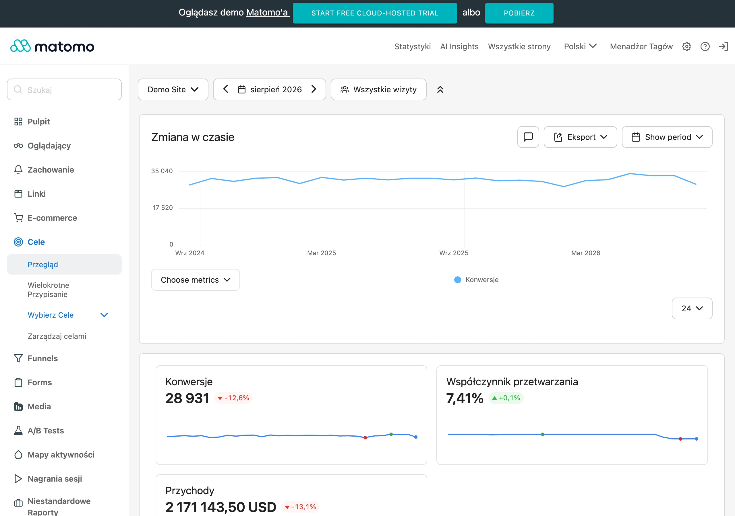
In practice, the core set of metrics is quite specific. It includes revenue, conversion rate, basket value, acquisition cost and the share of entrances ending in a move to the product. Then you have micro-actions that ruthlessly show where the user drops off: clicks on the CTA, use of filters, choosing a segment, scrolling to the offer section and adding to basket. If a landing page gets plenty of visits but a low product click-through rate, the problem is usually not the campaign, but the first screen, the layout of the offer or a mismatch in the message.
Measure traffic sources separately. Newsletter, Google Ads, social media and organic traffic behave differently, so lumping them together ends in wrong conclusions. The same landing page can perform brilliantly from a brand campaign and poorly from cold traffic, even if the average “on the dashboard” looks fine. That is why UTM tagging, consistent campaign naming and correct channel mapping are simply essential. Do not judge the page solely on the overall result, because the average often hides a real problem in one source or on one device.
Measurement has to cover the whole journey: entering the landing page, interacting with sections, moving on to the product, adding to basket and purchase. Only then will you distinguish a problem with the campaign page from a problem with the product page, basket or delivery conditions. In seasonal campaigns there is another layer, often ignored. I mean operational errors: clicks on unavailable products, a drop in the number of active offers or a sudden rise in exits after a price change.
Results should be broken down by device, because mobile usually delivers the most traffic and exposes the page’s weaknesses fastest. When conversion on desktop looks decent, but on mobile the number of moves to the product drops, the culprit is often a heavy first screen, vague CTA, hard-to-read filters or an unstable layout. Differences between devices are one of the quickest ways to spot a problem that is not visible in the overall report.
Privacy complicates the data. And quite specifically. Analytics limitations resulting from consent mean that not every session will be complete, and some transactions will not be attributed perfectly to a source, so instead of staring only at absolute numbers, it is better to read trends and relationships between stages of the funnel. Day-to-day, week-to-week and year-on-year comparison with the same period from the previous season works well, if the landing page has already been used before.
Monitoring cannot end on the dashboard. During the campaign it is sensible to review a few operational signals every day: availability of promoted products, price consistency with the advert, discount code correctness, link functionality and page speed after deploying new modules. A seasonal landing page often loses performance not because of a poor strategy, but because of a simple deployment error or a lack of synchronisation with the store’s offer.
After the campaign, it is not just total sales that matter. The mechanisms matter too. It is worth gathering insights at the level of sections and user scenarios: which entrances delivered the highest quality, which blocks actually led to clicks and which products most often closed the purchase decision. The key point is that this data lets you treat the landing page as a developing asset for the next season, rather than a one-off page built from scratch.
FAQ
Frequently asked questions
How does a seasonal landing page work in e-commerce?
Such a page takes over traffic from ads, email, social media and search, then guides the user to a specific offer. It has one main goal: to focus attention and shorten the path to purchase.
Should a seasonal landing page be aligned with product prices and availability?
Yes, because it must be connected to real prices, stock levels, delivery and return policies. When the ad promises something different from the page, campaign performance drops quickly.
What are the most important elements of an effective seasonal landing page?
The key things are: a clear above-the-fold section, a well-chosen product range, simple navigation, visible CTAs, trust signals, fast loading and accurate data tracking. The biggest impact on results comes from the above-the-fold section, product selection and message consistency.
How should you plan a landing page for a seasonal campaign?
First you need to define the business goal, traffic sources and the specific offer. Then the page should be connected with the product catalogue, promotions, logistics and analytics.
What are the best SEO practices for seasonal pages?
It is best to build a single stable URL if the season returns every year, instead of creating a new page for each edition. Also important are deliberate indexing, specific on-page content, internal linking and good loading speed.
How can you optimise a seasonal landing page to improve conversions?
First it is worth improving what the user sees in the first few seconds: the headline, promotion, offer range and CTA. Then you need to test the product layout, filters, page speed and data on product page clicks and segment usage.