
Landing page is one of the key pages in a campaign, because its job is to lead the user to one specific action. That might be submitting a form, signing up, booking a call or making a purchase. In practice, the result depends not only on the design, but above all on whether the offer is clear and whether it matches the intent of the person landing on it. The best landing page’e do not try to tell the whole story, but close the decision as quickly as possible. That is why it is worth looking at the message, form, credibility, technical setup and measurement holistically. When any of these elements is underperforming, conversion usually drops, even with quality traffic.
What is a landing page and what is its role in marketing?
A landing page is a page designed around one main conversion goal, which is why it is so important in marketing. It is not a standard informational subpage or a shortcut to the whole company. It is meant to reduce distractions, explain the offer clearly and guide the user towards one action. That might be lead generation, booking a demo, downloading a resource or making a purchase.
Its advantage lies in shortening the path from click to decision. The user should not have to puzzle over what you offer, who it is for and what the next step should be. For this reason, an effective landing page usually removes unnecessary navigation, minimises the number of links and builds a simple path to the CTA. The fewer distractions along the way, the easier it is to convert.
In marketing, a landing page combines several layers at once: offer, copywriting, section layout, interface, technical implementation and analytics. Aesthetics alone will not deliver results if the offer is unclear or the form creates too much friction. On the other hand, even a strong proposition can lose out when the page loads slowly, performs poorly on mobile or does not track conversions properly. In practice, a landing page is both a sales and measurement tool.
The importance of this page grows especially in paid campaigns, email marketing and activities focused on lead generation. In such channels, every visit costs money or has a specific value, so you need to know precisely what delivers results. A landing page makes it easier to compare traffic sources, lead quality and the effectiveness of different messages. A well-built landing page helps not only to increase conversion, but also to spot more quickly where a campaign is wasting budget.
It is also worth remembering that effectiveness depends on context. A landing page for a simple webinar sign-up is designed differently from one for a B2B service with a longer decision-making process. For simple offers, a short path, a clear message and light trust signals are usually enough. For more expensive or more complex services, you need a stronger explanation of value, objection handling, a description of the process and an indication of what happens after the form is submitted.
How do you tailor a landing page message to the traffic source?
The message on a landing page should be tailored to the traffic source, meaning it should maintain consistency between what the user saw before clicking and what they land on on the page. This determines whether they will see the offer as “spot on” or close the page after a few seconds. If an ad promises a free quote, the page should say clearly that it is a free quote, not vaguely talk about the company and its history. The most common mistake is inconsistency between the ad, the search phrase or email and the page headline.
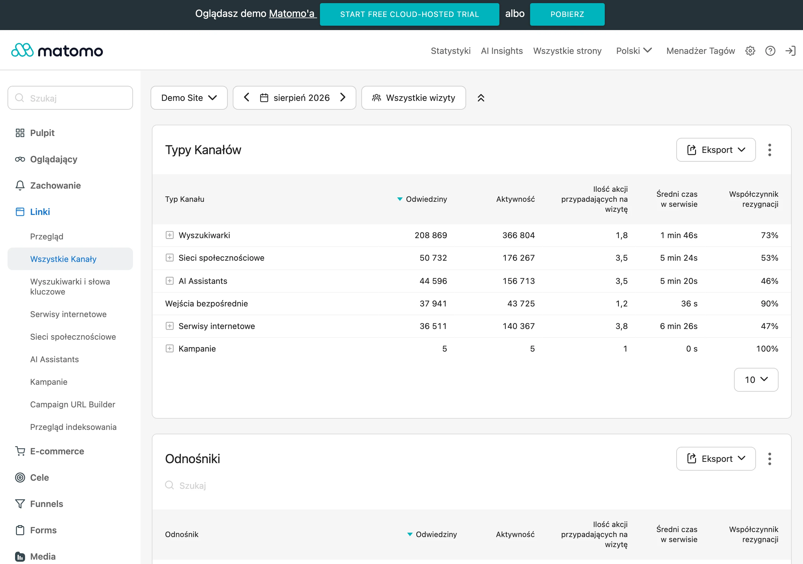
First, it is worth reading the user’s intent. Someone from a branded campaign usually knows the brand and needs quick confirmation that they have landed in the right place. Someone from cold traffic more often expects a simple explanation of why this offer makes sense for them. A user from remarketing is often closer to a decision, so it is a good idea to highlight proof, conditions and a clear next step more strongly.
- Traffic from Google Ads on specific keywords requires a very precise headline and an unambiguous answer to the query.
- Traffic from Meta Ads more often needs a quick “hook”, simple benefits and an easy entry path.
- Remarketing traffic responds better to a reminder of the offer, objection handling, references and a stronger CTA.
- Traffic from email should see a continuation of the same message, the same offer and the conditions that were in the message.
Tailoring does not end with the headline. Usually you also need to adjust the arguments, the level of detail, the length of the page and the type of trust signals. For traffic with high purchase intent, price, deadline, scope of service and a simple form will be more important. For people who are only just getting used to the topic, explaining the problem, showing the benefits and proving that the solution is credible will matter more.
In practice, it is best to start with the hero section. It should answer four questions in a few seconds: what it is, who it is for, why it is worth it and what to do next. If the user has to scroll to understand the basic promise, the message is too weak or too generic. This is especially important on mobile, where content is more often scanned than read.
One version of the page will not always “deliver” all traffic. When you are directing campaigns to different segments, it is often more sensible to prepare separate variants with a different headline, promise and set of arguments. This is not about a full rebuild, but about maintaining relevance. The same layout can perform completely differently depending on the quality and intent of the traffic.
In the end, you need to check in the data whether this fit actually works. The sheer number of clicks on the CTA is not enough, because it may rise while lead quality falls at the same time. It is worth measuring form submissions, errors, drop-offs, lead sources and what happens after conversion. Only then can you see whether the message not only attracts attention, but also moves the right users further on.
How to build an effective landing page in terms of UX/UI?
An effective landing page in terms of UX/UI is a page that leads the user to one action, with no unnecessary doubts, friction or distractions. The user should immediately see what you offer, who it is for and what the next step is. If they have to guess where to click or what the message actually means, conversion usually drops. The best UX on a landing page is not about a “wow effect”, but about quickly understanding the offer and completing the next step simply.
Information hierarchy is key. The first screen should include: a specific headline, a short value description, a clear CTA and one element that builds credibility. This set is usually enough for the user to assess whether it is worth going further, without scrolling and without reading the whole page.
The section layout should reflect the way people make decisions. First the promise and the sense of the offer, then clarification of exactly what they will receive, next the removal of objections, and only later more detailed information. Do not start with the company history, generic slogans or a long description of the service, because in the first few seconds it simply does not work.
The CTA must be visible, clear and sensibly matched to the stage of the decision. If the user is to leave contact, the button text should directly communicate what will happen after the click, for example “Book a consultation” or “Download the offer”. A good practice is to repeat the CTA after key sections, because some people need several arguments before they take action.
The form should ask only for the data that is genuinely needed at this stage. Every additional field increases friction and gives another reason to abandon the page. If the process requires greater lead qualification, it is better to split the questions into two steps than to show a long form straight away.
UX/UI should be designed with a mobile-first approach, because it is on a phone that it is easiest to lose the user. Large, easy-to-use buttons, short text blocks, clear spacing, fast loading and no elements covering the content all matter. On mobile, heavy graphics, small fonts and forms that cannot be comfortably completed with a thumb perform particularly badly.
It is also worth cutting out everything that distracts from the page goal. Extensive menus, links to multiple subpages, several competing messages and too many options of choice blur the user’s attention. A landing page works best when every element on the screen supports one specific conversion.
Why are trust signals crucial on a landing page?
Trust signals are crucial on a landing page because they reduce the risk the user feels before submitting a form, making a booking or buying. Even a good offer may not be enough if the recipient is not sure that the service is real, safe and relevant to their need. That is why the page must not only promise an outcome, but also show where the credibility of that promise comes from.
The strongest trust signals address specific objections. When a user is considering whether the company has the right experience, client logos, implementation examples or a clear description of the process help. If, on the other hand, they are worried about quality, reviews talking about results, communication and the course of cooperation work better than generic phrases such as “full professionalism”.
The moment when you show these materials is also important. Some of them should be visible already high up on the page, near the hero section or the first CTA, to reduce uncertainty straight away. Others are worth placing where questions naturally arise, for example next to the form, pricing, process description or in the FAQ section.
Effective trust signals should be specific and credible. The more strongly they stem from real customer experience, the better they support the decision. That is why one substantive review set in context will more often work than several anonymous, short quotes lacking detail.
On a landing page, elements that set expectations after conversion also work well. Information about what will happen after the form is submitted, how long the contact takes, who will respond and how the data is processed also builds trust. This is especially important when the user provides a phone number, email address or company details.
Trust does not come from simply adding reviews, but from combining a coherent offer, a clear process and evidence that answers the audience’s real questions. If the testimonials are random, exaggerated or look artificial, they can work in the opposite direction and reduce the effectiveness of the page. That is why it is worth choosing only those materials that genuinely help with making a decision.
How to measure landing page effectiveness and what to optimise?
Landing page effectiveness is assessed by the number and quality of conversions and by the stage at which users drop off. The number of visits or button clicks alone tells you little if the form is not being submitted, the leads are poor quality or the data is not being saved correctly. First you need to clearly define one main conversion, for example submitting a form, booking a call or making a purchase. Only then do you set up analytics, reports and tests around that goal.
In practice, it is worth observing not only the end result, but the entire journey. Page visits, scrolling, CTA clicks, form starts, form errors, drop-offs, submissions and visits to the thank-you page all matter. If users click the button but do not finish the form, the problem is usually not the headline, but friction in the next step.
Technical configuration also matters greatly. Events should only trigger after user consent, the form must pass data to the CRM or another system, and the thank-you page should confirm the conversion. If tracking, consent or integrations are wrong, it is easy to make poor decisions based on incomplete data.
When assessing results, the source of traffic is key. The same landing page can perform well in remarketing and poorly with cold traffic from ads, because users have a different intent and a different level of trust. That is why it is better to compare results separately for campaigns, devices, ad groups and message variants, rather than relying solely on one aggregated report.
It is worth optimising what genuinely affects the decision and the level of friction. Most often, the headline, subheading, copy and CTA label, form length, section layout and order, visibility of trust signals, and mobile loading speed are tested. First, remove the biggest blockers rather than polishing minor visual details, because a slow page, a broken form or an overly complex form harms performance more than the colour of an icon.
It is also worth measuring the quality of conversions, not just their number. If after changing the landing page the number of leads rises, but the number of calls, sales or properly qualified enquiries falls, the improvement exists only on paper. A well-performing landing page not only gathers more contacts, but gathers the right contacts.
The most common mistakes when creating a landing page and how to avoid them
The most common mistakes when creating a landing page come from the lack of a single goal, a mismatched message and too much friction when carrying out the action. The user lands on the page, but does not immediately understand what they are getting, who the offer is for and what the next step should be. In such a situation, even an attractive page does not convert as it should.
A very common problem is a lack of consistency between the ad and the landing page. The ad promises a specific benefit, while the page talks generally about the company or presents several different services at once. Message match must be visible from the first screen, because the user should immediately see that they have landed in the right place.
The second mistake is overloading the page with content and elements. Too many sections, an extensive menu, numerous side links, several different CTAs and a long form break concentration. If the page is meant to support one campaign, it is usually better to cut distractions than to add more information “just in case”.
Another problem is too little credibility. Generic claims about quality, without reviews, examples, information about the process, FAQ or clear details on what will happen after submitting the form, do not remove objections. The user does not need to know the company, but they do need to quickly assess whether getting in touch is safe and worthwhile.
- Too generic a headline without a clear promise — state plainly what you offer, for whom and with what outcome.
- Lack of alignment with the traffic source — create page variants or at least adapt the hero to the campaign, keyword or audience segment.
- A form that is too long or too difficult — keep only the fields needed at this stage and move additional questions further along.
- Weak or hidden CTA — use specific labels and repeat the button at natural decision points.
- Lack of trust signals — add testimonials, client logos, a description of the process, objection handling and information about data security.
- Heavy graphics and slow loading — compress assets and check how the page performs primarily on mobile.
- Incorrect tracking or broken integrations — test the form, events, the thank-you page and data passing to the system.
The most reliable way to avoid mistakes is to build the landing page in this order: goal, traffic source, offer, content, form, trust, measurement. This working order limits random design decisions and makes it easier to assess what actually needs improvement. A landing page should be easy to understand, but precise in how it works.
It is also worth remembering that not every weak conversion rate means there is a problem with the page itself. Often the issue is traffic quality, overly broad targeting, an ad promise that does not match reality, or an offer that does not fit the user’s intent. That is why a landing page should be analysed together with the campaign, analytics and lead quality, rather than in isolation from the whole funnel.
What are the best practices for designing forms on a landing page?
The best practices for designing forms on a landing page come down to collecting only the necessary data, removing friction and clearly guiding the user to submit the form. The form is not an end in itself. It should be the shortest possible route to conversion. Every additional field lowers the chance of form submission if the user cannot see a clear reason to complete it.
The starting point is deciding which data are truly necessary at this stage. If the goal is initial contact, usually a name, e-mail or phone number, and one descriptive field are enough. When a lead needs qualifying, it is better to break the questions into stages instead of showing a long form straight away. The scope of the form should result from the sales model, not from the company’s habits.
The form layout should be simple and clear, especially on mobile. Distinct field labels, a logical order and a minimal number of decisions along the way usually work well. In practice, it is worth avoiding ambiguous placeholders instead of labels, fields that are too small, and drop-down lists where a short answer or simpler choice would be enough.
The submit button itself and the message around it are very important. The CTA should clearly state what will happen after the click, for example “Book a call”, “Download the offer” or “Send an enquiry”, instead of the generic “Send”. This reduces uncertainty and usually improves the quality of enquiries. The user should know what they will get and when the next step will happen.
A well-designed form can remove concerns even before submission. Short information about response time, data security, the scope of contact and any required consents helps with this. If you ask for a phone number, it is worth briefly explaining why. If the form is for a quote, it is good to add what the user can expect after submitting it.
Validation errors should be visible and genuinely useful. A terse “An error occurred” explains nothing, so the user often simply leaves the page. It is better to clearly indicate which field needs correcting and why, without removing the data already entered. Well-designed error handling can rescue conversions that would otherwise be lost for good.
In mobile forms, ease of data entry is crucial. It is worth choosing the right field types, for example setting a numeric keyboard for the phone number and an email keyboard for the email address, as well as ensuring clear spacing between elements. The less scrolling and correcting, the smoother the whole process. This is particularly important for traffic from paid ads, where users act quickly and are often operating with limited concentration.
Finally, you need to make sure what happens after the form is submitted. A working thank-you page, submission confirmation and correct transfer of data to the CRM or inbox are essential. If the form works technically, but the lead does not reach the team, the landing page is not fulfilling its purpose. It is worth evaluating the form not by the number of clicks, but by the number of correctly saved and efficiently handled submissions.
FAQ
Frequently asked questions
How do you align a landing page with the traffic source to increase conversion?
The page content should be consistent with what the user saw earlier in the ad, email or search result. The most important things are: a matching heading, the right level of detail and arguments tailored to the audience’s intent.
Is it worth removing the menu and extra links from a landing page?
Yes, because the fewer distractions there are, the easier it is to lead the user to one action. A landing page works best when every element supports the main conversion.
What elements should be on the first screen of a landing page?
The first screen should include: a specific heading, a short value description, a clear CTA and one trust-building element. This layout makes it possible to understand the offer quickly without scrolling.
Why shouldn’t a landing page form have too many fields?
Every additional field increases friction and gives the user another reason to abandon the page. If you need more data, it is better to split it into two steps than to show a long form straight away.
Which trust signals work best on a landing page?
The best-performing assets are specific materials that address real objections, such as testimonials, implementation examples, client logos or a process description. It is important that they are credible and also shown close to the CTA or form.
How do you measure a landing page’s effectiveness beyond the number of visits?
You need to track the full journey: CTA clicks, form starts and drop-offs, errors, submissions and visits to the thank-you page. It is also worth assessing lead quality, because a higher number of conversions does not always mean a better result.