


Responsive design increasingly rarely comes down to “fitting a website to a phone”. It is more about creating a single website that remains meaningful in different usage contexts. A user may land on a page on a small screen, with a weak signal, using one hand and with limited willingness to search for key information. For that reason, you need to look beyond appearance alone, taking into account the order of content, click comfort and loading speed. If the mobile version is poor, the problem usually affects not only usability, but also business results and the visibility of the entire website. In practice, the mobile-first approach usually works best, meaning designing from the smallest screen rather than adapting a finished desktop version. This makes it easier to set priorities, simplify the interface and limit costly fixes after launch.
What Responsive Web Design (RWD) means in practice
Responsive Web Design in practice means designing a single interface that works properly on a phone, tablet and desktop, without building separate versions of the website. This approach covers not only the page layout, but also the way navigation, forms, images, sales sections and interactive elements work. The aim is not to copy the same look onto every screen, but to maintain readability, functionality and ease of use.
The most common mistake is reducing RWD to “shrinking” the desktop version. In practice, that is usually not enough, because an element that looks good on a wide monitor can become unreadable on a phone or simply lose its purpose. Responsiveness begins with deciding what the user should see first, what can be simplified, and what needs to be completely redesigned.
In well-prepared RWD, the content structure and component logic are key. Sections should follow a natural order, buttons must be easy to use with a finger, and forms should not force unnecessary typing. This also applies to media. Images should be delivered in different variants, and heavy elements should not burden the mobile version without a clear need.
In practice, you refine the behaviour of the whole website, not just its width. This involves flexible grids, relative units, breakpoints driven by content, and control over how a component responds to changes in screen orientation and text length. Well-implemented RWD also improves maintainability, because one coherent interface base is easier to develop than several inconsistent versions.
Why the mobile-first approach is crucial
The mobile-first approach is crucial because it forces you to design the website from the most difficult, most constrained usage environment. On a small screen, you can immediately see which content is truly important, which elements can safely be removed and where the interface is overloaded. This structures design decisions far better than trying to “shoehorn” a finished desktop version into a narrower view.
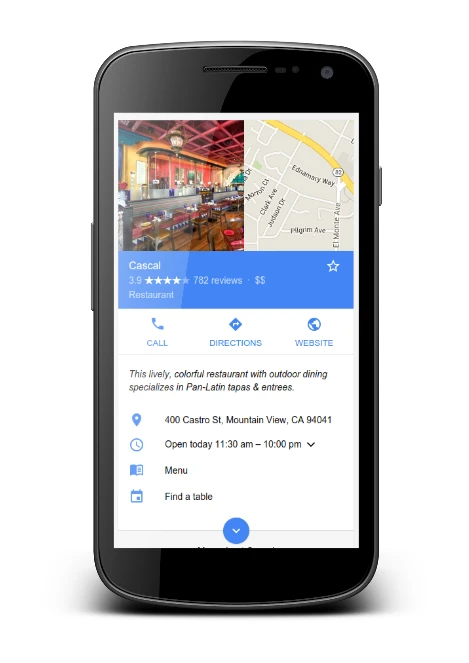
Mobile-first also has an operational dimension. The mobile version of a website now has a major influence on how its quality is assessed, and issues with content, performance or usability on a phone have a broader impact than just on smartphone users. If search, a form, the basket or a CTA does not work on mobile, the entire conversion path effectively falls apart.
The second argument is the real-world environment in which the website is used. Users move across different screen widths, in different network conditions, on devices with varying power and with changing phone orientation, so the design should be robust, not just visually appealing. Mobile-first usually leads to lighter, simpler and faster solutions, because from the outset it limits heavy extras, excessive sections and components that require precise cursor-based control.
This approach also reduces the number of typical mistakes at the implementation stage. Expanded menus, multi-column sections, heavy sliders, forms with fields that are too small or images without responsive variants most often result from desktop-first thinking. When a project starts with the phone, it is easier to plan navigation, forms and components so that they are readable and convenient to use by touch.
In practice, mobile-first is not about designing only for phones. It is about building a solid base for the smallest screen and then extending it to larger views where the content genuinely needs extra space. This makes desktop a natural extension of the structured mobile version, rather than the other way round.
What the current challenges in RWD design are
The current challenges in RWD design come down mainly to balancing mobile usability, performance, accessibility and interface consistency in very different conditions. A website has to work on small and large screens, in portrait and landscape, on good and poor connections, and on faster and weaker devices. This means that simply “adjusting the width” is no longer enough. Good RWD should be resilient to changing circumstances, not merely look correct in an ideal design view.
Many problems stem from a desktop-first approach. Elaborate menus, multi-column sections, heavy sliders, small form fields and images without responsive variants often work only on a large screen. When moved to a phone, they start to hinder navigation, slow down loading and break key paths such as contact, purchase or form submission.
The technology behind the site is also a challenge. Working with a new component system is different from working with an extensive CMS, legacy CSS and JS code and numerous custom integrations. The scale of the problem often does not result from the visual design, but from how flexible the code is and whether the order, length and behaviour of the content can be controlled.
Combining responsiveness with accessibility is also becoming increasingly important. On a phone, the user should be able to click a button effortlessly, read the text without zooming, complete a form without frustration and use the site even when they are not operating a precise cursor. If an element looks responsive but is awkward to use by touch or hard to read, in practice it is still poorly designed.
We no longer design for specific device models, but for the moments when a layout or component starts behaving incorrectly. For this reason, breakpoints should result from the content, tables, cards, forms and navigation, rather than from a ready-made list of screen widths. This approach delivers a more stable result and limits the number of exceptions that later have to be patched with separate CSS rules.
How the RWD implementation process works
The RWD implementation process starts with an audit of the current site and ends with testing, fixes and establishing rules for further maintenance. The order matters because, without analysing traffic, content and usability issues, it is easy to improve the appearance while failing to remove real barriers. In practice, the implementation should organise the way content is presented as a whole, rather than merely rearranging the layout of blocks.
- audit of templates, analytics data and main user journeys,
- setting content and functionality priorities for the mobile view,
- designing the layout logic and breakpoints,
- developing the behaviour of components such as menus, forms, tables and galleries,
- implementing the front end with a flexible grid, media and typography,
- optimising assets and testing on real widths and devices,
- post-test adjustments and preparing principles for the site’s further development.
At the start, you analyse which templates are key and where mobile users most often drop off. It is worth checking not only the homepage, but also listing pages, service subpages, blog posts, forms, checkout and the user account. Without such a review, it is easy to get stuck on less important views and overlook areas that genuinely affect conversion.
The next stage is to decide what should be visible and immediately available on a phone. This is about the order of sections, simplifying supporting content and identifying critical elements such as CTAs, contact details, search, the basket or the lead form. Mobile-first implementation forces you to decide what is truly important, instead of trying to cram the entire desktop experience into a narrower screen.
Next, the logic of the components and the layout itself is designed. Most often, the starting point is a single column, and only later are more elaborate variants added where the content genuinely requires them. Breakpoints should be based on component and content behaviour, not on an arbitrary list of devices. This is particularly important for tables, filters, product cards, galleries and multi-step forms.
At the front-end implementation stage, not only appearance matters, but also page weight and stability of performance. In practice, flexible grids, relative units, media queries, responsive images, proper spacing and typography scaling are used. The mobile version should not load heavy elements simply because they exist on desktop. This applies especially to graphics, scripts, sliders, embedded videos and purely decorative components.
At the very end, testing in real usage scenarios is needed. Different content lengths, form error messages, screen orientation changes, slower connections, dynamic modules from the CMS and typical issues with clicking or scrolling are verified. Only then is it possible to catch layout breaks, content jumps, touch targets that are too small and script conflicts that are not visible at the design stage itself.
What to pay attention to before starting implementation
Before starting implementation, it is worth defining mobile goals, the scope of work, risk-prone elements and technological constraints. Without these decisions, the project easily ends up as a series of cosmetic fixes rather than a real improvement in usability. In practice, you first need to define what the user is supposed to do on a phone: call, send a form, buy, book an appointment or simply find information quickly. If the mobile goal is not clearly named, the content hierarchy usually ends up being arranged arbitrarily.
The second point is scope. It is necessary to specify which templates and journeys the implementation covers, because the homepage rarely determines the entire experience. Often the greater difficulties appear on offer listings, service pages, the blog, in forms, checkout or the client panel. A well-defined scope prevents a situation in which only the homepage is “responsive”, while the rest of the site still ruins the mobile experience.
It is also worth identifying high-risk elements as early as possible, because these are the ones that most often add time and cost. This particularly applies to extensive menus, data tables, filters, maps, embedded videos, pop-ups, multi-step forms and custom modules from the CMS. If such elements are on the site, you need to decide straight away how they should work on a small screen, rather than leaving it until the post-implementation fix stage.
- What are the 3 most important actions for the mobile user?
- Which subpages and templates affect conversion or contact?
- Which components are currently causing problems on phones?
- Does the CMS allow you to control content length, block order and responsive images?
- Should the mobile version retain all important content and functions from desktop?
From an implementation perspective, it is worth checking the base technology at the outset. Work is planned differently in a well-structured component system and differently in a site with random CSS, a large number of exceptions and dependencies on external scripts. Integrations, the state of the front-end code, CMS capabilities and whether it is possible to implement proper responsive images, lazy loading and real control over critical resources also matter.
In practice, it is worth insisting on component-based design, rather than limiting yourself to preparing a few views. A component should behave predictably at different widths, with short and long content, with and without a form error, in portrait and landscape. If a component is not resilient to different conditions, the problem will return with every subsequent expansion of the site.
Before launch, it is also a good idea to agree how the result will be evaluated. Simply saying that “it looks better on a phone” does not give a reliable picture. You need to analyse form drop-offs, CTA clicks, scrolling, navigation errors, loading time and user behaviour on key screens. RWD does not end the moment it is published; it starts with the first real usage data.
Typical mistakes and how to avoid them in RWD
The most common RWD mistakes stem from a desktop-first approach, rigid layouts and ignoring the real conditions of mobile use. Usually, the problem is not the CSS itself, but poor decisions regarding content, section order and component behaviour. As a result, the site formally “fits” the screen, but still remains inconvenient, heavy and not very user-friendly.
A very common trap is to transfer the desktop layout to mobile without changing priorities. An elaborate hero, several columns, large decorative blocks and long introductory sections push key content too far down. To avoid this, it is best to start with a single-column version and decide what the user should see first: the heading, benefit, CTA, contact, search or form. On a small screen, the order of content usually matters more than the visual appeal of the layout itself.
The second problem is components that work great with a mouse but fail on touch. This includes buttons that are too small, overly dense links, menus that require precise tapping, dropdown filters without a sensible hierarchy and forms with small fields. The solution is to design for the finger: larger touch targets, simpler navigation, shorter forms and clear error states.
Media handling and performance often suffer as well. Images are too heavy, do not have responsive variants, and the same assets reach mobile as on desktop. On top of that come sliders, animations and scripts that block rendering or put excessive strain on weaker devices. The mobile version should not just look lighter — it should actually load less and respond faster.
A separate category of problems affects the content itself and the CMS. It happens that text is placed in graphics, headings do not fit into cards, editors have no influence over the length of descriptions, and the block layout is imposed from the outset. In practice, you have to assume that content will take on a life of its own and, from time to time, “spill over” beyond the perfectly drawn design. That is why components should also be checked with longer titles, a larger number of elements and atypical data.
Another common mistake is hiding important content or functions on mobile just because space is tight on the screen. If on desktop the user has key information at hand, and on mobile they can no longer see it, SEO, usability and conversion can all suffer. Hiding only makes sense when it follows a specific business decision or genuinely improves the experience, rather than acting as a fix for a lack of a layout concept.
Finally, testing often falls short. Checking the site in only one browser view will not uncover problems with screen orientation, longer content, form errors, weaker network conditions or script conflicts. Most errors only come to light when you test not “screens”, but specific user scenarios.
How to monitor and optimise the mobile version
The mobile version is best monitored by combining user behaviour data, interface errors and loading performance. The fact that the site “opens on a phone” proves nothing by itself. You need to check whether the user can complete the key task without frustration and without unnecessary steps. The most important thing is data from real use: CTA clicks, form drop-offs, transitions between steps and the points at which the user leaves.
In practice, it is a good idea to analyse the mobile version separately for the most important templates and paths, instead of limiting yourself to overall mobile traffic. Users behave differently on a service page, differently in a blog, and differently again in a basket or contact form. When the average results are “fine” and one critical view has a serious problem, it is easy to miss it. Mobile analytics need to be read per goal and per template, not just per device.
Beyond hard numbers, qualitative observation is also needed. Session recordings, click maps and simple tests on real phones quickly show whether the menu is too complex, the form too long, and the popup is covering the content. A browser emulator can be helpful, but it will not show everything, because it does not fully reproduce touch, the performance of a weaker device or the behaviour of the site on a poorer network.
It is also worth tracking performance separately. On a phone, problems with heavy images, render-blocking scripts, content shifting after load and sluggish interface response come to light fastest. In practice, it is a good idea to regularly monitor speed and view stability metrics, as well as check which elements place the greatest load on the first screen. If the mobile version downloads resources needed mainly by desktop, the user and the business result usually pay for it.
It is best to start optimisation with defects that genuinely block the goal from being achieved. First, fix unclickable buttons, broken menus, form errors, fields that are too small, unreadable text and sections that “break apart” at specific widths. Only later does it make sense to refine secondary issues, such as small spacing or purely cosmetic differences between views. The priority is not what looks bad in a screenshot, but what disrupts the user journey.
Regularity matters too. Every major change in the CMS, modules, banners, marketing scripts or the content itself can worsen the performance of the mobile version, even if everything was fine before. That is why, after implementation, it is worth setting a fixed review rhythm: checking key screens, analysing errors, measuring performance and verifying the impact of changes on conversion.
Ultimately, what counts is not just collecting data, but reacting quickly. If mobile users reach the CTA but do not click it, the cause may be the copy or the button’s too low contrast. If they click, but do not complete the form, the problem usually lies in the fields, validation or the length of the whole process. The best mobile optimisation is a cycle: measurement, diagnosis, fix, re-measurement.
FAQ
Frequently asked questions
What does Responsive Web Design mean in practice?
It means designing a single interface that works on a phone, tablet and desktop without creating separate versions of the site. Not only the layout matters, but also navigation, forms, images and interactive elements.
Why is the mobile-first approach crucial in RWD?
Because it forces you to design for the smallest and most constrained screen first, making it easier to prioritise content. It also helps create lighter, simpler and faster solutions.
What are the most important challenges in RWD design?
You need to balance mobile usability, performance, accessibility and interface consistency in different conditions. A change in screen width alone is not enough, because the site must also work on a weak connection and on less capable devices.
How does the RWD implementation process work?
It starts with an audit of the site and ends with testing, fixes and setting rules for ongoing maintenance. Along the way, content, user journeys, layout, components, performance and behaviour on real devices are analysed.
What should you pay attention to before starting an RWD implementation?
First, you need to define mobile goals, the scope of work, risky elements and technical constraints. It is also important to check whether the CMS and code allow you to control content, responsive images and component behaviour.
What are the typical mistakes in RWD and how can you avoid them?
They most often result from a desktop-first approach, rigid layouts and neglecting touch support. Starting with a single-column version, larger touch targets, simpler navigation and testing on real widths and devices helps.