


Mobile SEO is the process of optimising your website so that it achieves higher positions in search results on mobile devices such as smartphones and tablets. Its aim is also to provide a better experience for users of such devices. This strategy includes the same best practices as SEO for standard devices and plays an important role in overall SEO optimisation.
People are increasingly using mobile devices to search for information. That is why it is crucial to prioritise mobile experiences. These activities include optimising the site design, its content and other elements with mobile users in mind. Target keywords may also be different when optimising a mobile site for SEO.
The importance of mobile SEO
Google statistics say that more than 60% of visits from organic search come from mobile devices. As mobile search grows in popularity, the share of search on standard devices decreases.
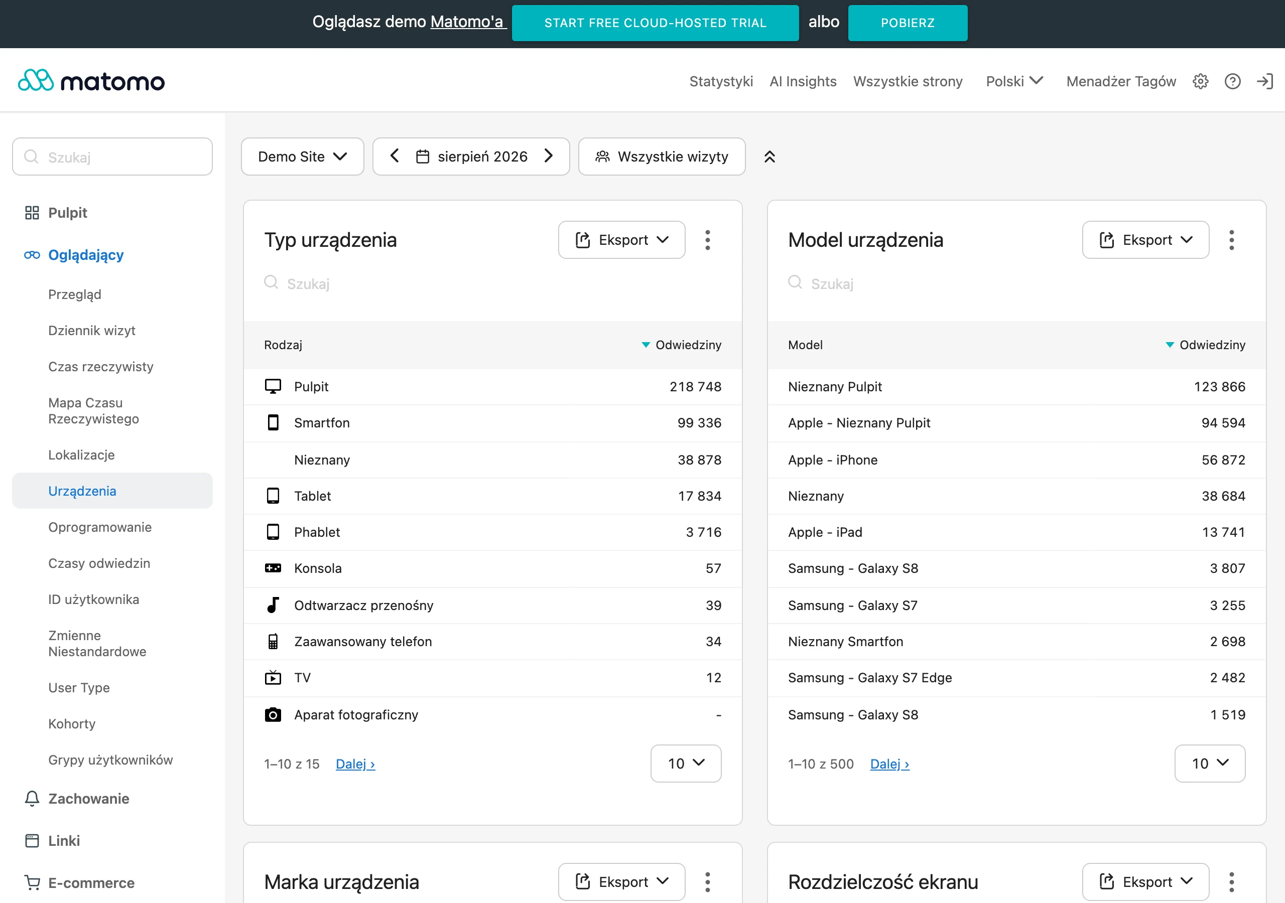
According to Google, 56% of shoppers use smartphones to look for products while physically in a shop. Even if lots of people come to your store, you cannot ignore mobile SEO.
- 0160% of mobile trafficThe majority of organic visits
- 02Searching in storeComparing products physically
- 03Mobile-first indexThe mobile version determines ranking
- 04Single URLOne address preferred for everyone
In summary: ignoring mobile SEO means losing over half of potential customers and lower positions in Google.
Google uses Mobile-First indexing
Google now uses “mobile-first” indexing for every website on the web (with a few exceptions). This means that your website’s mobile version is highly important for its rankings.
As a result, if you have separate URLs for the standard and mobile versions (e.g. “example.com” and “m.example.com”), Google will show in search results the version that is most appropriate for the user.
3 ways to configure a site for mobile devices
There are three options for creating a site adapted to mobile devices:
- responsive design,
- dynamic serving,
- separate URLs.
- 01Google Search ConsoleCheck “Mobile Usability”
- 02Identify issuesToo small text, small spacing
- 03Google Mobile-Friendly TestTest individual URLs
Regular checks ensure a better user experience.
1. Responsive design
Responsive design allows the same site to work on both standard and mobile devices. Each time, the server sends the same HTML code. CSS changes how the site is displayed based on the device.
Responsive design is the best for SEO for several reasons:
- it allows users to share pages and links to your content using a single URL (better than in the case of a separate “mobile” URL),
- it reduces the risk of common errors that negatively affect mobile versions of pages,
- it takes less time to maintain and manage compared with other methods,
- it does not require a redirect for users with a device-optimised view (loading time is reduced),
- it saves resources when Google crawls the site – Googlebot will crawl the site only once, not several times.
Google recommends using responsive website designs. In that case, you do not need to worry about duplicate content issues or redirects that can slow the website down.
Instead, you can create one responsive page for each piece of content. This will save a huge amount of time. You also do not need to worry about designing responsive pages. The layout always adapts properly to different devices.
2. Dynamic serving
With dynamic serving, different HTML is shown based on the user’s device. However, the URL does not change. The content therefore remains at the same address, but the server delivers different code for each device type.
Even so, Google prefers responsive design. Websites based on dynamic serving may show users incorrect versions of the site. In other words, servers may accidentally show the standard version to someone using a smartphone. This can be annoying and leads to a poor user experience.
It is worth reading Google’s guidelines on dynamic serving. This way, you can find out why a responsive website design is preferred.
- 01Position trackingMonitor keywords on mobile.
- 02Competitors’ mobile SEOAnalyse the performance of others.
- 03Support toolsFree and paid online.
Systematic analysis and the right tools are the key to effective mobile SEO.
3. Separate URLs
The last option is to create separate URLs for standard and mobile pages. This means that the standard version will have its own URL, and the mobile version will have a different address.
The standard URL looks like a typical address: https://www.twojastrona.com/
In the case of the mobile version, part of the URL is replaced with the letter “m” from the word “mobile”: https://m.twojastrona.com/
Google recommends avoiding this tactic. When someone visits your site, the server determines which device the user is using and directs them to the standard or mobile version of your site. The problem with this solution is the considerable amount of work and effort needed to create everything properly.
In addition, because there are two versions of each page, you will need to add rel=”canonical” or rel=”alternate” tags to their HTML code. This will let Google Search know which version of the page is the primary version:
- on mobile pages – set the rel=”canonical” tag pointing to the primary version,
- on standard (desktop) pages – set the rel=”alternate” tag pointing to the mobile version.
If you do not set these tags correctly, Google may treat the standard and mobile versions of the site as duplicate content. This can be a serious problem when it comes to ranking the correct page. Later, it will involve spending a significant amount of time fixing technical SEO issues. Your position in Google will also suffer as a result.
How do you check whether a site has been optimised for mobile devices?
Once you have created the mobile version of the site, you can check whether it is user-friendly. Various tools are used for this.
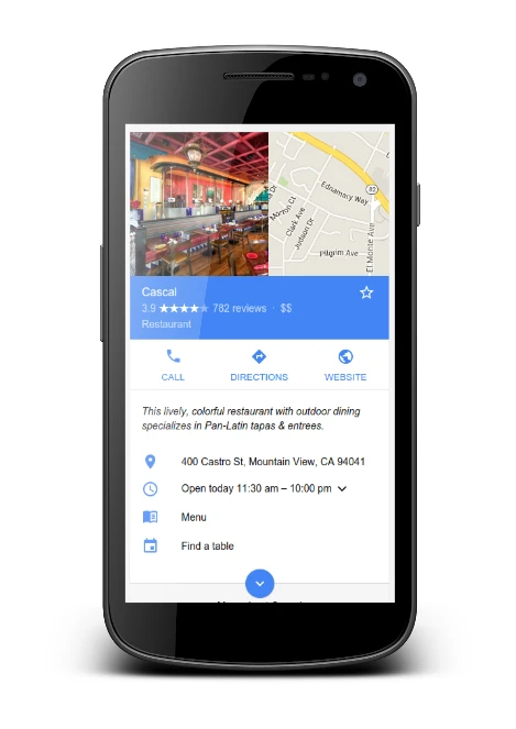
Google Search Console
After logging in to your GSC account, click “Mobile Usability” (mobile usability) in the side bar.
The tool will notify you whether there are any problems with the mobile version of the site. It may tell you, for example, that the text on the page is too small or that clickable elements are too close together. Use this information to make the appropriate changes.
Mobile-Friendly Test tool
Another option is Google’s Mobile-Friendly Test tool for testing the mobile version. This solution allows you to check the usability of individual pages.
In this case, you do not need to log in. You only need to paste the URL into the tool. It will then tell you whether the given URL is mobile-friendly. If it is not, it will point out the elements you should pay attention to.
PageSpeed Insights
Google treats a site’s user experience as a ranking factor. This experience is linked, among other things, to page loading speed.
Google recommends that a page should load in under a second. Fortunately, the search engine provides a tool that allows you to check issues related to page speed. It is called “PageSpeed Insights”.
This tool assesses Core Web Vitals (Core Web Vitals), etc. In other words, it checks groups of factors that affect user experience.
Core Web Vitals are:
- Largest Contentful Paint (Największe wyrenderowanie treści – LCP). The time needed to load the main content.
- First Input Delay (Opóźnienie przy pierwszym działaniu – FID). The time needed for the page to respond to the user’s first interaction (e.g. a click).
- Cumulative Layout Shift (Zbiorcze przesunięcie obrazu – CLS). How much your page shifts when additional content loads (e.g. banners, illustrations, etc.).
To use the PageSpeed Insights tool, enter a URL to get a full report. You will also receive a diagnostic report. It includes existing errors and code that may be slowing down page load times.
You will also see an opportunities report suggesting actions to speed up the page. Try to make your site faster to improve user experience and show Google that you meet their needs quickly.
Tips and best practices for mobile SEO
There are several important tips and best practices in the field of mobile SEO. It is worth paying attention to them.
1. Create mobile-friendly content
In addition to using special tools that make a site more mobile-friendly, it is worth taking care of other issues. One of them is content optimised for portable devices.
Use short paragraphs
Remember that even paragraphs that look short on standard devices will be much longer on mobile devices. To keep everything readable let one paragraph cover one thought or idea.
There is no fixed number of sentences that should be included in a paragraph. Reducing them, however, makes the whole thing easier to read. It is also a good idea to split long sentences into shorter ones. Users can then browse the content more easily.
Text can also be broken up with numbered lists, bullet points, tables, illustrations or videos.
Create short introductions
For the same reasons as above, it is best to use introductions that are as short as possible. Users see at most a few paragraphs when browsing a page. Your aim is therefore to hook them as quickly as possible. So get to the point quickly and then expand on the topic.
If the article focuses on a keyword that is a question, answer it at the beginning. For example, if someone asks “ile mililitrów ma szklanka do herbaty” (how many millilitres are in a tea glass), they should find the answer in the first sentence.
Do not be afraid of white space
White space is one of the most valuable elements of page design. Placing white (or empty) space between blocks of text, illustrations or margins has a positive effect on page readability.
White space can also have a significant impact on text comprehension. The content is simply easier to scan.
Avoid unwanted pop-ups
Google has been penalising “unwanted pop-ups” for years. Particularly unwelcome are pop-ups that cover the main content of the page as soon as it loads.
It is allowed to use pop-ups asking users to accept cookies or verify their age. You can also place a standard advert, provided it takes up a “reasonable” amount of screen space.
If you plan to use pop-ups, use them for a purpose. Under no circumstances may they obscure the page content.
2. Use structured data on your mobile site
Structured data makes it possible to organise content so that Google Search can understand it more easily. Schema markup, in turn, is code that represents such data in a way that is understandable to search engines.
Schema markup can add elements such as recipes or reviews directly to results visible on the search engine results page (SERP). Standard snippets are enriched (or results with additional data are displayed).
This way, a site can stand out even more on search engine results pages. On mobile devices there is only one column of results, so if they are enriched they stand out even more.
Your goal is therefore to generate mobile user traffic. It will therefore be helpful to implement structured data in order to gain additional space and visibility in the SERP.
3. Target keywords optimised for voice search
Lists of voice-search-friendly keywords are key in mobile SEO. In fact, around 65% of consumers aged between 25 and 49 often use devices that support voice search.
It is therefore a good idea to optimise your content for people using voice search on their phones. This can be done by optimising for conversational or semantic search.
People using voice assistants search more conversationally. To optimise for this, you need to find long-tail keywords that are questions. For example, on a standard device you might search for “buy PlayStation 5”. However, in a voice search you might ask conversationally, “where can I buy a PlayStation 5?”
4. Optimise site speed for better user experience (UX)
Many Google tools can help you check site speed. Examples include the PageSpeed Insights and Mobile-Friendly Test tools mentioned above. It is worth paying attention to their advice on site speed and following it.
5. Optimising title tags and meta descriptions for mobile SERPs
Optimising title tags and meta descriptions can improve your site’s click-through rate (CTR). To optimise title tags for mobile search, the title should contain 50 to 60 characters.
Google shortens or rewrites 99.9% of titles that are over 70 characters long. Titles of the recommended length are less likely to be rewritten or shortened.
Here are additional tips for title tags:
- focusing on one main keyword,
- avoiding keyword stuffing,
- creating a unique title for each page,
- placing important information at the beginning.
As for meta descriptions, it is best if they do not exceed 120 characters. Longer descriptions can be too long for mobile devices (and Google may rewrite or shorten them).
By keeping within the 120-character limit, users will be able to read the whole thing on both a standard and a mobile device.
Here are additional tips for mobile meta descriptions:
- summarising the page content,
- using unique descriptions on every page,
- including the primary keyword,
- a call to action or suggesting some value to encourage clicks.
6. Compare the standard and mobile versions in terms of SEO performance
You can use Google Analytics to compare how your standard and mobile pages are performing.
First, log in to your Google Analytics account. Go to “Behavior” > “Site Content” > “Landing Pages” in the left-hand navigation bar.
You will see a list of your pages. Those performing best are at the top. To include information about the standard and mobile versions for each page, click “Add Segment” at the top of the page.
Select the “Mobile Traffic” and “Tablet and Desktop Traffic” segments. Then click “Apply”.
You will see mobile, standard and tablet traffic for each page. You can also adjust the date range to get more specific results.
Look for pages that generate more traffic from standard devices than from mobile devices. Most users nowadays use mobile devices. As a result, this influx of traffic on standard devices may indicate a usability problem with that page’s mobile version.
What else is worth remembering?
It is also worth keeping track of keyword rankings for mobile versions of pages, as well as checking the effectiveness of mobile SEO among competitors. These and other tasks can be carried out using many free and paid tools. They can be found quickly and easily on the internet.