


UX and UI design: key elements of modern websites
A modern approach to UX and UI assumes that a website is clear, predictable and convenient from the very first interaction, especially on mobile devices. Responsive design (RWD) and a mobile-first strategy mean that navigation, buttons and forms remain usable without zooming in and without the risk of accidental clicks, which matters when in many industries 60–80% of traffic comes from mobile. No less important is a clear information architecture, because users reach sections such as “Pricing”, “Case studies” or “Contact” more quickly. A good practice is to limit the main menu to around 5–7 items and support navigation with breadcrumbs and on-site search.
A modern website organises the user’s attention through visual hierarchy and typography, which structure the content and shorten the time needed to make a decision. Using logical H1–H3 headings and clearly highlighted CTAs makes it easier to understand what is most important on a given screen. The body text is worth setting at a sensible size (e.g. 16–18 px), with appropriate line height and contrast, so as not to strain the eyes. In practice, UI gains consistency when, instead of designing every element from scratch, you create a design system and components (e.g. buttons, cards, forms) together with hover, focus and disabled states.
- CTAs and conversion paths: one main CTA per screen (e.g. “Book a consultation”), repeated in key places, with shortened forms and information about response time (e.g. “we reply within 24 h”).
- User-friendly forms: a minimal number of fields, live validation (e.g. email format), autocomplete, clear error messages and an alternative contact method (phone, chat).
- Micro-interactions “in moderation”: short animations (100–300 ms) provide feedback (e.g. confirmation that a form has been sent), taking into account “prefers-reduced-motion”.
- Credibility and trust: prominently displaying reviews (e.g. from Google), client logos, case studies and certificates, as well as clear parameters such as step-by-step process or return terms.
Modern UX/UI may also anticipate dark mode and visual personalisation, provided there is a functional reason for it. Implementation is usually based on CSS and the “prefers-color-scheme” media query, and preferences (e.g. font size, contrast) can be saved in localStorage. Such solutions improve convenience for some users, but they should remain consistent with the overall UI and should not complicate navigation. The most important thing is that, regardless of the chosen variant, the user always knows what the next step should be.
- 01Mobile-first strategyRWD comfort and accessibility
- 02Clear architectureQuick access to content
- 03Visual hierarchyGuiding the user’s attention
- 04Simplified navigationLimited menu and easy interaction
Modern websites focus on clarity, predictability and convenience from the very first interaction, especially on mobile.
Performance and optimisation: how to speed up a website
A website is improved fastest when optimisation is carried out with Core Web Vitals and the user’s real experience in mind. The quality standard is made up of the LCP, INP and CLS metrics, and the typical targets are LCP < 2.5 s, INP < 200 ms and CLS < 0.1, measured in Lighthouse or in real-world data (CrUX). In practice, this means, among other things, ensuring a fast first render and maintaining a stable layout during loading. Performance translates not only into comfort, but also into SEO, so it is better to treat it as a permanent part of the project rather than a final-stage task.
Speed is most often improved through images and resources loaded at the start. Using AVIF/WebP, compression and responsive images (srcset/sizes) shortens the waiting time, and lazy-loading for elements below the fold reduces unnecessary transfer. At the same time, it pays to fetch only what is needed on a given subpage, that is, to use lazy loading and bundle splitting (code splitting) through dynamic import, supported for example by Next.js/Nuxt and tools such as webpack/Vite. For a fast first render and more efficient content indexing, SSR or SSG is often chosen instead of a heavy SPA, while the ISR approach makes it possible to refresh pages in the background without a full redeploy.
- Cache, CDN and compression: using a CDN (e.g. Cloudflare, Fastly), correct Cache-Control, Brotli/gzip, long cache for assets with hashes and short cache for HTML.
- HTTP/2 or HTTP/3 (QUIC) and request reduction: limiting external scripts (tracking, widgets) and combining resources where it makes sense.
- Minimalism in JavaScript and dependencies: smaller libraries and selective imports (e.g. dayjs or native date APIs instead of large moment.js), and icons as individual SVGs.
- Measurement and performance budgets: performance budget (e.g. JS < 200 KB gzip on a landing page) and regression control through Lighthouse CI, WebPageTest and SpeedCurve.
PWA and offline mode can additionally improve the quality of using the service, provided they genuinely fit its nature. The PWA approach is based on a manifest, installation on the home screen and cache managed by a Service Worker, which can be useful, among others, in directories, B2B tools or intranets. However, this requires consistency in updating the cache so that users do not receive outdated versions of content. The best results come from an approach based on regular measurement and consciously set constraints, rather than a one-off “optimisation before launch”.
SEO and accessibility: how to increase visibility and usability
Visibility and usability of a website most often grow when technical SEO is combined with a semantic HTML structure and accessibility practices. The foundation of technical SEO is correct sitemap.xml, robots.txt and a sensible URL structure (short, descriptive addresses). In websites with a large number of subpages, canonical tags, pagination and limiting content duplication are also important, especially in online stores and when filtering. Such elements make it easier for search engines to index the correct variants of pages and reduce visibility “dilution”.
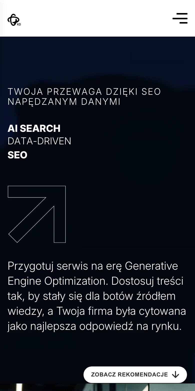
Modern websites “translate” better to Google and users thanks to Schema.org structured data implemented as JSON-LD. It is used, among others, for types such as Product, FAQ, Organization or BreadcrumbList, always in line with the actual content on the page. At the same time, it is worth refining share metadata (Open Graph and Twitter Cards) so that the link displays correctly, e.g. on LinkedIn and Facebook, which directly translates into CTR in campaigns and posts. In practice, this is a simple and often underestimated “SEO + marketing” layer that improves traffic quality.
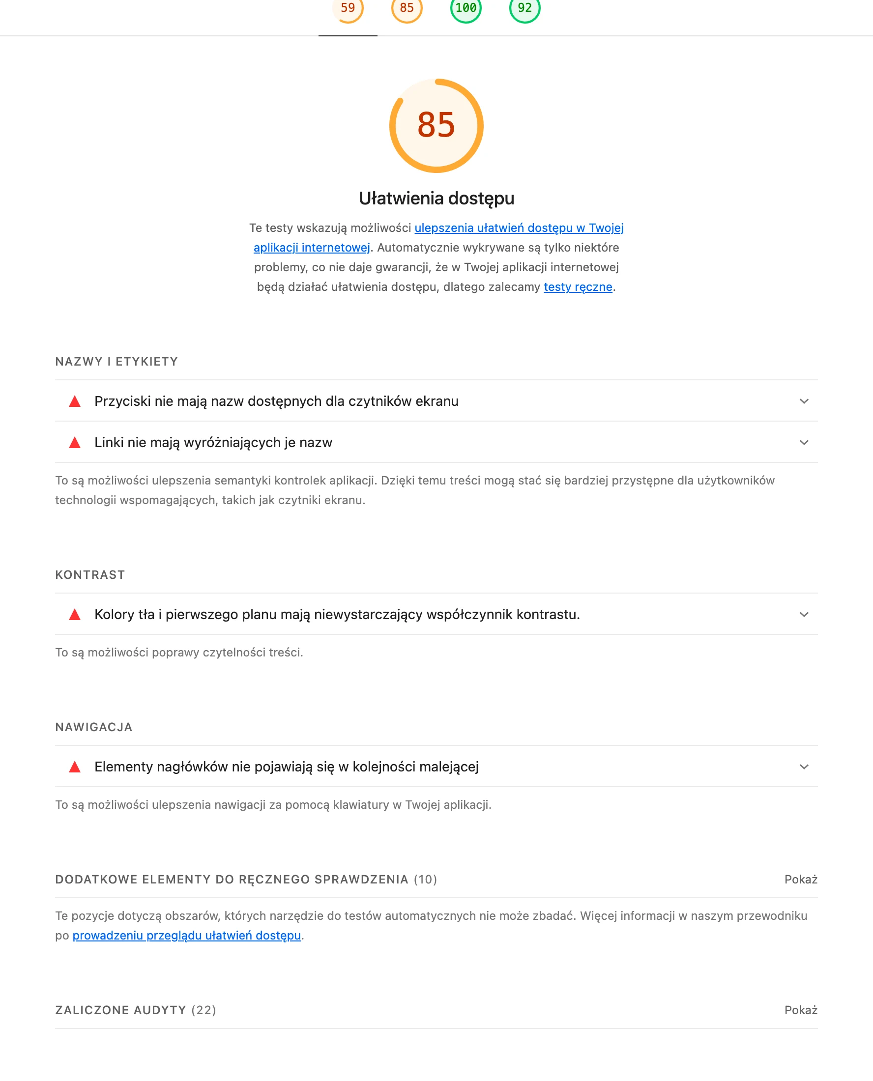
Accessibility increases usability for a wider audience, which is why in many projects WCAG 2.2 (AA) is becoming the standard. The most important elements are contrast, keyboard support (logical tab order, focus visible), correct labels for form fields (label/aria-label) and avoiding focus traps in modals with the option to close them with the Esc key. In multimedia content, it is worth using alt text where an image carries information (and marking decorative elements with alt=””), and providing captions and transcripts for video. Quality control is well served by tools such as Lighthouse, Ahrefs/Semrush, Screaming Frog and accessibility tests (axe DevTools, WAVE), which make it possible to catch errors before publication.
- 01Technical foundationsSitemap, robots.txt, URL
- 02Order and structureCanonical tags, pagination, avoiding duplication
- 03Semantic HTMLLogical and clear structure
- 04Structured dataSchema.org for better understanding
Technical SEO, semantic structure and accessibility practices together increase the visibility and usability of a website for users and search engines.
Security and privacy: ensuring user trust
You build user trust when security and privacy are considered “by default”, from the very beginning, rather than bolted on as an afterthought after publication. A modern website should run exclusively over HTTPS, with HSTS enabled and a secure TLS configuration (up-to-date cipher suites and automated certificates, e.g. Let’s Encrypt, with regular renewal). Another layer of protection is provided by security headers that limit XSS and clickjacking risks, such as Content-Security-Policy and X-Frame-Options/Frame-ancestors, as well as Permissions-Policy. These are strictly technical elements that users usually do not notice, but which directly translate into safe use of the website.
Forms and APIs are protected against spam and abuse through rate limiting (e.g. 10 requests/min IP) and server-side data validation. For admin panels and sessions, CSRF protection is standard, and in contact forms reCAPTCHA/hCaptcha or honeypot-type mechanisms are additionally used. If the website offers login, the practice is to hash passwords (Argon2/bcrypt) and allow 2FA (TOTP, backup codes), and in B2B, SSO (SAML/OIDC) is often implemented via Auth0, Azure AD or Keycloak. Resilience to incidents is also strengthened by backups (daily backups + 14–30 day retention, separate location such as S3 + versioning) and regular restoration testing.
Privacy is supported by minimising data and by transparent processing policies compliant with RODO/GDPR. In practice, a consent banner is implemented that actually blocks marketing scripts until approval, and for Google Analytics/Ads Google Consent Mode v2 is often used to align measurement with user consent. Consistent transparency also works well: company details that are easy to find (NIP, address), terms and conditions, and information about payments and returns. In e-commerce, recognised payment methods (e.g. Przelewy24, PayU, Stripe) and clear messages about transaction security are also standard, which reduces uncertainty at the point of purchase.
Architecture and content management: flexibility and integrations
Flexibility and efficient integrations are ensured by an architecture in which content and functionality can be developed independently of each other. In practice, this means frequent use of a headless CMS (e.g. Strapi, Contentful, Sanity), so that marketing can edit content without a developer, while the front end can be developed independently of the admin panel. At the same time, modules are planned (e.g. blog, knowledge base, landing pages, customer panel) so that the site can be expanded in the following months without rebuilding everything. This approach also makes it easier to keep information consistent across the entire site.
Today, integrations are most often built in an API-first approach, i.e. via REST or GraphQL and webhooks, instead of manual data exports. Webhooks make it possible to automatically send information to the CRM after a form submission or purchase, and GraphQL makes it easier to fetch only the required fields. In e-commerce, payment integrations are standard (e.g. Stripe, PayU, Przelewy24, BLIK and Apple Pay/Google Pay depending on the market), along with handling success/failure/pending statuses. An important part of implementation is often the automatic sending of email confirmations after events such as a purchase or registration.
With a larger number of pieces of content or products, search and filtering come to the fore, e.g. using Algolia or Elasticsearch/OpenSearch, so the user can quickly find the right information. When a site sends transactional messages or notifications, providers such as SendGrid, Mailgun or AWS SES are often used, which supports deliverability (SPF/DKIM/DMARC) and makes handling sending errors easier. In sites with user accounts, roles and permissions (e.g. admin, editor, client) and secure sessions and token refreshes matter, implemented, for example, via NextAuth, Auth0 or a custom OIDC solution. For media management, an approach such as Cloudinary or S3 + optimisation on the CDN side helps, where thumbnails and WebP/AVIF versions and crops are created automatically.
- 01Headless CMSIndependent front-end development.
- 02Modular structureBlog, knowledge base, landing pages.
- 03API-first approachREST, GraphQL, no exports.
- 04Webhooks (automation)Passing data to CRM.
Flexible architecture and API-based integrations enable independent development of content, functionality and process automation.
Analytics and testing: measuring success and optimisation
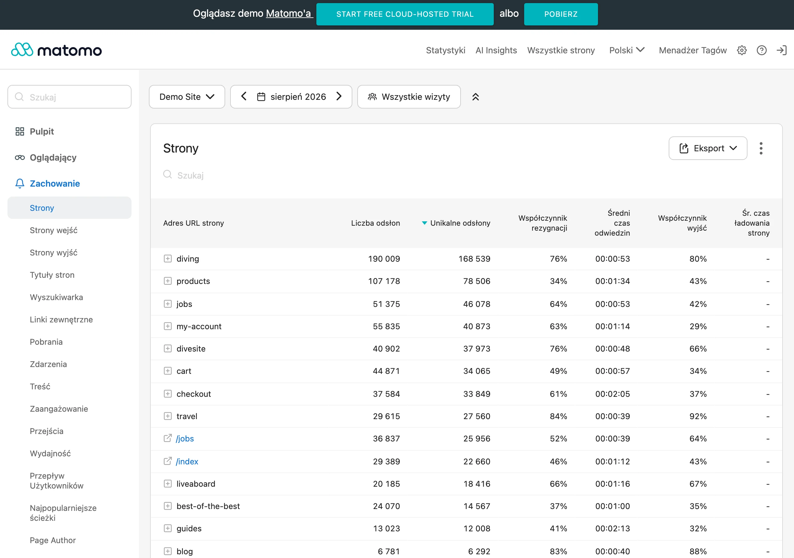
The success of a modern website is assessed through goal-oriented analytics and regular testing of changes, rather than purely by the number of page views. In practice, events and funnels are configured around conversions (e.g. form submission, phone click, purchase, registration) in tools such as GA4 or Matomo (on-premise). Tags are usually managed through Google Tag Manager, while maintaining control so as not to multiply scripts and worsen the experience. Server-side tagging is also being implemented more and more often (e.g. GTM Server), which reduces the number of scripts in the browser and makes privacy compliance easier.
Conversion optimisation is based on comparing variants, which is why A/B testing is used for headlines, CTAs and section layouts in tools such as VWO or Optimizely (or in custom experiments). At the same time, it is worth launching error monitoring and observability (e.g. Sentry, Datadog), because users will not report most problems with a form or checkout. For sites generating leads or selling, uptime monitoring (e.g. UptimeRobot, Pingdom) with alerts is also important, so you can react quickly to outages. This approach shortens the time it takes to detect a problem and helps maintain continuity of key journeys.
Stable growth is supported by deployment automation in CI/CD (e.g. GitHub Actions, GitLab CI), where the pipeline includes tests, build, deploy and, if needed, rollback. To ensure updates do not break critical paths, automated tests are used: E2E and component tests (Playwright, Cypress) as well as unit tests (Jest). Code quality is also supported by standards and tools such as TypeScript, ESLint and Prettier, which reduce the number of production errors and simplify maintenance. When traffic grows, the topic of costs and hosting returns, so available options are compared (Vercel/Netlify for the front end, VPS e.g. Hetzner, cloud AWS/GCP/Azure) and resources are matched to the actual load.
Automation and CI/CD: efficient deployment and maintenance
Automation and CI/CD make it possible to deploy changes frequently and predictably, with the option of a quick rollback when a problem appears. In practice, this comes down to a pipeline that runs tests, builds the project, publishes the release and handles rollback, instead of manual “production” deployments. The biggest benefit is that quality does not depend on the team’s memory, but on a repeatable process run with every change. This means content and feature updates can go hand in hand with risk control.
Effective CI/CD is based on quality gates that catch regressions before users notice them. In this approach, automated tests for critical paths (e.g. E2E) and unit tests are typically run so that changes in forms or checkout do not affect conversion. In addition, code maintenance standards can be consistently enforced with tools such as TypeScript, ESLint and Prettier, which reduces the number of production errors. In practice, “effective deployment” means fast releases without putting stability at risk.
CI/CD should be supplemented with automated performance and security checks so that quality is not lost alongside successive campaigns and integrations. Rather than flying blind, teams can keep an eye on the performance budget and detect drops with tools such as Lighthouse CI, WebPageTest or SpeedCurve before publication. In the area of technical risk, scanning dependency vulnerabilities and carrying out quick updates (e.g. npm audit, Dependabot, Snyk) is also important. After deployment, it is worth combining this with observability (e.g. error and performance monitoring) so that problems in a critical path can be identified quickly and response time shortened.
FAQ
Frequently asked questions
What features do modern websites have according to the article?
They combine polished UX/UI, strong performance and practices that support SEO, accessibility and user trust. It is also important that they remain readable on a phone, load quickly and lead to the goal without uncertainty.
Why are responsiveness and a mobile-first approach so important on a modern website?
Because the site should be convenient and predictable from the first interaction, especially on mobile devices. The article emphasises that in many industries most traffic comes from mobile, so navigation and forms must work without problems.
Which UX/UI elements improve the usability of a modern website?
Clear information architecture, logical H1–H3 headings, prominent CTAs and a consistent design system all help. Appropriate text size, contrast and components with well-designed states, such as hover or focus, are also important.
How can you speed up a modern website?
The biggest impact comes from optimising images, reducing resources loaded at startup and using cache and a CDN. The article also points to SSR or SSG instead of a heavy SPA, and to minimalism in JavaScript and dependencies.
What affects a site’s visibility in Google and its accessibility?
Correct sitemap.xml, robots.txt, sensible URLs, Schema.org structured data and well-configured metadata for sharing all matter. Accessibility is strengthened by contrast, keyboard support, proper form labels and alt text and captions for video.
How does a modern website build user trust?
Through HTTPS, HSTS, secure headers, protection of forms and data, and clear information about the company, payments and returns. Reviews, case studies, certificates and a clear privacy policy and consent management also help.