A modern company website has a job to do these days. Not just to “look good”, but above all to help people quickly find the answer, understand the offer and take the next step without getting lost in the menu. The same content is now read not only by people, but also by search engines, AI assistants and systems that automatically process information. That changes the rules of website design, because it is not just the design that matters, but also the structure, naming and technical preparation of content. In practice, the sites that win are the ones that say it straight: what they offer, who it is for, how the service works, what the terms are and what the user should do next. If key information is hidden, inconsistent or hard to read in the site code, both the user and the site’s visibility in AI systems suffer. In this article I’ll show how such a site works on the ground, not on slides, and which elements really determine effectiveness.
What a site supporting the user and AI looks like in practice
It is a site that does not get in the way. It is designed so that a person can quickly find the answer or complete an action, while an AI system can correctly interpret the meaning of the content. And this is not just a cliché. In practice, it is not about a “site for bots”, but about a website that organises information so it is readable for both sides. The user should understand the offer without guessing, and the system should see what the main topic of the page is, what the service is about and what it is connected to.
Such a site grows out of real user tasks. Most often these are: finding an answer, comparing options, understanding the cooperation process, checking requirements, making contact or buying. The question is whether the website leads to the goal, or merely “makes an impression” on the first screen. That is why concrete sections, clear headings and a logical order of information matter more than flashy visual embellishments.
The content has to do work, not just sound good. The website should provide things that genuinely help people make a decision, usually: a definition of the service, scope, stages of delivery, entry requirements, limitations, final outcomes, FAQ, contact details and information about the company or author. What matters is what happens after the promise. Good content does not end with a description of the benefits, but also answers operational questions: how it works, what needs to be prepared and what affects the scope or pricing.
From the perspective of AI systems, recognisability and associations matter. If one service has different names in the menu, heading and form, the risk of misinterpretation increases, and the problem is that later “it is no longer clear what is what”. But note: this does not apply only to bots. If important information sits in sliders, graphics or loads only after interaction, its use by search engines and AI models may be limited, and the user can easily miss it too.
There is no single magic switch here. In practice, such a site combines several areas at once: UX, information architecture, technical SEO, semantic HTML, structured data and a consistent content model in the CMS. Instead of relying on copywriting alone — or the visual design alone — it is better to tie this into one operating logic. The best-performing websites are those in which layout, content and technical implementation support the same goal: quick understanding and easy processing of information.
Key elements of designing a site for people and AI
The basics matter. Clear information structure, consistent naming, semantic HTML code, content that answers users’ questions and technical implementation that does not make it harder to read the page. This is the foundation without which even a good offer can be misread. And this is not about a whim. Both a person and an AI system need a predictable site logic, otherwise they wander around it like through a badly labelled warehouse.
The first element is information architecture. The user should immediately know where to find the service, where to find answers to questions, and where to find details of the process or contact information. It sounds obvious, but that is exactly where things most often go wrong. Every important subpage should have one dominant intent and one main topic, rather than mixing several different messages at once. Otherwise the website speaks in several voices at the same time and trips itself up.
The second element is the way content is written and structured. Good sites do not build sections out of vague statements, but out of useful information. Who it is for, what it includes, how delivery works, what the limitations are and what the customer gets at the end — simple, without the fog. The question is: after one pass, does the reader know what they are signing up for? Consistency of naming is also very important, because the same thing should not appear under several competing terms in different parts of the website, once as a “service”, once as a “package” and once as a “programme”.
The third element is the technical layer. It decides whether the content can be “seen” at all. The content should be available in HTML, have a proper H1-H3 hierarchy, readable URLs, logical internal linking and correct technical signals such as canonicals, sitemap or HTTP statuses. If important information appears only after a click, browser-side rendering or in elements that are difficult to read, systems may skip it or misinterpret it. The problem is that then the “algorithm” is not to blame, but the site design.
The fourth element is structured data and trust signals. Statements alone are not enough. Schema.org helps describe the organisation, services, FAQ, articles, breadcrumbs or authors, but only when it reflects the actual content of the page, rather than being decoration for bots. Equally important are visible company details, authorship, update dates, policies and consistency of information across the entire website. Not “on the About us subpage”, but everywhere the user makes a decision.
The fifth element is the content model in the CMS and the subsequent maintenance of quality. Without this, things quickly descend into chaos. If the editor does not have fields for H1, lead, FAQ, related entities, author or update date, over time the site loses consistency, and fixes turn into patching holes. A well-designed CMS not only makes publishing easier, but enforces order that later helps with SEO, UX and the use of content by AI. Instead of a free-for-all — sensible discipline.
At the end, there is still validation after deployment. Without it, it is easy to live in the belief that “it’s ready”, even though in practice it does not work. You need to check whether the page is indexed, renders correctly on mobile, has logical transitions between sections and genuinely answers users’ questions. And one more thing: whether those answers can be found without hunting through the menu and guessing the author’s intent. This matters, because designing a site for people and AI does not end with publishing, but with whether the content is truly understandable, complete and useful.
Current requirements for websites in the context of AI
Today a website has to speak plainly. Key information should be presented in a clear structure and in code that is understandable both to the user and to AI systems. More and more often, an answer is generated from a shortened “read” of the page, rather than from a full visit to the site. That changes the rules of the game. The most important content therefore cannot live only in graphics, sliders or heavy JavaScript components. If the system cannot clearly see the scope of the service, the process and the terms of cooperation, it is harder for it to understand and use the page correctly.
In practice, one thing matters: unambiguity. The service name should sound identical in the menu, URL, H1 heading, internal links and contact form, rather than changing depending on the place. Stable URLs, clear H1-H3 headings and logical sections do the job here. Add organisational data, authors and update dates. These are the very elements that help systems recognise what the page is about and whether it can be trusted.
How you write the content also matters a great deal. AI systems process pages more efficiently when they clearly show: who the service is for, how the process works, what affects the scope, what the entry requirements are and what the client receives at the end. It sounds obvious. And yet it is enough to look at sites where everything is “in one piece”. A long piece of text on its own, without clear section boundaries and semantic HTML tags, makes it harder to identify the relationships between pieces of information.
The most common problem is with sites built mainly for design or campaigns. The result is often predictable: duplicated templates, no answer to real user questions, poor accessibility and a lack of structured data matched to the content. And that is where the disconnect appears. Instead of content that works, we get packaging that looks good but does not explain. Equally important is the consistency of the content with the technical implementation, because if key information appears only after interaction or is rendered in a way that is difficult for crawlers, its use by search engines and AI may simply be limited.
The current standard is not simply “putting” a page live. The standard is checking whether it really works after deployment, not just on a mock-up. You need to verify indexing, rendering, schema accuracy, mobile usability, linking logic and user behaviour. Anyone who does not do this is asking for trouble. A page that is friendly for AI is not a declaration, but the result of consistency between content, structure, code and real usefulness.
How to implement an AI-friendly website step by step
Implementing an AI-friendly website is not a one-off action. It is a transition from analysing user questions and knowledge structure to technical implementation, testing and continuous iteration. First, you need to define business goals, audience types, priority services, areas of operation and technological constraints. The question is: what is this website meant to “deliver” in practice. Without that, it is easy to build a site that looks right, yet leads neither to answers nor to conversions.
- 1. Start with discovery and an audit. Establish what tasks the website needs to handle, which services are most important and what role the site is meant to play: lead generation, sales, decision support or education. Then check the current URL structure, navigation, indexing, content duplication, technical condition, performance, accessibility and analytics data.
- 2. Map user intent and entities. Start with the specifics. You need to know what the user is looking for before contact, what they do not understand and what objections they have. At the same time, define the main knowledge entities: services, problems, industries, locations, processes, tools, requirements and outcomes. Only then do the relationships between them come together, because without that you get a set of headings, not a system.
- 3. Design the information architecture. This is where order is created. At this stage you build the site tree, topic clusters, pillar and supporting pages, breadcrumbs and pathways between informational and commercial content. Good architecture does not mix several dominant intents on one page, but leads the user along one logical path. Instead of a labyrinth, you get a route.
- 4. Build the content and UX model. Without a template, chaos sets in. For service pages and articles, prepare a consistent section layout, for example: problem, solution, scope, implementation stages, entry requirements, limitations, deliverables, FAQ and CTA. At the same time, simplify forms, microcopy, comparison elements and the information hierarchy. Why? So the user does not have to guess what to do next.
- 5. Implement the site technically and semantically. Technology does not forgive shortcuts. This includes correct headings, semantic HTML, internal linking, canonicals, sitemap, robots, rendering handling, performance, mobile version and accessibility. Structured data should only be added when it matches the actual content of the page. In other words: organisation, services, FAQ, articles, authors or breadcrumbs, but only when those elements are actually present on the page.
- 6. Publish, validate and improve. Publication is only the start. After deployment, check indexing, rendering, structured data, links, forms, conversion paths and compliance with analytics. Then iterate based on Search Console, analytics, heatmaps, session recordings and user questions. The problem is that only this data shows where answers are missing or where the structure is simply too weak.
In practice, an important part of implementation is also the CMS. It should uphold the standard, not blur it. It should enforce basic quality through fields and rules such as H1, lead, page goal description, FAQ, related entities, author, update date, CTA, breadcrumb and related content modules. If the CMS allows pages to be published without these elements, the quality of the site usually quickly goes off track. And that is not a cliché.
At the end, it is a good idea to gather the project outputs into working materials rather than keeping them in the team’s memory. Most often these are an information map, an entity model, a list of page types, content briefs, section wireframes, SEO and developer guidelines, schema maps, a QA checklist and an optimisation backlog. Such a package closes the loop: it makes implementation easier and then keeps everything consistent as the site starts to take on a life of its own.
The biggest problems start when a company wants to implement everything at once, without priorities. The problem is that such a “push” usually ends in scattered energy and chaos in the content, rather than a real improvement. It is better to start with the most important services, the main user questions and the pages with the greatest impact on the decision, and only then expand the knowledge base and topic clusters. A site that is AI-friendly is not created by one technical trick, but by a well-planned process and consistent information structuring.
Best practices for ensuring usability and accessibility
Usability and accessibility begin with a simple test: can the user quickly find the answer, understand the content and complete an action without stumbling over obstacles, on every device. In practice, this means a clear site structure, readable headings, predictable navigation and forms that do not make contact or purchase difficult. And here an interesting side effect appears. The same also helps AI systems, because structured content is easier to “read” and interpret correctly. The most important information should be visible immediately in the HTML, not only after a click, expansion or full script rendering.
A good website leads the user from question to decision in a few clear steps. Not in ten, not “at some point”, but right away in a logical order. That is why every subpage should have one main topic, a clear H1, a short lead and sections that answer specific needs: who it is for, how it works, what it includes, what the limitations are and what to do next. If one page tries at the same time to sell several different services, compare variants and educate from scratch, chaos grows and clarity drops.
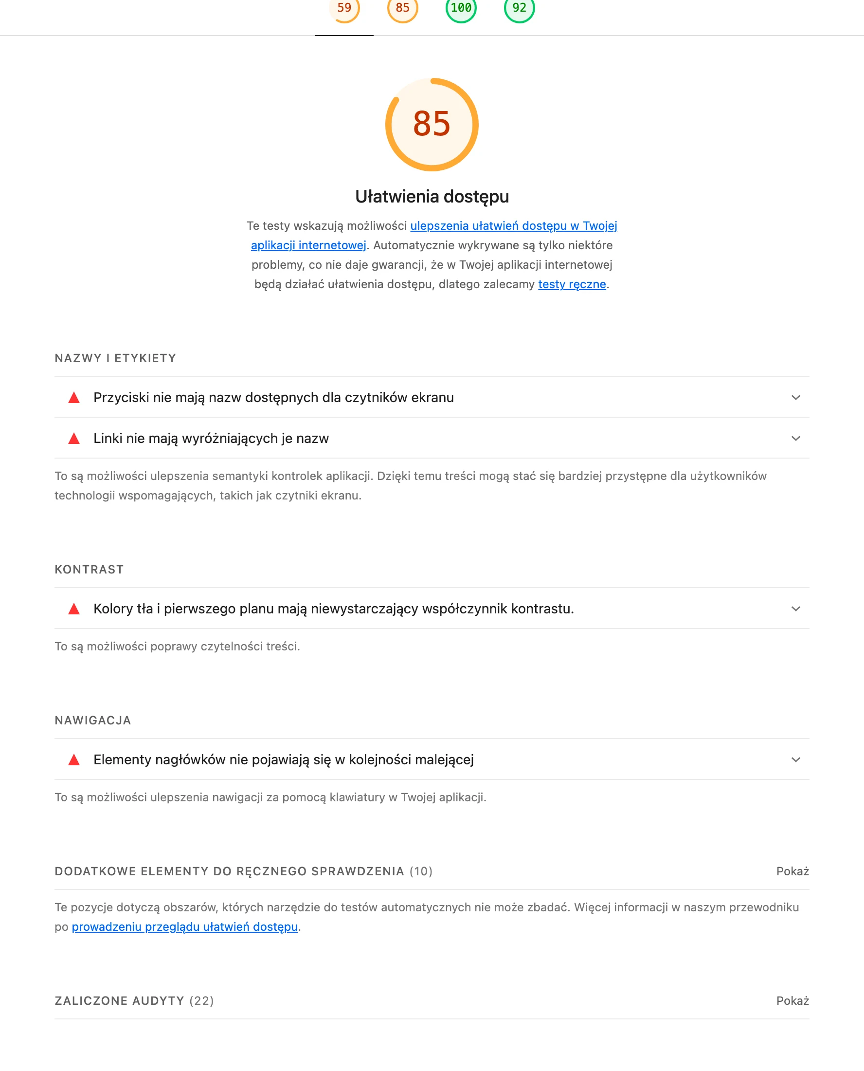
Accessibility does not end with technical compliance. The key is whether the text has good contrast, clickable elements are comfortable on mobile, and forms clearly state which data is required and why. Form error messages must point out the problem specifically, rather than just saying that “something went wrong”. The effect is visible in the numbers: better conversion, fewer drop-offs, less frustration.
Consistency of naming across the whole site is also important. Is the user supposed to guess whether “SEO audit”, “visibility analysis” and “site review” are the same service, or three different entities. One service should have one main name in the menu, URL, H1, anchors and CTA. That kind of consistency makes it easier for a person to decide, and helps AI systems recognise the entity without guesswork.
- Maintain a simple heading and section hierarchy so that each part of the site answers one question or one stage of the decision.
- Design internal linking like a knowledge path: service, problem, FAQ, supporting content, contact.
- Add alternative image descriptions only where the image adds information, rather than being purely decorative.
- Ensure keyboard support, visible focus and a sensible tab order between interface elements.
- In the CMS, set required fields for H1, lead, author, update date, FAQ and related content so quality stays at the same level with every publication.
In the end, verification after implementation still wins. You need to check without mercy whether the site works just as well on a phone, whether key content is indexed, whether forms are tracked correctly and whether users really reach the information without stumbling around in the dark. If behaviour analysis shows that users are scrolling, clicking and returning without an answer, the problem usually lies in the content structure, not in the traffic itself.
Typical mistakes and how to avoid them on a website
The most common sins of a website are painfully repetitive. Hiding specifics, mixing topics and building the site for appearance rather than the user’s task. In practice, someone arrives and does not get a quick answer to simple questions: what do you offer, for whom, what does the process look like, what depends on the scope and what should they do next. Without that, effectiveness for people drops, and at the same time the chance that AI systems will make sensible use of the content falls too. The problem is that it is rarely one element failing; more often it is the whole set: poor architecture, inconsistent naming and technical chaos.
A very common mistake is copying similar descriptions between services or locations. It seems convenient to implement, but in practice it does three things at once: creates duplication, blurs the differences between offers and weakens the site’s topical signal. It is better to set up a shared content model and then fill it with unique information. Scope, requirements, limitations, the cooperation process and specific use cases.
The second major mistake is hiding important information in tabs, sliders, pop-ups or components loaded only after interaction. The user may not notice it, and a crawler or AI system may read the content incompletely or simply too late. Service scope, terms of cooperation, FAQ and contact details should be available without effort and without guessing where they have been hidden.
Technical problems are often brushed off too, even though they can undermine the whole site. Broken redirects, orphaned pages, poor canonicalisation, slow loading, the lack of a mobile version properly refined for touch, or inconsistent HTTP statuses make both indexing and real use of the site harder. The effect is paradoxical: everything looks elegant in the mock-up, and after publishing it works as if at half speed. And then the guesswork starts over where the drops came from.
- Do not build one page for several intents at once. If the user is looking for a service, do not mix that with a long guide and a comparison of all solutions in one place.
- Do not overuse animations and heavy JavaScript when the same information can be presented simply in text and semantic HTML.
- Do not publish structured data that is not confirmed by the visible content on the page. Schema should describe the content, not pretend to be it.
- Do not leave content without an author, update date and organisational context if you expect trust and correct citation.
- Do not end the page with a generic CTA. The user should know what will happen after sending the form, how long the response will take and what information is worth having to hand.
Avoiding these mistakes is a process, not a one-off tidy-up. Routine works. The best approach is consistent quality control: reviewing new subpages before publication, link validation, mobile testing, indexing checks and regular content updates when the offer or delivery method changes. The site only truly starts helping people and AI when content, UX, CMS and technical implementation all play by the same rules.
How to measure the success and effectiveness of a site for users and AI
The success of such a site is visible in three layers. First: whether systems can read it correctly, second: whether the user quickly finds the answer, third: whether the site leads to real action. Traffic growth alone is not enough, because a page may rack up views while failing to explain the offer or support the decision. The best measurement combines technical data, user behaviour and the business result at the level of a specific subpage or page type. This makes it immediately clear whether the problem lies in indexing, in the content, or in the conversion path.
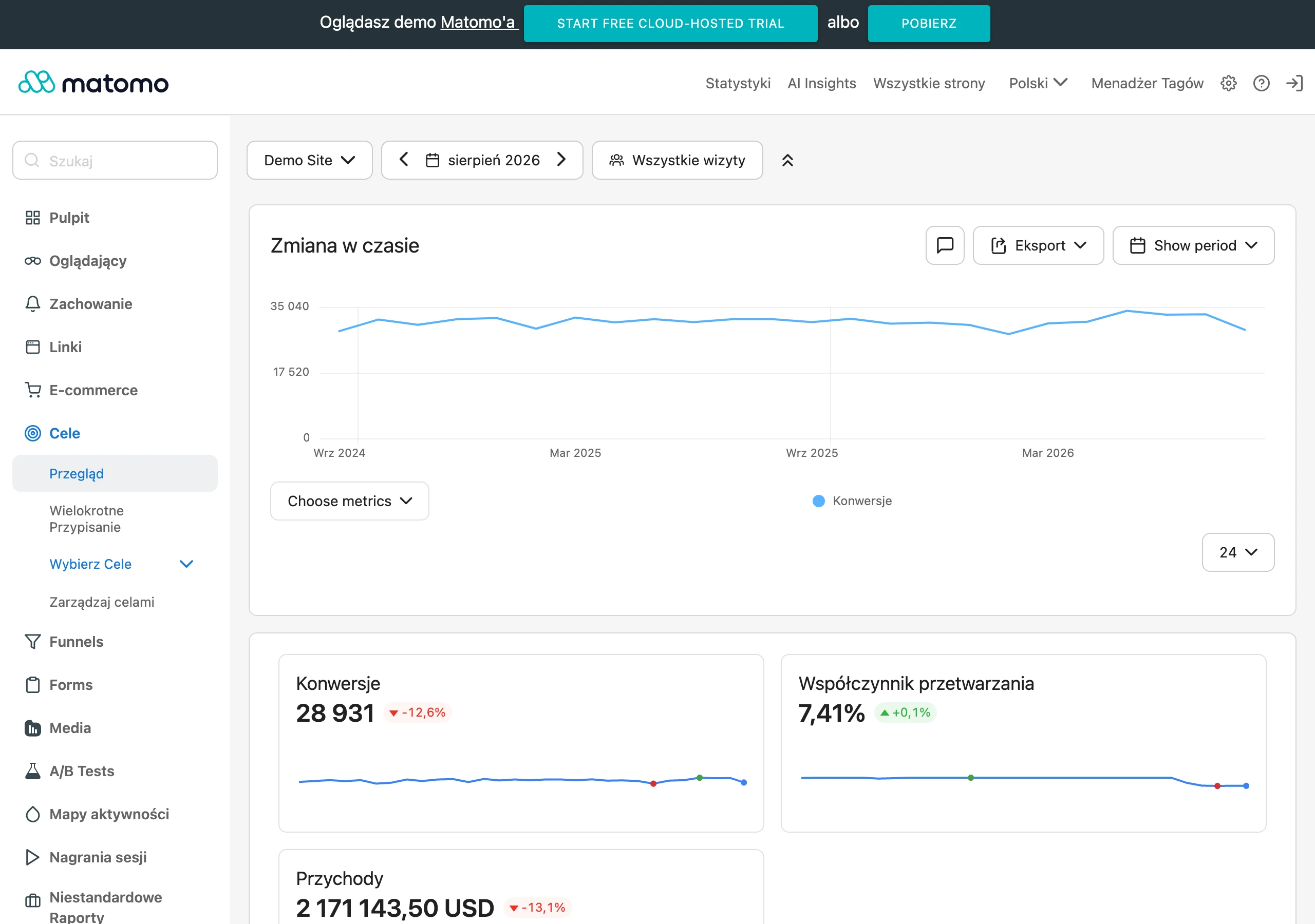
From a technical perspective, one thing is crucial: whether important subpages are “available to be taken” without tricks. So the check is whether they are indexed, render correctly and show the most important information without any additional interaction. In practice, this involves the indexation status, crawl errors, mobile compatibility, internal linking logic, HTTP status codes, canonicalisation and the correctness of structured data. If a page is not properly accessible in HTML or important sections only appear after complex JavaScript rendering, AI and search engines may be able to use only part of the information.
From the user’s perspective, the question is: does the subpage answer the need and move things forward, rather than forcing the user to wander through the menu. Conversions themselves are important, but the quality of the journey is just as important. What matters are entrances to the right pages, clicks through to related content, use of FAQs, clicks on contact, form submissions, starts and drop-offs in the process. Qualitative data also helps — session recordings, heatmaps, internal search analysis and questions asked by users — because they show where answers are missing or where the message is simply unclear.
In the context of AI, effectiveness matters. It is measured by whether the content is unambiguous, complete and easy to reuse by automated systems. It is not always possible to capture directly how an AI model “read” a page, so indirect indicators remain: increased visibility for problem-based questions, better matching of queries to the right landing pages, a larger share of visits to pages with a specific answer and fewer situations in which the user returns to the search engine. A good page for AI is usually one where the query intent, heading, section content and next action path all speak with one voice.
Segmentation of results is fundamental. A service page is assessed differently, a FAQ differently, and a how-to article differently again, because each of these formats plays by different rules. A service page should lead to contact or lead qualification, whereas a knowledge article first delivers the answer and only then passes the user on, if that even makes sense. The most common mistake in analysis is prosaic: putting all subpages into one report, which means you cannot see which templates really work and which only pump traffic.
In practice, the simplest post-implementation evaluation rhythm works best. First technical checks, then behaviour analysis, and finally decisions on changes to the content and architecture. The first few weeks ruthlessly expose problems with indexation, rendering and linking, and only later does it become clear whether the section layout, service naming and answers to questions really deliver conversions. The most useful reporting does not answer “how much traffic was there”, but whether the user and the system landed on the right answer on the right page.
FAQ
Frequently asked questions
What should a page that helps users and AI systems look like?
It should quickly lead to an answer and action, without getting lost in the menu. It also needs content and code that allow AI systems to correctly read the topic, offer and relationships between pieces of information.
Is design more important than the page structure and content?
In the article, concrete sections, clear headings and a logical order of information are more important than flashy embellishments. Design should support understanding, not replace content.
Why does consistent naming on a site matter for AI?
If the same service appears under different names in the menu, H1 and form, the risk of misinterpretation increases. A consistent name helps systems understand what is what.
What should be in the page content to make it useful for the user?
The content should include a definition of the service, scope, delivery stages, entry requirements, limitations, end results, FAQ and contact details. Also important are answers to operational questions, that is, how it works and what needs to be prepared.
What technical elements are needed on an AI-friendly page?
Semantic HTML, correct H1-H3 hierarchy, readable URL addresses, logical internal linking and proper technical signals, such as canonicals and a sitemap, all matter. The content should be available in the code, not hidden in hard-to-read elements.
When is it worth implementing structured data on a page?
When it matches the actual content of the page, for example organisation, services, FAQ, articles, authors or breadcrumbs. It should not be just decoration for robots.