

The number of forms on a company website should not result from the number of subpages. It should result from the number of real processes triggered after clicking “send”. In practice, a form is not a layout decoration, but an entry point into a specific type of handling: contact, quote, support, recruitment or booking a consultation. That is why the question “how many forms should we add” is better replaced with another, more honest one: “how many different service paths do we really have”. Most often, one main form and a few specialist forms are enough, but only where the data, team, workflow or method of qualifying the enquiry changes. Too few forms make handling and lead segmentation harder, too many complicate the website, analytics and maintenance. And these are not minor details: a good decision in this area translates into user convenience, data quality and the team’s response time.
The importance of the number of forms on a company website
The number of forms matters. And very specifically, because it determines how easily the user can submit the right request and how efficiently the company can handle it. Each form should lead to a process, not just “collect messages”. If different things happen on the company side after enquiries are submitted, the number of forms usually should not be the same either.
A single main form is a good starting point when most enquiries go to the same team and require a similar set of data. It works for general contact, questions about the offer or initial discovery. A separate form only makes sense when the user intent, the scope of required information or the way the enquiry is handled changes.
Too few forms can hurt too. When the same form has to handle a quote request, a service issue, a job application and a general question, the company receives a mix of matters with different priorities and different data gaps. As a result, sales asks for the basics, support does not have an order number, and recruitment receives messages without attachments. Is that really the kind of “universalism” we mean.
Too many forms work the other way around. The user has to guess which one to choose, and the company maintains many similar versions of fields, consent statements, messages and integrations. An excessive number of forms usually distracts the user, makes analytics harder and increases the cost of changes, testing and GDPR compliance.
What happens technically after submission is also crucial. If different types of enquiries are meant to go to different people, enter the CRM with different tags or trigger different automations, the number of forms should reflect that. If, however, everything ends up in the same inbox and requires the same data, multiplying forms gives more of an illusion of order than a real benefit.
How to determine the right number of contact forms
The right number of forms is determined by analysing the real contact goals, the required data and who handles the enquiry after submission and how. This is not an aesthetic decision or a purely marketing one. First, map out what issues users are resolving on the website and what operationally distinguishes them, because that is where the devil lies.
Start with an intent map. Simple. Check whether the user wants to ask a question, request a quote, report a technical issue, send a CV or book a consultation. If two types of enquiries have the same business goal, similar fields and go to the same team, they should usually be one form.
Then comes the minimum data without which handling cannot even begin. For a simple contact form, name, e-mail or phone number and a message are often enough. For a quote request, you usually also need the scope of work, deadline, location or budget, and for support, an order number, the type of issue and the option to add an attachment.
And that is where the truth test begins. If the fields are different, the validation is different, the priority is different, the process owner is different or the consents are different, a separate form makes sense. If only the context of the subpage differs, let us look at it differently: it is better to pass it automatically to the CRM via a hidden field or campaign parameter, instead of multiplying entities and adding another form.
In practice, it is also worth checking how the form behaves on mobile and whether it is collecting data “just in case”. Speed matters. A short journey, sensible required fields, autofill and clear errors are more likely to improve effectiveness than adding yet another form variant that only complicates the choice. Anything that can be clarified later in a conversation or in the CRM should not block the first contact.
The decision on the number of forms must take implementation and measurement into account, because without that we are moving blindly. Forms should have sensible anti-spam protection, correct consent storage, CRM or e-mail integration and analytics events such as view, start filling in, error and submission. The problem is that without those signals it is impossible to assess fairly whether the issue is the number of forms itself, their content, the validation, or simply the enquiry routing.
The simplest decision rule is practical and usually works. One main contact form, and separate forms only for processes with clearly different handling logic. A website needs as many forms as it has genuinely different contact processes, not as many as it has services, subpages or campaigns. This principle brings order not only to UX, but also to the team’s work on the other side.
Key principles of form design on a website
Designing forms on a website is not a puzzle of fields arranged to match the look of the subpage. It is about matching fields, logic and messages to a specific process, step by step, exactly where the user actually is. The form should collect only the information needed at that stage of handling. The best form is not the one that asks about everything, but the one that collects the minimum set of data needed for the team to respond sensibly. If the rest can be clarified later, why block submission with extra questions.
In practice, it is crucial to clearly separate required and optional fields. It is a small detail that makes a difference. The more required fields there are, the greater the risk of form abandonment, especially on mobile, where patience runs out faster than the battery. A simple structure works well: contact details, a short description of the issue and only those specialist fields without which handling cannot begin. For example, an order number in support or the project scope for a quote.
The logic of the form should respond to user intent. Not to our convenience. If additional data is needed after selecting the type of enquiry, it is better to show conditional fields than to build one long form for everyone. This usually gives a better result than multiplying almost identical forms or dumping all cases into one extensive view. The question is whether we really want everyone to fill in everything.
On mobile devices, a short and clear journey matters. No messing about. Appropriate field types, autofill, large touch targets and clear error messages shown under the specific field, rather than somewhere at the top of the page, all help. If the form works badly on a phone, the problem is not mobile traffic itself, but an overly heavy design pretending to be “complete”.
Validation should help, not punish. And that is not a cliché. The user must immediately know what to fix, in what format to enter the data, and why the field is required; otherwise they start guessing. Validation errors are not a technical detail, but one of the main places where enquiries are lost.
GDPR compliance and accessibility also need to be taken into account. Consent should appear only where it is genuinely needed, and the purpose of processing must be stated clearly, without legalese. Just as important are proper field labels, keyboard support, clear focus and messages understandable to screen readers. Because a poorly accessible form not only reduces effectiveness, but also increases the risk of errors on both sides.
The post-submit state is part of the design, not an extra. Full stop. The user should see a clear confirmation, know what happened to the enquiry and when they can expect a reply, instead of wondering whether the click even worked. The lack of a sensible thank-you page or a clear final message makes both handling and measuring effectiveness harder.
Integrating forms with operational tools
Integrating forms with operational tools means that after an enquiry is submitted, the data goes automatically to the right system and the right team. No manual copying and pasting. The e-mail from the form alone is not enough if the company wants to handle leads, service or recruitment efficiently, because an inbox is not a process. The form should trigger a specific process, not just pass the message on.
The key is to match the integration to the type of enquiry. A sales enquiry should usually go to the CRM, a problem report to the ticketing system, and a consultation booking to the calendar or meeting scheduling tool. When everything lands in one inbox, the team starts sorting the data manually, and that not only slows down the response, but also damages service quality.
Routing cannot be done “by eye”. It has to result from the form data, that is, from specific transfer rules based on enquiry type, service, location, priority or language. The problem is that without such a setup the form often generates no fewer leads, but instead adds operational chaos that is then hard to unwind. A form without proper routing often generates no fewer leads, but more operational chaos.
Equally important is what data you store and in what structure. Form fields should correspond to fields in the CRM, ticketing system or backend database, otherwise duplicates, manual retyping and loss of context quickly appear. The fact is that the user is not there to translate your analytics. That is why it is better to pass campaign source, the name of the landing page or the service identifier automatically, rather than asking for it in fields.
Effective integration is also about analytics. And that is not a cliché. You need to measure not only form submissions, but also its display, start of completion, validation errors and the move to the thank-you page. Only then can you see where conversion is really leaking, and where it only “seems” that everything is working. In practice, GA4, GTM, CRM data and backend logs are connected so that you can see not only the number of enquiries, but also their quality and what happens to them next.
Security and failure handling are not an add-on. They are a condition for operation. The form should have anti-spam protection, server-side validation, submission limits and error logging. And what if integration with the main system is temporarily unavailable. Then you need a safe fallback, for example saving to the database and an e-mail notification, so that the enquiry does not disappear without a trace.
Before deployment, check who will later edit the fields and form logic. It is a detail that can eat the budget. If every change requires a developer’s work, maintenance quickly becomes costly and slow, and the form starts to lag behind reality. The best setup is one in which marketing, sales and customer service can easily update the content, while integrations and routing rules remain stable. Instead of constant tinkering with the technology — a predictable process.
Avoiding the most common mistakes when creating forms
Avoiding mistakes in forms means tailoring them to real service processes, not to the number of subpages or marketing ideas. The question is: do these forms really do different things. The most common problem is multiplying very similar forms that collect the same data and go to the same team. The result is predictable: site maintenance becomes harder, analytics fall apart, and integrations start to live their own lives. If the objective, input data and post-submit handling are the same, there should usually be one form, not several.
The second common mistake is one overly extensive form for all enquiries. The user wants to ask a simple question, and in return gets fields for budget, deadline, location, attachments and project details. The result is predictable. The number of submissions falls, especially on mobile, and data quality drops because some fields are filled in “any old way”. A minimal set of data for the team’s first response is usually better than trying to collect everything at once.
Another mistake is setting required fields incorrectly and failing to use conditional logic. The form should help, not interrogate. If support needs an order number, then such a field makes sense in a service form, not in a standard contact form. If sales needs data for a quote, additional questions can be shown only after the appropriate enquiry type has been selected. This way most users see a short form, and the details appear only where they are genuinely needed.
In practice, many problems stem not from the form itself, but from what happens after clicking “send”. Submissions land in one inbox with no segmentation, nobody knows who is responsible, and leads are manually copied into the CRM. And then even a sensibly designed form loses operationally, because the process on the other side is leaky. A separate form only makes sense when it triggers a different routing, a different qualification or a different way of handling.
The technical and legal basics are also often overlooked. They may seem like details, but they can sink performance. A form should collect only the necessary data, include clear information about processing, sensible consent checkboxes only where required, and anti-spam protection that does not destroy usability. Just as important are correct field labels, error messages and mobile handling. A form that works on desktop but is a pain on a phone will quietly lose some submissions, without a clear signal for the site owner.
At the end, there are the details that surprisingly heavily affect the result. Who likes sending a form into the void. No thank-you page, no information about response time, unclear validation errors or no limits and rules for attachments are “small things” that in practice reduce effectiveness. After submitting the form, the user must know that the submission has been received and what will happen next.
The importance of measuring form performance
Measuring form performance shows whether the form not only collects submissions, but also delivers valuable enquiries into the right process. The raw number of submits can be misleading, because it says nothing about lead quality, errors along the way or whether the team knows how to process those submissions. The question is: what’s the point if they “come in” but get stuck in the inbox or are lost in manual copying. Good measurement connects user behaviour on the site with what happens later in the CRM, inbox or ticketing system.
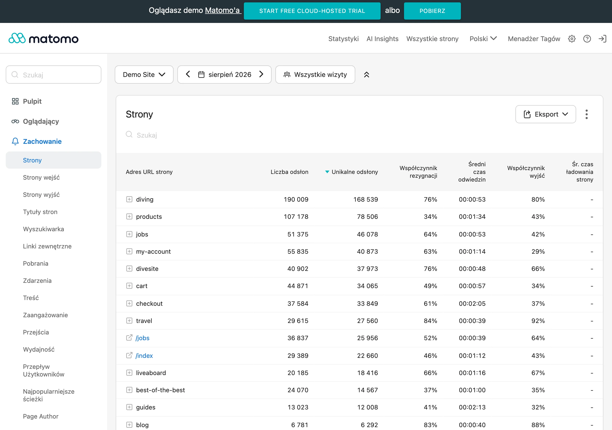
In practice, you need to measure the entire journey, not just the button click. The most useful events are: form view, start of completion, validation errors, abandonment, submission and entry to the thank-you page. This set immediately reveals whether the obstacle is an overly long form, unclear questions, technical hiccups or simply low-quality traffic. If you see lots of visits and few starts, the issue is often the offer or the placement of the form; if you see lots of starts and few submissions, the problem is more often in the fields, validation or mobile UX.
It is not enough to measure conversion alone. You also need to keep an eye on data quality and service quality, because they decide whether the form is a tool or just decoration. A form may have a high submission rate and still generate few valuable contacts, because the questions are too vague or the routing sends enquiries to the wrong team. That is why you should check which forms end in a real sales conversation, a correctly created ticket, a booked consultation or a case that is closed efficiently. Only then can you see whether the number of forms and their logic make sense.
This kind of measurement usually combines GA4, GTM, CRM and backend logs. Web analytics will show user behaviour, the CRM will tell you something about lead quality and the sales stage, while the backend can help catch technical errors, spam or integration issues. That matters, because a lack of submissions does not always mean poor conversion. Sometimes the form is being submitted, but the data does not reach where it should, or it ends up in a folder that nobody actually handles.
Measurement is also useful when deciding on the number of forms. If two forms have similar traffic, but one produces better data, fewer errors and a faster team response, then its logic is simply better aligned with the process. If several forms on different subpages produce identical enquiries, it makes more sense to merge them and pass the context automatically via hidden fields or campaign parameters. The decision to add, combine or remove a form should be based on analytics and CRM data, not on intuition.
A properly set up measurement framework also helps with everyday optimisation. You can immediately see which fields most often trigger errors, on which devices abandonment increases, and whether a particular traffic source delivers meaningful enquiries. That makes it possible to improve the form in small steps, rather than doing a full rebuild without a diagnosis and without knowing what is actually not working. The best form is not the one that looks the simplest, but the one that strikes a good balance between ease of submission and the usefulness of the data for the team.
Technical requirements and form compliance
Technical requirements and form compliance are hard ground. The form has to work in the company’s real environment, process data securely and be easy for the team to handle, not just “look nice”. Appearance alone will not save the situation if submissions do not reach where they should, get lost when errors occur or do not save consents. A good form is part of the operational process, not just a page element.
Technically, it starts with the basics. You need to check compatibility with the CMS, hosting setup, API integrations and the site’s publishing model, because these define the boundaries of what is possible. It is also crucial whether the form can be developed further without rebuilding the entire site, that is, whether you can add a field, change routing or connect another lead source without fiddling with half the system. If every change requires developer work, maintenance quickly becomes expensive and simply sluggish.
GDPR is not an add-on, but a baseline requirement. A form should collect only the data needed for a specific purpose, clearly say why it is being collected, and show consent only where it is genuinely required. You should not combine consent to be contacted about an enquiry with marketing consent if those are two different processing purposes. On top of that, there needs to be a clear link to the privacy policy and the ability to document which consents were given, when and in what form. The question is: will anyone still be able to reconstruct that a few weeks later without guessing.
Form security is not just SSL. You need server-side validation, spam protection, submission limits and sensible handling of attachments, meaning file size limits and accepted file formats, not “upload anything”. If the form accepts files, you need to pay particular attention to validation, scanning and control over what gets into the system. The problem is that attachments are often the shortest route to trouble.
The form also has to work on a phone. In practice, that means correct field labels, logical keyboard handling, clear error messages, the right focus state and field types matched to the data, such as e-mail or phone number. This matters not only for WCAG, but also for effectiveness, because mobile friction can reduce the number of submissions more than the layout of the fields itself. And bear in mind, users rarely “try again” when something blocks them once.
Operationally, resilience to failures matters. Check whether e-mail fallback works, whether errors are logged, and whether there is confirmation that the submission was actually saved, rather than simply “going off into the ether”. If the integration with a CRM or ticketing system stops working temporarily, the submission should not simply disappear. The safest setup is one where every submission leaves a trace in the logs and you can reconstruct what happened to the form.
Before deployment, there are other things that are easy to forget. Language versions, routing to different departments and passing context, for example which subpage or campaign the enquiry came from, make a difference to handling time. It is often better to pass that context automatically instead of asking the user for information the system already knows. That way the form stays short, and the team still gets a complete set of data needed to act, without adding more fields “just in case”.
FAQ
Frequently asked questions
How do you determine the right number of forms on a company website?
First, you need to check which real contact and service paths are triggered after a submission. If only the context of the subpage differs, it is usually better to use one form with the appropriate routing.
Is one form enough for contact, quotes and support?
Only if those submissions go to the same team and require similar data. If the service, priority or required fields are different, a separate form will be better.
Why can too many forms harm a website?
Because the user has to choose between similar options, and the business has to maintain more fields, consents and integrations. It also makes analytics harder and increases the cost of changes and testing.
What should a simple contact form include?
The article notes that often a name, email or phone number and a message are enough. It is better to collect the rest of the data only when it is needed to start the service.
When is it worth creating a separate form instead of one universal one?
When the user’s intent, required data, process owner or way of further handling changes. A separate form also makes sense with different routing or a different integration after submission.
How should forms work after a submission?
After submission, the data should automatically go to the correct system and team, for example CRM, a ticketing system or a calendar. Confirmation for the user, analytics integration and anti-spam protection are also important.