
CTA on a service page decides one thing: whether the user will take the next step, or simply read the offer and disappear. On such pages, the problem is rarely a lack of a button; more often, the button misses the recipient’s intent and the logic of contact. A good CTA must be in the right place, say things clearly and lead to a simple action. An effective CTA does not work in isolation from the offer, the page content, trust and the way enquiries are handled. That is why the same button can “pull” on one page and completely fail to deliver on another. In practice, it is not the copy alone that matters, but the whole path: from the first visit to sending an enquiry or having a conversation.
What is an effective CTA on a service page
An effective CTA on a service page is a specific moment of moving from reading to action: contact, a quote, a consultation or a phone call. It is not only about the click, but about ensuring the user reaches a sensible next step. On a service page, that step should sound natural and fit what the recipient is looking for right now. The question is: does the CTA help them make a decision, or does it merely ask for attention.
In practice, a CTA is not just the button itself. It consists of the button copy, the section heading, the short description beside it, the form, contact details and all the little things that remove resistance to action. If the user does not know what they will get after clicking or submitting the form, the CTA loses effectiveness even when it is clearly visible. And that is not a detail, it is fundamental.
A good CTA communicates the next step in simple language and reduces the sense of risk. Instead of a general “Send”, it works better to use a message that says what the form is for and what happens next, for example a request for a quote or arranging a call. Not X, but Y: not “click”, but “let’s take the next step”. Such wording more accurately matches the user’s intent and structures the decision.
On service pages, two CTA levels are usually needed. The main CTA is for people ready to get in touch, and the secondary one is for those who are still comparing the offer, want to see case studies or clarify the scope of the service. One main CTA and a limited number of supporting actions usually work better than several equal calls competing for attention. The more equal “escape routes” there are, the easier it is to end up with choice paralysis.
The effectiveness of a CTA also depends on the company’s actual handling model. If a quick phone call works best, the page should support that and highlight calling or a callback. If the team needs a few details to prepare a sensible quote, the CTA should lead to a short form that collects only what is truly needed at this stage. Rather than building out the mechanism, it is better to shorten the distance to a conversation.
Current context and the conditions for CTA effectiveness
At present, CTA effectiveness mainly depends on adaptation to mobile devices, the traffic source, the level of trust and the amount of friction in the form. More and more users land on service pages from a phone, so the button must be immediately legible, easy to tap and linked to simple contact. But note: if the form is long or works badly on mobile, the CTA alone will not save the result. First comes convenience and confidence, only then the “call to action”.
Not every user lands on the page with the same intent. Someone from Google Ads is usually hunting for a quick quote, a user from SEO wants to understand the scope of the service first, and a person from maps expects immediate contact and clear confirmation of the service area. The same CTA should not serve all visits in exactly the same way, because different traffic sources mean different expectations and a different stage of decision-making.
Trust wins over fireworks. Today, credibility elements placed right next to the CTA are becoming increasingly important, because within a few seconds the user wants to check whether the company operates in their area, what the cooperation looks like, when they will get a response and whether the service fits their problem. And that is where the question arises: what will really reassure them. Reviews, case studies, FAQ, a description of the service scope and information about response time can increase conversions more effectively than a “stronger” button colour.
Friction in forms hurts most. A major problem is decision-making chaos, meaning unnecessary fields, unclear consent options, a lack of information about what happens after submission, and several buttons placed next to each other as if each were meant to lead somewhere different. The user more often gives up not because the offer is poor, but because the contact path is unclear or simply tiring.
Clicks alone are not enough. When assessing CTA effectiveness, what matters is whether the enquiries are complete, whether they concern the right service and whether they progress to a sales conversation. Only such a filter shows whether the CTA truly supports sales, or merely inflates the metrics and generates apparent traffic.
How CTA optimisation works in practice
CTA optimisation in practice comes down to one thing: matching the next step to the page’s goal, the user’s intent and the company’s real approach to handling enquiries. First, you need to decide which conversion is most important here. A phone call, a form, a request for a quote, a consultation or booking an appointment. Without that decision, it is impossible to assess honestly whether the CTA is working, because each button pushes the user towards a different type of contact and a different process on the company side. The most common mistake appears when a page tries to sell, educate and capture leads at the same time through several equal pathways.
The next step is a cool-headed analysis of the intent with which the user lands on the page and what they need to move on. Someone from an ad may expect a quick quote, while a user from SEO often first checks the scope of the service, cooperation terms and examples of work. The problem is that CTA is often copied mechanically between service pages, as if context did not matter. But it does. A CTA should answer the specific question that appears at that moment in the reading, not the general idea of “encourage contact”.
Then comes structuring the page. The sections are mapped and the most natural action is assigned to each one. After the heading, the main CTA usually works, but after a section about the service scope, reviews or FAQ, a second placement of the same step is often needed, because only then does the user finish forming their decision in their head. For less decisive users, it is worth adding a secondary CTA. Not instead of the main goal — just as a lower entry threshold that does not distract. A good CTA does not interrupt the decision path; it closes the stage the user is currently at.
Then the action-execution experience itself is refined. It’s about the details that do the heavy lifting: the button text, the short note next to it, the number of form fields, field labels, error messages and a clear explanation of what will happen after the enquiry is submitted. If the company calls back within one working day, say so clearly. Better yet, say so upfront. If two technical parameters are needed for a quote, then those are the ones that need to be collected. No more. Instead of adding questions that change nothing at this stage, it’s better to shorten the route to contact. The user is more likely to click when they know what the next step will be and how much effort it will take.
It’s also worth separately auditing the mobile version and traffic sources. This is not just cosmetic. On a phone, a large tap target, a simple form layout and no elements covering the screen matter — and there are surprisingly many such “cases”. For urgent services, a quick contact option or click-to-call works better. For complex services — a form, but with a well-described data scope, no guesswork and no uncertainty. The question is: who lands on the page and why. The same page may therefore need a different emphasis for a user from Google Ads than for someone who arrived from organic results.
In the end, you measure not just clicks, but the whole downstream outcome. And that is the key point. In practice, it’s worth checking form submissions, form abandonment, movement between sections, the quality of enquiries and whether the lead moves on to a sales conversation. Only on that basis do you change the CTA copy, its placement, the order of buttons or the length of the form. Instead of celebrating an increase in clicks, it’s better to see what comes out of them. Effective CTA is judged by the quality of contact, not by the mere increase in the number of clicks.
The most important elements of an effective CTA
An effective CTA consists of several elements, not just one button. The key is the combination of: a clear message, the right place on the page, low friction in completing the action and support from trust. The button alone is not enough if the offer is unclear or the form is too difficult. The problem is that a CTA only works as part of the whole conversion journey, not as a lone “magic” trick. That’s why it needs to be assessed together with the section copy, the visual surroundings and the way of making contact. Otherwise, you are improving the symptoms, not the cause.
- One primary CTA — the user should immediately see which step is the most important on that page.
- Specific button copy — “Request a quote” works better than “Submit” or “Find out more”.
- Match to the stage of the decision — the main CTA for those ready to make contact, a secondary one for those still comparing.
- Visibility and hierarchy — the button must stand out, but it cannot compete with several other actions nearby.
- A short note next to the CTA — it’s worth clarifying the response time, the data scope and what will happen after the form is submitted.
- Low-friction form — only the necessary fields, clear labels and a simple layout, especially on mobile.
- Trust elements nearby — reviews, service area, case studies, FAQ or terms of cooperation help close the decision.
CTA timing also matters. Placing it only at the top of the page often underdelivers, because many people only decide after reading the details. Good results come from repeating the CTA after the section on the scope of the service, delivery advantages and answers to typical objections. Then the button lands exactly where readiness to make contact increases.
Equally important is matching the CTA to the type of service and the sales model. If the client usually needs a quick response, a phone call or a request for a callback will simply feel more natural than a long form. If the service requires initial data, a form makes sense, but it should collect only what is needed for the first qualification. The CTA should support the real sales process, not just look good in the website design.
There are usually three things that get in the way. Generic buttons, several competing actions in one place and no information about what happens next. On top of that, there is low contrast, a button that is too small on mobile, too many fields or unclear consent checkboxes. Even a catchy headline loses its power when, after clicking, the user lands in a long, tiring form. In practice, the simplest moves do the most: simplifying the choice, clearing up the clutter and clarifying what the user will get after completing the action.
Typical mistakes and obstacles in CTA performance
A CTA most often stops working at one particular moment: when the user does not know what will happen after clicking and which step is right for them. And no, that does not always mean a “bad button”. The problem usually lies in the surroundings, namely the section copy, the number of options, the form and the lack of a clear promise of further contact.
A classic example is several equally important CTAs placed next to each other. When phone, form, quote, chat and offer download are all competing in the same section, the user gets information noise instead of a decision. On a service page, it’s better to have one main step and at most one sensible secondary route.
The second obstacle is copy that is too generic. Buttons such as “Submit”, “Check” or “Find out more” rarely help, because they do not reveal the purpose of the action. The user wants to know specifically: are they requesting a quote, booking a call, checking availability, or simply asking a question.
A CTA also loses effectiveness when it appears too early. In many services, the user first needs to see the scope, the way of working, the service area, case studies or answers to typical objections. If you ask for contact before you have built a minimum level of trust, clicks will be random or there will be none at all.
A strong barrier is often friction in the form. Too many fields, unclear labels, awkward selection on mobile, error messages without explanation and a heavy captcha can effectively cut the number of enquiries. The same applies to a lack of information about what will happen after the form is submitted and when someone will reply.
The problem starts when the CTA does not match the real sales process. If the company handles quick phone enquiries best, a long form will only slow down contact and raise the entry barrier. If, on the other hand, a quote requires a few key details, a button leading to a very short form will do something else: generate a mass of weak, incomplete enquiries.
A separate mistake is weak visual hierarchy. The CTA copy may be fine in theory, but it loses out when the contrast is poor, the click area is too small, or the button gets lost among banners, icons and decorative background. The button’s visibility should help with the decision, not fight for attention with the rest of the section.
In practice, we also run into information gaps right next to the CTA. There is no service area, response time, approximate way of working or service scope, and suddenly the user puts off getting in touch until later. And “later” on service pages usually does not mean tomorrow. It means going to a competitor.
How to measure and assess CTA effectiveness
CTA effectiveness is visible in whether it delivers valuable enquiries, not just clicks. A rise in clicks on its own means little if the form is abandoned or the team receives enquiries outside the service scope. The most important thing is the quality of the whole journey from landing on the page to a real sales conversation.
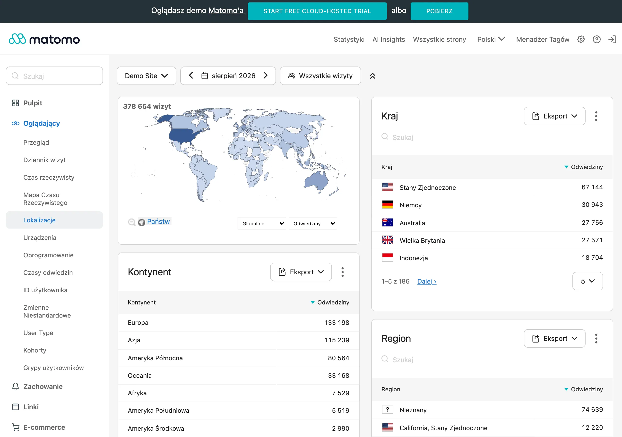
At the first level, you measure behaviour around the CTA itself. This includes clicks, the button’s visibility on screen, scroll depth to the CTA section and transitions between sections. This data clearly shows whether the user even reaches the decision point and whether the button is actually noticeable, rather than just “somewhere” on the page.
At the second level, you assess the completion of the action. For a form, that will be starts, submissions, validation errors and abandonments on individual fields. For a phone number or messenger, you need to measure clicks, but note: whenever possible, link them to the later contact, because tapping a number does not yet mean a conversation.
The most useful picture comes from combining website analytics with a CRM or another lead management system. Only then can you see which CTA generates complete enquiries, aligned with the service and realistically possible to handle further. Without this, it is easy to optimise a site for “empty” conversions that look good in reports but do not support sales.
- the number of clicks on the main and secondary CTAs,
- the form submission rate relative to opening or starting it,
- form abandonment on mobile and desktop devices,
- lead quality: data completeness, service fit, readiness to talk,
- the traffic source from which the enquiry came: SEO, ads, maps, social media,
- the next stage in the funnel: callback, booked consultation, quote, sale.
Analyse the results separately. For different traffic sources and different devices, because what works in an advertising campaign can hit a wall in SEO. The same CTA may work well in ads but poorly in organic traffic, because users arrive with a different intent and need a different level of clarification about the offer. Mobile can be unforgiving. It often exposes issues invisible on desktop, especially with forms and small buttons.
Assess effectiveness by comparison, not by a single figure. If changing the button copy increases the number of enquiries but lowers their quality, what have we actually won? Sometimes it is the other way round. There are fewer clicks, but more enquiries move on to a conversation or a quote, so the CTA can perform better for the business, even though it looks worse “on the surface”.
The most sensible approach is iteration. Regular, without fireworks, but consistent. You change one important element — the CTA copy, the section position or the number of fields in the form — and check what happens across the whole journey. CTA effectiveness is determined not by individual clicks, but by whether the user moves on to a sensible next step without unnecessary friction.
Practical tips for implementing CTA
Implementing a CTA starts with a decision. You assign one main goal to each service page and build the entire contact journey around it, instead of scattering attention across five directions at once. First decide whether this particular page is meant to collect quote requests, book calls, generate phone calls or qualify more complex enquiries. If one page tries to sell everything to everyone at the same time, the CTAs start blocking each other. In that case, the main button should lead to the most important conversion, while the secondary step should help those who are not yet ready to make contact.
The CTA copy should name the action and the outcome. Not just the click. Instead of a generic “Send”, it usually works better to use “Request a quote”, “Book a consultation” or “Check availability”, because it immediately tells the user why they are taking that action. A good CTA does not guess the audience’s intent; it clearly serves it. If the service is urgent, give more prominence to the phone or a callback. If it requires collecting data, direct users to a short, well-described form.
The form should collect only what is truly needed at this stage. Not one field fewer, but also not one “just in case” extra. If the salesperson cannot prepare a sensible reply without budget, location or scope of work, then those fields are justified and do the job. If, however, the data does not affect the first contact, it is better to remove it and ask later. The biggest conversion losses come not from weak buttons, but from unnecessary fields, unclear labels and a lack of information about what will happen after the form is submitted.
The CTA should not live only at the top of the page. It should also “return” after sections that close the decision, that is, after the service scope description, execution advantages, testimonials, FAQ and at contact. Users are rarely ready on the first screen, but after reading the specifics that readiness grows. And that is exactly when the button makes sense. It should appear where confidence in the choice increases, not where the layout happens to begin.
Right next to the CTA, add a few small “safeguards” for doubts. Often one or two pieces of information are enough: when you reply, the area you cover, whether the first contact is without obligation, what data you need, and who will actually call back. A small clarification next to the button often delivers more than yet another generic sales promise. This is especially important for more expensive, local and simply more complex services. Because the stakes are higher there, and “we’ll see” costs the client time.
On mobile, the CTA must not get in the way. It should be convenient, quick and clear without straining the eyes. The button should have strong contrast, a sensible size and a single-column form, with no thumb gymnastics. If a large share of traffic comes from local ads, maps or mobile results, test a visible phone number or a sticky CTA. A design that looks good on desktop very often loses on a phone because the path to contact is too long.
- Set the main conversion for each service page and assign one primary CTA to it.
- Add at most one or two secondary CTAs for users at an earlier stage of the decision.
- Write microcopy next to the CTA: what the user will get, what data they will provide and when they will receive a response.
- Simplify the form to the essential fields and check how it works on a phone.
- Place the CTA after the most important decision-making sections, not only above the fold.
- Connect click and submission tracking with the CRM so you can assess lead quality, not just traffic on the button.
In the end, it is not the click itself that matters, but what results from it. If a button generates lots of visits but few meaningful conversations, the problem is usually in a mismatched promise, a poorly arranged form or a badly set CTA hierarchy. Let’s look at it differently: implementation is a process, not a one-off “drop-in”. First come order and logic, then measurement, and only later tests of content and layout variants.
FAQ
Frequently asked questions
What should an effective CTA on a service page look like?
It should clearly indicate the next step, match the user’s intent and lead to a simple action. A button alone is not enough if it is not supported by the page content, trust and an easy contact path.
Is one CTA enough on a service page?
Usually, one main CTA and at most one supporting CTA works best. Too many equal options create chaos and make the decision harder.
Why does text like “Send” perform worse than a more specific CTA?
Because it is too generic and does not say what will happen after the click. A message that clearly names the goal works better, for example a request for a quote or booking a call.
When is it worth repeating a CTA on a service page?
When the user first needs to read the scope of the service, reviews or the FAQ before making a decision. Repeating the CTA after sections that resolve objections can work very well.
What most often gets in the way of a CTA on a service page?
Most often, several competing CTAs, overly generic buttons and a lack of information about what will happen after the click get in the way. A long or unclear form is also a major problem.
How can you measure whether a CTA actually works?
It is not enough to look at the number of clicks. You need to check the quality of enquiries, form abandonment and whether the lead moves on to the sales conversation.