
A simpler site does not mean a poorer site. It is simply a site that is easier to understand and quicker to use. In practice, the point is that the user should immediately know what you offer, who it is for and what the next step should be. Usually the biggest problem is not a lack of content, but an excess of messages, options and elements competing for attention. If a client has to stop and think where to click, what to read and where to start, the decision takes longer or is not made at all. And then even the best offer gets bogged down in chaos. That is why simplifying a site combines UX, content, technical performance and analytics, rather than focusing solely on design. The aim is not “prettier”, but less friction and a higher chance that the user will do what the business really needs.
What does simplifying a site mean in practice?
In practice, simplifying a site means shortening the path from the user’s entry to one, most important action. That action can be contact, submitting a form, booking, making a purchase or sending an enquiry. The key thing is that this is not about cutting everything out, but about keeping what genuinely helps the user make a decision. A good simplified site guides the user instead of forcing them to map out the journey themselves. The question is: does the site show the way, or just put up question marks.
The biggest change usually concerns the communication logic. It needs to be clear and quick. The user should immediately see what you offer, what benefits it delivers, why they should trust you and what they should do next. When three offers, several buttons and an overly vague headline compete on the first screen, the site becomes harder to use, even if it looks modern. And that is not a matter of taste, but of attention load.
In practice, simplification starts with selection. Without sentiment. You check which sections are needed, which are repetitive and which only lengthen the process of scanning the site without affecting the decision. Often a better result comes from removing one block, shortening the text and changing the order of information than from adding a new section or another animation. Instead of adding layers, you remove them one by one.
This approach also covers the interface and the technical side. And that is a good thing, because details can quietly kill conversion. The menu is simplified, button styling is tidied up, the number of fields in the form is reduced and readability on mobile is improved. If a site loads slowly or requires too much precise tapping on mobile, even a good message stops working. Because the user will not fight the screen; they will leave.
It is also important that simplification is based on data, not just taste. The data makes it clear where people drop off. User behaviour is analysed in GA4, Search Console, click maps and session recordings, as well as the questions asked by customers before contacting you. This shows whether the problem is a poor offer, an unclear message, a form that is too long or simply too many decisions along the way. Exactly — because sometimes it is not the product that loses, but the path to it.
What are the key elements of site optimisation?
The key elements of site optimisation are the message, content structure, CTA, form, credibility, performance, mobile version and measurement. It sounds technical, but essentially it all comes down to one thing: can the user quickly understand the offer and move to action. Together, these areas decide whether the site delivers results or merely “looks nice”. If one of them fails, the rest lose effectiveness too.
The first element is a message that lands straight away. The user should understand, without guessing, what you offer, for whom and with what result. Rather than big slogans, concrete benefits, simple language and one dominant message at the top of the page work better.
The second element is information architecture, that is the order and layout of the content. The site should answer customer questions at the right moment: first the point of the offer, then the details, then proof of credibility and only then action. A common mistake is not that there is too much content, but that it is shown in the wrong order.
The third element is the conversion path. In short: it should be easy. The CTA must be visible, clear and matched to the page’s intent, and the form should ask only for data that is truly needed. Because when you ask for too much information too early, resistance grows and abandonment rates rise.
- Main message — should explain the offer and the benefit straight away, on the first screen.
- Content structure — should lead from understanding to decision, without unnecessary jumps.
- CTA and form — should shorten the path to contact or purchase, rather than complicate it.
- Credibility — reviews, case studies, the answers to objections and cooperation process should appear where the user actually needs them.
- Performance and mobile — the site should work quickly and readably on a phone, because that is often where the first decision is made.
- Measurement — without events, micro-conversions and behaviour analysis, it is hard to assess what really improves results.
The fourth element is credibility. Without it, the offer sounds like an empty promise. Reviews, case studies, the scope of the service, costs, terms of cooperation or answers to common objections should be present, but they must not overwhelm the site. Placement and format are key, because trust signals are meant to support the decision, not add another layer of chaos.
The fifth element is performance and technical quality. This is not a “detail for IT people”, but a basic requirement. In practice, you check image weight, external scripts, fonts, cache and Core Web Vitals indicators. A slow site not only reduces comfort, but also weakens brand perception and increases the risk of abandonment before contact is even made.
The sixth element is the combination of SEO and UX. And this is where the hard work begins. Simplification should not remove content needed by search engines, but rather organise it more intelligently: through a sensible heading structure, internal linking and alignment with user intent. The best result comes from a site that both ranks well and quickly leads to action.
The final element is post-launch analytics. The question is: how do you know what really works. You need to measure CTA clicks, form submissions, form errors, calls, scroll depth and other micro-conversions. Without this, you cannot tell whether the problem lies in the messaging, the page layout, or simply a technical fault.
How does simplifying a page affect customer decisions?
Simplifying a page speeds up the customer’s decision. It reduces the number of questions and choices they have to “process” before they even move on to contact, an enquiry or a purchase. The user does not decide in a vacuum. First they check whether they’ve landed in the right place, whether they understand the offer, and whether the next step is obvious rather than hidden somewhere between sections. The fewer decisions along the way, the greater the chance of action.
The first screen and how you arrange the information on it carry the most weight. If it is immediately clear what you offer, who it is for, what benefits it brings and where to click next, the user does not have to piece the puzzle together from several scattered fragments. The first screen should answer three questions: what you offer, who it is for and what to do next. When those answers are scattered around, the decision does not so much slow down as start to wobble. Why make it harder for them.
Simplification also works for a very straightforward reason: it cuts friction in the conversion path. Overly complex menus, several equal CTAs, long forms, pop-ups and too many blocks on a single subpage do not help; they pull attention off course. On mobile, the problem gets worse. The screen is small, and every additional section means more scrolling and another judgement about whether it is even worth going further.
The customer decides faster also when the page builds trust at exactly the moment hesitation appears. Testimonials, case studies, process description, terms of collaboration or answers to the most common objections should appear where doubt naturally arises, not only at the very end “for the sake of formality”. And one thing is crucial here: it is not about adding more of everything, but about showing the right proof in the right place. Most of the time you do not need to add new content, only remove or move the parts that get in the way.
In practice, the effect also depends on the intent behind the visit. Someone coming from an ad usually expects a short path to the offer or the form, while someone coming from Google more often wants to confirm the scope of the service and the company’s credibility first. A good simplified page is not “shorter at all costs”, but better matched to what the user is looking for at that stage of the decision. The question is whether your page understands that.
What are the most important steps in the page simplification process?
The most important steps are fairly down to earth. You define the page’s main goal, analyse the data and user behaviour, organise the content, and then implement the changes and measure the effect. Without this order, it is easy to “pretty up” the design instead of improving the real decision-making process. Every important page should have one main business action.
The first step is to state clearly what exactly the user is meant to do on a given page. For one subpage it will be form submission, for another a phone call, a booking or a purchase. If the same page tries to sell several services, educate, send people to the blog and still collect leads at the same time, the simplification will be merely cosmetic. The problem is that in that case there is no shortage of elements, but of priority.
The second step is an entry audit. In practice, this means looking at data from GA4, search queries and landing pages from Google Search Console, session recordings from Clarity or Hotjar, as well as the menu structure, forms and site speed in Lighthouse or PageSpeed Insights. The aim is not to collect everything for the sake of it. It is to identify the places where the user pauses, goes back, abandons the form or simply does not see the key CTA.
The third step is to analyse user intent and objections. It sounds academic, but it comes down to straightforward findings: what question brings them to the page, what information they are looking for straight away, and what is stopping them from taking the next step. Not only analytics tools help, but also questions from sales calls, emails, FAQ and the wording of search queries entered into the search engine. Because the data tells you clearly, if you are willing to hear it.
The fourth step is to rebuild the page logic. This is where you arrange the order of sections, shorten copy, merge duplicate fragments, simplify the menu and strengthen the main CTA. At the same time, you improve the interface: button contrast, spacing, heading readability, the number of form fields and ease of use on mobile. And that is usually what delivers a bigger effect than adding new visual flourishes that look nice but do not drive decisions.
The fifth step is technical optimisation and deciding the scope of implementation. Sometimes quick fixes on the existing page are enough, and sometimes a rebuild of the templates or the entire information architecture is necessary. What matters is what is constraining the team: the CMS setup, SEO dependencies, the number of integrations, heavy scripts, language versions and whether content can be edited without going into “call the developer” mode.
The final step is post-publication validation. You check whether tracking is working properly, whether forms submit without errors, whether the page performs well on mobile and whether any indexing or speed issues have appeared. A redesign without measurement before and after leaves you with opinions only, not evidence. Only data on clicks, micro-conversions, form errors and user behaviour show which simplifications really shortened the path to decision.
What are the most common mistakes when simplifying a page?
The most common mistake is surprisingly basic, but by no means rare: the look changes, but the user’s decision is not simplified. A page may be shorter or “cleaner”, yet still fail to clearly communicate what it offers, who it is for and what the sensible next step is. The question is whether the user has anything to hold on to. That is exactly why some redesigns look better but do not improve the number of enquiries or sales. Simplification only works when it reduces friction on the path to contact or purchase.
A very common mistake is adding new sections instead of making a hard choice about priorities. On one page you end up with descriptions of every service, several target groups, multiple buttons and far too many sales arguments. The effect is simple: the user does not get one path, but several competing messages that cancel each other out. If every section is trying to be the most important, then in practice none of them is.
The second problem is shortening content without changing its logic. That is a shortcut. Simply reducing the text will not help if the offer still answers questions in the wrong order, shows the price, process or terms of cooperation too late, or pushes the user to the form too early. And that is not a cliché. The user does not always need less content, but the right content at the right moment. The question is: what really pushes them towards a decision. That is why it is better to trim what is repetitive and keep what overcomes objections and builds trust.
Results are often damaged by not separating the main CTA from secondary actions. Chaos hurts. If on one subpage the user is supposed to call, fill in a form, download a PDF, view the portfolio and go to other services all at once, the decision takes longer because the brain is given too many directions at the same time. This applies especially to service pages and landing pages, where traffic usually has one specific goal. And then, instead of guiding the user by the hand, the page distracts them. Every key page should lead to one main business action.
A separate category of mistakes is simplifying without data and without checking side effects. It sounds sensible, and often ends up backfiring. Changes are rolled out “by instinct”, without checking CTA clicks, form errors, scroll depth, traffic sources or landing pages from search. Then it is hard to separate whether the problem lies in the message, the technical setup, or simply the fact that the traffic does not match the offer. But beware: it is equally dangerous to remove content that is important for SEO, internal linking or search intent just because it “seems long”. The facts are that length alone does not decide anything. Good simplification is judged not by aesthetics, but by whether the user understands the offer faster and more often takes the next step.
What tools are essential for analysing and optimising a website?
Analysing and optimising a website requires a set of tools that shows four things: where users come from, what they do on the site, where they run into problems and whether the site works fast enough. Facts, not impressions. It is not about the number of apps, but about being able to make decisions based on facts. In practice, a combination of traffic analytics, user behaviour tools, performance tests and basic SEO analysis is usually enough. Without that, it is easy to confuse “prettier” with “more effective”. Without proper measurement, even well-designed changes are only a hypothesis.
GA4 is the foundation, because it lets you check traffic sources, user journeys, landing pages, micro-conversions and drop-off moments. That is where you can see where people are falling off, not just the “for peace of mind” charts. If you correctly set up events for CTA clicks, form submissions, phone calls, scrolling and form errors, you will see where user intent is really being lost. The second pillar is Google Search Console, which shows queries, the visibility of service pages and whether simplification has weakened alignment with the topics being searched. Only then does the full picture come together. Together, these two tools answer the question: who lands on the site and whether the offer matches their intent.
You want to understand what users are doing. That is where tools such as Microsoft Clarity or Hotjar come in handy, because click maps, session recordings and scroll analysis show within minutes whether someone is clicking on “dead” elements, reaching the key sections and where they start to get lost. It works like a torch in a dark room. Especially when the numbers in GA4 only say that the result is poor, but stubbornly refuse to reveal the cause. This makes it easier to distinguish a communication problem from an interface problem.
Mobile and speed do not forgive. That is why Lighthouse and PageSpeed Insights come into play, as they let you assess the impact of images, external scripts, fonts, loading structure and issues affecting Core Web Vitals, especially LCP, CLS and INP. The key thing is this: we are not chasing a “perfect score”, but the assets that are genuinely harming the user experience and making it harder to take action. It sounds obvious, but that is usually where the problem lies. On simple sites, just a few technical fixes can shorten the path to a decision more than yet another pretty but cosmetic layout tweak.
Changes still need to be planned and delivered. That is where Figma, Google Tag Manager and a SEO crawler come in, because Figma organises the new section structure, content layout and CTA hierarchy before coding, so the direction can be agreed more quickly. GTM makes it easier to implement measurement events without involving a developer every time, while a SEO crawler lets you check headings, meta data, internal linking and duplication after a larger rebuild. And that is not a cliché. The best toolset is the one that answers specific decision-making questions, not the one that generates the most reports.
How do you measure the effectiveness of changes made to a website?
Measurement only makes sense in comparison. The effectiveness of changes on a website is measured by comparing user behaviour and business results before and after implementation, on the same page and for comparable traffic segments. First, you decide what should improve: the number of contacts, submitted forms, bookings, purchases or lead quality. And if you do not do that. If you do not define one main conversion, assessing the effect quickly becomes chaotic. Only then does it make sense to add supporting metrics, because otherwise you look at everything at once and see nothing.
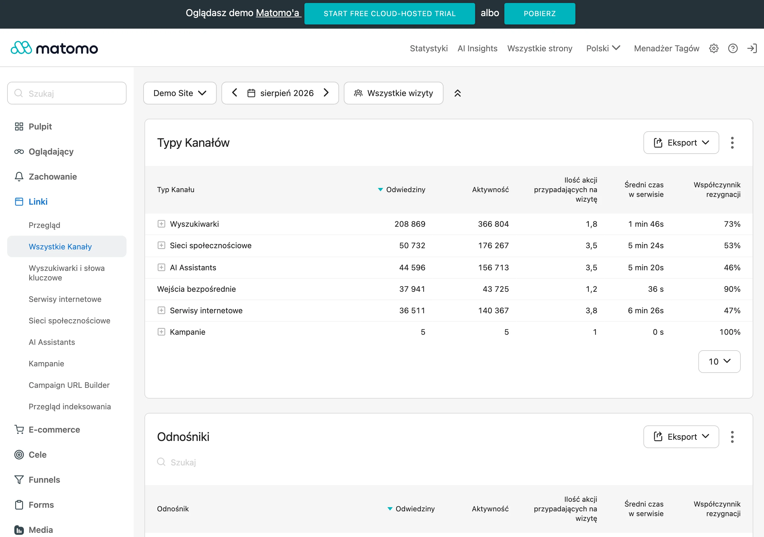
There are two levels and it is not worth mixing them up. The most important are the main conversion and micro-conversions: the main conversion will be, for example, submitting a form, clicking the phone number, making a purchase or booking a call, while micro-conversions show whether the user is actually moving closer to a decision. This is exactly where the details show. Clicks on CTAs, scrolling to key sections, opening the pricing page, moving to the form, starting to fill in the form and errors in the fields tell you more than a dry percentage on a chart. These are most often what show whether the problem lies in the message, the page layout or the form itself.
In practice, measurement is based on properly implemented events in GA4 and GTM, data from Search Console and behaviour observation in tools such as Microsoft Clarity or Hotjar. Page views alone. They are not enough. After all, they do not tell you whether the user noticed the offer at all, understood it and tried to take the next step. That is why you track clicks on the main buttons, form submissions, form errors, abandonments, clicks on the phone number and visits to key service subpages. And when the changes concerned performance speed, you also compare Lighthouse, PageSpeed and key website performance metrics.
The comparison has to be fair. That means we do not compare everything with everything. It is best to separate the analysis: mobile and desktop traffic, entries from SEO, paid campaigns and direct traffic, as well as the specific pages where the changes were actually implemented. The average for the whole site very often hides the real effect, because it mixes pages with different goals and users with different intentions. It is also good practice to mark deployment dates so it is clear which change may have pushed the result up or dragged it down.
An increase in conversions is not always a success. Especially when lead quality falls or the number of random enquiries rises. That is why website data needs to be linked with sales information: which forms result in a real conversation, which leads are a good fit and from which subpages better enquiries come. This is particularly important for service websites, where the goal is not “more forms”, but more of the right conversations, the ones that really make sense.
Interpreting the results should get to the point. No waffle. If the number of CTA clicks increases, but the number of submitted forms does not, the culprit is often the length of the form or technical errors, sometimes both at once. If visibility in Search Console improves but users leave quickly, the page may be attracting traffic with the wrong intent. The best measurement does not end with a report, but leads to the next iteration: what to keep, what to improve and what to remove even further. So the question is not “does it work”, but “what exactly works and why”.
FAQ
Frequently asked questions
How does simplifying a website affect the customer’s decision?
It reduces the number of questions and choices along the way, so the user moves faster to contact, an enquiry or a purchase. The less friction there is, the greater the chance of action.
Does a simpler website mean less content?
No, it means keeping only what genuinely helps the user make a decision. Often, removing unnecessary blocks and shortening the text gives a better result than adding new sections.
What should be on the first screen of a simplified website?
It should be immediately clear what you offer, who it is for and what the user should do next. If those answers are scattered, the decision starts to wobble.
What are the most important elements of optimising a simple website?
The message, content structure, CTA, form, credibility, performance, mobile version and measurement all matter. Together, they determine whether the website quickly leads to action.
Why does website speed matter when simplifying?
A slow website reduces comfort, weakens brand perception and increases the risk of abandonment before contact. This is especially important on mobile, where the user will not fight with the screen.
What are the most common mistakes when simplifying a website?
Most often, people change the design instead of the user’s decision, or add too many sections and CTAs at once. Another mistake is shortening the content without improving its logic and without analysing the data.