
A company website only makes sense when it works for clients, makes contact easier and closes sales, rather than merely “looking nice”. In practice, many sites can boost their stats, but nothing comes of that traffic: no enquiries, no phone calls, no orders. And usually it is not about nobody visiting, but about the message being blurred, the layout not guiding people by the hand, or nobody measuring what works. The most important question is not whether the website is attractive, but whether it leads the user to a specific action and whether that can be measured. In this article I will show how to tell when a website genuinely supports a business, and when it is just taking up space on the internet. We will start with the fundamentals, because without them, assessing results is just groping in the dark.
What a website supporting business growth is
A website supporting business growth is a tool that leads the user towards an action important to the business. That might be submitting a form, making a phone call, purchasing, booking, signing up for a consultation or downloading materials. Its effectiveness is measured by the achievement of business goals, not by the number of visits alone.
Such a website is not merely an online business card. It should clearly communicate the offer, answer the client’s key questions and remove doubts before contact is made. The user should understand within moments what the company does, who the offer is for and what the next step should be. Because if they do not get that immediately, why would they stay any longer.
A good website works in layers. Clarity is one thing, but alongside it sit speed, credibility, search visibility and properly configured analytics. If one layer falters, the whole thing usually suffers, even if the rest is at a decent level. This is not a system of communicating vessels. It is a gear mechanism: one crooked cog and the whole thing stops working smoothly.
The classic picture is simple: the traffic is there, the results are not. The cause may be content that does not match user intent, an offer that is too generic, weak CTAs, an awkward form or chaos in the information structure. It is not enough to bring users onto the site — you still have to help them make a decision without unnecessary friction. Instead of “let them choose something”, it should be “I know what I need to do and why”.
A website genuinely supports business growth only when the owner or team can answer three questions: where the traffic comes from, what the user does and at which point they drop off. It is also important which subpages help sales and which block them, because often the problem is not the advertising, but the bottleneck on the site. Without this knowledge, decisions about advertising, SEO, content or a website rebuild become a lottery. And business does not need a lottery. It needs a predictable process.
How to assess a website’s effectiveness
A website’s effectiveness is recognised by whether it delivers a specific business goal and how efficiently it leads the user to it. First, you need to define what counts as a conversion for the business: a lead, a sale, a call, a booking or a sign-up. Without one clearly defined conversion, assessing the website quickly turns into guesswork. And the question is: are we measuring what matters, or only what is easy to count.
The number of visits alone is not enough. The next step is checking the quality of the traffic, not just its volume. The key is which channels users come from, which subpages they land on and whether the message from the advert, SEO or social media actually matches what they see on the landing page. The problem is that when the promise at entry does not match the content after the click, the number of quick exits rises and the chance of contact falls.
Now we move on to behaviour on the site. In practice, you check whether visitors scroll through the key sections, click the CTA, start the form and reach the contact point. If they drop off earlier, it is rarely the “wrong user” to blame; more often it is the content, the page layout, a lack of trust or too much effort required to complete the action.
UX carries significant weight here. Especially on mobile. The site should be readable from the first screen, have simple navigation, clearly visible buttons and a short, understandable form. The mobile version often determines the outcome more than the desktop design, because that is where it is easiest to lose the user.
Without analytics, you are groping in the dark. The practical minimum is tracking submitted forms, clicks on the phone number, email address, messenger and the main CTA buttons. If you are not measuring real user actions, you do not know whether the problem is traffic, the offer, the content or the contact process itself. And then optimisation turns into guesswork, instead of A. B., that is, decisions based on data.
Finally, there are the technical and content-related issues. Loading speed, indexing errors, heading structure, the quality of service pages, FAQ, testimonials and a clear description of cooperation affect both SEO and conversion. There is no magic here, there are consequences. A website may look modern, but if it loads slowly, does not answer customer questions or does not build trust, it will limit business growth rather than support it.
Current trends and practices in website optimisation
The trends in website optimisation today are brutally simple. What matters is a data-driven approach, mobile convenience and improving the entire user journey, not just the “nice” appearance. Aesthetics alone are not enough if the user cannot quickly understand the offer and move on to contact or purchase. The data is clear: the sites that win are those that work smoothly on mobile, are readable and whose real impact on the business can be measured. The most practical change of recent years is that a website is judged by the result, not by the graphic design.
The mobile version is gaining in importance because that is often where the first interaction with the company takes place. If the text is too small, the buttons are hard to tap and the form is tiring, the user drops off before they even get to know the offer. The question is: how many steps really separate entry from sending an enquiry. In practice, it is best to regularly go through the entire journey on your own phone and check it without any special treatment.
In SEO, it has long been about more than just keywords. Visibility is increasingly determined by whether a website matches user intent, has a sensible structure, proper internal linking and does not fall over because of technical barriers that block indexing. Good content is not “for SEO” or “for the client” — it should at once answer the search query and lead to a decision.
It is increasingly standard to analyse the entire user journey: from clicking an advert or a search result through to a form, phone call or brochure download. And rightly so, because the problem is rarely on the homepage; more often it sits on a specific subpage, in the form itself or in a break in the message between the advert and the landing page. The trouble is that the user comes looking for the promised solution and gets generic statements instead. The result is predictable: bounced traffic increases and conversion drops.
In practice, a well-optimised website also needs to be suitable for day-to-day work. It should be quick to edit and develop when the business wants to improve an offer, add a new service, change the CTA or implement new tracking without rebuilding the whole website. A website that cannot be developed efficiently very quickly stops supporting sales, even if it once looked modern.
Key elements affecting website performance
Website performance consists of several things at once: technical speed, content quality, UX logic and whether the user can carry out the right action without friction. It is enough for one of these elements to fall apart and the whole thing loses effectiveness even with decent traffic. Let’s look at it differently: chasing one metric in isolation from the rest is a straightforward route to illusions. Because a fast website with a poor offer still will not start selling.
The first key area is the offer message. The user should understand within a few seconds what the company does, who it is for, what problem it solves and what they should do next. If they have to guess what you actually offer, the website loses before it starts persuading.
The second area is the conversion path, i.e. everything that leads to contact, an enquiry or a purchase. The most common losses come from mundane things: overly long forms, poorly visible buttons, unclear menus and too many routes at once. The question is: why force the user to guess where to click? Good performance means they do not have to wonder what will happen after they submit the form.
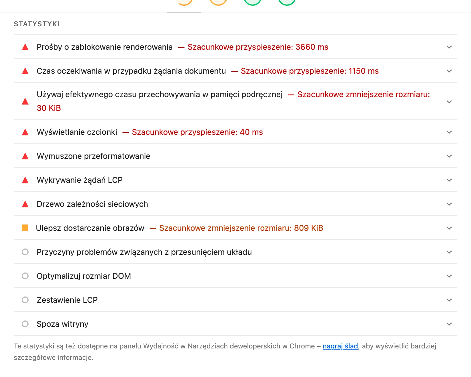
The third element is the technical layer. Loading speed, site stability, correct redirects, security, the absence of indexing errors and clean code have a direct impact on SEO and user behaviour. But be careful: especially on mobile, the margin for error is small. Even slight delays or elements shifting around can noticeably reduce the number of enquiries.
The fourth area is content and information architecture. Without this, the website does not guide the user. Service pages should answer real customer questions, dispel their doubts and show the next step, rather than hiding behind a generic “about us”. Equally important are logical headings, sensible internal linking and a section layout that leads from problem to solution, rather than from paragraph to paragraph without purpose.
Credibility is no less important. That is what closes the decision. References, a description of the process of collaboration, FAQ, clear contact details, the scope of the service and basic terms of cooperation often determine whether the user takes the next step or turns back. A lack of trust rarely shows itself directly — usually you can see it when people visit the offer but do not take any action.
The last element is proper tracking and lead handling on the company side. That sounds technical, but it works ruthlessly. If you do not track forms, phone clicks, emails, messaging apps and campaign visits, it is hard to tell a real problem from a simple data-reading mistake. Even a good website will not drive growth if enquiries disappear into a void or analytics does not show where the valuable contacts really come from.
The most common mistakes and pitfalls in website design
The most common mistakes in website design are deceptive. The website looks fine, but it does not lead the user to a specific action. In practice, the problem is rarely the design itself; more often it is the lack of a goal for the subpage, an unclear offer and a weak contact path. The user comes in, browses and at some point simply does not know what to do next. If, in the first few seconds, it is not possible to understand what the company does, who the offer is for and what the next step is, the website starts losing sales regardless of traffic.
A very common trap is designing a website to suit the business owner’s taste instead of the user’s decision. It may seem like a small thing, but it makes a difference. The result is often a homepage overloaded with slogans, animations and blocks that do not help people make a decision, only distract them. Instead of organising the offer, such a website amplifies chaos and cognitive load. The more unnecessary elements there are, the harder it is to get to contact or submit an enquiry.
Another mistake is ignoring the mobile version. A phone does not forgive. On a smartphone, all the problems show up faster: buttons that are too small, forms that are too long, poorly arranged sections and slow loading. A website that works well on desktop but is tiring on a smartphone often loses already at the first touchpoint. This is particularly important when traffic from ads, maps or search results comes mainly from mobile devices.
Communication consistency between the traffic source and the landing page also often fails. And that is when the classic misunderstanding begins. The user clicks an ad or an SEO result with a specific promise, but after landing sees a general page that does not address their need. The effect is predictable: bounced traffic increases, and the problem is wrongly blamed on a “weak campaign”. In reality, it is the alignment of content, headings and CTA with the search intent that fails.
The biggest trap. It is not measuring real user actions, only looking at the pageview counter. If a company only sees pageviews and session numbers, it has no idea which subpages drive sales and which quietly choke them off. Without properly implemented analytics, it is easy to make costly decisions based on impressions rather than data. This hurts most where conversion actually happens: forms, clicks on the phone number, messaging apps, file downloads and campaign journeys.
The second classic is a full redesign without diagnosis. It sounds impressive, it looks effective. Companies change the look, logo, site layout and images, but in the background the old problems remain: the offer, content, CTA, technical SEO and lead handling after the form submission. Aesthetics alone rarely fix a low conversion rate. Let us look at it differently: sometimes a greater effect comes from shortening the form, refining the services section and adding specifics about cooperation, rather than an expensive rebuild of the entire website.
Strategies for optimisation and improving conversions
Conversion optimisation is not magic. It is about simplifying the user’s decision, removing friction and measuring what actually leads to the business goal. First, you need to establish which action is key for a given subpage: contact, enquiry, booking, purchase or downloading a resource. Without such an anchor, it is difficult to honestly assess whether a given change helps or just “looks nicer”. One subpage should have one dominant goal, because then it is easier to build a clear message and effective CTA.
What usually helps most is refining the offer message. The key is for the page to answer four questions clearly: who it is for, what problem it solves, why it is worth trusting, and what to do next. In practice, that means simpler headings, more specific service descriptions, a clear cooperation process, and ruthless cutting of generalities. The user does not need to read an epic; they need to find, within a few seconds, what moves them towards a decision.
The second area is the conversion path. You need to go through the whole process on a phone, from entering the subpage and scrolling, through clicking the CTA, to filling in the form and confirming contact. Every unnecessary field, every unclear label and every extra step reduces the number of leads. Shortening the form and adding an alternative contact option, such as a phone number or a messaging app, often delivers a faster result than expanding the content.
The third strategy is the simplest, yet also the most often ignored: working with data, not assumptions. The question is whether we are measuring what really matters. You need to track events, conversion goals, traffic sources, entry pages and drop-off points, because the data clearly shows where the result is leaking away. Only then can you see whether the problem lies in traffic quality, a weak landing page, a faulty form or a mismatch in the offer. Comparing results before and after changes also works well, instead of making lots of tweaks at once and guessing what actually worked.
SEO and conversions cannot be separated. Service pages, FAQ, articles and internal linking are not there only to boost visibility, but also to lead the user to the next step in the buying decision. When the content answers real customer questions and, along the way, without artificial stuffing, directs them to the offer, traffic from search begins to have real value. It is exactly the same in paid campaigns: the promise in the advert must match what the user sees on the landing page.
In the end, one thing matters: priorities. First, fix the critical issues. Broken forms, incorrect analytics implementation, a poor mobile version, slow loading and unclear CTA. Only then is there room to develop content, information architecture, SEO and testing of further variants. The most effective optimisation is not a one-off project, but the regular improvement of the website based on real user behaviour.
The importance of analytics and performance measurement
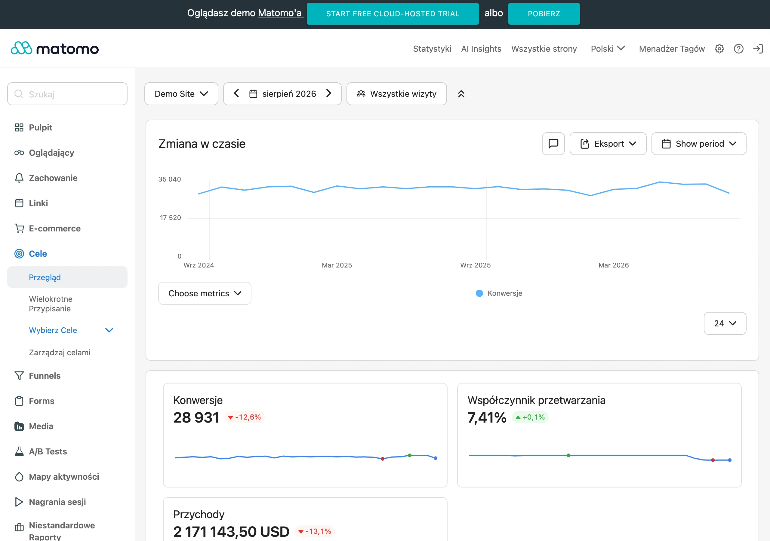
Analytics is not a decoration for the report. It is there to check whether the website is actually delivering the business goal, not just generating visits. Without data, you cannot honestly assess which subpages help with sales and which lose the user halfway through the journey. Traffic on its own is not a result if it does not lead to contact, an enquiry, a purchase or another important action. In practice, meaningful measurement answers three questions: where the user came from, what they did on the site, and at which point they gave up.
The key is measuring real business actions, not just the number of page views and time on site. The practical minimum is tracking form submissions, clicks on the phone number, email address, messenger, main CTA buttons, file downloads and transitions to key stages of the funnel. If a website does not measure conversions, the business does not know whether the problem is traffic quality, the offer, the content or the contact path itself. But beware: it is worth distinguishing between primary conversions, such as a lead or a purchase, and micro-conversions, which signal interest, for example a click on pricing or FAQ.
- traffic source: SEO, ads, social media, email campaigns, direct visits,
- landing page and device, especially behaviour on mobile,
- clicks on the most important page elements,
- submitted forms and form abandonment points,
- phone calls, emails, messengers and other quick forms of contact,
- the quality of traffic from UTM-tagged campaigns and the match between the ad and the landing page.
The number of users alone rarely reveals the heart of the problem. A site may record plenty of visits, but when people land on the wrong subpage, do not grasp the meaning of the offer, or bounce because of a form that is too long, conversions fall regardless of the advertising budget. The question is: what are they doing after they enter. The most valuable data is about the user journey, because that is what shows specific points of friction: weak CTAs, an unclear offer, the wrong landing page or a contact process that is too difficult. That way, you can improve the site step by step instead of shooting in the dark.
Measurement needs to be technically sound. Otherwise the conclusions will simply be false, and that is a straight route to bad decisions. The classic problems are missing event configuration, double-counting conversions, missing campaign tags or no testing after a form has been implemented. Data is only useful when it is complete, comparable and linked to a business decision. That is why, after changes, you should compare results before and after, rather than judging the site’s effectiveness on the basis of single days or random spikes.
The best results come from linking website analytics with further lead handling. If the form works, but the company replies after two days, the website alone will not save sales. And that is not a cliché, just reality. Measurement should therefore cover not only the moment a contact is captured, but also lead quality and their дальнейшее fate in the sales process. A website supports business growth only when analytics data helps you make specific decisions: what to improve, what to keep and where to invest next.
FAQ
Frequently asked questions
How do you check whether a company website really supports business growth?
You need to assess whether it leads the user to a specific conversion, such as contact, purchase, booking or sign-up. The number of visits alone is not enough if there are no enquiries, phone calls or orders.
Is a nice-looking website enough to win customers?
No, because aesthetics without a clear purpose and good user guidance do not deliver results. The website also needs to explain the offer, build trust and make the next step easy.
Why do users visit a website but not leave enquiries?
Often the cause is a vague message, a cluttered layout, weak CTAs or a form that is too difficult. Another issue can be content that does not match the intent behind traffic from ads or search results.
Which website elements have the biggest impact on conversion?
The most important are: a clear offer message, an easy contact route, loading speed, credibility and proper analytics. A logical content structure and a good mobile version also matter a great deal.
Does the mobile version of a website have a big impact on business results?
Yes, because on a phone it is easiest to lose a user through small buttons, slow loading or a form that is too long. Mobile is often where the first interaction with a business takes place.
What mistakes most often damage the effectiveness of a website?
The most common problems are no goal for a subpage, ignoring the mobile version, a lack of consistency between the ad and the landing page, and incorrect measurement of user actions. Another frequent mistake is a redesign without first diagnosing the problem.