
A company website can genuinely take pressure off sales. The condition is simple: it has to be built around the sales process, not just a polite brand presentation. In practice, it should help the user understand the offer, choose the right contact path and leave their details in a form that is useful for the salesperson. A good website does not replace a sales conversation; it shortens the route to it and improves the quality of the first contact. Instead of collecting random enquiries, it organises traffic by intent and level of purchase readiness. The key point is that the effectiveness of such a website comes from combining content, UX, forms, analytics and the lead-handling process after an enquiry is submitted.
What a company website that supports salespeople looks like in practice
This is not a “business card” to be looked at. It is a website designed as a sales tool that helps salespeople acquire, qualify and manage contacts, not just present the company. It does not work like a set of random subpages, but like a coherent system in which every section has a specific purpose and measurable value. One section is meant to lead to contact, another to explain the way of working, and yet another to answer questions that would usually only come up in a conversation.
In practice, such a website segments users by intent. Someone who wants to talk quickly should be able to find contact or a meeting slot without getting lost. Someone who is still comparing solutions needs content explaining the scope of the service, differences between variants, implementation requirements and limitations. The question is: what happens when everyone sees the same message. If everyone lands on the same message, the salesperson gets more random or immature enquiries.
Good information architecture cuts out repetitive questions. Before getting in touch, the user should be able to find answers to what the service includes, what the collaboration process looks like, what integrations are available, who is responsible for what and in which situations the solution will not be a good choice. And that is not a cliché, but an everyday time saving for both sides. As a result, the sales conversation does not start with a basic explanation of the offer, but with the customer’s real need and the specific conditions.
What the website gives sales in terms of data is just as important. An email address alone is usually not enough, because it tells you nothing about intent or context. A good website gives the salesperson the entry source, visited subpages, selected area of the offer, form content, attachments and preferred contact time. This shortens the initial qualification time and makes it easier to assign the lead to the right person, instead of fumbling in the dark.
Such a website usually combines sales content, SEO, UX, forms, automations and integration with a CRM or a team inbox. Design comes at the end of the puzzle. The problem is that “nice” does not mean “effective” if the website does not support the user’s decision and the salesperson’s work. The most common mistake is for a company to judge a website by its aesthetics, rather than by whether it helps generate better sales conversations.
The current context and operating conditions of a company website
Today, a company website operates in a reality where the customer does a large part of the homework before they even send an email. That changes the rules. Broad brand-led slogans are no longer enough, because the user is not looking for a feeling, but for answers. They want specifics: who the offer is for, how it works, how much it requires from their side, how the variants differ and at what point a conversation with a salesperson makes sense.
Traffic to a website almost never comes through one channel only. Some people arrive via SEO, others from paid campaigns, outbound, recommendations, social media or direct visits. And the key point here is that each source carries a different intent and a different level of purchase readiness, so you need coherent landing pages and proper source tracking. Without this, it is hard to distinguish a valuable lead from a contact that simply landed on the form by chance.
In B2B, it is rarely one mind making the decision. Usually there are several. The business owner looks at the commercial result, the technical person at integrations and requirements, and the purchasing department at the terms of cooperation and the orderliness of the process. If the content is written solely in the brand’s language, rather than the language of these roles, the website does not guide the customer through the internal decision. And then it does not help; it just looks nice.
Not every user is ready for a sales conversation straight away. And that is normal. That is why one conversion format usually does not get the job done; instead, you need several entry paths. Alongside the classic form, it is worth providing a meeting booking option, a technical enquiry, a brief, a material download or another lighter form of contact. The result is simple: you capture the contact without unnecessary pressure and it is easier to tailor the next stage of the process.
It is not just the number of contacts that matters. Quality is the key. The form should collect information that is useful for sales, but it cannot grow so much that it starts putting people off submitting. In practice, the aim is to balance friction on the user side with the value of the data for sales, that is, between “fast and easy” and “specific and to the point”.
Integrations and analytics are becoming increasingly important. Without them, the website is blind. A CRM, meeting-booking tool, analytics system, chat, marketing automation or team email should work on shared data, not as islands. If the company does not measure which subpages and forms generate real sales opportunities, it does not know whether the website supports salespeople or just produces traffic and random enquiries.
How the service works and the logic of a website supporting salespeople
This is not a “website project”. It is a process. The point is to design the site so that it leads the user to the right type of contact, while giving the salesperson context for a meaningful conversation. It starts with analysing sales, not with drawing mock-ups, because otherwise it is easy to confuse aesthetics with effectiveness. You need to establish who the customers are, what questions they ask before buying, what blocks the decision and when the contact should go to the right person. If there is no clarity at this stage, the website will look good, but it will not help sales.
The next step is simple in theory. User journeys need to be mapped by intent, because someone who wants to speak to a salesperson straight away behaves differently from someone comparing solutions, and differently again from a technical user looking for specifics about implementation or integration. This is not a detail, but a foundation. These differences determine the structure of the subpages, the order of information and the type of call to action.
On that basis, the information architecture is built. Offer pages, pages by use case and industry, sections about the cooperation process, sales FAQs, downloadable materials, contact pages and landing pages for campaigns are created. Such a framework has one job. Good architecture reduces the number of questions the salesperson has to explain from scratch during the first conversation.
Sales content cannot end with slogans about quality and experience. It has to explain the scope of the service, the differences between variants, requirements on the client side, the limitations of the solution and the situations in which it is better to consult an adviser. Without that, the user gets lost. With these elements, they can assess fit on their own even before getting in touch.
Then the conversion mechanisms come in. In practice, one contact form is rarely enough, because not every user is at the same stage of the decision. That is why, alongside the standard form, there can be meeting-booking modules, briefs, technical enquiries, material downloads or service selectors that preliminarily organise needs. Instead of one narrow funnel — several sensible entry points. And that is the point.
At the same time, measurement and integrations need to be put in place. Information about the source of the visit, visited subpages, selected service, form content, attachments and preferred contact time should be passed to the lead. It sounds technical. Without proper analytics, it is impossible to distinguish a valuable enquiry from random traffic that only inflates the number of contacts.
Once launched, the website starts its real life. It requires optimisation based on data and conversations with salespeople, because only then can you see which subpages generate good leads, where users drop off and which questions still keep coming up on calls. The data speaks clearly, but only if someone reads it. The most important metric is not “how many forms came in”, but “did the salesperson get a better starting point for the conversation”.
What needs to be planned, optimised and delivered on the website
The website needs to be planned so that it answers real sales questions and collects data useful for qualifying the contact. The key point is that the best starting point is not the competitor’s menu, but the list of topics that salespeople hammer away at every day in conversations. Those questions become subpages, offer sections, FAQs, checklists and downloadable materials. Simple. And effective.
The logic of the forms also needs to be planned. The form should collect the minimum information needed for sales purposes, for example the area of interest, scale of need, company type, timeframe or expected scope of cooperation. The question is how much this “minimum” actually is in practice. A form that is too short generates lots of empty leads, while one that is too long lowers the number of submissions, so a sensible middle ground needs to be found.
When a company is playing to several goals at once, one entry path is not enough. Separate landing pages, tailored CTAs and precise messaging usually qualify better than one generic page “for everyone”. And this is not just cosmetic. It is especially important when traffic comes in simultaneously from SEO, paid campaigns, outbound and referrals, that is, from channels with completely different intents.
You also need to draw the boundaries of the service clearly. The user should quickly understand who the solution is for, what conditions they need to meet on their side, what the offer does not include and when a consultation call makes sense. It sounds like a brake on sales. In fact, it is the opposite: it filters out irrelevant enquiries and brings real time savings for the team.
From an implementation perspective, not only the content and views matter. The mechanics matter. In practice: the site structure, CTA scenarios, form logic, integration with the CRM or sales inbox, the analytics dashboard, the list of tracked events and the rules for handling leads once they come in. Without an owner for the contact and a clear response path, even a good website quickly loses value, because a lead does not tolerate a vacuum.
The scope of work grows with complexity. It depends on the complexity of the offer, the number of personas, the number of traffic sources, the integrations needed, the number of languages and the available source materials. A site is structured differently for one simple service and differently again for a company with several customer segments, a long decision-making process and technical requirements. The key thing is that the plan for the website should follow the sales process, not a ready-made template.
- Focus on aesthetics without sales logic.
- No separation of paths by user intent.
- Forms that do not help qualify leads.
- No contact owner assigned after an enquiry is submitted.
- No measurement of contact quality and no assessment of which sources really support sales.
- Content written solely in the company’s language, instead of the language of the customer’s problems and decisions.
A good practice is to review the data regularly together with the sales team. That is when it becomes clear, with a cool head, which subpages genuinely help in conversations, which objections keep coming back and which CTAs fit best at different decision stages. Without this, the website becomes a display case for information. But it is meant to be a sales tool.
Which decisions matter most when designing the website
The most important decisions concern who the website is meant to guide, which questions it should answer before contact and what type of conversion it should trigger. That is the foundation. If these three elements are blurred, the website starts mixing users with different intents and serves them the same messages. The result is predictable: salespeople get contacts without context or enquiries that were never a fit for the offer in the first place. Is that really what all this work is for.
The first key decision concerns traffic segmentation. The question is where the user should land first: straight into sales, at the education stage, on a material download page, or perhaps on a technical brief submission page. One path for everyone usually lowers lead relevance, because someone ready to talk behaves differently from someone who is only comparing options.
The second important decision is the scope of information that the website shows before the conversation. Benefits alone do not close the topic, because the client will still ask about the way of working, limitations, requirements on their side, implementation, integrations and typical usage scenarios. The effect is simple. Sales conversations become shorter because some questions disappear before the first contact.
The third decision concerns forms and CTA. The form should collect data that is useful for sales, but it cannot turn into a mini-audit that puts people off at the first step. The best approach is to collect only the information that genuinely affects qualification or assigning the case to the right person, for example the scope of the need, timeframe, company type or area of interest.
The fourth decision is the integration of the website with the lead handling process. A form on its own is not enough if, after submission, no one knows who receives the contact, what data goes into the CRM and whether the source of the visit is saved correctly. And that is where the problem starts. The website supports salespeople only when it passes the lead together with context, not just with an email address and phone number.
The last decision concerns measuring effectiveness. Counting all contacts in one basket blurs the picture instead of sharpening it. Then it is hard to distinguish valuable enquiries from random ones. The key is to measure not only the number of conversions, but also the quality of sources, the effectiveness of specific subpages and which paths end in a real sales conversation.
Most common mistakes and limitations of company websites
The most common mistakes start with a simple reversal of priorities: the website is designed for appearance, not for sales logic. Admittedly, it can make a good first impression, but it does not organise traffic, does not answer specific questions and does not help qualify contacts. In practice, the salesperson still starts from zero. They waste time explaining things that could have been described earlier.
A very common problem is overly general communication. When one offer, one heading and one CTA try to serve all audiences, the website stops being relevant to anyone. That sounds harsh, but the facts are as follows. The more diverse the offer or target group, the greater the need to separate content, landing pages and contact scenarios.
The second mistake is poorly designed forms. Forms that are too short do not give salespeople enough context, while overly long ones increase resistance and reduce the number of submissions, which is exactly the opposite of what “optimisation” promises. But note, that is not the end of the list. The problem can also be a lack of distinction between a sales form, a technical form and a general one, which means enquiries end up with the wrong people or require additional manual sorting.
The next limitation lies in the process, not in the website itself. Even a well-designed website will do little if the company does not have clear lead handling rules, a response-time standard, an assigned owner for the contact and integration with the CRM or at least a well-organised team inbox. The problem is that part of the blame is shifted to the website, although in reality the later sales stage is simply too slow or inconsistent.
There are also limits that a website cannot overcome. Not every person visiting the site is ready for a conversation, and not every objection can be closed with content alone. The website is meant to prepare the ground for sales, not replace the salesperson in complex B2B decisions, especially when there are several decision-making roles on the other side and each asks about something different.
A separate sin is the lack of regular updates to content and data. When the offer changes, new integrations are added, the onboarding process is adjusted or salespeople hear new questions from clients, the website must reflect that immediately. Otherwise it starts sending messages from several months ago, and that does not help sales; it only slows it down because conversations have to be corrected from scratch.
What and how to measure so that the website effectively supports sales
A website that supports sales is measured by the usefulness of contacts for salespeople, not by the number of forms alone. Lead growth looks good on a chart, but the data says clearly: if most submissions do not fit the offer, have no budget or reach the wrong person in the company, then that is only apparent traffic. The most important question is not “how many contacts were there”, but “did the salesperson get the right contact, with the right context, at the right time”. Only then can you see whether the website genuinely relieves sales and shortens the path to a conversation.
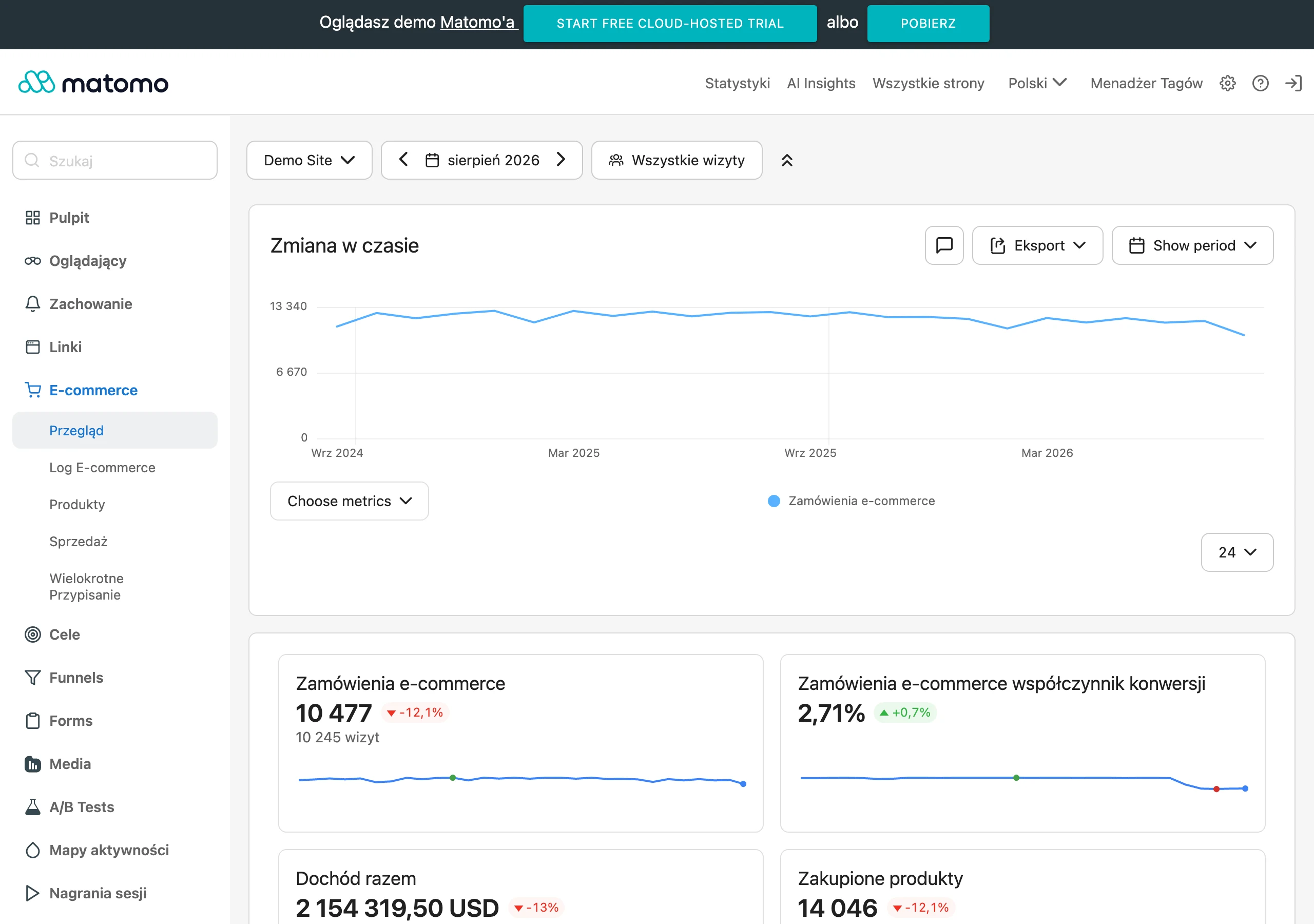
In practice, several layers need to be measured at once. The first is simple, because it concerns conversions: sending a form, booking a meeting, downloading material, a technical enquiry or sending a brief. The second is more difficult, because it concerns the quality of those conversions: traffic source, visited subpages, selected service, type of enquiry, completeness of data and later status in the CRM. Without connecting website analytics with the CRM, you cannot distinguish a valuable lead from a random one.
The most revealing metrics are those that link user behaviour with the sales result. And that is not a cliché, because only then can you see which traffic sources and which landing pages deliver contacts that move on to the next sales stages, and which generate nothing but noise. But note, it is equally important to check which forms collect data that is genuinely helpful in a conversation and which only boost the number of submissions without context. A high conversion rate on the website can go hand in hand with low-quality leads, so you must not assess the website solely on one metric.
A good measurement set does not end with the number of leads. It usually includes: the number and type of conversions, the source of entry, the user journey before contact, the sales rep’s response time, the percentage of qualified leads, the percentage of rejected leads, the number of meetings booked after contact, and transitions to stages such as proposal, negotiations or sales opportunity. If a company has a longer B2B process, there is another layer: which content the leads viewed and which of them later moved further down the process. And here the facts are as follows. This shows whether the website only collects enquiries or whether it really educates and prepares the client for a conversation.
Technically, everything starts with proper tagging of sources and events. Every form, click on a phone number, transition to the calendar, file download and brief submission should be tracked separately, otherwise it all merges into one blur. Form data must be mapped to the CRM together with traffic source, campaign, landing page and information selected by the user. If the sales rep sees only the name, phone number and message in the CRM, the website is not providing them with real operational support. Instead of context, they have guesswork, and that costs time and the quality of conversations.
You also need to catch the points where the user drops off before contact. If lots of people visit the offer page but few go any further, the problem may not be traffic but a lack of specifics: an unclear scope of service, a message that is too generic, weak CTA or a form that asks for commitment too early. The question is what exactly is stopping them. If, on the other hand, the form is submitted often but the sales reps reject most enquiries, it is worth checking whether the website properly separates intent and whether it is not pushing everyone down one path. Not every click is an opportunity; sometimes it is only casual interest.
A dashboard for such a website should answer a few simple questions. Where the best leads came from, which subpages most often preceded a valuable contact, which CTA work for different decision stages, and where the context needed by sales reps is lost. Such a report does not have to be bloated, but the key thing is that it combines marketing and sales data instead of keeping them in two separate drawers. The best time to assess a website’s effectiveness is a joint review with sales reps, because they are the quickest to see whether forms, content and user journeys are actually improving the quality of conversations.
FAQ
Frequently asked questions
How can a company website lighten the load on salespeople in sales?
It helps the user understand the offer more quickly, choose the right contact path and leave details useful for lead qualification. As a result, the conversation starts with a concrete need rather than a basic explanation of the offer.
Is a standard company profile enough to support sales?
No, because a simple brand presentation does not organise traffic or help salespeople qualify contacts. An effective website works as a sales tool and has a specific objective in every section.
Why is it worth separating pathways on a company website according to user intent?
Because a person ready to talk behaves differently from someone who is only comparing solutions or looking for technical information. One message for everyone increases the number of random enquiries and reduces lead relevance.
What information should the website show before contacting a salesperson?
It should explain the scope of the service, differences between variants, client-side requirements, integrations, limitations and the situations in which a consultation makes sense. This shortens the later conversation and limits repetitive questions.
What should a website form collect to be useful for sales?
The minimum is data that helps with qualification, such as the area of interest, scale of need, company type, timeframe or expected scope of cooperation. The form should not be too long, because that may discourage submission.
When is it worth adding more than one contact method on the website?
When users are at different stages of the decision and not all are ready to talk to a salesperson straight away. Alongside the form, for example, meeting booking, a brief, a technical enquiry or downloading a resource may work.