
A service page does not convert traffic into enquiries by accident. It must simultaneously answer a specific intent, explain the offer quickly and remove doubts before contact. If the user does not see within a few seconds that they have landed in the right place, they usually return to the search results. That is why an effective service page combines sensible segmentation, a clear message and measurable calls to action.
Intention and user segmentation
Intention and user segmentation determine whether a page responds to the needs of someone ready to send an enquiry. Someone looking for general information behaves differently from someone entering a service name with a problem, industry or location. That is why a single “offer” subpage rarely serves the whole demand well. First establish whether the user wants to understand the topic, compare solutions, or is already looking for a provider.
In practice, map keywords to stages of the buying journey. Broader phrases are more often suited to content that helps users understand the problem, while more precise phrases fit service pages. Create separate landing pages only when the intent, scope of the service, industry or local context really changes. When you publish many almost identical subpages, you easily cause cannibalisation and weaken visibility.
The best source of customer language is real queries from Google Search Console. There you can see how users describe their needs in their own words, often more specifically than in internal offer names. Long-tail phrases are particularly important, because they often show readiness to buy or make contact. Evaluate the effectiveness of segmentation through organic CTR, enquiry rate, engagement time and lead quality on the sales side.
Value proposition and CTA (Call to Action)
The value proposition and CTA must clearly say on the first screen what you offer, to whom, and what the next step is. The user should not have to guess whether you provide the right service and whether you handle their case. The H1 heading should respond to the query intent in plain language, without industry jargon. Under it, add a short description of the benefits that shows what the client actually gains.
Most often, one main CTA and one alternative work best. The main one leads to the most important action, usually a form, and the alternative to the phone for people ready to talk immediately. If you place several equally prominent buttons on the first screen, they start competing for attention. The same happens with a slider or a large banner that pushes the most important message outside the visible area.
This section should be tested continuously, because it has a direct impact on the number of enquiries. Measure CTA clicks, form starts, form submissions and the number of phone calls from call tracking. If traffic is high but forms are not being started, the problem usually lies in the message or the layout of the first screen. Test the button copy, colour and placement, but change one element at a time so you know what really improved the result.
Objection-busting content
Objection-busting content removes the reasons why a user postpones contact or leaves the page. It is not enough to describe the service itself. You need to show who it will genuinely help, in what situation and what can be expected from the collaboration.
Clear audience qualification works well. Describe who the service is right for and for whom it will not be the best choice. This reduces the number of irrelevant enquiries and improves lead quality. The better the page filters at the entry point, the less time the team wastes on conversations with no potential.
Transparent process description is also very important. The user wants to know what the stages are, what they receive along the way and when they can expect results from the work. If this information is hidden, uncertainty grows, and with it the willingness to submit the form falls.
On a service page, it is worth adding an FAQ based on real questions from sales conversations. This is better than generic marketing slogans, because it answers specific objections. If you can, show price ranges or a pricing model. Such information often reduces poor-quality enquiries and shortens the route to a meaningful conversation.
E-E-A-T signals (Experience, Expertise, Authoritativeness, Trustworthiness)
E-E-A-T signals show that there is a real company and real specialists behind the page, people you can trust with the problem. On a service page, the user judges not only the offer, but also the credibility of the provider. If they cannot see who is responsible for the service, they are more likely to delay the decision.
First show the people and the experience. The “About us” page or author profiles should contain specific roles, qualifications and areas of practice, rather than generic self-presentation. First-hand examples work even better: case studies, own observations, unique data and descriptions of the actions taken. It is these that build experience and expertise, not statements alone.
Trust is also strengthened by complete company details and formal order. Address, phone number, NIP or REGON, privacy policy and terms should be easy to find. Hidden contact details are a risk signal to the user, even when the offer itself looks good.
Authoritativeness grows when the brand is verified outside its own website. That is why it is worth linking to expert profiles, publications, interviews and other credible mentions. You also need to keep company details consistent across the internet. An inconsistent address or phone number weakens user trust and makes it harder to assess the brand’s credibility.
UX and information architecture
UX and information architecture guide the user from entry to contact without unnecessary searching and guessing. On a service page, each section should answer the next stage of the decision: what the service is, who it is for, how it works and how to get in touch. If this sequence is chaotic, the user loses their bearings and postpones action. In practice, this means fewer clicks to the form and faster access to key information.
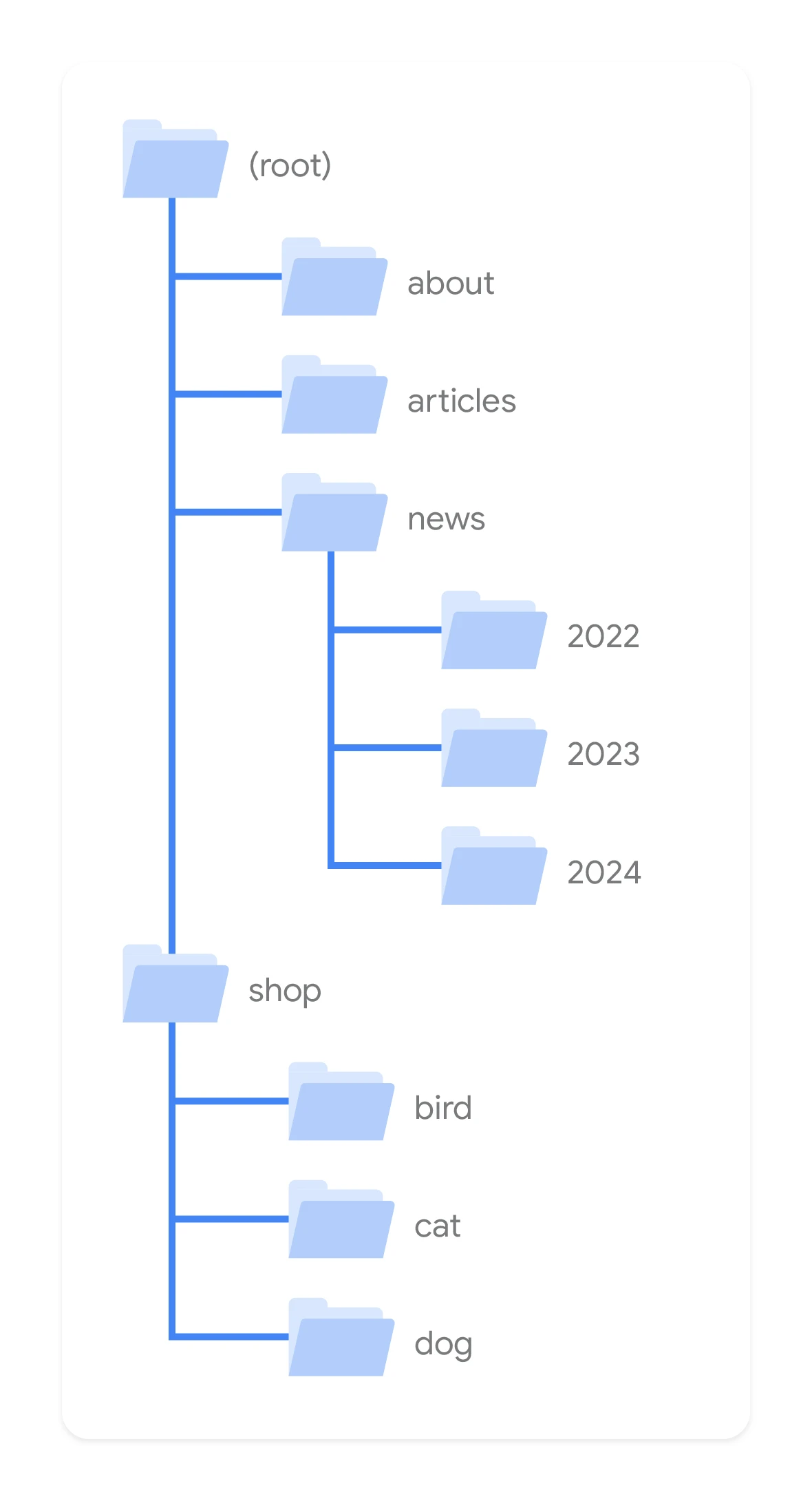
A good structure starts with a simple menu and clear navigation paths. The user should be able to find the service, company information, the collaboration process and contact details without effort. Breadcrumbs help them return to a higher level without getting lost, especially when the offer has several variants. The fewer technical and navigation decisions the user has to make, the easier it is to reach an enquiry.
Content readability is just as important as the offer itself. Short paragraphs, sensible emphasis and good contrast make the page easier to scan, especially on mobile. Hidden CTAs, buttons that are too small and aggressive pop-ups often damage the user journey more than poor content. That is why it is worth analysing bounce rate, navigation paths, heatmaps and form errors.
On-page optimisation and semantics
On-page optimisation and semantics tell Google and the user which question a given service page answers. Each subpage should have one main query and a set of closely related semantic variants. This structure organises the content, reduces the risk of mixing intents and makes it easier to build visibility for long-tail keywords. When one page tries to rank for too many different topics, it usually loses precision.
The most important thing is a logical heading hierarchy. H1 should clearly define the service in line with the intent, and the following headings should develop the topic in a predictable way. This helps crawlers understand the structure more easily and helps the user find the fragment they are interested in faster. Illogical or repeated headings weaken both readability and the page’s relevance.
Title and Meta Description also matter a great deal, because they affect CTR from search results. It is not just about adding the keyword, but about matching the promise from the result to the page content after the click. In internal links, use descriptive anchors that indicate the service context instead of vague phrases such as “check here”. Avoid keyword stuffing and copying the same metadata across many subpages, because that makes it harder to assess which page is truly the most relevant.
Analytics and KPI measurement
Analytics and KPI measurement show which page elements really generate valuable enquiries. On a service page, you need to measure not only visits, but also specific interactions that lead to contact. In practice, this means tracking clicks on the main CTA, the phone number, the email address, and form starts and submissions. Without that, you cannot tell a page that is being viewed apart from a page that is actually working for leads.
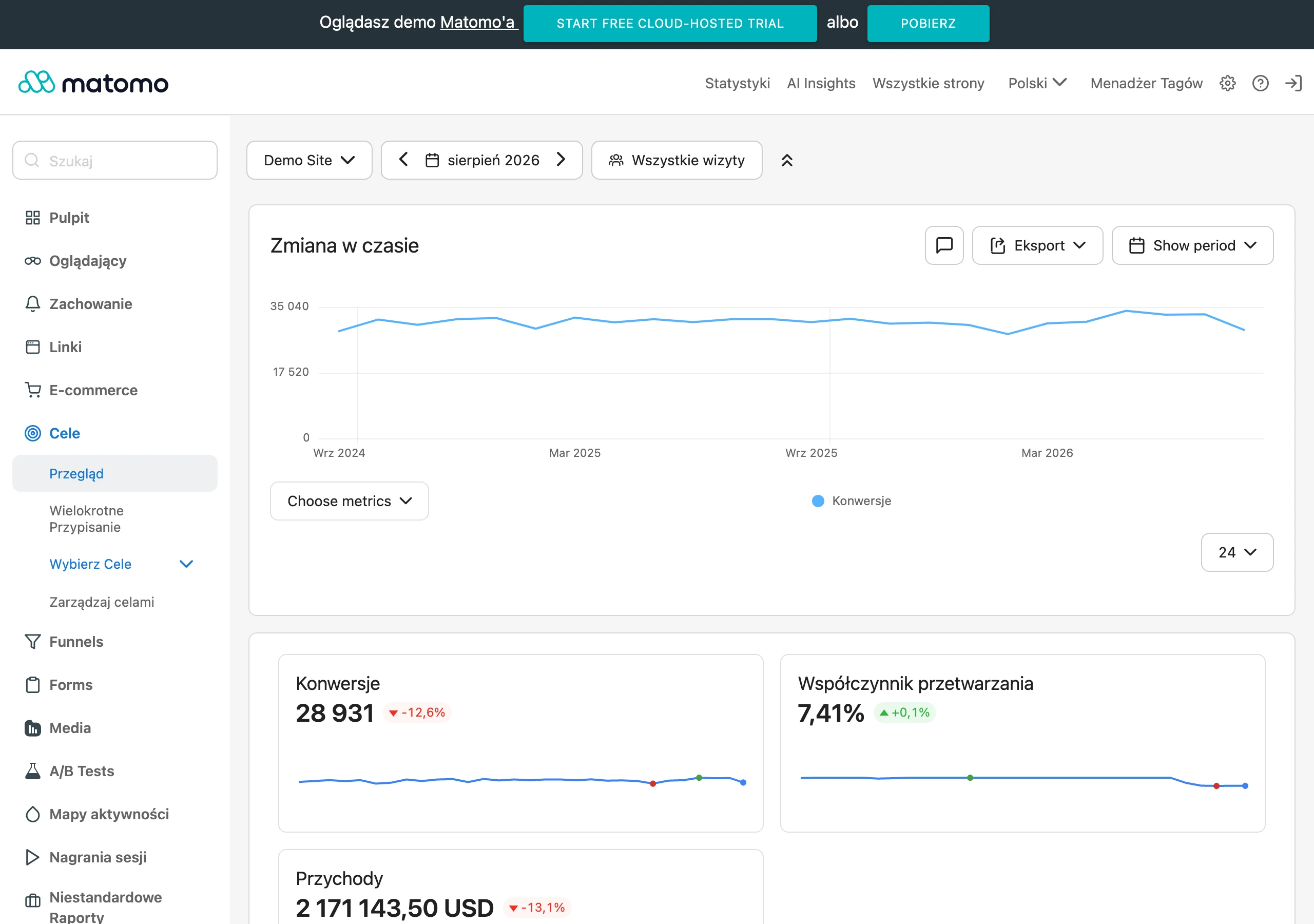
The best structure comes from splitting into micro- and macro-conversions. A micro-conversion can be a click on a CTA, while a macro-conversion is an enquiry sent or a phone call that ends in a conversation. This split shows where users drop off and which stage needs improvement. Not every form has the same value, so submissions must not be treated as a single, equal conversion.
The full picture appears only after combining analytics with CRM or sales evaluation. This makes it possible to see which traffic sources and which subpages bring qualified leads, not just a large number of submissions. It is also worth separating new and returning users, because the two groups often convert differently. For day-to-day assessment, the conversion rate for macro-goals, cost per lead, SQL rate and impact on marketing performance are usually enough.
Analysing conversion paths explains what role different channels and pages play on the way to an enquiry. A user rarely goes straight from the first click to the form, which is why traffic to a service page alone is not enough to assess effectiveness. If you base decisions only on page views, it is easy to strengthen content that is popular but weak from a business perspective. Better decisions come from observing which paths end in contact and later turn into real sales opportunities.
FAQ
Frequently asked questions
How do you build a service page so it converts visits into enquiries?
The page should quickly show what is offered, who the service is for and what the next step is. It also needs to remove doubts, guide the user through a logical path and have measurable CTAs.
Is one offer page enough for all users?
Usually not, because users have different intent and are looking for the service in different contexts. Separate landing pages only make sense when the intent, service scope, industry or location changes.
What should be on the first screen of a service page?
The first screen should include a simple H1, a short description of the benefits, one main CTA and one alternative CTA. The user should immediately know what you offer, for whom and what to do next.
Why is it worth adding FAQ and information about the cooperation process to a service page?
Because this content removes objections and reduces uncertainty before contact. A clear description of the stages, outcomes and answers to real questions from sales conversations makes it easier to decide to send an enquiry.
What trust signals help on a service page?
Specific information about the company and the people helps: roles, qualifications, experience, case studies and full contact details. Trust is also strengthened by consistent company details online and visible references to credible sources.
Which KPIs should you measure on a service page to assess effectiveness?
It is worth tracking CTA clicks, form starts and submissions, phone and email clicks, and the number of calls from call tracking. Micro- and macro-conversions, plus combining analytics with CRM, also provide a good picture.