
Contact form is often the last stretch before an enquiry for a quote, a request for help or the first contact with a company. And this is the moment of truth. If something breaks here, the user will not try to work out what went wrong — they will simply give up. A good form is not a block of fields on a page, but part of the entire enquiry handling process. The best form does not collect the maximum amount of data, only the minimum set needed for a quick and sensible response. In practice, what matters is not only the appearance, but also whether the submission reaches where it should and whether the user understands what will happen next. That is what determines whether the form supports sales and customer service, or instead quietly generates losses.
What an effective contact form is in practice
An effective contact form works without fuss. It lets the user send a submission quickly and passes it on to the right person or system without errors. Its job is not to “keep the user on the page”, but to turn a visit into a structured message that can be handled efficiently. In practice, such a submission lands in an e-mail inbox, CRM, ticketing system or another tool used by the company.
The effectiveness of a form is essentially determined by the cost of completing it on the user’s side. The more fields, harder questions and unclear messages there are, the greater the chance that someone will abandon the process halfway through. Every additional field should have a specific operational justification, not just “it might come in handy”. The problem is that “might” usually means “gets in the way”. If a given piece of information does not help to answer faster or qualify the issue better, there is usually no point in asking for it upfront.
A good form is matched to the user’s intent. And to the place they came from. Someone from a “quote” campaign expects a different set of questions than a person reporting a technical issue — the question is why we so often pretend it is the other way round. That is why one universal form for all cases usually works worse than a simple variant with topic selection that routes the submission to the right team.
In a practical assessment, it is not only the number of submissions that matters. Quality matters. If the form delivers incomplete data, generates errors or routes messages to the wrong people, it will burden the team instead of helping it. An effective form shortens the path for both the user and the company.
What elements should the ideal form contain
The ideal form has one goal: to help the user send a correct submission and to help the company respond sensibly to it. Nothing more. Usually this means a clear heading, a short note explaining what the form is for, a few well-chosen fields, a visible submit button and a clear confirmation after sending. This layout gives the user a sense of control, reduces uncertainty and limits the number of abandoned submissions.
It starts with the heading. And there is no room for vagueness here. Instead of the bland “Contact form”, it is better to promise something specific straight away: a quote, a problem report or a request to be contacted, because that sets expectations on both sides. The user should immediately know why they are filling in the form and what they can expect next.
The second point is fields matched to the goal, not to whims. In a simple form, usually all you need is a name, e-mail or phone number, subject and message content, because everything else only distracts. Additional fields make sense only when they genuinely speed up the response, for example an order number in a support form or the scope of a project in a quote form. Otherwise it becomes an interrogation rather than contact.
The third point is consent and privacy. Here, clarity is a currency, not an ornament. The user should know who is processing the data, for what purpose and where to find the privacy policy, without having to wander around the page. But be careful: marketing consent should not be mixed with the mere ability to respond to an enquiry, because that creates a barrier where fluidity is needed and simply increases distrust.
The submit button itself also matters, as does what happens after clicking it. This is the moment of truth. The button should clearly say what will happen, for example “Send message” or “Request a quote”, rather than a generic “Submit”, which carries no promise. After sending, the user must see an unambiguous confirmation that the submission has been received, as well as information about the next step, for example an estimated response time. A lack of clear confirmation after sending often causes repeat attempts, duplicates and a drop in trust.
The importance of adapting the form for mobile devices
Mobile does not forgive. A “phone-friendly” form is one that can be completed with one hand, without zooming in and without guessing what the author meant. On a smartphone, the user has less time, less patience and simply worse conditions for typing longer messages, so every extra step hurts more than on desktop. If a form on a smartphone requires too much effort, abandonment rises very quickly.
In practice, the details decide, even if that sounds unromantic. Large fields, clear labels and the right input types make a difference because a finger is not a mouse cursor. The e-mail field should open a keyboard suited to an address, the phone field a numeric keypad, and a longer message should have a comfortable text area with the right height. These are technical details, but the facts are: they shorten completion time and reduce the number of errors.
On a small screen, a short layout wins. And a minimum of decisions. Instead of many optional fields, it is better to keep only those needed for the first response, because the rest can be clarified later. A mandatory phone number, extensive dropdowns and several consents side by side are common reasons for abandonment on mobile.
There is also the issue of errors, i.e. the places where forms most often quietly fall apart. The user must not lose the entered content after a failed attempt, and the message should appear next to the specific field and clearly say what to fix, rather than frightening them with a generic “something went wrong”. The question is: how are they supposed to fix it if they do not know where and why. A placeholder does not replace a label, because once typing starts it disappears and makes orientation harder, especially on a phone.
Mobile use has to be measured separately. Do not assume that because the form works on a computer, it will automatically work on a smartphone too. Check which fields mobile users most often drop out on, how many times validation errors appear, and whether the issue affects a specific traffic source, for example an ad campaign. The best design decisions come from data on abandonments and errors, not from the form’s appearance alone.
Protecting the form against spam and abuse
A form without protection is an invitation. Protection against spam and abuse means stopping bots and suspicious submissions without discouraging genuine users. This matters because an open form quickly becomes a target for automated sends, phishing attempts and a flood of useless messages. The problem is that it does not stop at the inbox. Spam burdens the CRM, ruins reports and makes sales or support work harder.
The foundation is safeguards invisible to the average user. In practice, we are talking about server-side validation, checking required fields, content length limits, data sanitisation and a simple honeypot, i.e. a hidden field that a human will not fill in, but a bot often will. It is worth implementing lightweight protection mechanisms first, because they are often enough and do not increase friction.
The next layer is limits and behaviour monitoring. If an unusually high number of submissions comes from one IP address or from the same session, the system can temporarily block the form or require additional verification. On top of that, there is filtering of repeated content, suspicious links and known spam patterns. It sounds technical, but it works.
CAPTCHA should not be the first reaction. It works, but it can reduce form effectiveness, especially on phones and with a weaker connection. A better solution is to trigger CAPTCHA only when the system detects elevated risk. That way, legitimate users pass through without obstacles, and the bot gets an extra barrier. The question is, why make life harder for everyone if the suspicious ones leave traces anyway.
You also need to watch out for false blocks. Overly aggressive filters can reject normal messages, for example ones with a link to the client’s website or with short, unusual content. That is why it is better to log rejected attempts, check the reason for the block and provide an alternative contact channel if the form does not accept the submission. This is not a detail, it is a safety valve.
Protection is effective only when it ties security together with the handling process. The submission should be saved correctly, tagged and passed on, and the user must receive a clear sending status. The worst-case scenario is a form that blocks some genuine enquiries or accepts spam and pretends everything is working properly.
How the data validation and sending process works
Data validation and sending are the moment when the form stops being a “nice interface” and starts being a process. First you check whether the fields are filled in correctly, and then you safely pass the submission to where it is actually meant to go. A well-designed mechanism catches errors early, but it must not bite the user on the ankle at every click. The worst-case scenario. The form looks sent, but in practice nothing reaches the company.
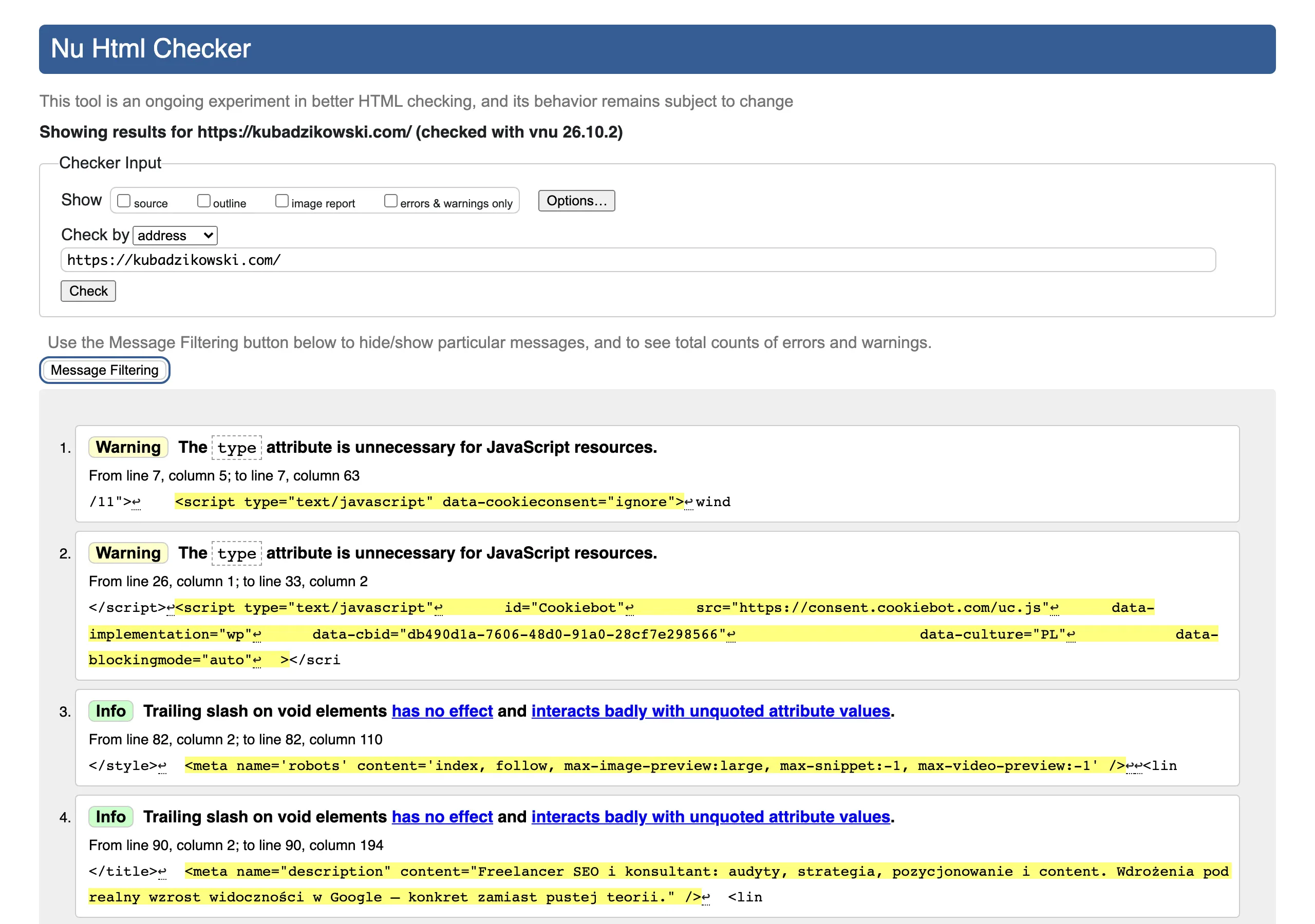
The first line of defence is browser-side validation. It handles simple things: whether the email has the correct format, whether a required field is empty, whether a file is of an allowed type. This shortens the route to fixing the issue and saves the user’s nerves, but it cannot be the only safeguard, because everything has to be checked again on the server side. Otherwise, you are asking for trouble.
Server-side validation is crucial. And it is ultimately what decides whether the data will be accepted. In practice, this is not just about field format, but also about length limits, content cleansing, blocking disallowed characters and checking attachments. The problem is that an error on the user’s side cannot mean punishment in the form of losing everything they entered. The form should preserve the data and point out the problem in the specific field, rather than throwing a generic message without a sensible explanation.
Once validation passes, the real work begins. The submission should be saved and passed on: to email, a CRM, a ticketing system or via integration to another tool. At this stage, it is worth adding tags such as traffic source, form topic or campaign, because this makes handling and later analysis easier. If the form goes to several departments, the routing must be unambiguous, because a misassigned submission works just as badly as no response. Instead of order, you then get chaos with white gloves on.
After sending, the user must know where they stand. The message should distinguish at least three situations: success, a technical error and an attempt to submit the same enquiry multiple times. The most important thing is to remove uncertainty after clicking the “Send” button. What will happen next, when a response can be expected, whether anything else is needed.
Measuring form effectiveness and optimisation
Form performance is measured not by intuition, but by user behaviour. So you check where people start filling it in, where they stop, what errors they make and how many valuable submissions ultimately reach the company. The number of forms sent alone is not enough, because it tells you neither about lead quality nor about the reasons for abandonment. The data make one thing clear: a well-measured form tells you what to simplify, what to improve and at which point you are losing contact. The question is whether you are looking at it in enough detail.
In practice, it is better to measure the whole funnel, not just the button click. The following are analysed most often:
- form display,
- start of completion,
- errors in specific fields,
- abandonment before submission,
- successful submission,
- submission quality on the sales or customer service side.
This kind of measurement quickly shows where the real problem lies: in the form itself, in a specific field, on mobile devices, or in traffic from a campaign that simply does not fit the offer. When many people start but few finish, it is most often about too much friction, an unclear message or a simple technical fault. And if there are plenty of submissions but the leads are poor, the culprit is usually bad traffic targeting or a form that is too generic to filter out casual enquiries.
The biggest benefit comes from combining data from analytics, backend logs and information from the CRM. Analytics shows how the user behaves, logs catch technical errors, and the CRM answers the most important question: did the submission have any business value at all. Only this kind of setup lets you assess the form fairly, not just through the prism of what is visible on the front end.
Optimisation should be based on observations, not gut feelings. If users often drop off at the phone number field, check whether that field really needs to be mandatory. If the number of errors rises on phones, verify the input types, field lengths, messages and how the whole thing works on a weaker connection. Simple tests, hard conclusions.
The safest approach is to change one important thing at a time and measure the effect using the same set of events. Otherwise, it is easy to make the form look prettier while at the same time worsening lead quality or routing. Good optimisation shortens the path to contact, but it cannot disrupt the company’s handling process. Instead of cosmetic tweaks — order in the flow.
Najczęstsze błędy i bariery w formularzach kontaktowych
The most common barriers in contact forms are mundane, but painful: too many fields, unclear messages, poorly handled errors and no certainty about what will happen after submission. At that point, the form stops being a simple route to contact and starts to feel like a patience test. The user will not spend long overthinking it. If something looks difficult, unnecessary or risky, they leave the site and the matter disappears. Every field the company does not need for the first response increases the chance of form abandonment.
A very common barrier is the desire to collect the whole dossier of data right at the start. A mandatory phone number, company name, budget, job title, VAT number or full address are usually not needed when someone just wants to ask a question or request contact. The problem is that the user sees a list of requirements, not help. In practice, it is better to collect the minimum and clarify the details later than to lose the submission before the button is even clicked.
The second problem is a lack of clear context. If the form does not say what it is about, who will respond and when, the user does not know whether their message will reach the right place. Whether they should send it blindly. A short note about the next step and the expected response time reduces uncertainty more effectively than a long description.
- an overly generic heading and button that do not say directly what exactly will happen after submission,
- a mandatory phone number even though an e-mail would be enough,
- consents combined in such a way that it looks like a condition that, without marketing consent, it is impossible to send an enquiry,
- attachments without clear size and file type limits,
- no information on what to do if the matter is urgent or the form is not working at that moment.
Poor error handling also does a lot of damage. A terse “An error occurred” explains nothing, and clearing all entered data after a failed attempt can cut the whole process off halfway through. A good form points to the problem in a specific field, suggests how to fix it, and preserves what the user has already entered.
Another barrier. Overly aggressive security measures. CAPTCHAs triggered for everyone, odd tasks or frequent blocks stop not only bots, but also real customers who simply want to send a message. In practice, it makes more sense to start with lighter mechanisms and only trigger stronger challenges when the system actually sees elevated risk.
Consents and legal notices can also be problematic. Marketing consent should not be a ticket of admission to a reply to a standard enquiry, and data processing information should be written in plain language and placed where the user expects to find it. Because if the form looks like a newsletter trap, trust drops immediately.
Technical and organisational errors are no less dangerous. The form may submit the data correctly, but without routing to the right person, without an acknowledgement of receipt or without a fallback plan when the integration breaks, the submission simply disappears into the void. No response after a successful submission is the same to the customer as a broken form.
What should you do about it in practice. Test the form regularly as a normal user, not just as a site administrator who knows the shortcuts and bypasses the obstacles. Checking it on a phone, on slower internet, with an incorrect e-mail, with a larger attachment and after deliberately triggering an error quickly exposes the real barriers. Most contacts are not lost because of one big problem, but because of several small obstacles gathered in one place.
FAQ
Frequently asked questions
What elements should an effective contact form include?
It should have a clear heading, a short introduction, a few well-chosen fields, a visible submit button and a clear confirmation after submission. Its purpose is to make it easy to send a correct enquiry and get a sensible response from the company.
Should a contact form collect as much data from the user as possible?
No, because every additional element increases the effort required to complete it and may discourage the user. The best form collects only the minimum data set needed for a quick response.
Why does one universal form for all enquiries perform worse?
Because users have different intents and need different questions, for example someone requesting a quote versus someone reporting a technical issue. A simple topic selector works better because it routes the enquiry to the right team.
How should a contact form work on a phone?
It should be possible to fill it in with one hand, without zooming the screen and without guessing what the author meant. On mobile, large fields, clear labels and the right input types matter.
What should you do so the form does not let spam and abuse through?
It is worth using server-side validation, a honeypot, limits, data sanitisation and filtering of suspicious content. CAPTCHA is better used only when the risk is elevated, so you do not make life harder for all users.
How can you check whether a contact form is working effectively?
You need to analyse the whole funnel: form views, starts, errors, abandonments and successful submissions. The number of forms alone is not enough, because it does not show the quality of enquiries or the reasons for dropping out.