
Jump page is a simple funnel element that often determines whether a user will go further or give up after the very first click. It works particularly well where instant alignment of the message with the traffic source matters and the number of choices needs to be limited. It does not replace a full offer page, but it streamlines the transition between an ad, email, social media or a QR code and the actual action. Its biggest value lies in the fact that it shortens the user journey while also providing a more precise measurement of what happens before entering the destination page. In practice, this solution is particularly useful in paid campaigns, mobile traffic and anywhere a single offer exists in several variants. The key, however, is not to add another step without a clear, measurable benefit.
What is a jump page and what is it used for?
A jump page is a short intermediary page designed to direct the user to one specific next step. Most often this means clicking a CTA button, choosing an offer variant, moving to a form, making a phone call or opening the right subpage. Such a page contains a minimum of content: a heading, a short presentation of the benefits, one main button and sometimes 2–3 selection options.
Its use has a very practical dimension: it organises traffic coming in from different channels and allows you to quickly match the user to the right path. When the same campaign sends people to different locations, languages, service versions or platforms, a jump page can act as a simple traffic “splitter”. Instead of forcing the user to look for the right option on the site, you immediately indicate the next step.
Compared with a full landing page, a jump page is clearly simpler and shorter. Its job is not to build full purchase intent, but to speed up the decision and redirect the user onwards. This difference matters because when a user needs offer details, pricing, reviews or answers to objections, it is better to send them straight to a more developed destination page.
A jump page also brings operational value for marketing and analytics. It makes it easier to test headings, CTAs and transition variants without rebuilding the whole site. Thanks to a separate step, you can measure clicks more precisely, verify the effectiveness of traffic sources and assess which messages actually move the user further down the funnel. However, you need to consciously decide whether such a page should be indexed, because in SEO it should not function solely as an artificial stop without real value.
How to use a jump page effectively in marketing campaigns?
A jump page in marketing campaigns delivers results primarily when it shortens the distance from the click to the actual action and remains fully consistent with the ad promise. If a user clicks an ad “Choose a city”, they should see the city selection module immediately upon arrival, not a generic homepage. That is the foundation of effectiveness, especially in paid campaigns, where every extra step and bit of “friction” can reduce performance.
To start with, it is worth identifying one overarching action. This could be moving to a form, selecting a service variant, downloading an app or contact by phone. The fewer decisions the user has on the screen, the faster they understand what to do next. For this reason, it usually makes little sense to leave a full menu, lots of secondary links or long blocks of text on a jump page.
The content should match the entry source. A different message will work after clicking a search ad, another after coming from a social media post, and yet another after scanning a QR code at the point of sale. In practice, changing the heading, image and CTA is often enough for the user to feel continuity between the ad and the page.
In campaigns, the following jump page uses work best:
- choosing a location, language or branch,
- splitting traffic between several offer variants,
- moving from an ad to a specific form or basket,
- handling traffic from a bio link, email campaign or QR code,
- directing the user to the right platform, e.g. App Store or Google Play.
Effectiveness should be assessed at the transition level, not only at the page entry level. In practice, this means properly tagging the campaign, tracking CTA clicks and verifying whether the user actually reaches the next stage of the funnel. Without measurement, it is easy to consider a jump page effective simply because it generates traffic, even though in reality it does not move users any further.
Ultimately, usability matters, especially on mobile. The page should load quickly, the button must be visible without scrolling, and the message should be understandable at first glance, within a few seconds. If the additional step does not simplify anything but only lengthens the journey, it is better to abandon the jump page and send traffic directly to the proper destination page.
How to design the structure of a jump page for optimal results?
The structure of a jump page is built around one user decision and one next step. It is not a space for a full presentation of the offer, but for a quick confirmation: “you are in the right place, click here”. The fewer elements compete for attention, the easier it is to drive the user onwards.
The first screen should close the key message without the need to scroll. In practice, that means a heading aligned with the ad or source link, a brief indication of the benefit and one main CTA. If the user arrived from a campaign with a specific promise, they must see it immediately on entry.
The content should be shortened as much as possible, but without losing clarity. The user should immediately know what they gain and what will happen after clicking. The CTA should literally name the next step, for example “Go to the form”, “Choose a city” or “Download the app”.
If the offer exists in several variants, 2–3 selection tiles usually work better than a single button. Such a layout only makes sense when the choice genuinely simplifies the next path, for example by splitting traffic by location, language, service type or device. When there are too many variants, the jump page stops organising traffic and starts dispersing it.
At the design stage, it is worth establishing a simple hierarchy of elements:
- a heading consistent with the source entry,
- one sentence with a benefit or a brief explanation,
- one main CTA or, at most, a few sensible variants,
- a minimum of secondary links, with no extensive menu,
- an optional trust element only when it speeds up the decision.
Results depend largely on the mobile version. The layout should load quickly, the button should be visible straight away, and the text readable without zooming in. On a phone, every unnecessary section genuinely reduces the chance of a click.
A good structure also means accurate measurement. It is worth tagging traffic sources, measuring CTA clicks and verifying whether the user actually lands on the correct destination page. Without this data, it is hard to determine whether the problem lies with the jump page, the ad message or the final subpage.
The best results come from iteration, not a one-off project. Usually you test the heading, button label, number of options and the order of elements. If you change several things at once, you lose the information about what really improved the result.
When is it worth using a jump page, and when should you avoid it?
It is worth implementing a jump page when it simplifies reaching the goal or helps direct the user to the right offer variant. An extra step only makes sense if it delivers a specific benefit: better message matching, easier selection or more accurate measurement. If it does not add that value, it is usually better to send traffic directly to the destination page.
This solution works especially well for traffic from multiple channels. Users arrive from ads, email campaigns, social media, QR codes or a bio link and should not always land in the same place. A jump page lets you capture this traffic and split it into the right paths without rebuilding the entire website.
In practice, it is worth using it in a few specific situations:
- when one offer has several versions and you first need to choose a city, language, platform or category,
- when a paid campaign requires the heading and CTA to be matched to the keyword or creative,
- when you want to test different messages without making changes on the main page,
- when the user is meant to take a simple action, such as a phone call, moving to a form or downloading an app,
- when you need separate click tracking before moving on to the next stage of the funnel.
There is no point using it in situations where the user needs a full set of information before making a decision. If the product is more complex and requires comparing variants, checking the price, terms or clearing up doubts, a full offer page or landing page will work better. In such a setup, a jump page only lengthens the path and increases the risk of abandonment.
You should also avoid it when the user already knows exactly what they are looking for. Someone clicking on a precise product ad or a specific service should usually land straight on the relevant subpage instead of going through an intermediate screen. Every additional step without a clear justification almost always lowers effectiveness.
The same mistakes crop up most often: too many options, an unclear page goal, a weak or overly general button, slow loading and no event tracking. A common source of problems is also inconsistent messaging between the ad, the jump page and the destination page. The user may then feel they have clicked on something other than what was promised.
SEO and website architecture are also worth keeping in mind. If a jump page serves only a campaign purpose, the decision about whether to index it must be made consciously, rather than treating it like a standard subpage for SEO. An intermediate page with no real value for the user should not be created solely to “have more pages”.
After implementation, it is worth looking not only at the number of visits, but above all at progression to the next stage, drop-offs and differences between traffic sources. When one campaign performs well and another clearly underperforms, the cause is often not the page itself but a poorly matched message at entry. That is why a jump page should be evaluated as part of the whole journey, not as a separate entity.
What are the most common mistakes when implementing a jump page?
The most common mistakes when implementing a jump page are: too many options, an unclearly defined goal, poor matching to the traffic source and a lack of proper measurement. Such a page is meant to lead to one decision, so every additional element reduces clarity. If the user has to wonder where to click and why, the jump page stops fulfilling its function. First you need to define one main action, and only then build the rest of the page.
Another very common issue is inconsistency between the ad, email, bio link or QR code and the content on the page. The user clicks on a promise of a specific benefit, but on arrival sees something vague or a different offer. In practice, this weakens trust and increases the number of exits without clicking through. The jump page must confirm exactly what the user saw before entering.
Another mistake is overloading the page with elements that do not support moving on. Menus, links to the blog, elaborate footers, several equal buttons and long blocks of text effectively distract attention. A jump page is not meant to exhaust the topic, only to direct the user to the next stage. The shorter the route to the CTA, the easier it is to assess whether the message works.
Many implementations also run into technical issues. The page loads too slowly on mobile, the button is hard to read or requires scrolling, and the click takes the user to the wrong subpage. In paid campaigns this is especially painful, because every click has a cost. If most of the traffic is mobile, the design should be assessed first on a small screen and only then on desktop.
Analytics is a separate group of problems. Often only page visits are measured, while CTA clicks, variant selection, moves to the form or phone calls are not recorded. As a result, it is difficult to determine whether the problem lies with the jump page itself, the destination page or the quality of traffic. When moving between domains or to external systems, you also need to ensure that campaign parameters are passed correctly and session tracking remains consistent.
Improper use of a jump page in SEO also happens. If such a page adds no real value and exists solely as a campaign layer, it should not be treated as a standard subpage for search engine optimisation. Otherwise it is easy to create thin, duplicated content that complicates the site structure. From the outset, implementation should decide whether the page is to be indexed or used only for campaign traffic.
What metrics should you track to assess the effectiveness of a jump page?
The effectiveness of a jump page is best assessed by how many users take the next step and how that result differs between traffic sources. So the key metric is not the number of visits itself, but the ratio of visits to clicks on the main CTA. If a page has one dominant goal, this indicator most accurately shows whether the message and layout are doing their job. The primary metric is the conversion rate to the next stage, not overall traffic on the site.
The second group of metrics describes the quality of that transition. It is worth counting clicks on the main CTA, clicks on alternative paths, tile selection, phone calls and transitions to a form, map, store or app. If a jump page leads on to another domain or an external tool, you need to confirm that the user actually reached the next step, rather than simply clicked the link. The click event alone does not always mean a successful transition.
It is also useful to have metrics showing where users drop off. In practice, bounces, exits without interaction, time to click and scrolling the page are worth checking when the CTA does not fit on the first screen. If many people scroll but few click, the problem may be the layout or too weak a promise. If most leave immediately, it is usually worth checking the match with the ad, loading speed and the clarity of the first screen.
A jump page cannot be assessed reliably without breaking the data down into segments. Results should be compared by traffic source, campaign, creative, device, location, language or page variant. The same layout can work brilliantly for email traffic and poorly for mobile ad traffic. Analysis without segmentation often masks the real issue, because averaging combines traffic with completely different intent.
It is also worth tracking the end result, not just the click from the jump page. If the page passes traffic on efficiently, but users do not submit a form, buy or make contact, the optimisation should also cover the next subpage. For that reason, it is best to link micro-goals, such as a CTA click, with the business macro goal, such as a lead, sale or registration. Only then can you see whether the jump page genuinely shortens the journey, or merely moves the problem to a later stage.
Finally, you need to keep an eye on technical metrics, because they have a direct impact on the outcome. Loading time, stability of the view on mobile and correct button functionality are not extras, but part of effectiveness. When the page loads slowly or does not work properly on mobile, even the best message will not save the result. The best measurement is one that combines click, traffic source and final conversion data in a single, consistent funnel.
How do you optimise a jump page for mobile users?
A jump page for mobile users is optimised by simplifying the view as much as possible, shortening loading time and showing the main CTA immediately on entry. On a phone, the user decides faster, but also has less tolerance for searching for information. When the button, benefit and next step are not visible without scrolling, effectiveness usually drops.
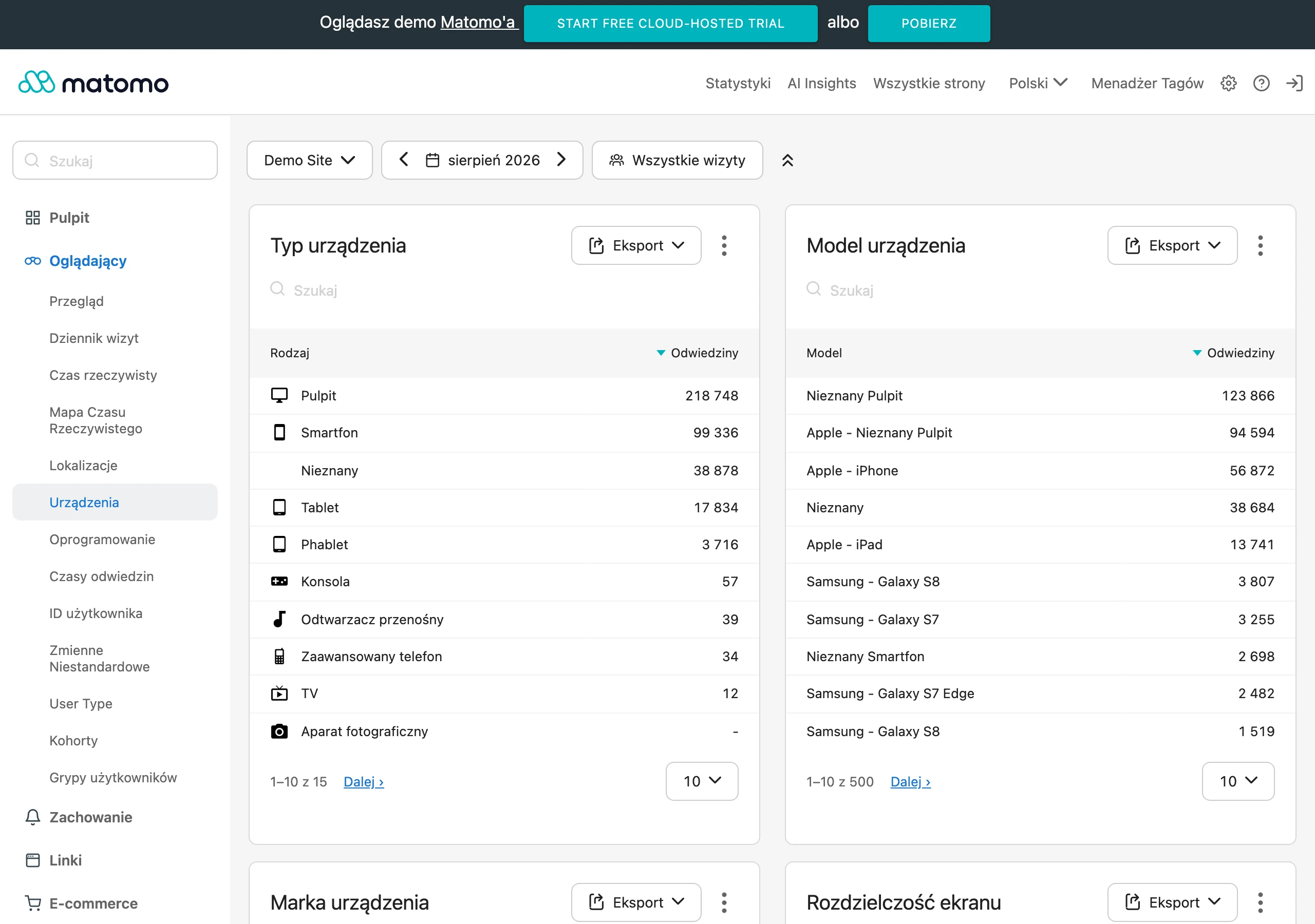
First of all, it is worth reducing elements that slow the page down or distract attention. Large graphics, heavy video, animations and pop-ups often get in the way more than they help. A mobile jump page should load quickly even on a weaker connection, so it is a good idea to use lightweight assets and a simple layout.
The content should be shorter than in the desktop version and immediately confirm the promise from the ad, email or QR code. The heading must clearly show where the user has landed and what they will gain by clicking дальше. On a small screen there is no room for several equally important messages, so each additional section competes with the main action.
The CTA button should be large, clear and easy to tap with a thumb. The best option is one main action with a clear description, for example “Go to the form”, “Call now” or “Choose a city”. If two or three options are needed, they should be shown as simple, easy-to-hit tiles, without small links placed next to one another.
It is also worth adapting the transition logic to the device and user context. On a phone, it is more often effective to redirect straight to a call, map, app store or a short form, rather than sending the user to a detailed subpage. When mobile traffic lands on a page that requires long reading or filling in many fields, the jump page no longer shortens the journey, but starts to lengthen it unnecessarily.
After implementation, it is worth analysing results separately for mobile and desktop, because the same solutions can work differently on both devices. Pay particular attention to CTA clicks, transitions to the next step, abandonment and loading time on phones. The most practical test is a simple scenario: a user enters from an ad on a phone and within 3-5 seconds should immediately know what to do next.
FAQ
Frequently asked questions
How does a jump page work and what is it for?
It is a short intermediate page that directs the user to one next step, most often via a CTA, a variant choice, a form, a phone call or the right subpage. Its role is to shorten the journey and organise traffic from different channels.
Does a jump page replace a landing page?
No, because its job is simpler than that of a full sales page. It does not build the full case for purchase; it only speeds up the decision and redirects the user onwards.
When is it worth using a jump page in marketing campaigns?
It is worth using when one offer has several variants, traffic comes from multiple channels or there is a need for a quick choice of city, language, platform or category. It also works well for simple actions such as a form, a phone call or app download.
What should an effective jump page look like?
It should be built around one decision and one next step, with a short message, a consistent heading and one main CTA. If there are variants, it is best to limit them to 2–3 sensible options.
Why is consistency between a jump page and an ad so important?
Because the user needs to immediately see what they expected after clicking, for example a specific location or offer variant. An inconsistent message increases exits and weakens trust.
What metrics are worth tracking to assess a jump page?
The most important one is the transition rate to the next stage, that is the relationship between visits and clicks on the main CTA. It is also worth measuring clicks on alternative paths, form completions, phone calls, and bounces and exits without interaction.