
The entry page is the point at which a user decides within a few moments whether they have found what they were looking for. When, in the first few seconds, they do not get a clear answer to their need, they most often return to the search results, move on from the ad, or put the decision off until later. That is why optimising such a page is not about “making it look nicer”, but about removing obstacles and guiding the user towards a specific action. The biggest impact on conversion is usually the match between the promise of the entry source and what the user sees after clicking. In practice, this means combining traffic analysis, a well-thought-out content structure, simple UX and reliable measurement. This article shows how to approach it step by step.
What is an entry page and its role in conversion
An entry page is the first subpage or screen a user lands on from an ad, Google, social media, email marketing or a direct visit. Its role is not to tell the company’s whole story, but to capture the entry intent and lead the user towards one main action. This could be a purchase, submitting a form, a phone call, signing up or moving to the next step.
In practice, a good entry page answers three basic questions: what is it, who is it for and what should I do next? If the user has to fill in the offer, conditions or next stage for themselves, conversion usually drops. The less uncertainty and the fewer unnecessary choices on the page, the greater the chance that the user will take action.
The role of the entry page changes depending on the type of traffic. In a sales campaign, it should close the decision or direct the user to the basket. In services and lead generation, it more often filters the user and encourages contact. For traffic from problem-based queries, you first need to explain the solution and only then ask for an action.
The outcome is determined to the greatest extent by message consistency. If the ad promises a specific service, discount or timeframe, the user should see the same thing immediately after landing. A mismatch between the ad, the search result and the page content undermines trust and increases drop-off already on the first screen.
The most common mistakes include: too generic a heading, several equal-priority goals on one page, too long a form, no price or conditions, and a poor mobile version. Other problems can be elements that distract attention, such as distracting links, heavy graphics or a CTA hidden too low down. An entry page should be built around one business goal, not around a full company presentation.
Conversion is affected not only by the content, but also by the speed of decision-making. A mobile user usually scans the page faster, reads less and gives up more quickly when friction appears. That is why the following matter: fast loading, a clear first screen, a clearly visible button and a short path to completing the action.
How to analyse traffic sources and user intent
Analysing traffic sources and user intent comes down to establishing where a given person came to the page from, what they were looking for before entering, and whether the site delivers that goal. Without such recognition, it is easy to confuse an offer problem with a traffic quality problem or with the page itself. That is why it is worth doing this stage first, before you start improving headings, forms or section layout.
To start with, split traffic by source and type of entry. A user from a brand campaign behaves differently from someone coming from an ad for a problem-based keyword or from a social media post. Traffic from maps, organic results or remarketing has different expectations too. Do not assess the entry page “on average for everyone”, because in such an averaged view the key differences between segments simply get blurred.
The most useful thing is to combine source data with on-site behaviour data. The sheer number of sessions or the bounce rate is not enough, because it does not show where the user actually loses interest. It is better to track CTA clicks, scroll depth, form opens, form abandonment, phone number clicks, basket transitions and other intermediate steps.
- check the source, medium, campaign and the specific ad message or query,
- compare devices, because mobile often reveals different barriers than desktop,
- see whether new and returning users respond in the same way,
- analyse drop-off points: the first screen, the form, the pricing section, FAQ, checkout,
- separate the main conversion from micro-conversions so it is clear at which point real interest ends.
User intent is easiest to read from the entry context. If someone enters a specific commercial query, they usually expect quick access to terms, price, availability or contact details. When they land on an informational keyword, they more often first need an explanation of the problem, the benefits and how it works. This difference should be reflected in the first screen content, sales arguments and page length.
In paid campaigns, analyse not only the channel, but also the creative and the promise with which the user clicks. Two ads leading to the same page can attract traffic with completely different mindsets. One promises a promotion, another speed of delivery, a third specialisation in a specific problem. If the page communicates one general message for everyone, part of the traffic will be mismatched from the very first seconds.
It is also worth tracking traffic quality signals broken down by device, location and time of day. Sometimes the problem is not the page itself, but poorly matched traffic that simply has no conditions to convert at this stage. At other times it is clear that desktop performs correctly, while mobile is losing users because of a too-small button, a malfunctioning form or an overly heavy first screen.
At the final stage, the analysis should lead to a clear conclusion: which traffic segment has the greatest potential, where the strongest drop-off occurs and what the user cannot find after landing on the page. Only then does it make sense to plan changes on the site. The most accurate optimisation decisions result from combining quantitative data, behavioural observations and the actual landing intent.
Stages of optimising a landing page for better conversion
The process of optimising a landing page for conversion starts with choosing one goal and ends with continuous testing of changes based on data. Without following this order, it is easy to refine elements that look good but have no impact on the user’s decision. First, you need to define which conversion is the priority, because it sets the entire structure of the page.
- First, the main conversion and the role of the page are defined: sale, lead, contact, sign-up or moving to the next step.
- Next, entry sources, queries, ads, devices and the points where users drop off are analysed.
- The next stage is to verify the consistency between intent and the message on the page, especially in the area of the heading, offer and CTA.
- Then barriers are diagnosed, such as an overly general message, several equal priorities, an extensive form or weak mobile.
- After the diagnosis, the page layout is designed around the user’s decision: value proposition, benefits, trust signals, objection handling and action.
- The first screen is refined separately, because this is where the decision is most often made whether the user stays on the page.
- The action path is also simplified: the form, the number of clicks, error messages, the next steps and mobile accessibility.
- At the end, tracking for main and supporting events is implemented, and then hypotheses are tested and the weakest points are improved.
In practice, the most valuable thing is checking the consistency between the entry source and the landing page. If an ad promises a free quote, but after clicking the user lands on a general company description, conversion usually drops regardless of the quality of the design. The mismatch between the landing promise and the page content is one of the most common reasons for poor performance.
The first screen is worth treating as a separate decision zone. The user should immediately see what it is, who it is for and what to do next. When those three pieces of information are scattered or hidden under a graphic, the campaign advantage quickly disappears.
The next important stage is reducing friction. This usually comes down to shortening the form, simplifying field labels, improving validation and removing unnecessary exit links. Every additional step or form field increases the cost of the decision and raises the risk of abandonment.
Optimisation does not end once the new version of the page has been implemented. It is worth measuring not only the main conversion, but also micro-conversions such as clicking the phone number, opening the form, scrolling to the offer or selecting a service variant. It is precisely these that indicate whether the problem lies in the offer, the page layout or the form itself.
Practical tips on design and content
Practical tips on design and content come down to one thing: the page should lead the user to one decision via the simplest possible path. The best-performing pages are those that do not try to say everything at once, but instead answer the specific question of the person arriving from a given source. That is why content should be built not from the company’s perspective, but from the user’s need.
The heading should clearly name the offer and the benefit, rather than sounding like a generic brand slogan. Beneath it, it is good to specify who the solution is for, in what situation it helps and what exactly will happen after clicking the CTA. If the heading can be pasted onto any competitor’s page and still fits, it is usually too vague.
The CTA should be visible, specific and placed in the context of the decision. On a short page, often one main button repeated in key places is enough, while on a longer one it is worth adding further entry points where the user is already ready to act. Messages such as “Send an enquiry”, “Book a call” or “Check a quote” usually work better than just “Click here”.
The content below the first screen should address real objections. The user most often wants to understand what the process looks like, how long it will take, what they will get after submitting the form and whether the offer suits their situation. Instead of long blocks of copy, it is better to show a clear sequence, benefits, conditions, how cooperation works, proof of credibility and the next step.
Trust signals make sense only when they support the decision, rather than serving as page filler. Testimonials, case studies, process information, contact details or clear terms of cooperation help when they remove a specific uncertainty for the user. In service industries, information about response time, the scope of the service and what happens after submitting the form is often more important than decorative sections.
The mobile version requires a separate approach, because this is where conversion problems most often appear. The CTA button must be easy to tap, the text readable without zooming in, and the form short and convenient to complete on a phone keyboard. If the page works well on desktop but slows down or frustrates on mobile, the campaign result will be understated.
Finally, it is worth remembering what to avoid. Do not combine several equal-priority goals on one page, do not hide the price or terms if they are crucial to the decision, and do not start with cosmetic changes without diagnosis. First, the offer, heading, CTA, form, trust, speed and measurement are refined, because these are the elements that most often determine the result.
The importance of measurement and iteration in landing page optimisation
Measurement and iteration are key, because without them it is hard to distinguish a real improvement in conversion from changes that only give that impression. The raw number of entries and final conversions is usually not enough to make an accurate diagnosis. You also need to see what is happening before the decision: CTA clicks, form opens, field abandonment, scroll depth, moving to the next step, and phone contact. Micro-conversions show where the user is still interested, but is running into a barrier.
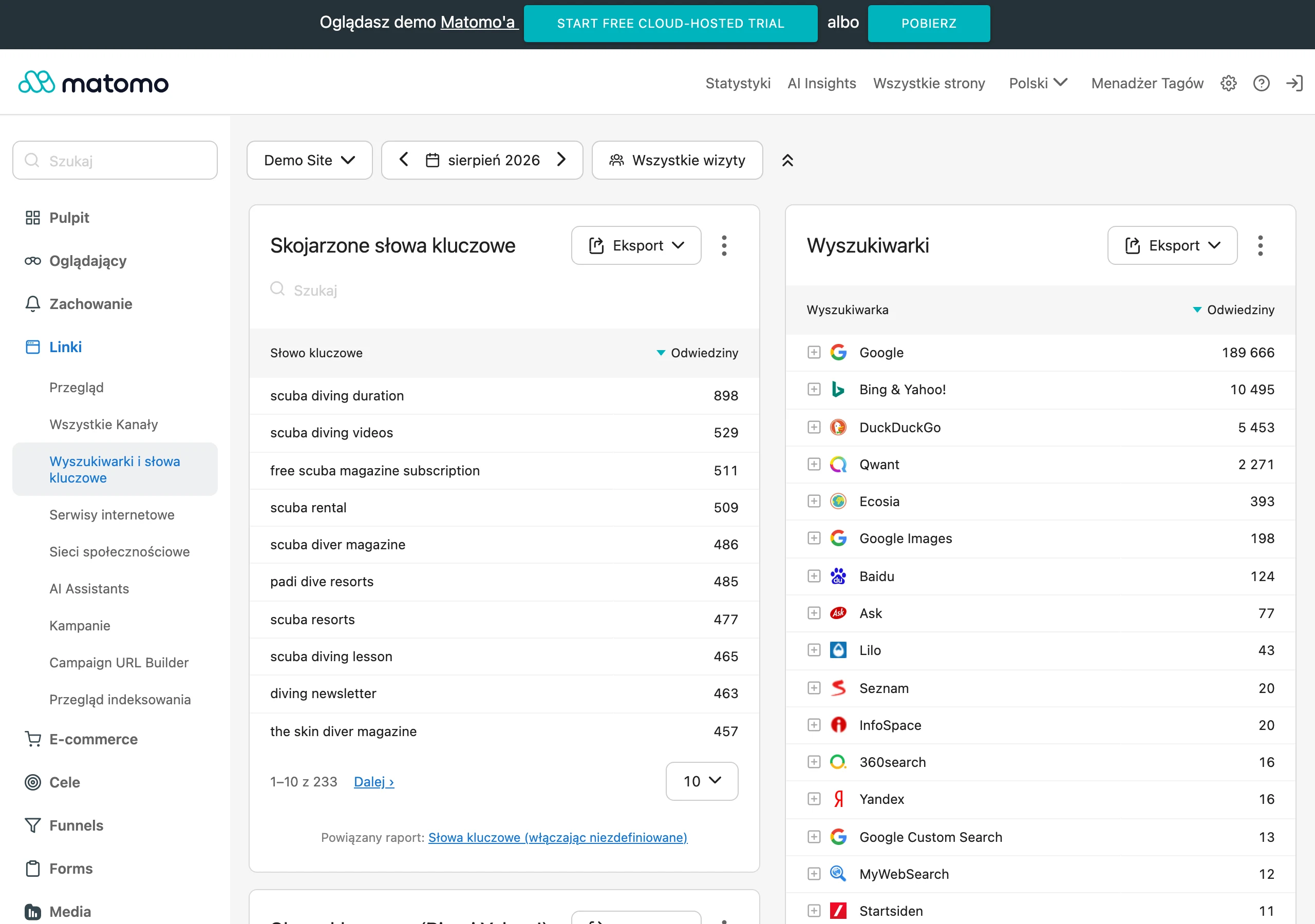
Good measurement starts with identifying one main goal and a few supporting events. If the page is meant to collect leads, then beyond form submission it is worth measuring form start, validation errors, phone number clicks, and visits to the offer section. This makes it easier to assess whether the issue lies with traffic quality, the offer itself, or rather the technical difficulty of completing the action.
In practice, measurement has to be planned carefully, because data can be incomplete due to consents, script blocking and discrepancies between platforms. That is why it pays to combine several sources: event analytics, advertising data, CRM, call logs, forms, and on-page behaviour observation. If you only measure the final form, you will often not notice that the problem starts much earlier, for example on the first screen or on mobile.
Iteration means making changes based on a hypothesis, not the team’s taste. First you identify the problem, then you point to the element that may be causing it, and only then do you implement the change and verify the result. A sensible hypothesis might sound like this: simplifying the heading will increase moves to the form from the offers campaign, because the current message is too generic in relation to the ad. This way of working allows you to build a backlog of changes and avoid wasting time on random fixes.
The biggest gains come from iterations on elements that genuinely affect the decision. These are usually the heading, the offer, the CTA, the first-screen layout, the form, trust-building sections and mobile logic. Do not start with interface polish if you have no evidence that it is what is blocking the traffic. In many cases, shortening the form or making it clearer what will happen after the click produces a better result than changing colours or illustrations.
It is also worth remembering that the results of a test or an implemented change should be read in the context of the traffic segment. The same variant may work differently for brand campaigns, differently for traffic from problem keywords, and yet differently again on a phone. The best optimisation decisions come from combining quantitative data, behavioural observation and an understanding of entry intent.
Najczęstsze błędy przy optymalizacji stron wejścia
The most common mistakes in optimising entry pages stem from a mismatch between the content and user intent, and from making the decision too little simpler. Very often one page tries at the same time to sell, educate, direct to contact and promote several offers at once. As a result, the user does not get a clear cue about what their next step should be.
Another very common problem is a mismatch between the message in the entry source and what the user finds on the page. Someone clicks an ad or a search result with a specific promise, and after landing sees a generic company description or an offer laid out too broadly. This lack of consistency quickly undermines trust and increases drop-off. If the heading does not confirm the reason for entry, the page loses part of the traffic before the user starts reading.
Another mistake is overloading the page with content, outgoing links and additional choices. On an entry page, every element should work towards the main goal, not pull away from it. An extensive menu, too many secondary sections or aggressive banners more often distract than help. This is especially painful on mobile devices, where attention and space are limited.
Many problems result from an underworked offer and weak handling of objections. The user does not clearly see what they are getting, who it is for, how much it costs or what the price depends on, what the process looks like and what will happen after the form is submitted. When this information is hidden or incomplete, the decision is put off until later. Uncertainty blocks conversion more often than a lack of interest itself.
A separate category of mistakes is the form and mobile UX. Too many fields, unclear labels, poor error messages, an inconvenient date picker, a barely visible CTA or slow page loading can ruin even a strong message. The problem grows when the company does not measure where users abandon the process and does not know at which step they drop off. In practice, this means the team improves the copy, even though the real barrier lies in the form handling or the phone interface.
A frequent mistake is also testing without proper measurement or without a sensible hypothesis. Visual details are changed because they are easy to implement, while the page’s main problem is ignored. It is better to start with a diagnosis: which traffic source is underperforming, where engagement drops, which segment has the lowest effectiveness and which element of the journey is actually causing it. The most expensive mistake is optimisation based on assumptions instead of data and observation.
What elements of an entry page have the biggest impact on conversion
The strongest impact on conversion comes from: consistency of the message with the entry source, the first screen, offer precision, the CTA, the form, trust-building elements, speed and the quality of the mobile version. When any of these points fails, the user usually does not go any further, even if the service itself is valuable. In practice, it is better to treat the entry page as a sequence of decisions rather than a set of independent sections. First it must be obvious that the user is in the right place, only then is it worth expanding on the offer details.
- consistency of the heading and content with the ad, query or link from which the user entered,
- the first screen: value proposition, identification of the audience and information on what to do next,
- clear CTA and a short, simple path to completing the action,
- the offer described specifically, without generalities or omissions,
- trust signals and information that reduces the risk of making the decision,
- loading speed, readability and ease of use on mobile devices.
The first screen often determines whether a user stays on the page, returns to search results or simply closes the tab. The heading should match the entry intent, rather than sound like a generic company slogan. A good first screen explains within a few seconds what it is, who it is for and what the next step should be. If the heading does not directly refer to the promise from the ad or the user’s query, conversion usually drops right from the start.
Just as important is the offer itself, that is, what the user actually gets and on what terms. The problem is often not only the lack of a price, but also the lack of specifics: the scope of the service, turnaround time, cooperation model or information about what happens after sending the form. The user does not need to know every detail, but should understand the value and the logic of the next step. The longer the decision-making process, the greater the role played by sections that clarify the benefits and answer the most common objections.
CTA and form have a direct impact on conversion, because they turn interest into action. The button should be clear, unambiguous and placed where the decision arises naturally, not only at the bottom of the page. The form should collect only the information needed at this stage, because every additional field raises the entry barrier and increases abandonment. More often than not, simplifying the form and refining the CTA delivers more than cosmetic changes to the page design.
Trust is also hugely important, especially when a user has to leave their details, call or start a more expensive service. Reviews, case studies, contact details, process description, FAQ and clear terms of cooperation help close the most common doubts. It is not about adding as many badges or logos as possible, but about showing the information needed to make a decision at exactly this stage. A good trust section is not page decoration, but a way of removing a specific user uncertainty.
The final result is also heavily influenced by page performance and the refinement of the mobile version, because a large share of visits comes from phones. When the first screen loads too slowly, the text is too small, the CTA blends into the background or the form does not work with the mobile keyboard, the user gives up before even assessing the offer. In practice, it is worth monitoring not only the average load time, but also how quickly the content appears, when the button is actually clickable and whether the page shifts elements while loading. On mobile, simplicity matters: fewer distractions, shorter sections and easy completion of one main action.
FAQ
Frequently asked questions
How do you optimise an entry page for conversion step by step?
First define the page’s main goal, then analyse entry sources, intent and drop-off points. Next, align the headline, offer, CTA and form, and finally measure micro-conversions and test changes.
Should an entry page have one main goal?
Yes, because an entry page should lead to one most important action. Several equally important goals distract the user and usually reduce conversion.
Why is message match between an ad or search result and an entry page so important?
Because the user must immediately see what was promised before clicking. When the message is inconsistent, trust falls and drop-off rises on the first screen.
What most hinders conversion on an entry page?
Most often, a too-generic headline, an overlong form, no price or terms, and a poor mobile version hurt performance. Distractions such as unnecessary links and heavy graphics are also a problem.
How do you analyse traffic sources on an entry page?
You need to separate traffic by source, campaign, device and type of entry, rather than looking at the average for everyone. Then it is worth comparing this with user behaviour, for example CTA clicks, scrolling and form abandonment.
Does the mobile version affect an entry page’s conversion?
Yes, because mobile users read less, scan pages faster and give up more quickly when friction appears. That is why fast loading, a clear first screen, an easy-to-click CTA and a short form are important.