
Interactive content effectively engages the user because it requires a response and immediately provides feedback. Instead of passive reading, there is a decision to make, an answer to give, a comparison, a calculation or a result tailored to the context of the audience. This changes the way the material is consumed and gives the company more insight into users’ real needs. Well-designed interaction is not a decorative element of a website, but a tool that at the same time focuses attention, organises intent and directs the user to the next step. In practice, what matters is not so much the format itself as its alignment with the business goal, stage of the journey and traffic source. That is why interactive content is worth planning as a process: from the logic of questions and results, through analytics, to later optimisation.
What is interactive content and how does it affect user engagement?
Interactive content is a format that requires the user to take an action, rather than simply read or watch the material. It can take the form of a quiz, calculator, survey, test, configurator, checklist or interactive infographic. Its aim is not only “fun”, but to obtain a response that makes it possible to better tailor the message, result or offer.
Engagement increases because the user has a specific reason to go deeper into the content. Instead of browsing vague statements, they move through successive steps and see the point of their activity. The key thing is that every interaction is a signal of intent: it shows what the user is looking for, what they do not understand and how close they are to a decision.
Well-designed interactive content consists of three elements. First, it gives the user value, for example a result, a recommendation or a simplified comparison. Second, it has a simple completion path, meaning clear steps, short questions and visibly presented progress. Third, it leads to the next action, such as a sign-up, contact, downloading a resource or moving on to the offer.
In practice, it is not about a single module to insert on the page, but about a specific way of working with content. You need to define the goal, design the logic of questions and answers, prepare the messaging, implement measurement and then check where users drop off. When any of these elements is lacking, engagement usually falls, even if the format looks attractive.
Why are interactive content key in today’s digital context?
Interactive content is key today because users increasingly expect a quick answer, personalisation and a concrete result instead of a general message. A single article or static page is often not enough when the audience wants to calculate the cost straight away, check whether a solution fits or compare variants. Interaction shortens the path from interest to decision.
The way content effectiveness is measured has also changed. It is no longer enough to look only at pageviews or average time on page, because these metrics do not determine whether the user has actually moved one step further. In digital marketing, the quality of interaction matters more and more: start, completion, depth of answers, CTA click and transition to the next action.
Technology and the way content is consumed also play a major role. Most interactions need to work smoothly on mobile, without heavy components, too many fields or unclear screens. If the mechanism is too long or inconvenient on a mobile device, the user gives up faster than with plain text.
It is also increasingly important what happens to the data after the interaction ends. The quiz result, calculator answers or choices in a configurator should flow into analytics, and sometimes also into CRM or marketing automation. This means interactive content does not end on the results screen, but becomes part of further communication and audience segmentation.
Privacy and measurement compliance cannot be overlooked either. The user should know clearly what data they are providing, for what purpose it is being collected and what will happen to the result or lead. The best results come from interactive content that is at the same time useful for the audience, technically lightweight and correctly connected to analytics.
What steps should be taken to implement interactive content effectively?
Effective implementation of interactive content requires defining the goal, designing the logic, implementing measurement and later optimisation. Most problems come from doing things in the opposite order, that is, choosing an attractive format without a clearly defined business role. First you need to establish what should improve: the number of leads, the quality of segmentation, user education or sales support. Only then is it worth deciding whether a quiz, calculator, survey or configurator will be better.
At the start, it is sensible to narrow the project down to one main goal and one basic user scenario. It is also worth checking where the traffic comes from, what device the audience uses and what they expect after landing on the site. You design interaction differently for a user from an ad campaign and differently for someone who is already comparing offers and looking for a specific answer.
- Define a measurable goal and success metrics, e.g. interaction start, completion, CTA click, form submission or moving on to the offer.
- Analyse user intent, traffic sources, the funnel stage and the most common decision barriers.
- Choose a format that solves a specific problem, not just one that looks good.
- Design the logic of questions, answers, transition conditions and final result variants.
- Prepare short messages, clear buttons, a sensible results screen and the next step after completion.
- Implement event tracking, ensure privacy compliance, responsiveness and integration with CRM or automation if the result is meant to trigger further communication.
The moment of capturing contact details is crucial. When the form appears too early, the user often gives up before seeing any real value. Usually better results come from showing a useful outcome first, and only then inviting the user to get in touch, sign up or download the material.
The work does not end after publication, because only the data show whether the mechanism is clear to the audience. It is worth analysing which step users drop off at, which questions are too general, and whether the result actually leads to the next action. Most often it is not the format itself that gets improved, but the length of the path, the order of the questions, the headline on the first screen and the way the result is presented.
How to match the interactive content format to business goals?
The format should be matched to the business goal and the user’s decision stage, because the same mechanism does not work equally well in every situation. If the goal is to spark interest and quickly introduce the topic, a different format works better than when the user wants to calculate the cost, compare options or receive an offer recommendation. A good decision starts with determining what specific action the user should take after the interaction ends.
- A quiz or test works well when you want to segment the audience, educate them and direct them to different communication paths.
- A calculator works best when the user wants to estimate cost, savings, profitability or the scale of a problem.
- A survey is suitable for collecting opinions, researching needs and identifying barriers before changing the offer or communication.
- A configurator is a good choice when a product, service or package needs to be matched to several variables.
- A comparison of options or a decision map helps the user narrow down the choice when the offer is broad or too similar.
- An interactive checklist or a simple self-assessment works well in lead magnets and educational content when the audience wants to quickly assess their situation.
At the top of the funnel, shorter, lighter formats that deliver a quick result and do not require much commitment usually work better. Closer to the purchase decision, the user will accept more steps, as long as they see the point and get concrete value. That is why a quiz may be a good way to start the relationship, but a calculator or configurator more often supports the final choice.
Choosing the format should also take into account traffic source and technical limitations. Mobile traffic handles long paths, heavy components and less readable fields worse, so even a good idea can lose effectiveness because of a poorly matched interface. If most visits come from a phone, a simpler format with one clear result will usually beat a more complex mechanism.
In practice, it is worth looking not only at the completion rate, but also at how it translates into business results. A quiz with a high completion rate can be of little use if it does not segment the audience in a way that is genuinely helpful for sales. Conversely, a lower number of completions in a calculator may turn out to be more valuable if it ultimately leads to a better-matched lead or directs the user to the right offer.
What mistakes should you avoid when designing interactive content?
When designing interactive content, it is worth avoiding missteps that add friction, reduce completions or result in collecting data without real business value. More often than not, the problem lies not in the technology, but in the logic of the entire experience. The user should quickly understand what they need to do, why they are doing it and what they will see at the end. When that value is not clear on the first screen, most users drop off before they even start the interaction.
Another common mistake is designing from the format rather than from the decision the user wants to make easier. A quiz, test or calculator on its own does not automatically increase engagement. It starts to work only when it responds to a specific need, for example helps estimate a cost, choose an option or assess one’s own situation. If the mechanism looks impressive but does not lead to a useful result, the interaction ends with curiosity, not action.
- A path that is too long and too many steps, especially on mobile.
- Questions that are too general and do not add anything to the result or segmentation.
- Asking for contact details before the user has seen any value at all.
- An unclear result without interpretation and without indicating the next step.
- Artificial gamification that lengthens the process but does not support the user.
- Missing integration with analytics, CRM or marketing automation.
- A technically heavy component that loads slowly and works poorly on a phone.
- Missing information about what data is being collected and for what purpose.
A particularly costly mistake is blocking the result with a form too early. In many situations it is better to show at least part of the value first, and only then offer sign-up, contact or a further recommendation. The closer to the end the user can see a concrete benefit, the greater the chance that they will consciously move on to the next step.
A separate issue is poorly phrased questions and answers. When questions are too abstract, ambiguous or require longer reflection, the user starts guessing or abandons the path. This harms both the experience and the data. A good question should be short, clear and genuinely necessary to build a sensible result.
Many projects also fail at the result presentation stage. The result should not be an empty label like “Your profile is X” if it does not explain what that means and what the next step should be. A good result must interpret the answers, suggest a decision and lead to a logical CTA at the same time. Without this, interactive content generates clicks, but does not move the user further down the funnel.
Technical issues should also not be overlooked. The absence of a progress indicator, poor field validation, buttons that are too small, mobile display problems and lack of accessibility quickly reduce completion rates. In practice, a simpler mechanism implemented without errors works much better than an elaborate format that only looks good on slides. The biggest losses are most often caused by small UX frictions, not by the content idea itself.
How to measure effectiveness and optimise interactive content?
The effectiveness of interactive content is assessed across the entire user journey, not just by the number of completions. A high completion rate on its own is not a success if the result does not translate into better leads, sales or sensible segmentation. You need to analyse user behaviour, the quality of the collected answers and the further business impact in parallel.
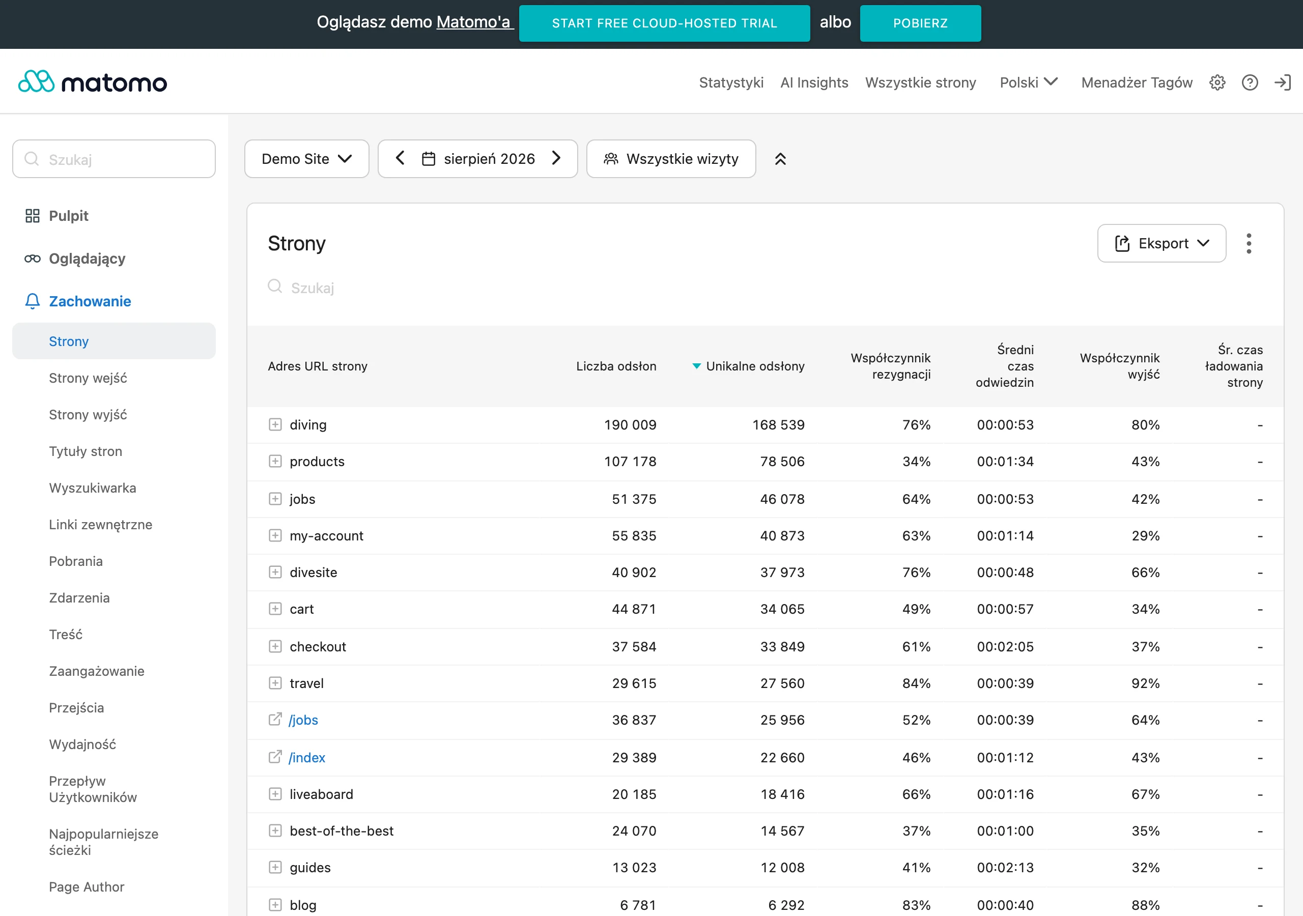
The basis is correct event tracking at subsequent stages of the interaction. In practice, it is worth measuring entry into the module, start, transitions between steps, abandonment, completion, CTA clicks, form submission and the assigned result. This makes it possible to determine whether the problem is the headline, the first question, the number of steps, or only the final screen. Without such measurement, optimisation turns into guesswork.
At the analysis level, the most insight comes from looking at several metrics together: start rate, completion rate, abandonment at specific steps, time to progress, share of individual results, CTA clicks and conversion after the interaction ends. It is worth comparing them by traffic source, device, campaign and user type. It often turns out that the same quiz performs well from organic traffic, but poorly from ads, because audiences arrive with a different intent.
The number of answers alone is not enough if you do not know whether that data is useful. That is why you need to assess its quality: whether the answers are consistent, whether the results make business sense, whether the segments are sufficiently distinct and whether the collected leads can be handled sensibly in the next steps. A smaller volume of data that helps with decision-making is better than a large set of random clicks.
It is best to start optimisation with the weakest point in the journey. If users do not start the interaction, the value proposition and the first screen need refining. If they drop off halfway through, the length, question order or excessive cognitive effort are usually to blame. If they finish but do not click through, the result, recommendation and CTA need improving.
Good tests should be narrow and easy to measure. Rather than rebuilding everything at once, it is better to change one element, for example the headline, the number of questions or the moment the form is displayed. Then, without guesswork, you can see what actually tipped the balance of the result. Most often, simplifying the first steps and fine-tuning the final recommendation makes the biggest difference.
It is also worth looking beyond the module itself. When interactive content is connected to CRM or marketing automation, you can see which results more often lead to a sales conversation, a purchase or another valuable action. This insight allows you to assess not only the level of engagement, but also the real quality of the segmentation and how well the result matches the offer. Only this broader picture shows whether the interactive content truly supports the process or merely generates activity.
Finally, you need to remember about updates. Traffic sources, the offer, user questions and legal requirements change, so logic implemented once will not work identically for long. A regular review of questions, results, consents and integrations is part of maintaining effectiveness, not an afterthought once the implementation is live.
FAQ
Frequently asked questions
How does interactive content increase user engagement?
Because instead of passive reading it requires action: an answer, a choice, a calculation or a comparison. The user sees the value of their activity faster, and every interaction shows their intent.
Do a quiz, a calculator and a survey serve the same purpose?
No, each of these formats has a different purpose. A quiz and a test help to segment and educate, a calculator is used to estimate cost or profitability, and a survey to collect opinions and needs.
Why are interactive content important in today’s digital?
Because users expect a quick response, personalisation and a concrete result rather than a general message. Interaction shortens the path from interest to decision.
How do you implement interactive content so it works effectively?
First you need to define the business goal, then design the logic of the questions and results, implement measurement and plan optimisation. It is also crucial to match the format to the traffic source and the user’s stage of decision-making.
When is the best time to ask for contact details in interactive content?
It is best only after showing the user real value, for example a result or a recommendation. Asking for a form too early often causes people to drop off before seeing the outcome.
What mistakes most often reduce the effectiveness of interactive content?
Most often the problem is a journey that is too long, unclear questions, no progress indicator and a weak result without interpretation. A technically heavy component, lack of analytics and blocking value with a form too early also hurt performance.