
What goals does the “About us” page serve in marketing?
The “About us” page in marketing is primarily there to answer the question of why the client should trust you and buy from you. It is a subpage that reduces risk in the user’s mind and helps close the decision after arriving from Google, an advert or a recommendation. In practice, the reader usually checks three things here: whether the company is “real” (people, address, details), whether it understands their problem (industry-specific context), and whether it delivers (proof, numbers, reviews). That is why the content should combine credibility with clear context: what you do and who you do it for.
The “About us” page also plays a specific role in the funnel, because it is often one of the top 5 most visited subpages before contact, especially in services. Well designed, it directs users to the next step, e.g. “Book a consultation”, “See case studies” or “Download the PDF offer”. To judge whether it is actually supporting sales, measure at least: CTA CTR, time on page, scroll depth, and transitions to “Contact” and “Offer” (GA4 + Google Tag Manager). If, after changes, the share of transitions from “About us” to the form rises (e.g. by 15–30%), that is a clear sign that the content is genuinely working for the business.
- 01Builds trustBuilds credibility, shows the truth
- 02Reduces riskUnderstands the client’s problem, shows context
- 03Provides proofPresents numbers, reviews, specifics
- 04Guides the funnelEncourages action, leads on
A top subpage for building trust and guiding users deeper into the funnel.
How do you adapt the content of the “About us” page to different target groups?
You can tailor the content of the “About us” page to target groups when you answer their most common questions directly and show proof that matters to them. Users usually want to know: “Who are these people?”, “How long have they been operating?”, “Do you have experience in my industry?”, “What is the turnaround time and what quality standards do you work to?”. That is why it is worth answering directly, e.g. in short Q&A blocks or in an FAQ section, instead of writing a generic self-introduction. The more precisely you name the reader’s situations and doubts, the easier it will be for them to assess fit.
In practice, the “About us” page is built differently for B2B and differently for B2C. In B2B, the focus is on specialisation, methodology, measurable results and references, whereas in B2C it is better to work with brand story, values, product origin, warranty, returns and the team’s “human face”. The level of detail should also be matched to the purchase risk. The greater the cost, time and responsibility, the more proof and specifics should appear on the page (e.g. the process, the team, examples of results). The easiest way to start is by collecting 5–10 questions from salespeople or from client emails and turning them into headings, e.g. about lead times and delivery options within specific ranges.
Proven sections and structure of the “About us” page
The proven structure of the “About us” page is based on the idea that from the first screen you clearly show what you do, who it is for and on what terms, and then step by step you close the trust gap. Instead of a generic hero message, it is better to use a promise rooted in context and backed by proof (e.g. a result + a link to a case study), so the reader can immediately judge whether the solution is for them. Right below that, it is worth adding a short TL;DR in the first 5–7 lines, which can be understood without scrolling: specialisation → scale → area/location → differentiator → CTA. Such a layout reduces uncertainty, because the user quickly gets the answer “do we fit?”, without having to read the whole story.
- Hero with a promise and proof (e.g. result + link to case studies)
- TL;DR: who you are in 5–7 lines + quick CTA
- “Who it is for and in what problems” (industries, scenarios, situations)
- History as 2–3 turning points that explain the current expertise
- Team with roles and skills (not just photos)
- Working process in 4–6 steps (start, communication, handover)
- Values shown as behaviours and working standards
- Trust signals woven into key claims
- Strong CTA and exit paths (contact/offer/portfolio/FAQ)
Describe the collaboration process in 4–6 steps, because that is the quickest way to reduce risk and make the decision to get in touch easier. Show values as actions visible in practice (e.g. how you report and where the client tracks progress), rather than slogans such as “transparency”. Keep the company history only if it explains the current specialisation and standard of work, rather than as an expanded timeline. If you present the team, add roles, specialisations and skills, because photos alone do not answer the question “can they do it?”.
Drip-feed trust signals in the copy exactly where you make promises, rather than leaving them right at the bottom of the page. When you write about speed or quality, support it with measurable context (the period, sample size and data source), so the user knows where the conclusions come from. On every “screen”, after 1–2 scrolls, suggest the next step: contact, offer, portfolio or FAQ, preferably as a CTA with clear context (e.g. “See if we’re a fit – 15 min consultation”). The most effective exit paths are those matched to the user’s intent at that point (e.g. after the process: “See our projects”, after the proof: “Book a call”).
- 01Concrete heroPromise + proof + link
- 02Quick TL;DRUnderstanding without scrolling
- 03Clear rulesSpecialisation, scale, differentiator, CTA
- 04Collaboration process4-6 simple steps
Key: Show what, for whom and how straight away, to build trust quickly.
How do you build credibility through content and trust signals?
Credibility on the “About us” page is built with specifics and verifiable proof, not adjectives or self-promotion. Instead of “we are effective”, show numbers, certifications, your working method and results with the relevant frame (period, sample, source), so the audience can assess them on their own terms. It is also worth clarifying “what exactly you do” by listing real services or outcomes (e.g. GA4 audit, e-commerce event configuration, Looker Studio dashboard, A/B tests in VWO), because that answers the question “what am I paying for?”. A good UVP in one sentence combines the audience, the result and the mechanism (that is, how you do it), which makes it sound more specific than vague claims about “innovation”.
Trust grows when you clearly communicate your specialisation and scope, including what you do not do. Such a “What we’re good at / What we don’t take on” block often increases credibility, because it shows selection rather than claims that “we do everything”. If you do not show the price, you can justify it with your working standard: who works on the project, what quality control looks like and what is included. Tone also matters: short sentences, verbs and scenes from real work sound more “real” than brochure language.
Trust signals should be clear, placed in context and consistent with what the user is looking for about the brand. Collect testimonials after the “moment of value” (e.g. after implementation or after 30 days) and show them with context and the person’s full details (first name, surname, company, job title), e.g. via a form in Google Forms or Typeform. Build case studies in the structure: goal → constraints → actions → result → lessons, because then they answer the question “will you do this for me?”. Also make sure transparency is covered: company details (e.g. NIP, KRS/CEIDG, address, contact) and a link to the privacy policy and terms, and for client logos add “with clients’ permission” or a link to public case studies.
SEO and UX optimisation for the “About us” page
SEO and UX optimisation for the “About us” page comes down to making it visible for branded queries and easy to scan quickly on mobile. This subpage often ranks for terms such as the company name and “[company] reviews”, “[company] contact” and “[company] NIP”, so refine the title and meta description with the brand and a short description of the specialisation. Headings should address user questions (“What do you do?”, “How do you work?”, “Who is behind the company?”), and paragraphs are best kept concise and easy to read. The key is that the user can find the information they need within seconds, without having to push through long walls of text.
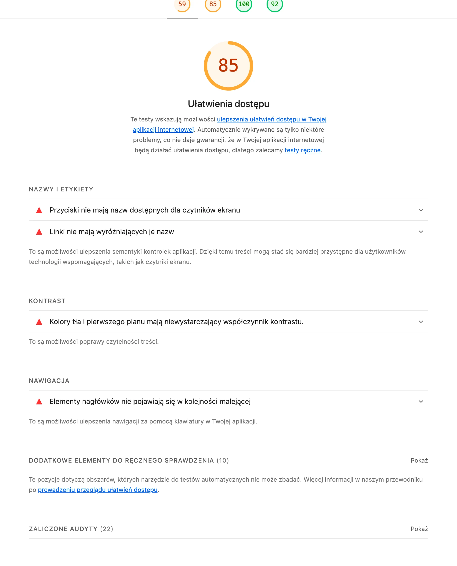
You also strengthen the UX of the “About us” page through sensible journeys and contextually placed trust-building elements. Link internally to the offer, portfolio/case studies, the team, the expert blog and contact, and if it makes sense — also to “Careers”, because some of the traffic is generated by candidates. From a technical perspective, make sure the page is fast: heavy team photos can hurt LCP, so compress them to WebP/AVIF and use lazy loading. After adding the gallery, check the result in PageSpeed Insights and Lighthouse and make sure the page does not drop below 75–85 points on mobile.
- Complete the title and meta description with the brand and specialisation (for branded SEO).
- Structure the H2/H3 headings as questions that users can easily scan (“What do you do?”, “How do you work?”, “Who is behind the company?”).
- Add links to: offer, portfolio/case studies, team, blog, contact and — if needed — “Careers”.
- Optimise images (WebP/AVIF, lazy loading) and verify PageSpeed Insights/Lighthouse after publication.
- Make sure accessibility is covered: alt text for images, contrast, readable fonts and keyboard support (WAVE or axe DevTools tests).
- On mobile, make sure the CTA is not too small (min. 44×44 px) and avoid elements that like to “break” (e.g. image carousels).
- If it makes sense, add schema.org “Organization” or “LocalBusiness” with the address, phone number and profile links.
- Tag analytics: clicks on the CTA, scrolls to “Team”/“Testimonials” and clicks on phone/email (GA4 + GTM).
It is worth treating analytics and microcopy as part of UX, because they close the user’s intent after reading “About us”. Tag clicks on the CTA (“Book a call”, “Download the offer”), scrolls to the “Team” and “Testimonials” sections, and clicks on phone/email, then compare variants in GA4 with implementations via GTM. Next to the CTA, add “risk reducers”, e.g. “we reply within 24h”, “no obligation” or “first call 15 min”, because that helps shorten the distance before contact. If you use a calendar (e.g. Calendly), you can embed it as an alternative to the form for people who want to book a slot straight away.
- 01Visibility for branded queriesTitle, Meta, brand and specialisation.
- 02Headings answering questionsMatch user needs.
- 03Quick scanning and readabilityConcise paragraphs, no walls of text.
- 04Trust and path buildingTrust elements, internal linking.
The key is being visible for branded keywords at the same time as making it easy to find information quickly and build trust.
How to write about company values and mission without pathos?
You can write about company values and mission without pathos if you translate declarations into concrete actions and standards that are visible in everyday practice. Instead of vague terms like “transparency”, it is better to show how this works operationally, e.g. “We report weekly in Asana, and the budget and hours are visible to the client in real time”. The same goes for “honesty”. It is worth describing it as a clear rule of cooperation, e.g. “if we do not deliver results, we end the cooperation after 30 days with no charges for the next stages”. Values only start to sound credible when you present them as repeatable behaviours, not slogans for the “Mission” tab.
The mission is worth formulating from the client’s perspective, i.e. as an answer to the question “why do you exist” in their reality, rather than as a description of your own ambitions. For example: “We want small businesses to be able to have accounting like corporations – without paper and stress, within 24 hours of enquiry” is more understandable than broad declarations about “changing the market”. To stop the mission sounding like an extract from a brochure, it is a good idea to tie a mechanism to it: what exactly you do and how, so that this promise works. Such wording also indirectly helps in price discussions, because it shows the standard and the way you deliver, even if you do not publish a price list.
It is easier to keep language free of pathos when you write “human, not brochure” and keep an eye on the “you” vs “we” ratio. Instead of starting with self-presentation, lead sentences with the audience’s problem, and only then show how your way of working solves it (a 60/40 practice: 60% of the content for the client, 40% about the company as proof). In storytelling, stick to function. The story should explain choices (specialisation, process, what sets you apart), not be a timeline. If you give numbers, provide them in context and with sensible precision, avoiding “no conditions” promises. It is better to add “typically” or “depending on” and refer to a case study.
The most common mistakes on the “About us” page and how to avoid them
The most common mistakes on the “About us” page come from the text not answering the client’s specific questions, but sounding like a brochure. Instead of clichés such as “passion, innovation, comprehensiveness”, it is better to use descriptions of specialisation, working standards and evidence that can be checked. When the user does not see specifics, they start looking for confirmation from competitors, because the risk in their head does not disappear. The simplest rule: every important claim on “About us” should have a mechanism attached (“how do you do it”) or evidence (“how do you know”).
Another frequent mistake is letting history outweigh benefit, because a long timeline detached from the offer does not show whether you will solve the client’s problem. Keep only those elements of the story that justify current competence or working standards (e.g. where the specialisation came from or why you have a specific process). Equally often, effectiveness drops because there is no clear CTA, as after reading it is not obvious what the next step should be. A layout with one dominant CTA and a second, secondary action that responds to another user intent helps.
The page loses credibility when the “we” narrative dominates and the “you” perspective is missing, which means the reader does not see their own situation in the content and gives up. It is worth rewriting paragraphs so that they start from the client’s problem and only then show how the company solves it. Another issue is hiding information people are going to look for anyway: company details, policies, address, names or photos (especially when competitors publish them). If something cannot be disclosed (e.g. because of an NDA), you should explain why and show alternatives, e.g. anonymised case studies.
Stock photos and unnatural portraits also undermine trust, especially in services, because users often recognise such shots at first glance. A better choice is authentic, consistent photography or a simple corporate shoot with a uniform background and a repeatable frame. Another common mistake is failing to update the page and “dead” numbers that do not change for years and suggest neglect. A quarterly review helps: figures, the team, certifications and links to case studies.
Testing and analysing the effectiveness of the “About us” page
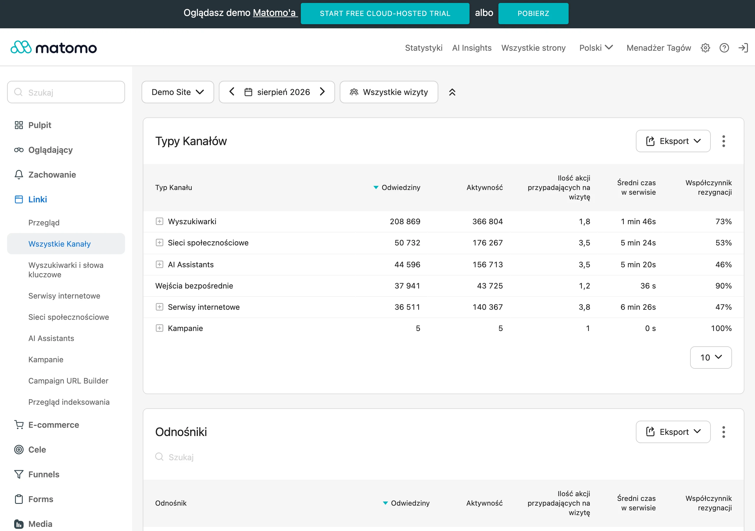
The effectiveness of an “About us” page can only be assessed reliably when user behaviour and their next-step transitions in the funnel are measured. The basic set is: CTR on the CTA, time on page, scroll depth and paths to “Contact” and “Offer”, measured in GA4 with implementation via Google Tag Manager. In practice, it is also worth tagging clicks on the phone and email, because these are often “hidden” conversions after reading. This makes it clear whether “About us” supports the decision rather than just generating page views.
Testing the “About us” page involves comparing variations of key elements, provided there is enough traffic. The hero and CTA versions are most often compared (e.g. “Book a call” vs “Check the fit”), using VWO, Optimizely or simpler tests by duplicating the page and splitting traffic in Webflow/WordPress. Measure not only the button click, but the final conversion, i.e. form submission or a booking in Calendly, because that is what shows whether the change is actually working commercially. This approach protects against optimising for “pretty metrics” that do not translate into results.
The analysis should also take into account whether users reach sections that reduce risk, such as “Team” and “Testimonials”. Tagging scrolls to these places makes it possible to compare whether, after changes, people reach the information needed to make a decision more quickly. At the same time, it is worth treating the page as an asset requiring maintenance: set “last updated” in the CMS or schedule a quarterly review. This keeps figures, links and trust signals up to date, and the page does not give the impression of being abandoned.
FAQ
Frequently asked questions
How do you write an About us page that builds customer trust?
The best approach is to show specifics: the team, the process, trust signals, company details and a clear description of what you do and who you do it for. Instead of generalities, it is worth addressing the user’s typical concerns, namely whether the company is real, understands the problem and delivers results.
Is it worth including company history on the About us page?
Yes, but only if the history explains your current specialism or standard of work. An expanded timeline with no connection to the offer does not help the user assess whether they can trust the company.
What sections should a good About us page have?
The article points to, among other things, a hero with a promise and proof, a short TL;DR, information on who you work for, a history in bullet points, the team, the collaboration process, values, trust signals and a strong CTA. It is also important that the following sections lead the user to the next step, such as contact or an offer.
Why do you need to show proof on the About us page rather than just slogans?
Because credibility is built by concrete and verifiable information, not adjectives or self-promotion. It is better to show figures, certifications, the working method, results and context than to write that the company is simply effective.
How do you write about company values and mission without sounding pompous?
You need to translate them into real actions and working standards that can be seen in practice. Instead of slogans such as “transparency”, it is better to describe what reporting, communication or quality control looks like.
How do you optimise an About us page for SEO and UX?
It is worth refining the title and meta description with the brand and specialism, using headings in the form of questions and adding links to the offer, portfolio, team, blog and contact page. Also important are fast loading, good readability on mobile, alt text, appropriate contrast and marking key clicks in analytics.