
A references page is not decoration, but a sales tool for people who are already close to making a decision. A user usually lands on it when comparing risk, checking credibility and looking for confirmation that the offer works in practice. A well-built references page should reduce customer uncertainty and push them to the next step. That is why it is not the number of reviews that matters here, but their quality, context and ease of moving on to the service, case study or contact.
Strategic importance of references pages
A references page has strategic importance because it builds trust, supports SEO and helps to close the decision to get in touch or buy. It is a place where the offer stops being a company claim and starts being confirmed by customers. For many users, this stage is what decides whether they move on or return to the search results. If the page does not answer objections, it loses its role as social proof.
In practice, such a subpage also answers queries with verification intent, for example when someone is looking for opinions about a company. This matters because the user no longer wants general promises, but confirmation of experience and results. Well-prepared references can also add what the service page does not fit: who the service is for, how the cooperation works and what results have been achieved. As a result, a references page should not only reassure, but also direct the user to a specific next step.
User intent when looking for references
Users looking for references primarily want to check whether a company has already solved a problem similar to their situation. They are interested not in praise itself, but in relevance. They look at the industry, company size, type of challenge and whether the cooperation concerned a similar service. The more they see their own context, the easier it is for them to regard the offer as safe.
The second important intent concerns the course of cooperation and the predictability of the process. A potential client wants to know what the communication looks like, who is leading the project and whether the provider operates efficiently. This is especially important in services where the result depends on both sides working together. The mere information that the client was satisfied is usually not enough without showing what that satisfaction was based on.
The user is also looking for results that can be verified or at least placed in time and context. Numbers, the scope of cooperation and concrete outcomes are more valuable than general statements about professionalism. Such a person assesses risk: whether the effect was real, accidental and whether it can be related to similar conditions. That is why an effective references page should quickly answer questions about the problem, solution and result.
Key elements of an effective reference
An effective reference must show who is speaking, what problem they came with and what result they achieved. The best format is a short mini case study rather than a simple praising quote. The user should immediately see the industry, company size and scope of cooperation. This makes it easier for them to judge whether that story is relevant to their situation.
A good reference includes specific person details: first name, surname, job title and company name. If the client has given consent, it is worth adding a photo, logo and a link to a professional profile. These are not decorative extras, but signals of authenticity. One verifiable detail about the client builds more trust than several general compliments.
Equally important is the description of the problem, solution and effect. The reader wants to know what the challenge was before the cooperation, what service was delivered and what changed after implementation. The strongest results are those placed in time, numbers or a clearly named business outcome. The quote should summarise the most important benefit, not repeat obvious compliments.
A reference without verification loses its persuasive power. That is why it is worth providing the date of the review, the cooperation period or the scope of the completed project. If full details cannot be disclosed, you should at least retain as much context as possible. Overly strong anonymisation makes publication easier, but weakens credibility.
Information architecture and UX optimisation
Good information architecture and UX help the user quickly find references similar to their case and move on to the next step. The most practical structure is a main references page as a hub plus shorter reviews on service pages. This model organises the content and supports decision-making at different points in the journey. A person comparing offers reaches the full collection, while a user reading about a service gets proof in exactly the right context.
On the overview page, it is worth clearly separating short testimonials from more detailed case studies. This matters because not everyone is looking for the same depth of information. Some people need quick confirmation, others want to follow the whole process and result. With a larger number of opinions, filters by industry, service or company size work well.
The UX of this page should make scanning easier, not force users to click through carousels and hidden tabs. The introduction must clearly explain what the user will find here and how the testimonials were selected. Headings should group content thematically so the reader can go straight to the segment that interests them. Testimonials should be written in HTML, not as screenshots of emails or heavy sliders.
The placement of calls to action is equally important. A CTA should not wait only at the end of the page, because some users decide earlier. It is best to place it next to testimonials linked to a specific service, pricing or contact. On mobile devices, readability, loading speed and a simple layout without too many elements matter especially.
Credibility and E-E-A-T signals in testimonials
Credibility in testimonials is built primarily by the details that make it possible to verify that a real person and a real collaboration stand behind the opinion. The strongest elements are full information: first name, surname, job title, company and scope of cooperation. When the date of the opinion is added, the user can better judge its freshness and context. This matters because a testimonial is meant to reduce risk, not just make a good impression.
A person’s photo, company logo and a link to a professional profile strengthen trust if they were used with the client’s consent. This is not about aesthetics, but about the ability to verify. One specific, verifiable detail about the client is more valuable than several general statements about professionalism. In practice, users trust more quickly an opinion they can place in the real world.
The persuasive power is also affected by whether the testimonial shows experience rather than just enthusiasm. That is why it is worth providing one measurable result, a time frame or a clearly named outcome of the collaboration. If the material is in video form, it is a good idea to add captions and a transcript. Such a format is harder to fake, but it still needs to be readable in HTML too.
Typical mistakes and how to avoid them
The most common mistakes are anonymous quotes without context, content hidden in graphics, carousels, no CTA and a poor choice of format for the page’s goal. Each of these issues weakens the value of testimonials as social proof. The user does not find answers to their objections, and bots have a harder time interpreting the content. The effect is simple: less trust and a weaker move to the next step.
Mistake number one is a wall of text made up only of praise. If the opinion does not show the problem, the solution and the outcome, the reader does not know whether the case is similar to their situation. Instead, it is worth keeping a consistent structure for each testimonial: who, with what challenge, what service and what result. Such consistency helps both the user and systems analysing the content.
Another common mistake is email screenshots and sliders that look impressive but reduce usability. Content as an image is less accessible and less useful for SEO. Carousels with autoplay additionally hide important information and distract attention. A better solution is plain text in HTML and a static, readable layout on mobile.
With a larger number of opinions, a lack of segmentation and filtering is also harmful. The user does not want to read everything, only to find a similar case by industry, service or company size. If they have to search for too long, the chance that they will abandon the journey increases. The same happens when there is no CTA next to a relevant testimonial, because then the page does not use the moment of highest conviction.
A separate mistake is overusing structured data of the Review type just to get stars for your company website. Such a tactic does not replace credible content and may weaken trust if it looks like an attempt to bypass the rules. Structured data is meant to organise information about the person, company and service. It should not be used to mask low-quality testimonials.
How to measure the success of a testimonials page
The success of a testimonials page is measured by its impact on the user’s decision, not by traffic alone. The most important metrics are visits from verification-intent keywords and clicks through to services, pricing and contact. If the page gets visits but does not generate clicks onwards, it is not addressing objections well enough. A good testimonials page not only holds attention, but moves the user to the next step.
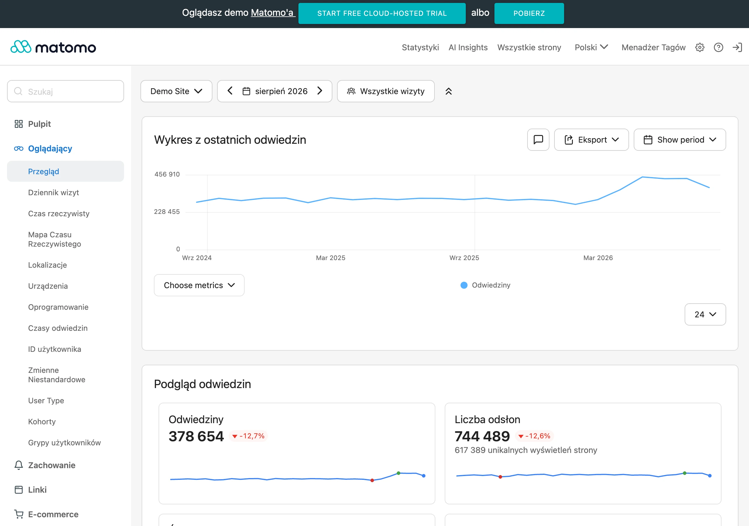
In practice, it is worth checking conversion paths, because this subpage often works as an intermediate stage. Particularly valuable are sequences such as service, then references, and finally the contact form. This pattern shows that testimonials help confirm the choice, even if they are not the last page visited. Therefore, you should also look at assisted conversions, not just the last click model.
As a support, it is worth analysing engagement metrics, but only as a diagnostic signal. Scroll depth, time on page and clicks on filters show whether the user can find references matched to their situation. If filters by industry or service are used often, the information architecture is working in practice. An additional check is the qualitative assessment of leads by sales, because better references often shorten the conversation about trust and experience.
FAQ
Frequently asked questions
What information should an effective testimonials page include?
It should show who is speaking, what problem they came with and what result they achieved. The industry, company size, scope of work and an easy route to the service or contact are also important.
Is a client’s praise alone enough for a testimonial to be credible?
No, because praise alone does not show what the satisfaction comes from. Credibility is built by specifics, context, client details and a description of the outcome of the cooperation.
Why should testimonials be linked to a specific service or case study?
Because the user wants to quickly find a story similar to their own situation. This structure makes it easier to assess risk and moves them on to the next step in the decision.
What is the best way to organise a testimonials page so it is easy to read?
A hub page with a full collection of reviews and shorter testimonials on service pages works best. If there are more reviews, filters by industry, service or company size help.
Are screenshots or carousel testimonials a good solution?
No, because content in images and carousels is less useful and supports SEO less well. Plain HTML text and a simple, static layout are better, including on mobile.
How can you measure whether a testimonials page is really working?
The key metrics are clicks through to the services, pricing and contact pages, plus conversion paths where the testimonials page is an intermediate step. Clicks on filters, time on page and lead quality assessed by sales are also helpful.