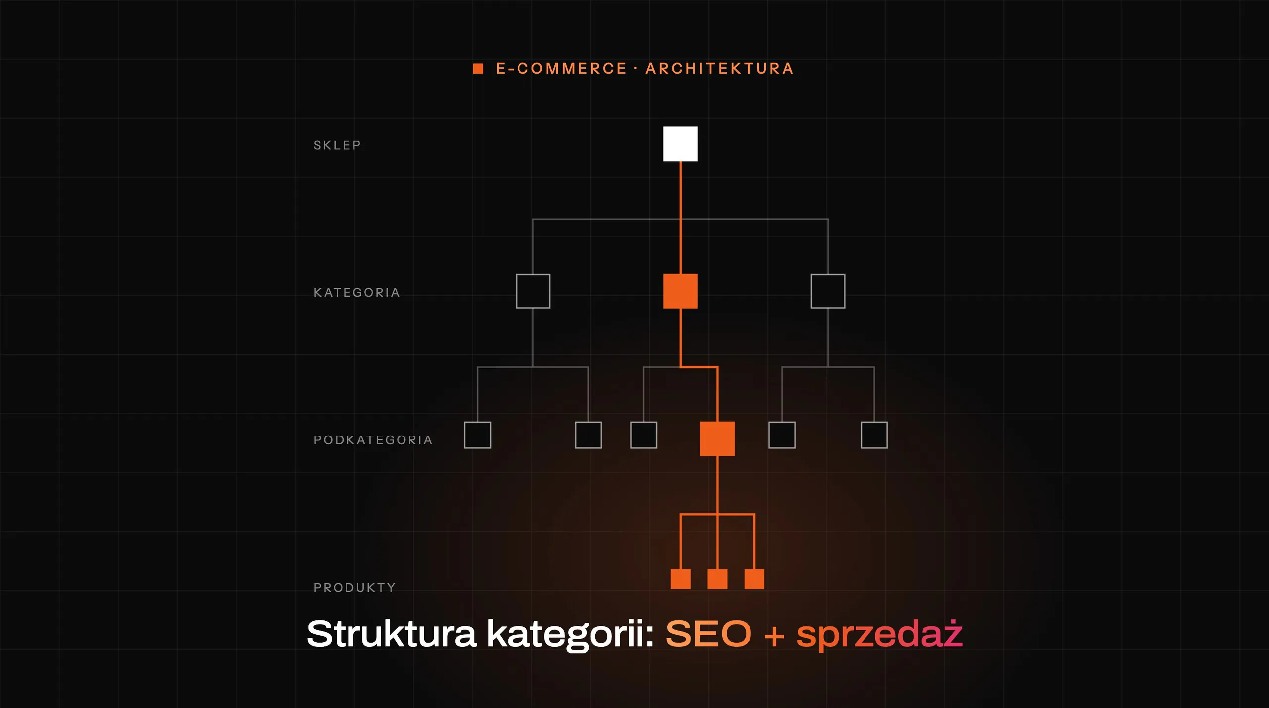

Blog categories determine whether a user will quickly reach the right content. And, as a bonus, whether the blog will genuinely support sales, SEO and order in the CMS, rather than just “looking nice” in the admin panel. This is not a minor technical detail, but a chunk of the site’s overall information architecture. Poorly designed categories create chaos, empty archives and random assignment of posts. A well-designed category makes sense for the user, the editorial team and the search engine at the same time. In practice, you have to align user language, topic logic and business priorities. In this section, I break down what categories really are and what context now determines whether they work.
What blog categories are in practice
Blog categories are the main level of organising content. They group posts by a shared topic, user goal or stage of the buying decision, that is, by the way people actually “arrange” knowledge in their heads. Thanks to them, a blog is not a collection of random articles, but an ordered structure. The user can see where to look for more materials, and the editorial team knows where a new post should go.
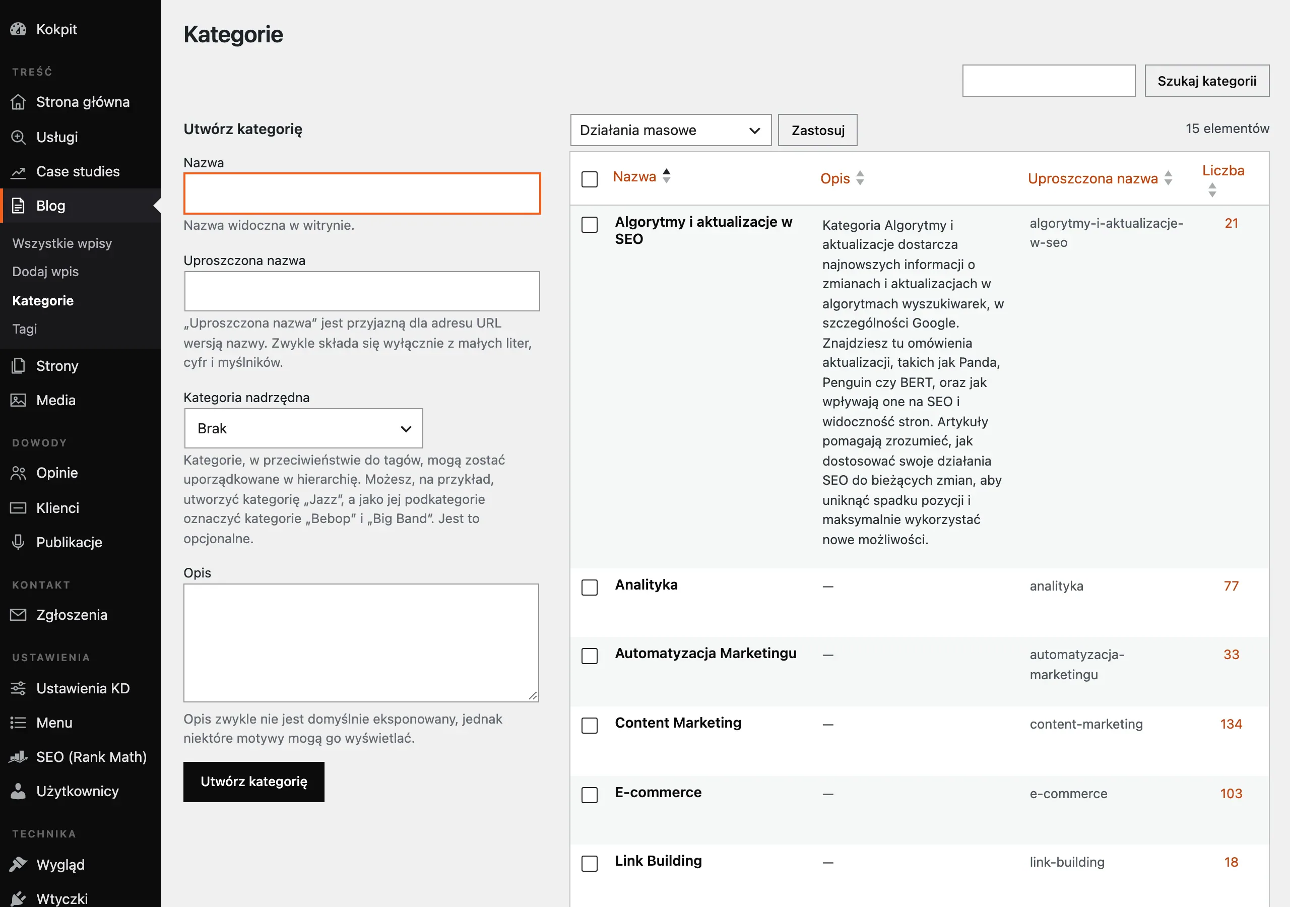
A good category does several things at once. It is a navigation element, a content archive, an entry page from Google and an internal linking point to other articles, services or products, so it does not function in a vacuum. The problem is that many people treat it as a separate entity, instead of part of the site’s nervous system. That is why category design should be tied to the menu, breadcrumbs, URLs and related content modules.
A user-friendly category has a simple name and a clear scope. The reader should not have to guess whether an article about choosing a tool belongs in “Advice”, “Strategy” or “Marketing”, because this is not a quiz. A category should not be just an editorial label. It must reflect the real way the audience searches for information, not the team’s internal habits.
A business-friendly category organises content around the areas the company wants to develop. These may be customer problems, product uses, industries, services or stages of the buying process, that is, topics that deliver intent, not just traffic. Such a structure helps not only with SEO, but also with guiding the user from an educational article to offer content. Instead of random “reading for the sake of reading”, you get a path that can be measured and optimised.
The most common mistake is surprisingly simple. Categories are created for individual keywords instead of logical topic clusters, and then you are left with a pile of narrow, poorly developed archives. Such a taxonomy helps neither the user nor the search engine. In practice, it ends up as categories “for a keyword” instead of categories “for meaning”.
The current context for designing blog categories
The current context is clear: thematic consistency, simple navigation and real value of category pages matter, not multiplying artificial divisions. Modern SEO assesses a logical site structure better than fragmented archives created only to “cover keywords”, because algorithms increasingly understand the topic rather than just the label itself. Let’s look at it differently: a category should be a door, not a storage room full of random boxes. In practice, fewer categories with a clear scope usually work better than an extensive but unreadable taxonomy.
Today, many users land on a blog not via the homepage, but straight from the search engine to a specific article. That shifts the thinking about categories. If a user lands straight on an article from Google, the category page must suggest the next step. It should lead on, not end the journey with a random list of links. Instead of an “archive without a face”, you need a place that reveals related content and gives it meaning.
Mobile rules. Full stop. Category names should be short, understandable and easy to scan on a small screen, because no one reads a menu like a novel. An overly deep subcategory structure does its own damage: it makes navigation harder and lengthens the path to the right content, sometimes by several unnecessary clicks.
Modern CMSs are tempting. Category, tag, filter, archive, and on top of that different page types. Without clear rules, this quickly ends in duplication, empty subpages and indexing chaos that is hard to unwind later. The problem is that this is rarely the tool’s fault itself, but rather the lack of decisions about what is a main category and what is merely a supporting label.
You do not assess category quality “by feel”. That is not enough. In practice, you need to look at data from Google Search Console, GA4, internal search, the site crawl and user behaviour, because they do not lie. Only then can you see which categories genuinely attract traffic, drive further pageviews and support transitions to service pages, instead of just looking nice in the menu.
Not every category page deserves indexing. Category pages should only be indexed when they have their own value, not when they are an empty archive. What does that mean in practice. A sensible description, a clear topic, up-to-date posts and a logical place in the site structure, without pretending that the list alone solves the problem. When a blog serves several offers or different audience groups, another layer comes in: rules for when to create a subcategory, when to create a separate thematic landing page, and when to leave the topic within a larger cluster.
How category design and implementation work
Designing and implementing categories starts with checking what content you already have, what business goals it is meant to support, and how users are actually searching for information. First comes a post audit: topic, quality, freshness, traffic, intent, and whether a given article can sensibly be assigned to a coherent topic cluster. And suddenly everything becomes clear. This is exactly where duplicates, dead topics and categories created only because there happened to be one text before come to light. If you do not start with an audit, the new structure usually only tidies up the chaos on the surface, not in reality.
At the same time, you need business analysis and user analysis. It sounds formal, but it comes down to something concrete: you map services, products, the most important customer segments and the questions that keep coming up in sales or support. Then you add sources that show the real language: Search Console, internal search, FAQ, customer conversations and support. The data clearly shows how people call it and what they are looking for, not how the topic is described inside the company.
The next stage is topic clustering, that is, grouping posts into larger sets with a shared intent. This is the moment when order starts to emerge. It is not about building a separate category for every keyword, but about finding logical areas that can be developed over a longer period and that will not fall apart after a month. A good category covers a topic cluster, not a single keyword.
On this basis, a taxonomy model decision is made. The key is to clearly separate what is a main category, what is a subcategory, what is a tag, and what should not be a separate entity in navigation at all. This stage hurts, because it forces choices. But note that this is exactly where most later problems are born, when different division logics are mixed, for example industry, persona, content format and funnel stage on one menu level.
Then comes the time for category names and scope. It sounds simple. The name must be understandable to the user, and the scope must answer one very down-to-earth question: which posts belong here, and which do not. If the editorial team cannot explain the boundaries of a category in two sentences, the user will not understand this division either.
Next, content is assigned to categories and internal linking is organised. There is no room for playing it safe here. Each post should have one main category, not several equal labels used “just in case”, because over time that turns into chaos, not flexibility. In practice, this kind of order simplifies the archive, straightens out navigation paths and makes it easier to build connections between informational articles and service or product pages.
Implementation also includes the category page itself. It is not just a “list of posts”. Such a page should have a short scope description, a logical SEO title, a list of current posts, breadcrumbs and modules leading to related content. If a category is to be indexed, it must provide real value, not just be an automatic archive without context.
At the end, what remains is checking the URL architecture, indexing and CMS configuration. This is the technical stage, but without it the whole puzzle does not hold together. It is about friendly URLs, sensible pagination, no thin archives, correct links and a template that does not require manual improvisation for every new post. The result should be two practical deliverables: a category map with assignment rules and a change backlog covering duplicate merging, expanding descriptions, link fixes and removing empty archives.
What to do to make categories work for the user and business
To make categories work for the user and business, you need to limit their number, give each one a clear purpose and keep consistent publishing rules. Less is more. It is better to have a few strong categories developed consistently than a dozen weak ones with two posts in each and then silence. A small number of well-defined categories almost always wins against an extensive but inconsistent structure.
Each category should have one dominant task. The question is: why does it exist. It may educate, solve a specific problem, compare options, support the offer or guide a specific audience, and that is fine. The problem is that when one category tries to do everything at once, it quickly becomes a container for random content, and then it is only pretending to be organised.
This is where order begins. The publishing rule for new posts cannot be based on the author “feeling something” and adding a category on that basis. You need a simple editorial standard: one main category, a scope description for each category, and someone who makes sure this structure does not fall apart.
Category names should speak the users’ language, not company-internal jargon from a spreadsheet. If a customer is looking for a solution to a problem and the categories reflect the organisational structure, the person on the other side of the screen simply does not know where to click. The problem is that names that are too technical work just as badly as names that are too general, because in practice they do not communicate anything specific.
Do not add a new category when the topic is narrow. If you do not have enough content to fill it properly, the category becomes an empty shelf in a shop. Often it is better to include such an area in a larger cluster or create a thematic landing page instead of another navigation item. A new category should only be created once you know it will be regularly supplied and has separate value for the user.
The division logic has to be one. When categories by industry, content type, product and decision stage are mixed on one level, the user starts guessing instead of choosing. And that is no longer a detail. In practice, usability drops and it becomes harder to develop the blog, because new posts do not have an obvious place in the structure.
Every important category needs its own description and content development plan. The description introduces the user to the scope of the archive, and helps the search engine understand the page topic better. What comes next is also key. If a given category is important for the business, it makes sense to map out pillar content straight away, fill gaps with supporting articles and plan links to offer pages.
Regular review is not a whim, because even a well-designed taxonomy becomes outdated over time. You need to check which categories generate visits, transitions to further content and clicks to service pages, and which are empty, duplicated or not delivering value. Analytics, site crawling and search engine reports help. The data clearly shows where orphan posts, overly deep paths and archives that nobody needs are.
Errors come back like a boomerang. Too many categories, unclear names, duplication with tags, no archive descriptions and no process owner. The minimum conditions for a sensible implementation are also specific: access to the CMS, a list of existing content, analytics data, a decision on indexing and a person responsible for governance. Without a process owner, even a good structure usually slips back into chaos after a few months.
The most common mistakes in designing blog categories
The most common sins are straightforward. Too many categories, unclear names, mixing classification logics and no rules for assigning posts all break down in practice faster than anyone can get a handle on them. Then the user does not know where to click, and the editorial team does not know where to place a new piece of copy. From a business point of view, this ends up with scattered visibility, weak internal linking and archives that support nothing. A category is meant to organise decisions, not create additional doubts.
A very common mistake. Creating categories for individual keywords or even for individual posts looks impressive only on the day of publication, and after a few months you are left with one or two articles and no meaningful cluster. Instead of multiplying entities, it is better to have fewer categories, but ones that can be developed systematically and that cover a real topical area.
The second problem is chaos at one level. Categories such as “SEO”, “E-commerce”, “Guides”, “For beginners” and “B2B” sit next to each other, so topic gets mixed with industry, format and stage of knowledge in one bag. The user does not understand whether the blog is divided by topic, industry, format or level of expertise. The question is: how are they meant to read that in a few seconds. If the logic of the categories is not obvious within a few seconds, the structure needs simplifying.
The structure can also be damaged by duplication between categories, tags and filters. The same topic then exists in several places, but without a clear role for each element, so instead of navigation we get a maze. As a result, the CMS generates similar archives, some of them are empty, and some compete for similar queries. This is not only an SEO problem, but also an operational one, because the editorial team starts publishing inconsistently.
There is another mistake, usually the least spectacular and the most costly. No process owner and no taxonomy review after a change in offering or content strategy mean that a category which made sense a year ago is now often dead or simply too broad. Without regular audits, categories age faster than the articles themselves. The facts are these: it is worth checking from time to time which archives generate visits, which drive transitions to further content and clicks to service pages, and which only take up space in the structure.
Optimising categories for SEO and UX
This is not cosmetic work. Category optimisation for SEO and UX means making archives readable for people, valuable for the search engine and useful as navigation nodes, not just a repository of posts. A simple list of articles is usually not enough, because it does not explain why the user should stay here. A category page should clearly say what it is about, what content it covers and where it leads next, ideally without guessing and without assumptions. Only categories that have real content and a concrete function are worth indexing.
In SEO, the fundamentals matter. A sensible category name, a user-friendly URL, a unique SEO title, a short description and no thin or duplicate archives do the heavy lifting here. If a category is important, add a few featured articles to its page and links to service content or guides from the next stage of the decision process. The page then starts working like a thematic hub, not just a technical archive. And when a category no longer delivers value, it is better to trim its indexing than keep in the index a page that drags everything down.
In UX, speed of orientation wins. Category names should be short, unambiguous and in the users’ language, especially on mobile. Breadcrumbs, visible links to related topics and modules at the end of the post that point to the next sensible step make a difference from the very first click. A good category shortens the path from one article to the next valuable piece of content.
Implementation is only the start. In Google Search Console, GA4 and site crawls you need to regularly check whether categories are getting impressions, whether users are clicking further and whether orphaned content is not growing outside the main structure. If an archive has traffic but does not lead to further views, the culprit is often the page layout or a name that is too generic. If there is no traffic at all, the problem is usually a topic scope that is too narrow, no description or a category created without real demand. The data say it clearly: an archive without a next step is a dead end.
The best result comes from a duo: optimisation plus a publishing plan. A category important to the business should have planned pillar articles, supporting content and consistent links to service pages, because without that it quickly turns into an empty signpost. That way, not only does order on the blog improve, but so does the chance that the user will move from information to action. The category then starts working at the same time on visibility, navigation and business goals.
Practical tips for managing categories in the CMS
Managing categories in a CMS is a game of rules. It is about simple rules that organise the publication, editing and maintenance of content before the editorial team has time to “add” its own logic to the taxonomy. The system cannot leave room for random decisions. If it is easy in the CMS to create new categories, tags and archives without any control, chaos arrives faster than you can name it. A good taxonomy in practice requires not only an idea, but also technical and editorial constraints.
Start with one hard rule: every post must have one main category. This simplifies navigation, breadcrumbs, URLs and performance analysis — in other words, everything that later gets measured in numbers anyway. Additional labels may exist, but they should not replace category logic. Because what is left of the structure when the team assigns a post to three or four categories at once. Then categories stop meaning anything.
First you need to establish one thing. Who actually has the right to create new categories in the CMS. The most common problem in a CMS does not stem from technology, but from the lack of an owner for the process. If every author adds their own category with every publication, order breaks down faster than you can name it. Writers should choose from a ready-made list, not produce new entities on demand. The creation, merging and deletion of categories is best left to one person or a small team responsible for content architecture.
- establish a closed list of main categories,
- add a note to each category explaining which topics belong to it,
- block all authors from freely creating new categories,
- define the default elements of the category page: title, description, lead, breadcrumbs,
- regularly identify empty archives, duplicates and incorrect post assignments.
Within the CMS itself, refine the category page template. Do not treat it as an automatic list of posts. A category page should have its own description, a logical heading and a module with important articles, because then it genuinely guides the user and also does the job for SEO. If a category archive is empty, thin or unclear, it usually should not be highlighted or indexed.
Changes to the structure have technical consequences. And usually painful ones. Merging categories without redirects, without improving internal links and without controlling URLs ends in a loss of order and errors on the site. The problem is that the mess does not appear immediately; it accumulates in logs and in the index. That is why every major change in the CMS should include three things: reassignment of posts, updating internal linking and checking whether old URLs have been abandoned.
In practice, a simple publishing checklist wins. Short, but merciless. Before publication, the editor should check whether the chosen category matches the post’s intent, whether the post links to related materials and whether it does not add yet another thematic duplicate. The CMS is meant to support good editorial decisions, not just store content. When these rules work, categories stop being decoration for the blog and start organising traffic, content and paths to the offer.
FAQ
Frequently asked questions
How should blog categories be designed to be user-friendly and business-friendly?
First, you need to analyse the existing content, business goals and the way users search for information. Only then is it worth building a coherent taxonomy based on topic clusters, rather than on individual phrases.
Is it better to have few or many categories on a blog?
Usually, a few strong, well-defined categories work better than an extensive but unclear structure. A small number of categories makes navigation, content development and keeping things organised easier.
Why is it not worth creating categories for individual keywords?
Because such categories quickly become narrow, poorly developed archives and do not build a meaningful content cluster. It is better to design them around logical topic areas than around the phrase itself.
When should a category page be indexed by a search engine?
When it has its own value: a sensible description, a clear topic, current posts and a logical place in the site structure. An empty archive without context should not pretend to be a valuable page.
What information helps assess whether blog categories are working well?
It is worth checking data from Google Search Console, GA4, internal search, site crawl and user behaviour. This shows which categories attract traffic and lead to further page views or service pages.
What are the most common mistakes in designing blog categories?
The most common issues are too many categories, unclear names, mixing different classification logics and no rules for assigning posts. Problems also include duplication between categories, tags and filters, as well as empty archives.