
On a service page, benefit-led language is not about writing “more nicely”. It is about clearly showing why this offer matters to a specific client and their situation. The user does not come for a litany of declarations about quality, experience and flexibility. They want to understand in a minute what they will get, how it works, whether it fits their problem and what the next step should be. Effective benefit-led language combines a service feature with the outcome, condition and proof, instead of replacing one cliché with another cliché. And this is not a platitude. It matters not only for copywriting, but also for SEO, UX and lead quality, because precise messaging filters out random enquiries. If the message is too generic, the page may be grammatically correct and yet still not push anyone towards a decision.
What is benefit-led language on a service page in practice?
Benefit-led language on a service page is a way of communicating in which every important piece of information answers the user’s one simple “why”. The question is: what do I gain, how does it work and how do I know it will be a good solution for me. In practice, this is not about more “marketing” words, but about translating the scope of the service into a real outcome for the client, ideally described in ordinary, easy-to-understand language. Such a description reduces uncertainty and makes it easier to compare the offer with others, because it gives criteria rather than moods.
The most common mistake is banal, but costly. The company describes itself, instead of the outcome for the audience and their everyday pain point. Phrases such as “comprehensive service”, “individual approach” or “professional delivery” sound safe, but on their own they explain nothing. Only combining “what we do” with “what changes for the client” creates a real benefit. Instead of a generic “high quality”, it is better to show that the client gets a structured process, a shorter implementation time or fewer errors at the start. This is not rhetoric, but a concrete claim that can be checked.
In practical work, a simple unit of thought works best. The audience’s problem, the service mechanism, the expected result, the condition for action and the proof. Thanks to this, the message stops being a slogan and starts behaving like an argument that carries the weight of the decision. If the service includes an audit, implementation and consultations, it is not enough to list them, because a list does not sell understanding. You have to add what problem each stage solves, when it matters and how the client will know it is working, rather than just “sounding nice”.
On the page, such language should be placed in specific areas. Not dropped only into the headline, which promises but does not lead anywhere. The hero should show the main outcome and the audience, the service description should explain the mechanism, the scope should clarify responsibility, and trust elements should confirm credibility, not decorate. If the benefit is not embedded in the page structure, the user sees individual promises but does not understand the logic of the offer. The problem is that then even a good service looks like every other one. And that is exactly why service communication is not “copy”, but a joint task for content, UX and sales.
Current context and conditions for using benefit-led language
Today, benefit-led language only works when it is specific. It must be quick to scan and match the user’s intent, because most people compare several similar offers in a short space of time. They read selectively: headlines, first paragraphs, FAQ, service scope and CTA. If they see the same generic lines in these places as everywhere else, they simply move on without going any deeper into the content.
The conclusion is simple. The advantage comes not from a “stronger” adjective, but from better tailoring the message to the audience’s situation. You need to clearly show who the service is for, what problem it helps with and what the outcome depends on. The more similar the market is, the more important specificity becomes, rather than declarative language. In practice, the message “we will organise campaigns and reporting so it is easier to assess the profitability of your activities” works better than simply “we increase marketing effectiveness”.
The problem is that many modern websites are built from a template. Or, worse, from automatically generated boilerplate. Such texts sound correct, but they are not anchored in real customer questions, so they do not drive results. That is why sensible material for building benefit-led language usually comes from sales conversations, CRM notes, questions from forms, pre-purchase emails, support and reviews. The best messages rarely come from a brainstorm; more often they come from carefully gathering how customers actually describe their problem.
The effectiveness of benefit-led language also depends on the technical and design conditions of the page. Even a good message can fail if it is hidden behind an overlong introduction, poorly visible on mobile or broken into several unreadable sections. What matters is the pace and order of information, the cognitive load and whether a proof point or at least an explanation of the mechanism appears alongside the promise. The user should not only believe in the offer, but also quickly understand how to move on to the next step.
There is one more condition: honesty. If the result depends on budget, input data, implementation scope, the industry or cooperation on the client’s side, that needs to be stated. This does not weaken the message; it raises credibility and better qualifies leads, and that is not a cliché. A service page should help with making a good decision, instead of hiding conditions that will surface anyway during the sales conversation.
How does benefit-led language work on a service page?
Benefit-led language works on a service page when it guides the user from their problem to a decision. It shows the outcome, the mechanism, the conditions and the proof, not just a pretty slogan. This is not a single sentence in the headline, but the logic of the entire page. The user should understand step by step what they will get, what it stems from, whether it suits their situation and what they should do next.
In practice, this logic needs to be broken down into specific sections. The hero should quickly name the main outcome and the audience, while the service description and scope of work should explain where that outcome comes from. If the benefit is not connected to the service mechanism, it sounds like an empty promise. So the question is not “should we talk about benefits”, but how to embed them in what you actually do.
The process, FAQ and trust elements play in a different league from the sales headline. The process cuts uncertainty and gives a sense of predictable cooperation, the FAQ removes typical barriers before contact, and the proof points allow the risk to be assessed coolly. Thanks to this, benefit-led language does not end with a declaration, but genuinely guides the reader through the next stages of the decision on the page.
Effectiveness also depends on the entry intent and the decision stage. Someone just identifying the problem needs a simple explanation and a clear outcome, while someone comparing offers will be looking for differences in scope, way of working and terms of cooperation. And that raises the question: does “stronger” really win, or rather “more specific”? More often than not, it is not the stronger adjective that wins, but greater specificity: for whom, in what situation and with what real effect.
On a page that works, benefits are not multiplied in every section. They are structured. Usually, a few key messages are enough to differentiate the service or remove the main objections, while the rest goes into supporting sections, where it makes sense and does not drown out the core point. Instead of selling everything at once — it is better to deliver one clear reason. Trying to sell everything at once usually weakens the main message.
Whether benefit-led language really works is visible not only in the final conversion. In practice, it is better to look at the journey: CTA clicks, moves to the form, FAQ interactions, scroll depth and the quality of the enquiries themselves. The data clearly shows whether the promise is “carrying” the user, or just sounding nice. If the promise on the page does not match what the client later hears in sales, the problem lies in the message, not in the traffic itself.
Kluczowe etapy tworzenia języka korzyści
The key stages of creating benefit-led language start with gathering data from real conversations with clients and end with checking whether the content actually improves understanding of the offer and lead quality. This is analytical work, not a quick swap of a few words on the page. Without source material, it is easy to write copy that sounds correct but misses the audience’s real questions.
The best starting point is sales notes, call transcripts, questions from forms, pre-purchase emails, reasons for lost and won opportunities, and analytics data. Add to that SEO keywords, existing CTAs, session recordings and heatmaps, because that is exactly what shows where the user stops, what they do not understand and which sections they simply skip. Let us look at it differently: you do not invent benefits, you extract them. Good messages usually come from the client’s language, not the brand’s language.
- First you need to gather and organise the source material: service description, scope of work, customer questions, sales objections and user behaviour data.
- Next, it is worth segmenting audiences by role, industry, urgency of the problem and selection criteria, because the same service may be bought for different reasons.
- The next step is to map out the relationships: the audience’s problem, the service mechanism, the expected result, the conditions, and proof or an example of application.
- Then choose the 3-5 most important benefits, meaning those that genuinely affect the decision or remove typical objections.
- Only then do you structure the content within the page framework: hero, service description, scope, process, proof sections, FAQ and CTA.
- At the very end comes evaluation and refinement: messages, section order or the level of specificity, based on user behaviour and enquiry quality.
Most mistakes happen when translating service features into outcomes. Saying you work “comprehensively” or “individually” sounds good, but it still does not say what changes for the client in real terms. It is better to show straight away which problem it solves, when it matters and how the user will recognise that it works in their situation.
Prioritisation is also key, because not every benefit deserves a high place on the page. Some messages are meant to attract the right audience, others to clarify the scope, and still others to lower the risk before contact. If all the benefits sound equally important, the user usually will not remember any of them.
The final stage is validation, meaning checking whether the page really communicates the offer better. In practice, this means analysing lead quality, the questions asked after landing on the page, CTA effectiveness and the alignment between the content and the actual sales scope. Only then do you find out whether the message is specific, or simply well written.
What to do, and what to avoid in benefit communication
In benefit communication, you need to show a concrete outcome for a concrete audience, and avoid words that sound professional but explain nothing. The best messages do not come from brainstorming, but from source material: questions from forms, sales notes, pre-purchase emails, reasons for won and lost opportunities, and sales conversations. That is where you can clearly see what the client really wants, what they are afraid of and how they describe the problem in their own words. If the language on the page does not sound like the client’s language, it usually loses relevance already at the first skim.
The most practical message structure is: problem, outcome, mechanism, condition, proof. It is simple. This way, you do not stop at a promise, but show where it comes from and when it makes sense. Instead of writing “we run campaigns effectively”, it is better to specify which result you want to improve, what exactly you do, what the outcome depends on and how the client can assess that it works. Such a structure also organises the conversation between marketing, sales and the person implementing the page.
If the service is complex, communication needs to be split into layers. The hero should sell the main point of the offer, not the whole service at once. The service description should show the mechanism, the process should reduce uncertainty, the FAQ should defuse typical objections, and the CTA should match the stage of decision. The most common mistake is trying to cram all the benefits into one headline, which makes none of them sound credible.
The most deceptive words are things like “comprehensively”, “professionally”, “flexibly” or “modernly” when they are not backed by specifics. They sound good, but without elaboration they are empty, so only keep them if you immediately show what they mean in practice: what the scope of responsibility is, what the cooperation looks like, what the client provides and what they receive at the end. Every general word should be convertible into an observable result, way of working or condition of cooperation.
Don’t hide the limitations of the service either. That backfires. If the result depends on the budget, the quality of the input data, the implementation deadline, cooperation on the client side or the state of the current site, say so plainly. You are not weakening the message; you are increasing its credibility and filtering out enquiries that would have drifted away from reality anyway. In practice, a better lead can be a greater benefit than a higher number of forms.
A serious implementation mistake is copying the same benefits across all service subpages. A page about an audit, implementation and ongoing support should not promise the same thing in the same words, because the user has different questions and a different level of readiness. The benefit must come from the real scope of the given service, not from the content template. If the message is linguistically correct but does not fit the actual sales and delivery process, it will start producing bad expectations. And then all that is left is firefighting.
How do you measure the effectiveness of benefit-led language?
You can tell how effective benefit-led language is by whether the user understands the offer better, more often takes the right next step and leaves more relevant enquiries. Conversion alone is not enough, because an increase in the number of leads can go hand in hand with a drop in their quality. So the key is to look simultaneously at on-site behaviour, transitions between sections and what happens later in sales. A good message not only increases response, but also reduces the number of conversations with clients who have misunderstood the service.
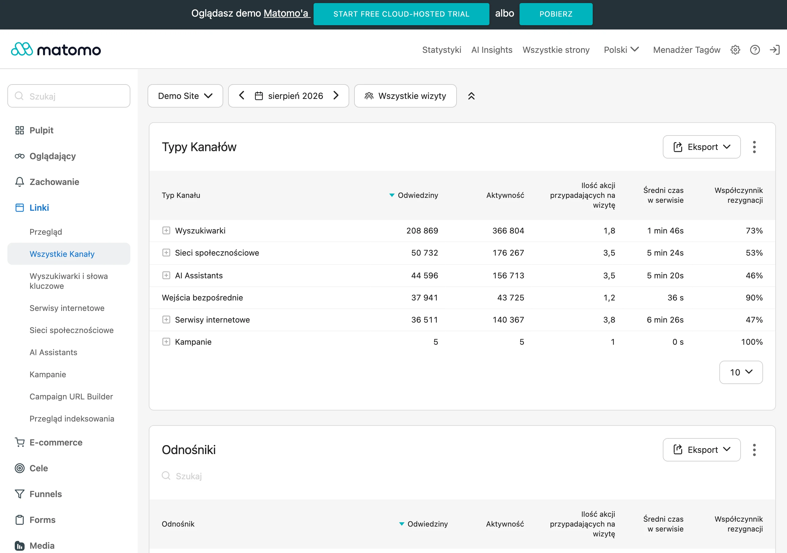
In practice, it is worth measuring several groups of signals at once:
- clicks on primary and secondary CTAs,
- journeys to the form and its completion rate,
- scroll depth and time to reach key sections,
- interactions with the FAQ, pricing, case studies and trust sections,
- lead quality in the CRM: fit, budget, decision stage, enquiry source,
- alignment between the promise on the site and the questions asked on sales calls.
If users click the CTA but abandon the form or enter very generic enquiries, the problem is often not the button itself, but an offer that is too broad or too imprecise higher up the page. And that is exactly what creates the confusion. If many people scroll to the FAQ or process section, it is often a sign that earlier they were not given a clear enough answer about how the collaboration works and what the risk is. Conversely, low scroll depth does not always mean weak content; sometimes the hero and the first sections simply do not show quickly enough who the service is for and what it really delivers. The question is whether the first on-screen promises answer that straight away, or only after a few scrolls.
Without data, you are shooting in the dark. Useful signals for evaluating effectiveness come from Google Search Console, analytics, heatmaps, session recordings, forms and sales notes. Search Console will quickly show whether the page headings and descriptions genuinely match search intent, or merely sound nice. Heatmaps and recordings will help you see where the user stops, where they hesitate and where they scroll back up because something does not quite add up. CRM data and sales conversations will fill in the rest: whether the site attracts the right people and whether the promise in the content matches the real scope of the service.
Test the whole logic of the message, not just the wording. Instead of tweaking one knob in one place and changing only “free consultation” to “book a call”, it is better to check whether a different sequence delivers more impact: audience, problem, result, proof and only then the CTA. The question is whether you are comparing two different communication hypotheses or just two cosmetic variants that settle nothing. In tests, set one communication logic against another, not X but Y. If the number of enquiries rises after a change, but salespeople more often have to straighten out client expectations, then the message has not been improved — the problem has only been moved further on.
It is worth measuring effectiveness separately for different traffic sources. A user from SEO often needs more explanation and problem fit, while a user from a brand campaign may react more quickly to proof and a CTA. Without separating sources, it is easy to fall into the trap of a simplistic conclusion that the message works or does not work, even though the truth is often more uncomfortable. The key is to distinguish: for whom, from which entry point and at what stage of the decision the given content actually does the job.
The most common mistakes in using benefit-led language
The most common mistake is simple in mechanism but costly in effect: the page speaks generally about the service, but does not show what exactly will change on the client’s side, for whom and under what conditions. Then the message looks correct, but it does not push the decision forward by even a millimetre. The user sees similar claims on many sites, so there is no reason to regard the offer as more relevant. The problem is that what usually goes missing is not “nice” slogans, but hard specifics.
A very common mistake is confusing benefits with service features. “SEO audit”, “specialist support”, “dedicated strategy” or “quick contact” are not benefits yet until you explain what they give the client in practice. The label on its own does not sell. A feature starts to work commercially only when you show its effect, mechanism and significance in a given situation.
The second common problem is copying the same promises across all service subpages. If every service “increases results”, “saves time” and “is tailored individually”, the communication loses distinction, and then we wonder why everything merges into one. The client does not see how one offer differs from another or when to choose a specific service. That hurts not only conversion, but also the alignment of the content with search intent, from a slight mismatch to a complete miss.
Many sites promise an outcome. But they no longer show what that outcome really depends on, and in services that can turn the conversation upside down. The result often requires a specific budget, a sensible quality of input data, cooperation on the client’s side, or simply time for implementation. Naming the constraints does not weaken the offer; it increases its credibility and better qualifies the lead. As a result, you attract those who understand the real conditions of cooperation, instead of hoping for a miracle in a week.
The site structure itself often fails too. The hero section contains too many promises at once, the scope section does not explain where the declared results come from, and the CTA expects quick contact from someone who is still weighing up the options. And then there is a clash: someone is supposed to click “let’s talk”, even though they still do not know what it is actually about. In practice, benefit-led copy stops working if it is presented in the wrong order or does not match the stage of decision-making.
Another mistake is the lack of proof. Even a good message loses its force when it is not backed up by an example of application, a process description, an FAQ that removes objections, or a clear presentation of the scope of responsibility. A promise on its own, without confirmation, looks like a marketing statement, not a real proposal for cooperation. On a service page, trust is built with precision, not stronger adjectives.
At the end there is a mistake that is easy to overlook: the copy is linguistically correct, but it has no anchor in the real service or in conversations with clients. It sounds “nice”. But so what, if it does not answer the questions that really come up before purchase. If the message does not come from sales calls, CRM, forms and real objections, it very easily slips into banality. The problem is that, in that case, editing becomes whitewashing rather than organising the facts. And that is exactly why effective benefit-led copy starts with source material, not with sentence construction alone.
FAQ
Frequently asked questions
How do you write benefit-driven copy on a service page so it does not sound cliché?
You need to combine a service feature with the customer outcome, the condition for it to work and proof. Generic phrases like “comprehensive service” do not explain what the recipient will actually gain.
Is benefit-driven copy on a service page just nicer words in the heading?
No, it is the logic of the whole page, not a single slogan. The hero, service description, scope, process, FAQ and CTA should together guide the user to a decision.
Why do generic slogans on a service page not work?
Because they do not show who the offer is for, what problem it helps with and what result it delivers. The page may be correct linguistically, but it still does not help with the decision.
What elements should be included in an effective benefit message?
The best structure is: problem, service mechanism, expected result, condition and proof. This makes the message an argument rather than just a promise.
Is it worth writing about the service limitations on the page?
Yes, if the result depends on budget, input data, implementation scope or cooperation on the client’s side, you need to say so. It increases credibility and qualifies leads better.
How can you check whether benefit-driven copy on the page works?
You need to look not only at conversion, but also at lead quality, clicks on CTAs, form submissions, interactions with the FAQ and scroll depth. It is also important whether the promise on the page matches what the client later hears in sales.