
Strategy for m-commerce and offer alignment
An effective m-commerce strategy is about aligning the offer with mobile intent: quickly verify key information and buy in 1–2 minutes. On a smartphone, the user most often expects a clear display of price, availability and delivery date (“tomorrow”) without having to click through successive screens. In practice, it pays to split the paths into “buy now” for returning users and “compare” for new ones, because their needs in the same store differ significantly. If the customer does not immediately see the variant, availability and delivery (including on the product listing), they usually go back to the results and choose a different offer.
Segmenting the assortment for mobile should highlight products with a shorter decision-making process and bundles that reduce the number of clicks. Instead of presenting the whole catalogue with the same “strength”, it is better to promote categories such as cosmetics, accessories or consumables, as well as bundles that remove doubts about compatibility and value for money. For example, instead of many individual coffee machine filters, you can offer 3 packages “for 3/6/12 months” with a clearly stated price and fit. This layout speeds up selection on a phone and makes the purchase decision easier.
Pricing policy in m-commerce must take intensive price comparison into account, because the user can effortlessly switch tabs and check, for example, Allegro or Google. Therefore, next to the price, communicate value immediately (e.g. free delivery from a specified threshold, 30-day returns, warranty) in a visible place, not only in the footer. If you are competing on price, show the “lowest price in 30 days” in line with the Omnibus requirement and set the free-delivery threshold sensibly, e.g. 10–15% above the average basket value. This approach helps defend margin without reducing the clarity of the offer on a small screen.
- On the product page, place 3–5 key pieces of information above the fold: variant, availability, delivery, returns and the CTA button, and move the rest of the content into accordions.
- Add a “Fits” or “Frequently bought together” section, because on mobile cross-sell usually works better than extended descriptions.
- Add quick actions: “Buy now”, “Add and go to checkout”, remembering size/colour and the last selected delivery and payment method for logged-in users.
- Consider “re-order” for recurring products (e.g. coffee, supplements, filters) to shorten repeat purchases to 2–3 taps.
Multichannel selling supports m-commerce, because a significant share of mobile purchases starts in marketplace apps (e.g. Allegro, Amazon, OLX, Vinted), and the store can close the transaction through bundles, a loyalty programme or a wider range of variants. The key is to keep SKUs and stock levels consistent using tools such as BaseLinker or ErpBox, in order to avoid cancellations that can quickly undermine trust on a phone. Time-limited promotions (e.g. “Order within 2h 15m, we will dispatch today” and a real “Only 3 left” stock message) work, but only if they are true and synchronised with inventory. If messages such as “last items” or counters do not come from the data, the bounce rate rises and credibility on mobile falls.
Growth in LTV in m-commerce can be supported through subscriptions and deferred payments, because on smartphones users more often abandon high one-off amounts. In the Polish market, PayPo and Twisto are popular, and during implementation it is crucial to show the costs and repayment dates clearly in the basket from the outset, not only in the payment gateway. At the same time, set KPI from the beginning: mobile CR, mobile share of revenue, time to purchase, abandoned baskets and “checkout completion rate”. If you have >60% of traffic from mobile and <30% of revenue, the bottleneck is usually UX/checkout or site speed.
- 01Intent alignmentKey info in 1-2 minutes
- 02Path separationBuy now vs. Compare
- 03Assortment segmentationFast products and bundles
An effective mobile strategy: highlight price, availability and delivery (“tomorrow”) without unnecessary clicks, differentiating the experience for new and returning customers.
Mobile UX: navigation, content and thumb-friendly design
Good mobile UX is a “thumb-friendly” design in which key actions are accessible effortlessly and without mistakes. A sticky CTA at the bottom edge of the screen usually works best, with variant selection in one step, so the user does not have to scroll after changing size or colour. Avoid small links and important actions in the top corner, as this increases the number of misclicks and frustration. In m-commerce, the “Add to basket” button should remain easily reachable within the thumb zone.
Readability and tapability on a phone are ensured by touch and typography standards that reduce the number of mis-taps. Keep a minimum of 44×44 px for touch targets (Apple standard) and leave clear spacing between elements to limit accidental clicks. Set text at least 16 px to avoid automatic zooming and eye strain. These are small decisions that directly translate into smoother shopping on a small screen.
Navigation in a mobile store should largely rely on search, especially with an extensive product range. A hamburger menu alone often proves insufficient, so it is worth implementing suggestions, typo handling and synonyms (e.g. Algolia, ElasticSearch). Add “top categories” and “recent searches” suggestions, because on a smartphone users are less likely to browse the category tree. This helps them reach the product list faster, shortening the path to purchase.
Filters and sorting on mobile need to be concise and easy to remember, so they do not turn into a wall of settings. Choose 3–6 priority filters and preserve their state when returning to the list, because losing settings when going back is usually very frustrating. In the fashion industry, the key factors are usually size, colour, price and availability, while less important parameters are better moved into the “more filters” section. If there are too many filters or they reset after going back, conversion on smartphones drops not because of the offer, but because of friction in the interface.
Product content on smartphones should be easy to scan and supported by “quality proof” in the form of short visual materials. Rather than many poor images, it is better to use 5–8 good shots plus a short 5–15 s video, because it builds trust faster and reduces returns. Add pinch-to-zoom and scale information (e.g. “the model is 182 cm tall, size L”), because it is hard to judge proportions on a small screen. In messaging and microcopy, focus on specifics (e.g. “The postcode has 5 digits (e.g. 00-001)”) and clarify the CTA (e.g. “Buy now — pay with BLIK/Apple Pay”), which reduces uncertainty and speeds up decision-making.
Forms in m-commerce should be limited to the essential fields and support autofill, because every extra field reduces checkout completion on a phone. Narrow the data down to the absolute minimum (email, phone, delivery, payment) and use autofill (HTML autocomplete and field masks), leaving first and last name split only for situations where it is genuinely needed. At the same time, it is worth improving accessibility (a11y), because contrast, focus, field labels and correct screen reader messages reduce errors and make it easier to complete purchases. In practice, better error-state clarity and contrast can raise CR, because users finish forms more efficiently.
Speed, technology and reliability on smartphones
Speed and reliability on smartphones determine whether a user completes the purchase or abandons the site at the first delay. The benchmark remains the Core Web Vitals metrics: LCP < 2.5 s, INP < 200 ms and CLS < 0.1 (according to Google), because they strongly correlate with the perception of fluidity. Monitor them both in PageSpeed Insights and in the CrUX report, because a lab test does not always reflect real user data. If real mobile CWV do not meet the thresholds, conversion usually suffers, even with a good offer and UX.
The fastest lever for improving performance in m-commerce is often image optimisation, because images are usually what “drive” LCP. In practice, moving to WebP/AVIF, responsive images (srcset), lazy-loading and compression (e.g. ImageMagick, Cloudinary, Imgix) works well. Even a small reduction in file size can deliver a noticeable result. A knowledge base example is reducing a JPG from 600 KB to an AVIF of 120 KB, which can shorten LCP by hundreds of milliseconds on 4G. It is worth treating product graphics as a performance element, not just design.
A CDN and properly configured cache reduce server waiting time, which is particularly important with higher mobile network latency. Solutions such as Cloudflare, Fastly or Akamai can lower TTFB and stabilise performance during peak hours. Configure cache for static assets and the correct headers, and for HTML consider SSR/edge caching where possible. This makes the store run more “consistently”, regardless of the user’s connection quality.
Responsiveness after the page has loaded is most often broken by overly heavy JavaScript, when the page “is already there” but does not respond to touch. Reduce the bundle, remove unused code (tree-shaking), delay marketing scripts and use a tag manager with loading control. Lighthouse, WebPageTest and the bundle analyser in Next.js/Nuxt help with diagnostics, making it easier to identify elements blocking the main thread. This is especially important in critical views such as the basket and checkout.
The choice of technology (PWA vs app) should stem from retention needs and mobile purchase frequency. A PWA is often enough with smaller budgets, because it provides offline cache, an icon on the home screen and quick returns, whereas an app (React Native/Flutter) makes sense with high retention, personalisation and frequent purchases (e.g. quick commerce or a loyalty programme with notifications). At the same time, ensure stability through error monitoring (Sentry, Bugsnag) and performance observation (Datadog, New Relic), because a single bug in iOS Safari can noticeably reduce sales. Test at least iPhone Safari, Android Chrome and Samsung Internet (e.g. in BrowserStack or Sauce Labs), and in the security area use HTTPS as the minimum, plus protection against bots and abuse (Cloudflare Bot Management, reCAPTCHA in critical places), CSP and limiting external scripts.
The checkout should be technically “lighter” than the rest of the store, because this is the stage where every delay directly increases abandonment. Limit tracking in it to the necessary minimum and load components conditionally, instead of pulling in the whole “marketing” layer by default. A good pattern is a separate, stripped-back checkout layout and priority loading of payment methods (BLIK/Apple Pay/Google Pay). If the mobile checkout is the heaviest page in the store, you can usually see it in a drop in payment completions.
- 01Fluidity translates into conversionSpeed keeps the customer.
- 02Key Core Web Vitals metricsLCP, INP, CLS – the quality standard.
- 03Monitor real user dataCrUX reports, not just lab.
- 04Image optimisation is the priorityWebP/AVIF, lazy loading, compression.
If real CWV on mobile do not meet the thresholds, conversion suffers, even with a good offer.
Checkout, payments and building trust on mobile
An effective mobile checkout is one that reduces information overload and leads the user to payment in short, clear steps. On a smartphone, a staged approach (address → delivery → payment) often performs better than one page, because it supports autofill and reduces clutter on a small screen. It is also important to show progress clearly (e.g. 1/3, 2/3) and to allow editing without losing data. The less uncertainty and backtracking there is in checkout, the higher the “checkout completion rate” on a phone.
In Poland, the set of payment methods in m-commerce should reflect how people actually pay on smartphones, because missing a key option usually lowers conversion. The standard is BLIK, fast bank transfers, cards, and Apple Pay and Google Pay, with BLIK often being the fastest method on a phone. Payment integrations may include Przelewy24, Tpay, PayU, Autopay and Stripe (especially for cards and wallets). The choice of provider affects not only the available methods, but also the smoothness of order completion.
- Payment methods that usually must be available on mobile: BLIK, fast bank transfers, card, Apple Pay, Google Pay.
- Popular integrations: Przelewy24, Tpay, PayU, Autopay, Stripe.
Express checkout reduces data entry to a minimum, because the address and card details are pulled from the Apple Pay or Google Pay wallet. In practice, it is worth surfacing express buttons already in the basket, rather than only at the end of checkout, so the user can immediately see the fastest path. For some customers this means completion in a matter of seconds, which on a smartphone is a tangible advantage. The solution reduces friction especially when the user is “on the go”.
Guest checkout reduces friction, because registration on mobile means extra fields and passwords that slow down the purchase. Instead of forcing an account, allow guest checkout and offer account creation after the transaction. If login is important, magic links (an e-mail link) or Google/Apple login (OAuth) work better than a classic password. This order supports conversion without giving up the ability to build a relationship.
Delivery costs and times should be clear before payment, because “hidden costs” are among the most common causes of abandonment on mobile. Show them as early as possible, ideally already in the basket and on the product page, and base messages on real cut-off times. An example formula from the knowledge base is “Delivery to InPost Parcel Locker from 9,99 zł, tomorrow for orders placed by 14:00”. This allows the user to make a decision without unpleasant surprises at the end of the process.
Trust on a phone is built by elements visible right next to the key actions, not those hidden in the footer. The most reassuring are: reviews (average and number), a simple returns policy (e.g. 30 days), and clear information about warranty and service. To collect reviews, you can use integrations such as Opineo, TrustMate or Trusted Shops. Also reduce abandonment “during the process” by implementing automatic basket saving, a clear “Back to shopping” button, and information about stock reserve (if there is one) without creating artificial pressure. When a user interrupts checkout, an e-mail/SMS with a link to restore the basket (e.g. Klaviyo, SalesManago) can be effective. For card payments, test 3DS2 scenarios on iOS/Android and provide clear messages after redirection. In anti-fraud, risk scoring (Stripe Radar, Sift) and acceptance thresholds work better than aggressive CAPTCHA at every step.
Acquiring mobile traffic: SEO, ads, social and marketplace
Acquiring mobile traffic works most effectively when you combine mobile-first SEO with product campaigns and short-form social content that leads straight to the product page. Google uses mobile-first indexing, so the mobile version determines visibility, and gaps in content or structured data on phones can lower rankings. Make sure schema.org (Product, Offer, Review) is in place and do not block resources in robots.txt, as this makes it harder to assess the quality of the site. If the mobile version is “poorer” than the desktop one, you lose visibility exactly where the user most often starts the purchase.
In Google ads, sales on smartphones are most often closed by Performance Max and product campaigns (Shopping), because they present the product with price and image, which shortens the decision-making process. The key asset remains the feed in Merchant Center: correct GTINs, variant attributes and up-to-date prices reduce wasted budget on clicks without conversions. It is the quality of product data that determines whether the ad matches the intent of the mobile user. When the feed is inconsistent, you pay for traffic that has little chance of ending in a purchase.
In Meta Ads (Facebook/Instagram), “thumb-friendly” creatives work best, i.e. 9:16 formats (Stories/Reels) and short 6–15 s videos with a clear hook in the first 1–2 seconds. In e-commerce, catalogues (Advantage+ Shopping) and dynamic remarketing with products viewed in the shop work well. This setup makes it easier to move quickly from scrolling to a specific product, instead of directing users to a general category. The more the ad and landing page respond to the same promise (price/benefit), the higher the chance of conversion on a phone.
TikTok can sell directly, provided you use UGC that shows the product in use and a real solution to a problem. On mobile, such content often convinces more than studio photos because it builds credibility faster. Make sure you link to the specific product page and keep the price and benefit consistent between the material and the landing page. When the promise from the video “drifts apart” from what the user sees after clicking, conversion drops immediately.
Social commerce shortens the journey from inspiration to purchase when you connect the catalogue to Instagram Shopping and Facebook Shop, and where available, consider TikTok Shop. A mobile user is happy to go from a post straight to a product, but then you need consistent UTM parameters and attribution to reliably assess the return on activity. At the same time, a marketplace (e.g. Allegro/Amazon) can act as an acquisition channel if you build advantages in your shop (bundles, a loyalty programme, a wider range) and keep margins and commission costs under control. In this model, product naming and parameter consistency for marketplace search engines is also important.
Mobile landing pages convert better when they answer one intent (1 product/1 problem) and take the user straight to the CTA instead of distracting attention. To create such pages, you can use Unbounce, Webflow or Landingi, and in Shopify test fast LPs on a minimal theme. In influencer marketing, measure sales with discount codes per creator and links with UTM, and where greater precision is needed — affiliate links (e.g. Admitad, Impact). E-mail and SMS still support acquisition on mobile, provided the templates are responsive (button min. 44 px), subject lines are short, and SMS (e.g. SMSAPI, Twilio) is used cautiously from a legal standpoint and with limited frequency.
- 01Mobile-first SEO & indexingOptimisation for mobile-first indexing and schema.org
- 02Product campaigns (Shopping)Effective sales in Performance Max and Google Shopping
- 03Short-form social content & creativeDriving users directly to the product page
- 04Full mobile version & conversionAvoid poorer versions to shorten the decision-making process
The key to success is an integrated approach: mobile SEO optimisation, product campaigns and engaging social media that lead to a smooth purchase path.
Retention in m-commerce: returns, personalisation and communication
Retention in m-commerce grows when you have a concrete reason and a return mechanism that works on a smartphone with one click rather than “starting the search from scratch”. Push notifications (OneSignal, Firebase Cloud Messaging, Braze) can bring users back to the basket or notify them of a price drop, but they must provide a clear benefit. In web push, take into account iOS consent limitations (historically lower) and a larger, sensible share of Android/Chrome. Push works when the message is precise and leads to the right place (basket/product page), not to a general page.
The most predictable mechanism for winning back a mobile user is abandoned cart and abandoned browse automations. Sequences of 2–3 messages over 24–72 h with a cart recovery link, alternatives and trust signals (reviews, delivery, returns) can be effective, rather than a one-off discount. For implementation, you can use Klaviyo, SalesManago, Bloomreach or Synerise. This scenario shortens the return journey on a small screen, because the user does not have to search for the product again.
Personalisation in m-commerce should be based on simple behavioural signals that speed up purchase without the feeling of “being under the microscope”. It is worth using recently viewed products, top categories or preferred size, and surfacing a “For you” section on the homepage and in the cart. Start with rules first (e.g. recommendations of compatible accessories), and only then consider ML, because that usually delivers a measurable impact fastest. As a result, mobile becomes more convenient, not more pushy.
A loyalty programme makes sense on smartphones if it remains as simple as possible and visible in the shopping context. Points for purchase, thresholds with a clearly described benefit, and the points balance displayed in the cart work best. On mobile, it is worth supporting this with a digital customer card (Apple Wallet/Google Wallet) and rewards that can be redeemed with one tap. If the reward is not “ready to use” on the phone straight away, loyalty stops being a real advantage in m-commerce.
Transactional communication after purchase is part of UX, because on a phone the customer tracks order status mainly in the inbox. Send a clear order confirmation, a tracking link and a simple returns path to reduce pressure on support and strengthen trust. Send tracking as soon as the parcel is dispatched, and for repeat products add a “Buy again” button. Such small touches can shorten the next purchase journey to a minimum.
Customer service in mobile channels works best when the user can ask a question exactly where they have stopped. Implement live chat (Intercom, Zendesk, LiveChat) and consider WhatsApp Business or Messenger with a quick handoff to a human, because that is a common choice for smartphone users. At the same time, keep an eye on contact frequency: limits (e.g. max 2 pushes/week + 1 SMS only for critical events) and preferences in the communication centre help reduce opt-outs and blocks. For reactivation, set a “churn” point (e.g. 60–90 days without a purchase) and come back with a concrete reason (new arrivals, stock replenishment, service), and reduce returns through better product page information (size charts, dimensions, scale photos, FAQ, short “how it fits” video and reviews with height/weight information).
analytics, tests and conversion optimisation on smartphones
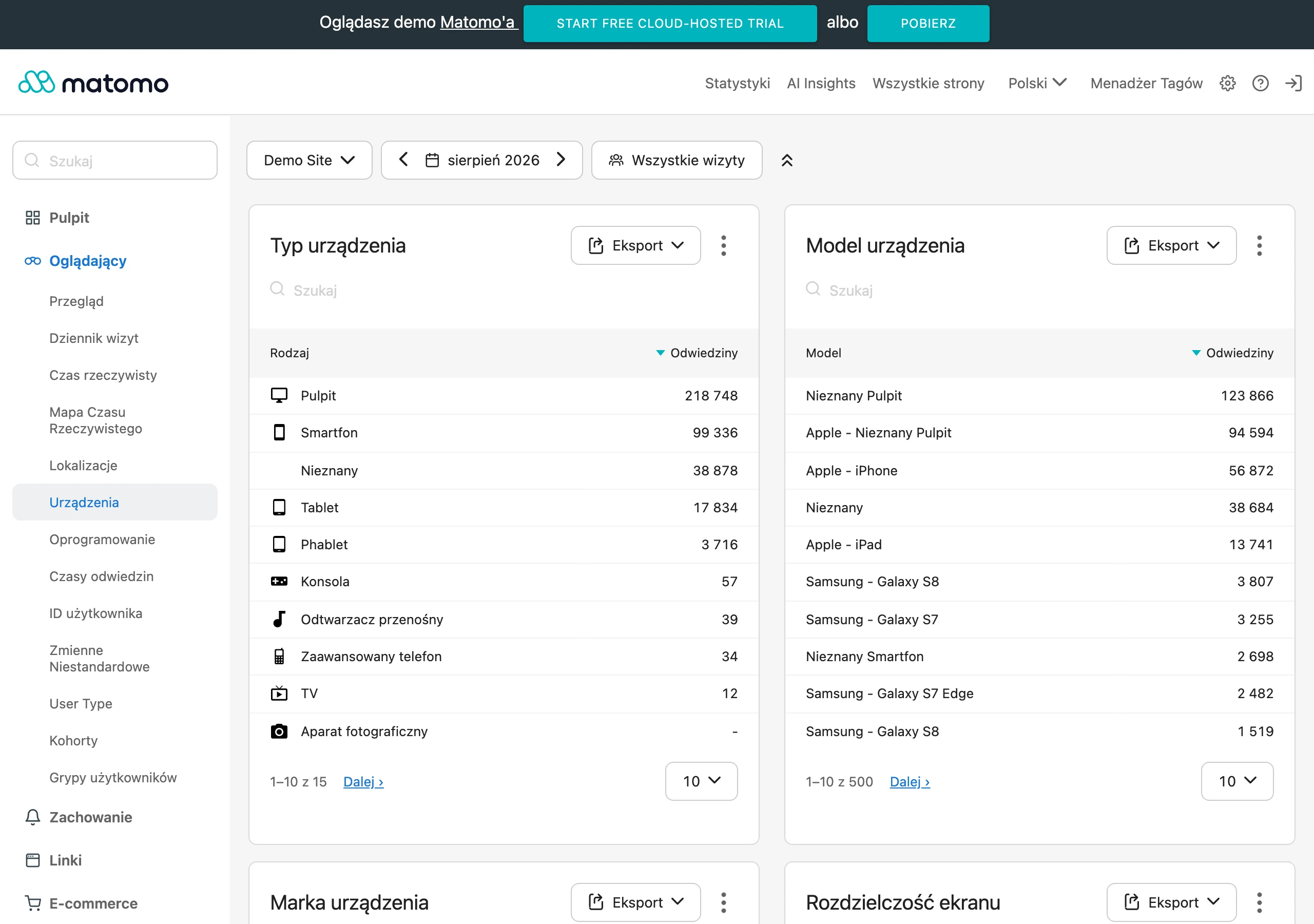
Analytics and tests in m-commerce only make sense if from the outset you measure the full purchase journey separately for mobile devices. In GA4, implement e-commerce events (view_item, add_to_cart, begin_checkout, add_payment_info, purchase) and device-level funnel reports so you can see at which stage mobile “breaks”. Without such measurement, you will not distinguish a problem with adding to basket from a payments problem, and that leads to misguided optimisation decisions. If you do not have a mobile funnel based on e-commerce events, conversion optimisation becomes guesswork.
Analysing user behaviour on phones should be based on qualitative data, because mobile is more prone to mis-taps and “rage clicks”. Heatmaps and session recordings from Hotjar or Microsoft Clarity show where the user scrolls, what they click and at which point frustration builds. It is worth separating the data for iOS and Android, because differences in usage can be significant. This makes it easier and faster to connect funnel drops with a specific UI obstacle.
Checkout abandonment on smartphones is best diagnosed by measuring “field drop-off” and logging client-side and server-side validation errors. Such measurement lets you identify the specific field that causes exits, rather than ending up with the broad conclusion that “users are not buying”. Typical sources of friction include a poor phone number mask, no postcode autofill, or a problem with selecting an InPost parcel locker on the map. The faster you identify the exact breaking point, the easier it is to plan a high-impact fix.
A/B tests on mobile should be run on the basis of a hypothesis and genuine statistical power, so that you do not draw conclusions from “noise” in the data. Set a minimum effect (e.g. +5% mobile CR) and test duration, and assess results in segments (new vs returning, channel, OS). For testing, you can use Optimizely, VWO or Convert, and with low traffic sequential tests or micro-conversion experiments work better. This approach reduces the risk of rolling out changes that “look better” but do not deliver results on smartphones.
Attribution and assessing the quality of mobile traffic must take into account privacy limitations and low-intent traffic, otherwise campaign reports will not tie up with sales. iOS limits tracking (ATT, ITP), so alongside GA4 it is worth relying on data from the shop system/PSP, and in Meta using Conversions API, and in Google Enhanced Conversions. At the same time, filter suspicious sources and exclude placements if you see unusual engagement metrics, because some clicks are bots or accidental taps (“fat finger”). Build the CRO backlog from critical friction points (speed, CTA, mobile payments, delivery costs), and prioritise with the ICE method (Impact, Confidence, Ease).
operations, logistics, law and post-purchase support in a mobile context
Operations in m-commerce should be designed so that key customer actions can be completed conveniently on a phone without involving support. Choosing a collection point can be critical, because maps are heavy and awkward on weaker devices, so alongside the map add a list of points, a postcode search and remembering the last selected point. In practice, integrations include, among others, InPost, DPD Pickup and Orlen Paczkę, and the performance of this step needs to be tested on smartphones with poorer specifications. This helps you reduce abandonment, which stems not from price, but from friction in delivery.
Automating logistics reduces the number of errors and improves the handling of growing mobile sales. Integrating the store with BaseLinker, Apaczka or Furgonetka makes it easier to generate shipping labels automatically and update statuses on an ongoing basis. In practice, this translates into fewer “where is my parcel” queries, which on mobile often come in via chat and unnecessarily burden the team. The more smoothly the automatic statuses work, the less manual work there is for the support team.
Returns on smartphones should be handled in a short, simple panel, because a complex process usually ends with a message to support rather than the customer taking action independently. Provide a clear path: order selection, reason, return method and an automatic label or posting code, e.g. in the InPost Szybkie Zwroty model. Equally important is handling complaints and servicing: the user needs a clear status and one place to track the case (ticket number, deadlines, required photos/documents, decision). Tools such as Zendesk or Freshdesk allow you to combine threads from email, chat and social into a single customer card.
Legal compliance on mobile means short, understandable consents that do not hold up purchases or hide key information. Use separate checkboxes for the terms and conditions and marketing consent, and avoid “walls of text”, because on a small screen they quickly increase abandonment. For cookies/consent, use a CMP compliant with TCF (e.g. OneTrust, Cookiebot), but configure it so that it does not block critical store functions. Show Omnibus-compliant promotions clearly: “lowest price in the last 30 days” as a short line under the price + a “details” link, instead of a multi-line block.
Operational security in m-commerce comes down to ensuring that payments and customer data are handled by the right entities and procedures, without risky shortcuts. Use payment operators who have PCI DSS on their side, and do not store card data in your system if you do not have the expertise and audits. Also establish anti-phishing procedures in customer service, because fraudsters often try to “change the delivery address” via chat. When a shipment delay occurs, send a proactive SMS/email with the new date and an option to cancel, which reduces chargebacks and negative reviews.
Consistency of product data across channels is crucial in mobile sales, because users easily switch between apps and devices. A mismatched description, image or specifications increases returns and damages reviews, and that quickly affects results. In such conditions, it is worth considering a PIM (e.g. Akeneo, Pimcore) and attribute standards so that the product feed, store and marketplace use the same information. This is the operational foundation that stabilises sales and post-purchase service on mobile.
FAQ
Frequently asked questions
Which elements should be visible in a product listing in mobile commerce?
In a product listing, it is worth showing the price, availability, delivery time and variant straight away. This helps the user make a decision faster and makes them less likely to go back to the search results.
Is “buy now” or comparing offers better on a smartphone?
It depends on the user’s intent, so it is worth splitting the paths into “buy now” for returning users and “compare” for new ones. This division shortens the process and better adapts the store to how people shop on mobile.
Why is a sticky CTA important in a mobile store?
A sticky CTA makes it easier to carry out the key action without scrolling and keeps it within thumb reach. This reduces the number of mistakes and speeds up the purchase on a small screen.
Which filters work best on mobile?
On a phone, 3–6 priority filters work best, as they are easy to remember and quick to recreate after returning to the listing. In the fashion industry, these are most often size, colour, price and availability.
Does one-page checkout work well on a smartphone?
In the article, a step-by-step approach is rated better: address, delivery and payment. This layout supports autofill and reduces clutter on a small screen.
Which payment methods should be available in mobile commerce in Poland?
In Poland, the standard options are BLIK, fast bank transfers, card, Apple Pay and Google Pay. BLIK is presented as the fastest method on a phone, and express checkout shortens purchase completion even further.