
Changes on a website become a problem not when they are big, but when the customer suddenly does not know how to complete their task. And that hurts. This especially applies to returning users who remember the old layout and try to navigate the site along old routes, like using a well-known shortcut. In practice, information about an update is not enough if it does not show exactly what has changed and where to look for things now. Effective change communication should keep the user oriented, not just “announce what’s new”. That means combining UX, content, analytics, support and technical elements such as redirects or event tagging. The closer the message appears to the point where the task is carried out, the lower the risk of frustration and process abandonment.
What is effective change communication on a website?
Effective change communication on a website is a process that allows the user to complete a task without unnecessary hesitation despite a new layout, content or features. So it is not about the mere fact that “something has changed”. It is about showing what has changed from the user’s perspective, where the needed option is now and what the next step should be. This is an operational approach, not X but Y. Not purely editorial or visual, but one that genuinely guides the user through the change.
In practice, this process starts with mapping out the changes. Without that, we are guessing. You need to know which elements have been removed, moved, renamed or rebuilt, because each of these decisions has a different cost on the user side. The most important changes are those that affect login, product search, basket, checkout, customer panel, forms, contact, payments and documents. If a change affects a high-intent task, the message should appear exactly where the user is trying to complete that task. The question is: why put up a “works in progress” sign if people will end up walking straight into a closed door anyway.
Effective communication usually involves several layers at once. One message is not enough. On the site, this can be microcopy near a field, a short message in a section, a tooltip, a transition screen or a local banner, depending on how much the change “hurts”. Outside the site, FAQs, an email to regular customers, instructions for customer service and consistent answers in the help centre are useful. A single global banner rarely suffices, because it does not answer the user’s specific question at the specific moment.
Audience segmentation is important too, because not everyone needs the same explanation. This is obvious in practice, although often ignored. A new user learns the interface from scratch, but a returning customer looks for the old path and unconsciously compares the new layout with the previous one. A logged-in user may need a different message from someone who has only just reached the site from an advert or search engine. Good change communication is conditional: it depends on who the user is, where they came from and what they want to do now.
In the end, it is not the message itself that matters, but what happens after deployment. If the number of 404 errors rises after publication, questions like “where is this” increase, basket abandonment grows or support contacts multiply, it is a sign that communication has not closed the orientation gap. And then no pretty wording will help. That is why we measure clicks on the new CTA, use of redirects, searches for old feature names and the behaviour of returning users. The data clearly shows whether the change has really been explained.
What are the main areas of risk when making changes to a website?
The risk sits where the user wants to get something done “here and now” and has no desire to guess the new logic. The most sensitive areas are login, basket, checkout, customer panel, payments, search, contact, forms, pricing and document sections. Why exactly these areas. Because these are points of friction. When something changes there, even a small lack of clarity can reduce conversions or increase the number of support tickets.
- login and account recovery,
- basket, checkout and payment selection,
- customer panel, orders, invoices and subscriptions,
- search, menu and moved product sections,
- contact, complaints and registration forms,
- pricing, terms and mandatory information.
There is a high risk with changes to navigation and information architecture. The user remembers the old entry path, so after a redesign they try to recreate the old clicks instead of learning the layout from scratch. That is an instinct, not a flaw. If categories have been renamed, sections moved and old URL addresses do not lead to equivalents, confusion arrives faster than you can “explain” it with a banner. When structural changes are made, the UX layer alone is not enough — you also need 301 redirects, updated internal linking and control of 404 errors.
Changes to feature names and labels are risky too. For the internal team, a new name may sound more polished, but for the customer it often means losing an orientation point. “My documents” turns into “File centre”, “Orders” ends up in the “Activity” tab, and suddenly the same need no longer has an obvious address. The question is: does the user have time to figure this out. During the transition period, it is better to add the old names in brackets, use aliases in search and apply messages such as “you’ll now find this here”.
A separate category of risk is changes that affect users mid-process. Someone has an active basket, a form in progress, an open ticket or a subscription and suddenly gets a new interface in the middle of the task. That hurts more than it does for someone visiting the site for the first time. In such situations, the message should be short, immediate and embedded in the action context, rather than hidden in a general news item on the homepage. The biggest problems are caused by changes implemented without thinking about the user “halfway through a task”.
Technical and organisational issues also affect the scale of the risk. And these are not details. The share of mobile traffic, language versions, CMS limitations, personalisation capabilities, accessibility requirements and whether the change can be rolled out in stages all matter. When there is no monitoring plan, no owner for the change and no fast route for correcting content after publication, even a correct redesign can cause communication chaos. That is why, before deployment, you should define not only the content of the messages, but also the response rules for when users start to get lost.
How does the audit and change impact classification process work?
The process of auditing and classifying the impact of changes comes down to one thing: checking exactly what has been removed, added or moved, and then assessing whether this will make it harder for the user to complete a specific task. What matters is not that the page looks different, but whether the customer can still find login, the offer, the basket, payment, contact or documents in the panel without getting lost.
A good audit starts by comparing the views before and after the change. Then you need to trace the old user paths and identify the places where someone would instinctively try to do something “the old way”. In practice, this means analysing the menu, URL addresses, button labels, forms, checkout, search, help section and customer panel. It sounds technical, but the stakes are simple: whether the user gets the task done to the end.
Analysing mock-ups alone is usually not enough. It is better to immediately compare the design with sources that show real behaviour: analytics data, session recordings, heatmaps, internal search queries and reports to Customer Support. If users were often looking for a feature even before the change, the problem usually worsens after it is moved. Quite simply, these signals rarely lie.
The result of the audit should be a simple risk map. Not a multi-page report, but a list of changes with answers to three questions: who is affected, which task may be interrupted, and where the message needs to appear. Such a map quickly reveals which areas need microcopy, a tooltip, a local banner, a redirect or an FAQ update. The question is: should the message help, or merely “inform”.
Impact classification organises these changes according to their importance to the user. Usually, four levels are enough: a cosmetic change, a functional change, a change critical to the task, and a change requiring formal confirmation, for example for terms and conditions, consents or payments. This way you do not overwhelm users with messages where they are not needed. Instead of noise — precision.
Cosmetic changes usually do not require separate communication, unless they alter how something works. Functional changes call for a short explanation at the point of use, without any waffle. Critical changes, such as a new login path, moving payments or a different customer panel layout, should be supported by contextual messaging, a redirect and often also information in an email or help centre. Otherwise the user pays in time, and the company pays in frustration.
The most common mistake is assessing changes from the team’s perspective, rather than from the user’s task perspective. For the business, moving an option to a new section may be a minor reorganisation. For the customer, it can already mean a break in continuity. The effect is simple: an interrupted purchase or account service process, which means a cost here and now. That is why the classification should refer to the effect, not the intention. The question is whether the user will take the next step without stopping.
Before publishing, it is also worth checking whether the message genuinely leads to the goal. The link must work. The text must be readable on mobile, and the message itself should be dismissible without fighting the interface. And one thing is crucial: after seeing it, does the user really reach the new location of the function instead of wandering around the screens. If the message does not shorten the path to the task, it is just additional noise.
How to segment audiences effectively when communicating changes?
Effective audience segmentation means that different messages reach different groups of users. Simple. Only then does it get interesting, because what they remember, what stage they are at and which task they are trying to complete matters. The same message will not be equally useful for a new user, a loyal customer, a mobile user and someone who happens to be finishing a purchase. And this is not a matter of “nice copy”, but of fit with context.
The most important split is usually between new and returning users. New users are learning the interface from scratch, so there is no need to explain to them what has been moved from the old layout. Returning users work differently. They try to recreate the old path, because that is how muscle memory works. That is why they need messages like “you will now find it here” or information using the old name of the function.
The second practical split concerns the user’s status and context. You communicate changes differently to a logged-in person, differently to someone with an active basket, and differently again to a customer with a subscription or an ongoing complaints process. And this is where it is easy to make a mistake: not a “for today” message, but a “for the situation” message. The message should result from the user’s situation, not from the change publication calendar.
The device and entry point also matter a great deal. If most returning traffic is mobile, messages need to be shorter, less intrusive and placed directly alongside the task. Instead of covering the screen — they should guide the user by the hand, but discreetly. By contrast, a user arriving from a saved bookmark or an old link in an email more often needs a redirect and a short explanation of why they are seeing a different page than before. After all, they are not “discovering what’s new”, they just want to finish the matter.
In practice, segmentation is best based on a few simple signals: account status, visit history, source of entry and the section being visited. That is usually enough to set display rules in a CMS, a personalisation tool or the frontend layer. There is no need to build a complex system straight away. It is enough to be able to answer clearly who and when you show a given message to, and what should happen after it is clicked.
It also helps to think in terms of journeys, not just groups. A person who has entered the customer panel needs different support from someone opening the checkout or a contact form. First a bit of help, then a specific pointer, and finally a quick route to the goal. The best segmentation answers the question: what is this user trying to do right now?
Segmentation should help, not create a mess. When one person meets several conditions at once, it is crucial to define message priorities, otherwise everything starts to conflict. A message critical for payment should take precedence over general information about the site’s new look.
The effectiveness of segmentation is only verified after implementation. The data clearly shows where something has gone wrong: abandoned journeys, clicks on the new CTA, searches for the old function name, 404 errors and the number of questions to support from specific segments. If returning users are still asking where something is, the problem usually is not a lack of information, but a bad display rule or a message that is too general.
How to design messages so they are understandable for users?
The message is understandable when it says straight away: what has changed, where to complete the task now, and whether anything important has stayed the same. The user does not come to read a description of the site’s reorganisation. They want to know how to log in, where to find documents, or how to finish a purchase after the page layout has changed.
The best message follows four questions: what has changed, why it matters, where the new path is, and what works as before. This structure organises the information, cuts out guesswork and reassures. If the message does not lead to the next step, it usually does not help — it just increases friction.
The content must sit exactly where the task happens. For log in, a short note next to the form works better than a general banner on the homepage. In the checkout, the message should be ultra-short, because every extra decision can interrupt the process.
The language should be task-oriented, not “internal”. Instead of writing “we moved the subscription management module”, it is better to write “you’ll now find subscription settings in the Account > Payments tab”. The user grasps an instruction for action faster than a description of organisational changes.
For larger changes, it is a good idea to leave transitional elements in place for a while. Old names in brackets, copy such as “you’ll now find it here”, and aliases in internal search all work well. This is especially important for returning users who are trying to recreate an old habit, and habits do not disappear after a single message.
Comprehensibility also depends on the form of the message. A small label change usually ends with microcopy next to a field or button, but moving a function to another section may require a local banner, a tooltip, a message in the customer panel and an additional FAQ. Not every message should be loud, but every message should be proportionate to the risk of error.
Before publishing, check whether the message can be understood quickly on mobile, whether it has clear contrast, and whether it does not cover key interface elements. But beware, the closing logic of the message also matters. If the user closes a hint and then cannot get back to it, they very easily lose the context and start fumbling around blindly.
What are the key steps for implementing change communication?
The key implementation steps are simple, although they do not forgive shortcuts. You need to prepare the places where messages will be displayed, set the display rules, connect the changes to analytics and, after publishing, check whether everything is under control. The message text alone is not enough. It has to reach the right person at the right time and guide them along a working path, not into a dead end.
First, you decide where the message should appear and who should see it. There is no single template here. Information is implemented differently for all visitors than for logged-in customers, people with an active basket or users returning to an old URL. The display rules should come from the page section, account status, visit history or traffic source. The question is: is the message meant to help, or just to “be there”.
Then comes the technical stage. Messages are best implemented through CMS components or the design system, so they can be corrected quickly without ripping up the whole site rebuild. For larger changes, feature flags are very helpful because they let you switch off a new element if there is a problem, without rolling back the entire deployment.
If the site structure or URL addresses are changing, communication must go hand in hand with 301 redirects and updates to internal linking. This is not “a separate technical matter”. It is part of the user experience, in other words whether someone reaches the goal. When a user clicks an old link from an email, bookmark or search results, they should land where they are supposed to, not bounce off a 404. Instead of frustration — continuity.
Before publishing, you need a ruthless quality check. You check the copy, links, mobile behaviour, keyboard accessibility, CTA clarity and whether the user, after seeing the message, actually reaches the new location of the function. It sounds painstaking. And good, because it is exactly the details that make the difference between “it works” and “it works for people”. The best test is simple: can someone who knows the old layout complete the task without extra help.
At the same time, you need to prepare the operational backbone. Customer Service should receive ready-made answers, a list of the most common questions and clear rules for escalating issues after implementation. In practice, it is about one thing: making sure support does not have to improvise under stress. A single source of truth also works well, with a list of changes, message publication locations, task owners and success criteria. Not “everyone knows”, but everyone can check it.
Measurement comes at the end. Without it, you are left with intuition and wishful thinking. In practice, that means tagging clicks on new CTAs, monitoring abandoned paths, 404 errors, internal search queries and contacts such as “where is this”. Without measurement, you do not know whether the problem is the interface itself, the message copy or the wrong place where it is displayed.
It is also worth having a fallback plan for the first hours and days after publishing. Sometimes a quick copy tweak, an extra redirect or a local message in one section is enough to stop a wave of errors. The problem is that the greatest damage usually comes not from the change itself, but from the lack of a quick reaction when users start losing their way. And then it gets expensive.
How do you monitor the effects of changes after implementation?
The effects of changes after implementation show up quickly. You monitor them by comparing user behaviour before and after publication and spotting the places where they lose the new path. The key question is not whether the message was displayed, but whether the customer can still complete their task without extra effort. In practice, you observe what happens to log in, basket, checkout, contact, customer panel and forms. If after the change the number of attempts, backtracks, abandoned sessions or support questions increases, it means that publishing the message alone did not solve the problem.
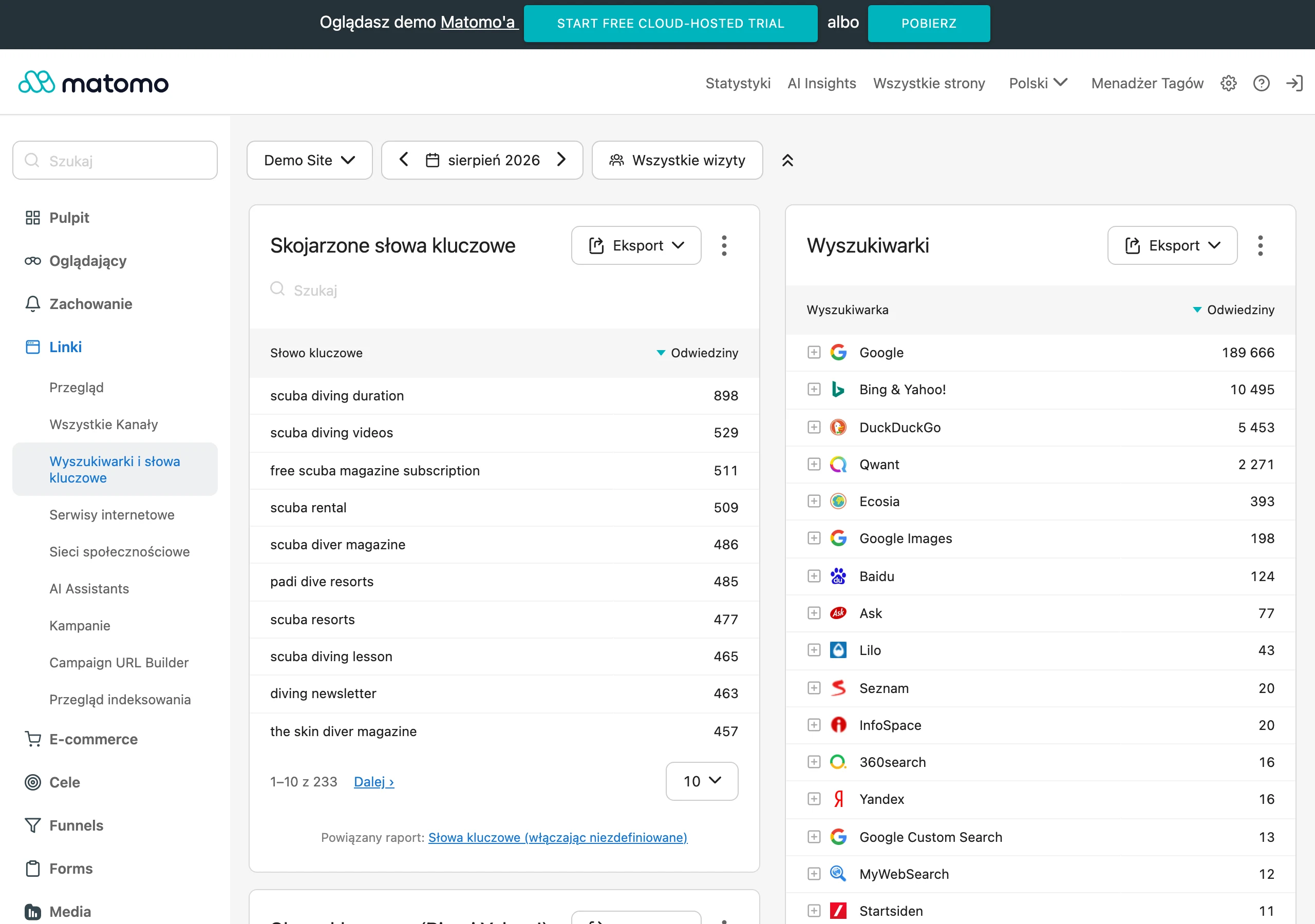
The benchmark is simple: data from before the implementation for the same tasks and the same segments. And this is not a cliché, but the only way not to confuse noise with signal. Compare not only overall conversion, but also micro-steps: entering the dashboard, clicking into a new section, using a new CTA, moving to checkout or submitting a form. Without such a comparison, it is easy to treat a change as neutral, even though the problem affects only returning users or only mobile traffic. The question is: are you looking at the same slice of reality.
Returning users are the litmus test of changes. They are the ones trying to recreate old habits, not learn everything from scratch. If new users are doing well and returning users are abandoning the path more often, searching for the old feature name or running into redirects, the problem is usually not the interface itself, but a lack of continuity in orientation. This is precisely where the difference between “it works” and “it is clear” appears. This is a frequent signal that it is worth temporarily keeping the old name in brackets, adding a helper link, or improving labels in the menu and search.
One data source is always half the truth. The problem is that each tool shows only a fragment of the picture, so the value only emerges once you put it all together. Analytics will show a drop in transitions and an increase in exits, 404 logs will reveal a problem with old URLs, site search will expose old feature names, and support tickets will tell you what the user does not understand in their own words. Session recordings and heatmaps make it possible to spot the moment of hesitation, but beware: they work best once you already know which task they concern.
Monitoring has two speeds. The first is the check immediately after publication: link correctness, redirect behaviour, message display, event tagging and the basic paths on mobile and desktop. The second is observation over the following days and weeks, because some issues only surface when regular customers return or when users reach for less obvious scenarios. And that is exactly why “checked on the day of deployment” does not mean “checked in practice”.
Warning signs need to be defined in advance, together with the owner of the response. If 404 errors are increasing, you update the redirect map and internal linking. If users enter the old section name into search, you add aliases and tidy up the naming. If the number of contacts such as “where is this” is rising, you shorten the path, refine the microcopy or move the message closer to the task. Without a decision owner, monitoring quickly turns into a report from which nothing follows.
Do not measure effectiveness solely by clicks on a banner or tooltip. That metric only tells you that the message flashed before the user’s eyes, but it does not confirm that the person actually got where they were meant to and completed the process. And that is the point, isn’t it. A better test is to connect message exposure with subsequent behaviour: moving to the right section, completing the task and a drop in help questions.
After a few days or weeks, prepare a short list of adjustments rather than limiting yourself to a summary of the results. Some fixes will concern the wording of messages, others navigation, and still others technical elements — such as redirects or menu labels. And here the key is not to fall into the “nice report” trap. The most effective monitoring ends not with a report, but with a series of small improvements that restore the user’s sense that everything can still be sorted out quickly and without searching.
FAQ
Frequently asked questions
How do you communicate changes on a website so the user does not get lost?
The message should say what changed, where to find the needed option now and what step to take next. It works best when it appears close to the place where the user is completing the task.
Is a global banner enough when making changes on a website?
Usually not, because it does not answer the user’s specific question at a specific moment. Better are messages placed in context, for example next to a field, in a section or in the checkout.
Why do returning users cope worst with changes on a website?
Because they remember the old layout and try to use familiar paths. When names, sections or the layout change, they lose their point of reference and get lost more often.
When do you need to be especially careful about communicating changes on a website?
Most of all when the change affects a high-intent task, such as logging in, the basket, payment, a form or the customer panel. It also matters when the user is halfway through a task and suddenly sees a new interface.
Which areas of a website are the riskiest when making changes?
The most sensitive are login, basket, checkout, customer panel, payments, search, forms, contact and documents. These are places where even a small lack of clarity can interrupt the process or increase the number of support requests.
How can you check whether the communication of changes really works?
After launch you need to look at data such as 404 errors, abandoned journeys, questions like “where is this”, clicks on the new CTA and searches for old feature names. If users are still getting lost, the communication has not closed the orientation gap.