
Customer segmentation and range selection
Customer segmentation and range selection is about first establishing who buys and why from you specifically, and only then organising the offer and navigation. Divide customers into 3–5 segments (e.g. “fast delivery”, “premium”, “lowest price”) and match categories, filters and messages on product cards to them. This helps the user get to products aligned with their priority more quickly, instead of browsing random items. Such an approach also makes it easier to plan promotions and bundles around a specific buying intent.
Matching the offer works most effectively when you translate behavioural data into specific store elements. For example, if 40% of orders are “gift”, add a “for a gift” section with gift wrapping and D+1 delivery, because this addresses a real purchase motive. In the “fast delivery” segment, prominently highlight availability and dispatch time, and in “premium” use messages that justify choosing the more expensive option. The key is continuity: segment → range → filters → message that closes the decision.
- 01Behaviour analysisWho buys and why?
- 02Customer segmentationDivide into 3–5 groups.
- 03Matching the offerFilters, categories, messages.
- 04Buying intentQuicker to the goal.
- 05PersonalisationAn offer for the real motive.
Key: first understand the customer, then organise the range to make shopping easier.
Value proposition on the website and in ads
The value proposition on the website and in ads is a short, highly visible answer to the user’s question: “why should I buy here rather than elsewhere?”. Place 2–3 USPs above the fold so they are visible without scrolling, e.g. “InPost 24h delivery”, “30 days to return”, “original parts with a 24-month warranty”. This lets the customer assess more quickly whether the shop meets their conditions before getting into the product details. In e-commerce, such messages shorten the decision path and reduce distraction.
Repeat the same 2–3 USPs consistently in Google Ads headlines and in Merchant Center descriptions, because a consistent message usually improves CTR and ROAS. If you promise a specific condition (e.g. fast delivery or easy returns), make sure the user sees it also at the click stage and while comparing offers. The biggest effect comes from consistency: one set of USPs on the website, in ads and in the product feed. This limits the gap between the ad promise and the experience on the site, which often reduces campaign effectiveness.
Pricing policy and free delivery threshold
Pricing policy and the free delivery threshold boost sales when you check their impact on average order value (AOV) and gross margin, instead of setting them “by eye”. It is worth testing 2–3 levels (e.g. 149 zł vs 199 zł) and observing how AOV and gross margin change, because sometimes a 10–20% rise in AOV offsets the shipping cost. It is equally important that the threshold message is visible at the moment of decision, not only in the terms and conditions. The best threshold is the one that lifts AOV without “eating” the margin through delivery cost.
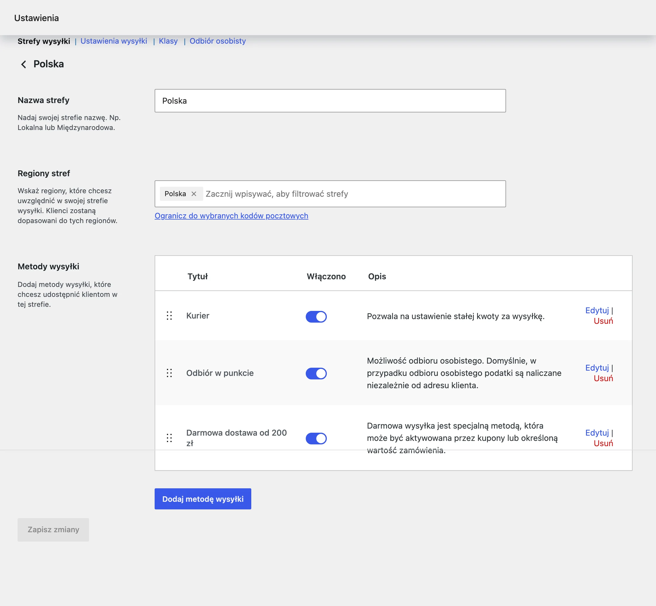
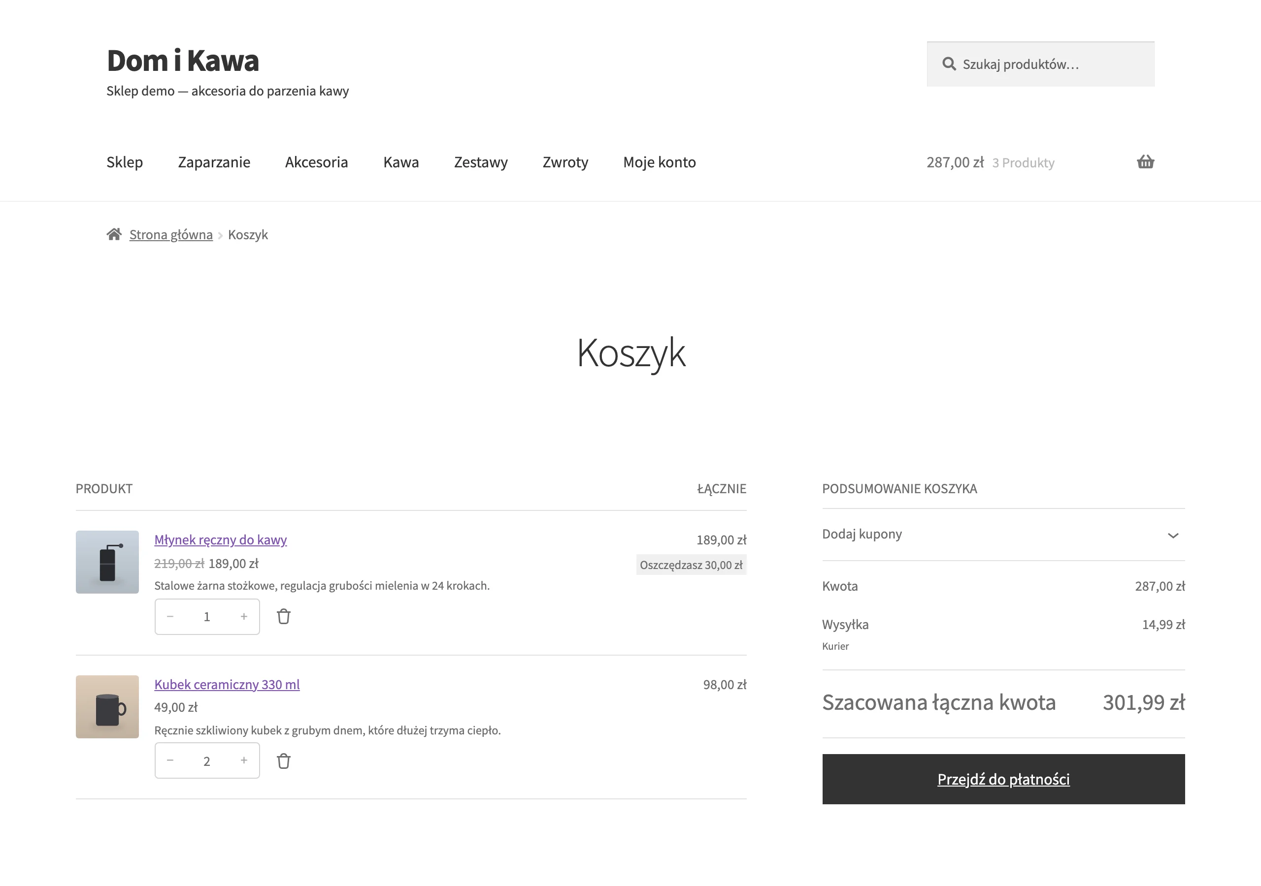
The free delivery threshold should be clearly shown in the basket and mini basket, so that the customer can immediately see what they can do next. A message such as “You are 23 zł short of free delivery” works well, because it leads the user to a simple step: add an extra product. A threshold that is too high can increase abandonment, while one that is too low reduces profitability, so comparable tests carried out on the same traffic structure are key. In practice, what wins is not the “lowest threshold”, but the best-communicated one, calculated against AOV + margin.
- Test 2–3 free delivery thresholds (e.g. 149 zł vs 199 zł) and compare the AOV results with gross margin.
- Show the threshold in the basket and mini basket, ideally in the form of the missing amount (“You are missing X zł…”).
- Check whether the rise in AOV compensates for the shipping cost (often a 10–20% increase in AOV makes the difference).
- 01Test thresholdsCheck 2-3 levels (e.g. 149 zł vs 199 zł).
- 02Measure AOV and marginMonitor the impact on average basket value and gross profit.
- 03Communicate in the basketThreshold visible at the moment of decision, in the basket and mini-basket.
- 04Encourage adding moreUse the message “You’re X zł short of free delivery”.
- 05Optimise profitThe ideal threshold increases AOV without losing shipping margin.
Key message: Strategic testing and clear communication of the free delivery threshold in the basket effectively increase AOV and protect margin.
Optimising the purchase process and Core Web Vitals
Optimising the purchase process and Core Web Vitals comes down to removing friction that makes the user disappear before they see the product or complete payment. Aim for LCP < 2,5 s, INP < 200 ms and CLS < 0,1, because site speed has a real impact on conversion rate. Use PageSpeed Insights, Lighthouse or GTmetrix for diagnosis, and start with the most common obstacles. In most cases, the fastest way to improve the result is by compressing images (WebP/AVIF) and implementing lazy loading.
Conversion in the purchase process increases when the customer immediately understands the costs and goes through as simple a checkout as possible, especially on mobile. Show delivery and return costs even before the basket and provide a clear delivery time, because hiding fees increases abandonment. In the checkout itself, reduce the number of fields to a minimum and add guest checkout so as not to stop the transaction at the final stage. On mobile devices, refine form ergonomics (e.g. appropriate keyboards and large CTAs), because that is where friction most often appears.
Navigation, filters and on-site search
Navigation, filters and on-site search should support sales, because they answer the user’s basic question: “where can I find it?” and shorten the path to the right product. If the customer cannot quickly reach a specific category or variant, the risk of leaving the site rises before anything is added to the basket. In e-commerce, search can generate 10–30% of revenue, so it is worth treating it as a key part of the purchase process rather than just an add-on. Difficulties in finding products usually signal that the information architecture and navigation priorities need refining.

The search engine should support autocomplete, typos and synonyms (e.g. via Algolia or Doofinder), so that users get relevant results even with an imperfect query. Filters must cover decision-making attributes (e.g. size, compatibility, colour, power), because these close the choice without the need to compare multiple product cards. Ideally, filtering works without reloading the page, as this maintains shopping pace and reduces frustration on mobile. In practice, this means designing categories and filters around real customer questions, not the internal warehouse structure. Should the user have to guess what the product is called in the system in order to find it?
- 01Quick findShortens the path to the product
- 02Less frustrationProtects against leaving the site
- 03Revenue generationSupports 10–30% of sales
Key elements that support sales and improve information architecture.
Keyword research for categories and products
Keyword research for categories and products is about building an SEO structure around keywords that attract people with buying intent, not just readers of guides. The foundation is transactional phrases such as “buy”, “price”, “shop”, “24h delivery”, because they signal readiness to place an order. At the same time, develop the long tail (e.g. “running shoes pronation 44”), which often responds better to specific needs and naturally ties in with filters in the store. Prioritise phrases with high intent and real volume so that work on categories and products translates into sales, not just traffic.
For analysis and planning, use tools such as Senuto, Semrush, Ahrefs and Google Keyword Planner to assess the potential of topics and query variants. The results of the research should influence how you name categories and how you develop product pages, rather than ending up as a list of keywords in a spreadsheet. A good practice is to split keywords into those that fit a category and those that describe a specific variant or buying need — then the user lands on a page that matches their intent. This way, SEO supports “ready to buy” traffic, not just reach building.
Google Shopping and Performance Max with a correct feed
Google Shopping and Performance Max increase sales on the condition that the feed in Google Merchant Center is complete and updated on an ongoing basis, so that ads do not display incorrect prices or availability. First, make sure the attributes are in order: GTIN, brand, Google category, condition, shipping time, promotional price and delivery cost, because these are most often responsible for the mismatch between the offer and the ad. If a customer sees a different price or “out of stock” in the ad, you lose the click and trust even before they enter the site. In practice, it is the quality of the feed that forms the foundation of effective product campaigns.
Update the feed at least 1–4 times a day, especially with rapid stock turnover, so that you do not serve unavailable offers or offers with an out-of-date price. For working with data, use tools such as DataFeedWatch or Channable, which make it easier to map and organise attributes in Merchant Center. Regular feed updates are the simplest way to limit errors that “ruin” campaign results without changing the budget. This gives the system better input data, and you can assess campaign performance based on the real offer.
Email automations: abandoned cart and post-purchase
Email automations increase sales because they can bring the user back to purchase and drive repeat transactions after the first order, without adding more budget for traffic. Set up a basic abandoned cart flow in three steps: 1h, 12h and 48h, to remind people about the purchase and address doubts at different decision-making moments. Then add a post-purchase sequence covering instructions, cross-sell and a request for a review, because that completes the post-purchase experience. The biggest advantage comes from an “always on” automation that recovers sales even when you are not running a promotional campaign.
To implement automations, use tools such as Klaviyo, Mailchimp or GetResponse and measure the revenue generated by the flow as a percentage of total sales. In mature stores, revenue from email automations can account for 10–30% of total revenue, so it is worth treating it as a permanent channel rather than a one-off campaign. The key is to measure the effect of automation, because only then do you know which sequences are truly “delivering” sales. If any element is missing (e.g. instructional content), roll it out iteratively, following the structure: reminder → post-purchase value → review.
FAQ
Frequently asked questions
How can you tailor an online store’s offer to the needs of different customers?
First, it is worth dividing customers into 3–5 segments, e.g. “fast delivery”, “premium” or “lowest price”. Then you need to match categories, filters and messaging to them so that the user gets to the right products faster.
How can you show a store’s value proposition so that you convince the customer to buy faster?
It is best to place 2–3 USPs above the fold, i.e. in the area visible without scrolling. The same set of messages is worth repeating in Google Ads and in Merchant Center so that the message is consistent.
Can a free delivery threshold increase sales in an online store?
Yes, if it is well calculated and shown at the right moment, it can increase the average basket value. The article emphasised that it is worth testing several levels and checking the impact on AOV and gross margin.
How should free delivery be communicated in the basket to reduce abandonment?
The threshold should be visible in the mini basket and basket, preferably as the missing amount. A message such as “You are X zł short of free delivery” encourages adding an extra product.
How can you improve the purchasing process to increase conversion in an online store?
You need to reduce friction: show delivery and returns costs before the basket, simplify checkout and allow purchase without registration. On mobile, a small number of fields, large CTAs and ergonomic forms are also important.
How do search and filtering affect sales in an online store?
A good search engine and filters shorten the path to the product and reduce the risk of leaving the site before purchase. They should support autocomplete, typos, synonyms and decision-making attributes such as size, compatibility or colour.