
Including your favourite colour in your own design does not necessarily mean you are making a mistake. However, if you are seriously working as a designer, you probably know that the psychology of colour plays a significant role in UX design (user experience). For example, pink may be your favourite colour, but you should still rather avoid it when creating a mobile app for a company operating in the agricultural sector.
Colours evoke different emotions. The most popular colour-emotion associations are:
- red – passion and desire,
- orange – creativity,
- yellow – cheerfulness,
- green – health or growth,
- blue – stability,
- gold – wealth,
- purple – luxury.
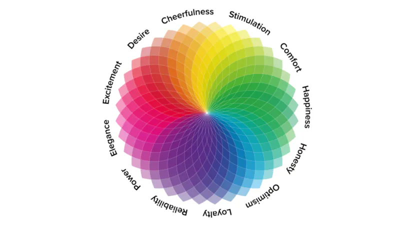
A carefully considered colour palette can have a very positive impact on a design, whereas an average set of colours may only lead to a poor user experience. The best solution is therefore to take psychology of colour in UX into account when creating user interface elements such as buttons, navigation elements, calls to action, etc.
Various studies have shown how colours affect emotions. That is precisely why many businesses use the psychology of colour to influence the actions and reactions of their target audiences. To create an excellent digital product, you need to understand how colours should be used in UX.
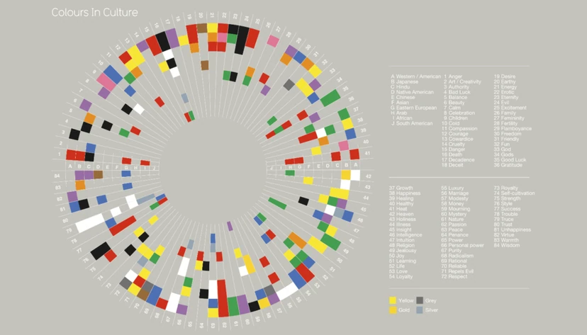
How are colours used in design?
Unfortunately, there is no single general rule for colours and UX that will suit different types of businesses, websites and applications. You should therefore pay attention to the industry or niche and the target audience. You will certainly choose more playful and vibrant colours for a brand aimed at children.
- 01No single ruleThere are no universal rules.
- 02Understand the industryAdapt to the niche and context.
- 03Know your audienceChoose colours for the target group.
Colours depend on the context, industry and audience; there is no single universal solution for every project.
Psychology of colour in UX design aligned with the niche/industry and inspiration for colour palettes in your next project
Different industries are associated with different types of colours. Here are a few of the most popular examples.
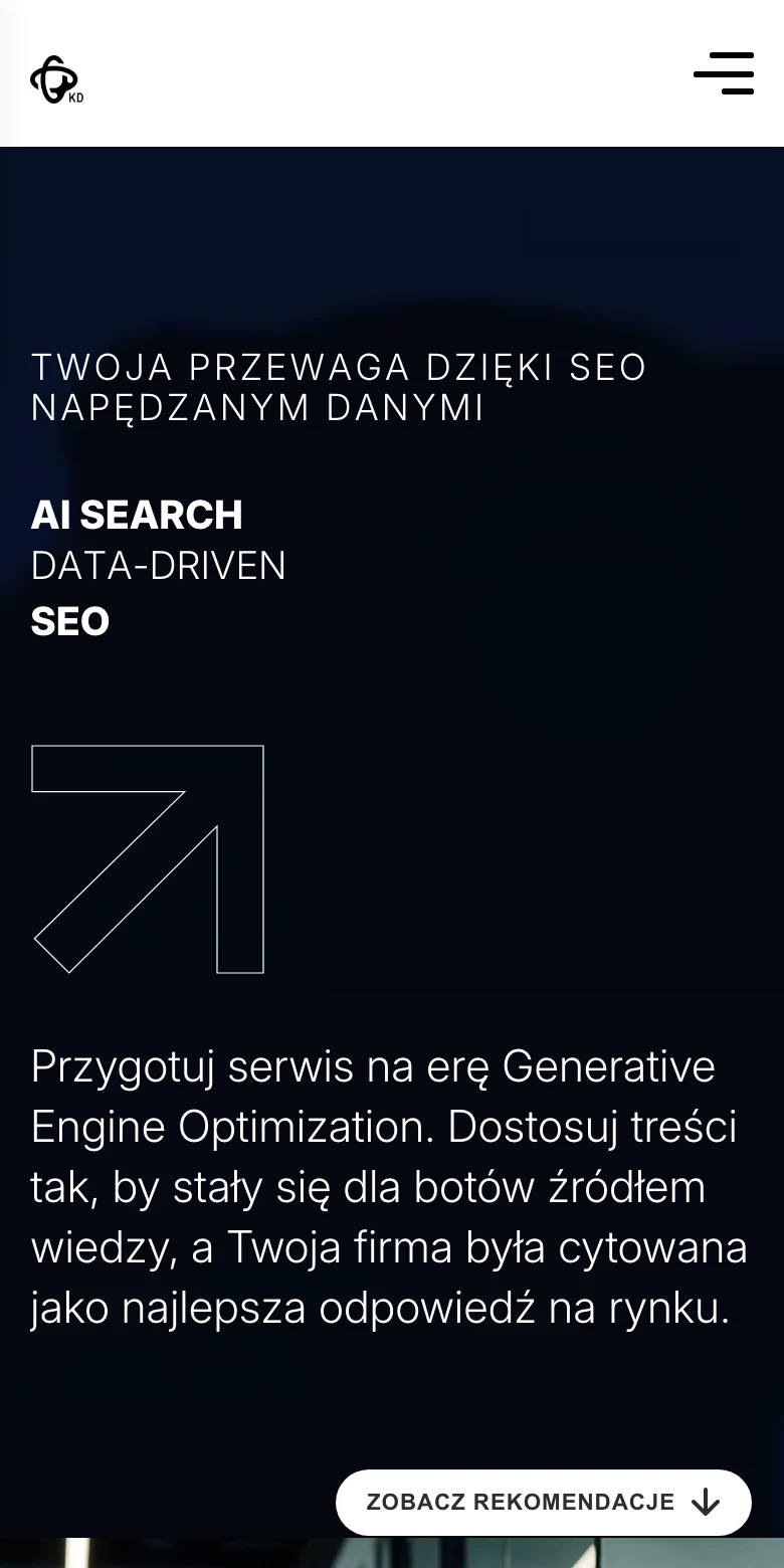
The best colours for the technology industry
Blue is undoubtedly the dominant colour in the technology industry. This colour evokes feelings of stability, trust and security, which are certainly attributes associated with users in the technology sector.
Another colour that is good for technology brands is silver. This colour is associated with modernity and innovation, which are closely linked to the technology industry.
The best colours for the fashion and beauty industry
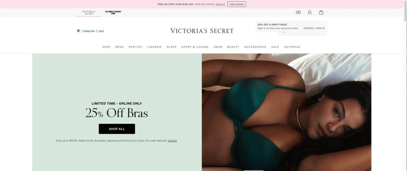
Fashion and beauty is an industry that may require more vibrant and appealing colours. Bright and bold colours such as pink are perfect. Purple, on the other hand, denotes royal dignity, fame and luxury, while pink is associated with femininity, love and beauty.
However, it is important to remember to restrict the use of pink to female brands. Purple (for both genders) is the ideal colour for luxury brands. Combining these two colours can help create a great eye-catching design.
The best colours for a website design related to artificial intelligence (AI)
The design of brand identity elements for companies associated with artificial intelligence should be sophisticated, modern and unique. Such elements should provide a futuristic, scientific look and convey a sense of authority, trust and reliability.
The best option is to use turquoise or blue when creating a design for an artificial intelligence company. Such colours are ideal for visualising future-oriented thinking as well as technological and communicative concepts.
The best colours for food brand identity
Red and yellow are the primary colours used when designing food brands. Such colours stimulate the taste buds and stimulate appetite. Orange is another colour that works perfectly for food brand identity. It is a combination of red and yellow, creating another appetising colour.
Another colour worth considering is green, which is associated with ecology and healthy eating (e.g. vegetables). However, this colour should not be overused, as it may look unappetising.

The best colours for an educational mobile app
When it comes to learning-related situations, blue springs to mind first. It symbolises intelligence, speech and understanding. Studies say that this colour has a positive effect on reading comprehension. It is a relaxing and calming colour. However, it is worth noting that lighter shades of blue are more “friendly”, while darker shades are more gloomy.
Another colour worth considering when creating educational apps is green. This colour promotes calmness and a sense of relaxation. It is also excellent for supporting long-term concentration and mental health.
Red and orange colours can be included in your design if the product is aimed at children (and adults in terms of creative learning). Red can stimulate the adrenal glands. It evokes a feeling of creativity and energy. Orange also has a positive effect on creativity and critical thinking.
The best colours for designing health-related websites
Green and blue are ideal colours for websites, mobile apps and other digital products related to health. The best choice is a light shade of green. It symbolises optimism, calm and balance.
Blue evokes a feeling of calm, openness and safety. It is usually described as the colour of calm, health, silence, safety and order.
Why should you use the right colour in brand identity design?
Choosing the right colour in UX (user experience) design is an absolute priority. It is just as important as the illustrations and fonts you choose. Brand colours attract users’ attention. In other words, colour in UX design is an important tool that influences the actions of potential users.
FAQ
Frequently asked questions
How does colour psychology affect UX design?
Colours trigger different emotions and can improve or worsen the user experience. In UX, they also help direct attention to buttons, navigation and calls to action.
Why is there no single universal colour palette for all apps and websites?
There is no one set of colours that suits every industry, website and app. Colours need to be chosen for the niche and the target audience.
Which colours work best for the technology sector?
In the technology sector, blue dominates because it is associated with stability, trust and security. A good complement is silver, which evokes associations with modernity and innovation.
Does pink suit fashion and beauty brand projects?
Yes, in fashion and beauty pink can be a very good choice because it is associated with femininity, love and beauty. However, it is worth remembering that the article pointed to limiting its use mainly to female brands.
Which colours should you choose for a food brand identity?
Red and yellow are most often recommended because they stimulate appetite. Orange also works well, and green should be used cautiously, because if overused it can look unappetising.
Which colours work well in education and health apps?
In education, blue works well because it supports reading comprehension and gives a sense of calm, and green, which encourages relaxation and concentration. In health-related topics, light green and blue perform best, as they are associated with balance, safety and calm.