
Website navigation is the most important aspect of the overall user experience that affects conversion potential. Having a solid navigation system is essential for maintaining a high user retention rate and a low bounce rate.
Nevertheless, many website owners focus on the design and multimedia, ignoring the fact that even well-designed websites can lose up to 55% of visitors because of poor navigation (data from Netguru). Users do not like searching for the information they need when they can move to another source.
Excellent website designs with good navigation support the achievement of business goals and at the same time deliver better performance and user experience, both on desktop and mobile devices. If you do not want users to leave, start improving the navigation of your website and app using the tips below.
Key facts
- effective website navigation is important for user experience and includes many elements, such as menus, fragments and links. It is important to have a clear and organised structure that makes content easy to find. This, in turn, affects engagement, SEO and business results,
- there are many types of navigation menu – horizontal, vertical, dropdown and footer – each suited to different website structures. The choice depends on content requirements and user journeys, taking desktop and mobile layouts into account,
- designing user-friendly navigation includes best practices such as keeping it simple, ensuring consistency between pages and creating responsive layouts. Running A/B tests to optimise it and avoid common mistakes, such as menu overload or lack of consistency, is also crucial.
- 01User experience (UX)Crucial for engagement and SEO.
- 02Types of navigation menuSuited to content and devices.
- 03User-friendly designKeep it simple and consistent.
A clear structure affects engagement, SEO and business results.
Understanding website navigation
Imagine a website as a multi-storey building. The navigation system serves as the lift panel directing visitors to the desired floor or providing information. This includes elements such as menus, breadcrumbs and links that direct visitors to content and features, significantly improving the user experience.
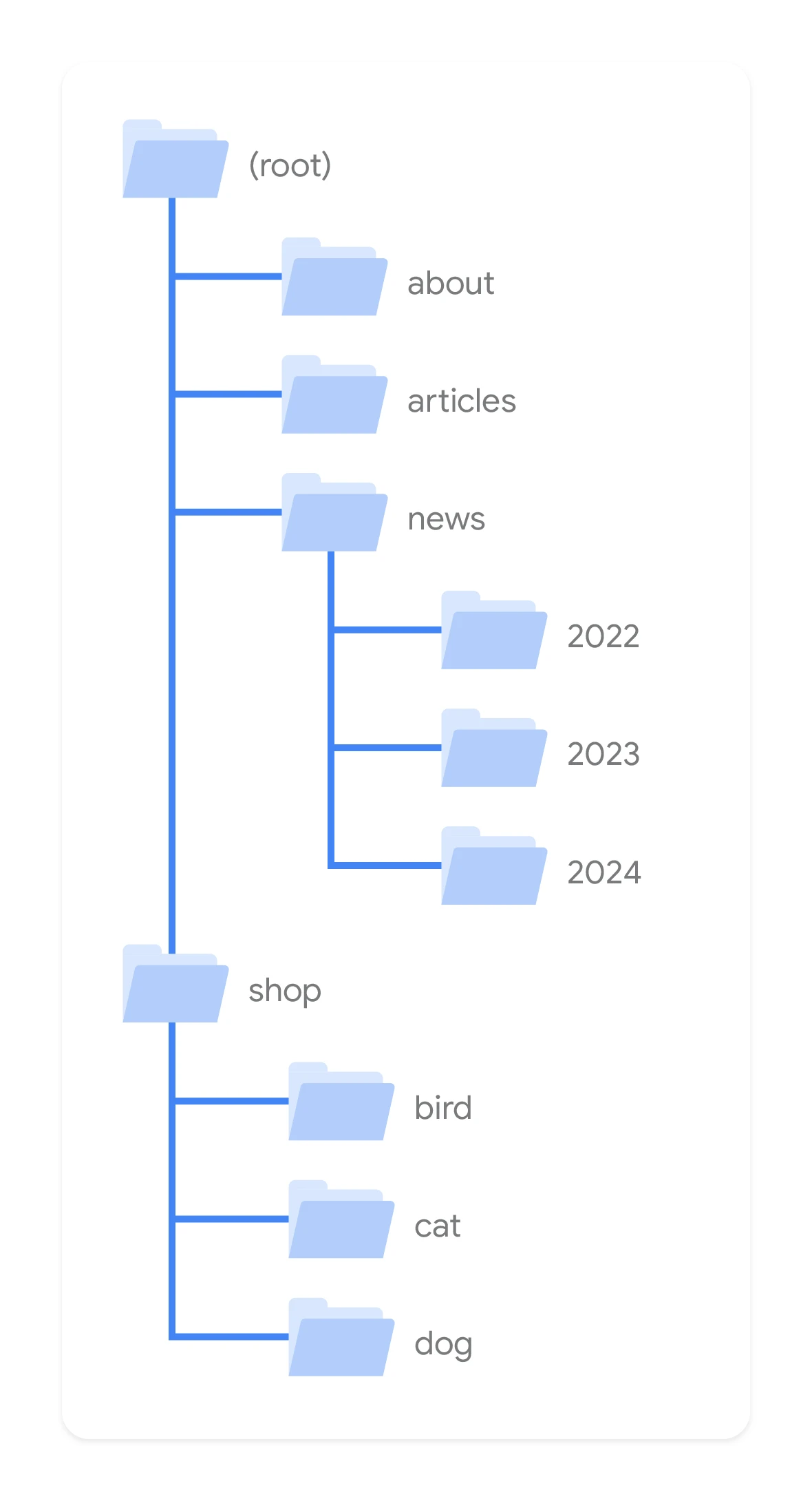
Such a map encompasses a complex information architecture, including key pages. The navigation menu, acting as the main gateway to other pages, must be clear and simple to support the user on their journey through the site. It is therefore necessary to have a well-organised navigation structure that provides clarity for users.
What is website navigation?
Website navigation serves as the interface that gives visitors access to different areas of the site. This set of interface tools, including the website navigation menu, guides users through the site, helping them to load content and features efficiently. A website navigation structure consisting of elements such as menus, breadcrumb menus and internal links plays a key role in delivering a seamless and intuitive site experience.
- 01Clear business objectiveCommunicating the company’s purpose
- 02Short, intuitive pathUnderstanding the user’s needs
- 03Key conversion featuresDirecting to sales
Optimised navigation links user goals with business outcomes.
The importance of good navigation
Good website navigation serves as guidelines helping users quickly and easily find what they are looking for. It encourages them to stay on the site longer by allowing them to fully explore and check what the site has to offer. Many customers focus on navigation links and the site layout during their first visit to the site.
That is why good navigation significantly improves the user experience by simplifying the location of information. It has a major impact on site effectiveness because it improves SEO, supports trust and credibility, and boosts conversions and business profit.
1. Aligning navigation with business priorities
Aligning the website design with business goals will not only help to communicate the company’s purpose clearly, but also help direct visitors to the most important conversion and sales functions. Be aware of where your users want to get to and offer a short, intuitive path that leads them there. The following steps will also help align navigation with business priorities.
- 01Quick overviewUsers have little time
- 02Simple menuMaximum 7-8 options
- 03Better indexingGreater SEO authority
Main takeaway: The simpler the menu, the easier it is for users and the better the search engine results.
2. Including calls to action
Calls to action (CTA) are essential in directing users where they should be. The right CTA can also improve click-through rates and help turn many leads into customers. These buttons are also ideal when you want a potential customer to fill in a form, share your content online or sign up for the event you are promoting. Precise and catchy phrases are far more effective than a plain “click here” button.
3. Reducing the number of options available in the menu
Users usually do not have much time to browse your website structure, so the simpler the menu, the better. Seven or eight categories to choose from is quite a lot, so do not go beyond that. More options can confuse users and cause them to leave your site. They will not waste valuable time browsing and trying to understand your site. Short menus also index better in search engines, which assign greater authority to internal pages, driving more traffic to your site.
4. Splitting categories
Your site navigation system probably has many categories, sections and sub-sections. They should have good SEO-optimised titles, but that is not enough. Your categories should also be clearly presented on the page and visibly separated from subcategories.
It is important for the user to be kept informed about their location at all times. Visual cues that help users navigate include contrasting full-width banner colours. Navigation titles and misleading content should be removed.
Be wary of incorrect navigation titles and links that may confuse or annoy visitors. This is a common reason for leaving the site. Visitors should have real information about what they can find if they click a navigation link. Misleading them is never good for the user experience. Make sure that all languages accurately represent the page they are assigned to (this also applies to illustrations).
5. Creating a “sticky” navigation bar or a button appearing at the bottom or top
If you are building a large site, add a “sticky” bar that will remain visible to users as they scroll down the page. You can also include a button appearing at the bottom or top that helps users return to the key content provided at the beginning. The aim of these actions is to create a site that is quick to navigate for users who have little time and to ensure that all pages are quickly and easily accessible.
6. Do not underestimate the footer navigation bar
The bottom navigation bar is excellent for displaying subcategories. Think about it – users browsing your site from top to bottom may be looking for further information. The footer is therefore a good place to put all additional information or options, but do not forget to also include links to categories from the main bar.
7. Adding a search bar
Users looking for specific information may prefer to use the search option rather than scrolling through the site and looking for something manually. Therefore make sure that such an option has been added to your site. The ideal place is the upper part of the sidebar or the header area.
In addition to being easy to find, the bar must also work well. A search bar that returns no results is bad for your business. It should always deliver high-quality results, cope with typos and present related products and items. Google offers a programmable search engine that allows you to add a search option to your site.
8. Making movement between subpages easier
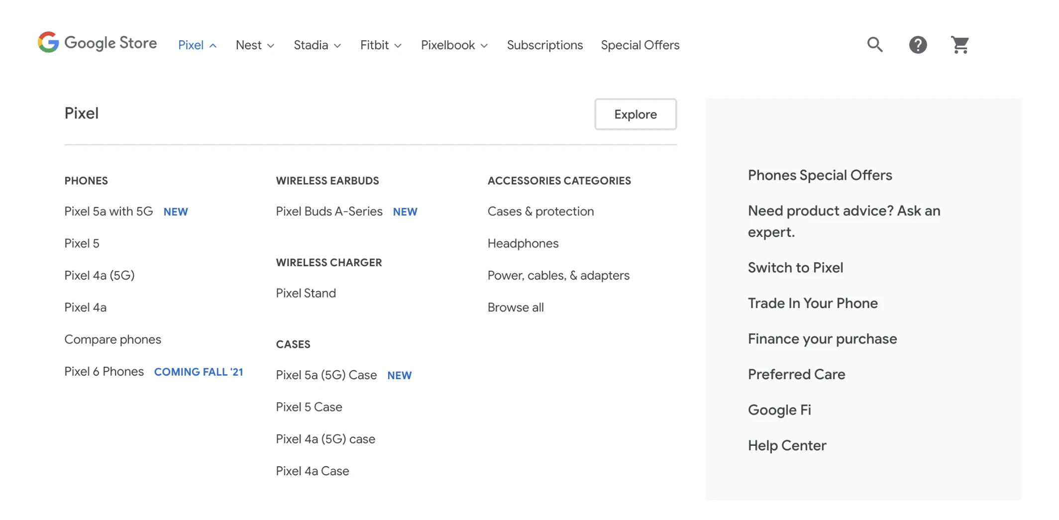
Users should be able to move between pages without any problem, so in addition to placing links to other pages on your site, it is good practice to provide access to all pages in the navigation bar. When designing the menu bar, think about information flow architecture. Choose a navigation map that provides clear and intuitive paths. Navigation icons, in turn, are a quick and simple way for users to find what they need.
9. Linking to the home page
Visitors may want to return to the home page after checking other pages, so make sure this option is always available. Never force users to click the “back” button in their browsers to get to the home page.
The home page acts as a base camp in the user journey, so it is the place they usually return to after browsing other sections of your site. Embedding such a link in the company logo is a good and intuitive way to direct users back to the home page.
10. Proper use of colours
Using different colours can provide some navigation cues and positively affect usability. Creating contrast and eye-catching colours can help users identify important elements more quickly and should be used to draw attention to the navigation bar. Make sure you visually distinguish it from the rest of your content. To do this, you may want to explore theory relating to colours.
11. Prioritising mobile navigation
Did you know that Google indexes and ranks websites based on their mobile versions? This is certainly the most important, but not the only reason why you should carefully think about how best to use mobile screen space in terms of content distribution. Here are some statistics:
- in January 2021, almost 60% of the global population used the Internet, according to information from Statista,
- in March 2022, almost 55% of those users browsed websites on their mobile devices.
Many users will barely see your site on a desktop at all, so you cannot afford to ignore having a responsive design for the new website. It is crucial for achieving business objectives. From the users’ perspective, providing excellent experiences on both standard and mobile devices is mandatory.
12. Use short and concise names
Good navigation uses short and precise words. Long and complicated names can not only confuse users and perform poorly in terms of navigation, but they are also difficult for search engines to recognise. When it comes to navigation element names, being original does not pay off. Choose names that are simple and appropriate. Standard phrases such as “contact”, “search”, “subscribe” and “register” will fulfil their tasks perfectly.
Best practices for site navigation
Creating user-friendly navigation involves both art and science. This process requires a delicate balance between the following elements:
- simplicity,
- clarity,
- logic,
- responsiveness.
They prioritise the experience and business objectives.
Keep it simple
In particular, in website navigation, simplicity is the pinnacle of sophistication. To prevent cognitive overload and make it easier to recall and navigate to options, a well-organised horizontal navigation bar should be limited to 7±2 elements at the top.
A minimalist approach to design, with clear lines and ample white space around navigation elements, significantly reduces clutter and positively affects the user experience.
A priority focus on user experience
When designing site navigation, user experience comes first. It requires creating separate navigation layouts for standard as well as mobile devices, using clear labels and ensuring accessibility.
Descriptive navigation labels are good for both search engines and visitors, because they clearly convey the content, in line with SEO and user expectations.
Consistency between pages
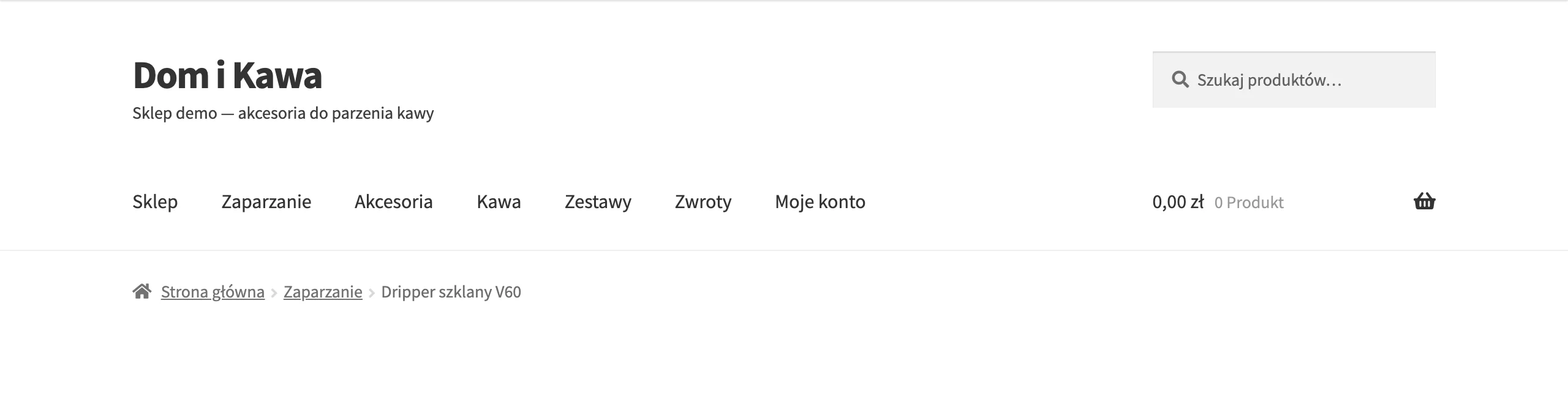
In website navigation, consistency is important. It gives users a sense of stability, a key aspect of the overall website experience, across all devices and screen sizes. Placing visual indicators, such as “breadcrumbs” and location indicators, in the navigation design helps users understand their current position within the site structure.
Improving navigation on a website using tools and techniques
The era of digital solutions provides us with a rich range of tools to improve site navigation. These tools include:
- Google Analytics, which helps understand user behaviour,
- Google Optimize, which allows you to experiment with changes using A/B tests,
- Google Keywords tool, which helps identify popular terms.
Using these tools can significantly improve navigation on your site.
Using Google Analytics to optimise navigation
Google Analytics is a valuable ally in your navigation. This tool allows you to perform the following actions:
- observe visitors’ interactions with the site navigation,
- identify opportunities for improvement,
- adjust navigation, placing important links and calls to action more prominently to improve the user experience.
With insights from Google Analytics, website owners can optimise navigation and improve the overall user experience.
A/B testing of navigation elements
A/B testing is another effective tool for improving navigation. It allows designers to compare different options with the current design to analyse which option delivers better user engagement and conversion rate.
Implementing a search function
The search function, provided by a search bar, works much like a personal assistant for your visitors. This solution significantly improves the user experience by providing a direct path to the information or products users are looking for. This leads to faster navigation and a better navigation experience. Moreover, search engine optimisation plays a key role in increasing the visibility and accessibility of the site for potential visitors.
Real examples of effective website navigation
Learning from specific examples is always valuable. Let’s look at a few navigation examples by analysing how two tech giants (Apple and Amazon) have mastered navigation on their sites, delivering excellent user experiences.
Example 1: Apple
Apple, a pioneer in design, uses minimalism in website navigation. A streamlined horizontal navigation bar that highlights product and service categories provides users with an intuitive experience.
Example 2: Amazon
Amazon is a titan in the e-commerce industry, using dropdown navigation elements to give users access to more than 150 content sections without feeling overwhelmed. This is an excellent example of how to handle a huge amount of content without negatively affecting the user experience.
Common mistakes to avoid in website navigation
As in any project, there are certain pitfalls that can lead you off course in navigation design. Overloading the menu, using unconventional navigation elements and neglecting mobile optimisation are common mistakes that can frustrate users.
Overloading the menu
Minimalism reigns in menu design. Overloading the main menu with various elements can overwhelm users, complicating the decision-making process.
Inconsistency in design
Consistency is paramount in design, and navigation is no exception. Changing the style or position of the primary navigation bar across different pages can confuse users and create a sense of being lost.
Ignoring mobile optimisation
In the smartphone era, overlooking mobile optimisation can be costly. Fast load times on mobile-optimised pages are crucial, because mobile users are less patient. This optimisation makes users more engaged and results in lower bounce rates.
The importance of good website navigation for the user experience
In the digital world, website navigation plays a key role in shaping the user experience and business outcomes. A well-designed navigation structure acts like a roadmap, guiding visitors to various features and content on the site. From simple horizontal navigation bars to complex dropdown menus, different types of navigation are tailored to different website structures and content needs.
Prioritising the user experience, maintaining consistency and using optimisation tools are key considerations when creating effective website navigation. As can be seen from the examples of Apple and Amazon, a well-thought-out navigation strategy can improve user interaction and engagement. So next time you start designing or refreshing your site navigation, remember — the most important thing is easy and intuitive operation for users.
Easy navigation on a site is crucial for guiding the user through the buyer’s journey, leading to conversion. Business owners should be aware of their business goals and must tailor their navigation strategy so that it supports them. Overly complicated menus, making it hard to find specific functions and using misleading words will cause confusion among users, who will quickly leave the site, and you will lose valuable conversions.
User experiences related to navigation have a direct impact on the time users spend on your site, their opinion of your company and the decision on whether to make a purchase. It is therefore worth following best practices in order to provide an excellent navigation experience.
FAQ
Frequently asked questions
How does good website navigation affect user experience and conversions?
It helps users quickly find the content they need, increases time on site and reduces the bounce rate. As a result, it supports SEO, trust and business results.
Why is it worth limiting the number of menu options to 7-8 categories?
Because an overly complex menu confuses users and makes it harder to find information. A shorter list is also indexed better by search engines.
What elements should a good website navigation include?
The article mentions the menu, breadcrumb navigation, internal links, a search bar and links to the home page. Clear labels and a consistent structure are also important.
Is it worth adding a sticky navigation bar on a large website?
Yes, because it makes it easier to move around the site while scrolling through a long page. This way, users can return to key sections faster and do not waste time looking for the menu.
How important is mobile navigation in website design?
It is very important, because Google indexes and assesses websites based on mobile versions. The article also emphasises that many users mainly use mobile devices.
What most often breaks navigation and puts users off a website?
The most common mistakes are overcrowding the menu, a lack of consistency between pages and misleading link titles. Another problem is the absence of a good search function or search results that do not work.