
The best dimensions for Instagram Feed and Stories
A good “default” choice for Instagram Feed is a vertical post at 1080×1350 px (4:5), and for Stories full-screen 1080×1920 px (9:16). The 4:5 format (1080×1350) is often the most “economical” in the feed, because it takes up more space on the screen and usually provides better visibility than a square. If you want a classic layout (e.g. product carousels or quotes), the standard remains 1080×1080 px (1:1). For wide shots in the feed, stick to 1080×566 px (approx. 1.91:1), because uploading 16:9 can end in an unfavourable crop.
The most common drops in quality in the feed are more often caused by small text or poorer export quality than by the “wrong size” itself. Instagram will resize the larger file anyway, so designing straight away at 1080×1350 or 1080×1080 makes it easier to keep things sharp, especially with text. When letters start to look blurry, increasing the font size and saving in high quality usually helps. In practice, photos are best exported as JPG (sRGB) at 80–90% quality, while graphics with text and flat colours often gain clarity in PNG (with control over file size).
Design Stories at 1080×1920 px, but keep the key content in the safe centre so it does not sit under the interface. Simply put: leave around 250 px of margin at the top and bottom (a safe area of about 1080×1420 px), and make sure the text and CTA do not “stick” to the edges. This way, the username, reply bar and buttons will not obscure the message. If you want maximum legibility, consider exporting at 2× and applying slight sharpening, because app compression can “eat up” small details.
- 01Optimal ReachVertical (4:5) and Stories (9:16) for better visibility.
- 02Standard and WideClassic (1:1) or cautiously use wide (1.91:1).
- 03Maintain QualityExport in high quality, avoid small text.
- 04Design at ScaleDesign straight away at 1080px to avoid loss of sharpness.
The key to a sharp image is the right format (preferably vertical) and high export quality, not just the size itself.
Key formats for Facebook Post and cover
The most “safe” dimensions on Facebook are considered to be 1200×630 px (1.91:1) for a link post and 1080×1080 (1:1) or 1200×1500 (4:5) for a graphic post without a link. The 1200×630 format matches popular Open Graph cards, so it reduces the risk of a cropped thumbnail. If the link preview looks wrong, the cause usually lies with the destination page. It is worth checking whether the og:image meta tag points to 1200×630 and whether key elements have not been pushed too close to the edge. For creatives with small text, 4:5 is often clearer on mobile because it takes up more space while scrolling.
It is worth designing the profile cover with two views in mind: 820×312 px on desktop and 640×360 px on mobile. Differences in cropping between devices mean that elements at the edges are more likely to “escape”, so it is best to keep text and the logo in the central area. If you want to avoid accidental cropping on mobile, do not place key information near the edges of the cover. In practice, a consistent grid and larger margins produce a more predictable result in the app.
The quality of graphics on Facebook can suffer because of compression, especially in JPG. When sharp text is the priority, exporting to PNG is a sensible test, and if the file becomes too heavy, controlled compression with tools such as TinyPNG or Squoosh is useful. It is also worth avoiding flat gradients and very small text on a low-contrast background, because artefacts appear more quickly after compression. This way, posts and covers remain legible both in the feed and on the profile page.
Effective dimensions for TikTok and Snapchat
The most effective “default” format for TikTok and Snapchat is vertical 1080×1920 px (9:16), because both platforms are designed for full screen. Uploading 4K usually does not bring a noticeable improvement, because the service will scale the content anyway, and the larger file only lengthens the upload. On TikTok and Snapchat, a common mistake is placing text too close to the edges, where the interface and gesture zones come in. That is why it is best to start with 9:16 and plan the composition with mobile viewing in mind.
The safe area often determines legibility. Keep the most important text roughly within the 1080×1420 area and leave extra space on the right and at the bottom, where icons and the description appear. If you are preparing captions, larger font sizes (often 48–72 px at a 1080×1920 design) and high contrast help. For white letters, a practical solution is a shadow or a semi-transparent background (e.g. #000 at 40–60% opacity), so the text does not blend into a light frame. Graphics and videos prepared this way remain legible even during fast “scrolling”.
The safest option for exporting video for vertical platforms remains MP4 (H.264) with AAC audio, because this set is widely supported and usually uploads without complications. When the material “jerks” after publication, exporting at 30 fps (or 60 fps for more dynamic shots) and using a constant bitrate instead of overly aggressive compression often helps. It is also worth bearing in mind that a thumbnail or cover can be cropped differently in the feed and on the profile, so it is better to keep the title and key shot closer to the centre. Before publishing, it is a good idea to check the preview on a phone to make sure the UI does not cover the most important elements.
- 01Optimal formatVertical 1080×1920 (9:16)
- 02Avoid 4KUnnecessary scaling, slower upload
- 03Safe zoneProtect text from the interface
- 04Subtitle readabilityLarger fonts for mobile
Start with 9:16, plan your composition in the safe zone for the best full-screen viewing experience.
Optimising YouTube graphics: thumbnails and Shorts
You should start optimising graphics on YouTube by preparing a 1280×720 px (16:9) thumbnail and Shorts assets at 1080×1920 px (9:16). The thumbnail often appears very small, especially on a phone, so the text should be short and clear, and it is better to limit fine patterns. If the thumbnail looks worse after upload, saving as a high-quality JPG and making sure the colour profile is sRGB usually helps. For better readability, it is also a good idea to avoid overly detailed backgrounds, which easily lose sharpness after compression.
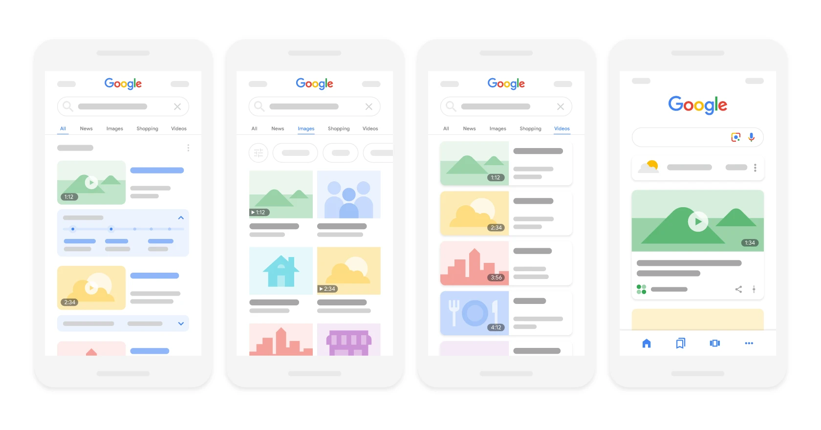
Design YouTube Shorts as full-screen 1080×1920 px and assume from the outset that the interface may cover the bottom of the frame. The simplest solution is to move titles and captions higher and leave safe margins instead of “pushing” the CTA against the lower edge. If you create graphics directly within the video frame, for example a lower bar with a name, test them in the player, because YouTube elements such as the progress bar and buttons can overlap the corners. If consistency matters to you, keep the same typography and contrast rules in 16:9 thumbnails and vertical Shorts, because users see them in different parts of the interface.
How to create effective graphics on LinkedIn and X (Twitter)
Effective graphics on LinkedIn and X (Twitter) are based on safe proportions and high readability in the feed. On LinkedIn, 1200×627 px (approx. 1.91:1) or 1080×1080 works well for a single graphic, and when infographics are being cropped, 1080×1350 (4:5) with larger margins is a practical solution. In X, it is safest to stick to 1200×675 px (16:9) or 1200×1200 px (1:1), because unusual proportions more often end up being cropped unintentionally. If the frame is “cut off” in the preview, returning to 16:9 or 1:1 and adding margins at the edges usually helps.
On LinkedIn, carousels are best prepared as a PDF document in a 1:1 ratio, for example 1080×1080, or horizontally 16:9, for example 1920×1080, because then the slides are more readable. A typical mistake in the business feed is overloading the design with text, because the image is often scanned in 1–2 seconds before anyone reads the description. A practical composition rule is a heading of no more than 6–8 words and one number, with the remaining information moved to the description or subsequent slides. This way the graphic keeps its hierarchy and does not turn into a wall of text.
Profile elements are also worth designing with cropping in mind. Set the LinkedIn profile banner to 1584×396 px, remembering that the left side can be partly covered by the photo, and prepare the X header at 1500×500 px, with key elements placed centrally. In X, the profile picture is circular, so it makes sense to use at least 400×400 px and leave a margin so the logo does not lose readability in “mini” next to tweets. For regular publishing, templates in Figma/Canva for 1200×627, 1080×1080 and 1584×396 work well in practice, because you keep fixed grids, margins and styles. This workflow reduces the risk that the same creative “looks different” after publication.
- 01Optimal LinkedIn proportions1.91:1, 1:1 or 4:5 (with margins)
- 02X (Twitter) graphic formats16:9 or 1:1 for a safe crop
- 03LinkedIn carousels as PDFPDF 1:1 or 16:9 for readability
High readability and safe proportions are the key to success in the feed.
Strategies for Pinterest: standard Pin and Idea Pin
The safest approach on Pinterest is to design Pins in a 1000×1500 px format (2:3) and Idea Pins in 1080×1920 px (9:16), because these proportions best suit vertical browsing. A 2:3 Pin (1000×1500) is less likely to be cropped and makes good use of the platform layout, which is why it works well as the default “evergreen” format. If you are preparing guides or lists, you can use taller formats, but keep the core message (the benefit and the main frame) in the upper half, because users often do not read to the end. For Idea Pins, you can use the same creatives as in Reels, but set the text so it is readable and “searchable” in the Pinterest context.
The most effective text pins are based on a simple hierarchy: a large heading and a smaller, clarifying subheading, without long paragraphs. In practice, this matters when the pin is seen as a thumbnail and the user makes a decision in a split second. For vertical video, stick to 1080×1920 and prepare a cover with a large title and a clear frame (e.g. product + final result), because Pinterest is all about quick thumbnail browsing. If the cover is “lost” in the feed, remove small details and increase contrast.
In e-commerce, product Pins in 1000×1500 often work well, with the product on a clean background and the price or benefit, because they shorten the path to decision. To reduce the number of questions about details, add 1–2 key parameters (without a “wall of text”), and move the rest to the landing page. For consistency across a series, keep the same colours, border and position of the title and logo, because consistency makes content easier to recognise in search results and on boards. When exporting graphics with text and sharp edges, readability often improves in PNG, while lifestyle photos often perform better in JPG with slight sharpening.
Universal principles for designing graphics in social media
The safest approach is to design based on proportions (1:1, 4:5, 9:16, 16:9) and only then adjust the pixels, because platforms will scale the materials anyway. When the proportions are correct and the resolution is sufficient (e.g. 1080 px on the shorter side), the risk of accidental cropping and “odd” framing clearly decreases. In tools such as Figma, you can set guides for “no text” zones straight away (e.g. margins at the top and bottom), and in Canva use margins and the grid. Regardless of the software, a preview on a phone is crucial, because the UI can look different between app versions.
The most common causes of blurry text are a font that is too small in a 1080 px design, low-quality export, or double compression (e.g. saving from Messenger and uploading again). Increasing the font size, exporting in high quality and avoiding multiple JPG saves helps, because each subsequent save reduces quality. If graphics look different on a phone and on a computer, the colour profile is usually to blame, so when exporting stick to sRGB. When choosing a format: JPG works well for photos and gradients (quality 80–90% as a starting point), PNG for sharp edges and text on a flat background, and WEBP can be good for websites, although not all social platforms accept it consistently.
DPI has no practical significance in social media, because what matters is the number of pixels, not the “print” density. If someone asks “72 or 300 DPI?”, the answer is: it does not matter — what matters is that the export has the correct dimensions in px and the right proportions. To quickly catch problems before publishing, do a short quality check on your phone:
- check the file at a zoom level (e.g. 200%) to see whether there are artefacts around letters and lines,
- run the “5-second” test: is the topic, benefit and brand understandable without reading the description.
FAQ
Frequently asked questions
What image dimensions are best for Instagram feed posts and Stories?
For the feed, 1080×1350 px in a 4:5 ratio works best, while for Stories it is 1080×1920 px in 9:16. The classic 1080×1080 px square also remains a standard, especially for carousels and quotes.
Should text on Stories be placed near the edges?
No, key content is best kept in the safe centre of the graphic. It is best to leave around 250 px margin at the top and bottom so the interface does not cover the text or CTA.
What image dimensions are safest on Facebook?
For a link post, 1200×630 px is best, as this format fits Open Graph cards. For a graphic post without a link, 1080×1080 px or 1200×1500 px works well.
Why does an image on Facebook or Instagram lose quality after upload?
The most common causes are text that is too small, low export quality or app compression. Saving in higher quality, using a larger font and PNG for graphics with text and flat colours helps.
Which video and image formats work best on TikTok and Snapchat?
The best default format is 1080×1920 px in 9:16, because both platforms are designed for full screen. Uploading 4K usually does not bring a noticeable improvement, and only lengthens the upload.
Which thumbnail and Shorts dimensions are best on YouTube?
The thumbnail should be 1280×720 px in a 16:9 ratio, and Shorts 1080×1920 px in 9:16. In both cases, it is worth ensuring short, readable text and sRGB on export.