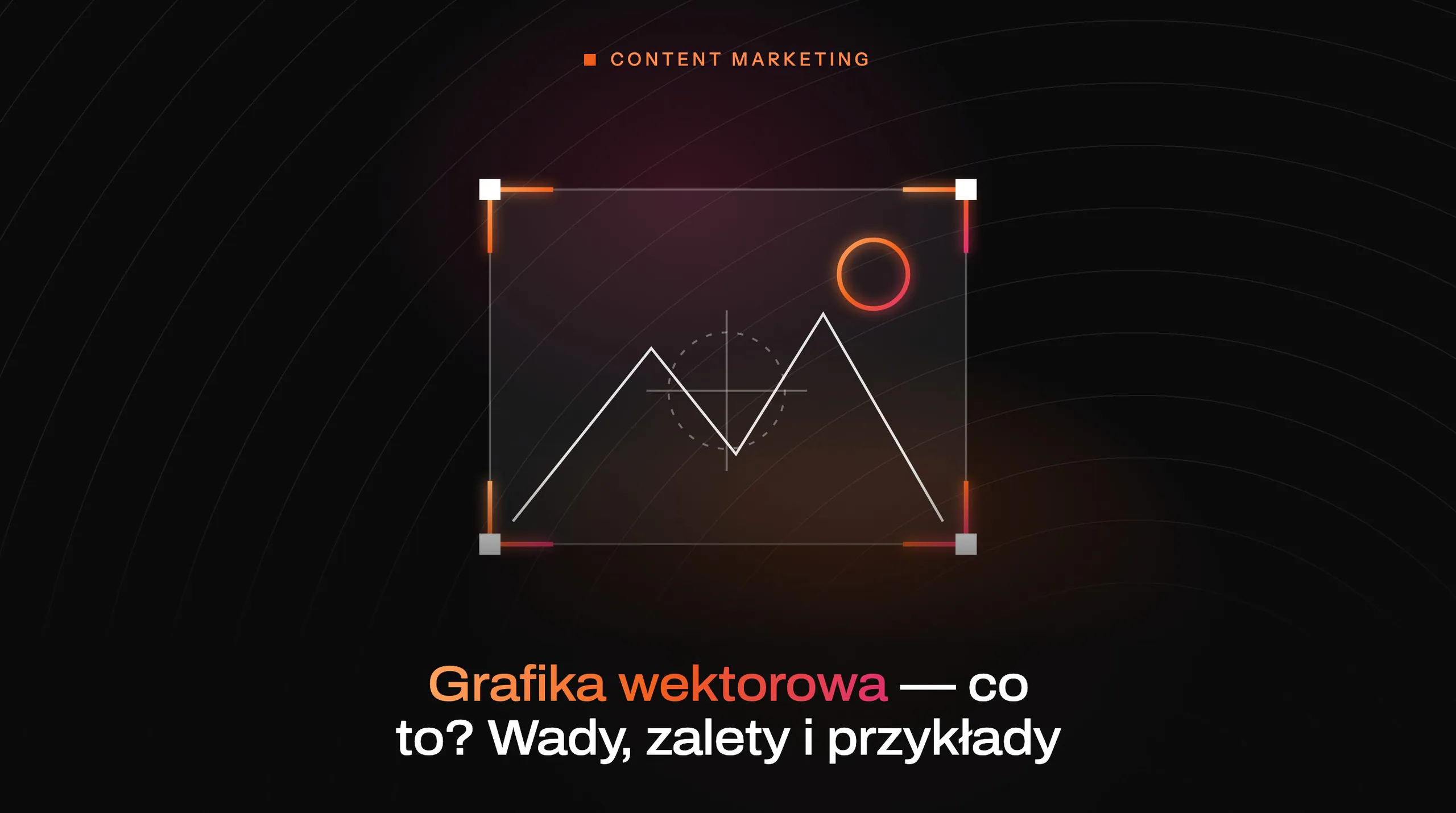

what is vector graphics and how does it work?
Vector graphics is an image described mathematically (points, lines, Bézier curves, polygons), not a grid of pixels. In practice, the file consists of objects (e.g. a circle with a specific radius) and their attributes, such as colour, stroke or transparency. That is why a logo in vector format does not lose quality when enlarged: the software recalculates the shapes from scratch instead of “stretching” pixels. This principle means that one design can be used in many sizes and contexts.
In vector graphics, you work on elements as separate objects, so it is possible to adjust the curve of a single letter in a logo without interfering with the background. Most shapes are based on Bézier curves controlled by points and handles, which makes it possible to achieve exceptionally smooth outlines. If the edges look jagged after exporting to PNG, this is usually due to rasterisation and anti-aliasing dependent on resolution, not the “quality” of the vector itself. In a vector file, the edges are not pixels, so “steps” appear only when outputting to raster.
Vector files often have a tree-like object structure: layers, groups, masks and drawing order affect whether an element is visible and whether it is not accidentally clipped. Each object usually has a fill and a stroke with parameters (thickness, joins, caps and miter limit), and unsuitable settings can result in, for example, “cut off” corners. Text in a vector file can remain editable (requiring the font to be available to the recipient) or be converted to curves (outline), which removes the risk of font substitution but takes away the ability to edit the letters. Very often a vector ends up as PNG/JPG on the web, with the raster being created only at the export stage.
- 01Mathematical descriptionPoints and curves, not pixels
- 02Perfect scalabilityQuality without loss of detail
- 03Precise editingIndependent objects and outlines
This technology allows for infinite enlargement and lossless editing of graphics.
advantages of vector graphics: scalability and precision
The biggest advantage of vector graphics is scalability without loss of sharpness, so one file works both at a small size and in a large format. This is particularly important in visual identity, where the same mark appears, for example, on a business card and on a banner several metres wide. Unlike raster graphics, you do not need to prepare an enormous resolution in advance to avoid pixelation. In print and production (laser, cutting plotter), vector graphics can be essential, because machines need paths as tool trajectories, not pixels.
Vector graphics also provides high precision and predictable editing, because you have full control over shapes, angles and rounding radii when working with points and curves. Thanks to styles/Appearance, you can globally change, for example, the stroke weight across an entire icon set instead of adjusting each file separately. For simple illustrations, charts and icons, SVG/PDF files can be smaller than several PNG versions (e.g. 1x/2x/3x), although they require discipline in path optimisation. In addition, vector elements are easy to build as libraries (symbols, components), which helps maintain consistency in larger systems.
- Scaling without loss of quality makes it easier to use one design in many formats and sizes.
- Precise object editing lets you adjust individual elements without “messing around” with the whole image.
- Better production control (printing, cutting, engraving) comes from the fact that paths are unambiguous geometry.
- Potentially small file size mainly applies to simple drawings and grows with an excess of points or complex patterns.
disadvantages of vector graphics: limitations in photography
Vector graphics are less suitable for photography, because photos consist of millions of irregular details that cannot be sensibly described only with shapes and curves without far-reaching simplification. In practice, “saving a photo as vector” ends up as stylisation (e.g. posterisation or vectorisation), and the result can look unnatural because subtle tonal transitions and texture are lost. Raster is better suited to photography (e.g. RAW/TIFF/JPG), while vector remains a tool for typography, frames and overlays.

Limitations also become apparent with more complex vector effects, which can behave differently after export and in production environments. Shadows, blurs, blending modes or gradient meshes may be flattened or interpreted differently, which can be visible, for example, after export to EPS or in older RIPs. If the final file is going to print or production, it is safer to simplify effects or rasterise selected elements in a controlled way, rather than assuming identical appearance in every workflow. In addition, too many nodes (for example after automatic tracing) increase file size and can slow down rendering, especially in the browser.
- 01Loss of detailSimplifying complex photos
- 02Stylisation, not realismPosterisation effect, loss of texture
- 03Export problemsErrors in complex effects and shadows
Vector graphics are excellent for typography and logos, but photos require raster formats to preserve realism.
popular vector file formats and their applications
The most popular vector file formats are chosen primarily according to the specific use case: web, print, working file in a given program, or CAD and production. SVG is an open W3C standard, supported by browsers, used for icons, illustrations and animation, and it works well with CSS and JavaScript. In practice, when publishing SVG on a website, it is worth keeping in mind that the file can contain scripts, so sanitisation is used (e.g. SVGO + DOMPurify) or it is embedded as a file rather than inline. If performance matters, path optimisation and removing unnecessary metadata are also important, because overly complex SVGs can become quite heavy.
In print, PDF is the most common format, because it can carry vectors, fonts, CMYK colours and bleed, and print RIPs usually handle it without problems. EPS is an older format (PostScript) and can be problematic with transparencies, which are often flattened, so in many situations the safer choice for print is PDF/X (e.g. PDF/X-1a or PDF/X-4). Native formats are used to preserve full editability (AI in Adobe Illustrator and CDR in CorelDRAW), however when exchanging between tools it is often better to export to PDF or SVG, because effects and fonts may be interpreted differently. In technical and production applications (drawings, plans, CNC/laser), DXF and DWG are standard, and in practice many companies choose DXF, because it transfers scale in mm and cutting and engraving layers better.
tools for creating vector graphics and their capabilities
For designing vector graphics, editors such as Adobe Illustrator, Inkscape, CorelDRAW, Figma and Affinity Designer are most commonly used, and the choice depends on whether you are working on branding, UI, print or production files. Illustrator is often the standard in identity design and commercial illustration, because it offers an extensive set of tools (including Pathfinder, Appearance and Image Trace) and makes it easier to prepare logo variations and exports to PDF/SVG. Inkscape is a free SVG editor that works well for icons, simple illustrations and files for laser and plotter work (after setting the units), although with more advanced effects and team collaboration it may lag behind commercial tools in terms of usability and stability. CorelDRAW, on the other hand, is often chosen in advertising and print (vehicle graphics, signs, plotters) thanks to integration with devices and convenient preparation of files for production.

When designing interfaces, Figma is often chosen because it facilitates real-time collaboration, component-based work and Auto Layout, and it also lets you export SVG/PNG quickly. In print, its weaker side remains the lack of full CMYK support and the typically “screen-first” nature of the workflow, which is why the final artwork for print is often moved to Illustrator or InDesign. Affinity Designer is often cited as a sensible alternative, valued, among other things, for its performance and lack of subscription, and before printing it is worth carrying out a trial preflight and checking transparencies and fonts. If the priority is file exchange between companies and tools, it is usually safer to export to PDF or SVG than to send the native format (AI/CDR), because effects and fonts may be interpreted differently.
In a practical logo design workflow, the working methods also matter: from sketching and manual vectorisation (Pen Tool), through refining curves and preparing variants, all the way to exports. Automatic tracing (Image Trace/Trace Bitmap) can speed up the start, but it often creates hundreds of points and jagged curves, which increases file size and spoils the geometry. Before handing materials over for production, quality control (preflight) is used, which helps catch typical problems such as accidental transparencies, missing bleeds or open cutting paths. This approach reduces the risk that the file will “go out of alignment” only after export or in the print shop environment.
- 01Industry standardIdentity, illustration, advanced tools.
- 02Free SVG editorIcons, simple illustrations, plotter, laser.
- 03Often chosenCommercial alternative, varied uses.
Key vector tools are chosen depending on specialism — from branding through to UI, and on to print and production.
How to optimise vector files for different platforms
Vector files are optimised primarily for a specific medium: web (SVG), print (PDF/PDF-X) and CAD/production (DXF/DWG), so as to maintain quality and avoid compatibility issues. On the internet, SVG is the natural choice, but it requires a security-conscious approach because it can contain scripts, which is why in practice sanitisation is used (e.g. SVGO + DOMPurify) or it is embedded as a file rather than inline. From a performance perspective, removing unnecessary metadata and optimising paths is very important, because an unoptimised file (e.g. with embedded rasters) can be extremely heavy. When fast loading and smooth rendering matter, simplifying paths and limiting excess nodes is key, because complex SVG can slow down the browser.
In print, optimisation comes down to selecting the right PDF/X standard, ICC profile and checking the file before sending it to the RIP. PDF is common in print production because it carries vectors, fonts, CMYK colours and bleeds, and the PDF/X variants (e.g. PDF/X-1a or PDF/X-4) reduce the risk of errors, with PDF/X-4 usually handling transparencies better. Differences in colour between screen and print often result from RGB→CMYK conversion and the ICC profiles used, which is why it makes sense to follow the print shop’s specifications (e.g. ISO Coated v2 / PSO Coated v3) and carry out preflight. If the project includes text, you also need to decide consciously whether to embed fonts or convert them to outlines, because outlines eliminate the risk of font substitution at the cost of editability.
In technical production and plotter cutting, optimisation essentially comes down to “clean” geometry and correctly set units. In a CAD workflow, DXF/DWG are often required because they transfer scale in mm and cutting/engraving layers better, and in the files themselves “artistic” effects such as blurs are avoided. At the cutting-preparation stage, closing paths, removing double lines, setting a 1:1 scale in mm and separating layers for cutting and engraving are important. If the final format is meant to be a raster (e.g. PNG/JPG), it is worth remembering that edge quality results from rasterisation and anti-aliasing, as well as from whether the export is matched to the target resolution (e.g. 1x/2x/3x for screens or 300 dpi in print).
Examples of the use of vector graphics in marketing
Vector graphics in marketing work particularly well where one creative asset needs to maintain a consistent style across many channels and formats. In practice, this applies to logos, icons and illustrations that must remain legible both on a website and in print materials. Because the elements are objects with attributes (e.g. fill, stroke, transparency), they can be easily adapted to the visual identity without “sculpting” in pixels. This approach makes it easier to maintain a consistent style in marketing projects, because you edit specific shapes rather than the entire “flat” image.
Editorial and marketing vector illustrations are popular on landing pages and in presentations, because the colour palette can be quickly matched to the brand and exported at any size. Such graphics retain clean edges in a flat or line-art style, and rasterisation only occurs at the display or export stage. In online campaigns, it is also useful that icons in SVG can have their colour set via CSS (e.g. fill: currentColor), which makes it easier to prepare variants without creating separate files. If lightweight page assets matter, vector often allows you to replace several raster versions with one file, provided the paths are optimised.
In marketing, vectors are also often used for infographics and charts, because text and lines remain readable when scaled and in print. For reports and sales materials, PDF or SVG exports usually work well, as they keep elements sharp. A separate category is animations and interactions in SVG, which can be implemented with CSS (e.g. stroke-dasharray) or JavaScript (e.g. GSAP, Snap.svg) as a lightweight alternative to video. With such uses, performance must be kept in mind: overly complex paths and too many points can cause “frame dropping”, especially on mobile devices.
FAQ
Frequently asked questions
How does vector graphics work and how does it differ from raster graphics?
Vector stores an image as mathematical objects, such as points, lines and Bézier curves, instead of a grid of pixels. This means the software recalculates shapes when the size changes, rather than stretching existing pixels.
Why do vector graphics not lose quality when enlarged?
Because the edges are recalculated from the mathematical description. For this reason, a logo or icon stays sharp regardless of scale.
Are vector graphics suitable for photos?
They are not ideal for this, because photographs contain a lot of fine, irregular detail and tonal transitions. After vectorisation, the image usually becomes simplified and may look unnatural.
What are the biggest advantages of vector graphics in practice?
The most important are scalability without loss of sharpness, precise editing and good production control. Vector also works well in print, plotter cutting and engraving, where unambiguous geometry is needed.
When can vector graphics cause problems?
Problems arise with complex effects such as shadows, blurs or blending modes, which may be interpreted differently after export. Too many nodes can also be an issue, because they increase file size and slow down rendering.
Which vector file formats are most commonly used?
On the web, SVG is most commonly used, in print PDF, and in technical applications CAD and production DXF or DWG. To preserve editability, native formats such as AI and CDR are also used.